Chapter 7. Designing for iOS
Anyone who has built a native iOS application knows that getting app store approval is not a trivial part of the project. Unlike the Android market, Apple reviews every application and will reject your application if it doesn’t follow their guidelines. We can’t go through all of these guidelines within the context of this book, but I can show you a few techniques so that you can maintain one version of your code and still target iOS with specific UI elements.
MultiDPIBitmap
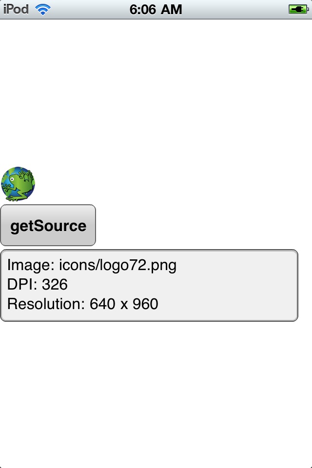
The resolution of an iOS device varies depending on the device. The devices with higher resolutions have a greater DPI (pixel density). To allow your application images to display correctly across these resolutions, you can use MultiDPIBitmapSource to define multiple versions of your bitmaps and ensure that the appropriate bitmap is used. The example below defines 3 versions of an image. The first is 36×36 pixels in size, the second is 54×54 pixels, and the third is 72×72 pixels. If the operating system’s DPI is less than 200 (like on the iPhone 3G), the 36×36 image will be used; if the DPI is greater than or equal to 200 and less than 280, the 54×54 will be used; and if the DPI is greater or equal to 280 (like on the iPhone 4), the 72×72 will be used. Figure 7-1 shows this application running on an iPhone 3 with a screen resolution of 320×480 (163 DPI), and Figure 7-2 shows this application running on an iPod with a screen resolution of 640×960 (326 DPI):
<?xml version="1.0" encoding="utf-8"?>
<s:Application xmlns:fx="http://ns.adobe.com/mxml/2009"
                  xmlns:s="library://ns.adobe.com/flex/spark">
    <fx:Declarations>
          <!-- Place non-visual elements (e.g., services, value objects) here -->
    </fx:Declarations>
    <fx:Script>
          <![CDATA[
               import mx.core.FlexGlobals;

               protected function button1_clickHandler(event:MouseEvent):void
               {
                     log.text = "Image: " +
                          myImage.source.getSource(
                                FlexGlobals.topLevelApplication.runtimeDPI)
                          .toString() +
                          "
DPI: " + Capabilities.screenDPI +
                          "
Resolution" +
                          Capabilities.screenResolutionX + " x " +
                          Capabilities.screenResolutionY;
               }

          ]]>
    </fx:Script>

    <s:VGroup verticalCenter="0">
          <s:Image id="myImage">
               <s:source>
                     <s:MultiDPIBitmapSource
                          source160dpi="icons/logo36.png"
                          source240dpi="icons/logo54.png"
                          source320dpi="icons/logo72.png"/>
               </s:source>
          </s:Image>
          <s:Button label="getSource" click="button1_clickHandler(event)"/>
          <s:TextArea id="log"/>
    </s:VGroup>
</s:Application>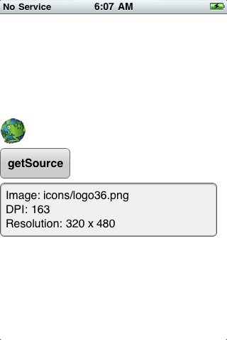
Setting Styles for iOS
CSS stylesheets are a great way for you to style your application; Adobe has provided the ability to use different CSS declarations according to rules defined in what is called the @media rule. Thanks to the ability to have conditional logic in your CSS using the @media rule, you can test for screen DPI or operating system. This makes it easy to style your application to meet the needs of any device.
The example below has some conditional logic to test for the application DPI as well as the operating system.
If the application DPI is less than 200, the Label font size will be set to 30 on all operating systems; if it is greater than or equal to 200 and less than 280, the font size will be set to 40; and if it is greater than or equal to 280, the font size will be set to 50.
There is also an operating system-specific CSS style defined for iOS
devices. If the device is iOS, the ActionBar’s
defaultButtonAppearance is set to beveled, which is the
standard look on an iOS device.
The available values that you can test for with the
application-dpi property are 160, 240, and 320. The
available values that you can test for with the
os-platform property are Android, iOS, Macintosh,
Linux, QNX, and Windows.
Note
QNX is the BlackBerry Tablet operating system.
Using these properties, you can easily style your application to run on different operating systems and screen resolutions.
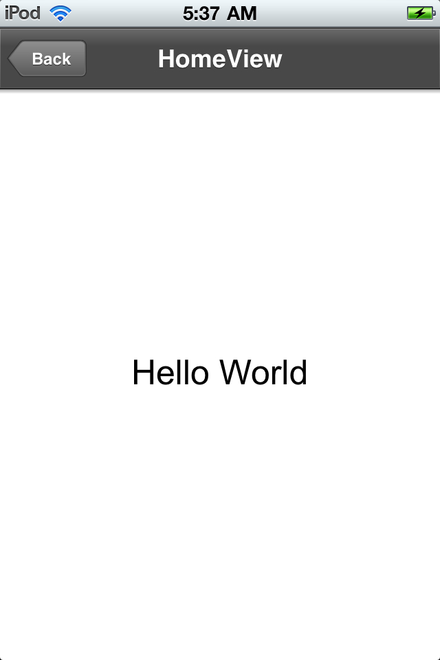
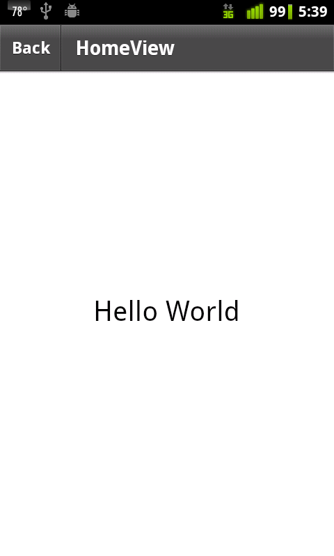
Figure 7-3 shows this application running on an iPhone 3, Figure 7-4 shows it on an iPod 4, and Figure 7-5 shows it on an Android phone.
Here is the code for the main application file:
<?xml version="1.0" encoding="utf-8"?>
<s:ViewNavigatorApplication xmlns:fx="http://ns.adobe.com/mxml/2009"
                                     xmlns:s="library://ns.adobe.com/flex/spark" firstView="views.CSSSampleHomeView">
    <fx:Declarations>
          <!-- Place non-visual elements (e.g., services, value objects) here -->
    </fx:Declarations>

    <fx:Style>
          @namespace s "library://ns.adobe.com/flex/spark";
          @namespace mx "library://ns.adobe.com/flex/mx";

          /* dpi less than 200 */
          @media (application-dpi: 160) {
               s|Label {
                     fontSize: 30;
               }
          }

          /* dpi greater than or equal to 200 and less than 280 */
          @media (application-dpi: 240) {
               s|Label {
                     fontSize: 40;
               }
          }

          /* dpi greater than or equal to 280 */
          @media (application-dpi: 320) {
               s|Label {
                     fontSize: 50;
               }
          }

          /* platform is iOS */
          @media(os-platform:"IOS")
          {
               s|ActionBar
               {
                     defaultButtonAppearance:beveled;
               }

          }

    </fx:Style>


    <s:navigationContent>
          <s:Button label="Back"/>
    </s:navigationContent>

</s:ViewNavigatorApplication>
Code for the CSSSampleHomeView:
<?xml version="1.0" encoding="utf-8"?>
<s:View xmlns:fx="http://ns.adobe.com/mxml/2009"
          xmlns:s="library://ns.adobe.com/flex/spark" title="HomeView">
    <fx:Declarations>
          <!-- Place non-visual elements (e.g., services, value objects) here -->
    </fx:Declarations>


    <s:Label text="Hello World" horizontalCenter="0" verticalCenter="0"/>

</s:View>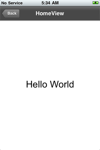
The @media rule also supports operators, so that you can apply a style only if multiple conditions are present.
The and operator is supported—for example:
| This statement “@media (os-platform: “IOS”) and (application-dpi: 160)” will only be true if the operating system is iOS and the screen DPI is less than 200. |
The or operator is supported by using a comma—for example:
| The statement “@media (os-platform: “IOS”), (application-dpi: 160)” will be true if the operating system is iOS or the screen DPI is less than 200. |
The not operator is supported—for example:
| The statement “@media not all and (os-platform: “QNX”)” will be true for all operating systems except for QNX (BlackBerry Tablet OS). |
Here is a sample:
<?xml version="1.0" encoding="utf-8"?>
<s:Application xmlns:fx="http://ns.adobe.com/mxml/2009"
                  xmlns:s="library://ns.adobe.com/flex/spark">
    <fx:Declarations>
          <!-- Place non-visual elements (e.g., services, value objects) here -->
    </fx:Declarations>

    <fx:Style>
          @namespace s "library://ns.adobe.com/flex/spark";
          @namespace mx "library://ns.adobe.com/flex/mx";

          /*
               platform is iOS
               dpi greater than 280
          */
          @media (os-platform: "IOS") and (application-dpi: 320) {
               s|Label {
                     fontSize: 100;
               }
          }

          /*
               platform is Android
               dpi greater than or equal to 200 and less than 280
          */
          @media (os-platform: "Android") and (application-dpi: 240) {
               s|Label {
                     fontSize: 50;
               }
          }

          /*
               platform is iOS
               dpi is less than 200
               OR
               platform is Android
               dpi is less than 200
          */          @media (os-platform: "IOS") and (application-dpi:160),
                  (os-platform: "ANDROID") and (application-dpi: 160) {
               s|Label {
                     fontSize: 30;
               }
          }

    </fx:Style>


    <s:Label text="Hello World"
                horizontalCenter="0" verticalCenter="0"/>

</s:Application>
Using Capabilities
So far you have seen how to use CSS to control some of the visual
aspects of your application, but you may also wish to have only certain
pieces of your application available to target specific devices or
specific views created for specific devices. This is possible by utilizing
the properties of the Capabilities class to determine
operating system, screen resolution, and so on. The example below will
serve a different home screen to the user depending on their device. This
technique will allow you to target specific
audiences with a custom experience. The firstView
property of the ViewNavigatorApplication is bound to a function
called getFirstView, which evaluates the
Capabilities.version, and returns a different view
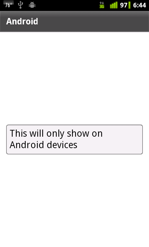
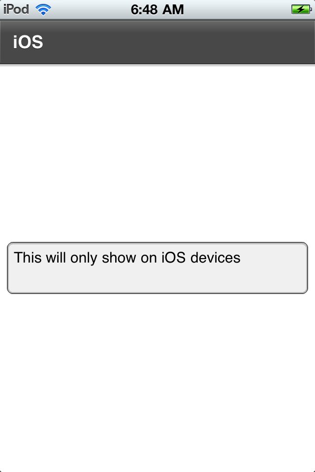
based on the operating system (see Figures 7-6 and 7-7).
You could also use other properties of the
Capabilities class in the same manner. You may wish to
look into Capabilities.screenDPI,
Capabilities.screenResolutionX, Capabilities.screenResolutionY, and
Capabilities.screenColor:
Note
I could also have had just one main view file, and simply set the state of that file to be different based on the operating system.
<?xml version="1.0" encoding="utf-8"?>
<s:ViewNavigatorApplication xmlns:fx="http://ns.adobe.com/mxml/2009"
                                     xmlns:s="library://ns.adobe.com/flex/spark"
                                      firstView="{getFirstView(Capabilities.version)}">
    <fx:Declarations>
          <!-- Place non-visual elements (e.g., services, value objects) here -->
    </fx:Declarations>
    <fx:Script>
          <![CDATA[
               import views.*;
               private function getFirstView(v:String):Class{                     if(v.indexOf("AND") == 0){
                          return views.AndroidHomeView;
                     } else if (v.indexOf("IOS") == 0){
                          return views.IOSHomeView;
                     }
                     return views.GenericHomeView;

               }

          ]]>
    </fx:Script>
</s:ViewNavigatorApplication>