
In this chapter, you will:
Explore what’s new for conditional formatting
Learn how to create a customized icon set
Uncover essentials for formatting data bars
See how to turn data bars into horizontal thermometer charts
Get comfortable with the Conditional Formatting Rules Manager
Discover the ease and power of sparklines
You might use a well-chosen image to illustrate a point in your document or create a diagram that helps express what you’re trying to say better than plain, boring bullets ever could. So you already know that adding visual impact to your documents helps your important information shine through.
With that thought in mind, you’re well equipped to start exploring data visualization features in Microsoft Excel. These tools are not just another pretty face. They are smart and powerful, and give you the flexibility to make your data as meaningful as it is beautiful.
If you think you’re new to data visualization, you’re probably not; if you’ve ever created a chart or a diagram, you already know the basic concept. For this chapter, we focus on two powerful data visualization features: conditional formatting and the new, very cool, tiny charts known as sparklines.
Conditional formatting in both Excel 2010 and Excel for Mac 2011 is now almost identical across platforms—from the dramatic conditional formatting data visualization options to the ability to manage formatting rules throughout a workbook from a single dialog box. So, if you share workbooks across platforms or work between a PC and Mac, this is very good news.
The key improvements to conditional formatting in Excel 2010 are more options and greater flexibility for icon sets and data bars. The same applies to Excel 2011, but the changes to conditional formatting for Mac users are on a much greater scale, a fact that is addressed in the sidebar For Mac Users, later in this section. Even though Mac users will see more changes, the following list of key improvements is applicable to both Windows and Mac users:
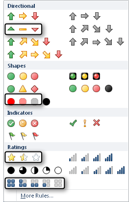
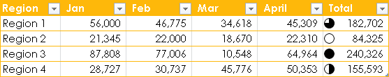
Icon sets, which use an icon to provide information about the value of the cell, are no longer limited to the prebuilt choices in the Icon Set gallery. You can now mix and match icons from different sets, as shown in Figure 19-1, or hide an icon for cells that meet a specified condition.
There are three new sets of icons available in the Icon Set gallery, as shown in Figure 19-2. Also note the gallery itself has been reorganized and the icon sets are placed in more meaningful groups.
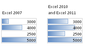
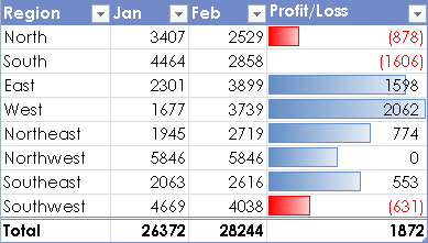
Data bars, used to identify trends in data, are now drawn proportionally according to their numeric value. Take a look at Figure 19-3 for an example of this improvement.
Notice the difference in the length of the data bars and then notice that the values in both examples are the same. In Excel 2007, the length of the data bars is based on the lowest and highest values in the range. It identifies a trend, but the length of the bars makes it difficult to compare those values to one another. In Excel 2010 and Excel 2011, you can make a more accurate comparison because the data bar length is based on numeric values instead.
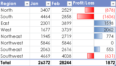
The behavior of negative and zero values has also changed. New negative data bars plot negative values in the opposite direction and the data bar is suppressed for zero values, as shown in Figure 19-4.
Data bars also received new formatting options. Now you can use a solid fill, as shown in Figure 19-5, or add a solid border to add more visibility to the length of the data bar.
The last change that merits a mention in this list is that you’re no longer limited to referencing cells on the same sheet in your conditional formatting rules. You can now reference cells from other worksheets, giving you even more flexibility.
Note
See Also For more information on conditional formatting, see the section Increasing Your Options with Conditional Formatting, later in this chapter.
When you view the Conditional Formatting menu on the Home tab, shown in Figure 19-6, you see the option to select from several common rules that highlight cells based on specific criteria. When you select a preset option from the Highlight Cell Rules or the Top/Bottom Rules, you’re prompted to enter the criteria and specify the formatting you need.
In addition to these commonly used rule types, you also see three types of data visualization formatting options, including Data Bars, Color Scales, and Icon Sets. Each option enables you to display a visual comparison for a set of values.
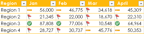
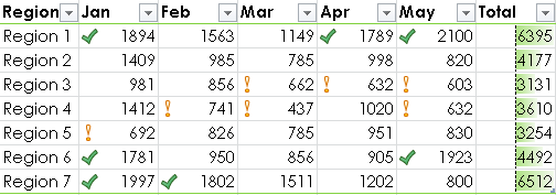
For example, in Figure 19-7, the icon set used in the Total column provides a clear and simple visual comparison of values.
Note
For a clean document design that effectively displays your data, think about what you want the formatting to accomplish before using data visualization tools. Data bars are likely to provide effective emphasis in most cases. However, when using color scales, consider light colors that won’t overshadow your data with dense formatting. And, when using icon sets, make sure they highlight something you want to say about your data rather than distracting attention from the data itself.
To customize your conditional formatting, find the More Rules option at the bottom of the gallery for each rule category in the Conditional Formatting menu. This takes you to essentially the same place as the New Rule option on the Conditional Formatting menu. Selecting either of these options opens the New Formatting Rule dialog box.
This dialog box displays very different options based on the type of rule you select. For example, the dialog box that you see in Figure 19-8 displays options for 2-color scale formatting. When you open the dialog box from the More Rules option at the bottom of a conditional formatting gallery, you automatically see options for the selected rule type.
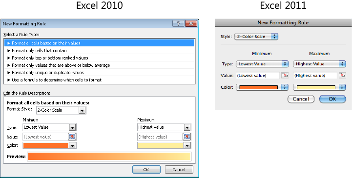
There are six types of rules, as you see in Figure 19-8 for Excel 2010. All data visualization categories fall under the first type, Format All Cells Based on Their Values.
In Excel 2010, change the Format Style option in the bottom portion of the dialog box to display formatting choices for a different style of data visualization formatting. Select a different rule type category from the top of the dialog box for a range of classic conditional formatting rule options.
In Excel 2011, the Style drop-down list provides both data visualization and classic options. When you select Classic from this list, the dialog box changes to display options such as Format Only Top or Bottom Ranked Values or Format Only Unique Or Duplicate Values.
To apply any type of conditional formatting rule, start by selecting the cells to format and then do the following:
On the Home tab, click Conditional Formatting. You can select a preset option, or select More Rules or New Rule to open the New Formatting Rule dialog box.
All preset options will set criteria based on your values (if selected cells contain values) and apply default formatting. However, options in the Highlight Cell Rules and Top/Bottom Rules categories will prompt you to confirm or change criteria and formatting; the data visualization categories will not.
If you open the New Formatting Rule dialog box, select the type of rule you need, and then specify criteria and formatting.
Notice that you can use theme colors for any type of conditional formatting rules.
Note
When you apply conditional formatting in an Excel table and then add rows or columns to that table, the conditional formatting automatically extends to new rows but not to new columns.
Note
See Also For more information on setting options for data bars and icon sets in the New Formatting Rule dialog box, see the section Setting Additional Data Visualization Options, later in this chapter.
The two data visualization options that have the most formatting choices are icon sets and data bars. So, in this section, we’ll walk through customizing icon sets and explore essential formatting information for data bars.
Note
Although this section covers two of the data visualization features in more detail, you can use similar steps to customize color scales along with any of the conditional formatting options.
When icon sets were first introduced in Excel 2007, it was an exciting technological advance. However, they lacked customization options—for example, by limiting your choices to the icon sets displayed in the gallery. Although you still can’t add a custom icon, you can now create a custom icon set that uses any of the icons from other sets. You can also choose to not display an icon for specific values, which you couldn’t do without creating multiple conditional formatting rules in Excel 2007. For example, you can emphasize only the highest and lowest values and hide all others, as shown in Figure 19-9.

To customize an icon set, select a range of cells to format and then do the following:
On the Home tab, click Conditional Formatting, point to Icon Sets, and then click More Rules.
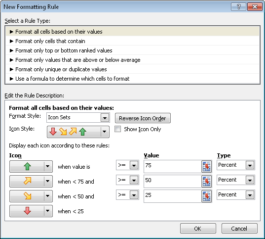
The default icon set provides three conditions that you can modify. If you want to use four or five conditions in your rule, then from the Icon Style drop-down (Icons in Excel 2011), select an icon set that uses the same number of icons, such as four or five arrows.
For this step, note that only the number of icons in the selected set matters, not the icons themselves, because you can change each icon as needed in the next step.
The default type for each condition in your rule is a percentage, and each value is equally distributed based on the number of conditions you are using. For example, if your rule has four conditions, as shown in Figure 19-10, the default percentages will be in increments of 25%.
Figure 19-10. The New Formatting Rule dialog box as it appears when you are customizing an icon set.
Also notice that the rule (condition) settings for each icon appear to the right, with the rule written out directly beside each icon. It’s usually a good idea to modify the rules prior to changing the icons. This way, you can easily reference your customized rule next to the icon to help you select appropriate icons for your purpose.
To customize a rule, first select the Type (options include Number, Percent, Formula, and Percentile) at the far right of the rule settings.
In the Value text box for each condition, add your numeric value or reference a single cell. You can also use a formula that includes a range function, such as SUM or AVERAGE.
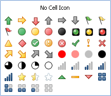
Then, for each condition in your rule, select a new icon if desired. If you don’t want an icon to display for a specific condition, use No Cell Icon, which appears at the top of the list of icon choices, as shown in Figure 19-11.
Data bars essentially look like a bar chart that’s been superimposed over the values in your worksheet.
As mentioned earlier, this functionality (along with all data visualization conditional formatting) is brand new to Office for Mac 2011. For Office 2010, you have the addition of negative data bars, the ability to format both the bar and its border, and a few axis formatting options—all of which help to make this feature appear even more chart-like (and with less work than most custom charts).
This section explores the essential data bar formatting options that are available in the New Formatting Rule dialog box, shown in Figure 19-12. To access this dialog box, on the Home tab, click Conditional Formatting, point to Data Bars, and then click More Rules.

Note
When you select Edit Rule from the Conditional Formatting Rules Manager (Manage Rules in Excel 2011), the Edit Formatting Rule dialog box appears. The dialog box has a different name but provides the same options as discussed in this section.
Note
See Also For more information on the Conditional Formatting Rules Manager (Manage Rules), see the section Managing the Rules in Your Workbook, later in this chapter.
When you apply data bars using the Data Bars gallery of preset options, the Minimum and Maximum options are both set to Automatic by default. The Automatic setting enables the data bar length to display relative values more accurately in Excel 2010 and Excel 2011 than it did in Excel 2007, as shown previously in Figure 19-3. This default sets the minimum value to zero (or the lowest negative value in the range) and the maximum value to zero (or the highest positive value in range).
You can, however, customize these settings to provide results similar to customizing the minimum and maximum on a bar chart value axis. Select Number, Percent, Formula, or Percentile as the type of minimum and maximum value setting. When you do, the option to enter specific values becomes available. You can type a value, reference a single cell, or use a formula that includes a function that references a range of cells.
Note that Lowest Value and Highest Value are also available choices for minimum and maximum type. However, these options return the data bar display behavior back to the Excel 2007 defaults, making it more difficult to compare values at a glance.
The Show Bar Only option (Show Data Bar Only in Excel 2011) lets you display data bars while hiding their numeric values in the cells. Use this option when you want your data bars to appear more like a bar chart without superimposed values, or for an in-cell progress chart.
Note
See Also For more on using data bars as an in-cell progress chart, see the upcoming sidebar Insider Tip: Turning Data Bars into Horizontal Thermometer Charts.
Another new option of note is Bar Direction (Direction in Excel 2011), which lets you change the direction the data bar displays, such as right to left, as shown in Figure 19-13.
Keep in mind that if you have negative values in the data bar range, this option will reverse the position of the negative and positive data bars. That is, positive values will display to the left of the axis and negative values to the right.
When you add data bars to a range of values that includes negative numbers, negative data bars automatically display in red and are plotted in the opposite direction of positive values. In Excel 2010, options for negative data bars are in the Negative Value And Axis Setting dialog box, shown in Figure 19-14. You access these options from the New Formatting Rule dialog box by clicking the Negative Value And Axis button near the bottom. In Excel 2011, negative data bar options are in the main New Formatting Rule dialog box.

Notice that you can change the fill color and border color for negative data bars. However, you can’t set a separate solid or gradient fill style for negative data bars, because this format is controlled by the positive bar fill style. And, if the positive bar doesn’t use a solid border, negative data bars will also have no border.
Here are a few points to keep in mind for the available axis options:
The Automatic option displays the axis position based on the largest negative value. That is, the smaller the negative value, the closer the axis will be placed to the left edge of the cell—provided the negative bar displays to the left of the axis. It will also suppress the display of the axis if there are no negative values in the range.
If you set the axis to the cell midpoint and have no negative values in the data bar range, the axis will still display, as shown in Figure 19-15.
When you suppress the axis (by selecting the option labeled None), the negative data bars display in the same direction as positive bars (as shown in Figure 19-16) rather than visually removing the display of the axis. However, they maintain the negative bar color setting.
Admittedly, it’s much easier to see the color differences when you’re not reading a black-and-white page. So, just trust me on this one (or check out the previously mentioned sample data for yourself): the top and bottom data bars in Figure 19-16 are red.
Also notice of zero value behavior in this case. Because the negative data bars display in the same direction, the lowest negative value is suppressed instead.
You can change the axis color, but the line style is limited to a preset dashed line. If you want to visually suppress the axis, set the color to the same color as the cell background. Of course, if you change the cell fill color, you’ll need to change the axis color as well.
Insider Tip: Turning Data Bars into Horizontal Thermometer Charts
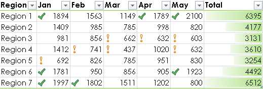
There are many creative ways in which you can use data bars to add visual clarity to your data. One of my favorite methods is to use data bars as a horizontal thermometer chart (or an in-cell progress chart) to show progress toward a specific goal or target. For example, check out the sales target data shown in Figure 19-17.
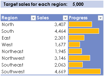
The data bars provide two visual comparisons: they compare the sales in each region as well as progress toward the target sales.
To learn how to use a data bar as a horizontal thermometer chart, take a closer look at the example provided in Figure 19-17.
The cells in the Progress field are set to the corresponding values in the Sales field (=[@Sales]).
These cells are also filled with a solid color to help identify the maximum length.
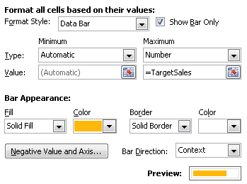
The formatting options for the data bars are as follows (and are shown in Figure 19-18).
Show Bar Only (Show Data Bar Only in Excel 2011) is selected to suppress the sales values in the Progress field.
Notice the Minimum Type is Automatic and the Maximum Type is Number. The Maximum Value is equal to the cell to the right of Target sales for each region, which is named TargetSales.
The data bars are set to a solid fill and a solid white border.
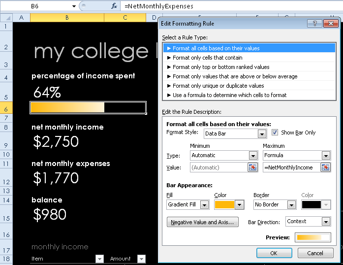
You can also use a single data bar as a thermometer chart, as shown in Figure 19-19.
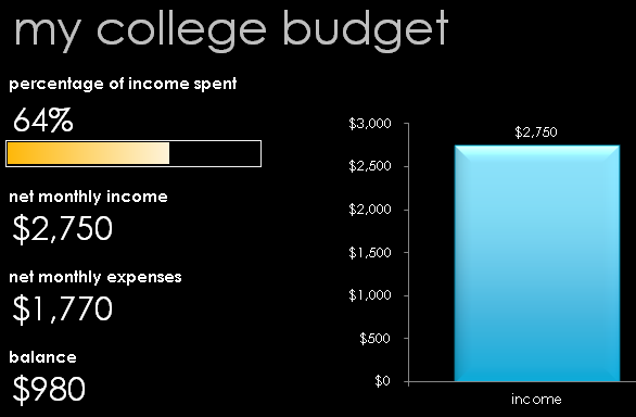
This example is also in the Data Visualization Examples workbook. It’s based on a template named “My College Budget,” which is available on Office.com.
The purpose of the data bar is to provide a visual representation of the percentage of income spent, which is net monthly expenses divided by net monthly income. As the percentage increases, the length of the data bar does too. If the percentage reaches 100% (or exceeds 100%), the data bar will fill the entire cell. Of course, the objective in the budget example is to not spend or exceed 100% of the available income, but this method can be used for any single goal-oriented scenario, such as a fundraising goal.
The data bar creation in Figure 19-20 is essentially the same as the previous one in Figure 19-19. In this case, the value for the data bar is equal to net monthly expenses and the maximum length for the data bar is equal to net monthly income.
Note
See Also This tip uses structured table references and named ranges. To review either of these features, check out Chapter 18.
Note
Companion Content As previously mentioned, you can explore the examples shown in this tip by downloading the Data Visualization Examples workbook in the Chapter19 sample files folder available online at http://oreilly.com/catalog/9780735651999.
You can view all of the rules in your workbook in the Conditional Formatting Rules Manager (Manage Rules in Excel 2011), shown in Figure 19-21. You can edit, reorder, or delete rules throughout your workbook from this one location, and even add new rules as well. It’s so flexible that once you’re comfortable with conditional formatting, you can use it as a single entry point for all of your conditional formatting needs.
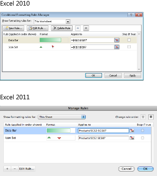
Figure 19-21. The Conditional Formatting Rules Manager dialog box for Excel 2010 and the Manage Rules dialog box for Excel 2011.
From the Show Formatting Rules For list, choose to view existing rules for the Current Selection, This Worksheet (This Sheet in Excel 2011), or any sheet or table in the active workbook.
Click New Rule (+ button in Excel 2011) to add a new rule for the active range in your worksheet. Or, select a rule from the list and then click Edit Rule to change the criteria or formatting for that rule.
Notice that you can edit the applied data range for any existing rule directly in this dialog box.
Use the up and down arrow buttons to reorder multiple rules that are applied to the same range. This changes the order in which rules are applied to the range, which can change the formatting that’s visible in the cell.
When you order rules, you can also use the Stop If True option to affect how rules are applied. If you select this option for a given rule, Excel ignores lower rules for a cell in the range if the value of that cell is true for the specified rule. This helps ensure that the most important conditional formatting information appears in your data. Note, however, that this option isn’t available for data visualization rules because they compare a range of values rather than specifying criteria as true or false.
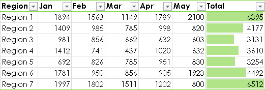
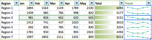
Sparklines are a brilliant new data visualization feature that essentially fits a true chart right inside a worksheet cell. For example, in Figure 19-22, sparklines appear in the Trend column of the table.
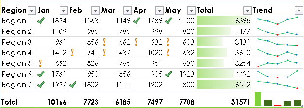
If you could see only the columns of values in Figure 19-22, you would likely review each cell and calculate comparisons in your head. If you happen to have a photographic memory, this is an easy task. For the rest of us, however, a quick and clear visual makes an enormous difference.
Notice how the sparklines—combined with conditional formatting in the data columns of the table—expand the story that this data tells. You can see at a glance that, though Region 7 has the highest overall sales, those sales are trending downward. My pick for the strongest performer in this example is actually Region 1.
So, these tools are not only fantastic for adding impact to the important points you want to make about your data when sharing the workbook with others, but they can also be incredibly useful for helping you analyze your own data more easily and effectively.
Excel offers three sparkline types: line, column, and win/loss. Following is some additional information for each sparkline type:
 A line sparkline is similar to a line chart, as shown at left. Each value, or point, in the data source is connected by a line. You can show or hide all markers to view only the trend, or customize specific markers to emphasize information such as high and low points in the data.
 A column sparkline, shown to the left, is similar to a clustered column chart. The height of each marker corresponds to the associated value, and negative values display below the axis. And, unlike a traditional column chart, you can choose to automatically display negative values in a different color.
 A win/loss sparkline illustrates the positive and negative split in your data, as shown at left. Positive values display above the axis, and negative values display below the axis. You can identify the highest and lowest points by color, but the size of each marker is based on cell height and width rather than a specific value.
As with traditional charts, determine the type of sparkline you need based on the type of data and what information you want the sparkline to illustrate. For example, if you want to identify a trend over a period of time, then a line type is your best choice. Or, if your data contains both positive and negative values and you want to visually compare those values, then a column type might be the best way to go. However, if your primary need is to determine whether the majority of those values is positive or negative, then a win/loss type will help you quickly identify this information.
Of course, it’s always best to know what information you want from your data as you format your worksheet. But if you later decide that a different type of sparkline might be more effective—or you want to try different types of sparklines to see which tells your story most effectively—you can change sparkline type with just a click.
Creating sparklines is almost identical to creating a formula that includes a range function (such as SUM or AVERAGE) for a single row or column. However, unlike range functions, you can’t create a single sparkline for an array of multiple columns and rows.
With this in mind, when you select a range of cells for your sparklines, make sure you include a destination cell for each corresponding column or row of values. For example, if you have three rows of data, you need to select three corresponding cells for your sparklines.
Note
Sparklines do not need to be placed next to their associated data. You can create sparklines for data in other locations, such as a large amount of source data that resides on another worksheet.
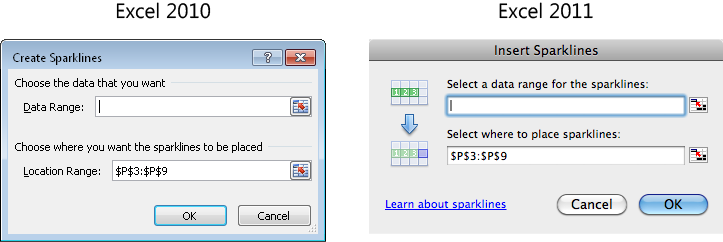
To create sparklines, you can begin by selecting either the data range for the sparklines or the destination cell (or range of cells) where you want them to appear. For these steps, start by selecting the destination cells and then do the following:
In Excel 2010, on the Insert tab, in the Sparklines group, click Line, Column, or Win/Loss.
In Excel 2011, on the Charts tab, in the Insert Sparklines group, click Line, Column, or Win/Loss. Or, on the Insert menu, click Sparklines. (Note that the latter method creates line sparklines by default.)
The Create Sparklines dialog box (Insert Sparklines in Excel 2011) opens, as shown in Figure 19-23.
Confirm that your insertion point is in the data range text box. Then, select the cells that contain your sparkline values (you can just click directly into the worksheet to do this).
If you select empty cells, the dialog box assumes you need to add the data range and places your insertion point in that box. If you start this task by selecting cells containing data instead, the dialog box assumes you selected the source data for your sparkline and places your insertion point in the location (destination) range text box instead.
Note
When you copy and paste sparklines, they automatically adjust relative to the copied cell, just like a formula. So, you can create a single sparkline and copy it for adjacent cells as needed. You can also use the cell fill handle at the bottom-right corner of a cell to copy sparklines down a column or across a row.
Before you begin to modify sparklines, save yourself a lot of effort and help keep your sparklines consistent by grouping them. When you group sparklines, you can select and modify any individual sparkline in the group and the changes are automatically applied to all of them.
If you create multiple sparklines at once, or if you use the cell fill handle to populate a row or column with sparklines, they are grouped automatically. But you can also group selected sparklines manually with just a click.
To determine whether your sparklines are grouped, select any sparkline in the set. A blue border appears around the group, as shown in Figure 19-24.
To add sparklines to a group, select all of the sparklines to include (even any that are already part of a group), and then, on the right edge of the Sparkline Tools Design tab (Sparklines in Excel 2011), click Group.
If you discover you have unrelated sparklines in your group, or wish to format some sparklines independently, just click into the group and then click the Ungroup command on the same tab.
Following are a couple of additional essentials to help you manage sparklines easily:
You can change the data source and location of your sparklines at any time using the Edit Sparklines dialog box. To display this dialog box:
If you’ve tried to delete a sparkline, you may have noticed that the Delete key isn’t much help. Instead, use the Clear options on the right edge of the Sparkline Tools Design tab (Sparklines in Excel 2011) to delete an individual sparkline or a group. You can also find these options when you right-click a sparkline. Or, on the Home tab, in the Editing group (Edit in Excel 2011), click Clear and then click All.
For Mac Users
A very nice Excel 2011 exclusive for sparklines is that you can see the data source for selected sparklines without having to access the Edit Sparklines dialog box. When you select a sparkline, the data range is highlighted, as shown in Figure 19-25. When viewed in Excel 2011, the associated data range displays with a dark green border and a light green interior.
Now we get to the fun part. There’s a lot you can customize about these nifty little charts, such as formatting the data points or changing the axis settings. And you can do it all from the Sparkline Tools Design tab (Sparklines tab in Excel 2011), shown in Figure 19-26, which becomes available whenever a sparkline (or group of them) is active.
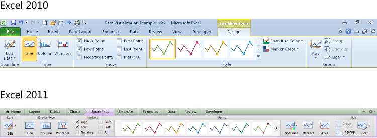
Explore the following sparkline formatting options to create the exact visual you want:
Click an option in the Type group (Change Type in Excel 2011) to change your sparkline type in a single click. When you change a sparkline type, all applicable formats are carried over to the new type. So you can easily experiment with different types of sparklines without having to redo work each time.
In the Show group (Markers in Excel 2011), you can specify whether you want to show the high, low, negative, first, or last points in a different color. And, similar to the Excel Table Styles gallery, when you modify marker options (such as to select the High or Low option), the available sparkline styles in the gallery reflect your changes.
Note that for column and win/loss types, these options don’t turn the marker on or off. However, when you’re using a line type, these options will also show or hide the various markers, provided that the Markers option (All in Excel 2011) isn’t selected. If that option (which is enabled only for the line type) is selected, every point in the data is plotted on the line.
Unlike a typical chart, each data marker cannot be formatted individually. You can, however, set a single color for your overall markers and format the high, low, negative, first, and last points differently from the others. To change the sparkline or marker color, use the Sparkline Color and Marker Color options (Sparkline and Markers in Excel 2011) to the right of the Sparkline Styles gallery.
The Sparkline Color (Sparkline) sets the overall marker color for column and win/loss types. For the line type, this option changes the line color.
The Marker Color (Markers) is where you can specify a color for the negative, high, low, first, and last markers. For the line type, this is also where you can change the color for the overall markers.
Note that for high and low markers, in the event of a tie, more than one marker will display the same color. Additionally, if a negative value is your lowest value, it will be displayed in the low marker color, provided that you elect to show both low and negative values in a different color. Both cases are additional reasons for why simplified formatting options can help clarify your key points.
Note
Although it may be tempting to select all of the available options, keep in mind not only how small sparklines are, but also the fact that they are designed to help clarify your data and highlight key pieces of information. Too much formatting can turn your sparklines into nothing more than a cool graphic that detracts from your points rather than emphasizing them.
One of my favorite things about sparklines is how much flexibility you get in such a small package. Axis options, shown in Figure 19-27, enable you to show the axis when working with negative values, plot your data right to left, and modify both the vertical and horizontal axes.
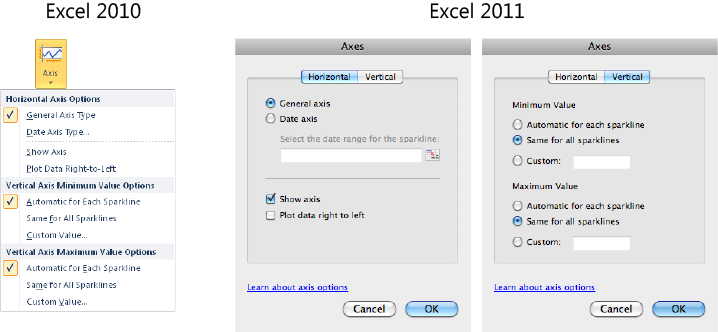
The General Axis Type evenly distributes your values with the same amount of space between each marker, provided that all of your data cells contain a value. The Date Axis Type lets you select date values associated with your sparklines, and any gaps in the date intervals will display as gaps, even if you have a value in each data cell.
For the vertical axis, there are three choices for minimum and maximum values: Automatic For Each Sparkline, Same For All Sparklines, and Custom.
By default, the Automatic option is used for both the minimum and maximum values, which essentially gives each sparkline its own axis based on the associated data range. If you choose to use the same minimum or maximum value for all sparklines, then the axis for all sparklines in the group is based on the lowest or highest value across the group, similar to a traditional chart that uses a single axis. Also as with a traditional chart, you can set a fixed minimum or maximum value using the Custom option.
As noted earlier, if you have empty cells in your data range or if you’re using a date axis type and have gaps in your date intervals, your sparklines may also have gaps by default. If you are using a line sparkline, you can choose to connect missing data points or plot missing values as zeros. To do so:
In Excel 2010, in the Sparklines group, click the arrow for Edit Data, and then click Hidden & Empty Cells.
In Excel 2011, in the Data group, click the arrow for Edit and then point to Hidden And Empty Cells.
In Excel 2010, the Hidden And Empty Cell Settings dialog box appears, as shown in Figure 19-28. In Excel 2011, the same options display directly in the menu.
In Excel 2010, next to Show Empty Cells As, select Zero or select the Connect Data Points With Line option. Then click OK.
In Excel 2011, click Show Empty Cells As Zeros or Connect Data Points With Line.
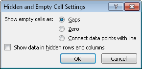
For column sparklines, you can choose to show empty cells as zeros, but you don’t have an option to remove the view of the gap itself. Also note when using column or line sparklines, choosing to show empty cells as zeros may also change the minimum value for your vertical axis if the lowest value was previously greater than zero.
Data Visualization Isn’t All Work and No Play
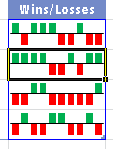
Data visualization options aren’t just for the business end of your workbooks. You can use them for a variety of tasks, such as tracking plant growth, stocks, or your favorite sports teams. For example, you can use both conditional formatting and sparklines to track seasonal games for little league teams, as shown in Figure 19-29.
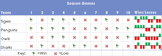
In the example shown in Figure 19-29, a win is entered as 1 and a loss as –1. The individual wins and losses are formatted with a custom icon set, and only the icon is shown. In the Wins/Losses column, a win/loss sparkline offers an at-a-glance view of each team’s overall season.
Note
Companion Content As with all samples from this chapter, you can check out this example for yourself. Just download the Data Visualization Example workbook, available in the Chapter19 sample files folder that you’ll find online at http://oreilly.com/catalog/9780735651999.