In this chapter, you will:
Get an overview of chart creation essentials
Explore chart customization
Discover tips on how to solve common chart issues
Get step-by-step instructions for creating bubble and price/volume charts
Okay, it’s time to have some fun. Microsoft Excel charts are among my favorite features in any program. To me, fun with software is when content looks so great or works so well in a document that you assume it must be difficult to create, but it’s actually easy. That’s charting in Microsoft Excel, and that’s what we’re going to look at in this chapter.
Creating and formatting high-quality, complex charts can be positively, absolutely easy. And, thanks to improved chart performance and chart formatting options, you can create those charts even faster.
It’s important to note that, although this is an Excel chapter, you can create the same Excel charts in Microsoft Word and PowerPoint. So, the majority of content in this chapter applies to charts regardless of whether you’re working in Excel, PowerPoint, or Word.
I used to recommend creating charts in Excel and copying them into other programs (especially Word) as pictures. But with charts now part of the Microsoft Office graphics engine (since Office 2007 and Office 2008 for Mac) and most of the same Excel charting tools available in Word and PowerPoint, you’re likely to create most of your charts directly in your documents and presentations when needed. For the occasions when you need to create charts in Excel and copy them into your document or presentation because you want to keep all of your Excel chart data in one workbook for a project—or because you don’t want the live chart to be available to people with whom you share your document and presentation files—you can get help in the Word and PowerPoint parts of this book.
Note
See Also For help getting charts that you create in Excel into Word, see Chapter 10. For help getting your Excel charts into PowerPoint, see Chapter 13.
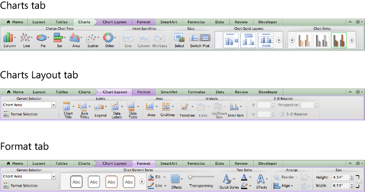
Figure 20-1. Chart tools in Excel 2011. The Chart Layout and Format tabs are contextual tabs and do not appear in the Ribbon unless you select a chart.
As you explore the charting options, be sure to check out the new Chart Quick Layouts gallery on the Charts tab. This gallery provides frequently used chart layouts that can be applied in one click. Take a pie chart, for example. You can use an available layout to add data labels, percentages, and remove the legend—all at the same time.
Even when you don’t see a Chart Quick Layout that fits exactly what you need, you can often still save time by applying a layout and then fine-tuning additional chart settings (such as axis titles, data label options, and legend placement) using the options on the Chart Layout tab.
Additionally, after you perfect your chart layout and any other design and formatting options, you can now save your chart customizations as a chart template for easy reuse across your workbooks or Word and PowerPoint for Mac 2011.
Note
See Also For more information on chart formatting options, see the section Customizing Chart Elements, later in this chapter. For information on chart templates, see Chapter 22.
Before we dive into more advanced topics, following is a quick summary of some charting essentials. Some of these are changes from earlier versions, but most are just provided to help you confirm that you’ve got your stroke down before we head into deeper water.
If the data range for your chart is contiguous, you can simply click in the data range to create your chart. You do not need to select the entire range. To use noncontiguous data, you need to hold the Ctrl key (Command key in Excel 2011) while selecting.
Caution
When you’re using the Ctrl (Command) key to select noncontiguous data, it’s important to drag to select any contiguous areas within the data, just as you would for a single contiguous data source. Individually selecting cells that you intend to be part of the same series can cause undesired results.
To insert a chart object on the active sheet, it’s a good idea to start by selecting your data. Then, in Excel 2010, on the Insert tab, in the Charts group, select a chart type from the available galleries. In Excel 2011, on the Charts tab, select a chart type from the Insert Chart group.
To create a chart on its own sheet, you can use the shortcut F11—which creates the default chart type. This is still the only method for creating a chart directly on its own sheet. You can, however, move any chart to its own sheet after creating it, as discussed later in this list.
Note
For Mac users, the F11 key may conflict with an Exposé shortcut that will override this single-key chart creation in Excel 2011. To turn off or reassign the Exposé shortcut,:
On the Apple menu, click System Preferences.
Click Exposé & Spaces and then, under the Exposé keyboard shortcuts, click the pop-up menu for the F11 shortcut and assign a different shortcut or select the dash (–) to turn it off.
Note that you can also turn off this or any system-assigned keyboard shortcut in the System Preferences Keyboard options.
Initially, the default chart type is a clustered column chart. To change the default chart type in Excel 2010, in the Insert Chart dialog box, select any chart and then click Set As Default Chart. (To access this dialog box, on the Insert tab, in the Charts group, click the dialog launcher.)
Note that nothing will appear to happen when you do this, but your default chart type will change. To confirm this, close and reopen the Insert Chart dialog box. The chart you set as your default should be selected. Also note that the capability to change the default chart type is not available in Excel 2011.
If your source data is in a table, the chart sees the table as the data range. This means that if you increase or decrease the table cell range, the chart will automatically update to reflect the revised data range.
Note
See Also To learn about structured references to tables, see Chapter 18.
To change the type of chart after it’s created, select the chart and then do the following:
In Excel 2010, on the Chart Tools Design tab, click Change Chart Type to select a new chart from the Change Chart Type dialog box.
In Excel 2011, on the Charts tab, in the Change Chart Type group, select another chart type from the available galleries. (Note that when you right-click the chart and then choose Change Chart Type, it just activates the Charts tab).
To move a chart between its own sheet and a worksheet, right-click the chart area and then click Move Chart. (This option does not appear if you right-click an individual chart element rather than the chart area.) Alternatively, do the following:
In Excel 2010, on the Chart Tools Design tab, click Move Chart.
In Excel 2011, on the Chart menu, click Move Chart.
Not all chart types, of course, are appropriate for all data—and different chart types may be more or less effective depending on both the data and what you want the data to express.
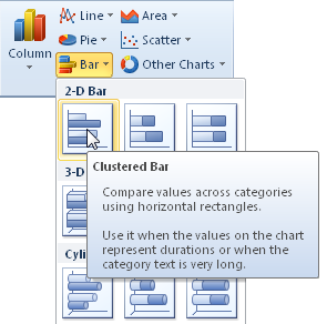
In Excel 2010, you can point to individual chart types in the chart galleries to view a ScreenTip with more detailed information about what the specific chart type displays and, in many cases, when to use it. For example, see the ScreenTip for a clustered bar chart in Figure 20-2.
Note that this detailed information is available only from the galleries. If you point to a chart type in the Insert Chart dialog box, only the chart type name appears in the ScreenTip.
Excel 2011 gives you more general information, but it’s still a nice reference when you’re planning the best chart for what you want to express. Point to a gallery for brief guidance on the chart types contained within it.
If you’re not positive about the most effective chart type for your data, try out a few chart types on your data before you spend time customizing formatting. Also keep in mind that simple customizations, such as changing the axis scale to more snugly fit your data range, can have a substantial effect on the statement you make.
For example, the charts in Figure 20-3 use the same data. The only difference between them is that the minimum and maximum values on the vertical (value) axis for the chart on the right have been customized to fit the data.
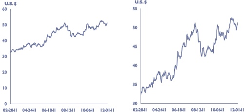
Figure 20-3. The chart shown on the left has an automatic vertical axis scale. The same chart on the right has a fixed vertical axis scale.
Finally, if you’re not sure of your data’s best side, consider using a PivotTable to find it. PivotTables are easier to use than many Excel users think they are, and they’re designed to be Excel’s very own spin doctors.
Note
See Also To learn how to create and use PivotTables, see Chapter 21.
This is where you garner the benefits of ease in formatting. The charting engine is part of the overall graphics engine (referred to throughout this book as Office Art graphics) that was introduced in Office 2007 and Office 2008 for Mac. This means that charts in Office 2010 and Office for Mac 2011 have formatting capabilities very similar to drawing objects, such as SmartArt diagrams or shapes.
In addition to fancy formatting, the following sections look at customization options from individual chart elements to the overall chart layout, as well as considerations for unique chart types.
Just because you want charts to look customized doesn’t mean you have to do it all yourself. Charts offer two types of Quick Styles that are designed to work together—Chart Styles and Chart Layouts galleries, as shown in Figure 20-4. Both galleries are available on the Chart Tools Design tab (Charts tab in Excel 2011).
Note
In Excel 2011, the Chart Layouts gallery is named Chart Quick Layouts. To minimize repetition, this chapter will refer to this gallery exclusively as Chart Layouts.

As with any set of Quick Styles, each choice within these two sets applies several formatting attributes at once. So, you can apply a chart layout or chart style that’s close to what you want, and then further customize individual chart elements as needed, such as deleting gridlines (for layout customization) or adding a custom shadow (for formatting customization).
Note
Live Preview in Excel 2010 doesn’t work with chart styles or chart layouts (unlike most types of Quick Styles in Office 2010). However, in charts that are objects on a worksheet, Live Preview works for formatting options that appear in the Shape Styles and WordArt Styles groups of the Chart Tools Format tab.
A key point to remember for chart formatting is that charts are drawing objects. For example, you can select a data series or a data point and then customize the formatting by using the Chart Tools Format tab (Format tab in Excel 2011) and the shape options, as shown in Figure 20-5.
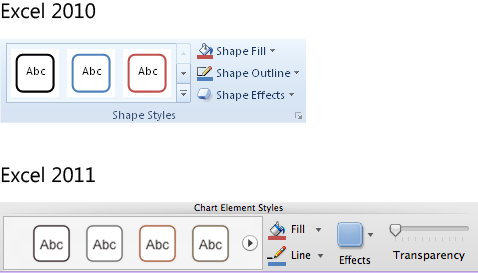
In Excel 2010, the shape options are in the Shape Styles group. In Excel 2011, they’re in the Chart Element Styles group. You can also use WordArt Styles (Text Styles in Excel 2011) on the same tab to enhance the formatting of chart text.
Note
Pattern fills, which were missing from Excel 2007 and Excel 2008 for Mac, have returned in both Excel 2010 and Excel 2011. So, for example, you can use a thatched line fill to indicate forecast data.
To access pattern fills in both Excel 2010 and Excel 2011, double-click a data series or data point to open the applicable Format dialog box. Find pattern options on the Fill tab. Note that pattern fills are now available to charts and other types of Office Art graphics, such as SmartArt and shapes, in Word, PowerPoint, and Excel. These options always appear on the Fill tab of the applicable Format dialog box, such as Format Shape.
Note that if you customize formatting for an individual chart element after applying a chart style, you can reset the formatting of just that element without affecting other customizations. To do this, select the element to reset and then do the following:
In Excel 2010, on either the Chart Tools Format tab or the Chart Tools Layout tab, in the Current Selection group, click Reset To Match Style. Or, to reset all chart elements at once, select the Chart Area and then use the Reset To Match Style command (or click the chart style again to apply it and remove customizations).
In Excel 2011, right-click the element and then click Reset To Match Style. Note that the Reset To Match Style command isn’t available when you right-click the Chart Area in Excel 2011, but you can reapply the chart style to clear all customizations at once.
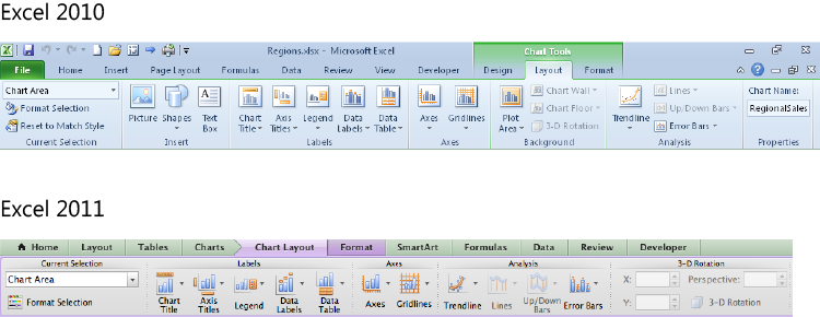
The Chart Tools Layout tab (called Chart Layout in Excel 2011) is your go-to location for customizing almost any chart element, as shown in Figure 20-6.
Before you begin to work with this tab, however, keep one important shortcut in mind. As you might already know from previous versions, to delete any chart element—from gridlines to data series—just select that element on the chart and then press Delete.
Caution
In Excel 2010, for charts on their own sheet, if you paste data back on the chart after deleting it, you will no longer be able to delete elements just by pressing Delete. You can, however, right-click and then click Delete.
With the exception of deleted data series or data points, deleted chart elements aren’t actually gone. They’re simply not displayed. So, you can select the chart element you need from the Chart Tools Layout tab (Chart Layout tab) at any time, such as with the Axes options that you see in Figure 20-7.

In fact, if you customize a chart element and then delete it, you can later restore it from the Chart Tools Layout tab (Chart Layout tab) options, and your customizations will be intact.
Note
If you select the plot area and then press Delete, any formatting applied to the plot area disappears, but the plot area itself always remains.
Note
See Also For help replacing deleted chart data, see the section Timesaving Techniques for Adding or Editing Chart Data, later in this chapter.
At the bottom of each menu of options for the various chart elements shown on the Chart Tools Layout tab in Excel 2010, click the More <Chart Element> Options to open the Format dialog box for that chart element. In Excel 2011, on the Chart Layout tab, click <Chart Element> Options. You can also access this Format dialog box when you double-click a chart element, or from the shortcut menu that appears when you right-click a chart element.
Note
Yes, Excel 2010 users, you read that last sentence correctly! The double-click shortcut to open the Format dialog box has, thankfully, been returned.
Additionally, if it’s difficult to select a chart element by clicking it, you can select it from the drop-down list in the Current Selection group on either the Chart Tools Layout (Chart Layout) or Format tabs. In that same tab group, you can then click Format Selection (if needed) to open the appropriate dialog box for your selection.
Tip
A new feature for charts in Excel 2010 is the capability to right-click anywhere on the chart and use the Mini Toolbar to select chart elements. (This shortcut appears whether or not you have the Mini Toolbar enabled in Excel Options.)
When you get into these Format dialog boxes, you see several options, such as Shadow, Fill, Line Color, and Line Style, that are available to many chart elements.
Note
See Also For details on specific formatting options, such as gradient lines or fills, see Chapter 14. Though that chapter appears in the PowerPoint part of this book, the details of many formatting settings discussed in this chapter apply to all Office Art objects (such as charts).
Note
In Excel 2010, one of the nicest features of the Format dialog boxes is that they’re modeless. That is, you can open a Format dialog box for any chart element and then leave it open as you select different chart elements for which to make changes. As your selection changes, the options in the dialog box change automatically to match.
This functionality helps to explain why there’s no Cancel button in those dialog boxes—formatting is applied as soon as you set it so that you can move on to something new. However, you can undo actions even while a Format dialog box is open. Just click on the sheet and then either click Undo on the Quick Access Toolbar or press Ctrl+Z. Then, select a chart element and click back into the dialog box to continue formatting.
The subsections that follow address important points to keep in mind for formatting key chart elements.
Rule number one for formatting text in charts: the Chart Area is the container for all chart elements. When you want your font formatting—whether it’s traditional font formatting or WordArt formatting—to apply to all text in all elements of the chart, select the Chart Area before applying the settings you need.
Additionally, use the following tips to help you take advantage of all chart text formatting options:
In Excel 2010, font settings are not available from the Format dialog boxes for any chart element. Instead, use the commands on the Home tab, in the Font group, for most settings (or use the Mini Toolbar, available when you right-click a chart element that contains text). Click the dialog launcher at the bottom-right of the Font group for several additional formatting options (such as character spacing, as shown in Figure 20-8).
In Excel 2011, many text formatting options become available on the Home tab, in the Font and Alignment groups, when you select applicable chart elements. However, you can access all available text formatting options in the Format dialog boxes, on the Font and Text Box tabs. Note that character spacing options for chart text are available in the Format dialog boxes, on the Font tab.
In both Excel 2010 and Excel 2011, notice that many options are available to text in charts that are not available to text in worksheet cells (such as the previously mentioned character spacing, as well as font attributes such as small caps). The font options that you see for charts are those available to Office Art objects.
Note
For those migrating to Office 2010 from Office 2003 or earlier, among all of the additions you see in the Font dialog box for chart text, one deletion is worth noting. The often-frustrating Auto Scale setting for text is, thankfully, gone. So, your chart text will no longer shrink to oblivion when you resize the chart.
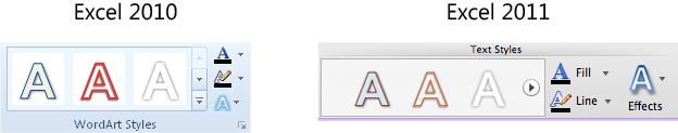
As mentioned earlier, also remember that text in charts can be formatted as WordArt. You can select a preset style or customize fill, line, and effects with very similar options to shapes. In Excel 2010, find these options on the Chart Tools Format tab, in the WordArt Styles group, as shown in Figure 20-9. In Excel 2011, these options are on the Format tab, in the Text Styles group.
In the WordArt Styles group for Excel 2010, when you click to expand the Text Fill gallery, you see fill options that include picture, gradient, and texture fills. In Excel 2011, in the Text Styles group, click the arrow next to Fill and then click Text Effects to access these fill options.
Keep in mind that WordArt and Text Styles options refer to the fill of the actual text characters themselves. In contrast, if you select a fill style from the Shape Style group (Chart Element Styles group in Excel 2011) or from the Fill tab of the Format dialog box for a text-based chart element (such as an axis or data labels), the text area that contains each axis label is formatted with that fill.
To wrap text within any label automatically generated from source data (such as an axis label or data label), you must insert line breaks into the text in the source data. To do this, in the cell where the source data appears, press Alt+Enter (Control+Option+Return in Excel 2011) to insert a line break wherever you want the text to break to a new line in the chart. However, in an axis title, data label, or text box that you edit by clicking in the box and typing, press Shift+Enter to create a line break.

Understanding different types of axes is one of the easiest ways to understand different chart types. There are, essentially, two types of axes—category and value—explained as follows:
A category axis can be either a date axis or text axis (known as time-scale axis and category axis in versions prior to Excel 2007 and Excel 2008). Category axes are typically used by charts containing two or more axes, which track values across categories—such as tracking sales for the past four quarters, which you might do with a column, line, or bar chart. These are often referred to as category-value charts, and they make up the majority of built-in chart types available in Excel, including column, line, bar, area, stock, and surface charts.
A value axis enables you to plot a range of values. Values can be plotted across categories, such as in the chart types referenced in the preceding bullet. Or, values can be plotted relative to other values—such as to compare salary increases relative to length of employment, as you can do with a scatter chart. Built-in Excel value-value chart types include scatter and bubble charts.
Similar to a value-value chart, a radar chart contains just one value axis, plotting all values relative to a center point to show variance from the center value. Though this chart type has only one axis, that axis appears separately for each data series, radiating out from the center, as you see in Figure 20-10. The axis labels can appear only once, but the line running from the center point to each category label (Q1 through Q4) is the same value axis.

Note
Pie charts and donut charts don’t plot values along an axis. Rather, they show contributions to a whole. You typically use a donut chart to show the same type of relationship you would with a pie chart, but using multiple data series.
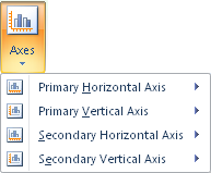
In the Axes options on the Chart Tools Layout tab (Chart Layout tab), shown in Figure 20-11, notice that Excel refers to axes as vertical and horizontal, indicating where they appear on the chart rather than the axis type.
Note
The terms horizontal axis and x-axis are used somewhat interchangeably in this chapter because x-axis is a common charting reference that generally refers to the same chart element that Excel calls the horizontal axis. Keep in mind that horizontal/vertical, x-axis/y-axis, and category/value aren’t necessarily synonymous. For example, a bar chart is a category/value chart, but its value axis is the horizontal axis. Similarly, both the x-axis and y-axis for a scatter chart are value axes.
When you point to a horizontal or vertical axis option on the Chart Tools Layout tab (Chart Layout tab), the choices you see for displaying a given axis vary by both chart and axis type (that is, category or value). For additional axis customizations, open the Format Axis dialog box. In Excel 2010, these options are located on the Axis Options tab of that dialog box, as shown in Figure 20-12. In Excel 2011, find virtually the same options on the Scale tab and the Ticks tab of that dialog box, shown in Figure 20-13.
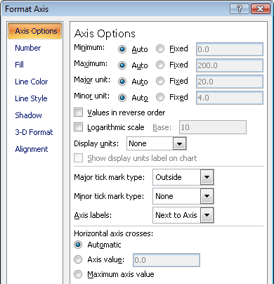
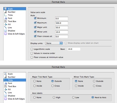
Figure 20-13. Chart axis options in Excel 2011 are in the Format Axis dialog box, on both the Scale and Ticks tabs.
Caution
Although it’s common to need to customize the scale—the maximum and minimum values—on an axis (and this can often be a good idea, as mentioned earlier), remember that those values become static once you customize them. Axis Options set to Auto will change automatically when content in your data requires it; those set to Fixed remain static regardless of changes to the source data. So, for example, say that you have values ranging from 50 to 100, and you customize your value axis accordingly with 100 as the maximum value. If you then add data to your chart and new values exceed 100, those values won’t be visible on your chart.
Customizing axes is often an important step in displaying your data effectively. Just remember to update a customized axis scale if changes to the data require it.
Note
See Also If you want to save a customized chart as a chart template, it’s a good idea to leave the axis automatic because the chart template records all customizations, even axis settings. For more information about chart templates, see Chapter 22.
With all of these great formatting and customization options, however, it’s worth noting that a couple of settings in the Format Axis dialog box (as well as the Format dialog boxes for some other chart elements) have simply been misplaced.
In Excel 2010, a 3-D Format tab appears in the Format Axis dialog box, but any enabled options on that tab are unlikely to have any visible effect on the selected axis.
A Vertical Alignment option is available in the Format Axis dialog box. In Excel 2010, it’s on the Alignment tab. In Excel 2011, it’s on the Text Box tab. It’s also available in the Format dialog boxes for several other chart elements containing text (Vertical Alignment changes to Horizontal Alignment if you rotate or stack the label text.) Though this option appears to enable you to align multiline labels within the text area, it doesn’t work as expected. This option works with text boxes and other text-enabled drawing shapes that you can add to a chart, but it doesn’t work for text within chart elements.
Group a Category Axis
You can visually group categories together on any category axis just by adding a second row or column of axis labels in your data.
For example, say that you want to look at revenue by salesperson. You might want to group those salespeople by region, as you see on the category axis in the simple example shown in Figure 20-14.
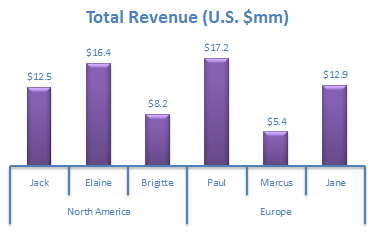
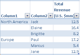
You create the groups in Figure 20-14 (North America and Europe) by adding a column to the left of your category axis labels (or a row above your category axis labels, if data is in rows), where the category name appears before the first axis label to which it applies. For example, the data in Figure 20-15 corresponds to the chart example in Figure 20-14.
Line style options available to other chart elements, such as axes, are available to gridlines as well. However, if you choose a gradient line, the gradient will progress from the top gridline to the bottom gridline (or the left gridline to the right gridline), rather than gradient changes taking place within each individual line. In Excel 2010, the gradient line style option is in the Format Gridline dialog box on the Line Color tab. In Excel 2011, it’s in the Format Gridlines dialog box on the Line tab under the Gradient options.
Titles are inserted with placeholder text, which you can click in and edit like any text box, or select and then click in the Formula bar to link the title to a cell value.
You can also link the text boxes for chart titles and data labels—as well as custom shapes and text boxes that you insert on a chart—to cell values in the workbook. To do this, follow these steps:
Select the title, label, or text box. (Select it; don’t click into it.)
Click in the Formula bar and then type an equal sign.
Browse to the cell and select it.
Press Enter to apply the link.
Note that you can also type the cell address in the Formula bar instead of browsing to it. However, be careful to specify the sheet name in your reference if the source cell is on a different sheet.
Also note that you can format a linked text box as needed with one exception—numeric values in your linked cell will always display the same number format in the linked text box. There is no way to format numbers separately in the text box. Even if the text box you link is a chart element (such as a data label), the Number format options in the Format Data Labels dialog box won’t apply to values linked using this method.
Combining chart types, such as when you want to display some chart series as columns and others as lines, is very easy to do. You just start with the chart type you want for the majority of series, select each series you want to change to another chart type, and select the new chart type you need. For example, if you want a chart with two column series and one line series:
Create a column chart.
Select the data series that you want to display as a line chart.
In Excel 2010, on the Chart Tools Design tab, click Change Chart Type. If a single data series is selected when you open the Change Chart Type dialog box, only the selected series will be affected.
In Excel 2011, on the Charts tab, the Change Chart Type (or Insert Chart Type) group becomes the Change Series Chart Type group automatically when you select a series.
Select the chart type for the selected series and then click OK.
Things get a bit more complicated when different chart types require different types of axes. An excellent example is a price/volume chart, where the volume is displayed in columns and the price as a scatter line. A scatter line is used instead of a line chart for the price series to control the appearance of the last date on the horizontal axis, as discussed in the sidebar Insider Tip: If the Last Date Doesn’t Appear on Your Line Chart X-Axis, earlier in this chapter.
Note
See Also For working with mixed axes requirements to any chart type where this issue presents itself, review the detailed instructions for creating a price/volume chart in the section Creating Price/Volume Charts, later in this chapter, and apply the techniques discussed there.
When different chart series have extremely different values—such as when one series shows sales volume and the other shows year-over-year percentage change in sales—you will likely need to show those series on different value axes to be able to see them both effectively at the same time.
To do this, double-click the series to open the Format Data Series dialog box. In Excel 2010, the Plot Series On option is on the Series Options tab. In Excel 2011, this option is on the Axis tab. If you have many series in your chart, assign each to the most appropriate value axis.
Note
When different series require different types of x-axes (category or value), you can’t mix their vertical (value) axis assignments. That is, if you have two scatter series, for example, and one column series, both scatter series will need to be plotted on the same axes because scatter charts and column charts require different types of x-axes.
Note that, if you change the chart type of a series to one that requires a different type of x-axis (such as changing a line series to a scatter line to get a value x-axis, as discussed earlier), the series with the unique x-axis type requirement is automatically plotted on a secondary value axis, and a secondary x-axis (be it value or category, as needed) appears on the chart. Secondary x-axes usually appear, by default, across the top of a chart (but you can change this).
Note
See Also For a detailed example of options for dealing with the appearance and placement of multiple axes, see the section Creating Price/Volume Charts, later in this chapter.
When you need a shape, a text box, or an image on your chart (such as a text box to annotate a particular date in the chart), in Excel 2010, simply insert the shape or picture you need as you would on a worksheet. You can select the drawing object you need from either the Chart Tools Layout tab (in the Insert group) or the Insert tab (in the Illustrations group).
After you insert a shape into a chart in either Excel 2010 or Excel 2011, you can then just begin typing to add text or click into a text box to begin editing it. Text boxes are shapes in Office 2010 and Office 2011, so they have the same capabilities. This means that you can add formatting such as shape styles to a text box and you can add functionality (such as linking cell values, as discussed earlier in this chapter) to the text area within a shape.
Note
For Excel 2010 users, if you open the Selection And Visibility pane on a chart sheet or on a worksheet that contains a chart, the pane recognizes the chart as an object. It does not, however, recognize separate shapes or other drawing objects created on your chart. This is because your chart itself is a drawing object. Objects created on your chart become a part of the chart. That’s good news, because if you copy your chart to another program, for example, you’ll want those objects to come along automatically.
Note that, if you drag a graphic onto a chart, it appears as a separate object in the Selection And Visibility pane. Watch out for this, because if it appears as a separate object in that pane, it’s not part of the chart and thus won’t come along for the ride when you copy that chart to paste it in another location.
Note
See Also For the steps to linking text boxes, see the section Chart and Axis Titles, earlier in this chapter. For more on formatting pictures, see Chapter 5. For more on working with Office Art shapes, see Chapter 14.
As mentioned earlier, when you format your source data as a table, you gain benefits for the chart, such as having it automatically update to reflect changes in the source data range. So, you probably won’t need to use shortcuts for adding data to your chart as often as you might have in the past. However, using a table this way isn’t always practical—such as when your table organization doesn’t lend itself to using the Excel tables feature, or your chart needs to be created from noncontiguous data. With this in mind, following are a few helpful methods for adding data to a chart.
When your data is not in an Excel table and the new series you want to add has exactly the same configuration (that is, it uses the same cells within its row or column as all other existing series), and is contiguous to your original chart data, simply select the chart and then drag the sizing handles of the source range to include your additional data.
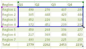
For example, in Figure 20-16 the active chart takes the data for Regions 1 through 4. To include additional regions, in the lower-right corner of the chart range, drag the sizing handle down through the regions you want to add to your chart.
When your data is not in an Excel table and your chart is on another sheet, and the new series you want to add has exactly the same configuration as existing series, you can just copy the new series data and paste it onto the chart.
For this method, your data doesn’t need to be contiguous; it just needs to use the same cells within its row or column as all other existing series.
Using the same example data in Figure 20-16, to add one or more of the other regions, just select and copy the data you want to add. Then, select the chart where you want to add the data and simply paste (Ctrl+V in Office 2010 or Command+V in Office 2011).
Neither of the preceding methods, however, is necessarily as easy when you’re adding data points to existing series or adding new series in a different configuration than existing series. It can also be inconsistent when source data is in an Excel table. In those cases, edit the data range using the Select Data Source dialog box.
When you open the Select Data Source dialog box (through the Chart Tools Layout tab in Excel 2010 or Charts tab in Excel 2011) or the shortcut menu available when you right-click the chart, you see an option to add data. Don’t use it. Instead, notice that the existing data range is highlighted on the worksheet.
You can simply click in the worksheet while the Select Data Source dialog box is open. Just select the revised data range and then press Enter to apply it. (Remember to hold the Ctrl key—Command key in Excel 2011—when selecting noncontiguous data.)
As an alternative to the preceding options for adding a data series, try using the SERIES function. When you select a data series, a formula is created with the SERIES function in the Formula bar. That formula has four parts, as shown in Figure 20-17.
The first argument is for the series name.
The second argument is for the category labels in a category-value chart or the x-values in a value-value chart.
The third argument is for the values in a category-value chart or the y-values in a value-value chart.
The last argument indicates the position in the series order.
You can edit the SERIES function right in the Formula bar for any series in an Excel 2010 or Excel 2011 chart. In Excel 2010, you can also use this function to add a new series to the chart.
To add a new series to an Excel 2010 chart using this formula, first copy the formula for any existing chart series. To do this, select a series, click into the Formula bar, select the contents of the formula, and then copy (Ctrl+C). Then, do the following:
Press Esc twice, so that no series is selected.
Select the Chart Area. Be careful not to leave a series selected, or you’ll replace the selected series instead of adding a new one.
Click in the Formula bar and then paste (Ctrl+V).
Edit the cell references in the appropriate arguments of the SERIES formula to represent the values of the data in your new series.
Press Enter to add the new series. Don’t press Enter until after you’ve edited the values for the new series (as indicated in the preceding step), or no new series will be added.
Whichever method you use, your new series will appear exactly as though it has always been there and will take on whatever applicable formatting is active when the series is added.
As mentioned in an earlier sidebar, If One Column or Bar Series Is Hidden Behind Another, the Select Data Source dialog box in Excel 2010 (or the Format Data Series dialog box in Excel 2011) is the place to go to change the order in which series appear on the chart and in the chart legend. To change series order, in Excel 2010, select the series to move from the Legend Entries (Series) box in the respective dialog box and then click the Move Up or Move Down arrows as needed. In Excel 2011, select the series on the Order tab of the Format Data Series dialog box and then click the Move Up or Move Down buttons.
Note
You can also reorder data series using the SERIES formula that was introduced in the preceding section, Timesaving Techniques for Adding or Editing Chart Data. Change the value of the fourth argument in the SERIES formula for whatever series you want to reorder, and the series numbers for the other chart series will automatically adjust to accommodate the change.
In the Select Data Source dialog box for both Excel 2010 and Excel 2011, notice the option Hidden And Empty Cells. In Excel 2010, when you click that option, you get a dialog box where you can opt to show data on the chart from hidden rows and columns included in your source data, and you can set options for how to plot empty cells. In Excel 2011, these options appear directly in the Select Data Source dialog box. To learn how to use these options to connect data gaps in a line chart, see the sidebar that follows.
Most complex charts are easy to create. It’s just that the more complex the chart type, the more likely it is to require some specific choices along the way. Once you understand the concepts behind these choices, you can apply them as needed to a variety of chart types.
With that in mind, this section takes you step by step through creating two complex chart types. These two chart types were chosen because they so often trip up even confident, experienced Excel users. The first of these, bubble charts, are a built-in chart type. The second, price/volume charts, are combination column and line charts often used in the securities industry.
A bubble chart is really just a scatter chart with an extra value per data point, so let’s first take a look at how you construct a scatter chart.
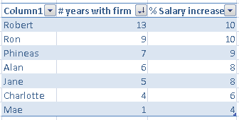
When you create a scatter chart, each data point is the intersection of two values. For example, take a look at the data shown in Figure 20-18.
The scatter chart shown in Figure 20-19 is created from this data. Notice that the first column of data becomes the horizontal axis and the second becomes the vertical axis.
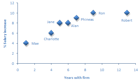
When you create a scatter chart, don’t select the data labels or series labels—Excel won’t understand them. Just select the x and y values. The data labels in Figure 20-19 are created by linking each label to the correct cell—something you’ll see how to do for the upcoming bubble chart.
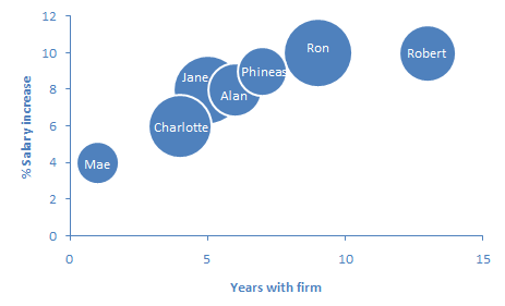
Use a bubble chart when you need to include a third value for each data point. That third value appears as the size of the bubble. Continuing with the same salary example, the bubble might be used to represent each person’s current salary. To include this value, add a third column of data, as you see in Figure 20-20, and then sort the data table so that the largest bubble value is on top. That sort positions the smaller bubbles in front when data overlaps.
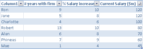
That data results in a bubble chart that looks like Figure 20-21.
Note
If you work in securities and you need a bubble chart for the common use of comparing deals across a market segment, set up your data as follows: use Days Trading Volume as your x-values, % Market Cap as your y-values, and Deal Size as your bubble sizes.
Though you can’t add category data labels automatically as part of the chart, you can insert data labels and then link them to the correct categories. To easily identify each data point, start by adding data labels to the chart that show both the x-value and the y-value. To do this, right-click the Data Series and select Add Data Labels. Then, do the following:
Double-click the data labels to open the Format Data Labels dialog box.
On the Label Options tab (Labels tab in Excel 2011), select the type of data label to show.
Under Label Position, select a different option if desired. Then, click OK to close this dialog box.
If the amount of overlap between bubbles makes it ineffective to use the Label Position setting, drag each data label to sit on or beside the corresponding bubble. They’re easy to identify because the ScreenTip for each bubble provides its x- and y-values, as well as the bubble size. To move an individual data label, just drag it to a new position. Remember, if you click a data label and all of the data labels are selected, click the data label a second time before dragging it.
Select the first label to link.
In the Formula Bar, type =.
Select the cell containing the label for the applicable data point (because you can see the x- and y-values in the label, finding the cell’s label should be quick and easy).
Press Enter to complete the formula.
Repeat steps 5 through 8 for each label as needed.
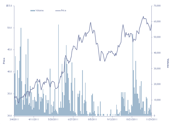
A price/volume chart, as mentioned earlier in this chapter, is a common chart in the securities industry. It’s used to show the daily price and trading volume of a security over a period of time.
For those readers not in the securities field, the value of this chart type is that it’s a combination chart requiring secondary axes, using series that require different types of x-axes—so you can see several complex types of chart customization managed in a single chart.
Note
Companion Content Find the completed price/volume chart used in the example that follows in the file named Price-Volume.xlsx, located in the Chapter20 sample files folder online at http://oreilly.com/catalog/9780735651999. You can open, examine, or edit that chart for yourself—or use the source data to try to duplicate the completed chart on your own.
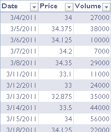
A price/volume chart commonly contains hundreds of data points—for example, if you’re tracking stock performance over an entire year. The sample used here tracks performance of our fictional sample stock from the beginning of March through the end of November. Set up the data just as you might for any category-value chart, with the x-axis labels (the dates, in this case) in the first column, followed by the data series in columns, with the series names at the top of each column. Figure 20-22 shows a snippet from that data; the full data range is 195 rows long in this case.
Note
Because we’re using only sample data, you may see data points for dates when the market is not open (such as holidays).
To create the chart:
Select the data, including x-axis labels and series titles.
Press F11 to create the default chart type on its own sheet.
If your default chart type isn’t a clustered column chart, change the chart type to a clustered column chart. (As mentioned earlier, Excel 2010 users can set a default chart type in the Change Chart Type dialog box, accessible from the Chart Tools Design tab.)
Select the volume series and then open the Format Data Series dialog box.
Change the Plot Series On Setting to Secondary Axis.
If the series is difficult to select, remember that you can select it using the drop-down list in the Current Selection group on the Chart Tools (Chart Layout) or Format tabs, and then open the dialog box from that same group. (Or, select the series name in the legend and then right-click for the Format Data Series option.) You need to place the volume series on the secondary axis, because the x-axis for the price series is the one you’ll want to display on the chart; plotting the price series on the primary axis makes that quicker and easier to do.
Select the price series (because the price series won’t be easy to see yet, you’ll most likely need to use the Current Selection group to do this).
In Excel 2010, on the Chart Tools Design tab, click Change Chart Type. In Excel 2011, on the Charts tab, in the Change Series Chart Type group, click Scatter.
In Excel 2010, select Scatter With Straight Lines. In Excel 2011, click Straight Lined Scatter.
You’ll then be able to see the price series as a line, but it most likely won’t stretch across the entire plot area. This is because you need to customize the x-axis values.
When you’re creating a chart of this type, selecting a scatter line instead of a typical line chart ensures that the last date in your data will appear on the x-axis without trial and error. This is because the scatter line uses a value x-axis, whereas a line chart uses a category x-axis.
Set the Minimum, Maximum, and Major Unit values for the primary x-axis so that the last date in your data appears as the last axis label. The Minimum and Maximum values are the first and last dates in your data, respectively, expressed as numbers. The Major Unit is the result of the calculation provided in the sidebar Insider Tip: If the Last Date Doesn’t Appear on Your Line Chart X-Axis, earlier in this chapter.
It’s worth noting that, when you use this method to show the last date on the x-axis, all dates in the data range are included in the x-axis, not just those on which the market is open. This isn’t typically considered a problem because the dates did occur in the time period being displayed. But it’s good to be aware that your x-axis labels might include dates for which there are no corresponding price or volume values.
Customize the y-axes as needed. For example, in the sample chart, all price data ranges between 30 and 55, so fix the Minimum value at 30 and the Maximum at 55.
To remove any unwanted gaps in the volume data that might occur because all dates aren’t included in true stock data (which usually excludes weekends and holidays), change the category axis type for the volume series to a Text Axis, as follows:
In Excel 2010, on the Chart Tools Layout tab, click Axes, point to Secondary Horizontal Axis, and then click Show Left To Right Axis. In Excel 2011, on the Chart Layout tab, point to Secondary Horizontal Axis, and then click Axis Left To Right.
The axis will appear across the top of the chart, and your volume series will flip upside down. Don’t panic! Open the Format Axis dialog box for this axis and then select Text Axis as the Axis Type.
Set all tick mark and axis label type options to None.
On the Line Color tab (Line tab for Excel 2011), select No Line.
In Excel 2010, click Close. In Excel 2011, click OK.
Open the Format Axis dialog box for the secondary y-axis (the one on which the volume series is plotted).
In Excel 2010, on the Axis Options tab, under the heading Horizontal Axis Crosses, click Axis Value and type a zero. In Excel 2011, on the Scale tab, select the option Horizontal Axis Crosses At, and in the text box type a zero.
In Excel 2010, click Close. In Excel 2011, click OK.
Your volume series should now be right side up once again, and you can now apply any chart style or other formatting that you want to perfect your chart.
That’s all there is to it. Your completed chart, if you’re using the sample data available from the online Chapter20 sample files folder, should look something like Figure 20-23.
To learn how to get the currency symbol on the top label for the primary vertical axis, see the following sidebar.
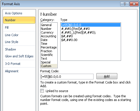
Insider Tip: Create a Custom Number Format for Specific Values on a Chart Axis
When you want to customize the number format of individual value axis labels, such as the currency symbol on the top label of the primary vertical axis in the price/volume chart shown in Figure 20-23, do the following:
Select the axis to customize and then open the Format Axis dialog box.
On the Number tab of that dialog box, select Custom. (Excel 2011 users may need to clear the Linked To Source option prior to selecting Custom.)
In the Format Code text box, type the custom format you want.
To specify a format for just one value, start by typing that value inside brackets, following an equal sign. After the closing bracket, type the format for that value followed by a semicolon. After the semicolon, type the format for all other values. For example, the custom number format used in the sample price/volume chart’s primary vertical axis looks like Figure 20-24.
You can examine this example for yourself in the sample file Price-Volume.xlsx mentioned earlier.
Note that, for custom number formats, use a zero when you want to ensure that the digit will appear, and use a pound sign (#) when you want a digit to appear only if used by the number. For example, if you set up a number format as 0,000, the number 325 would appear as 0,325. If you set up the format as #,##0, the number will appear as 325.
You can have more arguments than the two used in this example. For each value for which you want to specify a format, start with the number in brackets after an equal sign and follow the close bracket with the format. Separate each argument with a semicolon.
Where you see multiple arguments in a number format but no specified values, each argument provided refers to formatting for a specific type of value. The available arguments and values for a custom number format are: Positive;Negative;Zero;Text.
Click Add once you’ve finished typing in the custom format.
To apply the format to your axis, you add it to the custom list. Remember that this custom format is static to the specific value you indicate. So, if the scale for the applicable axis changes, you might need to change the specified value. Notice that, once you’ve added a custom format, it becomes part of the list in the active workbook so that you can use it again. Custom number formats that you save for chart formatting are available for use by any chart in any open workbook, as long as the workbook containing that format is open.