
For better or worse, the Web is a strong visual medium. A web page is a collection of visual elements that allow the user to view and manipulate information whose best presentation fits the right widget to the right data. In other words, the information cries out to be displayed in the correct form. Unfortunately, standard HTML only provides a small set of options for displaying data. Dojo expands our possibilities by providing a robust set of visual elements, called widgets, which offers us a much richer palette to choose from for bringing the data and features of our applications to life.
Web developers are looking for ways to apply Ajax techniques to their web pages. But what exactly is Ajax? The original acronym was capitalized as AJAX and stood for Asynchronous JavaScript and XML. But the meaning has evolved over time. Let me give you a more current meaning.
Ajax can be described as a two-sided coin. One side of the coin is the ability to communicate with the server asynchronously without refreshing the page—also known as the XHR object. This, in many ways, is the essential feature of an Ajax web site because this is the new paradigm on which many Web 2.0 interfaces are built. The other side of the Ajax coin is the rich user interface that most Ajax applications provide. To many, this is the real hallmark of an Ajax application, regardless of how server requests are made under the hood. A JavaScript library might address either side of this coin, but Dojo addresses both. We’ve already covered the XHR object, so in this part of the tutorial we focus on the ability of Dojo to provide the rich user interface through its set of advanced widgets.
Dojo uses the term dijit to describe its features related to creating and using widgets. Not only is this a conceptual term, but Dojo also physically organizes these features into a subdirectory called digit, which is at the root of the dojo directory. Also dijit is the namespace used to reference widget-related functions. We’ve seen some examples of the use of the dijit features already, but now we can explore them in a little more detail.
The Dojo team had a number of goals in creating the widget features:
Create a set of visual widgets that provide useful features beyond the standard HTML elements.
Expose the technique for creating Dojo widgets so that developers can extend existing Dojo widgets or create entirely new widgets based on the same techniques.
Make the widgets look the same in all the different browsers.
Ensure that the widgets can support accessibility features for impaired users.
Provide internationalization support for all the widgets so they can support multiple languages.
As you work with the Dojo widgets, you will discover that Dojo has achieved these goals and given developers a powerful toolbox for creating visually sophisticated web sites. Part II, “Dojo Widgets” explores individual Dojo widgets in greater detail. For now, let’s explore how to use a couple of the most powerful Dojo widgets by adding them to our web page.
In this step of the tutorial, we use Dojo widgets to replace some of the standard HTML widgets on our page. We’ve already done this in prior steps of the tutorial, so the technique should be familiar. Our approach will be to add a special attribute, dojoType, to the standard HTML tag that will be read by the Dojo parser and will cause the Document Object Model (DOM) element to be enhanced with additional features. That was a mouthful. More simply, we are just telling Dojo to replace the single DOM element representing the standard HTML widget with a more complex set of elements. This new group of elements, when acting together, provides the functionality for our Dojo widget. Additionally, Dojo will create a JavaScript object that is not part of the DOM that will be associated with the new widget. This “shadow” object will contain properties and methods not available in the DOM elements.
Note
Because Dojo widgets can consist of multiple DOM elements, you’ll want to be sure to access them using dijit.byId() instead of document.getElementById().
Let’s start with the “Service Date” field. This is the date on which the user wishes service to start. We haven’t seen this field since step 1 of the tutorial, so you might want to take a look at the original form in Figure 1.1 to refresh your memory. In the original form the user is presented with a text box containing no validation. As we discussed earlier, a number of problems exist with this approach, the most obvious of which being that the user does not know what format in which to enter the date. Beyond that, it is difficult for people to determine dates without access to a calendar. So it seems obvious that this widget, the standard HTML textbox, does not fit the function of the data the user needs to enter.
A more appropriate graphical user interface (GUI) element would provide the user with a calendar from which he or she could select a date. That would address the format problem because the user wouldn’t need to enter the date as text. And it would allow the user see the data in the form most useful for them: a calendar.
Let’s see how we can quickly add this widget to the page. Then we can discuss it in more detail.
We simply need to add the dojoType attribute to the <input> tag for the element. We’ll also add a few additional attributes that aren’t required but will provide some useful functionality. The following code shows the attributes to add to the tag. New attributes are bolded.
    <input type="text" id="serviceDate" name="serviceDate" size="10"
        dojoType="dijit.form.DateTextBox"
        required="true"
        promptMessage="Enter service date."
        invalidMessage="Invalid date."
    />
The new attributes tell the Dojo parser to replace the standard HTML <input> tag with the Dojo DateTextBox widget. However, Dojo needs to know where to get the code for the new widget, so an additional step is necessary. We tell Dojo where to get the code by including a dojo.require function call passing the widget name as a parameter. Add the following code to the top of the “form.html” file to the existing group of require function calls.
dojo.require("dijit.form.DateTextBox");Notice that the value of the dojoType attribute dijit.form.DateTextBox is the same as the parameter passed to the dojo.require function. This is the link that allows Dojo to associate the widget in the <input> tag with the code and additional HTML associated with the widget.
When we first run the form after making our code changes, it appears that nothing has changed. Next to the “Service Date” label, what looks like a simple text box is still displayed.
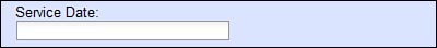
However, as soon as we place the cursor in the field, a calendar is automatically displayed from which we can select a date.

Service Date Field With DateTextBox WidgetNot only does a calendar appear, but also the current date is highlighted. In the preceding example, October 24 is selected, as shown by the dark background behind that date on the calendar. The user can flip through the calendar by clicking the back and forward arrows in the upper left and right of the calendar. When the desired date is visible on the calendar, the user can select it simply by clicking on the desired day, and the calendar widget automatically fills the text field with the correct text value for the date.
We’ve now added an extremely useful widget to our page with very little effort. But let’s get a little greedy. What other useful features can take advantage of in this widget? Let’s consider some additional business rules. For example, the user should not be able to schedule a date in the past. How can we accomplish this? It turns out that there is an attribute called constraints that can be used to define valid values for the date. By setting a minimum constraint to the current day, we are excluding prior dates. This can be done using the constraint attribute as shown in the following code. The new code is bolded.
<input type="text" id="serviceDate" name="serviceDate" size="10"
        dojoType="dijit.form.DateTextBox"
        required="true"
        promptMessage="Enter service date."
        invalidMessage="Invalid date."
        constraints="{min:'2007-10-24'}"
   />
Even through the value of '2007-10-24' appears to be hard-code, you could generate this dynamically when creating the page on the server so that the current date is always supplied. Now when the widget appears on the page, prior dates are crossed out as shown here.

We could go even further. For example, we could exclude weekends. However, we must be careful. Even if we include business rules for service date in the browser, they must be re-validated on the server. The server should never trust data from the browser. A better approach might be to create an XHR request to validate the selected date once the user enters it. This would allow us to keep the business logic on the server and yet still give the user the benefit of instant validation without having to submit the entire form. A number of other useful attributes to control the behavior of the calendar exist and will be explored in more detail in Part II.
Now let’s turn our attention to the comment field. This field allows the user to enter multi-line text comments using the <textarea> HTML tag. This standard HTML tag provides some simple features such as automatic word wrapping at the end of each line. But that is about all it offers. If we want to do anything fancy such as changing the font of the entered characters, making them bold, or putting them in a bulleted list, then we are out of luck. The standard widget just doesn’t allow for it. Wouldn’t it be nice to have a powerful text editor that we could insert right into the page? Yes, it would. And Dojo provides one. It is called dojo.editor, and it provides quite a robust set of default features.
Before exploring the details, let’s just put the default widget onto our page by replacing the existing <textarea> tag. As with the prior widgets, all we really need to do is add the dojoType attribute in the existing HTML tag. Then we need to make sure the widget code is included in the page by referencing the widget using dojo.require. First let’s change the current HTML tag so that the Dojo Rich Text Editor Widget will be used in its place.
        <textarea id="comments" name="comments" height="100px"
                dojoType="dijit.Editor"
        >
Notice that the widget name is a little different than for the other Dojo widgets we have used. The Editor is not part of the form package, so we don’t include form in the widget name.
Now we need to make sure that the code for the widget is available to the Dojo parser for substitution into the DOM. Add the following code to the top of the “form.html file” to the existing group of require function calls.
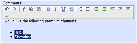
dojo.require("dijit.Editor");Now when we run the page, we see the new widget. By clicking just below the widget toolbar, we can enter some instructions regarding service. Figure 4.2 shows the widget along with some user-entered text concerning the types of service that the person wishes to purchase.
As you might have noticed in using the widget, it is hard to figure out exactly where the text area for the widget begins and ends. To improve the look of the widget, we’ll enclose it within a div and assign a style to it. We’ll add a solid border around the widget and make the text area have a light background, as shown here. The new markup code is in bold.
          <div style ="border: 1px solid #9B9B9B; background: #FFFFFF;">
            <label for="comments">Comments:</label>
            <textarea id="comments" name="comments" height="100px"
                    dojoType="dijit.Editor"
            />
          </div>
Now we get a clearer idea of where text can be entered, as shown in the following screen shot.
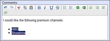
Notice how it is now much easier to see where the text area of the widget is.
The toolbar at the top of the widget displays a number of icons that can be used to provide formatting features. In the given example, the items “HBO” and “Showtime” were converted into an unordered list by selecting them and then clicking the unordered list icon. The various icons are explained in Table 4.1.
Table 4.1. Rich Text Editor Icons
Icon | Attribute Value | Description |
|---|---|---|
undo | Undo last edit. | |
redo | Redo last edit. | |
cut | Cut selected text. | |
copy | Copy selected text. | |
paste | Paste text at cursor. | |
bold | Make selected text bold. | |
italic | Make selected text italicized. | |
underline | Underline selected text. | |
strikethrough | Strike through selected text. | |
insertOrderedList | Turn selected text into an ordered list. | |
insertUnorderedList | Turn selected text into a numbered list. | |
indent | Indent selected text. | |
outdent | Outdent selected text. | |
justifyLeft | Left justify selected text. | |
justifyRight | Right justify selected text. | |
justifyCenter | Center justify selected text. | |
justifyFull | Justify selected text on right and left. |
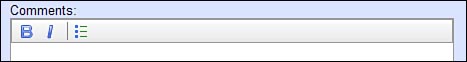
The default Editor widget provides a number of formatting tools represented by the icons on the toolbar. But you might not want to make all of the editing features available to the users of the page. It is possible to specify which tools you would like the editor to make available by setting the plugins property of the widget, which contains a list of editing features that should be displayed in the toolbar. Also you might notice that a vertical bar separates some features. This allows related icons to appear together as a group. The “|” character is used as a separator by default, but any character is allowed.
Following is the definition for an Editor widget that only allows three editing features (bold, italics, and ordered list/unordered list) with a separator after italics.
          <textarea id="comments" name="comments" height="100px"
                  dojoType="dijit.Editor"
              plugin="['bold','italic','|','insertUnorderedList']"
          >
Notice that the widget now has a different toolbar and is showing only the features that we have specified.
Each of the editing features has an icon and a name that can be used in the value for the plugins attribute. The following table lists the available editing features along with their corresponding icons.
We can specify any combination of editing features in any order.
In the next chapter we put the finishing touches on our form and see how we can submit the form to the server.