Form follows function—that has been misunderstood. Form and function should be one... | ||
| --Frank Floyd Wright | ||
The problem with the standard widgets available in the HTML toolkit (such as text boxes, radio buttons, and so on) isn’t that they are ineffective themselves: It’s that there just aren’t enough of them. There are certain functions for which the standard widgets are a perfect fit. And in those functions they find their proper homes. The purpose of a widget is to represent some piece of data or process to the user. The degree to which the widget corresponds to the user’s model of that data or process determines it success. When widget form and function correspond, the user interface can seem to become almost transparent, and users no longer perceive themselves as working through widgets but as working with their content directly. This chapter describes a number of Dojo widgets that each perform a specialized function to which they are perfectly matched.
The widgets described in this chapter each have some unique function. They are not necessarily the most advanced or complicated of the Dojo widgets, but because of their uniqueness they have been grouped together. There is no other unifying theme to tie them together as there was with the form widgets described in Chapter 7, “Dojo Form Widgets,” or the layout widgets described in Chapter 8, “Dojo Layout Widgets.”
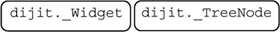
However, we’re not entering terra incognita here. Although the specific function of the widgets might be unique, they way we construct them and use them will be quite familiar. All the widgets in this chapter are descendents of digit._Widget and inherit all the operations of that mother of all widgets.
This chapter takes the same approach to describing these widgets as have the previous two chapters: Each widget will be described using the same standard layout as introduced in Chapter 7—except with the first widget covered in this chapter; it has a little more detail to be included.
Like the animals in Animal Farm, all widgets are equal, but some are more equal than others. That is, some widgets will probably be used much more often than others. For this reason and because of involvement of multiple component widgets, some extra time is spent describing the Menu widget.
One of the most often used features on a web page is navigation. Menus are used for executing commands and providing links to other web sites and documents, and they appear on almost every web page on the Net, so you would expect Dojo to have numerous options for creating menus. And you would be right.
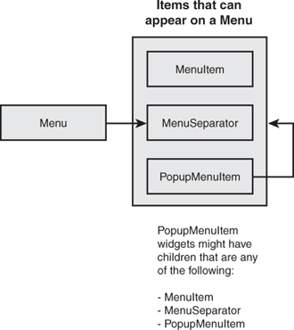
The Dojo Menu widget is really a collection of widgets working together. The base class for building menus is dijit.Menu. A Menu widget can have MenuItem widgets as children in addition to two other widgets, dijit.MenuSeparator and dijit.PopupMenuItem. Figure 9.1 shows the relationship of the components to each other.
The dijit.Menu widget is the container for menu elements. It is typically displayed either by linking it to a button on a Toolbar widget or by associating it with some other element that can be right-clicked to display the menu. Also by using a mouseover event, the menu could be displayed when the user rolls over some other widget on the page. This is a typical technique employed on some sites.
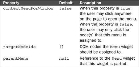
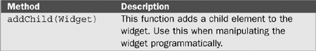
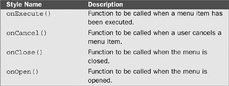
The dijit.MenuItem widget represents a command or link available on a menu. By activating the item, the user selects some function to be performed. Menu items can have a text label, an icon, or both. Tables 9.1 and 9.2 that follow describe the properties and method of this widget.
Table 9.1. Properties for dijit.MenuItem
Property | Default | Description |
|---|---|---|
|
| The text containing the displayed label for the item. |
|
| If the menu item should also have an icon displayed with it, this property contains the value for the CSS class describing the icon. |
|
| This property shows whether the item has been deactivated or not. Disabled items still display, but clicking them does not trigger their |
Table 9.2. Methods for dijit.MenuItem
Method | Description |
|---|---|
| This is the key event for this widget. It determines the functionality that the menu item provides. The handler associated with this event will be executed when the user selects this item by clicking it. |
| This method will disable a menu item. The item will still display on the menu but will appear in lighter text to indicate that it is not active. Also the |
The dijit.MenuSeparator widget is used to organize the display of menu items. It creates a gray horizontal line in the list of menu items that separates groups of related menu items. It can’t receive focus and isn’t clickable. It does provide a class, dijitMenuSeparatorTop, which can be used to style the link, perhaps changing the color or making it larger for example. See Figure 9.2 for an example of a menu with two separators.

The dijit.PopupMenuItem widget allows nested menus to be added to a menu. This widget can then act as a container for other menu elements including MenuItem widgets, MenuSeparator widgets, and even additional PopupMenuItem widgets, which provide the ability to have as many levels of nested menus as desired.
The standard technique for specifying a popup menu is to include a <SPAN> child element as the label for the popup and then to include a tag representing the widget to be shown when the popup is activated. In the case of submenus, the popup widget would be a digit.Menu as shown in the following code sample.
<div dojoType="dijit.PopupMenuItem">
     <span>Submenu Label</span>
     <div dojoType="dijit.Menu" id="submenu1" style="display: none;">
        <div dojoType="dijit.MenuItem" onClick="sub1Action()">
           Submenu Item One Label</div>
        <div dojoType="dijit.MenuItem" onClick="sub2Action()">
           Submenu Item Two Label</div>
    </div>
</div>
The general discussion of the dijit.Menu widget is now complete, so let’s continue with the standard presentation of the specialized widgets covered in this chapter.
Widget Name | dijit.Menu |
Super Classes | |
File Location | dijit/Menu.js Use |
Usage | This class creates a widget containing a list of items that can be selected to trigger some function. |
Display Examples |
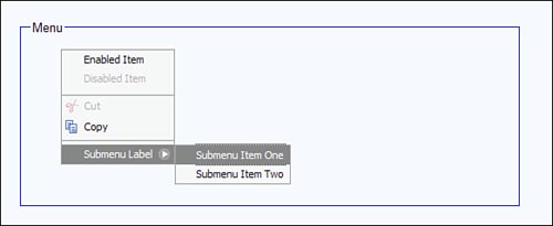
This figure shows a |
HTML Markup Examples | Create a new <div dojoType="dijit.Menu" id="menu1"
contextMenuForWindow="true">
<div dojoType="dijit.MenuItem" >Enabled Item</div>
<div dojoType="dijit.MenuItem" disabled="true">
Disabled Item</div>
<div dojoType="dijit.MenuSeparator"></div>
<div dojoType="dijit.MenuItem"
iconClass="dijitEditorIcon dijitEditorIconCut"
onClick="action1()" label="Cut" disabled="true">
Cut</div>
<div dojoType="dijit.MenuItem"
iconClass="dijitEditorIcon dijitEditorIconCopy"
onClick="action2()">
Copy</div>
<div dojoType="dijit.MenuSeparator"></div>
<div dojoType="dijit.PopupMenuItem">
<span>Submenu Label</span>
<div dojoType="dijit.Menu" id="submenu1">
<div dojoType="dijit.MenuItem"
onClick="subAction1">Submenu Item One</div>
<div dojoType="dijit.MenuItem"
onClick="subAction2()">Submenu Item Two</div>
</div>
</div>Notice that some of the items are disabled using the attribute Also notice the |
JavaScript Constructor Examples | The following code will create a menu1 = new dijit.Menu(
{targetNodeIds:["nodeId"], id:"menu1"});
menu1.addChild(new dijit.MenuItem(
{label:"Menu Item 1", onClick:menuAction1}));
menu1.addChild(new dijit.MenuItem(
{label:"Menu Item 2", onClick:menuAction2}));Notice that the The functions |
Key Properties | |
Key Methods | |
Key Styles | |
Key Events | |
Notes | To close the menu, use the <esc> key. |
dijit.Toolbar | |
Super Classes | |
File Location | dijit/Toolbar.js Use |
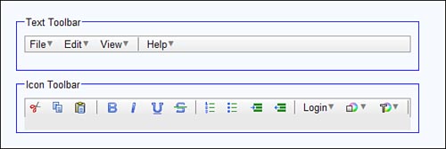
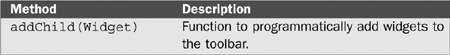
Usage | This class creates a widget that acts as container for buttons. This widget does not have explicit toolbar items but instead can use any widget as a toolbar item—although the most typical widget used is Like in |
Display Examples |
This figure shows two examples of the Toolbar widget. The first contains buttons with text labels. The second contains a mix of buttons, some with icons and others with text. A number of predefined icons are available in the tundra theme in the directory “dojo/dijit/themes/tundra/images.” Notice also the use of the |
HTML Markup Examples | Create a <div id="toolbar1" dojoType="dijit.Toolbar">
<div dojoType="dijit.form.Button" id="toolbar1.cut"
iconClass="dijitEditorIcon dijitEditorIconCut"
showLabel="false">Cut</div>
<div dojoType="dijit.form.Button" id="toolbar1.paste">
Paste</div>
</div>Actions would need to be associated with the |
JavaScript Constructor Examples | The following code will create a toolbar with two items. menu1 = new dijit.Toolbar({}, dojo.byId("d1"));
menu1.addChild(new dijit.form.Button(
{label:"Item1", onClick:menuAction1}));
menu1.addChild(new dijit.form.Button(
{label:"Item2", onClick:menuAction2})); |
Key Properties | None |
Key Methods | |
Key Styles | None |
Key Events | None |
Notes | None |
dijit.Dialog | |
Super Classes | |
File Location | dijit/Dialog.js Use |
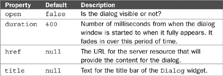
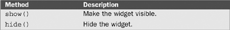
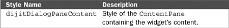
Usage | This class creates a widget that displays a A really useful feature of this widget is the ability to load dynamic content from the server using the |
Display Examples |
This figure shows examples of a dialog. Notice that the dialog box is active, but the page behind it has been “grayed out” to show that it is inactive. The icon in the upper right of the dialog can be used to hide it. Note: There is a button showing on the left of the screen shot with a “Show Dialog” label. Although this is not a part of the |
HTML Markup Examples | Create a <button dojoType="dijit.form.Button"
onclick="dijit.byId('dialog1').show()">
Show Dialog
</button>
<div id="dialog1" dojoType="dijit.Dialog" title="dijit.Dialog">
<div>
*** Content of Dialog Box ***
</div>
</div>The following example also creates a <button dojoType="dijit.form.Button"
onclick="dijit.byId('dialog2').show()">
Show Dialog
</button>
<div id="dialog2"
dojoType="dijit.Dialog"
href="content.html"
title="Dynamic Content">
</div> |
JavaScript Constructor Examples | The following code will create a new dijit.Dialog({
title: "Dialog",
href: "content.jsp" });The |
Key Properties | |
Key Methods | |
Key Styles | |
Key Events | |
Notes | None |

dijit.TooltipDialog | |
Super Classes | |
File Location | dijit/Dialog.js Use |
Usage | This class creates a widget that displays a dialog that has the same appearance as a Tooltip. This dialog slightly differs from a This widget is used to capture additional information for a Toolbar command by providing a form. When used this way, the widget will be hidden when the form is submitted. |
Display Examples |
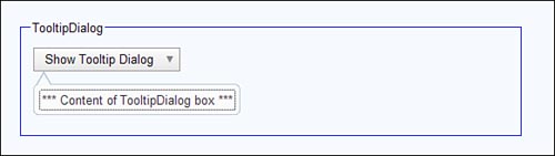
This figure shows the widget after it has been activated by clicking the button labeled “Show Tooltip Dialog.” Notice that the widget appears next to the button with an arrow pointing to the button. The Tooltip will be automatically oriented. |
HTML Markup Examples | Create a <div dojoType="dijit.form.DropDownButton">
<span>Show Tooltip Dialog</span>
<div id="dialog1"
dojoType="dijit.TooltipDialog" title="Tooltip">
<div>
*** Content of TooltipDialog box ***
</div>
</div>
</div>Note: The content could be retrieved dynamically from the server. The content is often a form that requests additional parameters for the command. |
JavaScript Constructor Examples | This widget would normally be created through HTML markup. |
Key Properties | None |
Key Methods | None |
Key Styles | None |
Key Events | None |
Notes | None |
dijit.Tooltip | |
Super Classes | |
File Location | dijit/Tooltip.js Use |
Usage | This class creates a widget that displays a pop-up message next to a field. The message appears automatically when the field receives focus and will disappear when focus is gone. The widget displays on top of any underlying page elements. This widget is similar to a This widget acts as a more powerful replacement for the |
Display Examples |
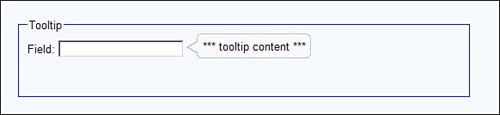
This figure shows the |
HTML Markup Examples | Create a <span dojoType="dijit.Tooltip" connectId="field1">
*** Tooltip content ***
</span>The preceding code assumes the existence of a form field with an id of “field1”. |
JavaScript Constructor Examples | The following code will create a Tooltip. new dijit.Tooltip({
connectId:["id3"],
label:" *** content ***"}); |
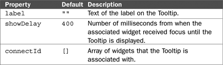
Key Properties | |
Key Methods | None |
Key Styles | |
Key Events | None |
Notes | None |
dijit.ProgressBar | |
Super Classes | |
File Location | dijit/ProgressBar.js Use |
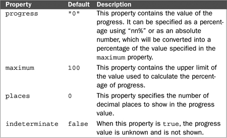
Usage | This class creates a widget that displays the completion state a process using a horizontal bar. This widget only displays the status unlike the Slider, which can be used as a control to change the status measurement. Also this widget can be displayed only horizontally. The progress is updated programmatically by this widget’s |
Display Examples |
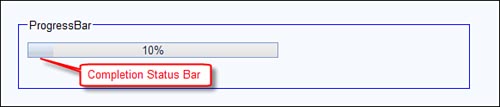
This figure shows a progress bar. Notice that there is a darker area within the progress bar representing the completion status. It takes up 10% of the space on the progress bar, which is equal to the number displayed in the center of the bar. |
HTML Markup Examples | Create a <div
dojoType="dijit.ProgressBar"
maximum="100"
progress="10"
id="bar1">
</div> |
JavaScript Constructor Examples | The following code will create a new dijit.ProgressBar({
annotate:"true",
maximum:"50",
progress:"35"},
dojo.byId("d1")) |
Key Properties | |
Key Methods | |
Key Styles | None |
Key Events | None |
Notes | None |
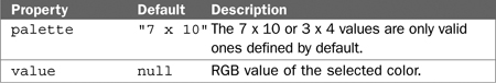
dijit.ColorPalette | |
Super Classes | |
File Location | dijit/ColorPalette.js Use |
Usage | This class creates a widget that displays a grid containing a selection of colors, one of which may be selected by the user. There are two built-in palettes available, the 7 × 10 and the 3 × 4. The specific colors are also built into the palette. After the user selects a color, the value of the widget is set to the RGB value of the selected color. |
Display Examples |
This figure shows the 7 × 10 version of the widget. |
HTML Markup Examples | Create a <div dojoType="dijit.ColorPalette"
palette="3x4" /> |
JavaScript Constructor Examples | The following code will create a new dijit.ColorPalette({palette:"7x10"}, dojo.byId("d1")) |
Key Properties | |
Key Methods | None |
Key Styles | None |
Key Events | |
Notes | None |

dijit.Tree | |
Super Classes | |
File Location | dijit/Tree.js Use |
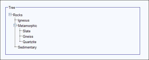
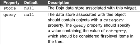
Usage | This class creates a widget that displays a collapsible and expandable outline structure. Nodes in the tree can be clicked to trigger some action. Also when nodes are expanded, their content can be dynamically loaded from the server. It is possible to build trees programmatically or through HTML, but the simplest technique is to use a Dojo data store, which can be directly associated with the widget and populates the widget automatically. It is also possible to enable a drag and drop mode so that tree items can be moved from one parent item to another. |
Display Examples |
This figure shows fully expanded |
HTML Markup Examples | Create a <div dojoType="dojo.data.ItemFileReadStore"
jsId="treeStore"
url="tree.json"></div>
<div dojoType="dijit.Tree"
store="treeStore"
query="{type:'category'}"
label="Rocks">Note: Following is an example of the original JSON content of the data store corresponding to the Display Example. { label: 'name',
identifier: 'name',
items: [
{ name:'Igneous', type:'category'},
{ name:'Metamorphic',
type: 'category',
children: [
{ name:'Slate', type:'subtype' },
{ name:'Gneiss', type:'subtype' },
{ name:'Quartzite', type:'subtype' }
]
},
{ name:'Sedimentary', type: 'category'}
]
} |
JavaScript Constructor Examples | The programmatic construction of this widget is beyond the scope of this book. See the Dojo documentation on the web site for more details. |
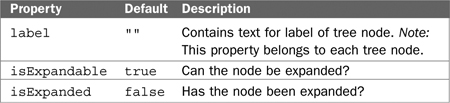
Key Properties |
The following table describes properties for tree nodes themselves which are of class |
Key Methods | None |
Key Styles | |
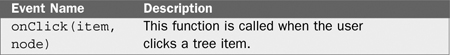
Key Events | |
Notes |
|
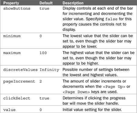
dijit.form.Slider | |
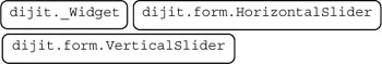
Super Classes | |
File Location | dijit/form/Slider.js Use |
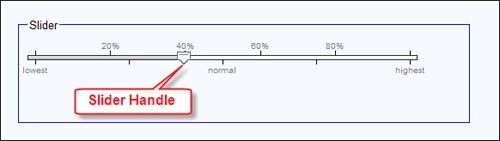
Usage | This class creates a horizontal or vertical bar with a slider that can be moved by the user to select a specific value. The slider bar can have hash marks on either side that are labeled. |
Display Examples |
This slider has hash marks and labels both above and below the bar. |
HTML Markup Examples | Create a <div dojoType="dijit.form.HorizontalSlider" name="horizontal1"
value="10"
maximum="100"
minimum="0"
pageIncrement="100"
showButtons="false"
intermediateChanges="true"
id="slider1"
>
<ol dojoType="dijit.form.HorizontalRuleLabels"
container="topDecoration"
style="height:1.2em;font-size:75%;color:gray;"
count="6" numericMargin="1">
</ol>
<div dojoType="dijit.form.HorizontalRule"
container="topDecoration" count=6 style="height:5px;">
</div>
</div>Note: This example places hash marks only on top of the slider bar. It is also possible to place labeled hash marks below the bar using the same technique. |
JavaScript Constructor Examples | Because of the number of components of this widget, it is more typical to create it using HTML than to create it programmatically. |
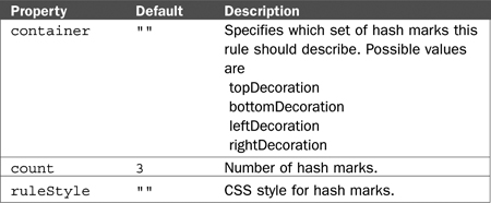
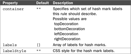
Key Properties |
The following table contains properties for either the The following table contains properties for either the |
Key Methods | |
Key Styles | None |
Key Events | None |
Notes | None |

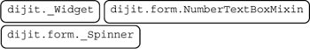
dijit.form.NumberSpinner | |
Super Classes | |
File Location | dijit/form/NumberSpinner.js Use |
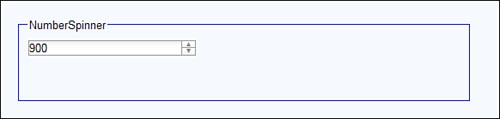
Usage | This class creates a text box for numbers that contains a control that allows the user to change the value by clicking the control. The control consists of an up arrow and down arrow icon. Clicking the up arrow increases the value, and clicking the down arrow decreases the value. This is superior to a regular |
Display Examples |
The user can increment or decrement the value by clicking the up or down arrow icons. |
HTML Markup Examples | Create a <input
dojoType="dijit.form.NumberSpinner"
value="900"
constraints="{max:1550,places:0}"
name="integerspinner1"
id="integerspinner1">Note: This widget is inherits the |
JavaScript Constructor Examples | The following code will create a Tooltip. |
Key Properties | |
Key Methods | None |
Key Styles | None |
Key Events | None |
Notes | This widget is a subclass |
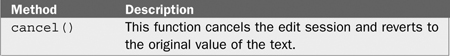
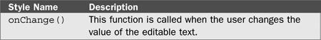
dijit.InlineEditBox | |
Super Classes | |
File Location | dijit/InlineEditBox.js Use |
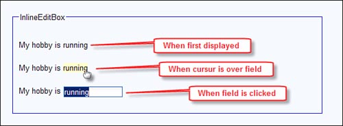
Usage | This class creates a widget that allows displayed text to be converted into a text box so that it can be edited by the user. |
Display Examples |
This screen shot shows the widget in operation. The first line, “My hobby is running,” appears as normal displayed text. The second line shows the text as highlighted when the mouse passes over it. The third line shows the text box that appears when the editable text is clicked. |
HTML Markup Examples | Create a <span
dojoType="dijit.InlineEditBox"
editor="dijit.form.TextBox"
width="100px" title="hobby"
style="border-bottom: 1px dashed blue;"
>
running
</span>Note: In this widget, the editable text is underlined with a blue dashed line to indicate that it is editable. |
JavaScript Constructor Examples | This widget is normally created using HTML. |
Key Properties | |
Key Methods | |
Key Styles | None |
Key Events | |
Notes | Use a style attribute to emphasize the editable word. |
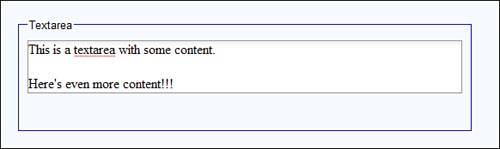
dijit.form.Textarea | |
Super Classes | |
File Location | dijit/form/Textarea.js Use |
Usage | This class creates a widget that replaces the standard HTML |
Display Examples |
This figure shows the widget with some lines of content. If the content extended beyond the boundaries of the widget, the size of the widget would change automatically. |
HTML Markup Examples | Create a <textarea dojoType="dijit.form.Textarea" name="textArea1">
This is the content of the text area.
</textarea> |
JavaScript Constructor Examples | This widget is normally created with HTML. |
Key Properties | None |
Key Methods | None |
Key Styles | None |
Key Events | None |
Notes | Use the The standard attributes for specifying the size of the text area in HTML are “cols” and “rows” corresponding to the number of columns and rows. Do not use these attributes when using |
dijit.Editor | |
Super Classes | |
File Location | dijit/Editor.js Use |
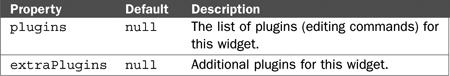
Usage | This class creates a widget that acts as a rich text editor allowing multi-line text with sophisticated editing options. This is a replacement for the standard HTML |
Display Examples |
This figure shows the |
HTML Markup Examples | Create an <textarea dojoType="dijit.Editor"
id="edit1"
height="110px"
>
Content for the text area.
</textarea> |
JavaScript Constructor Examples | The programmatic construction of this widget is beyond the scope of this book. See the Dojo documentation on the web site for more details. |
Key Properties | |
Key Methods | None |
Key Styles | None |
Key Events | None |
Notes | None |

We’ve now concluded our exploration of the Dojo widgets. We continue in the next section of the book by exploring some of the nonvisual elements of Dojo, the features that augment JavaScript programming. These are the hidden features of Dojo that don’t impact the visual display of the page directly but make JavaScript programming much easier.