
Chapter 13. Guide for the perplexed1
1 The Guide for the Perplexed (the real one) is a seminal commentary on the meaning of the Talmud written in the 12th century by Rabbi Moshe ben Maimon (better known as Maimonides). I’ve just always thought it was the best title I’ve ever heard.
MAKING USABILITY HAPPEN WHERE YOU LIVE
I am the Lorax. I speak for the trees.
—THE LORAX, DR. SEUSS
I get a lot of email from people asking me some variation of this question:
OK, I get it. This usability stuff is important, and I really want to work on it myself. How do I convince my boss—and his boss—that they should be taking users seriously and allow me to spend time making it happen?
What can you do if you find yourself in an environment where your desire to “do usability” isn’t supported?
Ya gotta know the territory
First, a little background about how the place of usability in the world has changed.
Back in the late 1990s, Usability and User Centered Design (UCD) were the terms most people used to describe any efforts to design with the user in mind. And there were essentially two “professions” that focused on making Web sites more usable: Usability (making sure things are designed in a way that enables people to use them successfully) and Information Architecture (making sure the content is organized in a way that allows people to find what they need).
Now the term you hear most often is User Experience Design, or just User Experience (UXD or UX, for short), and there are probably a dozen specialties involved, like Interaction Design, Interface Design, Visual Design, and Content Management—and, of course, Usability and Information Architecture—all under the UX umbrella.
One difference between User Centered Design and User Experience Design is their scope. UCD focused on designing the right product and making sure that it was usable. UX sees its role as taking the users’ needs into account at every stage of the product life cycle, from the time they see an ad on TV, through purchasing it and tracking its delivery online, and even returning it to a local branch store.
The good news is that there’s a lot more awareness now of the importance of focusing on the user. Steve Jobs (and Jonathan Ive) made a very compelling business case for UX, and as a result usability is an easier sell than it was even a few years ago.
The bad news is that where usability used to be the standard bearer for user-friendly design, now it’s got a lot of siblings looking for seats at the table, each convinced that their set of tools are the best ones for the job. The worse news is that not many people understand the differences between the specialties or the unique contributions they can make.
This is the field you’re playing on. So when someone tells you: “I’m in UX” or “Usability is so 2002—it’s all UX now,” smile graciously and ask them a few questions about how they’re learning about users, how they’re testing whether people can use what they’re building, and how they get changes to happen. If they don’t do any of those things, they need your help. If they do, learn from them. It’s not what we call ourselves that matters, it’s the attitude we bring and the skills we can contribute.
The usual advice
Here are the two suggestions I’ve always heard for convincing management to support (and fund) usability work:
![]() Demonstrate ROI. In this approach, you gather and analyze data to prove that a usability change you’ve made resulted in cost savings or additional revenue (“Changing the label on this button increased sales by 0.25%”). There’s an excellent book about it: Cost-justifying Usability: An Update for the Internet Age, edited by Randolph Bias and Deborah Mayhew.
Demonstrate ROI. In this approach, you gather and analyze data to prove that a usability change you’ve made resulted in cost savings or additional revenue (“Changing the label on this button increased sales by 0.25%”). There’s an excellent book about it: Cost-justifying Usability: An Update for the Internet Age, edited by Randolph Bias and Deborah Mayhew.
![]() Speak their language. Instead of talking about the benefits for users, learn what the current vexing corporate problems are and describe your efforts in a way that makes it clear that they’re part of the solution: Talk about things like pain points, touch points, KPIs, and CSI, or whatever management buzzwords are trending in your organization.
Speak their language. Instead of talking about the benefits for users, learn what the current vexing corporate problems are and describe your efforts in a way that makes it clear that they’re part of the solution: Talk about things like pain points, touch points, KPIs, and CSI, or whatever management buzzwords are trending in your organization.
These are both fine ideas and worth doing if you can manage it. But making an ROI case tied to costs and revenues can be a lot of work, and unless it’s rigorously implemented there’ll always be someone who’ll claim that the added value was caused by something else. And learning to speak “business” can be challenging, too. That’s what MBA degrees are for.
If I were you...
...I’d last about a week at your job. Every time I go to a client’s office I spend most of my time marveling at the fact that so many people can survive in the corporate world. I’m just not equipped for dealing with the office politics in a large (i.e., more than two people) organization and sitting in meetings all day.
But I have spent a fair amount of time visiting corporate offices and getting managers to take usability seriously. So I do have some ideas about tactics that work, and people who have tried them tell me they’ve had some success. So here’s what I’d do if I were you:
![]() Get your boss (and her boss) to watch a usability test. The tactic that I think works best is getting people from higher up the food chain to come and observe even one usability test. Tell them that you’re going to be doing some testing and it would be great for the Web team’s morale if they could just poke their head in for a few minutes.
Get your boss (and her boss) to watch a usability test. The tactic that I think works best is getting people from higher up the food chain to come and observe even one usability test. Tell them that you’re going to be doing some testing and it would be great for the Web team’s morale if they could just poke their head in for a few minutes.
In my experience, executives often become fascinated and stay longer than they’d planned, because it’s the first time they’ve seen anyone try to use the company’s site and it’s often not nearly as pretty a picture as they’d imagined.
It’s important to get them to come in person. The difference between watching a usability test live and hearing a presentation about it is like the difference between watching a sporting event while it’s happening versus listening to a recap of it on the evening news. Live games create memorable experiences; the evening news not so much.
If you can’t get them to come, then settle for second best: include clips of highlights from tests in your presentations. If you don’t get to do a presentation, post a short clip (less than 3 minutes) on your intranet and send out email with an intriguing description and a link to the video. Even executives like watching short videos.
![]() Do the first one on your own time. When you do your first test, don’t ask for permission; just keep it incredibly simple and informal, and find volunteers for participants so it doesn’t cost anything.
Do the first one on your own time. When you do your first test, don’t ask for permission; just keep it incredibly simple and informal, and find volunteers for participants so it doesn’t cost anything.
And try to make sure that something improves as a result. Pick an easy target to test—something that you know has at least one serious usability problem that can be fixed quickly without having to get a lot of people to sign off on the change—renaming a poorly labeled button, for instance. Then test it, fix it, and publicize it.
If you can find a simple way to measure the improvement, do so. For instance, you might test something that’s been causing a lot of support calls and then show how much the calls on that issue decreased after you fixed the problem.
![]() Do a test of the competition. I mentioned in Chapter 9 that it’s a good idea to test some competitive sites at the start of any project. But it’s also a great way to drum up support for testing. Everybody loves learning about the competition, and because it’s not your site being tested, no one has anything personally on the line. It makes a great brown bag lunch event.
Do a test of the competition. I mentioned in Chapter 9 that it’s a good idea to test some competitive sites at the start of any project. But it’s also a great way to drum up support for testing. Everybody loves learning about the competition, and because it’s not your site being tested, no one has anything personally on the line. It makes a great brown bag lunch event.
![]() Empathize with management. A few years ago at the UXPA annual conference, I looked around and thought “What a nice group of people!” Then it dawned on me: of course they’re nice. Empathy is virtually a professional requirement for usability work. And if you’re interested in doing it, you’re probably empathetic too. I recommend that you apply that empathy to your bosses. Not in the “how can I figure out what motivates these people so I can get them to do what I want” way, but more in the “understand the position they find themselves in” way, having real, emotional empathy for them. You may be surprised by the effect.
Empathize with management. A few years ago at the UXPA annual conference, I looked around and thought “What a nice group of people!” Then it dawned on me: of course they’re nice. Empathy is virtually a professional requirement for usability work. And if you’re interested in doing it, you’re probably empathetic too. I recommend that you apply that empathy to your bosses. Not in the “how can I figure out what motivates these people so I can get them to do what I want” way, but more in the “understand the position they find themselves in” way, having real, emotional empathy for them. You may be surprised by the effect.
![]() Know your place in the grand scheme of things. Personally, in the situation you’re in, I think a little bit of humility goes a long way. The reality is that in the business world almost everyone is just a very small cog in a huge collection of cogs.2
Know your place in the grand scheme of things. Personally, in the situation you’re in, I think a little bit of humility goes a long way. The reality is that in the business world almost everyone is just a very small cog in a huge collection of cogs.2
2 Sorry. Try not to take it personally. Do good work. Enjoy your home life. Be happy.
You want your enthusiasm for usability to be infectious, but it just doesn’t work to go around with the attitude that you’re bringing the truth—about usability, or anything else—to the unwashed masses. Your primary role should be to share what you know, not to tell people how things should be done.
I’d also recommend two books that can help.
First there’s Tomer Sharon’s It’s Our Research: Getting Stakeholder Buy-In for User Experience Research Projects. Tomer is a UX Researcher at Google, and I’ve never heard him say anything that wasn’t true, pithy, and actionable.
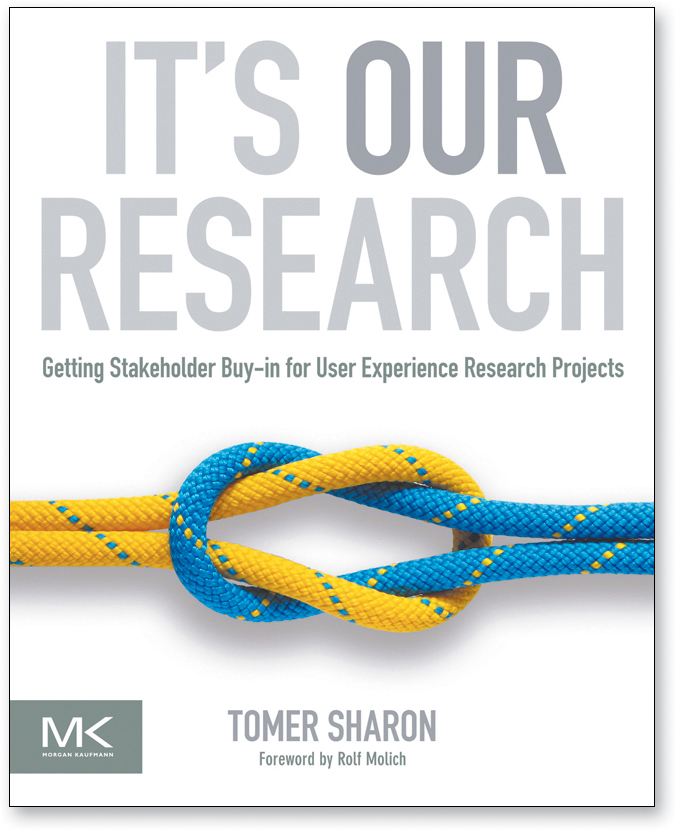
Any book with section titles like “Become the voice of reason” and “Accept the fact that it might not work and that it’s okay” is obviously worth reading.
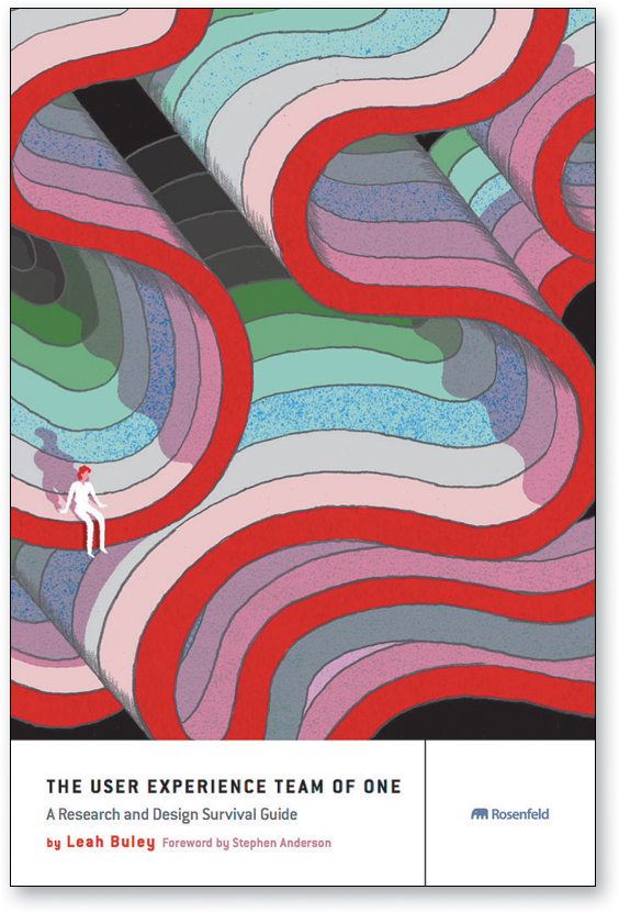
Leah Buley’s The User Experience Team of One: A Research and Design Survival Guide is written specifically for people who are “the only person in your company practicing (or aspiring to practice) user centered design” or who “regularly work on a team where you are the only UX person.” Chapters 3 (Building Support for Your Work) and 4 (Growing Yourself and Your Career) are full of good advice and useful resources.
Resist the dark forces
Usability is, at its heart, a user advocate job: Like the Lorax, you speak for the trees. Well, the users, actually. Usability is about serving people better by building better products.
But there’s a trend—which I first noticed about five years ago—for some people3 to try to get usability practitioners to help them figure out how to manipulate users rather than serve their needs.4
3 [cough] marketing [cough]
4 There’s even a book called Evil by Design: Interaction Design to Lead Us into Temptation by Chris Nodder that explains how an understanding of human frailties can guide your design decisions. Each chapter deals with one of the Seven Deadly Sins (Gluttony, Pride, Sloth, and so on).
I have no problem with the idea of people asking for our help influencing users.
If you want to know how to influence people, just read Robert Cialdini’s classic book on the subject, Influence: The Psychology of Persuasion. It’s brilliant and effective, full of time-proven ideas.
Or read any of Susan Weinschenk’s books about the useful lessons that neuropsychology research can teach us about human motivation and decision making.

I don’t have a problem with helping to persuade people to do things, either, as long as it’s not deceptive. The think-aloud protocol in usability tests can often produce valuable insights into why attempts at persuasion succeed or fail.
But I get anxious whenever I hear people talk about using usability tests to help determine whether something is desirable, because it’s just not something usability tests are good for measuring. You may get a sense during a test session that the participant finds something desirable, but it’s just that: a sense. Whether something is desirable is a market research question, best answered by using market research tools and instruments.
The real problem is that these people often aren’t actually asking for our help determining whether something is desirable, or even for help in figuring out how to make what they produce more desirable. Instead, they’re looking to usability to tell them how to make people think it’s desirable, i.e., to manipulate them.
Sometimes the intended manipulation is relatively benign, like using a slightly hidden checkbox checked by default to automatically sign you up for a newsletter.
Sometimes it inches closer to the darkness, doing things like tricking people into installing an unwanted browser toolbar5 and changing their default search and Home page settings while they’re not looking. We’ve all been on the receiving end of this kind of deception.
5 [cough] Yahoo [cough]

You click on a link to download some free software.

This opens a screen with three big “Start Download” links.

Not noticing the nearly invisible instructions, when nothing happens you click one of them to start the download.
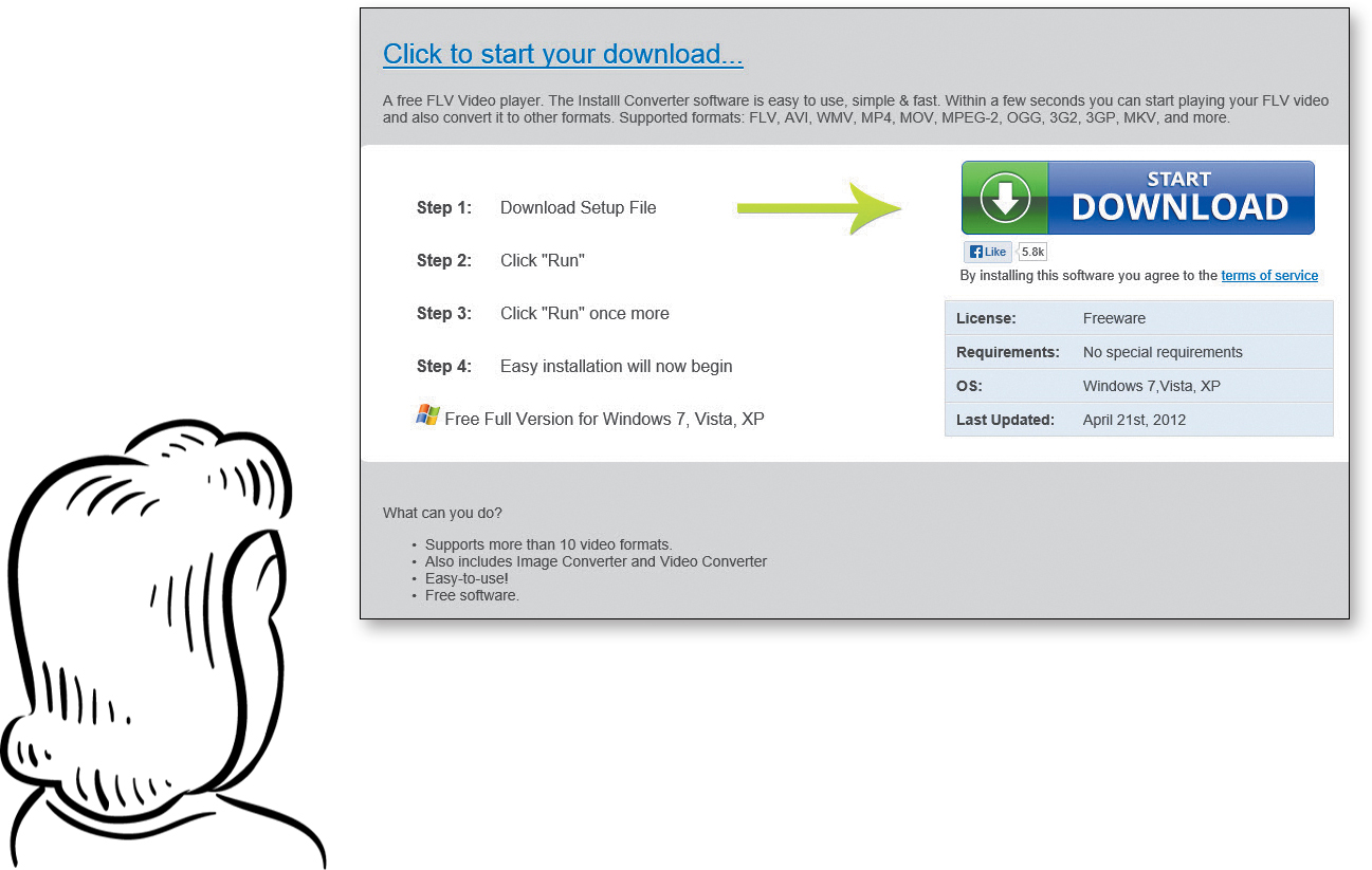
A new page appears with another “Start Download” link, so you click it...and end up downloading some software you don’t want.
At its extreme, though, it can cross the line into true black hat practices, like phishing, scamming, and identity theft.
Just be aware that if people ask you to do any of this, it’s not part of your job.
The users are counting on you.
Almost everything in this book has been about how much the answer to usability questions depends on the context and that the answer to most usability questions is “It depends.”
But I know that we all love to have definitive answers, so here’s a tiny collection of things that you should always do or never do.
![]() Don’t use small, low-contrast type. You can use large, low-contrast type, or small (well, smallish) high-contrast type. But never use small, low-contrast type. (And try to stay away from the other two, too.) Unless you’re designing your own design portfolio site, and you really, truly don’t care whether anybody can read the text or not.
Don’t use small, low-contrast type. You can use large, low-contrast type, or small (well, smallish) high-contrast type. But never use small, low-contrast type. (And try to stay away from the other two, too.) Unless you’re designing your own design portfolio site, and you really, truly don’t care whether anybody can read the text or not.
![]() Don’t put labels inside form fields. Yes, it can be very tempting, especially on cramped mobile screens. But don’t do it unless all of these are true: The form is exceptionally simple, the labels disappear when you start typing and reappear if you empty the field, the labels can never be confused with answers, and there’s no possibility that you’ll end up submitting the labels along with what you type (“Job TiAssistant Managertle”). And you’ve made sure they’re completely accessible.
Don’t put labels inside form fields. Yes, it can be very tempting, especially on cramped mobile screens. But don’t do it unless all of these are true: The form is exceptionally simple, the labels disappear when you start typing and reappear if you empty the field, the labels can never be confused with answers, and there’s no possibility that you’ll end up submitting the labels along with what you type (“Job TiAssistant Managertle”). And you’ve made sure they’re completely accessible.
If you don’t agree, before you send me email please search for “Don’t Put Labels Inside Text Boxes (Unless You’re Luke W)” and read it.
![]() Preserve the distinction between visited and unvisited text links. By default, Web browsers display links to pages that you’ve already opened in a different color so you can see which options you’ve already tried. This turns out to be very useful information, especially since it’s tracked by URL, not by the wording of the link. So if you clicked on Book a trip, when you see Book a flight later you know that it would take you to the same page.
Preserve the distinction between visited and unvisited text links. By default, Web browsers display links to pages that you’ve already opened in a different color so you can see which options you’ve already tried. This turns out to be very useful information, especially since it’s tracked by URL, not by the wording of the link. So if you clicked on Book a trip, when you see Book a flight later you know that it would take you to the same page.
You can choose any colors you want, as long as they’re noticeably different.
![]() Don’t float headings between paragraphs. Headings should be closer to the text that follows them than the text that precedes them. (Yes, I know I mentioned this is Chapter 3, but it’s so important it’s worth repeating.)
Don’t float headings between paragraphs. Headings should be closer to the text that follows them than the text that precedes them. (Yes, I know I mentioned this is Chapter 3, but it’s so important it’s worth repeating.)
That’s all, folks.
As Bob and Ray used to say, “Hang by your thumbs, and write if you get work.”
I hope you’ll check in at my Web site stevekrug.com from time to time, and always feel free to send me email at [email protected]. I can promise you I will read it and appreciate it, even if I can’t always find enough time to reply.
But above all, be of good cheer. As I said at the beginning, building a great Web site or app is an enormous challenge, and anyone who gets it even half right has my admiration.
And please don’t take anything I’ve said as being against breaking “the rules”—or at least bending them. I know there are even sites where you do want the interface to make people think, to puzzle or challenge them. Just be sure you know which rules you’re bending and that you at least think you have a good reason for bending them.
Oh, by the way, here’s the rest of Calvin and Hobbes.
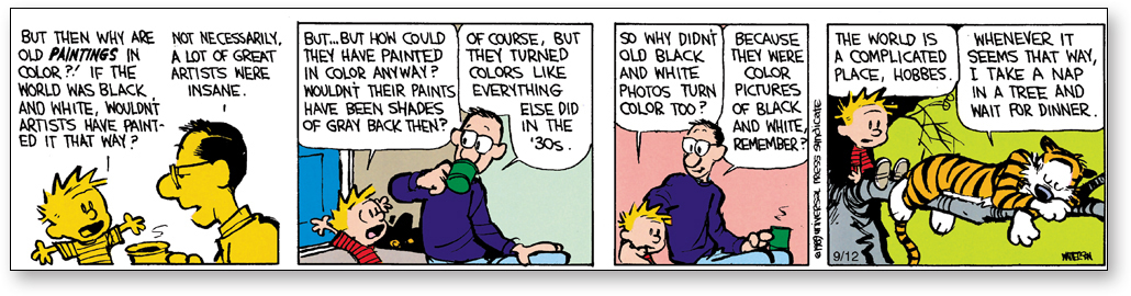
CALVIN AND HOBBES © 1989 Watterson. Reprinted with permission of UNIVERSAL UCLICK. All rights reserved.