
Chapter 1. Don’t make me think!
KRUG’S FIRST LAW OF USABILITY
Michael, why are the drapes open?
—KAY CORLEONE IN THE GODFATHER, PART II
People often ask me:
“What’s the most important thing I should do if I want to make sure my site or app is easy to use?”
The answer is simple. It’s not “Nothing important should ever be more than two clicks away” or “Speak the user’s language” or “Be consistent.”
It’s...
“Don’t make me think!”
For as long I can remember, I’ve been telling people that this is my first law of usability.
It’s the overriding principle—the ultimate tie breaker when deciding whether a design works or it doesn’t. If you have room in your head for only one usability rule, make this the one.
For instance, it means that as far as is humanly possible, when I look at a Web page it should be self-evident. Obvious. Self-explanatory.
I should be able to “get it”—what it is and how to use it—without expending any effort thinking about it.
Just how self-evident are we talking about?
Well, self-evident enough, for instance, that your next door neighbor, who has no interest in the subject of your site and who barely knows how to use the Back button, could look at your Home page and say, “Oh, it’s a _____.” (With any luck, she’ll say, “Oh, it’s a _____. Great!” But that’s another subject.)
When I’m looking at a page that doesn’t make me think, all the thought balloons over my head say things like “OK, there’s the_____. And that’s a _____. And there’s the thing that I want.”
Not Thinking
But when I’m looking at a page that makes me think, all the thought balloons over my head have question marks in them.
Thinking
When you’re creating a site, your job is to get rid of the question marks.
Things that make us think
All kinds of things on a Web page can make us stop and think unnecessarily. Take names, for example. Typical culprits are cute or clever names, marketing-induced names, company-specific names, and unfamiliar technical names.
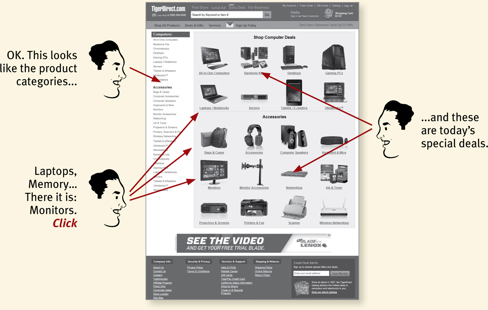
For instance, suppose a friend tells me that XYZ Corp is looking to hire someone with my exact qualifications, so I head off to their Web site. As I scan the page for something to click, the name they’ve chosen for their job listings section makes a difference.
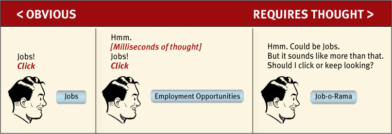
Note that these things are always on a continuum somewhere between “Obvious to everybody” and “Truly obscure,” and there are always tradeoffs involved.
For instance, “Jobs” may sound too undignified for XYZ Corp, or they may be locked into “Job-o-Rama” because of some complicated internal politics or because that’s what it’s always been called in their company newsletter.1 My main point is that the tradeoffs should usually be skewed further in the direction of “Obvious” than we think.
1 There’s almost always a plausible rationale—and a good, if misguided, intention—behind every usability flaw.
Another needless source of question marks over people’s heads is links and buttons that aren’t obviously clickable. As a user, I should never have to devote a millisecond of thought to whether things are clickable—or not.
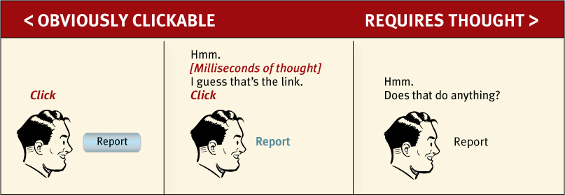
You may be thinking, “Well, it really doesn’t matter that much. If you click or tap it and nothing happens, what’s the big deal?”
The point is that every question mark adds to our cognitive workload, distracting our attention from the task at hand. The distractions may be slight but they add up, especially if it’s something we do all the time like deciding what to click on.
And as a rule, people don’t like to puzzle over how to do things. They enjoy puzzles in their place—when they want to be entertained or diverted or challenged—but not when they’re trying to find out what time their dry cleaner closes. The fact that the people who built the site didn’t care enough to make things obvious—and easy—can erode our confidence in the site and the organization behind it.
Another example from a common task: booking a flight.

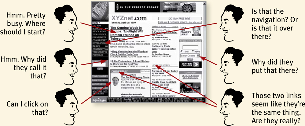
Granted, most of this “mental chatter” takes place in a fraction of a second, but you can see that it’s a pretty noisy process, with a lot of question marks. And then there’s a puzzling error at the end.
Another site just takes what I type and gives me choices that make sense, so it’s hard to go wrong.
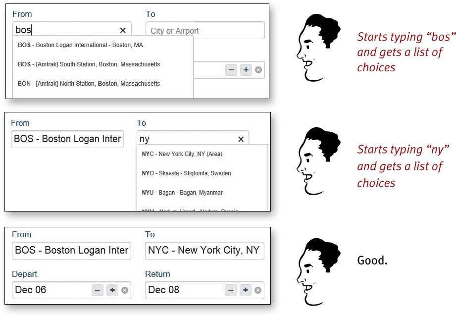
No question marks. No mental chatter. And no errors.
I could list dozens of things that users shouldn’t spend their time thinking about, like
![]() Where am I?
Where am I?
![]() Where should I begin?
Where should I begin?
![]() Where did they put _____?
Where did they put _____?
![]() What are the most important things on this page?
What are the most important things on this page?
![]() Why did they call it that?
Why did they call it that?
![]() Is that an ad or part of the site?
Is that an ad or part of the site?
But the last thing you need is another checklist to add to your stack of design checklists. The most important thing you can do is to understand the basic principle of eliminating question marks. When you do, you’ll begin to notice all the things that make you think in the sites and apps you use. And eventually you’ll learn to recognize and avoid them in the things you’re building.
You can’t make everything self-evident
Your goal should be for each page or screen to be self-evident, so that just by looking at it the average user2 will know what it is and how to use it. In other words, they’ll “get it” without having to think about it.
2 The actual Average User is kept in a hermetically sealed vault at the International Bureau of Standards in Geneva. We’ll get around to talking about the best way to think about the “average user” eventually.
Sometimes, though, particularly if you’re doing something original or groundbreaking or something that’s inherently complicated, you have to settle for self-explanatory. On a self-explanatory page, it takes a little thought to “get it”—but only a little. The appearance of things (like size, color, and layout), their well-chosen names, and the small amounts of carefully crafted text should all work together to create a sense of nearly effortless understanding.
Here’s the rule: If you can’t make something self-evident, you at least need to make it self-explanatory.
Why is all of this so important?
Oddly enough, not for the reason people usually cite:

It’s true that there’s a lot of competition out there. Especially in things like mobile apps, where there are often many readily available (and equally attractive) alternatives, and the cost of changing horses is usually negligible (99 cents or even “Free”).
But it’s not always true that people are fickle. For instance:
![]() They may have no choice but to stick with it, if it’s their only option (e.g., a company intranet, or their bank’s mobile app, or the only site that sells the rattan they’re looking for).
They may have no choice but to stick with it, if it’s their only option (e.g., a company intranet, or their bank’s mobile app, or the only site that sells the rattan they’re looking for).
![]() You’d be surprised at how long some people will tough it out on sites that frustrate them, often blaming themselves and not the site. There’s also the “I’ve waited ten minutes for this bus already, so I may as well hang in a little longer” phenomenon.
You’d be surprised at how long some people will tough it out on sites that frustrate them, often blaming themselves and not the site. There’s also the “I’ve waited ten minutes for this bus already, so I may as well hang in a little longer” phenomenon.
![]() Besides, who’s to say that the competition will be any less frustrating?
Besides, who’s to say that the competition will be any less frustrating?
So why, then?
Making every page or screen self-evident is like having good lighting in a store: it just makes everything seem better. Using a site that doesn’t make us think about unimportant things feels effortless, whereas puzzling over things that don’t matter to us tends to sap our energy and enthusiasm—and time.
But as you’ll see in the next chapter when we examine how we really use the Web, the main reason why it’s important not to make me think is that most people are going to spend far less time looking at the pages we design than we’d like to imagine.
As a result, if Web pages are going to be effective, they have to work most of their magic at a glance. And the best way to do this is to create pages that are self-evident, or at least self-explanatory.