
12. Using Dreamweaver’s Layout Tools
In This Chapter
The layout of elements on your pages is key to the usability of your sites, and Dreamweaver has many tools that help you view and work with your page layouts. These tools fall into two main areas: tools that help you work within your document window to align and view page elements, and tools to help you visualize your CSS-based layouts.
The document window tools will be familiar from image editing programs, and include an onscreen grid, page guides, and rulers. You also have the ability to zoom the document window.
CSS-based layouts allow you to create webpages that look good on computers, tablets, and smartphones, and Dreamweaver gives you two ways to do the trick. One is to create and add separate media query style sheets and swap out the style sheet for the page to match the screen size that is calling for the page. Another way is to create a single grid-based layout that builds and includes the media queries in the same style sheet and automatically switches screen sizes as needed. Dreamweaver CC handles both approaches, and we’ll see that in this chapter.
Using the Grid
If you want items on a page to line up, a handy way to make sure they’re aligned is to use the grid—a feature you may well be familiar with from other applications, such as Photoshop. If you’re used to it elsewhere, it’s easy; if you’re not, here’s a quick overview.
The grid overlays graph-paper-like lines on your webpage, making it easy to see if elements on the page are horizontally or vertically aligned. Nothing on your page is actually changed, and the lines are only visible inside Dreamweaver. If you choose to have elements on your page snap to the grid, whenever you move an element close to a grid line, it will “jump” (or snap) to match up with it. That way, you know for sure that your elements are perfectly aligned.
To turn the grid on or off
To toggle the grid display, choose View > Grid > Show Grid  .
.
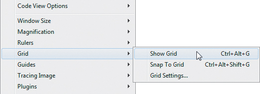
You can get to all the grid options from the menu.
or
Press Ctrl-Alt-G (Cmd-Opt-G).
Your document displays the grid if it wasn’t already displayed  , and vice versa.
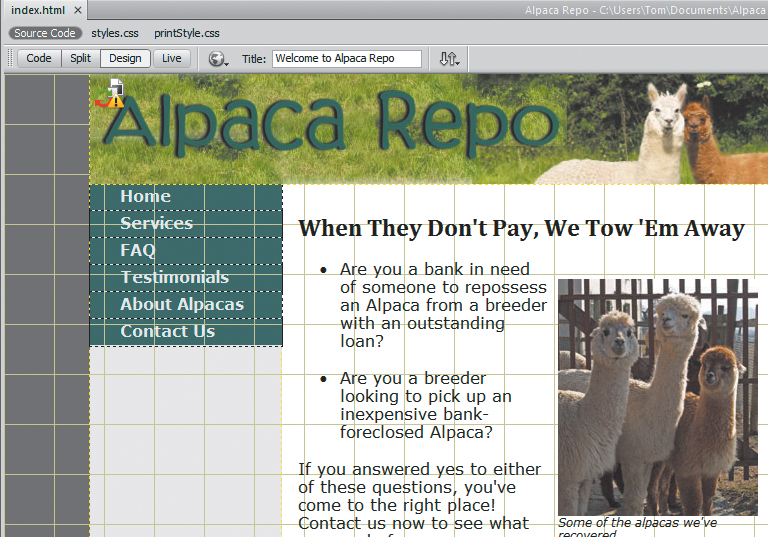
Here’s the page with the grid visible.
To change the grid settings
1. Choose View > Grid > Grid Settings  . The Grid Settings dialog appears
  .
.
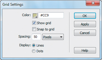
If you don’t like the grid defaults, you can change the settings.
2. From this dialog, you can change the color, the spacing, and whether the grid displays as lines or dots. You can also use this as a way to set the Show Grid and Snap To Grid options at the same time. If you want to check how a setting looks, click Apply. When you like your results, click OK, and if the grid is set to show, your document appears with your chosen grid style. If the grid is not set to show, the settings will still be changed and will display their new values the next time you show the grid.
To make elements snap to the grid
1. Choose View > Grid > Snap To Grid .
or
Select the “Snap to grid” check box in the Grid Settings dialog  .
.
or
Press Ctrl-Alt-Shift-G (Cmd-Opt-Shift-G).
2. Move an absolutely positioned page element. It snaps to line up with the grid if you move the element within a few pixels of a grid line.
Using Rulers and Guides
Rulers and guides are also tools commonly found in other design applications. Dreamweaver has both horizontal and vertical rulers, which can use pixels, inches, or centimeters as units.
Guides can do almost everything grids can and a whole lot more. For instance, guides can be locked into place, guides can be set to percentages of the page, and not only can elements snap to guides, but guides can be set to snap to elements.
To turn rulers on or off
To toggle the display of rulers, choose View > Rulers > Show . You can also choose the ruler units in this menu.
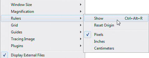
You can turn rulers on and off in the View menu.
or
Press Ctrl-Alt-R (Cmd-Opt-R).
To turn guides on or off
To toggle the display of guides, choose View > Guides > Show Guides .
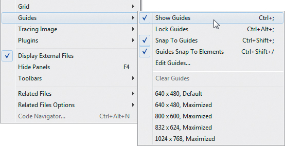
As you could with the grid options, you can get to many guide options in the View menu.
or
Press Ctrl-; (Cmd-;).
To add a guide to your page
1. Click in either the horizontal or vertical ruler, and then drag into the document. The guide appears along with a tip that displays the number of pixels that the guide is currently away from the edge of the document .

By default, guides are measured in pixels.
2. When the guide is where you want it, release the mouse button. The line remains, but the tip goes away.
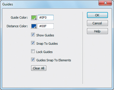
 Use the Guides dialog to change any of its settings.
2. From here, you can set:
 The guide and distance colors
Whether guides should show
Whether elements should snap to guides, guides snap to elements, both, or neither
Whether guides are locked
You can also use it to clear all the current guides by clicking the Clear All button.
3. When your changes are complete, click OK.
Tip
To move a guide, move the mouse over the guide. When the cursor changes, click the guide and drag it to its new location.
Tip
To remove a guide from your page, move the guide off the document. Mac users will see a little “puff of smoke” animation—sorry, Windows users! You can also remove all the guides at once (without the animated effect) by choosing View > Guides > Clear Guides or by clicking Clear All in the Guides dialog  .
.
Tip
To inspect the current position of a guide, hover the cursor over the guide, and a tip showing the position appears.
Tip
To position a guide based on the percentage distance of the document rather than pixels, hold down the Shift key while moving the guide  . The tip displays the current location in both pixels and percentage when you’re moving it and also when you check the guide’s position later.
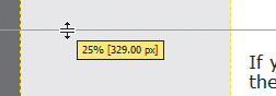
If you want a percentage instead of pixels, hold down the Shift key.
Tip
To see how far a guide is from the sides of your document, hold down the Ctrl (Cmd) key. Lines appear showing the distance in pixels (and percentage, if set in the previous tip) to the edges of the document  . If you have multiple guides on your page, the distance shown will be from guide to guide or from guide to edge.
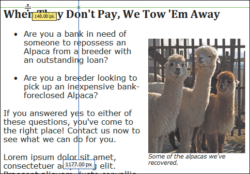
Holding down the Ctrl (Cmd) key gives you the distance between the document edge and the guide.
Tip
Guides can be locked on your page so that they can’t be moved. To do this, choose View > Guides > Lock Guides  or use the Guides dialog . It’s a toggle, so just do it again to unlock your guides.
Tip
Rulers have to be visible for you to add guides, but you can view, move, and delete guides even when the rulers are hidden.
Tip
Guides can be used to simulate dimensions of standard browsers. Choose View > Guides and pick one of the standard sizes from the bottom of the menu . This creates both vertical and horizontal guides on your page. Be careful, though, because you can still move them accidentally, and then they aren’t much use for providing dimension hints. This is the one exception to the previous tip: you can create guides with this method even when the ruler is hidden.
Tip
As with the grid, you can choose to snap elements to your guides—but you can also choose to snap guides to your elements. Choose View > Guides > Snap To Guides, or View > Guides > Guides Snap To Elements, or even both . Or, you can set them in the Guides dialog .
Tip
If you double-click a guide, the Move Guide dialog appears  . Use this dialog to set the guide to a precise position in pixels, inches, centimeters, or percentages.

Double-click a guide to get to the Move Guide dialog.
Zooming In on Your Page
Yes, it’s another feature borrowed from standard design applications, just like the grid and guides. The Magnification feature lets you design your pages more precisely. And as with the grid and guides, you’ll need to be in Design view to use it.
To zoom in on your page
 Choose View > Magnification, then choose the magnification level you want from the menu .
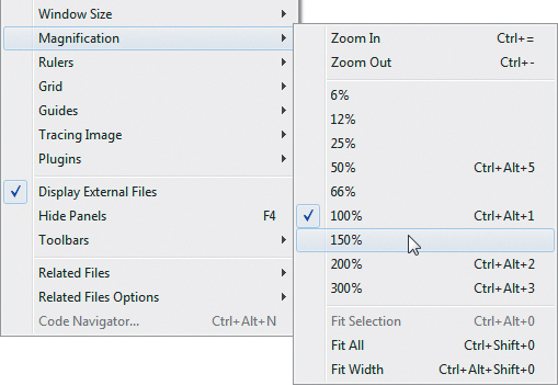
You use the Magnification settings in the View menu to zoom in or out of your page.
Press Ctrl- = (Cmd- =) until you’ve reached the magnification level you want.
Select an element on the page, and then choose View > Magnification > Fit Selection .
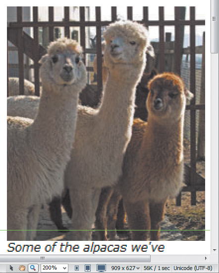
You can zoom in on a particular part of the screen.
Press Ctrl- – (minus key) (Cmd- – [minus key]) until you’ve reached the magnification level you want.
Choose View > Magnification > Fit All or View > Magnification > Fit Width.
Choose Fit All to get an overview of your page.
Setting Page Dimensions
It’s handy to be able to easily set guides to show the dimensions of common browsers, but it’s not quite the same as seeing how your design actually appears in a window of that size. That’s where setting page dimensions comes in.
To resize the window to a preset size
Click the Window Size pop-up menu in the Status bar, and select one of the listed sizes . Your document window resets to that size. If the new size fits within the document window, you see a view of the selected size .
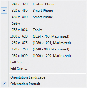
Dreamweaver comes with preset window sizes for the most commonly used monitors.
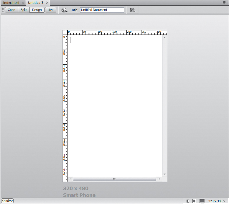
If the window size you set fits in the document window, Dreamweaver shows it to you as a view.
To edit the preset window sizes
1. Click the Window Size pop-up menu in the Status bar, and select Edit Sizes. The Window Sizes Preferences pane appears .
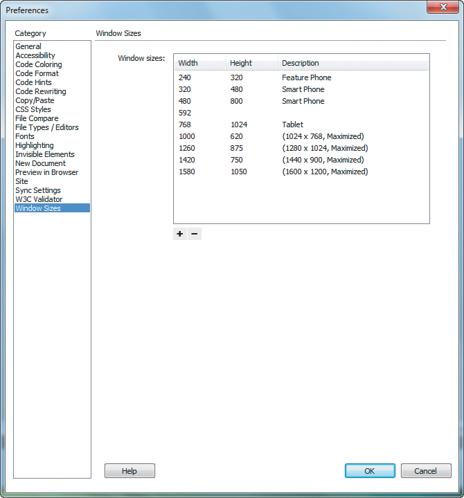
You can view or edit the window sizes in the Window Sizes category of Dreamweaver’s Preferences panel.
or
Open Dreamweaver’s Preferences panel and select the Window Sizes category.
2. Click in any of the fields and write over the current value to replace it. To add a value, click in the first unfilled line . To delete a value, clear the entire line by deleting the contents of each field.
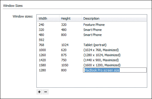
New sizes can be added just by clicking in the first unused line and typing the appropriate dimensions.
3. Click OK to accept. The new size now appears in the Window Size pop-up menu .
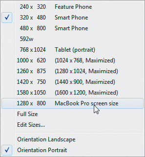
And here’s the new window size in the menu.
Tip
You can resize the window to a fixed width (leaving the height as is) by entering only a width value. To make the window resize to a fixed height, enter only the height.
Tip
Although it looks like you can sort the values in the Window Sizes Preferences pane, you actually can’t.
Tip
Sadly, if you enter a new window size, it doesn’t get added as a new possible value for creating guides—it’s only for resizing.
Using Structural Tags
Dreamweaver CC adds support for HTML5 structural tags. One of the goals of HTML5 is markup that provides better ways to define the structure of a page, using tags that make clear the meaning of a part of the page. These so-called structural tags can be used as containers for the main parts of the page, instead of using divs for each section of the page. Here’s an example. You could define a header this way:
<div class="header">...</div>
Or you could use this new HTML5 structural tag, which is the exact equivalent:
<header>...</header>
If you were to use the structural tags Dreamweaver CC offers to build a page structure, the code could look like this:
<body>
<header>Header Tag
Content</header>
<nav>Nav Tag Content</nav>
<section class="sidebar">
Section Tag Content</section>
<article>Article Tag
Content</article>
<aside>Aside Tag Content</aside>
<footer>Footer Tag
Content</footer>
</body>
You can see that markup using these structural tags is much easier to read and understand than if each of the blocks used div tags. After you use CSS to position the sections, the page would have a block structure like the diagram in .
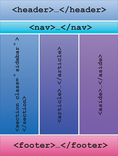
HTML5 structural tags make it easier to understand the meaning of the different blocks on the page.
To use structural tags
1. In Design view, click to place the insertion point where you want the structural tag to appear.
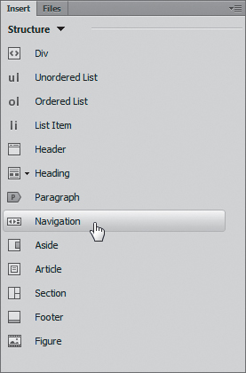
2. From the Structure category of the Insert panel , click the structural tag you want. For the purposes of this section, we’re only discussing the Div, Header, Navigation, Aside, Article, Section, and Footer tags.
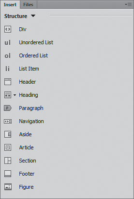
Choose the structural tag you want from the Structure section of the Insert panel.
The Insert [tag name] dialog appears .
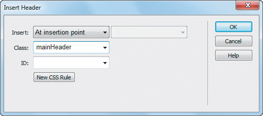
In the Insert dialog, you can specify a class or ID for your new tag.
3. In the Insert dialog, from the Insert pop-up menu, choose At insertion point, After start of tag, or Before end of tag. If you choose the latter two options, an appropriate tag (usually <body>) will appear next to the pop-up menu.
4. (Optional) Enter or choose from the pop-up menus the CSS class or ID for the tag. If you want to create a new CSS rule for the structural tag, click the New CSS Rule button and work through the process of defining the rule.
5. Click OK.
In Design view, a container for the structural tag appears, with placeholder text that you should replace with your own content .
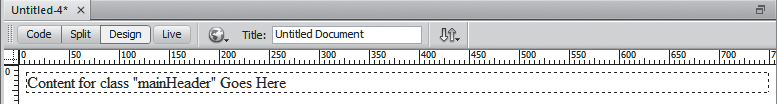
The structural tag appears in Dreamweaver’s Design view with a dashed border.
Tip
The dashed outline around the structural tag appears only in Dreamweaver’s Design view; it doesn’t appear on your webpages.
Adding Iframes
An iframe is an inline frame, or an inline subwindow. In much the same way that you can insert an image into a page of text, you can insert an iframe. The iframe element inserts an entire view of an HTML page into another page. This is handy when you want some small bit of content to come from somewhere else. For instance, those ubiquitous Google AdSense ads you see on many sites are done with iframes.
Dreamweaver CC is only a little helpful in inserting iframes. It inserts the iframe markup, then dumps you into Split view. From there, you need to enter the rest of the information for the iframe in the Code pane. You are required to add the src attribute, which contains the URL for the content of the iframe. You should also add the height and width attributes to specify the size of the iframe.
To add an iframe
1. In Design view, click to place the insertion point where you want the iframe to appear.
2. Choose Insert > Iframe.
Dreamweaver inserts the iframe tag and opens Split view . Unfortunately, it places the insertion point between the opening and closing tags, and you need to specify attributes for the tag.
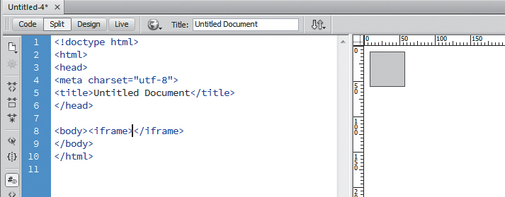
After you insert an iframe, Dreamweaver changes to Split view.
3. Click to place the insertion point inside the <iframe> tag, just before the closing angle bracket.
4. Type a space, then src. The code hint for the src attribute appears . Press the Enter (Return) key, and Dreamweaver adds ="" to the tag, and positions the cursor between the quote signs.
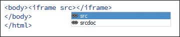
Code hinting helps you enter the iframe’s attributes.
5. Type in the URL for the source of the iframe. You must include the http:// portion of the URL.
6. (Optional, but recommended) Click to the right of the closing quote of the src attribute, then enter the width and height attributes.
After you enter the width and height, if you click the Refresh button in the Property inspector, you’ll see the gray placeholder box change size in the Design View pane .

The iframe appears as a gray placeholder box until you switch to Live view.
7. To preview your iframe, click the Live View button in the Document toolbar.
Adding Media Queries
It’s not enough to simply design your pages for the desktop; now any designer worth his or her salt needs to design with the mobile web in mind. Using media queries, a part of the CSS3 specification, you can automatically adjust the CSS properties of your page elements to rearrange the layout of your pages for given screen sizes. The reason to rearrange the layout is simple: a page layout that looks great and is perfectly functional on a desktop browser may initially look fine on a smaller screen (such as an iPad, iPhone, or Android device), but chances are the browser on the mobile device will automatically zoom the page out to fit as much of it as possible on the device’s screen. Making the user pinch, scroll, and zoom the screen just to see your content isn’t a good user experience. It’s better to anticipate and adapt the page for the smaller screen size. You’re not changing the content of the page for different screen sizes; instead you’re changing the presentation of that content for a better user experience.
Dreamweaver’s CSS Designer panel and the Define Media Query dialog allow you to add media queries to your CSS style sheet, and allow you to override particular CSS selectors depending on conditions such as the width or orientation of the user’s screen.
It’s important to note that although you can use Dreamweaver to create selectors to optimize page elements for a given screen size, the program can’t create the selectors for you automatically. You’ll need to make your layout decisions, add media queries, and adjust the selectors yourself. When you’re done, you’ll have a responsive layout that will work on a screen of any size, from desktop to tablet to mobile device.
In the example here, we will start with a layout that has no media queries, and then we will add two media queries, one for a tablet screen size and one for a mobile phone screen size. The media queries will change the appearance of the layout for each screen size. This task will be a bit unusual because we will specify particular CSS selectors and property values, rather than show a generic approach. Of course, you’ll need to adapt this approach as needed for your own pages.
To create media queries and adjust selectors
1. Open (or create) the HTML document to which you want to add media queries.
The document should already have CSS styles applied to it, as in our example here. While you are developing the media queries, it’s easier to have the style sheet internal to the document, but you can work with an external style sheet.
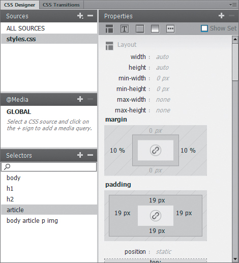
2. The CSS Designer panel is much easier to work with in two-column mode. Either drag the left edge of the CSS Designer panel to the left, or use the Workspace Switcher to choose Expanded mode .
It’s easier to work with the CSS Designer panel in two-column mode.
3. In the Sources pane of the CSS Designer panel, click to select the style sheet to which you wish to add media queries.
4. In the @Media pane of the CSS Designer panel, click the + button.
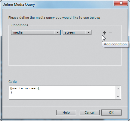
The Define Media Query dialog appears . In this dialog, there is a Conditions section and a Code section. As you define conditions, you will see them added to the code below. When you move the cursor next to a condition, the + and – buttons appear next to it, allowing you to add or delete conditions.
When you move your cursor next to a condition, the Add Condition and Remove Condition buttons appear.
5. Click the + button next to the initial condition (showing media and screen) to add a condition. We want to create a media query for a maximum screen size of 768 pixels (the width of a tablet in portrait mode), so from the resulting condition line, choose max-width and enter 768 pixels . You can see the code describing the media query at the bottom of the dialog; it can be read out loud as “If the media is a screen and its maximum width is 768 pixels, then implement the specified CSS.”
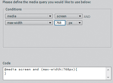
As you build your media query, you can see how its code will look at the bottom of the dialog.
6. Click OK to dismiss the Define Media Query dialog. The new media query appears in the @Media pane . If it is not already selected, do so by clicking it.
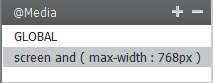
After you create a media query, it appears in the @Media pane of the CSS Designer panel.
7. Now we need to choose and modify a selector for the media query. In this example, we will be changing the article selector, so in the Selectors pane of the CSS Designer panel, click the + button.
8. A new selector appears. Begin typing the name of the selector you want to change, and when it appears in the auto-complete list, press Enter (Return) to choose the selector.
9. Change the properties of the selector in the second column of the CSS Designer panel. In this case, because we want the article selector to fit on a smaller screen size, we changed its left and right margins to 5% .
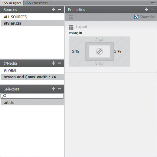
With a source and a media query selected, choose and modify one or more selectors.
These margin changes will override the regular values for article when the media query takes effect; that is, when the maximum width of the screen is 768 pixels.
10. (Optional) Repeat steps 7–9 to add more selectors to the media query, if needed.
11. Now we will add a second media query, this time for mobile phones. Repeat steps 3–9. In the media query, change the max-width to 480, and we changed the margin, text color, and background color of the article selector.
12. Switch to Live view and use the Screen Size buttons in the Document window to view your handiwork , or preview in a browser.
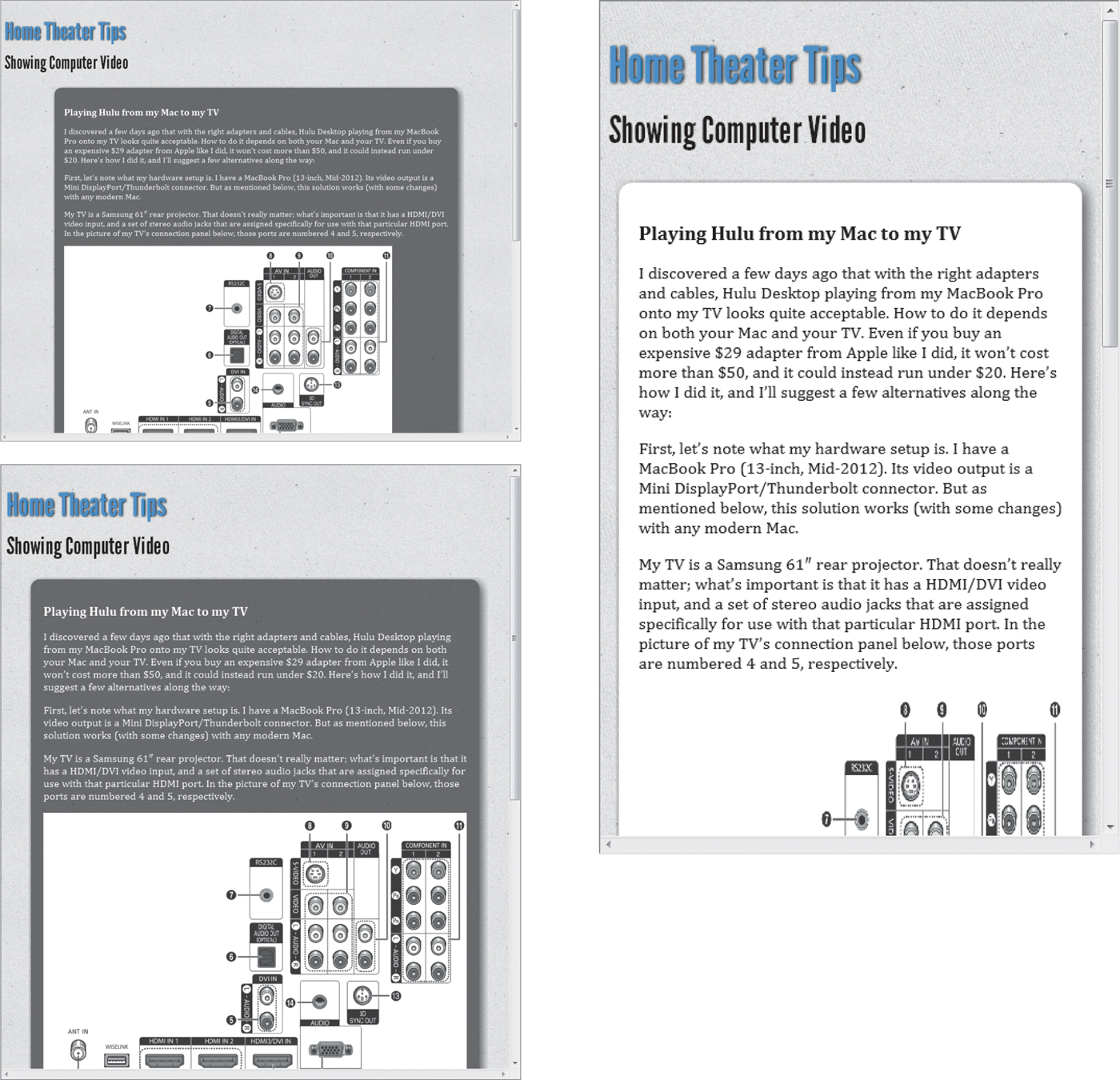
In Dreamweaver’s Live view, we can see the page with no media queries applied (upper left), with the tablet media query applied (lower left), and with the mobile phone media query applied (right).
Tip
You can also click the different media queries in the @Media pane to see the page size change.
Tip
To see how the media queries take effect in a browser, preview the page in a browser and reduce the width of the browser’s window.
Using Fluid Grid Layouts
Years ago, it was common for web designers to look forward to the day when everyone would have big displays and could see their works as intended. In recent years, that goal has become obsolete—sure, you have a big screen on your desk, but you’ve also got a small screen in your pocket and a medium-sized screen in your bag. You want your site to look its best on all of them, but you don’t want to have to create multiple sites. And that’s why Dreamweaver has fluid grid layouts, which have been improved in Dreamweaver CC.
Fluid grid layouts let you design your site based on grids with rows and columns: using one layout for smartphones, another for tablets, and a third for computer monitors—and which layout is displayed is based on the width of the browser window. As our example, we’ll use the good old HomeCook site you’ve seen before—but now it will work on a variety of screen sizes . For our purposes here, we’re using Dreamweaver’s terminology of Desktop for computer monitors, but of course that also covers laptop screens.
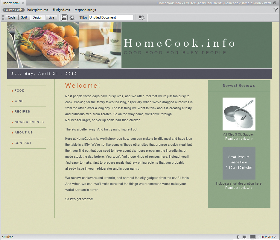
We like the way this site looks—but not on mobile devices.
One last note about terminology: In a fluid grid layout, you can add any of the block elements in the Structure category of the Insert panel to the layout. You will usually be placing a div, or one of the HTML5 structural elements, such as header, nav, or section. But you can also place block elements like lists, headings, or even paragraphs. In the steps below, we’re using the generic term “block” to describe the elements in a fluid grid layout.
The New Document dialog appears.
2. Click the Fluid Grid Layout category . This is where we create our grids for the three screen sizes: Mobile, Tablet, and Desktop.
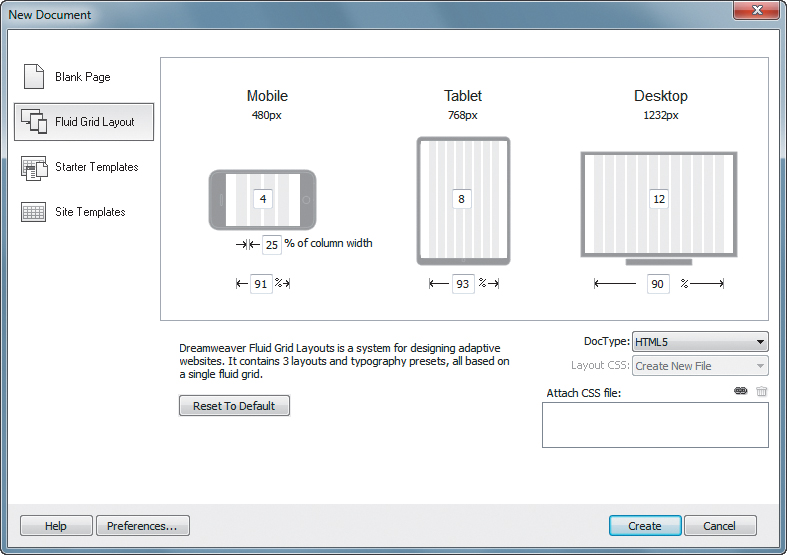
The New Document dialog is where you set up the grid for each of the three screen sizes.
3. In this example (which uses Dreamweaver’s defaults), for mobile devices (such as smartphones) we’ve entered 4 columns, and for tablets, we’ll say 8. The Mobile layout uses 91% of the screen, and the Tablet layout uses 93%, leaving room for margins on either side of the layout. For desktops, we can use 12 columns, but we can afford larger margins, so we’ve entered 90% as the page width in . When done, click Create. The Save Style Sheet File As dialog appears.
4. Dreamweaver requires you to start off by saving a style sheet, and we’ve called ours fluidgrid.css. Enter the name for your style sheet, and then click Save.
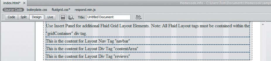
Your screen will look like after you create your style sheet; this example shows the smartphone (four-column) layout in Split view.
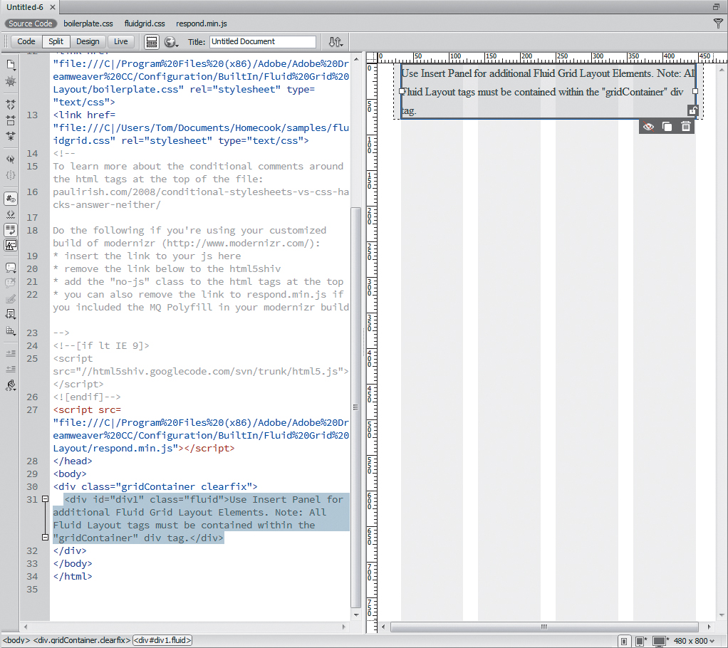
Dreamweaver starts off on the Mobile layout in Split view; the theory being that you should design for the smallest size first, and then add the extras on to the larger versions.
To build your fluid grid layout, you’ll lay out the divs separately on each of the three screen sizes. Dreamweaver automatically starts you on the Mobile size layout.
5. Save the page by choosing File > Save, and Dreamweaver lets you know that you’ll also need a couple of dependent files . Click the OK button to copy them (they’re required). That puts us back to , and now it’s time to start building our layout grid.
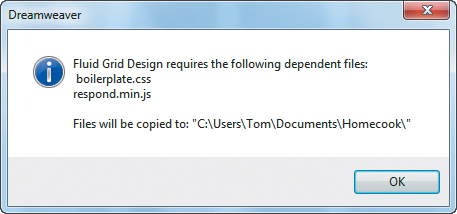
Here are the two files that Dreamweaver requires you to have: one is a style sheet, and the other is a collection of JavaScripts.
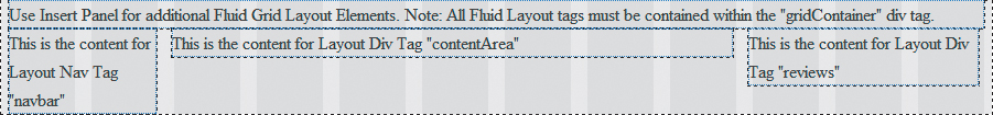
If you can’t read the fine print in the figure, it says, “Use Insert Panel for additional Fluid Grid Layout Elements. Note: All Fluid Layout tags must be contained within the gridContainer div tag.” The italicized part is what you need to keep in mind; normally, you can insert divs anywhere you want, but not when you’re working with fluid grid layouts.
6. To add new elements to the page, follow the onscreen directions: go to the Structure category of the Insert panel, and choose one of the block elements . For example, if we click Navigation, the Insert Navigation dialog appears .
Add a structural block element from the Insert panel.
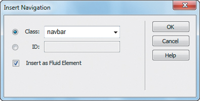
In the Insert dialog, you need to leave the Insert as Fluid Element check box selected.
Because we’re in a fluid grid layout, the Insert as Fluid Element check box appears in the dialog. It’s selected by default, and you should leave it that way.
7. Enter the name of your new element; we’ve called ours navbar. Once we add that block and a couple of others we need for the layout we’ve designed (in this case, contentArea and reviews), the page now looks like .
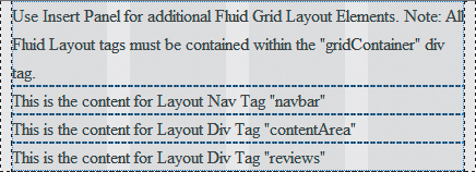
Here are the four blocks: the three just created plus the one that was automatically generated.
8. Now that we’ve created the blocks, we’re ready to do some layout work. Select the nav tag  , and then move the right handle to make the block thinner. One column is enough for the navbar on smartphones, and the result is shown in
  .
.
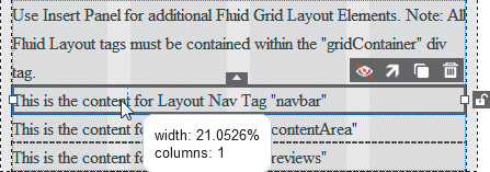
Drag the right handle to resize the block. In this figure, we’re in the middle of the drag, so the block hasn’t visually updated its size yet, though you see the onscreen tip showing the block’s current size.
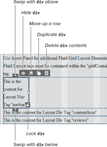
Here’s the block after it’s been resized. Note the block manipulation controls.
 also shows you the new controls in fluid grid layouts in Dreamweaver CC. You can now swap the selected blocks with blocks above or below it; lock the block in place; hide the block; duplicate it; or delete its contents.
9. The content area can fit into three columns, so resize the div to be three columns.
Since there is room next to the nav, the contentArea div should automatically move up  . If it does not, you can click its “Move up a row” arrow.
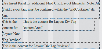
Here are our navigation and content blocks, just the way we want them to appear on smartphones.
10. Switch between the different layouts by choosing between the Window Size icons at the bottom of the document window  . You’ll notice (possibly to your surprise) that when you changed the smartphone layout, the others didn’t change
  . That’s because although each layout shares the same files, their designs are independent.
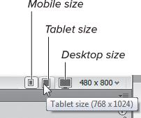
Click these icons to switch between the different layouts.
All the divs we added are full width again when we switch to Tablet layout.
11. For the eight-column tablet view, give the nav and reviews blocks two columns each, and the main content area four columns  .
.

We can choose to lay out our divs any way we wish; here, we’ve chosen a simple 2-4-2 column design.
12. The 12-column desktop view gets two columns for the navigation, three for the reviews, and seven for the main content  .
.
On the desktop we have all the room we need, so we’re going for an asymmetrical 2-7-3 column layout.
13. Next up is the easy part: copying and pasting the content from our old Home Cook page into our new fluid grid layout. Once that’s accomplished (plus a little bit of CSS tweaking), you can see the results in  (Mobile size),
  (Tablet size), and
  (Desktop size).
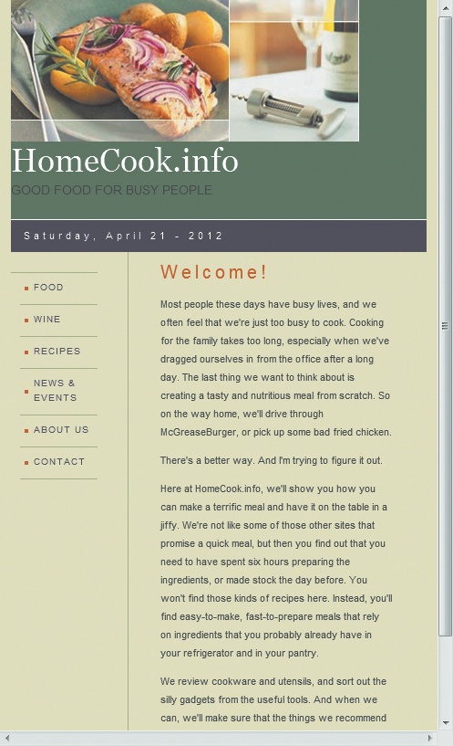
The Mobile layout has a header (with site name and tagline below the graphic) above the navigation and content areas.
The Tablet layout has the header (with site name and tagline in a condensed font) above the navigation, content, and reviews areas.

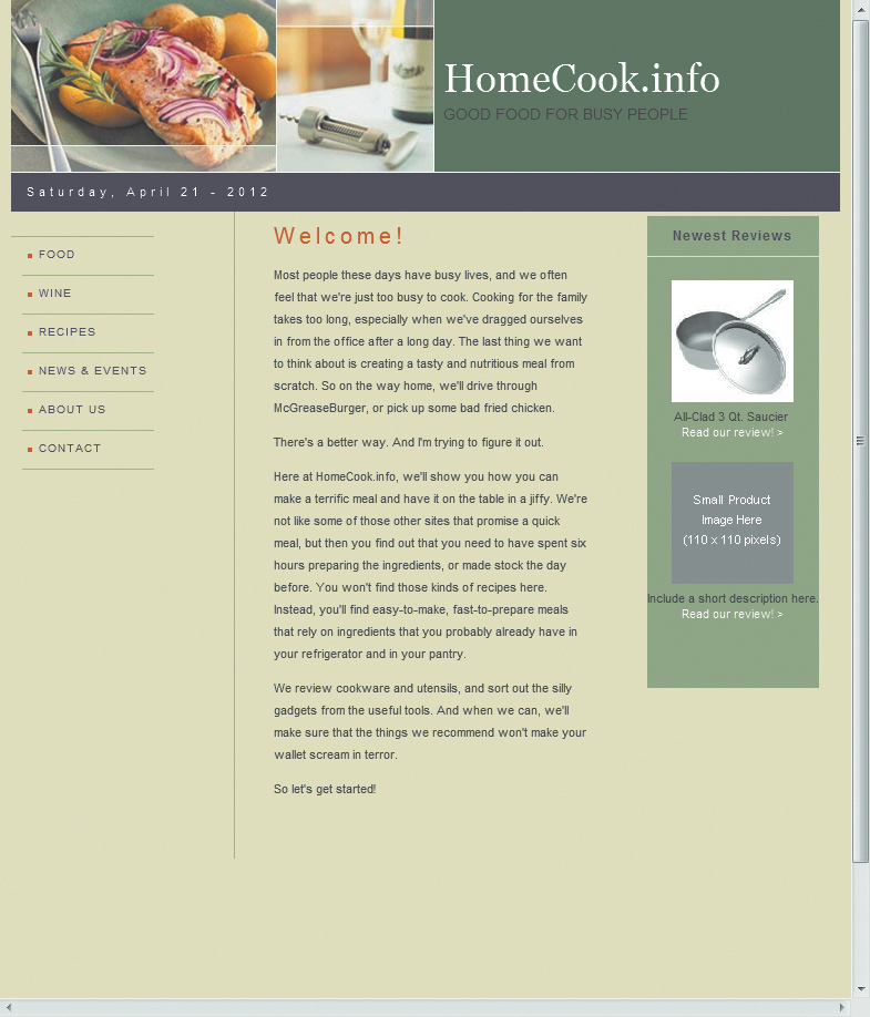
And finally, the Desktop layout has the header (with expanded font) above the navigation, content, and reviews areas—and there’s still room for left and right margins.
Tip
In order to make the most of the limited space on a smartphone, set the reviews column to have a style of display:none. It’s a handy way to hide less-important content when there just isn’t room.
Tip
Dreamweaver started us off with one default grid div . Here, we’ve repurposed it as the header for our pages.
jQuery Mobile (CDN) uses .css and .js files directly from jQuery’s content delivery network (CDN). That’s another way of saying that the jQuery files are hosted on servers spread across the Internet and are often going to be served to your user more quickly than they would be if they were hosted on your own server.
jQuery Mobile (Local) uses the same files as the CDN choice, but now they’re hosted on your server.
jQuery Mobile with Theme (Local) again uses the same files, but with the addition of your own jQuery theme file, so you can specify the look of the resulting layout.