Packing Space and Display Space
The packer distinguishes between packing space and display space when it arranges the widgets. The display space is the area requested by a widget for the purposes of painting itself. The packing space is the area the packer allows for the placement of the widget. Because of geometry constraints, a widget may be allocated more (or less) packing space than it needs to display itself. The extra space, if any, is along the side of the cavity against which the widget was packed.
The -fill Option
The -fill packing option causes a widget to fill up the allocated packing space with its display. A widget can fill in the X or Y direction, or both. The default is not to fill, which is why the black background of the main window has shown through in the examples so far:
Example 23-6 Filling the display into extra packing space.
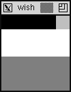
This is just like Example 23-5, except that -fill x has been specified for all the frames. The .two frame fills, but the .three frame does not. This is because the fill does not expand into the packing cavity. In fact, after this example, the packing cavity is the part that shows through in black. Another way to look at this is that the .two frame was allocated the whole bottom side of the packing cavity, so its fill can expand the frame to occupy that space. The .three frame has only been allocated the right side, so a fill in the X direction will not have any effect.
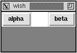
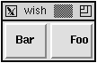
Another use of fill is for a menu bar that has buttons at either end and some empty space between them. The frame that holds the buttons is packed toward the top. The buttons are packed into the left and right sides of the menu bar frame. Without fill, the menu bar shrinks to be just large enough to hold all the buttons, and the buttons are squeezed together. When fill is enabled in the X direction, the menu bar fills out the top edge of the display:
Example 23-7 Using horizontal fill in a menu bar.
Internal Padding with -ipadx and -ipady
Another way to get more fill space is with the -ipadx and -ipady packing options that request more display space in the X and Y directions, respectively. Due to other constraints the request might not be offered, but in general you can use this to give a widget more display space. The next example is just like the previous one except that some internal padding has been added:
Example 23-8 The effects of internal padding (-ipady).
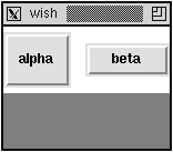
The alpha button is taller and the beta button is wider because of the internal padding. The frame has internal padding, which reduces the space available for the packing cavity, so the .menubar frame shows through above and below the buttons.
Some widgets have attributes that result in more display space. For example, it would be hard to distinguish a frame with width 50 and no internal padding from a frame with width 40 and a -ipadx 5 packing option. The packer would give the frame 5 more pixels of display space on either side for a total width of 50.
Buttons have their own -padx and -pady options that give them more display space, too. This padding provided by the button is used to keep its text away from the edge of the button. The following example illustrates the difference. The -anchor e button option positions the text as far to the right as possible. Example 37-5 on page 531 provides another comparison of these options:
Example 23-9 Button padding vs. packer padding.
External Padding with -padx and -pady
The packer can provide external padding that allocates packing space that cannot be filled. The space is outside of the border that widgets use to implement their 3D reliefs. Example 37-2 on page 528 shows the different reliefs. The look of a default button is achieved with an extra frame and some padding:
Example 23-10 The look of a default button.
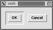
Even if the .ok.b button were packed with -fill both, it would look the same. The external padding provided by the packer will not be filled by the child widgets.
Example 23-10 handcrafts the look of a default button. Tk 8.0 has a -default attribute for buttons that gives them the right appearance for the default button on the current platform. It looks somewhat like this on UNIX, but the appearance is different on Macintosh and Windows.