
Chapters 7 and 8 discuss models for reliability estimations. In this chapter we discuss models that can be used for quality management. We also give examples of in-process quality reports that support the models and discuss a method of in-process defect type analysis—the orthogonal defect classification.
It is important to assess the quality of a software product, project the number of defects, or estimate the mean time to next failure when development work is complete. It is more important to monitor and manage the quality of the software when it is under development. Such a task is the purpose of the software quality management models and in-process metrics. Although some models can be used for both reliability estimations and quality management, as we will see in later sections, how the models are used for quality management is different from that for reliability estimations. On the one hand, quality management models must provide early signs of warning or of improvement so that timely actions can be planned and implemented. On the other hand, they can be less precise and less mathematical than predictive models.
For a development organization, to be helpful the quality management model(s) must cover the early development phases. Models based on data collected at the end of the development process allow little time for action, if needed. The reliability growth models, which are based on system-test data when development work is virtually complete, therefore, may not be as useful for in-process quality management as for reliability assessment. Nonetheless, the reliability growth models are useful for quality management in terms of tracking status and determining when to end system testing for a specific predetermined quality goal.
Unlike the reliability models, which are numerous and include constantly emerging new ones, there are few models for in-process quality management in the literature. The following sections describe models that we have developed or have used.
Perhaps the most important principle in software engineering is “do it right the first time.” This principle speaks to the importance of managing quality throughout the development process. Our interpretation of the principle, in the context of software quality management, is threefold:
The best scenario is to prevent errors from being injected into the development process.
When errors are introduced, improve the front end of the development process to remove as many of them as early as possible. Specifically, in the context of the waterfall development process, rigorous design reviews and code inspections are needed. In the Cleanroom methodology, function verification by the team is used.
If the project is beyond the design and code phases, unit tests and any additional tests by the developers serve as gatekeepers for defects to escape the front-end process before the code is integrated into the configuration management system (the system library). In other words, the phase of unit test or pre-integration test (the development phase prior to system integration) is the last chance to do it right the “first time.”
The Rayleigh model is a good overall model for quality management. It articulates the points on defect prevention and early defect removal related to the preceding items. Based on the model, if the error injection rate is reduced, the entire area under the Rayleigh curve becomes smaller, leading to a smaller projected field defect rate. Also, more defect removal at the front end of the development process will lead to a lower defect rate at later testing phases and during maintenance. Both scenarios aim to lower the defects in the latter testing phases, which in turn lead to fewer defects in the field. The relationship between formal machine-testing defects and field defects, as described by the model, is congruent with the famous counterintuitive principle in software testing by Myers (1979), which basically states that the more defects found during formal testing, the more that remained to be found later. The reason is that at the late stage of formal testing, error injection of the development process (mainly during design and code implementation) is basically determined (except for bad fixes during testing). High testing defect rates indicate that the error injection is high; if no extra effort is exerted, more defects will escape to the field.
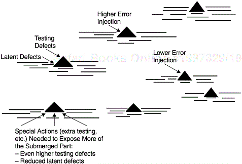
If we use the iceberg analogy to describe the relationship between testing and field defect rates, the tip of the iceberg is the testing defect rate and the submerged part is the field defect rate. The size of the iceberg is equivalent to the amount of error injection. By the time formal testing starts, the iceberg is already formed and its size determined. The larger its tip, the larger the entire iceberg. To reduce the submerged part, extra effort must be applied to expose more of the iceberg above the water. Figure 9.1 shows a schematic representation of the iceberg analogy.
A Rayleigh model derived from a previous release or from historical data can be used to track the pattern of defect removal of the project under development. If the current pattern is more front loaded than the model would predict, it is a positive sign, and vice versa. If the tracking is via calendar time such as month or week (versus by development phase), when enough data points are available, early estimation of model parameters can be performed. Quality projections based on early data would not be reliable compared to the final estimate at the end of the development cycle. Nonetheless, for in-process quality management, the data points can indicate the direction of the quality in the current release so that timely actions can be taken.
Perhaps more important than for quality projections, the Rayleigh framework can serve as the basis for quality improvement strategy—especially the two principles associated with defect prevention and early defect removal. At IBM Rochester the two principles are in fact the major directions for our improvement strategy in development quality. For each direction, actions are formulated and implemented. For instance, to facilitate early defect removal, actions implemented include focus on the design review/code inspection (DR/CI) process; deployment of moderator training (for review and inspection meeting); use of an inspection checklist; use of in-process escape measurements to track the effectiveness of reviews and inspections; use of mini builds to flush out defects by developers before the system library build takes place; and many others. Plans and actions to reduce error injection include the laboratory-wide implementation of the defect prevention process; the use of CASE tools for development; focus on communications among teams to prevent interface defects; and others. The bidirectional quality improvement strategy is illustrated in Figure 9.2 by the Rayleigh model.
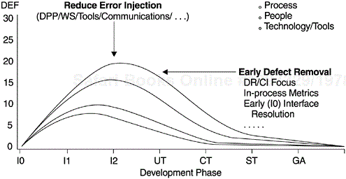
In summary, the goal is to shift the peak of the Rayleigh curve to the left while lowering it as much as possible. The ultimate target of IBM Rochester's strategy is to achieve the defect injection/removal pattern represented by the lowest curve, one with an error injection rate similar to that of IBM Houston's space shuttle software projects. In the figure, the Y-axis represents the defect rate. The development phases represented by the X-axis are high-level design review (I0), low-level design review (I1), code inspection (I2), unit test (UT), component test (CT), system test (ST), and product general availability (GA, or field quality, Fd).
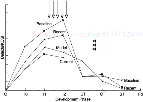
This type of strategy can be implemented whether the defect removal pattern of an organization follows a Rayleigh curve or not. If not, the discrete phase-based defect model can be used. The key is that the phase-based defect removal targets are set to reflect an earlier defect removal pattern compared to the baseline. Then action plans should be implemented to achieve the targets. Figure 9.3 shows the defect removal patterns of several releases of a systems software developed at IBM Rochester. As can be seen from the curves, the shifting of the defect removal patterns does reflect improvement in the two directions of (1) earlier peaking of the defect curves, and (2) lower overall defect rates. In the figure, the Y-axis is the number of defects normalized per thousand new and changed source instructions (KCSI). The development phases on the X-axis are the same as those in Figure 9.2.
One major problem with the defect removal model is related to the assumption of the error injection rate. When setting defect removal targets for a project, error injection rates can be estimated based on previous experience. However, there is no way to determine how accurate such estimates are when applied to the current release. When tracking the defect removal rates against the model, lower actual defect removal could be the result of lower error injection or poor reviews and inspections. In contrast, higher actual defect removal could be the result of higher error injection or better reviews and inspections. From the in-process defect removal data of the project under development, how do we know which scenario (better defect removal, higher error injection, lower error injection, or poorer defect removal) fits the project? To solve this problem, additional indicators must be incorporated into the context of the model for better interpretation of the data.
One such additional indicator is the quality of the process execution. For instance, at IBM Rochester the metric of inspection effort (operationalized as the number of hours the team spent on design and code inspections normalized per thousand lines of source code inspected) is used as a proxy indicator for how rigorous the inspection process is executed. This metric, combined with the inspection defect rate, can provide useful interpretation of the defect model. Specifically, a 2 × 2 matrix such as that shown in Figure 9.4 can be used. The high—low comparisons are between actual data and the model, or between the current and previous releases of a product.Each of the four scenarios imparts valuable information.
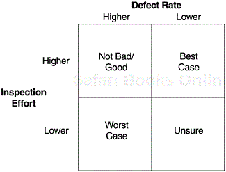
Best case scenario—high effort/low defect rate: The design/code was cleaner before inspections, and yet the team spent enough effort in DR/CI (design review/code inspection) that good quality was ensured.
Good/not bad scenario—high effort/high defect rate: Error injection may be high, but higher effort spent is a positive sign and that may be why more defects were removed. If effort is significantly higher than the model target, this may be a good scenario.
Unsure scenario—low effort/low defect rate: Not sure whether the design and code were better, therefore less time was needed for inspection or inspections were hastily done, so fewer defects were found. In this scenario, we need to rely on the team’s subjective assessment and other information for a better determination.
Worst case scenario—low effort/high defect rate: High error injection but inspections were not rigorous enough. Chances are more defects remained in the design or code at the exit of the inspection process.
The matrix is formed by combining the scenarios of an effort indicator and an outcome indicator. We call this approach to evaluating the quality of the project under development the effort/outcome model. The model can be applied to any phase of the development process with any pairs of meaningful indicators. In Chapter 10, we discuss the application of the model to testing data in details. We contend that the effort/ outcome model is a very important framework for in-process quality management.
Figures 9.5 and 9.6 show a real-life example of the high effort/high defect rate scenario from two software products. Compared to a predecessor product, the inspection effort of this product increased by more than 60%, and as a result the defect removal during the design and code inspection process was much higher than that of the predecessor product. As a result of the front-end effort, the test defect rate was significantly lower, and better field quality was observed. When development work was almost complete and lower test defect rates were observed, it was quite clear that the product would have better quality. However, during the front-end development it would have been difficult to interpret the defect removal pattern without the effort/defect matrix as part of the defect model. This example falls into the good/not bad scenario in Figure 9.4.
Among the major phases of any development process (i.e., requirements/analysis, design, code, test, and customer validation), code development is perhaps the most fundamental activity. Completion of coding and unit testing, and therefore the inte-gration of code into the system library (to be ready for formal testing) is perhaps the most concrete intermediate deliverable of a project. Code completion by no means implies that the project is near completion. The earlier the code is complete and integrated into the system library relative to the project completion date, the better chance it will be adequately tested. In most software development projects, code completion does not occur only once for the entire project. Different pieces of function are completed at different times, within a certain calendar-time range on the project schedule. There is a common practice of continual code integration into the system library and the starting of component tests (functional tests), usually until the start of system testing. The pattern of code integration over time, relative to the product delivery date, therefore, is a crucial variable for schedule and quality management.
Figure 9.7 shows the code integration pattern of a systems software relative to the product’s ship date. The vertical bars are the amount of code completed and integrated into the system library over time. Their values are expressed via the first Y-axis. The S curve is the cumulative percentage of code integrated over time, and is represented by the second Y-axis.
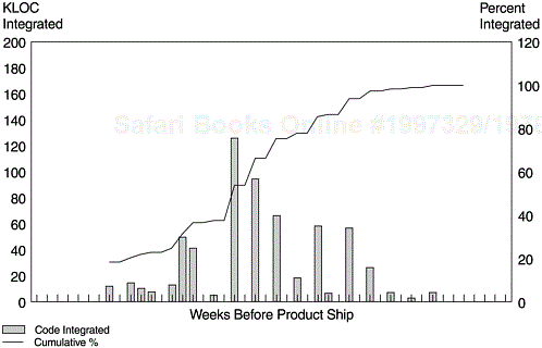
We call the code integration pattern a pattern, not a model. However, meaningful use of this pattern can make it function like a heuristic model. There are at least three meaningful ways to use it:
Establish a plan code integration curve as early in the development cycle as possible. Normally at the beginning of the project, team leaders are able to put down target dates for key activities of the line items they are responsible for, such as design complete, design review complete, code complete and integration, and testing start and completion. Use the plan curve to track the progress of code completion and integration.
As early as a plan curve is available, study its pattern and take early actions to improve the pattern. For example, the S curve with a concave pattern at the top, such as the example in Figure 9.7, is a normal and healthy pattern. If the S curve shows some steep step increases at the right side, then it is a back-end loaded integration pattern, which may pose risks to testing schedules, defect arrival pattern during testing, and even schedules and quality outcome of the project.
Perform project-to-project or release-to-release comparisons when baselines are available. Assess the feasibility of the current project based on the comparison results and take early actions.
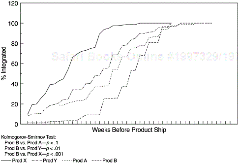
Figure 9.8 shows a project-to-project comparison of code integration patterns. Products X, Y, and A are completed projects with positive quality in the field. Product B is a new project in the beginning stage, with the code integration plan just established. Product B’s pattern is clearly back-end loaded with steep increases in the S curve up through the end of the code integration cycle. More important, it is significantly different from the other three projects, via the Kolmogorov-Smirnov test (Rohatgi, 1984). If the difference is not statistically significant, the plan can be recovered via effective quality improvement actions and sound project management practices. For examples, break big chunks of functions into smaller pieces and allow the pieces that get done earlier to integrate into the system library earlier, analyze the amount of new function and workload distribution across teams and balance the workload, or take actions on the front-end analysis and design work and attempt to move up the starting date of code integration. When the difference is statistically significant, it means that the feasibility of the project—on-time delivery with a field quality level similar to that of previous projects—is in question. In other words, the process capability of the development organization is being challenged. In such cases, the structural parameters of the project may need to be reevaluated. By “structural parameters,” we mean the delivery date, the schedule, the amount of functions to be developed and delivered, the quality goals, and so forth. The project team can use this metric to articulate the team’s evaluation to the executive project sponsor.
The code integration pattern metric is a simple and useful project management and quality management tool. Its objective fits perfectly with the overall framework of the Rayleigh model that the earlier defect removal, the better. We also recommend that the development team capture its experiences over time and derive its own “heuristic model.” The model may include heuristic values of parameters such as a lower limit (the best pattern), an upper limit (the most challenged pattern and yet the project was completed successfully), the largest step function in the code integration process that was handled successfully, the strategies that can transform a negative pattern to an acceptable one, and other meaningful parameters and criteria pertinent to the model’s objectives. This metric should be implemented by software projects of all kinds and sizes, and can be implemented easily with well-established tracking system, a simple Lotus 1-2-3 spreadsheet, or pencil and paper.
Although the Rayleigh model, which covers all phases of the development process, can be used as the overall defect model, we need more specific models for better tracking of development quality. For example, the testing phases may span several months. For the waterfall process we used in previous examples, formal testing phases include component test, component regression test, and system test. For in-process quality management, one must also ensure that the chronological pattern of testing defect removal is on track. To derive a testing defect model, once again the Rayleigh model or other parametric models can be used if such models adequately describe the testing defect arrival patterns.
If the existing parametric models do not fit the defect patterns, special models for assessing in-process quality have to be developed. Furthermore, in many software projects, there is a common practice that the existing reliability models may not be able to address: the practice of continual code integration. As discussed in the previous section, sequential chunks of code are integrated when ready and this integration occurs throughout the development cycle until the system testing starts. To address this situation, we developed a simple nonparametric PTR submodel for testing defect tracking. It is called a PTR model because in many development organizations testing defects are tracked via some kind of problem tracking report (PTR), which is a part of the change control process during testing. Valid PTRs are, therefore, valid code defects. It is a submodel because it is part of the overall defect removal model. Simply put, the PTR submodel spreads over time the number of defects that are expected to be removed during the machine-testing phases so that more precise tracking is possible. It is a function of three variables:
Planned or actual lines of code integrated over time
Expected overall PTR rate (per thousand lines of code or per function point)
PTR-surfacing pattern after the code is integrated
The expected overall PTR rate can be estimated from historical data. Lines-of-code (LOC) integration over time is usually available in the current implementation plan. The PTR-surfacing pattern after code integration depends on both testing activities and the driver-build schedule. For instance, if a new driver is built every week, the PTR discovery/fix/integration cycle will be faster than that for drivers built biweekly or monthly. Assuming similar testing efforts, if the driver-build schedule differs from that of the previous release, adjustment to the previous release pattern is needed. If the current release is the first release, it is more difficult to establish a base pattern. Once a base pattern is established, subsequent refinements are relatively easy. For example, the following defect discovery pattern was observed for the first release of an operating system:
Month 1: 17%
Month 2: 22%
Month 3: 20%
Month 4: 16%
Month 5: 12%
Month 6: 9%
Month 7: 4%
To derive the PTR model curve, the following steps can be used:
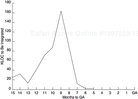
Determine the code integration plan; plot the lines of code (or amount of function points) to be integrated over time (see Figure 9.9).
For each code integration, multiply the expected PTR rate by the KLOC for each planned integration to get the expected number of PTRs for each integration.
Spread over time the number of PTRs for each integration based on the PTR spread pattern and sum the number of PTRs for each time point to get the model curve.
Update the model when the integration plan (e.g., KLOC to be integrated over time) changes or actual integration data become available.
Plot the curve and track the current project in terms of months from the product’s general availability (GA) date.
A calculator or a simple spreadsheet program is sufficient for the calculations involved in this model.
Figure 9.10 shows an example of the PTR submodel with actual data. The code integration changes over time during development, so the model is updated periodically. In addition to quality tracking, the model serves as a powerful quality impact statement for any slip in code integration or testing schedule. Specifically, any delay in development and testing will skew the model to the right, and the intersection of the model line and the imaginary vertical line of the product’s ship date (GA date) will become higher.
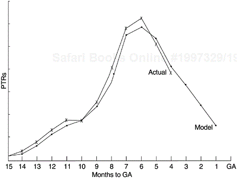
Note that the PTR model is a nonparametric model and is not meant for projection. Its purpose is to enable the comparison of the actual testing defect arrival versus an expected curve for in-process quality management. Compared to the model curve, if the actual defect arrivals increase and peak earlier and decline faster relative to the product’s ship date, that is positive, and vice versa. When data from the previous release of the same product are available, and the code integration over time is similar for the two releases, the simplest way to gauge the testing defect arrival pattern is to use the curve of the previous release as the model. One can also fit a software reliability model to the data to obtain a smooth model curve. Our experience indicates that the Rayleigh model, the Weibull distribution, the delayed S model and the inflection S model (see discussions in Chapter 8) are all candidate models for the PTR data. Whether the model fits the data, however, depends on the statistical goodness-of-fit test.
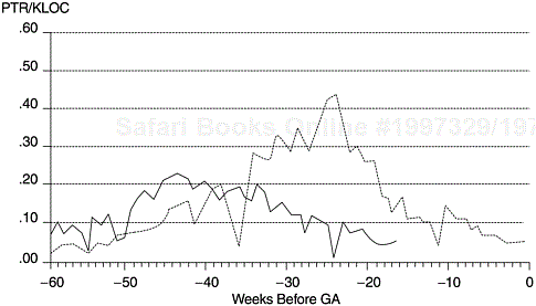
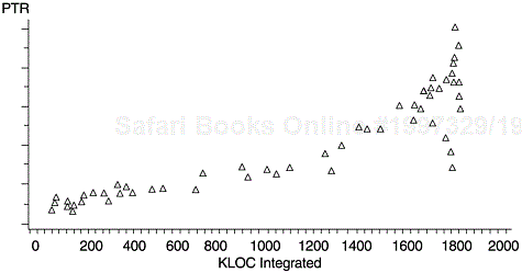
Figure 9.11 shows such a comparison. Given that the test coverage and effectiveness of the releases are comparable, the PTR arrival patterns suggest that the current release will have a substantially lower defect rate. The data points are plotted in terms of number of weeks before product shipment. The data points associated with an abrupt decline in the early and later segments of the curves represent Christmas week and July 4th week, respectively. In Chapter 10, we will discuss the PTR-related metrics with details in the context of software testing.
Near the end of the development cycle, a key question to ask is whether the scheduled code-freeze date can be met without sacrificing quality. Will the PTR arrival and backlog decrease to the predetermined desirable levels by the code-freeze date? The PTR submodel discussed earlier is clearly not able to accomplish this task because it is a tracking tool, not a projection tool. In contrast, the exponential model and other reliability growth models based on system test data, while being sufficient for the task, require data points well into the system test phase. Moreover, the analytic models may or may not be adequate depending on the goodness of fit. For cases like this, other types of modeling approaches may be needed. Here we present an example that we call the PTR arrival and backlog projection models. Its purpose is to project the PTR arrivals and backlog at the end of the development process. Analytical models aside, our approach was to derive empirical models based on data from the current project. If we were able to capture key explanatory variables in the models, we should be able to tap the correct message of the data with a certain degree of confidence. In this regard, the general linear model approach is readily available. From experience, we know that polynomial time terms combined with relevant variables usually form good projection models.
This model is different from the exponential model in several aspects. First, the time frame covers all machine testing (all PTRs) after the code is integrated (part of unit test, component test, component regression test, and system test). The exponential model applies only to defect arrivals during system test. Second, the data for this model are PTR arrivals and backlog, while the exponential model includes only valid PTRs (defects).
In our model building, the following sets of predictor variables were tested and their relationships with PTR arrival and backlog were specified:
Chronological time: The rationale is to capture the chronological pattern of the development process. It is well known that software development has a life cycle of systematic processes. The specific time trend, however, varies among systems. It may be linear or polynomial patterns of second degree or higher, a Fourier series, or some other forms.
Time lag variables: This set of variables is relevant because the data are of a time series nature and we need to assess the length of memory of these time series processes. Is this week’s PTR number affected by the PTR occurrence of the preceding five weeks? four weeks? or the preceding fourth and third weeks but not the immediate two weeks? Does this process have memory at all? Testing this set of variables can give answers to questions like these.
Cumulative thousand lines of code (KLOC) integrated: This variable is important because code was not integrated at only one point in time. Throughout the development cycle, pieces of code were integrated into the system library for testing. The number of PTRs is strongly related to the size of the code being tested.
Significant activities such as the onset of component test, system test, and other events: This set of variables is dichotomous, with 1 denoting the presence of the event and 0 denoting its absence.
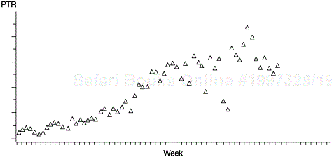
Prior to statistical testing of significance, scatterplots were used to examine the patterns of bivariate relationships and to detect outliers (Figures 9.12 and 9.13). For PTR arrival, a few obvious outliers were found, namely, the weeks of Thanksgiving, Christmas, and New Year’s Day. The conspicuously low PTR arrivals for these weeks were apparently attributed to fewer working days as well as fewer programmers, which were artifacts of our calendar-time data. The values for these weeks, therefore, were replaced by the medians of the five consecutive data points centering at the weeks of interest. Likewise, values for the weeks of Memorial Day, Independence Day, and Labor Day were replaced, although they were not particularly low. For the backlog data, no adjustment is necessary because the data are cumulative.
When the patterns of bivariate relationships were specified and separate significance tests performed, the independent variables were put together in a model and their net effects were estimated simultaneously by the method of least squares. For both the arrival and backlog data, several models were attempted and the final model was chosen based on the highest R2 value.
The number of PTR weekly arrivals was found to be a linear combination of a cubic pattern of time, a quadratic pattern of KLOC, the number of arrivals in the preceding week, and the presence or absence of the system test:
The equation of the model is as follows:
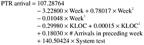
The model was highly significant (F = 169.6, df1 = 7, df2 = 55, p = 0.0001), as were its component terms. All independent variables together accounted for 95.6% of the variation of the arrival data. This R2 translates to a multiple correlation of 0.978 between the model and the actual data.
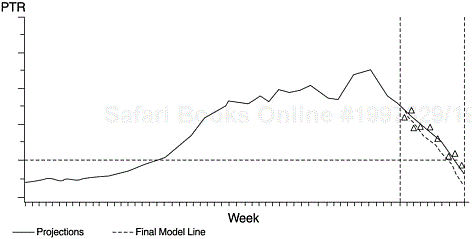
Figure 9.14 compares the PTR arrival projection model with actual data points for the projection period. The model produces a projection that is accurate within one week in terms of when the PTR arrivals would decrease to the predetermined desirable level prior to code-freeze. A PTR backlog model was likewise established and the projection was borne out very well.
Source: Kan, S. H., “Modeling and Software Development Quality,” IBM Systems Journal, Vol. 30, No. 3, 1991, pp. 35 1–362. Copyright © 1991 International Business Machines Corporation. Reprinted with permission from IBM Systems Journal.
Figure 9.14. PTR Arrival Projection Model
This analysis shows that the PTR arrival and backlog processes at the end of the development cycle are predictable with fairly good accuracy. Both our models are sufficiently strong, explaining about 95% of the total variation of the dependent variables. Both series of projections were borne out amazingly well, and were within one week in estimating the time of meeting the criteria levels.
This approach can be used in similar situations where projections for future dates are needed. It is especially useful when analytical models are not applicable. For the projections to be accurate, however, it requires a fairly large number of data points and the data collected must pass the last inflection point of the process. Another key is to capture significant variables in the model in order to obtain the highest R2 possible. After the initial model is derived, updates should be done when new data points become available. It is advisable to attempt different projection scenarios based on differing assumptions, thereby giving a broader perspective for the assessment.
At the beginning of a process when few data points are available, analytical models or models based on experience can be derived for management purposes. When sufficient data are available, the best model can be determined based on good-ness-of-fit tests. Combined with graphic techniques, the modeling approach is a very useful tool for software project management.
Unlike other models discussed, the PTR arrival and backlog projection models are really a modeling approach rather than a specific model. Statistical expertise, modeling experience, and a thorough understanding of the data are necessary in order to deal with issues pertaining to model assumptions, variables specification, and final model selection. A desirable outcome often depends on the model’s R2 and on the validity of the assumptions.
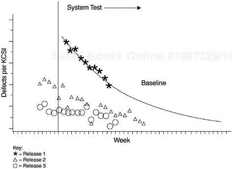
Although reliability growth models are meant for reliability assessment, they are also useful for quality management at the back end of the development process. Models developed from a previous product or a previous release of the same product can be used to track the testing defects of the current product. To have significant improvement, the defect arrival rate (or failure density) of the current project must fall below the model curve. Figure 9.15 shows an example from a systems software product developed at IBM Rochester. Each data point represents a weekly defect arrival rate during the system test phase. The defect arrival patterns represented by the triangles and circles indicate two later releases of the same product. Compared to the baseline model curve, both new releases witnessed a significant reduction in defect rate during the system test phase.
As a second example, when another product was just about at the start of system testing, the PTR arrival rates were unusually high compared to the model. It was clear that proceeding in a business-as-usual manner would not result in meeting the product’s quality goal. A special quality improvement program (QIP) was then pro-posed, evaluated, approved, and swiftly implemented. The QIP involved five extra activities:
Blitz testing—. “artistic” testing in stressful environments
Customer evaluation—. customers conducting testing in the development laboratory
Code inspections—. additional inspections of error-prone modules, especially routines that are difficult to test such as the error recovery/exception handling routines
Design reviews—. rereview of designs of suspect components and modules
Extension of system test—. improvement of test suites and extension of testing schedules to allow thorough final test execution
Because of the special QIP activities, the product ship date was delayed one month. As a result, more than 250 would-be field defects were found and removed. The field quality of the product, evidenced by field defect arrivals reported in later years, improved significantly.
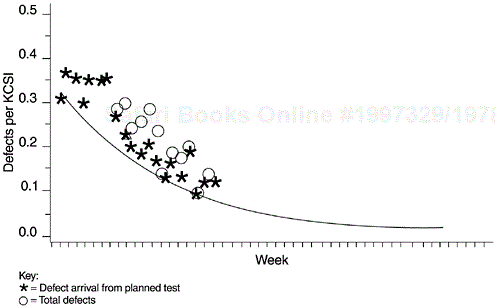
Figure 9.16 shows the defect arrival pattern of the product during system test. The data points represent the weekly defect rate (per thousand new and changed code—KCSI). The asterisks represent the defect arrival from the originally planned system test. The circles represent the total defect rates including the additional defects discovered and removed via the QIP activities. Since the QIP activities and defects were specially marked in the defect tracking system, we were able to assess the additional defect removal by the program.
One of the advantages of using the reliability growth models as a quality management tool is that comparisons can be made when the first data points become available. If unfavorable signs are detected (e.g., defect arrivals are much too high), timely actions can be taken. In contrast, for reliability assessment and projection, a substantial amount of data has to be available for the models to be reliable. For models with an inflection point (such as the delayed S and inflection S models), data must be available beyond the inflection point if the models are to work. As discussed in the preceding chapter, studies show that the exponential process model needs to have data from about 60% of the system test in order to provide reasonably adequate fit and projection. Therefore, the reliability models can be used more liberally for quality management than for reliability projection.
The typical use of reliability models for quality management, as described in the software reliability literature, is to determine the end date of testing given a reliability goal or a specific defect level to be achieved. If the model derived from the current data indicates less-than-desirable quality, then more testing will be done until the reliability reaches the goal. This strategy assumes an abundance of extra test cases is available or the generation of extra test cases is relatively easy. For many commercial development projects, such an assumption may be difficult to meet. Test plans and test cases are developed over time along with design and code development; adding effective test cases is not a task that can be accomplished in a short time. Therefore, actions other than simply prolonging the testing (such as customer beta test, special stress testing, etc.) should also be considered.
Managing development quality based on reliability models at the back end should be used as the last step in the broader context of a series of quality management models. It should not be the sole approach. A software development quality management system should put as much focus as possible at the front end, and actions should be triggered as early as possible if negative indicators are observed. Actions taken at design, code, unit test, code integration time, and even at early formal machine testing time, are apt to be more cost effective and have a smaller chance of affecting the delivery date than later actions. Unfortunately, in the software reliability literature, one often gets the impression that the main way to achieve quality is to keep on testing until the defect arrival rate or the mean time to failure rate reaches the desirable level. Such a testing strategy to achieve quality improvement is not a good one. It is more applicable to research projects than to commercial developments, which often do not have the luxury to react at the back end and to delay delivery. The QIP example given earlier was the last major improvement action of that product, not the only one.
Finally, when interpreting the defect arrival data against a predetermined model, the variable of testing effort or coverage must be taken into consideration. For instance, if the defect arrivals are substantially below the model curve (as is the case in Figure 9.15), questions arise such as, “are the lower defects due to less effective testing or really due to better quality?” In this regard, the effort/outcome model in Figure 9.4 also applies to the testing phases. In Chapter 10, we discuss the effort/ outcome model with respect to in-process metrics for testing.
As discussed in the previous chapter, we contend that the most important criteria for evaluating reliability models are predictive validity, simplicity, and quality of assumptions, in that order of importance. With regard to quality management models, we propose that timeliness of quality indications, scope of coverage of the development process, and capability be the major criteria for evaluation.
The earlier a model can detect signs of quality problems or improvements, the more time is available for proactive planning. Furthermore, corrections in the early phases of the development process are much less expensive than those made at the back end. See Chapter 6 for discussion of the cost effectiveness of defect removal by development phase.
Model coverage of all phases of the development process is important. To have a good quality end product, quality in the intermediate deliverables at each phase, as defined by the phase entry and exit criteria, is a prerequisite. Each development phase must be managed and appropriate quality actions implemented. In case a single model cannot perform the tasks adequately, the use of multiple models is recommended.
While we contend that capability (other than predictability) is not an important criterion for software reliability models at the current state of the art, it is very important for management models. If “capability” refers to the model’s ability to provide information for planning and managing software development projects, that is the purpose of quality management models. For instance, given the current in-process defect injection and removal pattern, will the project be likely to achieve its quality goal? If the effectiveness of the design review process improves by certain points, what is the possible impact on end-product quality? While quality management models may never reach the degree of accuracy and precision that reliability models have (or aim for), it is their capability to provide hints and findings for various in-process management questions that distinguish them as a separate category of software quality engineering model.
We have thus far discussed an overall framework and the models associated with the framework for quality management during the development process. To facilitate the implementation of these models, we need a defect tracking and reporting system and a set of related in-process metrics. This is especially true for large development projects that involves many teams. In-process measurements and feedback, therefore, need to be available at various levels, ranging from the component team (several members) level to the entire product and system, which may involve more than one organization. In this section we present some examples of in-process metrics and reports.
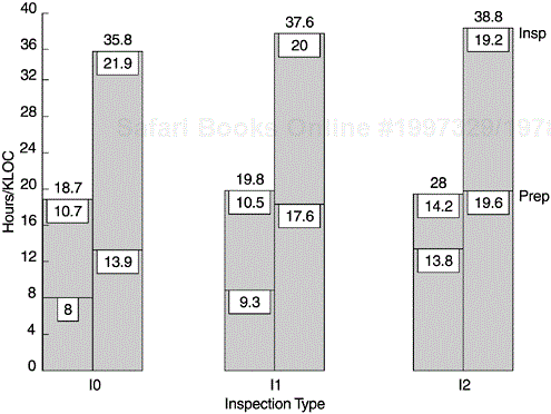
Figures 9.17 and 9.18 are examples of reports that can support the implementation of the front end of the Rayleigh model—the design and code inspection phases. Figure 9.17 is the implementation version of the effort/outcome model in Figure 9.3. It is the first part of the inspection report and provides guidelines for interpretation and for actions with regard to the data in Figure 9.18.
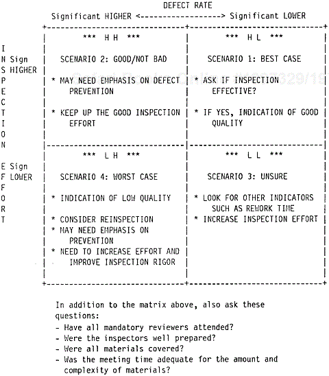
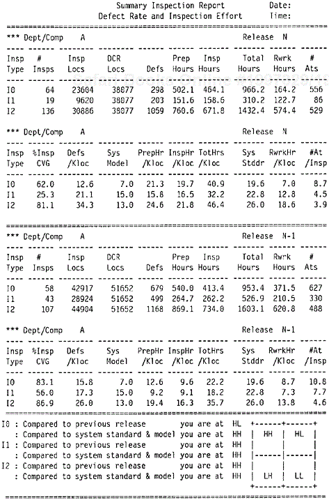
Figure 9.18 shows the number of inspections completed by stage (I0, high-level design review; I1, low-level design review; and I2, code inspection). The first part of the upper panel gives information about actual lines of code inspected (Insp Locs), total lines of code in the current plan for the department (DCR Locs), number of defects found, inspection effort in terms of preparation hours and inspection hours, rework hours, and the number of participants at the inspections (#Ats). The second part of the first panel (defined by double dashed lines) shows the normalized metrics such as percent inspection coverage (%Insp CVG), defects per thousand lines of code (Defs/Kloc), preparation hours per KLOC (PrepHr/Kloc), actual inspection hours per KLOC (InspHr/Kloc), total hours on inspection (the sum of preparation time and inspection time) per KLOC (TotHrs/Kloc), rework hours per KLOC (RwrkHr/Kloc) to complete the design or coding phase, and the average number of participants per inspection. The system model in terms of inspection defect rates (Sys Model) and inspection effort (Sys Stddr) are also presented for comparison.
In the second panel the same information for the previous release by the same team or department is shown. The bottom panel shows comparisons according to the scenarios of the effort/outcome model. For each phase of inspection, two comparisons are made: current release compared to the previous release, and current release compared to the system model. Specifically, the first comparison involves comparing “Defs/Kloc” and “TotHrs/Kloc” in the first panel with the corresponding numbers in the second panel. The second comparison involves comparing “Defs/Kloc” with “Sys Model” and “TotHrs/Kloc” with “Sys Stddr” in the first panel (current release). The report also automatically flags the total inspection effort (TotHrs/Kloc) if its value is lower than the system standard (Sys Stddr). As discussed in Chapter 6, inspection defect removal is much more cost effective than testing. Therefore, if a team’s inspection effort is below the system standard, the minimum the team should do is to examine if there is enough rigor in their inspections, and if not, take appropriate action.
Note that for the effort/defect matrix, the inspection effort indicator is a proxy variable to measure how well the inspection process was executed. It is one, but not the only, operational definition to measure process quality. An alternative could be the inspection team’s assessment and the inspection scoring approach. Specifically, instead of (or in addition to) the tracking of inspection effort, the inspection team assesses the effectiveness of the inspection and the quality of the design (or code) at the end of an inspection. Simple checklists such as the one in Table 9.1 can be used.
It is preferable to conduct two assessments for each inspection, one before and one after. Such pre- and postinspection evaluations provide information on the effect of the inspection process. For the preinspection assessment, the questions on inspection effectiveness and whether another inspection is needed may not apply.
The inspection scores can then be used as indicators of the process quality as well as the interim product (design and code) quality. When data on multiple inspections are available, the technique of control charting can be used for in-process quality control. For instance, the team may establish a requirement for mandatory rework or reinspection if the score of a design or an implementation is below the lower control limit.
Table 9.1. An Inspection Scoring Checklist
|
Response | ||||||||||||||||
|---|---|---|---|---|---|---|---|---|---|---|---|---|---|---|---|---|
|
Poor |
Acceptable |
Excellent | ||||||||||||||
|
Design |
1 |
2 |
3 |
4 |
5 |
6 |
7 |
8 |
9 |
10 | ||||||
|
Work meets requirements |
1 |
2 |
3 |
4 |
5 |
6 |
7 |
8 |
9 |
10 | ||||||
|
Understandability of design |
1 |
2 |
3 |
4 |
5 |
6 |
7 |
8 |
9 |
10 | ||||||
|
Extensibility of design |
1 |
2 |
3 |
4 |
5 |
6 |
7 |
8 |
9 |
10 | ||||||
|
Documentation of design |
1 |
2 |
3 |
4 |
5 |
6 |
7 |
8 |
9 |
10 | ||||||
|
Effectiveness of this inspection |
1 |
2 |
3 |
4 |
5 |
6 |
7 |
8 |
9 |
10 | ||||||
|
Does another inspection need to be held? |
_____Yes |
_____No | ||||||||||||||
|
Code Implementation |
1 |
2 |
3 |
4 |
5 |
6 |
7 |
8 |
9 |
10 | ||||||
|
Work meets design |
1 |
2 |
3 |
4 |
5 |
6 |
7 |
8 |
9 |
10 | ||||||
|
Performance considerations |
1 |
2 |
3 |
4 |
5 |
6 |
7 |
8 |
9 |
10 | ||||||
|
Understandability of implementation |
1 |
2 |
3 |
4 |
5 |
6 |
7 |
8 |
9 |
10 | ||||||
|
Maintainability of implementation |
1 |
2 |
3 |
4 |
5 |
6 |
7 |
8 |
9 |
10 | ||||||
|
Documentation |
1 |
2 |
3 |
4 |
5 |
6 |
7 |
8 |
9 |
10 | ||||||
|
Effectiveness of this inspection |
1 |
2 |
3 |
4 |
5 |
6 |
7 |
8 |
9 |
10 | ||||||
|
Does another inspection need to be held? |
_____Yes |
_____No | ||||||||||||||
When using the inspection scoring approach, factors related to small team dynamics should be considered. Data from this approach may not be unobtrusive and therefore should be interpreted carefully, and in the context of the development organization and the process used. For instance, there may be a tendency among the inspection team members to avoid giving low scores even though the design or implementation is poor. A score of 5 (acceptable) may actually be a 2 or a 3. Therefore, it is important to use a wider response scale (such as the 10-point scale) instead of a narrow one (such as a 3-point scale). A wider response scale provides room to express (and observe) variations and, once enough data are available, develop valid interpretations.
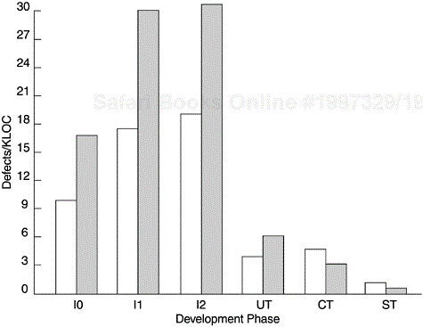
Figure 9.19 is another example of inspection defect reports. The defects are classified in terms of defect origin (RQ = requirements, SD = system design, I0 = high-level design, I1 = low-level design, I2 = code development) and defect type (LO = logic, IF = interface, DO = documentation). The major purpose of the report is to show two metrics—in-process escape rate and percent of interface defects. The concept of in-process escape rate is related to the concept of defect removal effectiveness, which is examined in Chapter 6. The effectiveness metric is a powerful but not an in-process metric. It cannot be calculated until all defect data for the entire development process become available. The in-process escape metric asks the question in a different way. The effectiveness metric asks “what is the percentage of total defects found and removed by this phase of inspection?” The in-process escape metric asks “among the defects found by this phase of inspection, what is the percentage that should have been found by previous phases?” The lower the in-process escape rate, the more likely that the effectiveness of the previous phases was better. The in-process escape metric also supports the early defect removal approach. For example, if among the defects found by I2 (code inspection) there is a high percentage that should have been found by I1 (low-level design review), that means I1 (low-level design) was not done well enough and remedial actions should be implemented.
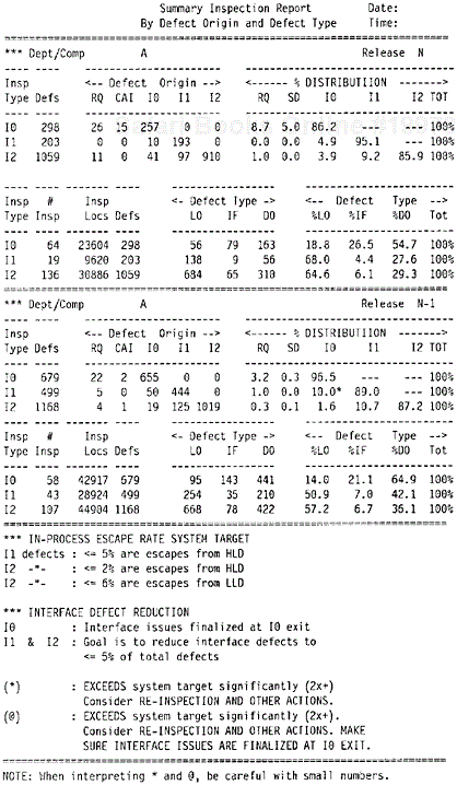
The rationale for the metric of percentage of interface defects is that a large percentage of defects throughout the development life cycle (from design defects to field defects) is due to interface issues. Furthermore, interface problems are to a large extent related to human communications and, therefore, preventable. Reducing interface defects should be an objective of in-process quality management. One of the objectives of high-level design is to finalize interface issues at the exit of I0 (high-level design review). Therefore, it is logical to see high percentages of interface defects at I0. However, at subsequent phases, if the percentage of interface defects remains high, it implies that the goal of resolving interface issues at I0 has not been achieved. In this example, the predetermined targets for in-process escape rates and for interface defect reduction were also shown in the report, and exceptions were flagged.
Figure 9.20 shows a report on unit test coverage and defects. Ideally, unit tests are conducted before the code is integrated into the system library. For various reasons (dependencies, schedule pressures, etc.), it is not uncommon that some unit tests are done after code integration. The in-process metrics and reports, therefore, should reflect the state of practice and encourage defect removal before integration. In Figure 9.20 the columns include the product ID (PROD), the ID of the components (CPID) that the organization owns, the lines of code by components for the current release (DCRLOC), the lines of code that have been unit tested (UTLOC), the unit test coverage so far (%CVG = UTLOC × 100/DCRLOC), the number of unit test defects found before integration [DEFS (DCR)], the number of unit test defects found after integration and expressed in the form of problem tracking reports (UT PTRs), and the normalized rates. The key interests of the report are the ratio of pre-integration defect removal [DEFS (DCR)] to postintegration defects (UT PTRS) and the overall unit test defect rate (TOTAL DEFS/DCR KLOC). The interpretation is that the higher the ratio (the higher defect removal before integration), the better. Components with high unit test defects found after code integration should be examined closely. Comparisons can also be made for the same components between two consecutive releases to reveal if an earlier defect removal pattern is being achieved.
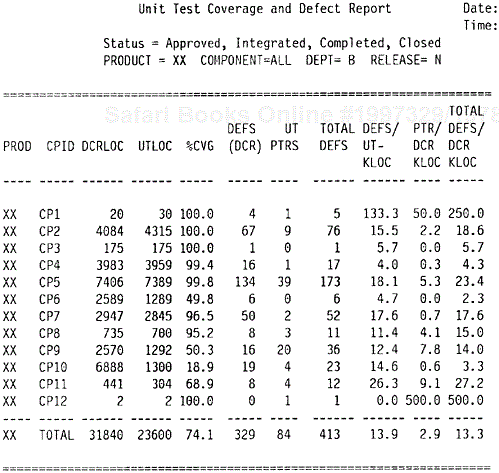
Figure 9.21 shows the test defect rate by phase. In addition to postintegration unit test defects (UT), it shows defects found during the build and integration process (BI), component test (CT), component regression test (CRT), system test (ST), and early customer programs (customer field test, customer early burn-in program, etc.).
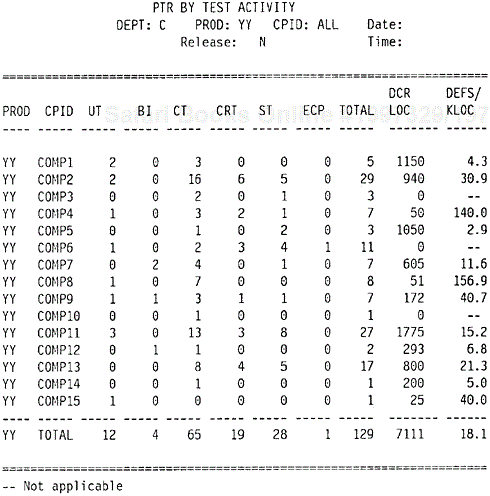
The column DCR LOC again shows the lines of new and changed code for the current release. The DEFS/KLOC column shows the defect rate per KLOC. The three components that have 0 in the DCR LOC column did not have new and changed code for that release but took part in the testing effort to remove defects in the existing code.
Data from Figure 9.21, together with data for unit test and the front-end inspections, provide sufficient information for the overall defect removal patterns for the entire development process. These in-process metrics and reports cannot be used in a piecemeal fashion. They should be used together in the context of the quality management models.
In addition to the basic metrics and reports, many other reports are useful for in-process quality management. The first is perhaps the test defect origin report. Similar to the inspection defect origin report, this reports classifies defects for each test phase by where they should have been found. For instance, when a defect is reported during a system test, its test origin (UT, CT, or ST) will be determined by involved parties. Usually it is easier to determine if a certain defect is a system test type defect, than to distinguish the difference between a unit test defect and a component test defect.
Other reports such as severity distribution of test defects, defect cause by test phase, and changes during the test phases due to performance reasons also provide important indicators of the product’s quality. Testing defect rates have a strong correlation with field defect rates; the severity of test defects is also a good indicator of the severity distribution of field defects. Severe problems, usually difficult to circumvent, tend to have a more pervasive impact on customer business. Performance changes, especially the late ones, are error-prone activities. If negative signals are detected from these metrics, proactive actions (e.g., special customer evaluation or extended customer burn-in) should be planned before the release of the product.
There are more in-process metrics for testing that are not covered in this chapter. The next chapter provides a more detailed discussion of the subject.
Orthogonal defect classification (ODC) is a method for in-process quality management based on defect cause analysis (Chillarege et al., 1992). Defect cause or defect type analysis by phase of development is not new. In many development organizations, metrics associated with defect cause are part of the in-process measurement system. The ODC method asserts that a set of mutually independent cause categories (orthogonal) can be developed, which can be used across phases of development and across products, and that the distribution of these defect types is associated with process phases. The authors contend that a more or less stable “signature profile” of defect type distribution can be established by each phase of the development process. By examining the distribution of defect types, therefore, one can tell which development phase the current project is at, logically. The authors propose eight defect types:
Function
Interface
Checking
Assignment
Timing/serialization
Build/package/merge
Documentation
Algorithm
The authors contend that functional defects (missing or incorrect functions) are associated with the design phase; interface defects are associated with low-level design; checking with low-level design or code implementation; assignment with code; timing/serialization with low-level design; build/package/merge with library tools; documentation defects with publications; and algorithms with low-level design.
The authors offer several examples of ODC. One example illustrates the high percentage of the defect type “function” found at a late stage in the development cycle. Specifically, the defect discovery time was classified into four periods; the last period corresponded approximately to the system test phase. In the last period the number of defects found almost doubled, and the percentage of defect type “function” increased to almost 50%. Since the defect type “function” is supposed to be found earlier (during the design phase), the observed distribution indicated a clear departure from the expected process behavior. Given that function defects were the cause of the departure, the analysis also suggested an appropriate design reinspection rather than more intensive testing.
In addition to defect type analysis, the ODC method includes defect triggers to improve testing effectiveness. A defect trigger is a condition that allows a defect to surface. By capturing information on defect triggers during testing and for field defects reported by customers, the test team can improve its test planning and test cases to maximize defect discovery.
The trigger part of ODC and its application to testing appear to be more solid than the assertion with regard to the “signature profiles” of defect type. Whether the process associations with defect type can be applied across products or organization uniformly is an open question. Even assuming similar development processes, differences in process details and focus areas may lead to differences in the distribution of defect types and defect causes. For instance, in the example shown in Figure 9.19, final resolution of interface issues is one of the exit criteria of high-level design inspection (I0). Therefore, higher percentages of interface defects are observed at I0, instead of at low-level design (I1). Another variable is the maturity level of the development process, especially in terms of the error injection rate. A defect type distribution for a development organization with an error injection rate of 60 defects per KLOC is likely to be different from that with an error injection rate of 20 defects per KLOC. The actions for reducing error injection or defect prevention are likely to have stronger effects on some defect causes than on others.
With regard to use of a defect type distribution for assessing the progress of the project, the ODC method seems to be too indirect. The several quality management models and the many in-process metrics discussed in this book would be more effective for project and quality management. At the defect analysis level, a more direct approach is to use the defect found (at which phase of development) versus defect origin (or test origin) analysis—see the examples in Figures 6.4 and 9.19.
The ODC method has evolved over the years. More defect attributes have been developed. The attributes classified by ODC when a defect is opened include the following:
Activity—. The specific activity that exposed the defect. For example, during system test, a defect occurs when one clicks a button to select a printer. The phase is system test but the activity is function test because the defect surfaced by performing a function test-type activity.
Trigger—. The environment or condition that had to exist for the defect to surface.
Impact—. This refers to the effect the defect had on the customer if it had escaped to the field, or the effect it would have had if not found during development.
The attributes classified by ODC when a defect fix is known include the following:
Target—. What is being fixed: design, code, documentation, and so forth?
Defect type—. The nature of the correction made
Defect qualifier (applies to defect type)—. Captures the element of nonexistent, wrong, or irrelevant implementation
Source—. The origin of the design/code that had the defect
Age—. The history of the design/code that had the defect
The ODC defect analysis method has been applied to many projects and successful results have been reported (Bassin et al., 2002; Butcher et al., 2002). The most significant contribution of ODC seems to be in the area of providing data-based assessments leading to improvement of test effectiveness.
Data and resources permitting, we recommend in-depth defect-cause and defect-type analysis be done (whether or not it is according to the ODC classifications) as an integrated part of the in-process metrics in the context of quality management models.
Quality management models are valuable for monitoring and managing the quality of software when it is under development. These models emerged from the practical needs of large-scale software development. Unlike reliability models, which are numerous, there are few models for in-process quality management in the literature. Whereas reliability models need to provide precise and predictively valid results, the demand for precision for management models is far less. In contrast, the major criteria for management models are timeliness for quality indications, scope of coverage (of various phases of the development process), and capability (various indicators and attributes of quality). Therefore, when reliability models are used for quality management (instead of being used as prediction tools), a different focus should be applied.
The Rayleigh model (or for that matter the phase-based defect model) provides a nice framework for quality management, covering the entire development process. Within the overall Rayleigh framework, submodels such as the effort/outcome model, the PTR submodel, the PTR arrival and backlog projection models, the reliability growth models, and related in-process metrics provide further specifics.
To implement these models, a good tracking and reporting system and a set of related in-process metrics are important. Defect cause and defect type analysis, such as the ODC method, can lead to more insights and, therefore, effective improvement actions.