
12. The Adobe Common Color Architecture: Color Management in Adobe Photoshop, InDesign, and Illustrator
On our bleaker days, we wonder why all vendors that implement color management feel they have to do it their way, with their own unique user interface and their own unique terminology. So we derive a certain amount of comfort from the fact that Adobe Systems has at least attempted to standardize much of the user interface and most of the terminology between its three main color-managed applications, Adobe Photoshop, Adobe Illustrator, and Adobe InDesign.
We think that Adobe has done more than any other vendor in finding rational ways to present color-management options to the user, and the integration between the three applications generally makes life easier. However, since the three applications do rather different things, some of the apparent similarities are misleading—we’ll point these out as they arise. And, sometimes, the more obscure consequences of some of the settings may not be particularly intuitive, so we’ll likewise flag these when we get to them.
We’ll start by looking at the settings that really do work identically in all three applications.
Color Settings—Command Central for Color
Adobe Photoshop, Illustrator, and InDesign all share a very similar and somewhat formidable-looking dialog box called Color Settings (see Figure 12-1).

For now, let’s ignore the differences, and concentrate on the similarities. All three applications’ Color Settings have areas labeled Working Spaces and Color Management Policies, though the options are slightly different in each one. Let’s first look at what they have in common.
Settings
The Settings menu simply contains saved presets for the Color Settings dialog box. Settings files created in one of the three applications can be used by the other two, which makes synchronizing the behavior of the three fairly easy. However, Photoshop has more options than InDesign, which in turn has more options than Illustrator—so if you want to synchronize Photoshop’s setting with either or both of the other applications, save the settings from Photoshop, and if you want to synchronize InDesign and Illustrator, save the settings from InDesign.
Saved settings should appear automatically in the Settings menu, and in the majority of cases, they do. If you find they don’t, check the location of the settings files—the file extension is .csf. On Mac OS 9, they’re stored in the Hard Drive:System Folder:Application Support:Adobe:Color: Settings folder; on Windows they’re stored in the Program FilesCommon Files AdobeColorSettings folder.
The somewhat anarchic situation that applied to previous versions of the applications under Mac OS X has been addressed in the CS release: Photoshop CS, InDesign CS, and Illustrator CS all default to saving them in the /Users/<username>/Library/Application Support/Adobe/Color/Settings folder, though you can manually load .csf files saved in the main /Library/Application Support/Adobe/Color/Settings folder, too. If you want to make the color settings available to other users, the simplest solution is create aliases of your settings in the main Library folder.
Macintosh users get one extra preset, labeled ColorSync Workflow. When you choose this setting, the application uses the RGB, CMYK, and in the case of Photoshop, Grayscale profiles specified in the Default Profiles for Documents panel of the ColorSync control panel (Mac OS 9), or under the Default Profiles tab of the Preferences panel in ColorSync Utility (Mac OS X). Also, on both operating systems the application uses the CMM chosen in ColorSync—see “Engine,” later in this chapter, for further ramifications. Unless you really know what both you and the OS are doing, we recommend that you avoid this option, which may well disappear in the future.
Default Profiles—Working Spaces
The Working Spaces section lets you specify default profiles (called “Working Spaces” in Adobe’s terminology) for RGB and CMYK. The exact role that these profiles play depends on the settings you enter elsewhere in the dialog box, but they always represent the default profile—either assumed or assigned—for untagged RGB and untagged CMYK, and for new documents.
When the “Advanced” checkbox is unchecked, your choices are limited to a recommended set of profiles for RGB and CMYK. But you can control which profiles appear in the lists when “Advanced” is unchecked. The lists simply show the profiles in the Recommended folder, so any profile you install there will show up in the list. This mechanism provides an administrator a convenient way to limit the choice of profiles in the three applications to “safe” ones.
On Mac OS 9, they’re stored in the System Folder:Application Support: Adobe:Color:Profiles:Recommended folder, on Windows they’re stored in the Program FilesCommon FilesAdobeColorProfilesRecommended folder, and on Mac OS X they’re stored in the /Library/Application Support/Adobe/Color/Profiles/Recommended folder. (In all cases, the folder is aliased to the main Profiles folder, so any profiles you install in the Recommended folder are available to those other applications that search more than one level deep for profiles in both the main Library and the user Library.)
If you turn on the “Advanced” checkbox, the RGB Working Space menu lists all the installed bidirectional RGB profiles, and the CMYK Working Space menu lists all the installed bidirectional CMYK profiles—you can’t use unidirectional input profiles that only convert from device values to PCS as working spaces. (In the case of RGB, you probably don’t want to use a device space at all—see “Intermediate Spaces,” in Chapter 10, Color-Management Workflow.)
Color Management Policies
The most critical choices you make in the Color Settings dialog box are the Color Management Policies, which control the applications’ behavior when they open tagged and untagged documents, when you create new documents, and when you move selected elements between documents. They don’t affect the handling of imported objects in InDesign documents, just native elements. The policies control the applications’ default behavior for assuming or assigning profiles to untagged documents and for handling tagged documents by either honoring the embedded profile, converting from that profile to another, or ignoring the embedded profile and assuming a different one. All three applications let you set separate policies for RGB and for CMYK (Photoshop lets you set a third policy for Grayscale).
A complicating factor is that InDesign documents have two default profiles, one for RGB and one for CMYK elements, which can muddy the distinction between tagged and untagged documents. It’s possible to have an InDesign document whose native RGB elements are tagged and whose native CMYK elements are untagged, or vice versa. We’ll leave you to make the call as to whether such a document is half-tagged or half-untagged!
The three Warning options provide manual overrides to the policies by displaying dialog boxes that let you take an action different from the one dictated by the current policy. Before we look at the warnings, here’s how the policies behave when the warnings are turned off.
Off
This is the probably the most misleadingly labeled option of the three. You can’t turn color management off in these applications—they always convert from a source profile (either embedded/assigned or assumed) to the monitor profile for display, and they always use profiles to convert from RGB to CMYK.
For new documents, the Off policy makes the applications assume the working space profiles for all native RGB and CMYK elements, and treat the documents as untagged—if you change the working spaces, the documents take on the new profiles, and the appearance changes.
For documents that are tagged with a profile other than the working space profile, the applications discard the embedded profile, assume the working space profile, and treat the documents as untagged.
However, when the application opens a document that’s tagged with the current working space profile, all sense goes out the window. It treats the document as tagged with the embedded profile, so any subsequent changes to the working space have no effect on that document. Effectively, a document with an embedded profile that matches the working space profile is treated with a “Preserve Embedded Profiles” policy (discussed next). We think this is counterintuitive, to say the least.
When you move native objects from a document in one space to another in a different space by copy and paste or drag and drop, the application simply moves the numerical values in the object.
Preserve Embedded Profiles
Unlike the previous option, this one does what it says. Tagged documents get opened in the embedded profile’s space (in the case of InDesign documents, which can have both RGB and CMYK elements, each keeps its definitions). New documents use the current working space(s) and are treated as tagged. Untagged documents stay untagged—you can think of this as “preserving” their untagged status—and use the working space profiles as assumed profiles.
When you move native RGB objects from a document in one space to another in a different space by copy and paste or drag and drop, the application performs a conversion from the source to the destination and moves the color appearance. When you move native CMYK objects from a document in one space to another in a different space by copy and paste or drag and drop, the application transfers the numerical values in the object.
Convert to Working Space
This policy is best thought of as an automation feature. When the application opens a tagged document, it performs a conversion from the embedded profile’s space to the current working space. When it opens an untagged document, it uses the working space as an assumed profile and keeps the document untagged.
When you move native RGB or CMYK objects from a document in one space to another in a different space, the application always performs a conversion from source to destination, preserving color appearance and changing the numbers.
As a general rule, we set all our policies to Preserve Embedded Profiles—that way, we at least get to evaluate the image in its profiled space before deciding what to do next.
Warnings—Manual Overrides
The Missing Profile warnings in Photoshop and InDesign and the Profile Mismatch warnings in all three applications let you manually override the default behavior dictated by the color-management policy currently in effect. The policies determine which radio button is checked by default in the warning dialogs, but the same options are available no matter which policy is in effect. However, since each of the three applications is designed to do different things, the warnings are presented slightly differently in each one.
The Missing Profile warnings appear when you open an untagged document, and offer the options listed below.
Missing Profile warning in Photoshop
The Missing Profile warning, when enabled, appears whenever you open an untagged document (see Figure 12-2).
Figure 12-2 Photoshop Missing Profile warning

The warning offers four options:
• Leave as is (don’t color manage) tells the application to assume the current working space profile and treat the document as untagged.
• Assign working RGB/CMYK/Grayscale tells the application to assign the working space profile and treat the document as tagged.
• Assign profile lets you tell the application to assign any profile that’s applicable to the document’s color mode (you can only assign RGB profiles to RGB documents and CMYK profiles to CMYK documents) and treat the document as tagged.
• Assign profile, then convert to “working RGB/CMYK” lets you tell the application to assign any profile that’s applicable to the document’s color mode, then convert from that profile to the Working Space for that color mode, and treat the document as tagged.
Missing Profile warning in InDesign
While Photoshop documents only exist in a single color space, InDesign documents can contain RGB and CMYK elements governed by different profiles, called Document profiles—so InDesign has not one, but two Missing Profile warnings, one for RGB, one for CMYK (see Figure 12-3). Note that this dialog only pertains to native InDesign content, not to placed objects. If the document has profiles embedded, but placed images do not, you won’t see this dialog. However, it’s also important to realize that untagged placed images will use the Document profiles (for RGB and CMYK) as assumed source profiles.
Figure 12-3 InDesign Missing Profile warnings

InDesign’s Missing Profile warnings provide the same three options (with slightly different labels), first for RGB, then for CMYK:
• Leave as is (use current working space) tells the application to assume the current working space profile and treat the RGB or CMYK elements in the document as untagged.
• Assign current working space tells the application to assign the working space profile (which becomes the RGB or CMYK Document profile for this document) and treat the RGB or CMYK elements in the document as tagged. Untagged placed objects assume these profiles as source and remain untagged.
• Assign profile lets you tell the application to assign any RGB profile in the first warning, and any CMYK profile in the second one. Untagged placed objects assume these profiles as source and remain untagged.
Missing Profile warning in Illustrator
Unlike the other two applications, Illustrator doesn’t let you turn off the Missing Profile warning—it always displays the warning when you open a document without an embedded profile (see Figure 12-4). (This can be annoying, since Illustrator always looks for profiles in EPS documents, but can’t embed profiles in EPSs on save.)
Figure 12-4 Illustrator’s Missing Profile warning

Illustrator’s Missing Profile warning provides the same options as InDesign’s—the only difference is that Illustrator documents are always defined as either RGB documents or CMYK documents, so you only get one warning:
• Leave as is (don’t color manage) tells the application to assume the current Working Space profile and treat the document as untagged.
• Assign current working space tells the application to assign the working space profile and treat the document as tagged.
• Assign profile lets you tell the application to assign any RGB profile to an RGB document, or any CMYK profile to a CMYK document.
The Profile Mismatch: Ask When Opening warning appears when you open a document with an embedded profile that’s different from the current working space.
Photoshop’s Embedded Profile Mismatch warning
When enabled, this warning displays the dialog box shown in Figure 12-5.
Figure 12-5 Photoshop’s Embedded Profile Mismatch warning

The warning offers the following three options:
• Use the embedded profile (instead of the working space) preserves the embedded profile and treats the document as tagged. The embedded profile is used as the source for all conversions.
• Convert document’s colors to the working space tells the application to perform a conversion from the embedded profile to the working space profile, and treats the document as tagged with the working space profile.
• Discard the embedded profile (don’t color manage) tells the application to discard the embedded profile, assume the working space profile, and treat the document as untagged.
InDesign’s Embedded Profile Mismatch warnings
Again, since InDesign documents can contain both RGB and CMYK elements, it’s possible to have a profile mismatch in either or both. If the Color Management Policies are set to anything other than Off, InDesign will embed the Document profile for that mode. If neither mode is set to Off, InDesign will embed both Document profiles (RGB and CMYK), regardless of the contents of the document. When enabled, this warning displays the dialog boxes shown in Figure 12-6.
Figure 12-6 InDesign’s Embedded Profile Mismatch warnings

Both warnings offer the following three options:
• Use the embedded profiles (instead of the working space) preserves the embedded profiles and treats the RGB or CMYK elements in the document as tagged. The embedded profiles become the Document profiles for this document, which means they are used as the source profiles for all conversions of native objects, and as the assumed source profiles for untagged placed objects.
• Convert the document’s colors to the current working space tells the application to convert the color from the embedded profiles to the working space profiles (which become the Document profiles for this document), and treats the document as tagged. It doesn’t convert placed objects, but untagged objects use the new Document profiles as assumed source profiles.
• Discard the embedded profile (and use current working space) tells the application to discard the embedded profile, assume the working space profile, and treat the RGB or CMYK elements in the document as untagged. Untagged objects use the working space profiles as assumed source profiles.
Illustrator’s Embedded Profile Mismatch warning
Illustrator’s warning is functionally identical and cosmetically very similar to Photoshop’s (see Figure 12-7).
Figure 12-7 Illustrator’s Embedded Profile Mismatch warning

It offers the following three options:
• Use the embedded profile (instead of the working space) preserves the embedded profile and treats the document as tagged. The embedded profile is used as the source for all conversions.
• Convert document’s colors to the current working space tells the application to perform a conversion from the embedded profile to the working space profile, and treats the document as tagged with the working space profile.
• Discard the embedded profile (don’t color manage) tells the application to discard the embedded profile, assume the working space profile, and treat the document as untagged.
Annoyingly, both InDesign and Illustrator take the warning a step further by displaying an Assigned Profile Mismatch Warning should you have the temerity to assign a profile other than the working space in the Missing Profile dialog box. This is the kind of behavior that gives color management a bad name. Photoshop sensibly refrains fron doing so, and we hope the other applications will follow suit in a future release!
Profile Mismatch: Ask When Pasting warning
The last set of warnings lets you override the default behavior when you move elements (or in the case of Photoshop, selected pixels) from a document in one space to another in a different space, by copy and paste or drag and drop. It only applies when both source and destination document are in the same color mode—RGB to RGB or CMYK to CMYK. If you move elements from one color mode to another, a conversion always occurs—you can’t paste RGB values into a CMYK document or vice versa. The warning offers the same pair of options in all three applications (see Figure 12-8).
Figure 12-8 Paste Profile Mismatch warnings

In this situation, the only choices are to move the RGB or CMYK values, in which case the appearance will very likely change, or move the color appearance, in which case the RGB or CMYK values will change.
• Convert (preserve color appearance) makes the application convert the object from the source document’s assigned or assumed profile to the destination object’s assigned or assumed profile, preserving the color appearance.
• Don’t convert (preserve color numbers) moves the numerical values in the object to the destination document, where they will likely generate a different color appearance.
We usually leave all the warnings turned on—they provide a useful reality check. If we know that we’ll be dealing with a large number of documents in a space other than our current working space, we’ll change the working space rather than turn off the warning.
Advanced Options—Default Conversion Settings
When you enable the “Advanced” checkbox, new controls appear that let you control how the applications perform conversions, including not only the ones discussed above, but all other conversions that don’t present a user interface with a choice of conversion options. This includes choosing a different mode from Photoshop’s Image>Mode menu, Illustrator’s File>Document Color Mode and Filter>Colors> Convert to RGB/CMYK, or InDesign’s Color palette pop-out menu (see Figure 12-9).
Figure 12-9 Conversion Options

Engine
This option allows you to choose a specific CMM from the ICC-compliant CMMs installed on your computer. We’re big fans of the Adobe (ACE) engine—it seems to be remarkably bug-free and accurate. Its only major downside is that it’s only available inside Adobe applications, so if you need to make sure that you’re getting exactly the same conversions inside and outside Adobe applications, you’ll need to settle on a CMM that’s installable as a standalone.
Most of the items on the menu are self-explanatory—it’s simply a list of different CMMs—but Mac users get one extra item, Apple ColorSync, that’s a bit more mysterious. When you choose Apple ColorSync, the application uses the CMM specified in the ColorSync control panel (Mac OS 9) or the ColorSync panel found in System Preferences (Mac OS X). If you choose Automatic, each profile looks for its preferred CMM, which then gets used for the conversion between that profile and the PCS. The positive aspect of this is that you ensure that any profiles containing “secret sauce” that’s reliant on a particular CMM will get used to their fullest potential. The negative is that it’s very unlikely that you’ll know at any given moment which CMM is doing what to whom!
Intent
This option lets you choose the default rendering intent, which is used for all conversions that don’t let you specify a rendering intent at conversion time. For those into trivia, it also affects the LAB values in the Info palette, so if you are wondering why the LAB values in the Info palette don’t match up to actual measurements, it’s because this setting isn’t set to absolute colorimetric.
Note that the default rendering intent is relative colorimetric with black point compensation, which is not at all the same thing as relative colorimetric without black point compensation—see “Use Black Point Compensation,” below. We leave this setting at the default, but if you find that you want to use some other rendering intent more than half the time, you may want to change it to the one you use most often.
Use Black Point Compensation
This proprietary Adobe feature plugs a hole in the ICC profile spec. It ensures that black in the source is always mapped to black in the destination, so that the entire dynamic range of the input is mapped to the entire dynamic range of the output (see Figure 12-10).
Figure 12-10 Black point compensation

When “Use Black Point Compensation” is turned off, it’s possible to get either of two undesirable outcomes:
• If the source has a lower black point than the destination, all values in the source that are darker than destination black get clipped to black, destroying shadow detail.
• If the source has a higher black point than the destination, the converted color contains no true blacks, so the result appears washed out.
“Use Black Point Compensation” avoids both these problems. The only reason we can see for turning it off, other than to see what it does, is if your workflow depends on having exactly the same conversions available inside and outside the Adobe applications—and quite honestly, we find it so valuable that if you do have such a workflow, you may want to consider changing it.
Manual Assignments and Conversions
The Color Settings dialog box is mostly concerned with the behavior of newly opened or newly created documents, but the three applications also let you perform profile assignments and conversions while you’re working on a document.
Like the Color Settings, the controls described in this section operate at the document level. They don’t affect the behavior of linked graphics with embedded profiles in InDesign, although they do affect the assumed profile for linked untagged graphics.
Assign Profile
All three applications offer an Assign Profile command. It lets you do three things:
• Untag any document (don’t color manage). Working spaces are assumed as source.
• Assign the Working Space profile to a document. If the document was untagged, assigning the profile turns it into a tagged one.
• Assign any profile to a tagged document, overriding the one that was previously in force, or to an untagged document, thereby turning it into a tagged one.
In Photoshop, Assign Profile is found on the Mode submenu under the Image menu. In InDesign and Illustrator, it’s on the Edit menu. The Assign Profile dialog box is virtually identical in Photoshop and Illustrator. Since InDesign documents can contain both an RGB and a CMYK document profile, the InDesign Assign Profiles dialog box lets you make separate assignments for RGB and CMYK (see Figure 12-11).
Figure 12-11 Assign Profile(s) dialog boxes

Tip: Don’t Trust Illustrator’s Document Info Palette
One Illustrator 10 bug that has made its way into Illustrator CS is that the profile information in the Document Info palette usually doesn’t update until you close and reopen the palette. At the time of writing, the current version of Illustrator is 11.0.0, and the bug has persisted in all versions of Illustrator 10, so we can only conclude that fixing it isn’t a high priority. The Document Profile display from the pop-up menu at the lower left of the document window, however, operates as expected.
InDesign’s Assign Profiles command is different in other ways, too. The profile assignments apply not only to native objects, but also to linked, imported objects that are untagged. To make matters a little more confusing, the rendering intent choices apply to both native and imported objects, whether tagged or not, by default. You need to use the Image Color Settings option, discussed later in this chapter, to specify a different rendering intent.
Convert to Profile
Photoshop and InDesign both offer a command labeled Convert to Profile, but due to the different nature of the two applications, they do very different things.
Photoshop’s Convert to Profile
Photoshop documents are always governed by a single profile, so assignments and conversions are both relatively straightforward. Photoshop’s Convert to Profile command is found on the Mode submenu of the Image menu. The dialog box lets you choose a destination profile, a CMM (or Engine, in Adobe terminology), a rendering intent, and a “Use Black Point Compensation” checkbox (see Figure 12-12).
Figure 12-12 Photoshop’s Convert to Profile dialog box

The conversion applies to the entire document. In the case of layered files, the dialog also offers the option to flatten the document—it’s usually a good idea to do so, particularly when the conversion also includes a mode change, because layers may blend differently in the destination space, changing the document’s appearance. The Preview checkbox lets you preview the result of the conversion.
InDesign’s Convert to Profile
InDesign’s Convert to Profile dialog box looks fairly different from Photoshop’s, since InDesign documents have two profiles—one for RGB, one for CMYK (see Figure 12-13).
Figure 12-13 InDesign’s Convert to Profile dialog box

InDesign’s Convert to Profile converts all native InDesign elements from the Document profiles (the current spaces) to the selected destination spaces. The destination spaces then become the Document profiles for that document. As a result, they also become the new assumed profiles for untagged placed objects. The operation has no effect on tagged placed objects.
Illustrator conversions
Illustrator only allows you to perform one type of conversion—a mode change between RGB and CMYK. The source profile is always the working space for the document’s color mode in the case of untagged documents, or the Document profile (which may be the working space, or may be a different assigned profile) in the case of tagged ones. The destination is always the working space for the destination color mode.
The Document Color Mode command (on the File menu) lets you convert an entire document from RGB to CMYK or vice versa.
Color Managing Imported Graphics
All the controls we’ve discussed so far operate primarily on native objects in a document, not on imported graphics such as placed images. But we have to leave in the weasel word, “primarily,” because the color-management policies do have an impact on how imported graphics are handled, and these interactions can be subtle and quite often counterintuitive. Moreover, all three applications have quite different controls.
Placed Graphics in Photoshop
Photoshop is pretty straightforward. It has a Place command, but any placed elements end up as part of the document, and are governed by the document’s assigned or assumed profile. Photoshop always places the numerical values contained in the placed document, so its embedded profile is ignored. Basically, once an object is placed in Photoshop, it ceases to be a placed graphic.
Placed Graphics in InDesign
When you place a graphic in InDesign, the numerical values in the file are always preserved—InDesign never changes these numbers except as part of the print stream. It lacks the ability to go out and change the source file. All it can do is take the numbers in placed graphics and put different interpretations on them by assigning or assuming profiles. The profiles are used for display and for conversion to output space at print time (and for exporting to PDF, discussed in Chapter 16). InDesign also allows you to specify rendering intents for placed objects, both as defaults and on an object-by-object basis—the rendering intents are used only for the conversion to output. Conversion to the display rendering intent is controlled by Color Settings.
Placing tagged graphics
InDesign always tracks embedded profiles in placed graphics, even if you choose the Color Management Off preset in Color Settings, but it doesn’t necessarily use them. To make InDesign ignore an embedded profile when you place a graphic, you can do any of the following:
• Set the Color Management Policy in Color Settings for the graphic’s color mode to Off;
• Uncheck “Enable Color Management” in the Color Settings dialog box; or
• Check the “Show Import Options” checkbox in the Place dialog box, then turn off the “Enable Color Management” checkbox in the Image Import Color Options (see Figure 12-14).
Figure 12-14 Image Import Options

Since this is a book about color management, we assume that you’re unlikely to disable color management by any of the aforementioned methods, but if you do, note that placed objects aren’t color managed at all, even to the monitor. There’s no display compensation, and CMYK images typically look hideous. If you subsequently enable color management for that object, InDesign will revert back to the embedded profile if present; otherwise it will assume the Document profiles, if present, and the working spaces if not. We take the view that placing tagged files in InDesign, then trying to make it do something other than honor the embedded profile, is at best a recipe for confusion, and more likely a fast ticket to the funny farm (assuming you’re not already there).
The key thing to realize here is that the only way to make InDesign ignore an embedded profile in an image and assume some other profile in order to get on-screen previews is to use the Off policy. Even then, the only profile that will be assumed is the Document profile for the image’s color mode, or, if the document is untagged, the working space profile for the image’s color mode.
Placing untagged graphics
The key to understanding the behavior of placed untagged graphics in InDesign is knowing whether the host InDesign document is itself tagged or untagged. Placed untagged graphics always use the Document profile for their color mode as the assumed source profile.
• Tagged host documents have two Document profiles assigned, one for RGB, one for CMYK. Changes to the working spaces don’t affect the document or the Document profiles, and therefore don’t affect the placed graphic. If you change the Document profiles (by using Assign Profiles or Convert to Profile), then the placed untagged graphic is affected.
• Untagged host documents have Document profiles that aren’t assigned to them, but are assumed from the working space profiles. If you change the working spaces, you also change the Document profiles, and therefore the behavior of untagged graphics.
The source profiles for untagged placed graphics are the Document profiles: Assign Profile and Convert to Profile change the Document profiles, and hence the source profiles for untagged placed graphics. InDesign documents can also be half-tagged (or half-untagged) if a profile is designated for one color mode but not the other. The above rules apply to that situation too.
Image Color Settings
The Image Color Settings command lets you assign a different profile to placed graphics on an object-by-object basis (see Figure 12-15).
Figure 12-15 Image Color Settings

Image Color Settings lets you assign a specific profile and rendering intent to a placed object. If you assign a specific profile, it becomes the assigned profile for that instance of the placed object, and remains in effect until you change it by assigning a different profile through Image Color Settings. If you choose Use Document Default in Image Color Settings, you’re in effect asking InDesign to treat the image as untagged, which means the Document profiles will apply.
Placed Graphics in Illustrator
We often finding ourselves wishing that Illustrator would decide what it wants to be when it grows up. It’s true that it’s an amazingly flexible tool that’s used for everything from page layout to Web page design, but all too often the process winds up being a bit like doing brain surgery with a Swiss Army knife, and we’ve seen Illustrator’s approach to color management reduce grown men to tears. This is particularly true in the case of images placed in Illustrator.
The first key point to understand is that Illustrator always includes a copy of the placed image in EPS files. Illustrator itself doesn’t seem to be aware of this—if you don’t specifically include the linked files when you save an EPS from Illustrator, and reopen the EPS in Illustrator, it looks for the linked file, and if it can’t find it, it asks you to replace it. But if you place the EPS in a page-layout application, it will display and print correctly.
But this doesn’t happen with native Illustrator files—if you want these to be self-contained, you need to save using the “Include Linked Files” option, or uncheck the “Link” checkbox in the Place dialog when you place images.
The second key point to understand is that Illustrator color-manages either the copy that’s always embedded in EPSs, or the copy that’s embedded in native Illustrator files, either by explicitly embedding or by refreshing the link. Illustrator never converts the linked image.
The third key point to understand is that Illustrator always converts placed images to the document color mode. If you place an RGB image in a CMYK Illustrator document, the copy that goes in the Illustrator file will be converted to CMYK, and if you place a CMYK image in an RGB Illustrator document, the copy that goes in the Illustrator file will be converted to RGB. You may get error or warning messages that would lead you to believe otherwise, but we’ve done enough testing to be pretty confident that they’re bogus.
All conversions of placed graphics use the CMM and rendering intent specified in Illustrator’s color settings, and the destination profile is always the document profile. So the only real questions are
• Does a conversion occur?
• If so, what is the source profile?
Placing untagged files in Illustrator
When you place untagged files in an Illustrator document, one of two things happens:
• If the placed file is in the same color mode as the Illustrator document, the numerical values in the placed file are transferred to the Illustrator document with no conversion.
• If the placed file is in a different color mode from the Illustrator document, the copy in the Illustrator file is converted using the Working Space profile for that color mode as the assumed source profile.
For example, if you place an untagged RGB image in a CMYK Illustrator file, Illustrator will use the RGB Working Space profile as the assumed profile for the conversion to document CMYK.
Placing tagged files in Illustrator
If you consider placing images in Illustrator documents as a pasting activity, things make more sense, including the occasional Paste Profile Mismatch dialog box you get when placing images. If the placed file is in a different color mode from the Illustrator document, Illustrator always performs a conversion using the placed file’s embedded profile as the source. If the placed file is in the same color mode as the Illustrator file, Illustrator works the same way as Photoshop’s pasting behavior, which depends on the Color Management Policy selected.
• Off: The numerical values in the file get placed (pasted).
• Preserve Embedded Profiles: Placing (pasting) RGB in an RGB document preserves the color appearance (Illustrator converts using the embedded profile as the source and the Document profile as the destination). Placing CMYK in a CMYK document preserves the color numbers and doesn’t do a conversion.
• Convert to Working RGB/CMYK: Illustrator always preserves (pastes) the color appearance—it converts from the embedded profile to the Document profile.
Of course, if the source and destination profiles are the same, no conversion occurs. If you’ve checked “Ask When Pasting” for Profile Mismatches in Color Settings, you’ll only get a Paste Mismatch dialog to override the above default behaviors if the Link checkbox is unchecked in the Place dialog. If you choose to Link the file to be placed, you won’t get a Paste Mismatch warning.
If you find this collection of paste behaviors counterintuitive, you’re not alone! The only silver lining is that they’re consistent in all three Adobe applications.
Simulations and Soft-Proofing
One of the most valuable capabilities of the Big Three Adobe applications is their ability to simulate, on the monitor, the result of conversions to other profile spaces, or, in the case of Illustrator and Photoshop, the result of sending the unconverted file to different outputs.
All three applications let you invoke a soft proof by choosing Proof Colors from the View menu. Soft proofs are window-specific, so you can view the same document with different simulations by opening multiple windows and assigning different soft proofs to each one.
The default simulation is for the CMYK working space, but you can change and control the simulation by choosing Proof Setup from the View menu. At this point, however, the applications diverge in the controls that they offer. We’ll start with Illustrator, since it’s the simplest.
Simulations in Illustrator
Illustrator’s Proof Setup dialog box is relatively simple (see Figure 12-16).
Figure 12-16 Illustrator’s Proof Setup

Illustrator’s Proof Setup offers only three controls:
• The Profile menu lets you choose a destination profile for the simulation.
• The “Preserve Color Numbers” checkbox tells the application to simulate what would happen if you printed the numerical values in the file, so it’s only available when the profile selected for the simulation is in the same color mode as the document—you can only send RGB numbers to RGB devices and CMYK numbers to CMYK devices. The visual result is the same as assigning the selected profile, but it’s a simulation rather than a permanent profile assignment. If you enable the checkbox, the third item, Intent, becomes dimmed and unavailable—rendering intents aren’t applicable since you aren’t requesting a conversion.
• The Intent menu lets you choose a rendering intent for the conversion from document space to simulation space, allowing you to preview the effects of different renderings.
Illustrator doesn’t let you control the rendering from the simulation space to the monitor space—it’s always relative colorimetric, with black point compensation if it’s checked in Color Settings, and without it if not. Note also that the Color Settings “Use Black Point Compensation” setting also affects the conversion from document to simulation space.
Simulations in InDesign
InDesign’s Proof Setup dialog box is rather different from Illustrator’s. In InDesign, rendering intents are applied to individual document elements rather than to the document as a whole, so the Proof Setup dialog box has no rendering intent control for the conversion from the various source spaces used by the document elements to the simulation space. Instead, each element is rendered according to its specified intent. As with Illustrator, the Color Settings “Use Black Point Compensation” setting applies globally to the conversions from all the source spaces to the simulation space.
Unlike Illustrator, InDesign offers control over the rendering from the simulation space to the display (see Figure 12-17).
Figure 12-17 InDesign’s Proof Setup dialog box

InDesign’s Proof Setup dialog box contains three controls, the Profile pop-up menu, and two Simulate checkboxes:
• The Profile menu lets you specify the destination profile for the simulation.
• The Simulate checkboxes let you control the rendering from the simulation space to the monitor:
• “Paper White,” when checked, produces an absolute colorimetric rendering from the simulation to the monitor, showing the color of the paper, and its influence on the rest of the color. When it’s checked, the “Ink Black” checkbox is automatically turned on and dimmed.
• “Ink Black,” when checked, turns off black point compensation for the rendering from simulation to the monitor, so if the simulation space black is lighter than the monitor black, “Ink Black” will show you the washed-out blacks you’d get on output—it’s most noticeable when you’re simulating low dynamic range processes like newsprint.
• When both “Ink Black” and “Paper White” are unchecked, which they are by default, the rendering from simulation to display is relative colorimetric with black point compensation, which means that the simulation white is displayed as monitor white, and the simulation black is displayed as monitor black.
For a more in-depth discussion on the pros and cons of the different renderings to the monitor, see “Soft-Proofing Practices and Pitfalls,” later in this chapter.
Simulations in Photoshop
Of the three applications, Photoshop offers the most complete set of soft-proofing controls. Photoshop’s Proof Setup is shown in Figure 12-18.
Figure 12-18 Photoshop’s Proof Setup dialog box

Photoshop offers the unique ability to name and save different proof setups for fast recall. The Setup menu lets you recall proof setups that you’ve saved in the special Proofing folder. (On Mac OS 9, this is the System Folder:Application Support:Adobe:Color:Proofing folder. On Mac OS X it’s the /Library/Application Support/Adobe/Color/Proofing folder, and in Windows, it’s the Program FilesCommon FilesAdobe ColorProofing folder.) You can save proof setups anywhere on your hard disk by clicking Save, and load them by clicking the Load button, but the setups you save in the Proofing folder appear on the list automatically. (Even better, they also appear at the bottom of the Proof Setup submenu, where you can choose them directly.)
Photoshop is also unique in offering a live preview—the window updates while the dialog box is open—when the “Preview” checkbox is checked. We find that this makes it much easier to compare the effects of different rendering intents.
The remaining controls operate like those in the other applications.
• The Profile menu allows you to choose the destination profile for the simulation.
• The “Preserve Color Numbers” checkbox tells the application to simulate what would happen if you sent the numerical values in the file, so it’s only available when the simulation and document profile are in the same mode—RGB to RGB or CMYK to CMYK.
• The Intent menu allows you to choose a rendering intent for the conversion from document space to simulation space, letting you preview the effects of different renderings.
• The “Use Black Point Compensation” checkbox lets you choose whether or not to apply black point compensation in the rendering from the document space to the simulation space.
The Simulate checkboxes control the rendering from the simulation space to the monitor.
• “Paper White,” when checked, produces an absolute colorimetric rendering from the simulation to the monitor, showing the color of the paper and its influence on the rest of the color. When it’s checked, the “Ink Black” checkbox is automatically turned on and dimmed.
• “Ink Black,” when checked, turns off black point compensation for the rendering from simulation to the monitor, so if the simulation space black is lighter than the monitor black, “Ink Black” will show you the washed-out blacks on output—it’s most noticeable when you’re simulating low dynamic range processes like newsprint.
• When both “Ink Black” and “Paper White” are unchecked, which they are by default, the rendering from the simulation space to the display is relative colorimetric with black point compensation, which means that the simulation white is displayed as monitor white, and the simulation black is displayed as monitor black.
Soft-Proofing Practices and Pitfalls
Using soft proofing successfully requires a little forethought and a little knowledge. First, it’s useful to distinguish between “Preserve Color Numbers” simulations, and simulations of actual conversions. We use Preserve Color Numbers in two different scenarios:
• With RGB, we use Preserve Color Numbers in conjunction with Web graphics. Choosing the Windows RGB and Macintosh RGB settings lets us see approximately how Web graphics will appear on uncalibrated Mac and Windows systems.
• With CMYK, we use Preserve Color Numbers to see how existing CMYK files will work on different printing processes. For example, we may use Preserve Color Numbers to decide whether we can get away with using the same file for several slightly different printing conditions, or if we need to create a separate file for each one.
Most of the time, though, we use Proof Setup to preview conversions to final output space. But no matter whether you’re previewing straight output or conversions, there are a few things you need to know about InDesign’s and Photoshop’s “Paper White” and “Ink Black” simulation settings.
You might expect the absolute colorimetric rendering of the simulation to the display that you get from checking “Paper White” to be the most accurate of the three possibilities. The problem, though, is that if you have any white user-interface elements—InDesign’s Pasteboard, or any menus or palettes—displayed on the screen, your eye adapts to that white, so the simulated paper white looks wrong.
In Photoshop, it’s relatively easy to hide everything except the image—we hide all the palettes, and use full-screen mode with the menu bar hidden—and get an honest absolute colorimetric soft proof. In InDesign, though, it’s just about impossible to do so. Hence in InDesign, we only use paper white simulation when we’re dealing with papers that are a long way from white or when we’re comparing the screen display with actual hard copy. (See “Viewing Environment” in Chapter 9, Evaluating and Editing Profiles, for a thorough discussion of the pitfalls of screen-to-print comparisons.)
With both Simulate checkboxes unchecked (and always in Illustrator since it lacks them), the rendering to the screen is relative colorimetric with black point compensation, which means that paper white is mapped to monitor white and ink black is mapped to monitor black. We find that this is generally the most useful view for making overall judgments on tone and color. Its only flaw is that it provides a somewhat optimistic rendering of low dynamic range processes such as newsprint or inkjet on uncoated papers.
In those cases, we’ll use the ink black simulation to make quick reality checks on shadow detail, but we still rely primarily on the other two settings to make critical judgments.
Tip: Change the Default Proof Colors from Working CMYK
The default setting when you choose Proof Colors is for Working CMYK, using the rendering intent and black point compensation settings specified in Color Settings, with (in InDesign and Photoshop) simulate Paper White and Ink Black turned off. If you want to change the default, simply choose Proof Setup with no documents open, enter the settings you want as the defaults, and click OK. The application will use the new settings whenever you choose Proof Colors.
Although Proof Setup is primarily for on-screen simulations, it also plays into the applications’ printing architectures, which are the penultimate stop on our journey through Adobe’s color-management features.
Printing
Photoshop, Illustrator, and InDesign can all perform a conversion on the data that gets handed off to the printer driver.
If you use these features—and we encourage you to do so—the one major pitfall to avoid is also having color management performed by the printer driver. It’s quite easy to set things up so that the driver does corrections to the already corrected data, and the results usually aren’t pretty. See Chapter 11, Color Management in the Operating System.
The features in these applications’ printing controls allow you to do essentially four things:
• Send the numbers in the document directly to the printer driver.
• Send the numbers in the document, along with a profile that describes their meaning, to the printer driver (with the assumption that the printer driver will be able to interpret the profile and do something useful with it).
• Convert the numbers in the document to the printer space, and send the converted numbers to the printer driver.
• Convert the numbers in the document to the space you specified in Proof Setup, then convert those numbers to the printer space, so that the resulting print is a hard-copy simulation of the Proof Setup space—this is sometimes called cross-rendering. (This option is not available in Illustrator.)
Let’s look at how the controls operate to let you accomplish these various ends. The layout of the dialog boxes is different in each of the three applications, but the controls have the same labels. In InDesign, they’re in the Color Management panel of InDesign’s Print dialog box. In Photoshop, they’re in the Color Management section of Photoshop’s Print with Preview dialog box. And in Illustrator, they’re in Illustrator 10 options for PostScript drivers and as an extension to raster printer dialogs. The dialog boxes are shown in Figure 12-19.
Figure 12-19 Print Color Management in Photoshop, Illustrator, and InDesign


Each dialog has a section labeled Source Space and a section labeled Print Space. Source Space has only two options (except in Illustrator):
• Document uses the Document profile (or profiles, in the case of InDesign) as the source profile for any conversion specified in the Print Space section.
• Proof Setup (Proof in InDesign) makes the application perform a conversion from the document profile(s) to the profile specified in Proof Setup. In Photoshop, it uses the rendering intent specified in Proof Setup. In InDesign, each object in the document has its own rendering intent. The results of this conversion are passed to the Print Space section of the dialog.
Print Space has only three options:
• Same as Source passes the numbers that result from the choice made in Source Space to the printer driver (InDesign doesn’t have this option).
• Printer Color Management/Postscript Color Management passes the numbers that result from the choice made in Source Space to the printer driver, along with the profile or profiles that describe the meaning of these numbers. The assumption is that the printer driver will then use the profile(s) as source space(s) for a conversion to the print space.
• Choosing a specific profile instructs the application to perform a conversion from whatever numbers result from the choice made in Source Space to the selected profile, using the rendering intent you’ve specified in Print Space.
InDesign has a couple of extra wrinkles. First, if you choose Document in the Source Space, you don’t get to choose a rendering intent in Print Space—instead, each object in the InDesign document is rendered using its own specified intent. (If you choose Proof in the Source Space, you do get to choose a rendering intent, since the conversion is now from one single space—the Proof space—to another—the Print Space.)
Second, the choice of profiles in InDesign’s Print Space is governed by the choices you make in the Color menu of the Output panel of InDesign’s Print dialog box (see Figure 12-20). If you choose Composite RGB, only RGB profiles are available, while if you choose Composite CMYK or Separations, only CMYK profiles are available.
Figure 12-20 InDesign’s Print Output options

While the number of possibilities that exist is extremely large, the printing controls offer easy support for three fairly obvious workflow options:
• In an early-binding workflow, where all the color is already in final output space, setting the Source Space to Document and the Print Space to Same as Source lets you print the document values unchanged to the final output device.
You can also print proofs to some other device by selecting its profile in Print Space. If you choose absolute colorimetric rendering, the proofing printer will lay down ink in the paper white areas to match the paper white of the final output, while relative colorimetric will scale the final paper white to the paper white of the proofer.
• In a late-binding workflow, where the document is in a space other than the final output space, choosing the profile for the final output device in Print Space makes the application convert the color to the final output space—you’d use this when you’re actually printing to the final output device.
• To generate proofs in a late-binding workflow, you can set Proof Setup to the final output space, then select Proof in the Source Space, and the profile for your proofing device in Print Space. This instructs the application to first convert the color from the source spaces to the final output space specified in Proof Setup, then to convert that color to the space you’ve specified in Print Space. The result is that the printer simulates the final output. Again, absolute colorimetric rendering makes the proofer simulate the final paper white, while relative colorimetric scales the color to the paper white of the proofer.
One caveat: InDesign only applies absolute colorimetric rendering to the contents of frames. It leaves the paper white areas paper white, which defeats the point of the excercise since our eyes promptly adapt to the blank paper white. An easy workaround is to place a blank frame on the background of the master page.
Adobe Camera Raw
The only completely new feature in the Creative Suite that has color management implications is the Camera Raw plug-in (a version was made available for Photoshop 7 towards the end of that product’s lifetime, but Camera Raw is built into Photoshop CS). In a nutshell, Camera Raw is a universal converter for raw captures from digital cameras. It also takes a unique approach to digital camera color management, one that we find extremely powerful and interesting. But before we discuss it in detail, it’s worth spending a little time on understanding the nature of digital raw captures.
Digital Raw
Raw format is to some extent a misnomer, because it isn’t a single file format. Each camera vendor has their own proprietary file format, and in some cases has different file formats for different cameras, but they all share a common characteristic. Raw files from digital color filter array cameras are linear-gamma grayscale images that require processing by a raw converter (such as Adobe Camera Raw) to produce a color image.
A typical Bayer-pattern color filter array (CFA) might look something like the one shown in Figure 12-21. The array contains twice as many green-filtered sensors as it does red and blue, because our eyes are most sensitive to the wavelengths we interpret as green. Other arrangements are possible—some cameras use CMY filters instead of RGB, because they transmit more light, while still others may add a fourth color.
Figure 12-21 Bayer pattern Color Filter Array

But no matter how the color filters are arranged, each element in the sensor simply records a brightness value in the raw file. To produce color, the raw image must be “demosaiced” to interpolate the missing channels for each pixel.
Camera Raw and Color
The demosaicing process necessitates some assumptions about the colorimetric values of red, green, and blue. Most raw converters use a camera profile to encode this assumption. Adobe Camera Raw takes a different approach.
Camera Raw Input
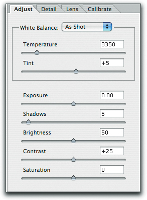
For each supported camera, Camera Raw contains not one but two built-in profiles, one for D65, the other for Illuminant A. Camera Raw’s White Balance controls—color temperature and tint—let you interpolate between, or even extrapolate beyond these two profiles—see Figure 12-22.
Figure 12-22 Camera Raw white balance controls
On the dozen or so cameras we’ve tried, we find that the Camera Raw approach allows us to get good color much more easily than we can with any of the raw converters that rely on a single static profile—most cameras respond very differently under tungsten and daylight, particularly in the blue channel, and the dual-profile approach addresses this issue capably.
However, the profiles built into Camera Raw are generic profiles for a specific camera model, and some cameras exhibit a great deal more unit-to-unit variation than others, so the default behavior may not work optimally with your specific unit. You can’t replace the generic profiles with custom ones, and it might not be a good idea to do so even if you could. The Camera Raw profiles were built by Thomas Knoll using his own proprietary profiling technology, and simply swapping in profiles built with different technology could hurt as easily as it could help.
Instead, Camera Raw features Calibrate controls that let you edit the built-in profiles so that they better reflect the behavior of your specific camera. We discuss the procedure in detail in “Calibrating Camera Raw” in Chapter 9, Evaluating and Editing Profiles.
Camera Raw Output
The destination spaces for Camera Raw are also hard-wired. Camera Raw offers the choice of sRGB, Colormatch RGB, Adobe RGB (1998), and ProPhoto RGB. Unless you’re preparing images for the Web, in which case sRGB is the obvious choice, we recommend using ProPhoto RGB, because the other spaces can easily clip colors, some of which are printable, that ProPhoto RGB does not. Figure 12-23 shows a ProPhoto RGB image plotted against sRGB and Adobe RGB, both of which clip a significant amount of color.
Figure 12-23 Color spaces and clipping

If you really need camera raw output in a space that isn’t supported by the Camera Raw plug-in, set it to produce a 16-bit/channel ProPhoto RGB image, then convert that image to your working space of choice. It’s highly unlikely that ProPhoto RGB will clip any visible colors, and any loss in the conversion from 16-bit/channel ProPhoto RGB to another space will be visually (and probably numerically) insignificant—see Figure 12-24.
Figure 12-24 Camera Raw workflow controls

If it strikes you as odd that anyone as fanatical about color management as we admit to being would advocate a solution that relies on generic profiles, bear in mind the following.
• Camera profiling is really a very special case. Most devices that we profile have a fixed, unambiguous color gamut, while cameras do not. (Scanners don’t have a fixed unambiguous color gamut either, but since the materials we scan DO have a fixed color gamut, it’s a moot point.) Cameras have to deal with the entire range of tone and color represented by the real world.
• The Calibrate controls in Camera Raw do a great job of letting you tailor the built-in profiles to match your camera’s behavior, and the process, while detailed, is a great deal simpler than building camera profiles from scratch.
Camera Raw has many other strengths besides its color-management features—Bruce has written an entire book (Real World Camera Raw with Adobe Photoshop CS) about it—but we think that the way Camera Raw handles color is nothing short of brilliant. In fact, the profile-tweening strategy is one we’d like to see extended to output. We can envisage, for example, being able to interpolate between two press profiles, one with heavy black generation, another with light black genaration, to optimize the black plate for a specific image. All we have to do now is to convince someone to build such a system.
The Same, But Different
Adobe deserves kudos for at least attempting to provide a consistent and rational user interface for color across its main applications, but as we’ve pointed out throughout this chapter, sometimes the similarities are misleading. Part of this is an inevitable consequence of the different capabilities of each application; part is an example of good intentions gone astray. The moral is to make sure that you understand the often-subtle differences between apparently identical features in each of the applications, and use them wisely.