
- Programming Python, 3rd Edition
- A Note Regarding Supplemental Files
- Foreword
- Preface
- “And Now for Something Completely Different . . . Again”
- About This Book
- About This Edition
- This Book’s Motivation
- This Book’s Structure
- This Edition’s Design
- Using the Book’s Examples
- Conventions Used in This Book
- Safari® Enabled
- Where to Look for Updates
- Contacting O’Reilly
- Using Code Examples
- Acknowledgments
- I. The Beginning
- 1. Introducing Python
- 2. A Sneak Preview
- II. System Programming
- 3. System Tools
- 3.1. “The os.path to Knowledge”
- 3.2. System Scripting Overview
- 3.3. Introducing the sys Module
- 3.4. Introducing the os Module
- 3.5. Script Execution Context
- 3.6. Current Working Directory
- 3.7. Command-Line Arguments
- 3.8. Shell Environment Variables
- 3.9. Standard Streams
- 4. File and Directory Tools
- 4.1. “Erase Your Hard Drive in Five Easy Steps!”
- 4.2. File Tools
- 4.2.1. Built-In File Objects
- 4.2.2. File Tools in the os Module
- 4.2.3. File Scanners
- 4.3. Directory Tools
- 5. Parallel System Tools
- 5.1. “Telling the Monkeys What to Do”
- 5.2. Forking Processes
- 5.3. Threads
- 5.4. Program Exits
- 5.5. Interprocess Communication
- 5.6. Pipes
- 5.7. Signals
- 5.8. Other Ways to Start Programs
- 5.9. A Portable Program-Launch Framework
- 5.10. Other System Tools
- 6. System Examples: Utilities
- 6.1. “Splits and Joins and Alien Invasions”
- 6.2. Splitting and Joining Files
- 6.3. Generating Forward-Link Web Pages
- 6.4. A Regression Test Script
- 6.5. Packing and Unpacking Files
- 6.6. Automated Program Launchers
- 7. System Examples: Directories
- 7.1. “The Greps of Wrath”
- 7.2. Fixing DOS Line Ends
- 7.3. Fixing DOS Filenames
- 7.4. Searching Directory Trees
- 7.5. Visitor: Walking Trees Generically
- 7.6. Copying Directory Trees
- 7.7. Deleting Directory Trees
- 7.8. Comparing Directory Trees
- 3. System Tools
- III. GUI Programming
- 8. Graphical User Interfaces
- 8.1. “Here’s Looking at You, Kid”
- 8.2. Python GUI Development Options
- 8.3. Tkinter Overview
- 8.4. Climbing the GUI Learning Curve
- 8.5. Tkinter Coding Basics
- 8.6. Tkinter Coding Alternatives
- 8.7. Adding Buttons and Callbacks
- 8.8. Adding User-Defined Callback Handlers
- 8.9. Adding Multiple Widgets
- 8.10. Customizing Widgets with Classes
- 8.11. Reusable GUI Components with Classes
- 8.12. The End of the Tutorial
- 8.13. Python/Tkinter for Tcl/Tk Converts
- 9. A Tkinter Tour, Part 1
- 9.1. “Widgets and Gadgets and GUIs, Oh My!”
- 9.2. Configuring Widget Appearance
- 9.3. Top-Level Windows
- 9.4. Dialogs
- 9.5. Binding Events
- 9.6. Message and Entry
- 9.7. Checkbutton, Radiobutton, and Scale
- 9.8. Running GUI Code Three Ways
- 9.9. Images
- 9.10. Viewing and Processing Images with PIL
- 10. A Tkinter Tour, Part 2
- 10.1. “On Today’s Menu: Spam, Spam, and Spam”
- 10.2. Menus
- 10.3. Listboxes and Scrollbars
- 10.4. Text
- 10.5. Canvas
- 10.6. Grids
- 10.7. Time Tools, Threads, and Animation
- 10.8. The End of the Tour
- 10.9. The PyDemos and PyGadgets Launchers
- 11. GUI Coding Techniques
- 11.1. “Building a Better Mouse Trap”
- 11.2. GuiMixin: Common Tool Mixin Classes
- 11.3. GuiMaker: Automating Menus and Toolbars
- 11.4. ShellGui: GUIs for Command-Line Tools
- 11.5. GuiStreams: Redirecting Streams to Widgets
- 11.6. Reloading Callback Handlers Dynamically
- 11.7. Wrapping Up Top-Level Window Interfaces
- 11.8. GUIs, Threads, and Queues
- 11.9. More Ways to Add GUIs to Non-GUI Code
- 12. Complete GUI Programs
- 12.1. “Python, Open Source, and Camaros”
- 12.2. PyEdit: A Text Editor Program/Object
- 12.3. PyPhoto: An Image Viewer and Resizer
- 12.4. PyView: An Image and Notes Slideshow
- 12.5. PyDraw: Painting and Moving Graphics
- 12.6. PyClock: An Analog/Digital Clock Widget
- 12.7. PyToe: A Tic-Tac-Toe Game Widget
- 12.8. Where to Go from Here
- 8. Graphical User Interfaces
- IV. Internet Programming
- 13. Network Scripting
- 13.1. “Tune In, Log On, and Drop Out”
- 13.2. Plumbing the Internet
- 13.3. Socket Programming
- 13.4. Handling Multiple Clients
- 13.5. A Simple Python File Server
- 14. Client-Side Scripting
- 14.1. “Socket to Me!”
- 14.2. FTP: Transferring Files over the Net
- 14.3. Processing Internet Email
- 14.4. POP: Fetching Email
- 14.5. SMTP: Sending Email
- 14.6. email: Parsing and Composing Mails
- 14.7. pymail: A Console-Based Email Client
- 14.8. The mailtools Utility Package
- 14.9. NNTP: Accessing Newsgroups
- 14.10. HTTP: Accessing Web Sites
- 14.11. Module urllib Revisited
- 14.12. Other Client-Side Scripting Options
- 15. The PyMailGUI Client
- 15.1. “Use the Source, Luke”
- 15.2. A PyMailGUI Demo
- 15.2.1. Getting Started
- 15.2.2. Loading Mail
- 15.2.3. Threading Model
- 15.2.4. Load Server Interface
- 15.2.5. Offline Processing with Save and Open
- 15.2.6. Sending Email and Attachments
- 15.2.7. Viewing Email and Attachments
- 15.2.8. Email Replies and Forwards
- 15.2.9. Deleting Email
- 15.2.10. POP Message Numbers and Synchronization
- 15.2.11. Multiple Windows and Status Messages
- 15.3. PyMailGUI Implementation
- 15.3.1. Code Reuse
- 15.3.2. Code Structure
- 15.3.3. PyMailGui2: The Main Module
- 15.3.4. SharedNames: Program-Wide Globals
- 15.3.5. ListWindows: Message List Windows
- 15.3.6. ViewWindows: Message View Windows
- 15.3.7. messagecache: Message Cache Manager
- 15.3.8. popuputil: General-Purpose GUI Pop Ups
- 15.3.9. wraplines: Line Split Tools
- 15.3.10. mailconfig: User Configurations
- 15.3.11. PyMailGuiHelp: User Help Text
- 15.3.12. Ideas for Improvement
- 16. Server-Side Scripting
- 16.1. “Oh What a Tangled Web We Weave”
- 16.2. What’s a Server-Side CGI Script?
- 16.3. Running Server-Side Examples
- 16.4. Climbing the CGI Learning Curve
- 16.4.1. A First Web Page
- 16.4.2. A First CGI Script
- 16.4.3. Adding Pictures and Generating Tables
- 16.4.4. Adding User Interaction
- 16.4.5. Using Tables to Lay Out Forms
- 16.4.6. Adding Common Input Devices
- 16.4.7. Changing Input Layouts
- 16.4.8. Passing Parameters in Hardcoded URLs
- 16.4.9. Passing Parameters in Hidden Form Fields
- 16.5. Saving State Information in CGI Scripts
- 16.6. The Hello World Selector
- 16.7. Refactoring Code for Maintainability
- 16.8. More on HTML and URL Escapes
- 16.9. Transferring Files to Clients and Servers
- 17. The PyMailCGI Server
- 17.1. “Things to Do When Visiting Chicago”
- 17.2. The PyMailCGI Web Site
- 17.3. The Root Page
- 17.4. Sending Mail by SMTP
- 17.5. Reading POP Email
- 17.6. Processing Fetched Mail
- 17.7. Utility Modules
- 17.8. CGI Script Trade-Offs
- 18. Advanced Internet Topics
- 18.1. “Surfing on the Shoulders of Giants”
- 18.2. Zope: A Web Application Framework
- 18.3. HTMLgen: Web Pages from Objects
- 18.4. Jython: Python for Java
- 18.5. Grail: A Python-Based Web Browser
- 18.6. XML Processing Tools
- 18.7. Windows Web Scripting Extensions
- 18.8. Python Server Pages
- 18.9. Rolling Your Own Servers in Python
- 18.10. And Other Cool Stuff
- 13. Network Scripting
- V. Tools and Techniques
- 19. Databases and Persistence
- 19.1. “Give Me an Order of Persistence, but Hold the Pickles”
- 19.2. Persistence Options in Python
- 19.3. DBM Files
- 19.4. Pickled Objects
- 19.5. Shelve Files
- 19.6. The ZODB Object-Oriented Database
- 19.7. SQL Database Interfaces
- 19.8. PyForm: A Persistent Object Viewer
- 19.8.1. Processing Shelves with Code
- 19.8.2. Adding a Graphical Interface
- 19.8.3. PyForm GUI Implementation
- 19.8.4. PyForm Table Wrappers
- 19.8.5. PyForm Creation and View Utility Scripts
- 19.8.6. Data as Code
- 19.8.7. Browsing Other Kinds of Objects with PyForm
- 19.8.8. Browsing Other Kinds of Databases with PyForm
- 19.8.9. PyForm Limitations
- 20. Data Structures
- 20.1. “Roses Are Red, Violets Are Blue; Lists Are Mutable, and So Is Set Foo”
- 20.2. Implementing Stacks
- 20.3. Implementing Sets
- 20.4. Subclassing Built-In Types
- 20.5. Binary Search Trees
- 20.6. Graph Searching
- 20.7. Reversing Sequences
- 20.8. Permuting Sequences
- 20.9. Sorting Sequences
- 20.10. Data Structures Versus Python Built-Ins
- 20.11. PyTree: A Generic Tree Object Viewer
- 21. Text and Language
- 21.1. “See Jack Hack. Hack, Jack, Hack”
- 21.2. Strategies for Parsing Text in Python
- 21.3. String Method Utilities
- 21.4. Regular Expression Pattern Matching
- 21.5. Advanced Language Tools
- 21.6. Handcoded Parsers
- 21.7. PyCalc: A Calculator Program/Object
- 21.7.1. A Simple Calculator GUI
- 21.7.2. PyCalc—A Real Calculator GUI
- 21.7.2.1. Running PyCalc
- 21.7.2.2. Evaluating expressions with stacks
- 21.7.2.3. PyCalc source code
- 21.7.2.4. Using PyCalc as a component
- 21.7.2.5. Adding new buttons in new components
- VI. Integration
- 22. Extending Python
- 22.1. “I Am Lost at C”
- 22.2. Integration Modes
- 22.3. C Extensions Overview
- 22.4. A Simple C Extension Module
- 22.5. Extension Module Details
- 22.6. The SWIG Integration Code Generator
- 22.7. Wrapping C Environment Calls
- 22.8. A C Extension Module String Stack
- 22.9. A C Extension Type String Stack
- 22.10. Wrapping C++ Classes with SWIG
- 22.11. Other Extending Tools
- 23. Embedding Python
- 23.1. “Add Python. Mix Well. Repeat.”
- 23.2. C Embedding API Overview
- 23.3. Basic Embedding Techniques
- 23.4. Registering Callback Handler Objects
- 23.5. Using Python Classes in C
- 23.6. A High-Level Embedding API: ppembed
- 23.7. Other Integration Topics
- 23.7.1. Jython: Java Integration
- 23.7.2. IronPython: C#/.NET Integration
- 23.7.3. COM Integration on Windows
- 23.7.4. CORBA Integration
- 23.7.5. Other Languages
- 23.7.6. Network-Based Integration Protocols
- 23.7.7. Integration Versus Optimization
- 23.7.7.1. Framework roles
- 23.7.7.2. Extension module roles
- 23.7.7.3. Picking an integration technology
- VIII. The End
- 24. Conclusion: Python and the Development Cycle
- 24.1. “That’s the End of the Book, Now Here’s the Meaning of Life”
- 24.2. “Something’s Wrong with the Way We Program Computers”
- 24.3. The “Gilligan Factor”
- 24.4. Doing the Right Thing
- 24.5. Enter Python
- 24.6. But What About That Bottleneck?
- 24.7. On Sinking the Titanic
- 24.8. So What’s “Python: The Sequel”?
- 24.9. In the Final Analysis . . .
- 24.10. Postscript to the Second Edition (2000)
- 24.11. Postscript to the Third Edition (2006)
- 24. Conclusion: Python and the Development Cycle
- Index
- Colophon
- Copyright
- 22. Extending Python
- 19. Databases and Persistence
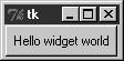
So far, we’ve learned how to display messages in labels, and we’ve met Tkinter core concepts along the way. Labels are nice for teaching the basics, but user interfaces usually need to do a bit more; like actually responding to users. The program in Example 8-10 creates the window in Figure 8-7.
Here, instead of making a label, we create an instance of the
Tkinter Button class. It’s attached
to the default top level as before on the default TOP packing side. But the main thing to
notice here is the button’s configuration arguments: we set an option
called command to the sys.exit function.
For buttons, the command
option is the place where we specify a callback handler function to be
run when the button is later pressed. In effect, we use command to register an action for Tkinter to
call when a widget’s event occurs. The callback handler used here
isn’t very interesting: as we learned in an earlier chapter, the
built-in sys.exit function simply
shuts down the calling program. Here, that means that pressing this
button makes the window go away.
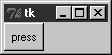
Just as for labels, there are other ways to code buttons. Example 8-11 is a version that
packs the button in place without assigning it to a name, attaches it
to the LEFT side of its parent
window explicitly, and specifies root.quit as the callback handler—a standard
Tk object method that shuts down
the GUI and so ends the program (really, it ends the current mainloop event loop call).
Example 8-11. PP3EGuiIntrogui2b.py
from Tkinter import *
root = Tk( )
Button(root, text='press', command=root.quit).pack(side=LEFT)
root.mainloop( )
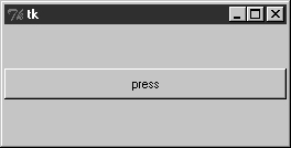
This version produces the window in Figure 8-8. Because we didn’t tell the button to expand into all available space, it does not do so.
In both of the last two examples, pressing the button makes the
GUI program exit. In older Tkinter code, you may sometimes see the
string exit assigned to the
command option to make the GUI go
away when pressed. This exploits a tool in the underlying Tk library
and is less Pythonic than sys.exit
or root.quit.
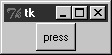
Even with a GUI this simple, there are many ways to
lay out its appearance with Tkinter’s constraint-based pack geometry manager. For example, to
center the button in its window, add an expand=YES option to the button’s pack method call, and generate a window
such as Figure 8-9. This
makes the packer allocate all available space to the button but does
not stretch the button to fill that space.
If you want the button to be given all available space and to
stretch to fill all of its assigned space horizontally, add expand=YES and fill=X keyword arguments to the pack call. This will create the scene in
Figure 8-10.
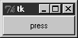
This makes the button fill the whole window initially (its allocation is expanded, and it is stretched to fill that allocation). It also makes the button grow as the parent window is resized. As shown in Figure 8-11, the button in this window does expand when its parent expands, but only along the X horizontal axis.
To make the button grow in both directions, specify both
expand=YES and fill=BOTH in the pack call; now resizing the window makes the button grow in general, as shown
in Figure 8-12. In fact,
for a good time, maximize this window to fill the entire screen;
you’ll get one very big Tkinter button indeed.

In more complex displays, such a button will expand only if
all of the widgets it is contained by are set to expand too. Here,
the button’s only parent is the Tk root window of the program, so parent
expandability isn’t yet an issue. We will revisit the packer
geometry manager when we meet multiple-widget displays later in this
tutorial and again when we study the alternative grid call in Chapter 10.
-
No Comment