11.1. NORMAL DATA
A lathe is machining shafts to a 1.0000" nominal diameter. You carefully measure 100 diameters of these shafts. If you sort the diameters into 0.0005"-wide "bins" and plot this data, you will get a histogram similar to that shown below (Figure 11-2). In this illustration, the ends of the shafts are shown for clarity. This would not be shown in a regular histogram.
|

Figure 11-2. Histogram of 100 shafts
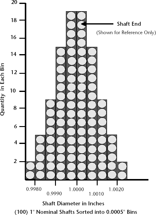
We must now interpret the data shown in this histogram.
First, notice that the process is centered and that the left half is a mirror image of the right. What percent of the shafts are within 0.001" of the 1.000" nominal diameter? Adding the bin quantities on both sides of the center ±0.001", we get 68, or 68% of the shafts. It will be shown later that on any process with a normal distribution, this 0.68 point (or 0.34 on either side of the center) is equal to ±1 sigma (or ±1 standard deviation).
For illustration purposes, 1 sigma in this case just happens to equal 0.001". Therefore, 2 sigma = 0.002". What % of the shafts is within ±2 sigma of the nominal diameter? Again, counting the bin quantities within ±0.002" on both sides of the center, we find that 96 shafts, or 96% of the shafts, are within 2 sigma of the nominal diameter.
|
All of the above questions referred to data on both sides of the center. However, it is often important to know what is occurring on only one end of the data. For example, what percent of the shafts are at least 1 sigma greater than 1.0000" diameter? Adding the bin quantities to the right of +1 sigma (sigma in this case happens to be +0.0010"), we get 16, or 16%.
We will be using charts (and computer programs) that take the reference points either at the center or at either end of the data. You have to look carefully at the data and chart illustration to see what reference point is being used.
Now, using some of the techniques from the previous chapter on probability and assuming independence (assume that you put back the first shaft before picking the second), what is the likelihood of randomly picking two shafts that are above 1.0000" in diameter? Since the probability of each is 0.5, the probability of two in a row is 0.5 * 0.5 = 0.25.
The above example used shafts, but other items could have been plotted with similar results. The height of adult men could have been plotted, with the bins representing 1" height increments. Multiple sales results could be shown as a histogram, with each bin increasing $10,000 dollars. Clerical errors could be displayed, with each bin being an increment of errors per 10,000 entries. Stock fund performance could be shown, with the bins being % annual gain. In all the above cases, you will probably get a normal distribution.
Let's now plot the same population of shaft data using 1000 shafts and breaking the data into 0.0001"-wide bins (Figure 11-3).
As we get more data from this process and use smaller bins, the shape of the histogram approaches a normal distribution. In fact it helps to think of a normal "curve" as a normal distribution with very small bins. This is the shape that will occur on many processes.
Below (Figure 11-4) is a normal distribution curve showing how it varies with different values of sigma.
As stated previously, on any plot of data from a normal process, approximately 2/3 (68%) of the data points are within ±1 sigma on either side of the center, 95% are within ±2 sigma on either side, and 99.7% are within ±3 sigma of the center. The use of normal curve standardized data allows us to make predictions on processes with normal distributions using small samples rather than collecting hundreds of data points on each process. As you will see later, once we establish that a process has a normal distribution, we can assume that this distribution will stay normal unless a major process change occurs.
Figure 11-3. Histogram of 1000 shafts

|
Figure 11-4. Normal distribution with various sigma values

We will be doing a lot of analysis based on the likelihood of randomly finding data beyond ±2 sigma, or outside of the expected 95% of the data. In the case of our 1000 shafts, below is our histogram (Figure 11-5) with this 5% area darkly shaded on the two ends below 0.9980" and above 1.0020".
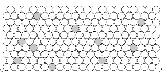
To get a sense of what this kind of distribution would look like if it were distributed randomly, Figure 11-6 shows several hundred shafts with 5% of the shafts shaded.
If you randomly picked a shaft from the distribution in Figure 11-6, you would be unlikely to pick a shaded one. In fact, if you picked a shaded shaft very often, you would probably begin to wonder if the distribution really had only 5% shaded shafts. Much of the analysis we will be doing has similar logic.
Let's pursue this further. Suppose you had been led to believe that a distribution had 5% shaded shafts, but you suspected that this was not true. If you picked one shaft randomly and it was shaded, you would be suspicious, because you know that the chance of this happening randomly is only 5%. If you had picked two shaded shafts in a row (assuming that you had put the first shaft back, mixed the shafts, and then randomly picked the second shaft), then you would really wonder, since you know that the chance of randomly picking two shaded shafts in this manner is only 0.05 * 0.05 = .0025, or only 0.25%! From this limited sample, you would suspect that the whole shaft population was more than 5% shaded.
Figure 11-5. Histogram of 1000 shafts with 5% shaded

Figure 11-6. Random shafts with 5% shaded