
Case Study 1
In Search of Enterprise Metrics
Doug Dexter’s case study is a good starting place and an example of how IT security metrics are a journey and not a destination. Doug’s experiences at Cisco put him at the heart of one of the most dynamic and complex IT security environments in the world. This complexity becomes apparent as Doug and team attempt to measure their risks, threats, and operational activities. Doug peels back the onion, so to speak, and shows how metrics at an organizational level cannot be something that you decide to do on a whim. Metrics take effort and a nuanced understanding of the goals and questions necessary even to define and articulate that which will be measured.
Doug offers a practitioner’s lessons in the benefits and pitfalls of measuring IT security that parallel the advice and examples you will read about throughout this book. One of the takeaways from Doug’s case study that I find most valuable is the need to question the value and positioning of your security metrics continually, both for yourself and for any stakeholders you may be trying to reach or sway. A careful and self-critical approach to security metrics that continually requires you to justify the data you collect and the analyses you perform on them is the best way to ensure that your metrics program provides long-term value for your organization.
Case Study 1: In Search of Enterprise Metrics
by Doug Dexter
I’m the team leader for Cisco’s corporate security audit team. My team is responsible for performing assessments, audits, and acquisition integrations for the Corporate Security Programs Office (CSPO). With a team mission to proactively identify, prioritize, and communicate threats, vulnerabilities, and other risks to the confidentiality, integrity, and availability of Cisco’s information and computing assets, we’re responsible for the corporation’s vulnerability scanning, web application scanning, and penetration testing programs. Communicating the results of these programs has put us squarely on the path to find and deliver the best set of security metrics to the people responsible for addressing the issues we discover.
We began our journey to find a set of enterprise security metrics five years ago, at the close of a project to procure and deploy a vulnerability scanning system capable of scanning all of Cisco. Yes, I said “close” of the project, because it wasn’t until after we had the scanning product in-house that we really started to understand just how large and difficult the issue of metrics was going to be for us.
Prior to that time, we had no enterprise-level ability to scan for security vulnerabilities. Some of the engineers had installed Nessus on their laptops and were using that on an ad hoc basis. But for a corporation our size, we knew we needed a “real” system. And in the back of our minds, we knew that we’d have to generate reports and use those reports to show the system administrators that they needed to patch this host or that one. Certainly we knew we needed metrics of some type, but we didn’t have a clue as to what we were really getting into.
To help visualize and provide some background about what we’re working with internally at Cisco, I’ve provided a couple of figures. Figure 1 shows the standard view of how an enterprise describes itself. The view contains internal networks, external networks, and others, all contained in clouds and connected by clearly defined lines. This is a high-level, conceptual view of the Cisco network. It doesn’t provide details about how anything is connected, or how any part interoperates with any other part, but it does show a “20,000-foot view” of the size and complexity of our network.
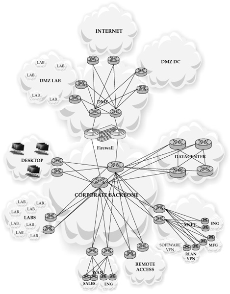
Figure 1. How Cisco views itself conceptually
Figure 2 shows a more realistic picture of Cisco. This view was created with network modeling software, and although it displays basically the same contents shown in Figure 1, it clearly demonstrates just how intricate modern networks have become. This model contains more than 27,000 router and switch configurations. Although Figure 2 also provides a broad view, with this model it’s possible to zoom into a specific zone, or even deeper into a specific router, or an ACL line on a router. In raw form, it’s more than 4 GB of text. Certainly we all know that networks are complex. But it isn’t until you create a model that includes every piece of equipment and defines how the different zones of the network communicate that you begin to comprehend just how overwhelmingly complex your network environment really is.
Cisco has more than 30 million available IP addresses, subdivided into approximately 56,000 networks that change on a daily basis. The Audit Team realized that due to Cisco’s size and complexity, any systems and processes we would create had to be automated. There was no sane way we could manually update this amount of information, let alone begin to comprehend it. And with that automation, we needed a set of metrics that would assist us in describing the threats and vulnerabilities in the devices that lived on our network and that would help us prioritize remediation efforts by identifying which vulnerabilities and hosts were likeliest to be attacked.
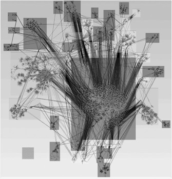
Figure 2. How Cisco actually looks
This case study consists of five scenarios that describe real-world situations we encountered. My team has learned a number of lessons from these experiences, and our goal is to share them.
Over the course of the past few years, the audit team has accomplished some things well, and we’ve made some mistakes. This case study isn’t written with the notion of teaching you everything you need to know about creating your own metrics. On the contrary, it consists of some of the more memorable mistakes we’ve made and the lessons we’ve learned on our journey toward finding a credible set of realistic, reliable, and reproducible metrics. The team is still not there yet, but we are getting closer.
Scenario One: Our New Vulnerability Management Program
On the first day of using our new vulnerability management system (scanners), we ran a series of scans and eagerly awaited the report. We had decided to focus on DMZ-based hosts, as they are the most accessible to an attacker. We ran the report and found a large number of hosts with easily exploited vulnerabilities on our DMZ. Our initial metrics looked like this:
![]() Total number of hosts scanned
Total number of hosts scanned
![]() Total number of hosts vulnerable by severity (low, medium, high)
Total number of hosts vulnerable by severity (low, medium, high)
![]() Percentage of hosts vulnerable
Percentage of hosts vulnerable
We put together a couple of slides and used them to brief our CSO, who looked at the slides and said, “So how many of these hosts are on the production DMZ, and how many are in lab DMZs?” We didn’t know. Not a clue. Not even a hint. We had gone to our boss with metrics that said, “There are this many vulnerabilities on our DMZ hosts,” when we really didn’t know how many were serious and how many were not.
For background, at that time, Cisco had more than 5000 labs and more than 600 hosts on DMZ networks. We did have a very good network management tool. However, no one had ever made a distinction between a “production DMZ” and a “lab DMZ.” They were all just labeled “DMZ” in the network management tool. Even the underlying system that maintained the inventory of all our networks didn’t have the ability to distinguish between the two. No one had ever thought about them in that manner before. They were all just DMZ networks.
Lesson One: Verify that the data you’re presenting accurately describes the conclusions you reach with the data. We mixed the two types of data (DMZ production and DMZ lab), and we couldn’t tell the two apart. While any issues in our production DMZ would be addressed immediately, issues in our labs aren’t revenue impacting so they’re not addressed as quickly. To make matters worse, we had no easy way to delineate the production networks from the lab networks. It took another three months for us to review all the hosts and their applications, mark the networks, add a new field in the database, and update the related tables. During this time, our CSO kept asking us for more information about the Production DMZ—information we simply couldn’t separate from the rest of the DMZ networks. It was a very long three months.
Lesson Two: Manage executive expectations about the accuracy of initial metrics, and solicit their input on metric creation. Executives at any company probably expect that a system just purchased will immediately begin providing very accurate information about the enterprise, and they will have an idea of which areas they want more information about. However, the tool will be only as accurate as the data it receives (see Lesson One).
You must explain to executives that the tool will need to be checked and tuned, prior to making any major decisions from the information it presents. Solicit executives’ input about which areas they want more information, or what questions they’d like answered. Consider that input and think through the metrics you’ll likely need to create to provide that information or answer those questions. Then think through what additional information will be necessary to act on the results you’ve just produced. If that additional information is not available, or accurate, it will affect your ability to act upon your initial results.
Scenario Two: Who’s on First?
Once we separated the two sets of networks, we ran our scans again and put together new slides. Most hosts were in very good shape, but a few hosts needed to be checked to verify whether their vulnerabilities were valid or if they were false positives. This is when we discovered another set of issues:
![]() Some hosts didn’t have anyone registered as the owner.
Some hosts didn’t have anyone registered as the owner.
![]() Some host owners were no longer at the company.
Some host owners were no longer at the company.
![]() Some host owners had moved on to other positions, but were still with the company (leaving us to follow up with someone who could possibly identify the current owner).
Some host owners had moved on to other positions, but were still with the company (leaving us to follow up with someone who could possibly identify the current owner).
Overall, we had a significant portion of our hosts with either a “zombie” owner (the name provided was someone who didn’t exist in the company anymore) or with no owner at all. Much to our chagrin, our initial set of metrics no longer described the real issues. Our new vulnerability scanning tool worked fine and could easily identify hosts with vulnerabilities. It was our internal processes and inventory control systems that were lacking, and they couldn’t tell us who was responsible for the hosts with vulnerabilities. The effectiveness of our scanning tool was hampered by our inability to contact a host owner to begin remediation.
Lesson Three: Knowing who owns a host is more valuable than knowing what vulnerabilities are on a host. It was at that point we realized we needed to create a new set of metrics based on ownership. Learning from our previous mistake, we included the subsets of DMZ(s) and datacenter(s):
![]() Hosts with valid owners (separated by DMZ and by datacenter)
Hosts with valid owners (separated by DMZ and by datacenter)
![]() Hosts with zombie owners (separated by DMZ and by datacenter)
Hosts with zombie owners (separated by DMZ and by datacenter)
![]() Hosts with no owners (separated by DMZ and by datacenter)
Hosts with no owners (separated by DMZ and by datacenter)
This new set of metrics helped us define the new problem of host ownership (or lack thereof). To help us gauge this new aspect of our situation, we added the category of Registration to our initial set of metrics and came up with a more accurate vulnerability management list:
![]() Total number of hosts scanned
Total number of hosts scanned
![]() Total number of registered hosts
Total number of registered hosts
![]() Total number of unregistered hosts
Total number of unregistered hosts
![]() Total number of hosts vulnerable (low, medium, high)
Total number of hosts vulnerable (low, medium, high)
![]() Total number of registered hosts vulnerable (low, medium, high)
Total number of registered hosts vulnerable (low, medium, high)
![]() Total number of unregistered hosts vulnerable (low, medium, high)
Total number of unregistered hosts vulnerable (low, medium, high)
![]() Percentage of hosts vulnerable (low, medium, high)
Percentage of hosts vulnerable (low, medium, high)
![]() Percentage of registered hosts vulnerable (low, medium, high)
Percentage of registered hosts vulnerable (low, medium, high)
![]() Percentage of unregistered hosts vulnerable (low, medium, high)
Percentage of unregistered hosts vulnerable (low, medium, high)
As we studied these categories, we realized that the most dangerous hosts in our organization were those that were unregistered and had high severity vulnerabilities. Vulnerable hosts with valid owners were easy to contact and correct. Vulnerable hosts with no owners were difficult, if not impossible, to remediate. We couldn’t “blackhole” them (disconnect them from the network), because we didn’t know whether they were still providing mission-critical services. They became our most urgent priority, and we began to sleuth out the owners.
Scenario Three: The Value of a Slide
As we worked our way through the issues, we started developing more accurate information from our scanning systems. This helped us build a relationship with our executives, and with the administrators tasked with remediating the issues found with the hosts. But there was a side effect—the ability to display too much information that added little or no value.
As we started considering which metrics to brief, we created tons of slides—most of which we discarded, because, although they were very cool looking, they really didn’t say much of anything. Figure 3 shows one of the automatically created graphs from our vulnerability management tool. The chart displays the total DMZ vulnerabilities by month over the course of the previous year.
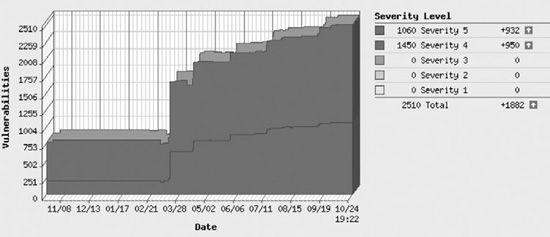
Figure 3. DMZ vulnerabilities across time
At first glance, this is quite an informative chart. There appears to be an increase in vulnerabilities across time. That is a fairly simple message. But the graph is missing so many items that it really doesn’t say anything, and it actually hides more important questions:
![]() It needs a key that explains Severity levels (for reference, 1 is low, and 5 is high).
It needs a key that explains Severity levels (for reference, 1 is low, and 5 is high).
![]() It needs to explain why there aren’t any Severity 1, 2, or 3 vulnerabilities. (They were omitted for clarity.)
It needs to explain why there aren’t any Severity 1, 2, or 3 vulnerabilities. (They were omitted for clarity.)
![]() It needs to explain whether these vulnerabilities are confirmed as definitely exploitable, or confirmed as potentially exploitable. (This chart included both confirmed and potential vulnerabilities.)
It needs to explain whether these vulnerabilities are confirmed as definitely exploitable, or confirmed as potentially exploitable. (This chart included both confirmed and potential vulnerabilities.)
One important question that should be asked is, why did the vulnerabilities triple in March? March was the month we moved from development to production and started scanning all, rather than only part, of our DMZ networks.
The other important question that is not readily apparent is, why do we have only an increase in vulnerabilities? Actually, many vulnerabilities were being remediated by decommissioning hosts and consolidating their services to other systems. But for the vulnerability management tool to remove a vulnerability, it needed to rescan the host and ensure that the vulnerability had been addressed. If there was no host to scan (that is, it had been decommissioned), the vulnerability would remain in the database until it was manually removed.
Lesson Four: You’ll be tempted to create and brief exciting slides. Don’t do it. Metrics aren’t about being pretty; they’re about inciting corrective action. Metrics exist to assure a process owner that a process is functioning correctly. If a metric indicates the process isn’t functioning correctly, the process owner needs to determine what is affecting the process and address the underlying issues. That’s simple enough. But if the metric is causing a belief that an issue exists when it actually doesn’t, then it’s not a good metric. In this case, the impression was that vulnerabilities had increased across the year, when actually they had decreased, but we hadn’t tuned out results from the decommissioned hosts. With Figure 3, we have a very good looking, easy-to-produce, and interesting looking chart that also happens to be horribly misleading.
Lesson Five: Don’t trend your data until you have a solid baseline. The graph in Figure 3 purported to display a trend in Severity 4 and Severity 5 vulnerabilities over the course of the previous year. But that trend actually presented data from initial product testing, initial deployment, and subsequent incremental additions to the overall pool of hosts being scanned. As a result, the total vulnerability count skewed upward, with no sign of any effort to reduce the vulnerabilities that had occurred the previous year.
More to the point is the question “How many vulnerabilities do we have?” a very good one? Does it really represent what we’re hoping to capture about our efforts at remediating vulnerabilities on our hosts? Certainly, we could compare how many vulnerabilities we have per month, as is demonstrated in Figure 3. As long as the trend is down, we must be appropriately addressing issues on our hosts, right? But, really, that question simply describes a point in time. It’s sort of a dipstick into the gas tank of total corporate vulnerabilities. A measurement like this describes only one facet of an issue (How much gas is in the tank?), and it often doesn’t answer the real question (Do I have enough gas to make it to the next filling station?). In this case, our metric failed to take into account how long it takes to remediate a vulnerability, what category of host requires remediation, and who is doing the remediation. As we realized this, we changed the question from “How many vulnerabilities do we have?” to a series of more accurate questions:
![]() What is the lifespan for a vulnerability on a production DMZ host?
What is the lifespan for a vulnerability on a production DMZ host?
![]() What is the lifespan for a vulnerability on a production datacenter host?
What is the lifespan for a vulnerability on a production datacenter host?
And even as good as these two questions may be, they become even more accurate once they have been reworded to include the responsible support teams. So here are those same questions, with their accuracy improved by defining who is doing the remediation:
![]() What is the lifespan for a vulnerability on a production DMZ host maintained by the e-mail team?
What is the lifespan for a vulnerability on a production DMZ host maintained by the e-mail team?
![]() What is the lifespan for a vulnerability on a production DMZ host maintained by the Windows Sysadmin team?
What is the lifespan for a vulnerability on a production DMZ host maintained by the Windows Sysadmin team?
![]() What is the lifespan for a vulnerability on a production DMZ host maintained by the UNIX Sysadmin team?
What is the lifespan for a vulnerability on a production DMZ host maintained by the UNIX Sysadmin team?
As we informed the teams about the vulnerabilities on their systems, and included the trend of how long remediation was taking, we encountered an interesting side effect: The metrics had spurred the teams to try and outperform one another. This is discussed in more detail at the end of the case study.
Scenario Four: The Monitoring Program
The Cisco Security Incident Response Team (CSIRT) is a sister to the Audit Team. As the name implies, this team is responsible for handling more reactive security tasks, such as incident response, while the Audit team handles more proactive security tasks, such as compliance audits. Of course, this is an oversimplification, because both teams perform proactive and reactive security tasks, and some overlap occurs between the teams.
A major task for the CSIRT team is to monitor botnet activity on the internal network via a network monitoring tool called NetFlow. Data is fed to this tool via a SPAN port on each datacenter switch. A SPAN port is a port whose purpose is to mirror the data flowing across all the other ports on that switch. (SPAN stands for Switched Port Analyzer, but this is Cisco’s specific name for this functionality. Other vendors provide this same port-mirroring ability with their own name for the feature.) So in a nutshell, all the traffic on every datacenter switch is mapped to a port on that switch, and all that traffic is sent through a series of NetFlow filters that recognize and identify botnet activity.
Over time, CSIRT has discovered a variety of malware, including botnets, on our internal network. As these malware-infected hosts are identified, they are not allowed to route traffic on the network via a technique commonly called BGP Blackholing. CSIRT worked with the network team to create an application that can easily deploy instructions to our routers to ignore traffic from these hosts. (For more information on this technique, go to www.cisco.com/web/about/security/intelligence/worm-mitigation-whitepaper.html.)
With these tools in place, the CSIRT team began detailed tracking of malware and botnet activity, kicking infected hosts off of the network and not allowing them back until the sysadmin said the infection had been removed from the hosts and that the hosts had been patched against reinfection. Hosts that were reinfected were repetitively denied access.
Figure 4 shows how this program ran over the course of two years. You’ll notice a gradual decrease in activity over the first year and a half, with a small increase in April 2009, followed by another decrease.
When this project began in February 2008, a large information awareness campaign was associated with it. The campaign was designed to inform our lab administrators that Cisco did have malware and botnets, and that entire lab networks had been removed from the Cisco network until they were fully patched. The program was largely successful; malware activity decreased in eight months from a high of more than 1000 botnet-infected hosts, to a low of 50 botnet-infected hosts. But after that time, the awareness campaign ended, and after four months of very few issues, the numbers started increasing again in February 2009. It seems that something must have happened to lower the total of botnet-infected hosts (perhaps a second awareness campaign?), but that’s not what really happened.
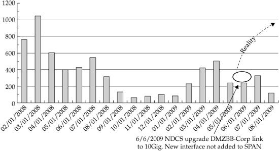
Figure 4. The disappearing interface
Cisco, like most large organizations, has a very large and distributed workforce. Unknown to the CSIRT team, the Network Operations team (NDCS) had been upgrading many corporate interconnection links from 1GB to 10GB. A ten-fold increase in bandwidth is usually a very good thing, but while performing the upgrade, the NDCS team neglected to reconnect the SPAN port for some of the links. In effect, this made our monitoring systems blind to traffic handled by those links. As for the metrics, it made it look like the CSIRT team was being very effective at addressing the malware and botnets. The CSIRT team discovered this four months later when they saw botnet traffic on a filter on a different network segment than the source of the traffic. That traffic should have been detected by a filter on that network segment. After reconnecting the SPAN ports so the filters could review the missing traffic, we saw a huge increase in malware activity.
Lesson Six: Create a sanity check on automated metric-generating processes. Automation is absolutely essential to managing and maintaining an enterprise network, and automating data collection and analysis is just as essential. In this case, an automated flow that had been running for over a year fell out of the total group of flows that CSIRT was measuring. Although a number of mechanisms were in place to determine whether the NetFlow collectors were functioning correctly, no mechanism was used to determine whether a NetFlow collector was up, but not doing anything. If all of our NetFlow collectors had been dropped, it would have been noticed immediately. But we lost only a few, so although the system was broken, it still appeared to be functioning correctly. This was an easy issue to fix, but it made us reexamine all our automated processes to look for gaps in how they functioned that could lead to an incorrectly generated metric.
Scenario Five: What Cost, the Truth?
This scenario looks more closely at the message we’re communicating from the data contained in one of our slides. We’d been running the vulnerability scanning program for more than a year and were providing more accurate information based on the metrics data we were capturing and the lessons we’d learned. Figure 5 shows a slide with vulnerability details about one of our datacenters. It lists the operating systems, the number of Severity 5 vulnerabilities, the number of hosts with Severity 5 vulnerabilities, and the percentage of hosts with Severity 5 vulnerabilities.
My team had marked the Windows OS row and the Solaris OS rows of this slide, because we thought that having 8.2 percent and 5.2 percent (respectively) of our managed hosts exhibiting high-severity vulnerabilities was too many. We went into an executive meeting to discuss these findings.
What was interesting was how this information was absorbed, evaluated, and repurposed by the executives. Everyone agreed that too many vulnerabilities appeared on the Windows and Solaris hosts, and we spent very little time discussing what my team had assumed would be the gist of the meeting. Basically, the executives knew that the hosts would be remediated and that the remediation effort would cost the company in time and resources. So that part of the meeting was quick and easy. The time-consuming part was the discussion around how many or what percentage of high-severity vulnerabilities was acceptable. One executive called out the Linux OS and Cisco OS categories and said that since both had less than 1 percent of their hosts with high-severity vulnerabilities, those teams must be spending too much time, effort, and resources on patching their hosts. Now that was an interesting thought. The executive didn’t realize it, but he was describing the law of diminishing returns and was applying it to vulnerability remediation.
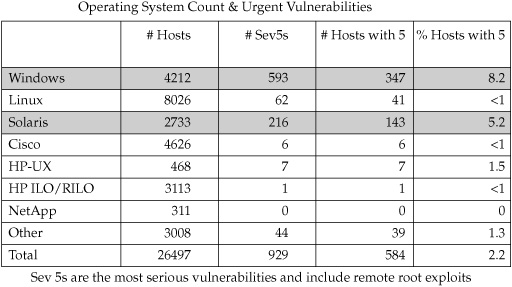
Figure 5. Operating System Count & Urgent Vulnerabilities graph
Lesson Seven: There is a trade-off between the money spent to remediate vulnerabilities and the increase in security posture. This balance between the money spent and the increase in security posture is the most important principle in information security. Certainly, if an organization had unlimited funds, it could spend those funds to create an “unhackable” environment. But the rest of us have to show that the money we’re spending is actually improving the overall security posture in the organization. We don’t have unlimited funds. Nobody does (except perhaps the government, or financial institutions such as banks). Even if we did spend more money (time, effort, resources) on remediating every vulnerability, it doesn’t necessarily follow that we would receive an increase in the overall security to the company. It’s quite possible that by patching every vulnerability, a critical vendor-supported application would fail because it wouldn’t be able to function with the latest operating system patch. At that point, you’d have to consider a mitigating strategy that maintained and defended the vulnerable critical system until the vendors figured out a patch, or you’d have to migrate your application to a more defendable system. Given that there are any number of complex situations like this that require a significant commitment in time, effort, and resources to address, it’s safe to say that some vulnerabilities are easier to patch than others. We can also infer that the more time and effort we have to remediate a vulnerability, the more it costs to repair.
So how much do you want to pay for security? How many vulnerabilities is too many? For that matter, how many vulnerabilities is too few? Is zero the right amount? And if zero is the right amount for your organization, are your executives willing to spend the money to ensure that there are zero vulnerabilities on their systems? Admittedly, some organizations are willing to spend more money on addressing vulnerabilities (such as banks, hospitals, and governments). But many other organizations are willing to accept the risk trade-off of balancing vulnerabilities with cost savings.
For Cisco, we decided that zero, for any of these, would be an awfully expensive number to maintain. From there, we decided to use a different metric. After listening to the executives describe the balance between money and security posture, we realized that the question we wanted answered wasn’t “How many hosts have high-severity vulnerabilities in this datacenter, sorted by OS Support team?” The question was, “How long does it take us to address vulnerabilities on hosts in this datacenter, sorted by OS Support team?” You may remember these questions from a couple of sections ago:
![]() What is the lifespan for a vulnerability on a datacenter host maintained by the e-mail team?
What is the lifespan for a vulnerability on a datacenter host maintained by the e-mail team?
![]() What is the lifespan for a vulnerability on a datacenter host maintained by the Windows Sysadmin team?
What is the lifespan for a vulnerability on a datacenter host maintained by the Windows Sysadmin team?
![]() What is the lifespan for a vulnerability on a datacenter host maintained by the UNIX Sysadmin team?
What is the lifespan for a vulnerability on a datacenter host maintained by the UNIX Sysadmin team?
This set of questions was created following the meeting with those executives. The questions reflect our realization that in a large enterprise, many different teams led by different executives are responsible for remediating issues. These executives are very focused on the issues they can control and that directly concern them. They are not interested in a metric that contains issues outside of their area of control. For instance, a slide that describes all UNIX-based vulnerabilities is mildly interesting, but it’s always followed by questions along the lines of “How many of these hosts are mine?” or “What action should I take from this data?” or “Why are you telling me this? It doesn’t concern me.”
Lesson Eight: Tailor your metrics to each executive and team you’re soliciting for remediation. To support the remediation effort fully, you must make sure that your analytic systems can not only narrow down the responsible owner or support team, but can also aggregate those support teams into a larger, more comprehensive view for executives to understand issues their teams are responsible to remediate. These larger views can be briefed to more senior executive management and display trends between and among teams.
For instance, dividing out the Windows Active Directory support team from the Windows Call Manager support team provides more detailed remediation data for the individual teams to address issues. But based on the principle of “everybody has a boss,” aggregating those same teams provides a view that allows a “very senior executive” to compare the executive-led Windows team to the executive-led UNIX team and review how those teams are doing. These comparisons, at the executive and more senior executive level, are what drive teams to address issues. There’s an old audit saying that goes like this: “That which is not inspected is neglected.” In this case, by creating metrics that are directly attributable to a team, and providing those metrics to the executives responsible for those teams, we’ve created an inspection process that is helping the corporation address host vulnerabilities.
Summary
In this case study I’ve attempted to illustrate a series of issues that we have encountered while trying to develop a set of enterprise metrics. Perhaps you were already aware of these pitfalls—if so, we’re jealous, because we’ve fallen headlong into every one of them, though we learned a lot in the process. If these pitfalls were new to you, we share them generously, in the hope that you and your organization won’t learn the same painful lessons that we learned and in quite the same way that we learned them.