
CHAPTER 7
Measuring Security Operations
The preceding chapters have outlined the Security Process Management (SPM) Framework, including the role of security measurement projects (SMPs) as a component of the framework. I also spent quite a bit of time describing various types of data and techniques for their analysis. The next few chapters will dive into the details of SMPs by way of examples drawn from a number of areas, beginning with the measurement of security operational activities.
Data analysis can be daunting, as literally hundreds of statistical tests and methods can be employed to make sense of your observations. The purpose of these chapters and examples is to show you how the concepts covered so far in the book can play out in actual practice, using several more commonly employed techniques. If you are looking to move beyond descriptive methods or to explore qualitative analysis in your security metrics program, I offer some starting points in the pages that follow.
The metrics, data, and analysis methods described in the coming chapters are just suggestions and they may not be appropriate to every organization. But hopefully they can give you some ideas on how you might approach metrics projects and data analysis in your own security programs.
Sample Metrics for Security Operations
The Goal-Question-Metric (GQM) method is a good way to develop security metrics that are targeted to specific needs and initiatives, and it takes into account the unique requirements of a particular organization or environment. But it can also be useful to have a set of predeveloped metrics that can be used “off the shelf” or as inspiration for developing other, similar measurement activities and projects. Most organizations will already have security metrics that they collect and analyze, usually through descriptive methods, and these metrics can be included in developing a sample catalog.
Table 7-1 lists a number of operational IT security metrics that can be used as a starting point for data collection and analysis. I have divided these metrics into four basic areas: budget & personnel, processes & projects, systems & vulnerabilities, and change & remediation. This is certainly not an exhaustive list and only scratches the surface of possible measurements. If you have your own metrics, you should add them to the list or replace those metrics that may not be appropriate to your security goals. And as your SMPs and GQM exercises produce new metrics, you should incorporate these as well into a documented and dynamic security metrics catalog.
These metrics provide just a few ideas for sources of security data that can be used to drive measurement and improvement of the security process over time. Most security organizations are already regularly collecting data on events, vulnerabilities, and other facets of their operational activities to support requests for information from supervisors and senior management. This data is important, but security really begins to benefit from the metrics program when analysis extends beyond the immediate data. This benefit may be brought about simply by collecting and collating data over time to provide baselines and more longitudinal insight, which already takes place in many IT security shops. But there are other creative ways to approach measurement and analysis projects that are not as commonly applied to IT security today, and I will explore a few examples in this chapter.
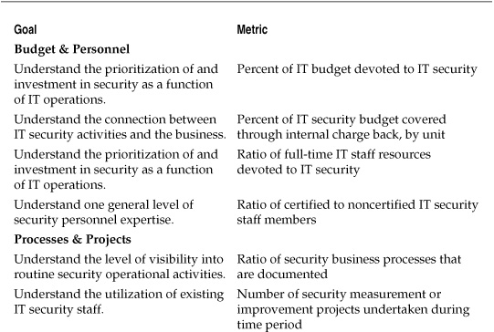
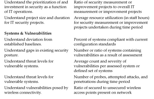
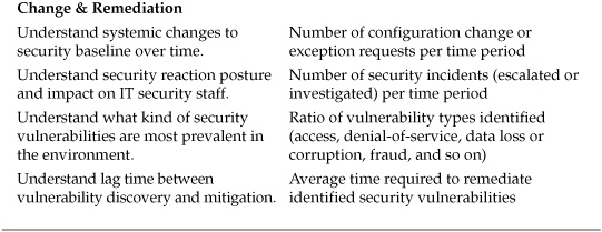
Table 7-1. Sample Metrics for Security Operations
Sample Measurement Projects for Security Operations
The following four projects provide some practical examples of how security metrics can be used in the context of SMPs to meet defined measurement goals. For each project, I have developed a basic GQM template to define the goal of the project, the questions the project is intended to answer, and the metrics used to provide those answers.
SMP: General Risk Assessment
The first project is designed to improve upon the annual loss expectancy and risk matrix methods of risk analysis that I critiqued in previous chapters. Estimations of annual loss expectancy have been critiqued because the numbers used are often completely made up, based on little or no supportable evidence.
Risk matrix analysis involves asking IT security stakeholders to assign simple ordinal values to the probabilities and costs of certain security threats. These values are usually a variation on high, medium, or low, although they may be expressed in numerical scales (1–3, 1–10, 1–100, and so on). These analyses are problematic because they measure perception of risk rather than actual risk, and they disconnect the risk metric from real numbers and costs in favor of a heat map. In both techniques, the assessments often introduce as much uncertainty to the risk question as they remove.
We continue to perform these risk assessments for many reasons, including familiarity and the fact that they are pretty easy to perform. We also perform them because of a perception that no viable alternatives exist. We need some way of estimating and judging risk even though we are uncertain about what the actual risk is. But how do you improve the accuracy of an educated guess? Assessing security risks is difficult in part because of a lack of solid, empirical data on which to base estimates. Without that data, it may seem hopeless that we can get any closer than experience and “gut” in our guessing.
Fortunately, a substantial body of literature is available on judgments in situations of uncertainty and of more rigorously analyzing the opinions of experts in the context of those situations. This measurement project used some of these techniques to improve on a company’s existing, matrix-based risk assessments to gain insight and reduce existing uncertainties regarding the annual financial costs of several threats. The GQM template for the project is listed in Table 7-2.
Using Confidence Intervals (CIs) for Analyzing Expert Judgments
A full treatment of the methods for analyzing human judgment under uncertainty is beyond the scope of this measurement project, but the implications of these techniques for IT security are interesting because they provide a balance between the estimates of an annualized loss expectancy (ALE) assessment and the construction of a risk matrix, all while focusing on maintaining sound methodological and statistical practices. Rather than attempting to develop numbers or scores that can be plugged into an equation or a matrix, these techniques focus on building CIs around the measurements under analysis. A CI is a range of values that is predicted to contain the true value sought at some level of assuredness. For instance, a 90 percent CI is a range of values that is predicted to contain the actual value you are seeking nine out of ten times. CIs allow expert opinion to be articulated in a way that is not absolute, but they eliminate a predefined amount of uncertainty.
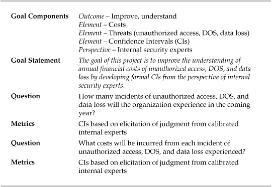
Table 7-2. GQM Template for General Risk Assessment Project
Earlier in the book I described building a CI using the example of estimating the balance of your checking account. We each have enough information and expertise about our finances to be more precise than simply saying our balances are low, medium, or high, even if we cannot give an exact amount. CI construction leverages expertise and experience in order to give a range that we are reasonably sure is correct. The level of reasonableness we need or want may vary—in some cases we may want to be 95 percent confident of a result while in others a 70 percent CI may be sufficient for our goals. The trick is to combine the proper level of available information with our experience and opinions at an appropriate level of certainty. Harnessing informed opinion is the core principle of developing expert CIs and can be effectively employed in IT security as an alternative to traditional ALE or matrix assessments.
One advantage of CI construction for security is that the practice of articulating risk as an expected interval with a certain probability reduces the tendency to treat the risk numbers as absolutes. Forcing yourself to consider the chances that you are wrong in your estimates adds a bit more rigor to your analysis, and thinking in terms of ranges helps you to avoid fixating or anchoring on a particular value. Another advantage to CI construction is that the treatment of risk in terms of a range of probabilities can open up further analysis, using techniques to model the various scenarios that you envision within the range. Finally, by building CIs in the context of an ongoing Security Improvement Program (SIP), you are able to check estimates against actual occurrence and use these comparisons to refine further estimates. Over time, this data can then be used to build more sophisticated risk models for the organization than a series of heat maps or a wildly dispersed set of ALE-to-actual loss figures.
CIs for Security Risks
The approach of this project was much the same as that of a more conventional security risk assessment, but the goal was to substitute a CI of 80 percent for the values under examination, rather than attempt to estimate a single best value or to score risks in some other way.
Four expert stakeholders participated in the project, all either members of the company’s IT security staff or risk management specialists with IT experience working in the office of the chief financial officer. The task assigned these individuals was to develop 80 percent CIs for the following risk criteria:
![]() Number of security events over the next 12 months (unauthorized access, DOS, virus outbreak, and data loss)
Number of security events over the next 12 months (unauthorized access, DOS, virus outbreak, and data loss)
![]() Total cost of each security incident of each type
Total cost of each security incident of each type
For each CI, the experts were to estimate a minimum value, a maximum value, and a most likely value that would represent the CI. The participants were to base their judgments on their experience and knowledge, such that they were 80 percent certain that the actual risk values (which were unknown) fell somewhere within the expressed range. The structure of the generic CI is illustrated visually in Figure 7-1.
Eliciting and Validating the Expert Judgments
Of course, the central problem of this metrics exercise is not much different from that of ALE or matrix assessments: How do we trust that these expert opinions are valid and useful for decision-making? To ensure that the developed CIs removed more uncertainty from the risk assessment than they added to it, several exercises drawn from decision sciences research were used during the project. In essence, attempts were made to “calibrate” the expert stakeholders’ judgments to ensure that they were justified. This task was accomplished by breaking the risk assessment into three phases, each involving the construction of a set of CIs. Each phase was accomplished using a facilitator with skills in eliciting expert judgments and conducted in the form of an exercise:
1. In the first exercise, each participant constructed his or her CIs based on his or her opinions and experiences, with no other input. Participants chose an estimated low, an estimated high, and an estimated most likely value for each risk and cost.
2. In the second exercise, each participant was asked to list three reasons that his or her original 80 percent confidence estimates were correct, and three reasons why the estimates might be wrong. After listing these justifications, the participants were asked to construct a second set of CIs for the risks.
3. In the third exercise, each participant was asked to compare his or her estimated values with a game of chance that involved spinning a wheel and winning a prize. Based on participant responses, each was asked to revisit his or her estimated values.
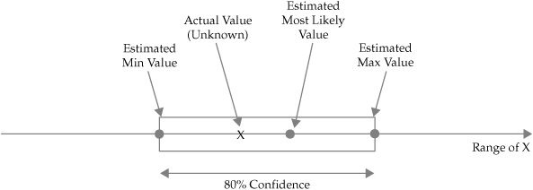
Figure 7-1. Illustration of general 80 percent CI
Table 7-3 shows the results of the CI calibration exercises for one participant in the assessment.
The changes in the estimates of the participants are accounted for by the nature of each exercise that they were asked to complete as part of the risk assessment. In the first exercise, the estimated values represent a more or less “gut” estimate. Each participant had his or her own reasons for choosing the numbers, such as a simple extrapolation of the number of each incident with which the participant was familiar from the previous year. In the second exercise, in which the participants were asked to make formal justifications for their estimated measurements and to consider reasons that they might have been mistaken, the process of reasoning through the numbers made it more likely that each participant would revise his or her estimates. These revisions were not based on new information, of course, but rather on a refinement of each participant’s own expertise as each worked to reduce the uncertainty regarding opinions.
The third exercise demands a bit more explanation. Several studies on expert calibration discuss the effects of using games to explore how confident an expert really is in the estimates that he or she makes. In the case of this project, the game used was a simple one in which the participants imagined that they would spin a wheel and possibly win a prize. The wheel used for the game is illustrated in Figure 7-2. Remember that the stakeholders participating in the assessment were asked to construct an 80 percent CI for their estimates, meaning that eight out of ten times they would expect the actual value for the risk to fall within their estimated range. To test this confidence, each participant was asked to choose one of two options:
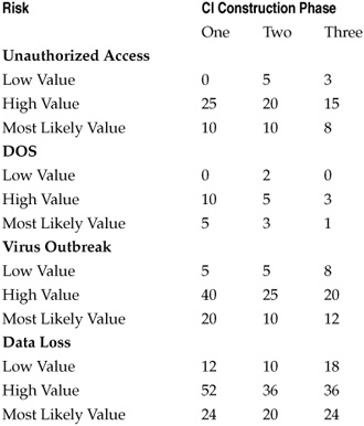
Table 7-3. Value Estimates for Single Risk Assessment Participant
1. Assume the actual value of each risk is known. The participant could choose to be given that value and, if the value fell within the range estimated by the participant (regardless of whether or not it matched the estimated most likely value), the participant would win a prize.
2. Instead of finding out the actual value, the participant could instead spin the wheel. If the pointer landed on one of the “win” sections, the participant would win the prize.
In many cases, the participants chose one or the other of the game options in the exercise, usually choosing to spin the wheel rather than take the risk that their estimates were incorrect. But an examination of the wheel reveals ten sections, two of which cause the spinner to lose the prize, meaning that the wheel provides an 80 percent CI for winning. The 80 percent CI for the wheel game is the same as the 80 percent CI that the participants were asked to construct. If the participants were 80 percent confident of their choices, taking a chance with their own estimates or spinning the wheel should instill exactly the same level of confidence—in other words, whether to play the estimated value or play the wheel is a wash. If a participant favored one or the other action in the context of an estimate, this is evidence that his or her estimate is one of the following:
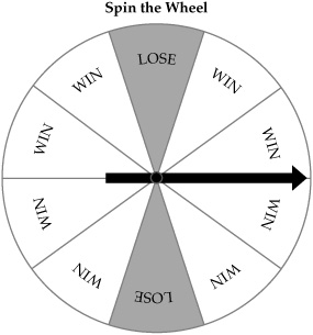
Figure 7-2. Wheel of chance used for calibration of CIs
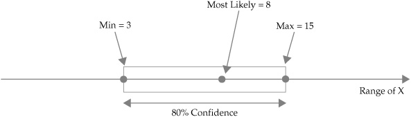
Figure 7-3. CI for estimated incidents of unauthorized access
![]() Higher than 80 percent, thus a participant is over-confident (if he or she chose the estimate over the wheel)
Higher than 80 percent, thus a participant is over-confident (if he or she chose the estimate over the wheel)
![]() Lower than 80 percent, thus a participant is under-confident (if he or she chose the wheel over their estimate)
Lower than 80 percent, thus a participant is under-confident (if he or she chose the wheel over their estimate)
Based on the results of the wheel exercise, each participant was asked to revisit his or her estimates and adjust them upward or downward until the participant was equally confident of the estimated values and of the chance of winning if he or she spun the wheel. This last CI was used as the final estimate. Figure 7-3 shows the visual CI for incidents of unauthorized access constructed by the participant scores in Table 7-3. CI construction and calibration exercises were carried out for all risks as well as for the estimated costs associated with the risks. Figure 7-4 shows the visual CI for the same participant’s estimated cost of each incident of unauthorized access.
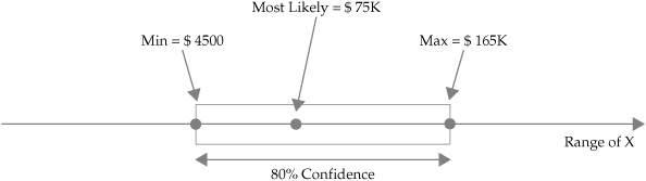
Figure 7-4. CI for estimated cost per incident of unauthorized access
Estimating Distributions Across Stakeholder Judgments
The results of the risk assessment were a set of estimates at an 80 percent level of confidence for each of the four participants. These estimates involved no more actual, known data than the ALE or risk matrix scores that were calculated during previous risk assessments conducted by the company. But the method for this risk assessment deliberately prioritized the analysis and documentation of uncertainty on the part of the participants. By looking at the problem as a probable set of ranges rather than single numbers (whether that number was a monetary figure or a risk score), the assessment characterized the risks in a more realistic way that was less likely to be mistaken for an absolute value by decision-makers.
The analysis was made more interesting by the substitution of the security heat map graph with a different visualization of risk. A common visualization technique for this type of CI data is a basic triangle distribution that shows the lower, upper, and most likely scores for the assessed risk CI. Figure 7-5 shows the triangle distribution for our example stakeholder. This distribution provides a very roughly shaped probability curve for the CI, although the single graph does not provide much visual insight. But consider what happened when all four participants’ CIs were calculated into a single triangle distribution. The distribution for estimated incidents of unauthorized access is presented in Figure 7-6, while the distribution for estimated cost per incident is shown in Figure 7-7.
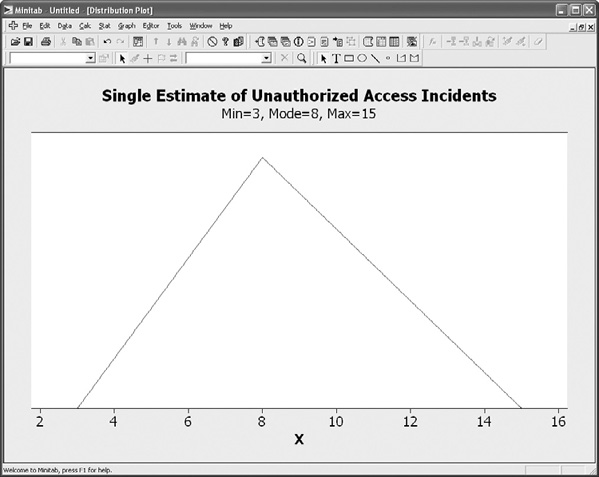
Figure 7-5. Triangle distribution for single participant’s estimate of unauthorized access
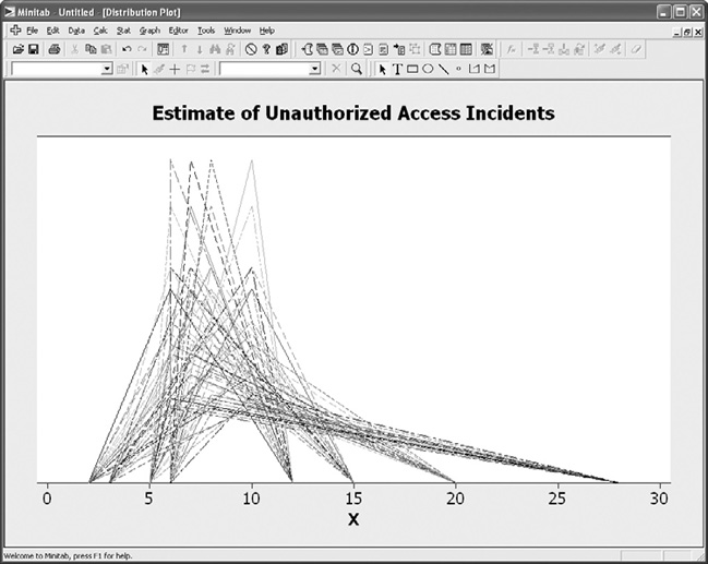
Figure 7-6. Triangle distribution for all participants’ estimates of unauthorized access
Visually, the individual CI distributions now begin to look a lot more like actual probability curves. In the case of Figure 7-6, the estimates for incidents of unauthorized access form a curve that is decidedly positive, or right-skewed. In the case of the cost estimates in Figure 7-7, the skew is negative, or left-skewed.
So what insight does this visualization provide? These values are not confirmed actual values, but rather estimates based upon the judgment of the experts chosen to participate in the assessment. However, if you trust the expertise and experience of these participants, and you assume that the calibration exercises have succeeded in producing real 80 percent CIs for the risks and costs under consideration, then these curves can begin to function as a model for what the organization can expect. The graphs also provide valuable insight into how the experts collectively thought of the risks. In the case of estimated incidents, the most likely values are bunched to the left of the distribution, with a longer right tail. This would seem to indicate that the participants believed there could possibly be a large number of incidents during the year, but that they generally expected fewer to occur. In the case of cost per incident, the opposite held true. While the participants acknowledged the possibility that the costs of incidents could be low, the longer left tail indicated that they expected each incident to be rather expensive for the company.
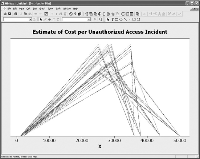
Figure 7-7. Triangle distribution for all participants’ estimates of incident cost
The purpose of this measurement project example was to describe how some of the metrics and techniques described in this book could be used even in the context of uncertain measurement analysis such as generalized risk assessments in situations of uncertainty about true probabilities and costs. As these measurement projects are then coordinated and added to a continual security improvement program, your organization can collect actual values for these estimates over time and add them to the assessment model. Actual probability distributions can then be compared to expert estimated distributions and factored back into the calibration exercises for the assessment. You’ll never know the actual risk values when making future predictions, but your predictive power for estimating those risk values and for basing decisions upon your estimates can nevertheless become highly sophisticated.
SMP: Internal Vulnerability Assessment
The next few projects are less complex than the previous example of an alternative general risk assessment, primarily because they involve relatively straightforward data collection and analysis. The need to calibrate and interpret the data sources is less onerous in these cases, because most of the work can be automated. This is not to say, however, that blind dependence on automated data is recommended. As I’ve said plenty of times before, you need to understand where your data is coming from and what you are doing with it if you are to be confident in the validity of your measurement results.
This next measurement project was an analysis of vulnerability data gathered during a security assessment of internal servers within a large public agency. Two groups of servers were assessed, each with its own administration team that was responsible for management, security, and maintenance of the machines. As part of a security improvement initiative instituted in response to new government rules, senior agency management mandated that internal system vulnerabilities be identified and mitigated according to a prioritized remediation plan. The GQM template for the resulting SMP is listed in Table 7-4.
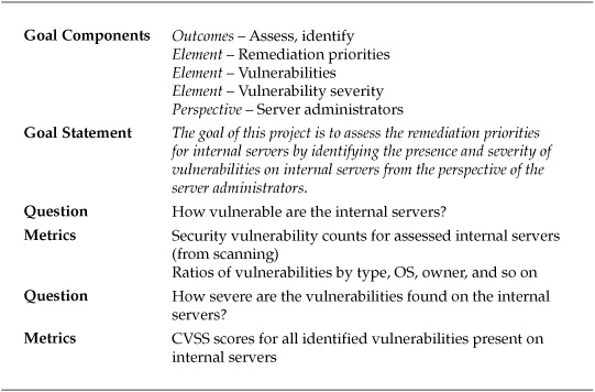
Table 7-4. GQM Template for Internal Vulnerability Assessment Project
An internal assessment team was assembled to conduct the security vulnerability analysis, using a standard commercial tool to scan the servers for security holes. At the end of the data collection phase, 55 individual servers had been identified and assessed. From the tool data, a basic set of criteria was developed for further analysis that included IP address, operating system, the admin team responsible for the system, and the information regarding the type and severity of each vulnerability identified. Table 7-5 shows a selection of the resulting vulnerability measurement data.
Descriptive Statistics for Internal Vulnerability Data
Having collected a variety of data regarding the internal servers’ security posture, the assessment team was ready to perform some analysis. The team relied on descriptive statistics to meet most of the goals of the measurement project.
Counts and Ratios The assessment team relied quite a bit on counts to understand much of the data, particularly in describing the server environment:
![]() Fifty-five servers were deployed within the assessed environment.
Fifty-five servers were deployed within the assessed environment.
![]() Five different operating systems were in use.
Five different operating systems were in use.
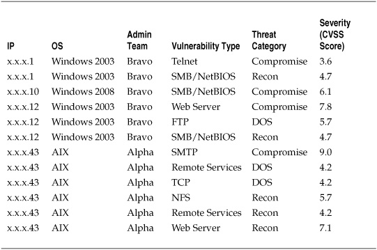
Table 7-5. Sample Vulnerability Data for Server Assessment
![]() One hundred thirty-six vulnerabilities were identified on the assessed systems.
One hundred thirty-six vulnerabilities were identified on the assessed systems.
![]() Admin team Alpha administered 20 of the assessed systems, while team Bravo administered the remaining 35.
Admin team Alpha administered 20 of the assessed systems, while team Bravo administered the remaining 35.
In addition to straight counts, ratios were established to help understand the breakdown of the criteria assessed. Table 7-6 shows selected ratios of OS, vulnerability type, and threat category.
The descriptive summaries in Table 7-6 are common ways of characterizing data in a security assessment and provided information on the vulnerability environment. The summaries showed that the server environment was mostly Windows, that the greatest risks (by count) were those that could lead to compromise of a system, and that two types of vulnerabilities accounted for nearly half of all those identified. So the project benefited from a basic analysis of the metrics data. But the project was also directly concerned with understanding the severity of the identified vulnerabilities so as to prioritize remediation efforts, and this required a bit more than simple addition and division.
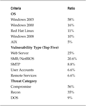
Table 7-6. Ratios of Various Vulnerability Criteria for Server Assessment
Severity Scores: Means and Dispersion The agency chose to measure the severity of the vulnerabilities identified during the assessment by using CVSS scores. Recall that the CVSS is an industry standard for assigning severity to particular security vulnerabilities. CVSS scores range from 0 (the lowest severity) to 10 (the highest). CVSS scores and the methodology used to derive the scores are open and have been adopted by a variety of institutions and vendors, including the vendor of the commercial scanner used by the agency to conduct this assessment, thus making it a logical choice for prioritizing the findings of the assessment. Findings aside, CVSS scores are not the only consideration when remediating vulnerabilities, of course. Other security and business concerns such as business impact, location and role of vulnerable systems, and productivity costs of remediation must also be considered when deciding what to fix first.
Using CVSS scores, the project team was able to gain information about the severity of security problems across the assessed systems, including the mean, or average, severity of the vulnerabilities identified and how much the severity of the problems varied between the systems. I discussed measures of central tendency such as the mean and the median, and measures of dispersion such as the standard deviation, in Chapter 5. Calculating the mean, variance, and standard deviation of the CVSS scores identified during the server assessment provided the assessment team with insights into how serious and how varied the identified security problems were.
When calculating these descriptive statistics based on CVSS scores, you should keep in mind that CVSS is an interval scale, meaning that there is an assumed standard distance between the numbers. CVSS scores are not on a ratio scale, so there is no conceptual zero point (although there is a score of zero) and you cannot assume any proportions between scores. It would be incorrect to use these scores to describe a server with a mean CVSS score of 3.5 as “twice as secure” or “half as vulnerable” as a server with a mean score of 7. Using CVSS scores to prioritize remediation is fine, but using them to make comparative judgments about relative security would be a misinterpretation of the metric.
Table 7-7 lists basic descriptive statistics for the CVSS scores for all vulnerabilities identified during the vulnerability assessment (rounded to two decimal places).
These statistics offer some insights into how the CVSS scores for the assessment were grouped and how spread out they were. Since the mode and median were both somewhat lower than the mean, several higher severity scores must have increased the average for the overall data set. Figure 7-8 shows a graphical output of these calculations from Minitab and includes several other descriptive statistics at greater precision than Table 7-7.
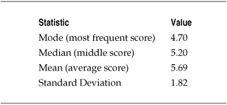
Table 7-7. Descriptive Statistics for Server Assessment CVSS Scores
Differences in Server Administration The vulnerability assessment project yielded more than enough information to support the agency’s decision-making process regarding remediation plans. But an interesting development arose during the assessment when tensions appeared between the two server administration teams over the results. Admin teams Alpha and Bravo each maintained different portions of the installed server base, stemming from reorganizations under previous agency leadership. A rivalry had developed between the teams, and the vulnerability assessment brought the political situation to the foreground as the two teams argued over which was doing the better job securing the agency’s servers. With senior management support, the assessment team responded by separating the server groups administered by each team and calculating the descriptive statistics for each group.
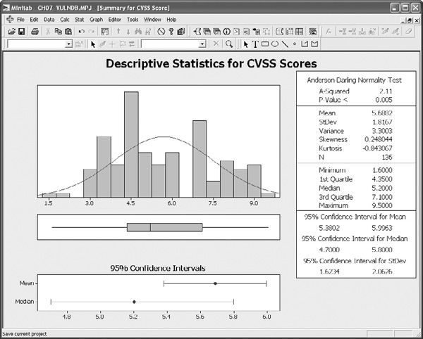
Figure 7-8. Graphical descriptive statistics for server assessment CVSS scores
The severity of the vulnerabilities identified in the servers under each group’s control exhibited similar characteristics, with means and standard deviations for the scores appearing to be roughly similar to a visual inspection, and is shown in Figure 7-9. It would be difficult to tell whether there were actual differences between Alpha and Bravo’s success in weeding out particularly bad vulnerabilities, much less why one team was more successful than the other.
The number of vulnerabilities that the administration teams were allowing on their systems was another story. The statistics appeared to show that Bravo was more successful at managing server vulnerabilities overall, with a mean vulnerability count that was less than half of Alpha’s. Visually, the difference is a bit striking as can be seen in Figure 7-10.
Actually proving this difference was more than random chance would require more sophisticated statistical tests. But there was strong circumstantial evidence that, while the vulnerabilities managed between the teams were equally bad, Bravo was letting fewer security holes remain on the systems. This finding allowed the agency to move beyond the sniping between the two teams and actually begin working to determine why Bravo was having more success, and to factor the results of those measurement projects into the agency’s overall remediation strategy.
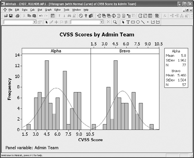
Figure 7-9. Descriptive statistics for CVSS scores by administration team
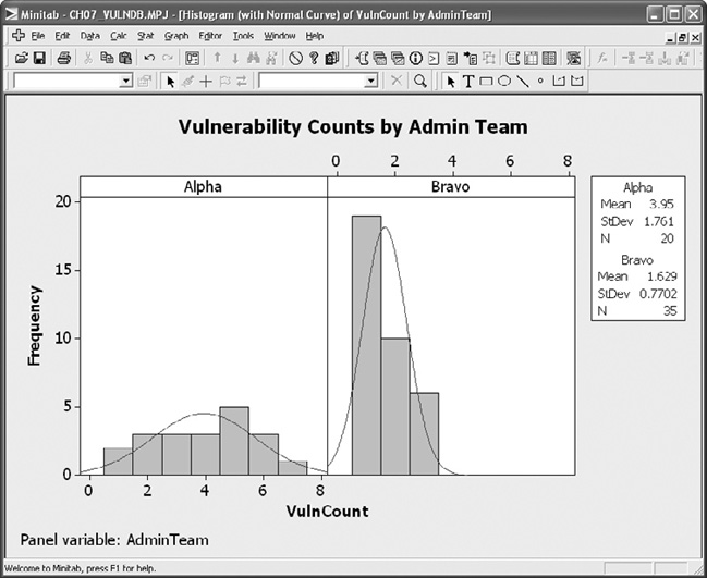
Figure 7-10. Descriptive statistics for vulnerability counts by administration team
In this case, the remediation strategy was twofold. On the one hand, it was necessary to fix the security holes found in the systems managed by each team. On the other hand, it was decided that remediation at the process level was necessary to bring Alpha’s security posture more in line with what Bravo was achieving. Without understanding why Bravo enjoyed a stronger posture than Alpha, however, making process improvements would be difficult. So the agency decided to conduct follow-on measurement projects to explore Alpha’s systemic lack of security compared to Bravo. Having settled the political rivalry and posturing with empirical evidence, and by focusing on the problem at hand rather than laying blame or criticizing Alpha, agency management was able to convince both teams that working together to improve overall IT security was beneficial to both groups.
SMP: Inferential Analysis
The preceding measurement project shows that descriptive statistics can provide a lot of information about your security environment, but it also shows that there are limits to what those numbers can tell you. In the case of the differences between how the admin teams were managing the security of their servers, it was only because one of the metrics was so obviously different under visual inspection that the assessment team could make any judgments. And they still could not “prove” that there was a difference beyond the evidence of their own eyes. The final two projects discussed in this chapter take these analyses one step further, using tests to provide statistical evidence that things are functioning differently within a single security environment.
One-Way ANOVA for Datacenter Perimeter Attacks
The first measurement project involves a large, multinational corporation that ran several Internet-facing datacenters across the globe. As the company considered security management and budget for the overall organizations, the CISO wanted to know whether certain areas of the company’s perimeter were at greater risk of attack than others. A measurement project was set up to determine whether perimeter security events were evenly distributed among the four datacenter locations. Table 7-8 shows the TQM template for the project.
Table 7-8. GQM Template for Datacenter Perimeter Security Project
The company’s datacenters were all roughly the same size and configuration, and they had been set up to offer redundant operations across time zones. To determine whether there were differences between the threat environments in which the datacenters operated, the project team analyzed the monthly levels of malicious activity, such as probes and attempted attacks, detected against the outside of the corporate Internet perimeter. The project team looked at the data for the previous year at each of the four datacenter locations. Table 7-9 lists the number of identified malicious activities by month and datacenter.
As you can see from the table, it is difficult to tell by looking how different the numbers of events were between the four datacenters. There are, however, statistical tests that can determine, with a certain level of confidence, whether differences existed between the locations. The event data is measured on a ratio scale, meaning that they reflect real numbers with an absolute zero point. This meant that the project team could select an inferential test statistic that used measures of central tendency and dispersion. The project team decided to use a one-way analysis of variance (ANOVA) test to compare the mean events between the four datacenters and determine whether they were different beyond a certain degree of certainty.
To conduct the analysis, the project team had to construct a hypothesis test. The test was fairly simple: The null hypothesis (the explanation assumed to be true in the absence of any alternative explanations) stated that there was no difference between the events across the four datacenters that could not be accounted for by random fluctuations in the data. In other words, the null hypothesis stated that the datacenters were all experiencing about the same number of events on average over time. The project team then constructed a second explanation, the alternative hypothesis, which simply stated that that there was a difference between the average number of events at the data-centers that could not be accounted for by random chance. It is important to note that the alternative hypothesis did not give a cause for the difference, but stated only that the average number of events over time were not the same. Finally, the project team selected a p-value, or a level at which they could claim they had “proved” that the difference existed. They selected a p-value of 0.05, which was the threshold at which they would be 95 percent certain that they had not been in error (although there was still a 5 percent chance that the differences could be random). P-values of 0.05 are a common threshold for statistical significance in the scientific community.
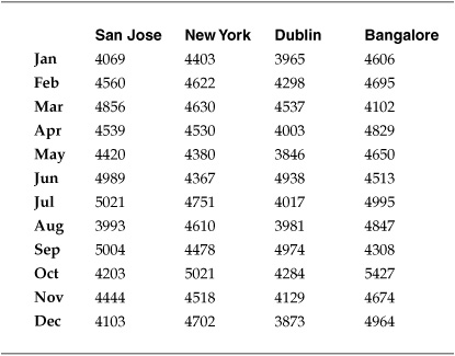
Table 7-9. Perimeter-Related Datacenter Security Events
All that remained was to conduct the test, using statistical software. If the test generated a p-value of less than 0.05, then the project team could reject the null hypothesis that there were no differences in the number of events and accept their alternative explanation that the datacenters were facing different security environments. The test would not tell the project team what was causing the differences in the number of events, but it would allow them better to prioritize resources and start asking more questions.
Figure 7-11 shows Minitab’s ANOVA output for the datacenter event data. In the session window, the ANOVA test can be seen to have produced a p-value of 0.009, which is less than the 0.05 threshold necessary to reject the null hypothesis. The project team did reject the null and accepted the alternative hypothesis that the average number of events occurring across the data centers was different. The output also included a boxplot of the four datacenters, which provides a visual analysis of the event means for the data.
As a result of these metrics, the project team found that the security environments at the four datacenters were different and recommended to the CISO that these differences be considered when allocating security resources and budget. The project team also recommended further SMPs to determine why the differences might exist and to look at ways to understand more thoroughly the threats and behaviors that were present at each datacenter.
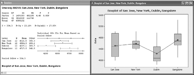
Figure 7-11. Results of one-way ANOVA test for datacenter perimeter security events
Chi-Square Test for Data Loss Prevention Initiative
The next SMP is similar to the datacenter security event analysis, with one important difference. This project involved a company that was conducting an initiative to prevent data loss by means of the corporate e-mail system. The company was responsible for adhering to several regulations that mandated the protection of sensitive personal data, and the company had internal data that it wanted to protect as well. After experiencing several incidents in which sensitive data was mistakenly included in e-mails leaving the company, the Director of Information Security set up a data loss prevention (DLP) program and began working on ways to improve the situation. One of the areas of concern was the type and source of data that was being included in e-mail traffic. The Director knew that he was going to meet political resistance from various business functions within the company to a blanket system of controls, so he wanted as much information as possible on where the problems existed. A SMP was set up, and the GQM template is listed in Table 7-10.
The company’s information security group was already working with a commercial DLP product vendor to pilot an e-mail–based DLP solution, and the vendor allowed the company to use the pilot devices to collect data regarding the type and amount of information that was leaving the company. Working with the vendor, the company had developed three categories of data that were of concern: personally identifiable information (PII) that was covered by privacy regulations, corporate confidential information (CCI) that was internally sensitive to the firm, and contractually protected information (CPI) that was protected by customer and partner agreements. The pilot project was set up to monitor e-mail from five divisions within the company. After eight weeks of data collection, the company had the DLP metrics data shown in Table 7-11. The numbers indicate unique incidents of specific types of information contained in outgoing e-mails from employees in each division.
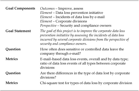
Table 7-10. GQM Template for Data Loss Prevention Improvement Project
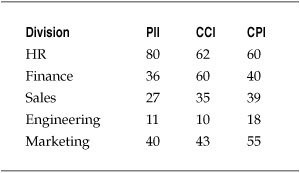
Table 7-11. Data Loss Events by Data Type and Corporate Division
In many ways, this looks like the same analytical challenge posed by the security events for the datacenters in the preceding project, but there is a key difference. The DLP-related data is categorical, with the number of e-mails divided between different buckets for the type of information and the corporate division from which the messages originated. Unlike the datacenters, the divisions were not necessarily similar in makeup, and comparing the means between them for each type of protected information would not have been appropriate. But the director of information security still wanted to know if there were differences between how the various divisions were sending out inappropriate e-mails, or if everyone in the divisions under scrutiny was treating (or mistreating) all types of protected data in the same way.
The chi-square test is a statistical test that can determine whether a relationship exists between categorical data variables, and this statistical test was chosen for the DLP project. Like the one-way ANOVA test in the preceding project, the chi-square test required that the project team set up null and alternative hypotheses to test, and that they would choose a level of significance necessary to reject the null hypothesis. In this case, the null hypothesis was that there was no relationship between the business divisions and the types of data that were being lost. If the null hypothesis held true, it would make more sense to institute blanket DLP policies and solutions across the organization, since it didn’t matter which division or which type of information was being considered.
The alternative hypothesis was that there was a relationship between the divisions and the types of information being lost. While the test could not tell the project team why certain divisions were more likely to mishandle certain information, rejecting the null hypothesis would indicate that certain divisions handled certain protected information differently, and this would provide the director of information security with insights he could take to the rest of the company as he expanded the DLP initiative. Like the datacenter project team, the DLP project team selected a p-value of 0.05 as the level of significance necessary to reject the null hypothesis.
Figure 7-12 shows the Minitab session output for the chi-square test. Much of the information contained in the session window describes the specifics of the statistical test and, despite the appearance of some of the chapters in the book, explaining the math of these tests is beyond the scope of what I am trying to do (not to mention that others have already done a far better job). Most security metrics professionals (me included) will rely on tools similar to Minitab or other stats packages to do the mathematical heavy lifting and will jump right to the most important part of the output, the p-value at the bottom of the session window. This value is less than the 0.05 necessary to reject the null hypothesis. Accordingly, the project team rejected the explanation that all divisions were treating different types of information in the same way. Instead, the team accepted the alternative explanation that there was a relationship between the business divisions and the types of data most likely to be lost. This finding provided the director of information security with more insight into the nature of the DLP challenge at the company, and gave him important discussion points to take back to the heads of the various divisions as well as company senior management.

Figure 7-12. Results of chi-square test for DLP initiative
Summary
The purpose of this chapter has been to show some of the security metrics techniques discussed so far in the book in the context of practical examples of SMPs. The collection and analysis of data makes any security metrics program effective, and that collection and analysis should be done as part of a defined measurement project with well-understood goals, data sources, and analytical techniques.
Measuring security operations does not have to be limited to automated data and descriptive analysis. As shown in the risk assessment project, there are innovative ways to revisit even generalized and subjective measurements using experts and elicited opinions. Descriptive statistics can be very valuable as part of a project, but you should consider adding more advanced descriptive techniques such as measures of central tendency (such as mean and median) and measures of dispersion (such as standard deviation) to your metrics program if you do not already do so. Inferential statistical tools can also be quite useful when used properly, and tools such as ANOVA and chi-square tests can identify relationships between variables and data that may not be immediately obvious from your descriptive statistics.
No matter which statistics and tools you decide to use for your measurement projects, you should always be aware of the limitations and caveats that are involved with your choices. There is no requirement to be able to do the calculations necessary for an ANOVA or chi-square test by hand (that’s what software is for), but you should always be concerned that you understand what you are trying to accomplish and why a particular statistic or test will get you the correct results.
Further Reading
Galway, L. Subjective Probability Distribution Elicitation in Cost Risk Analysis: A Review. RAND Corporation, 2007.
Goodwin, P. Decision Analysis for Management Judgment. Wiley, 2004.
O’Hagan, A., et al. Uncertain Judgements: Eliciting Experts’ Probabilities. Wiley, 2006.
Several of the books recommended at the end of Chapter 5 will also be useful for exploring the techniques outlined in this chapter.