
Chapter 11
New HTML Form Elements and Usage
Collecting data with HTML has always been an important facet of web design. Forms have evolved to support the current data needs. HTML5 continues this trend by introducing new methods of collecting data that are more secure, more user-friendly, and easier for the developer to use than with previous versions. They are also very browser-dependent.
The new items in HTML5 are not necessarily new tags, but modifications on how the existing tags can be used. For example, the <input> tag has many new types to use, well beyond the text boxes and menus offered by HTML4. Trying a new input type is completely safe, as browsers that do not support the new tag will convert them to a standard text box. Since the new types will revert to an HTML4 text box, you can safely experiment. (Of course, this has been a feature of HTML for quite some time; any mistaken input type becomes a text box.) Once browser support improves, your experiments will become more functional.
NOTE
At the time of this writing, Opera supported more form features than any other browser. Given the importance of forms, this is likely to change in the near future.
HTML5 Input Types
The most common form element in HTML4 is the <input> tag, a polymorphic tag that changes based on the type parameter supplied, such as text, password, hidden, radio, and checkbox.
HTML5 adds many new types for the <input> tag. The new types provide many benefits for the developer and user, including the following:
 They provide better functionality on mobile devices. The email type, for example, makes the @ symbol easy to find on Android and iOS on-screen keyboards.
They add more semantic meaning to the tags. For example, <input type="URL"> is clearly asking for a web page. Screen readers and mobile devices can present the correct prompts or helpers to the user for URL input.
Table 11-1 lists the new types, which we will explore in this chapter.
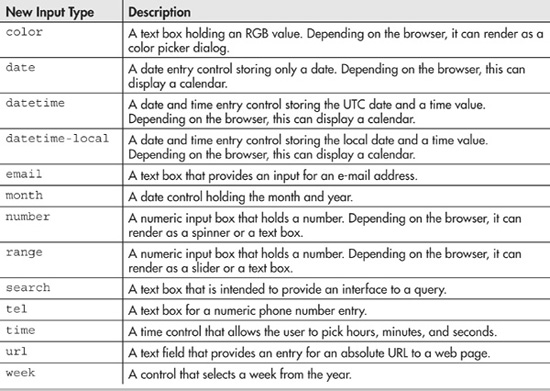
Table 11-1 The New Values for Input Types
In addition to new types, HTML5 introduces attributes that better support form-based input. These new attributes help validate the page and provide information for the types. Table 11-2 lists the new attributes.
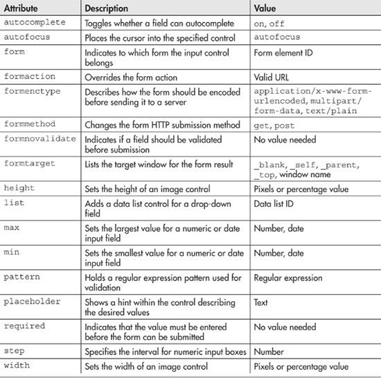
Table 11-2 The New Input Attributes
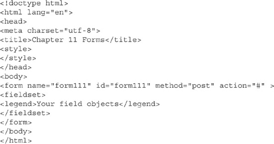
Creating a Form
Creating a form in HTML5 is little different than building one in HTML4. You still need to use a name and an ID, and select a method and an action. The name and ID are used for scripting purposes; either can be used. The method can be either GET or POST. Use GET for an action that is repeatable, such as for a search form. Use POST for a nonrepeatable action, such as for an order form or a contact update. The action is the URL to a script that responds to the form data.
Contained within the form are one or more fieldsets, a legend, and all of your form controls. The fieldset is a container for holding fields. It is primarily a styling tag. The legend provides a title for the fieldset. After the legend, your field objects are listed.
Code Listing 11-1 shows an HTML5 form that we will build on in this chapter.
Code Listing 11-1 A basic HTML5 form
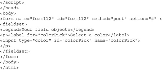
Adding a Color Picker
The color type, when implemented, will present a color dialog to the user, from which the user can visually select a desired color. The proper RGB value will be stored. This value can be used for DOM scripting, product choices, or whatever the programmer desires. Figure 11-1 shows the Opera browser rendering the color object.
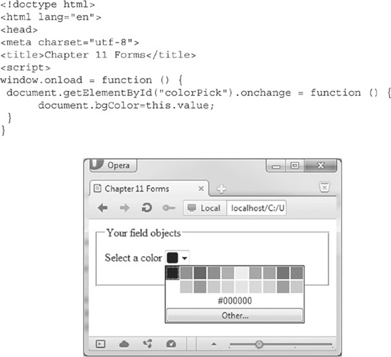
Figure 11-1 The color object running in Opera
NOTE
As of this writing, only Opera properly supports the color type. To reproduce the color picker in other browsers, you will need to write JavaScript code.
Code Listing 11-2 shows a form with a color object that changes the background color of the form when you select a new color.
Code Listing 11-2 Responding to the color object
Code Listing 11-2 shows a typical call to an HTML5 <input> element. Notice that it uses both the id and name attributes: the id attribute for scripting purposes, and the name attribute to post to the action. Changing a color fires the JavaScript change event that you can handle. The colorPick value holds the selected RGB value. In other browsers, if you type a valid HTML color, the page does react properly.
Adding Date and Time Controls
The date, datetime, datetime-local, month, time, and week types are related to date and time values. Depending on the browser, all except the time element will display a calendar control. The time control will display a time spinner. The calendar control provides an integrated method of selecting a date and time.
Date and time entry functionality has been available through JavaScript libraries for some time. W3C believed that including this functionality in the language made complete sense. It allows a unified method of gathering a date and reduces the need for using complex JavaScript to build the calendar drop-down.
As with the color type, the date and time controls are created by a value handed to the type attribute of <input>. The date type displays a calendar control allowing the selection of a date. Clicking this control displays the current month’s calendar, as shown in Figure 11-2. Simple navigation controls allow changing months and years.
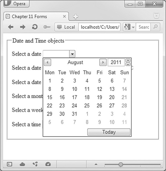
Figure 11-2 The date object displayed in Opera
The datetime and datetime-local types are very similar in functionality. Both return a value in mm-dd-yyyy HH:SS format. The primary difference is where in the world the time applies. The datetime-local type returns the time in your time zone, in UTC time, or Zulu time, based in Greenwich, England.
The month and week types also display a calendar. However, the user can select only a month or a week, depending on the control. Selecting a month control will return data in a form similar to 2012-09. The week control will return data in a form similar to 2012-W42.
The time control is simply a spinner. The spinner will count up in minutes from 0:00 to 24:00. Every 60 minutes results in a new hour. The time returned is independent of a time zone. You can manually enter the time values, but depending on the browser, the control will accept only valid time entries.
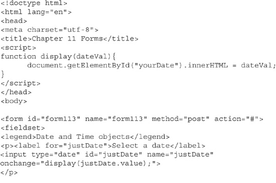
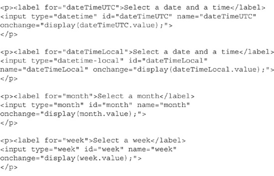
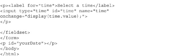
Code Listing 11-3 shows a form displaying all of these date and time elements. The change event fires whenever you select a new date or time. The change event calls the display() function, which will display the value returned by the control in a paragraph tag.
Code Listing 11-3 The HTML5 date and time form objects
Using the E-mail and URL Fields
The e-mail and URL fields render as text boxes. Semantically, they are special-purpose text boxes.
On a computer browser, there is little to no difference in functionality between the standard text box and the e-mail and URL fields. Current browsers will simply render them as text boxes. However, regardless of your browser’s support for these fields, you should use them. As browser support matures, your form will be future-proofed.
On a mobile browser, the e-mail and URL fields can trigger special on-screen keyboards. For example, on my Android, an e-mail box makes the @ symbol prominent, without needing to hit the Alt lock. For the URL boxes, my Android displays the / (slash) and .com buttons. The .com button is very useful, as it adds .com to the end of the address. Depending on the Android version, this button can change to a variety of different domains.
CAUTION
Since the e-mail and URL boxes work just like text boxes, you still need to protect your web site. You should use the maxlength attribute on all of these fields, and check the data both server-side and client-side for unwanted characters.
Where the e-mail and URL boxes really shine is in validation, which is the process of ensuring that the data entered in your form is correct. The new HTML5 validation tools make validating an e-mail or URL address a snap. Validation is covered later in this chapter.
Adding Number and Range Controls
The number and range controls continue HTML5 semantic and validation improvements over the standard text box. When implemented, both controls allow you to enter only a number. The range type provides a slider control, and the number type provides a spinner. Figure 11-3 shows the two controls in Opera.
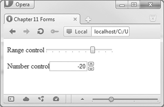
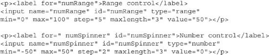
Figure 11-3 The range and number controls displayed in Opera
These controls have a number of useful attributes. Each is supposed to take a floating-point value, but currently, only integers seem to be supported. The min attribute sets the lowest value the box will accept, and max sets the largest value. The step property allows you to set an increment, which is used by both controls to determine the next numeric value as you scroll up or down. The default for step is 1. Later in the chapter, I will demonstrate how HTML5 can validate these values.
Code Listing 11-4 is the code snippet from the form that created the controls shown in Figure 11-3. The range control allows values from 0 to 100, stepping 5 at a time. The number control allows values from –50 to 50, in steps of 2. In both cases, I included the maxlength attribute. Finally, I set a value for the boxes, which acts as a starting point.
Browsers that do not support range or number boxes will revert to standard text boxes. The maxlength attribute limits the number of digits that can be input into the box.
Code Listing 11-4 The range and number controls
The form objects are typically used to gather information from the user. However, with a little programming skill, they can be used for a complete user interface. Microsoft has announced that HTML5 tools will be available for developing Windows 8 interfaces. In a similar vein, Apple has long blocked Flash from its iOS devices. Clearly, Apple wants developers to move from Flash to HTML5.
To demonstrate HTML5’s abilities for creating a user interface, Code Listing 11-5 revisits the audio player from Code Listing 6-3. In that code, the web site played a song without the player being visible. The version in Code Listing 11-5 adds a form with a range control to change the volume.
Code Listing 11-5 A user interface to the audio object
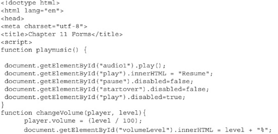
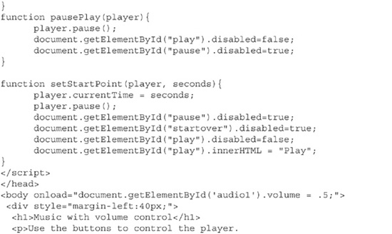
This range control fires the function changeVolume whenever the user changes the volume. This function does two things for the program. First, it sets the volume level for the player. This volume property takes a value from 0 to 1. Since the range control generates only whole numbers, changeVolume divides the value from the slider by 100. The second task performed by changeVolume is to address a weakness with the slider. Sliders do not show you what values are associated with the control. I used the label to display the chosen value.
Buttons are present to start, stop, resume, and start the song over. The buttons are clearly labeled. The program disables those buttons that are not valid at any given time. When the song is played, the pause and start over buttons become enabled. The play button changes to a resume button and is disabled. Once the user hits pause, the pause button becomes disabled, and the resume button is enabled. The start over button will pause the song, reset the play button, disable all other buttons, and start the song at position 0.
Using Search
The search input type is intended to allow you to create a text box for entering search terms. On computers, all major browsers render this as a standard text box. On Mac OS X and Ubuntu, this will render as a text box with rounded corners.
To add insult to injury, the search box will resist normal attempts at CSS formatting. You can trick CSS to format the search box as a text box, but this seems like a lot of work. Until browser support becomes available, avoid using the search input type.
Adding Telephone Number Boxes
The tel input type is intended to allow the user to enter numeric telephone numbers. In all browsers, it renders as a simple text box. On the Android and iOS devices, the box triggers a special keyboard that provides easy access to the () and – symbols.
Telephone numbers come in many formats. Without additional attributes, the difference between a standard text box and a telephone number box is only semantic. However, as with the email and url types, tel can be validated using the pattern attribute. Validation is discussed in the next section.
Creating Safe Forms
Creating a form to gather user input is easy. Creating a form that users can understand and fill in as desired is much harder. And creating a form that users understand and that guarantees that the user input is correct is very difficult. I often spend more time idiotproofing my forms than actually designing them.
My first professional programming job involved working with a law firm specializing in collections. The collectors had the unenviable job of phoning people who had not paid their jewelry credit card in more than 6 months. Part of the process was to create a payment plan to pay off the loan within 12 months. I wrote a program that asked the collector for the amount of the debt, the interest rate charged by the store, and the number of months to pay off the loan. I verified that all of the values were within certain limits. For example, the months had to be between 1 and 12. Additionally, local rules required that we audit all entries by saving them to disk.
One collector—let’s call her Brenda—used my program and entered 1200 for the amount of the debt, 18 for the percentage rate, and the word twelve for the months. Unfortunately, I did not expect string input into my integer variable. The C program then went into an infinite loop. To add insult to injury, the program wrote Brenda’s input into the log file. Within a few minutes, the log file filled the disk, dropping the Unix server that controlled the entire law firm. Ultimately, the blame for the server crash was laid on my shoulders.
The moral of this story is to assume that your users will do the most amazingly stupid things to your program. You need to do the absolute best you can to protect your input. In the case of a web form, the challenge is even greater because the form is available 24 hours a day to users that you cannot see. A poorly designed form can lead to server crashes or data breaches.
CAUTION
You need to also validate the data on the server script that receives the data from your form.
Laying Out Forms
The first step is to create a form that is easy to understand. Easy-to-use forms include clear labels and directions for filling out the form. Writing clear instructions is difficult. What is crystal clear to you might be murky to some of your users.
One way to achieve clarity is to provide two prompts that say the same thing in two different ways. Pulling this off is easy in HTML5. You create one prompt using the HTML4 <label> tag, and the second prompt using the new HTML5 placeholder attribute.
The <label> tag attaches a text prompt to a form object. Using CSS formatting, you can easily obtain a nice layout. Screen-reading browsers can determine that the label is associated with the control and provide the proper audio prompts.
The placeholder attribute displays text within the input object. In HTML4, this was achieved by creating a value for the object and selecting the text whenever the control gained the focus. The placeholder is background text for the object. Once the object gains the focus, the placeholder text will vanish. If the object loses focus and is still blank, the placeholder text reappears. Placeholders can hold either a direction or sample formatting.
TIP
The currently selected control on a form has the focus.
Figure 11-4 shows an example of a nicely designed form that uses labels and placeholders. Code Listing 11-6 creates the form shown in Figure 11-4, including the placeholder text. The placeholders for the name and company contain instructions. Placeholders for the tel and email types contain the desired format.
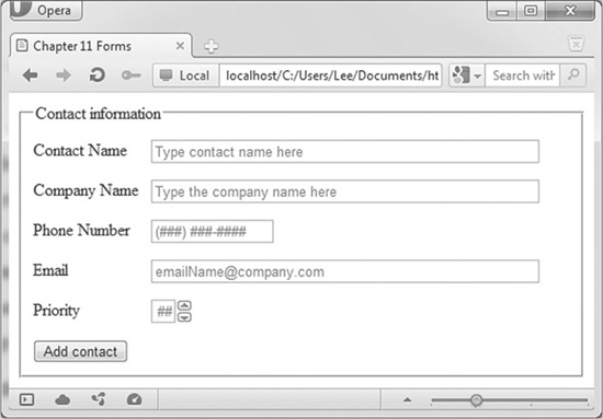
Figure 11-4 Example of labels and placeholders on a form
Code Listing 11-6 A nicely laid out form
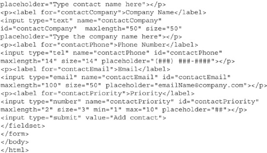
The form in Code Listing 11-6 implements many features of a well-designed form. First, it has a fieldset. This object surrounds your form objects. It is used to logically group form objects. You can have as many fieldsets as you have logical groups. The legend identifies the group for the user. In this case, “Contact Information” appears in the fieldset box. Inside the fieldset are the labels and fields. Each grouping is enclosed within a <p> tag for nice formatting. I included the for attribute. The value of this attribute matches the id of the field it is identifying. The width of the label was set to 7em to ensure the form looks good in all font sizes and screen sizes.
NOTE
The <label> tag can also enclose text and form elements. This method is valid but reduces search engine optimization and is slightly harder to format.
Performing Validation
Validation is the act of checking your form data for correctness. Correctness means many things. In general, it means that the data in your form logically makes sense, matches your desired format, and has all of the items you require. The code presented here will validate your form on the client side. The results will alert users to mistakes they made in the form data.
Code Listing 11-6 used two elements that help with validation:
The contactName field uses the autofocus attribute. This forces the cursor to rest in this field as soon as the page loads. This feature ensures that your user starts in the first field. You appreciate it because your users have a harder time missing the first field. The users appreciate it, as they do not need to click in the first field.
The maxlength attribute, which has been in the HTML specification as long as I can remember, limits the number of characters you can enter into the box. By limiting your field sizes, you can hinder attackers from flooding your web server by sending thousands of copies of War and Peace from your text boxes.
The maxlength attribute is not foolproof. You still need to verify your data in your server-side scripts.
Prior to HTML5, you needed to validate your forms using JavaScript. On this simple form, I would need to verify that every box had a value. I would then need to ensure that the contact name and company name were all alphanumeric characters, with limited punctuation. For the telephone, e-mail, and URL fields, I would need to ensure that the data matched the desired format. This was quite a difficult task. Just in the United States, there are several valid phone number formats. Likewise, the e-mail and URL fields would need validation. The validation for a simple form could easily reach 100 lines of code. Only if everything was valid would I let the data post to my server.
NOTE
Opera and Chrome both automatically added http:// in front of the URL entered in to the URL box. Both validated any e-mail address in the form of a @ a.
Validation in HTML5 is much simpler. Many new attributes support automatic validation. The attributes max, min, and pattern work with the browser to validate your data. If any object in your form does not contain valid data, then a global validation flag is set to false. This alone can be used to prevent your browser from posting invalid data. In addition to the global validation flag, each object has a validation flag. This allows you to set individual messages and format invalid boxes.
Figure 11-5 shows the sample contact form validated. Valid entries have a thumbs-up icon. Invalid entries have the thumbs-down entry.
CAUTION
Do not rely on just color changes to signify incorrect entries.
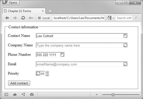
Figure 11-5 Data validated in the contact form
Formatting invalid boxes is handled through new HTML5/CSS3 pseudo classes. The classes valid, invalid, and out-of-range allow custom formatting whenever a box does not meet your constraints. You can validate the existence of an item, if it matches a pattern, or if the value is within a certain range.
Code Listing 11-7 shows complete validation on the contact form from Code Listing 11-6.
Code Listing 11-7 Validation of form data
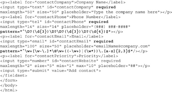
Wow, this is not a lot of code! The form will validate the data in each object. If the data is invalid, a thumbs-down icon will appear in the box. Valid data receives a thumbs-up icon. The required attribute is all that you need to add to verify the existence of data in the box. The pseudo classes of input:required:valid and input:required:invalid apply the formatting to improperly formatted objects.
For the telephone and e-mail objects, the pattern attribute is added to the object. Patterns hold regular expressions. Regular expressions are designed to allow you to write equations that match patterns. If the data typed in the box matches the pattern, HTML5 considers it valid. The regular expressions in this page come from the web site www.regexlib.com.
TIP
Regular expressions are not easy to write. RegExLib.com is the best resource online for working with regular expressions.
Unfortunately, validation through HTML5 and JavaScript alone is not sufficient. You still need to ensure that your server-side scripts validate everything that you check in your forms. It is all too easy to modify an existing web page and remove the validations. Your server is then vulnerable to attack. If you are developing the client side of a form, be sure to talk to your server programmers about the validations they need to include in their sanitizing scripts.
Submitting Data
The contact form presented in Code Listings 11-6 and 11-7 is designed to retrieve information about a business contact. This information needs to be stored somewhere. Typically, a web form such as this one will post to a script that will save the data. Before posting the data, the web developer should validate all data. Additionally, the server-side programmer should revalidate the data.
HTML5 adds another layer of validation when you attempt to submit. If a field does not pass validation, the browser will display a very obvious error message. If multiple fields do not validate, the browser will display one error at a time. If any field fails validation, the form will not send it to the action. Figure 11-6 shows an error on the telephone field.
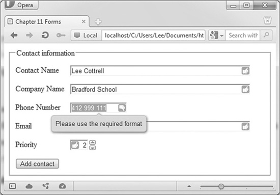
Figure 11-6 HTML5 validation message
NOTE
Through the setCustomValidation function, you will be able to customize the error message. However, this functionality is not quite ready yet.
The contact form is now validated with HTML5. However, you will still need to validate your forms completely using JavaScript. You cannot predict that all users will access your forms using an up-to-date browser, which means that you cannot depend on HTML5 validation. Additionally, HTML5 cannot handle some validations. An example is validating a credit card number. Many regular expressions exist that can verify that a 16-digit number is present in the box. However, not all 16-digit numbers are credit card numbers. For this trick, you can use the Luhn algorithm.
TIP
The Luhn algorithm mathematically verifies that a sequence of 16 digits is indeed a valid credit card number. It is the algorithm used by the credit card industry to generate account numbers.
In addition to validating, you can provide additional information to users. For those objects that do not pass validation, your script can add on-screen guidance to the user.
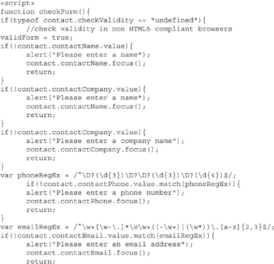
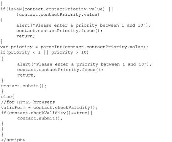
Code Listing 11-8 adds JavaScript validation to the contact form.
Code Listing 11-8 The JavaScript validation for the contact form
Code Listing 11-8 validates the form in both HTML5 and older browsers. I called this code by modifying the button in the form from type="submit" to type="button" and added a click event handler. Code Listing 11-9 shows the correct button.
Code Listing 11-9 The new button for our contact form
The script starts by determining if contact.checkValidity is defined. If it is defined, then the browser supports HTML5. If it is not defined, then you need to resort to traditional JavaScript page validation. In the body of the if statement, I check each object on the form. For the name and company, I check for the existence of a value. If anything is present, then the box validates. Unfortunately, this technique will validate a space. For the phone and e-mail fields, I validate using the match and the same regular expressions from the form. For the number, I need to check for existence, nonnumeric expressions, and a valid range.
Compare the two versions. For HTML5 browsers, the code is embedded within the form itself. For older browsers, approximately 60 lines of code need to be written to validate the page. Clearly, the HTML5 technique is more efficient. Unfortunately, you will still need the older method until more browsers support HTML5.
Summary
The new HTML5 form objects have added new functionality to web forms. You are able to create semantically correct forms. While these new objects do not yet work on all forms, you should start using them now, as browsers will simply render them as text objects.
Validation is handled by the browser within the form. When this feature becomes commonplace, one huge coding burden will be lifted from developers’ hands.