Chapter | 3
CHOOSING AND ADJUSTING PERIOD SETUP FOR OSCILLATORS
As the Stochastics indicator is one of the more widely used studies in the industry, it is a good place to begin a discussion about how to set up initial periods. As mentioned in the first chapter, quote vendors use the same default periods for their studies. Stochastics is generally one of the first studies that novice technical traders will add to their market data, allowing professional traders to use this knowledge to their advantage for short-horizon market moves.
The S&P 500 futures market can be graphed in three-minute time intervals. But clearly this would be ridiculous when the market is moving 20 S&P points in a minute. Markets sometimes adopt entirely different personalities and knowing the technical tool to use for a given environment is essential. In flash crash environments I personally do not use normalized oscillators at all that track between 0 and 100. A simple detrended oscillator from two simple moving averages will keep the trade on and take it off with the best timing. Take a look at the spread between two simple averages of periods 1 and 9 as an example. But the need for and application of normalized oscillators does not change.
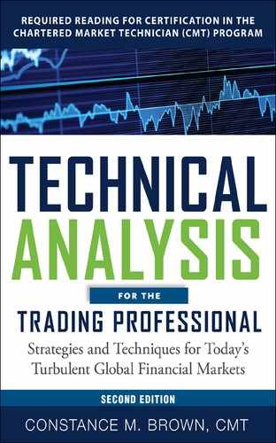
Figure 3.1 is a two-minute chart of the September S&P on June 12, 1998. The data are so well defined that I could remove the labels on the time and price axis and lead you to believe that the chart was a 60-minute or daily bar chart. Don’t drop down to these extremely short time intervals if the price swings are not as clearly defined. Bond markets I rarely drop below 20-minutes. Also, please keep in mind that the two-minute chart is used in emergency situations like fast waterfall declines. Go down in time rather than longer. It applies only after extensive analysis of longer time horizons from monthly charts on down to the shorter time intervals. I strongly recommend that you do not use tick charts as you will be forcing a fixed number of trades into a single bar as opposed to plotting the trades that occur over a fixed unit of time. If you apply the Elliott Wave Principle, as an analysis method, your wave structure will de distorted in a tick data format. If you need to look at your data in a different format, use candlesticks or consider Point-and-Figure charts. Intervals to consider using in the S&P are 100 by 3 and 50 by 3. Why those particular periods? These setup periods for point and figure charts are popular with the floor traders in the S&P pit. Even though volume has now switched to electronic trading, old habits still have an influence. Which leads us right back to Figure 3.1 because, if our market can be influenced by a known entity that could shift the timing for our own position entry or exit, we should monitor that element if at all possible. If there is a favored analytic method used by a large group of traders like a specific period for point and figure charts, candlestick charts, or simply a common error used by inexperienced traders in mass, that knowledge can be used to your advantage.
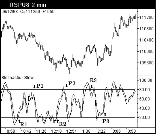
Figure 3.1 Aerodynamic Investments Inc., © 1996–2011, www.aeroinvest.com
Source: TradeStation. © TradeStation Technologies
The two-minute S&P chart in Figure 3.1 was deliberately set up with the vendor’s default periods so that the retail traders could be monitored. The “Stochastics Default Club” remains because countries with less experienced professional traders are part of the instantaneous global village. Our ability to trade any market is becoming easier as exchanges blend together in an effort to survive. What is fascinating is that the mass psychology remains the same. I might see a reason in a very thin market to delay my order if the timing is moments away from the Stochastics Default Club. There clearly have to be other concerns present first, such as an Elliott wave pattern and momentum indicator combination in my own charts to suggest that something could be out of sync. But then looking at a Stochastics study that is deliberately set up incorrectly can be of interest. In Figure 3.1, a few signals are marked to show an R for the retail sector most likely entering the market. The P in the same chart denotes where professionals are using the retail trader’s volume to establish more favorable entries for themselves. The Stochastics Default Club will enter on cue as the indicator crosses up through the 20 line and will sell as the indicator crosses below the 80 level. They are doing just what their user’s manual told them to do and what they often see demonstrated on the Internet. If Stochastics gives the novice trading group three signals in a row and offers divergence or a W bottom in the indicator like the chart displays at R2, they will generally come out in larger numbers and squeeze out some of the weaker market positions with size (large position size), producing a three-wave corrective move. The experienced traders generally will not let the Stochastics Default Club off the hook graciously because their orders will likely be entered before the Default Club charts have had an opportunity to trigger a reverse signal. That is because we are making our trading decisions from different periods and from different time horizons. Add the range rules for oscillators, and we would be entering orders from entirely different zones from the same chart. Coining the phrase “Stochastics Default Club” is not meant to be disrespectful, as I was once a member myself when I first started. Maybe it is just a rite of passage. There is no experience quite like the emotional swings of being trapped on the wrong side of a runaway fast market shortly after your indicators gave you permission to boldly step in front of an oncoming freight train. Splat. It isn’t too long before basic survival instincts motivate us to find a better way. Sadly George Lane has passed and he used to make me laugh when he referenced my definition for the trader that never learned how to setup Stochastics. He made me promise I would not stop abusing the Default Club in seminars so people would push themselves to do better. It is a promise kept, but we miss you, George.
How do we go about finding the right period to use? And what will happen when everyone uses the same method to define the right period? Won’t we be establishing a “Modified Stochastics Club”? Well, forming a new club will be harder to do as dominant cycles are not symmetrical, and it will be harder to identify the correct cycle to use than one might suspect. However, Stochastics is very forgiving if the period used is just slightly off the mark.
Stochastics is based on the observation that, as price decreases, the daily closes tend to accumulate ever closer to their extreme lows of the daily range. Conversely, as price increases, the daily closes tend to accumulate ever closer to the extreme highs of the daily ranges. This concept holds true whether we are trading from a two-minute bar chart or a monthly time period. George Lane used this observation to develop his overbought-oversold oscillator, which shows this relationship. Stochastics is a two-line oscillator that uses %D as the primary and %K in a shorter interval to offer a leading indicator to %D. George Lane used a three-line oscillator by plotting %K, %D, along with %D-Slow as a confirming indicator. The Slow Stochastics gave a smoother sine wave than the Fast Stochastics. By varying the period used for the primary oscillator %D, different results will occur.
In Figure 3.2 the weekly DMK/$ chart is offered. The method for defining the correct periodicity for %D is to study the time horizon in the chart from which you are making trading decisions and determine the best cycle for that chart. The data in this chart have been compressed so that as much data as possible can be seen on the screen for this weekly time horizon. We need to see only price lows so the temporary distortion of the data is inconsequential. In this chart a cycle of 118 is identified. This cycle is close, but it does not fit the price lows exactly, for reasons discussed in the preceding chapter. Therefore, bias your cycle placement so that the cycle bottoms align most accurately with the price lows in the most recent data, and let the price lows furthest to the left of the chart fall slightly out of phase. Most will establish cycles from left to right and let the price lows closest to the current bar fall out of sync. That just doesn’t make much sense.
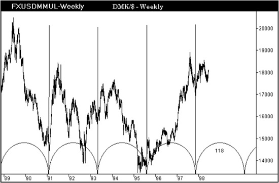
Figure 3.2
Use the periodicity that is half of the cycle length you identified. As a 118-period cycle is acknowledged in the weekly chart, a 59-period would be used for %D. But how do we know that the 118-period cycle is the correct one to use? In Chapter 2 we developed a chart that needed four cycles just to mark some of the more significant market lows. As we are never going to stumble on the ideal cycle to use in most cases, here is a useful way to evaluate the period you selected.
The compressed x axis can now be expanded so that the data appears normal on the screen. Then add the Stochastics study to the chart using a 59-period interval. While the results in Figure 3.3 are correct, I do not like the results from this period because there is insufficient movement in the indicator between zero and one hundred, and the oscillator does not display the range rules discussed in Chapter 1. So the first efforts have established a period that is too long. If I repeat the process of arbitrarily plotting a bestfit cycle and taking a look at the period results in the Stochastics formula, it could take several hours to find something I really liked. So let’s use the computer’s smarts to see what it can come up with as the period to use.
Figure 3.3
Professional charting products all have an optimization feature. In Figure 3.4 the Omega TradeStation software has the ability to optimize a period when you want to edit the default value. Omega TradeStation uses a default value of 10 in their Stochastics Crossover System, but their default value is different when you select Stochastics as an indicator to be plotted in a chart. Regardless, we know that the 59-period is too long and the default of 10 will be too short. Instead, let the computer run through an optimization range of 10 to 50 in increments of one unit to identify a better period. Curve-fitting technical indicators that are used in unconventional or specialized interpretative ways are not recommended. But in this situation we are consciously trying to curve fit the historical data into a single period to use as a guide or starting point.
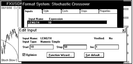
Figure 3.4
The optimization feature for the Omega TradeStation Stochastics system will use the buy-sell signals generated when the Stochastics oscillators cross through the 80 and 20 levels. As we do not want to use Stochastics in such a manner, the profitability test results as part of the optimization process will still be of value to us.
The computer optimization suggests a period of 36 is the best value to use for %D. Working backward, we know that the cycle will be double the Stochastics period. The computer is indicating that a 72-period cycle will be dominant in this weekly DMK/$ chart. After setting a 72-period cycle, comparable price lows can be identified. The computer may have found a better cycle, and this is tested when the data are compressed to show the full historical range in the database. Having passed the first test, we can go ahead and add a Stochastics study using a 36 period for %D. The results in Figure 3.5 should immediately offer confirmation that the right period has been identified. How? The range rules discussed in Chapter 1 are now present. The four boundary lines discussed in Chapter 1 to mark the upper and lower levels for a trending bull and bear market have been reduced in this chart to show only two: the lower range for a bull market and the upper resistance zone for a bear market.
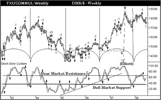
Figure 3.5
The price data show that the computer gave us buy-sell signals when the indicator crossed through the 20 and 80 levels. This is not how George Lane advises us to use his indicator, and we can see that these signals offer poor results. He advises trading only with the trend when using this indicator—that is, to buy or sell when permission is obtained from divergence analysis and when the “permission” signal is accompanied on lower volume. However, when the correct period is identified for the Stochastics Oscillator, it will contain trend information by traveling within the ranges that were detailed in the Chapter 1. While the oscillator character between RSI and Stochastics will be different, the signals to buy or sell will abide by the same range rules. The Stochastics indicator in Figure 3.5 has been marked to show the buy-sell signals generated when you apply range rules. The signals are occurring in the direction of the market’s trend. Every point marked with a buy or sell signal was discussed in the first chapter with the exception of three. There are two buy signals along a trend line drawn on the oscillator that occurred in 1996. The addition of trend lines and moving averages is of great value and will be discussed in greater detail separately. The other signal is the Stochastics peak that has the word “Elliott” above it. Permission to sell is not given by Stochastics just because it is at an extreme high. However, the rally that unfolds from the low identified with a dotted line to the high is a distinct five-wave advance that someone using the Elliott Wave Principle along with Stochastics would have known to act upon, or to at least unwind, or scale back a portion of a long dollar position. Figure 3.6 shows the December 2011 T-Bond futures. A vertical line on October 31 shows a momentum high in the Composite Index. Like the previous example, the momentum high is not the time to sell. It rarely is as this indicator will first top at the top of wave iii of 3 implying more to follow. Patience is needed to learn the characteristic swing action of any oscillator you favor to use.
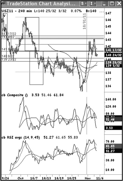
Figure 3.6 Aerodynamic Investments Inc., © 1996–2011, Daily Market Report, www.aeroinvest.com
Source: TradeStation. © TradeStation Technologies
After discussing how to identify the correct %D periodicity for Stochastics, you might ask, “When should the period be changed?” It is generally recognized that a shorter period can be used to anticipate a signal. It will also give you false signals in the form of noise. The best way to handle volatile markets is to use two windows with the data displayed in a ratio of 4:1. For example, a 240-minute chart next to a 60-minute chart will help you filter noise from your indicators and improve the timing. I personally do not use Stochastics as I favor the ranges in RSI that develop and the Composite index to increase probability. But I am aware of what the Stochastics trader is likely thinking.
Early in this discussion the question was asked, “Will we not be creating a new Modified Stochastics Club if everyone uses the same procedure of using half the cycle length?” First, people will find different cycles, but second, you will want to make one last “tweak.” What you will want to change is the time period for creating the bar chart. I have not encountered others that do this. You will find it is not only an effective way to make an adjustment but it is also the easiest way to catch that an adjustment is required.
Figure 3.7 is a comparison between an 88-minute and 60-minute September S&P 500 bar chart. (I should mention here that I displayed 88-minute and 60-minute; when you become one of the old dogs with nothing to prove, one becomes more humble. Use the ratio 4:1. Therefore 88- to 22-minutes would be the better pairing.) In both charts two oscillators are plotted. The bottom oscillator is a 14-period RSI, and the middle oscillator is a custom formula I developed called the Composite index as it is a formula that is a composite of two studies. Both oscillators have two moving averages plotted with them, and two averages are plotted with the price data. The only difference between these two windows is the time interval used to create the bar charts. In the 60-minute bar chart, the moving averages appear to be incorrectly defined, as the price highs near points 1, 2, and 3 are all exceeding the nearby averages. However, in the 88-minute chart the same data points are directly below the moving average at points 1, 2, and 3. Now take a look at what also occurs in the oscillators: the oscillator pivot points marked at X, Y, and Z in the 60-minute chart are not very helpful. However, the exact same indicators in the 88-minute bar chart trigger signals that are easy to interpret and are right on their mark when the market is at a very difficult decision point for a trader.
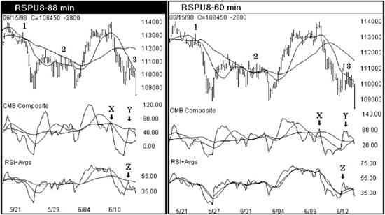
Figure 3.7 Aerodynamic Investments Inc., © 1996–2011, www.aeroinvest.com
Source: TradeStation. © TradeStation Technologies
How did I know 88 minutes would work at point 3? When I sit down in front of a chart, the first thing I check is the relationship of my fixed-interval averages on prices in the oldest data on the left of the screen. In this case, the 88-minute period of time was set up several weeks ago, and the key pivots were still working on the left-hand side of the screen. Therefore, I would not make a change. As the current data coming into the chart is the most critical, the assumption is made that if the signals are true on the left, then I should be able to see accurate signals form in the real-time data entering the screen on the right. In a two-minute chart, the far left or oldest data is clearly missing its mark. Change the time period of the bar chart. I look at the old points to see if a three-minute chart is a better fit … maybe a one-minute bar chart. What surprises me most is that I nearly always land right on or within a minute of a Fibonacci number. Keep an eye on the old data as it relates to its moving averages. This is really important: consider only the price data and moving averages; never try to adjust the indicators plotted below the data. Let the indicators fall wherever they will. When you encounter bar charts in this book created with unconventional time periods, this is the method by which they were derived. It is very rare that I change the favored periods for specific markets. Clearly, I can use this adjustment only within intraday periods, and I rarely exceed 240 minutes.
We need to cover times when you will want to change the periodicity of an oscillator. In the following example, a shorter period is deliberately used to move an oscillator freely between 0 and 100. In the first chapter a strong case was made that oscillators do not travel between 0 and 100. In this case we will set up a condition so as to look for a specific oscillator formation and ignore all other squiggles the indicator may produce. Figure 3.8 is an 11-period RSI calculated from the September S&P 500 futures market and charted in 88- and 13-minute intervals. When you look for a market top, use this chart combination to find just one pattern for confirmation between the two time intervals. In this example the 88-minute chart is forming a second peak with divergence near the 80 level. The same price high in the 13-minute chart forces the RSI to be pressed into the same 80 level boundary. That’s all there is to this signal if you need only the last trigger after everything else you monitor is in place. This method will help the timing of entering a position. It is not used to exit a position as I don’t hesitate when a target is realized for any reason. Ignore the fact that the oscillators roll to the bottom of the screen; in fact, don’t even look at this screen combination until you are interested in using it to buy the market. The RSI is not interpreted in any other way except to find the extremes to sell or buy into within a specific time period. Ensure that you enter stops the same time the order is entered. This concept works well with longer time horizons such as monthly-weekly chart pairings. Some markets such as currencies require longer trading pairings more suitable for that market. Figure 3.9 shows the Yen/$ applying a 360-minute and an 89-minute chart that completes a full sell-buy signal for this time horizon.
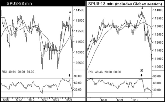
Figure 3.8 Aerodynamic Investments Inc., © 1996–2011, www.aeroinvest.com
Source: TradeStation. © TradeStation Technologies
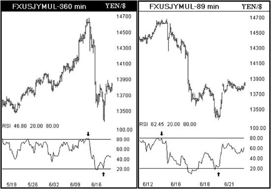
Figure 3.9 Aerodynamic Investments Inc., © 1996–2011, Daily Market Report, www.aeroinvest.com
Source: TradeStation. © TradeStation Technologies
Many of the short-horizon chart examples throughout this book were actual real-time trading screens that I took a quick snapshot view of in order to capture the analytics and prices moments after a position was established or closed. (I still do this today.) In this case I was selling into the 1,104 level based on the charts in Figure 3.10. The advance from the bottom was thought to be an Elliott wave pattern that we will look at much later called an expanded flat. It would mean that the market would rally sharply and reverse just as quickly. By just the press of the print key on my computer, the entire screen is recorded without interfering with the collection of real-time data. Various utility software packages function differently, but they all allow a later evaluation of the exact screen that was used to enter the trade. We will discuss some surprising observations derived from this method when we address indicators on indicators and moving averages. Ever wondered how you could have missed such an obvious market signal when you looked back? It is very possible that it was not there in real time.
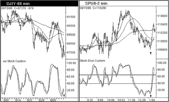
Figure 3.10
How do you set the periodicity for other indicators? The RSI will be set at 14 periods because it has a specific price projection capability that we will discuss separately.
MACD is favored by position traders as the indicator’s travel is very smooth. Smoothed indicators, however, have a severe lag that needs to be addressed by plotting two separate studies. MACD is simply two moving averages, one slow, one fast, plotted in a separate window below the price data. The spread of the two averages can be plotted as a histogram that will detrend the differential movement of the two averages. The histogram will cross the zero line as the faster moving average crosses through the slower average, making it easier for a trader to see a precise crossover point.
The MACD requires three periods that serve to smooth the oscillators’ travel. A single MACD study should never be used alone. As a minimum, you will need two MACD studies as illustrated in Figure 3.11. If a single study is used, the MACD in a downtrend, for instance, will generally develop late buy signals and premature sell signals, so two studies are needed. The default periods of 12-26-9 are offered as a starting guideline by the originator of the study, Gerald Appel. A short moving average pairing might be near 6-19-9, and the longer study may use periods closer to the default like 13-26-9. As markets tend to correct faster than they advance, you may need four MACD studies: two MACD studies using a faster moving average pairing for declining markets and two MACD studies using slower moving average pairings in rising markets. So the bear market studies may need two studies with periods near 6-19-9 and 13-26-9, while the bull market may need two studies that use 5-24-8 for one, and 5-34-5 or 19-39-9 for the other. You will have to do your own testing to find the pairing combinations that will serve you best. It becomes critical to know what trend is present so that the correct study combination is applied. To determine trend, Gerald Appel tends to favor a 50-day moving average on prices. As you can see from this discussion, the smoothed oscillator requires some specialized handling, as do all oscillators. The objective of this discussion is simply to caution you not to use a single study for MACD and then to do your homework to find the best moving average pairings for your particular market and time horizon.
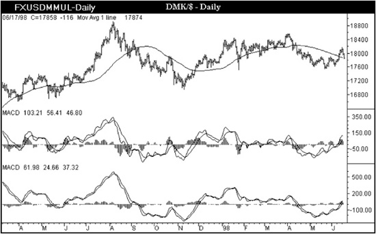
Figure 3.11
I learned about the need for two MACD studies while attending a lecture given by Gerald Appel at one of the Telerate Technical Analysis Seminars offered each year in the 1980s and early 1990s. In my own work I need methods that ultimately offer noncorrelated signals from varying techniques; I do not use the MACD because my Composite oscillator added to the RSI are better indicators for my needs. This doesn’t mean that I view the MACD unfavorably. Rather, the specialized applications I favor in other oscillators are not greatly enhanced if the efforts are duplicated by adding the MACD. But the point here is that considerable time was spent in evaluating the merits of a different formula; then a conscious decision was made. Although the MACD study does not suit my purposes, the underlying premise behind the construction of the MACD indicator and its use for multiple studies will be advantageous to many readers. So don’t skip over a technical method just because you may not have an immediate application for it.
As the lecture about the MACD progressed, discussing the use of multiple studies and periods, it led to an idea that produced an experimental chart formation. In Figure 3.12 an RSI is plotted with multiple periods. Because it looks like a wave, the study variation is named the “RSI wave.” However, I found that adding two simple moving averages on top of RSI or Stochastics to be far more valuable than this experimental oscillator display.
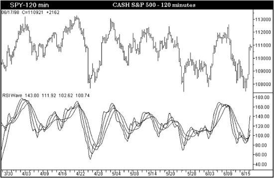
Figure 3.12 Aerodynamic Investments Inc., © 1996–2011, www.aeroinvest.com
Source: TradeStation. © TradeStation Technologies