Chapter | 4
DOMINANT TREND LINES ARE NOT ALWAYS FROM EXTREME PRICE HIGHS OR LOWS
We all have preexisting mental patterns that will dictate just how constrained our capacity is to learn new ideas or expand our visual perception beyond the conventional. Our ability to see the critical trend lines in prices or within our indicators will be affected by how strongly we hold onto our preconditioning. This chapter requires active participation from you in order to gain the most from it. Please grab a pencil and a straightedge before we move on, and resist the temptation to turn the page to see the solutions for the different problems. By not looking at the solution, you will consciously learn how you work within boundaries. How you attempt to find a solution is as important as the solution itself.
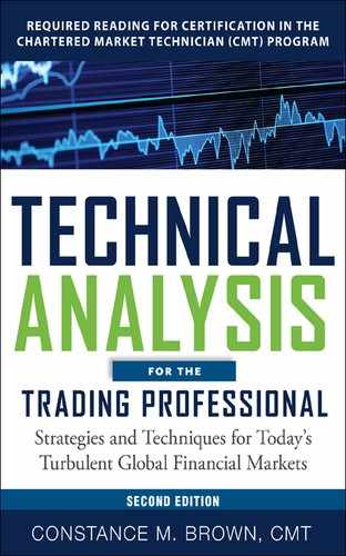
Let’s begin with a visual puzzle that you may have seen previously. Even if you have seen this puzzle before, do try to draw an answer as it will be the visual solution to a chart problem that follows. The first puzzle is in Figure 4.1, and it displays nine squares. Read the instructions carefully. Here is your task: You must connect all nine squares by drawing four straight CONTINUOUS lines without lifting your pencil or RETRACING a line. You may cross over one of the four lines that you draw, but you may not retrace its path.
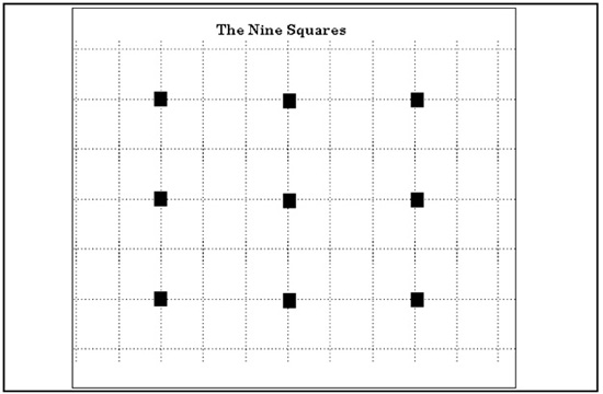
Figure 4.1
Turn the page and complete the puzzle before reading further.
The addition of grid lines in the background of the nine squares is intentional, and it was also deliberate to frame the grid lines within a box that is again surrounded by an outer perimeter border. Not only does it make the puzzle harder, but it also more closely approximates what we are all actually staring at for hours on end. The puzzle is displayed on paper in the same dimensions as a computer screen. The chart’s border and the frame of the computer screen all serve to precondition us. Whether you view charts with grid lines or not will make little difference. The impact in our minds of this configuration of nine squares is that we immediately try to create a square and attempt to circumscribe it with four lines, leaving the center square untouched. The key to solving the puzzle requires that we get out of the boxes that we create for ourselves and that others have designed for us. The solution is in Figure 4.2. You may feel this is an unfair quiz because the solution requires a line to be drawn beyond the left boundary, beyond the grid pattern. Read the directions closely a second time. At no time did the instructions state that you had to stay within the area marked with grid lines or stay within any boundary. Within the “rules” of trading markets, it at no time states that we may not scroll our data screen to the left to see if older data just out of view might contain the price pivot that is the solution to the market’s current movement. Ready for another one? Good.
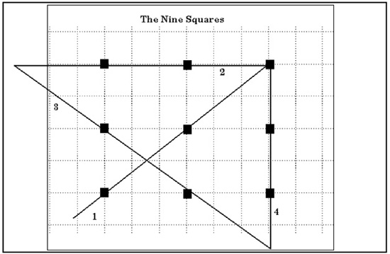
Figure 4.2
In Figure 4.3 we have a 120-minute chart of the Dow Jones Industrial Average. Just like the puzzle to connect the nine squares, now you will be asked to connect the nine dots. The dots are labeled 1 to 9, and the dots, of course, are the extreme price highs or lows that have been numbered in the chart. Here is your task: Connect all nine dots using only FOUR trend lines. You will not need any data out of view to draw the four lines this time. Do not turn the page to see Figure 4.4 until you have attempted to find a solution. If you get frustrated, look at the solution for the nine squares on the opposite page. The four trend lines that will connect all nine points in the DJIA chart will be very similar to the pattern that was drawn for the nine squares. Now try to connect the dots.
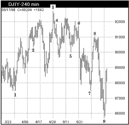
Figure 4.3
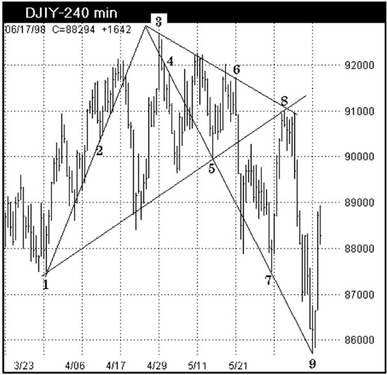
Figure 4.4
You probably had a tough time if you tried to draw trend lines that always started or ended at the price high in this chart. The solution for connecting all nine price lows and highs requires seeing that two major trend lines bisect one another just left of the price high and that the critical trend that connects points 4, 5, 7, and 9 originates from the intersection of the trend lines and not the price high. We have been told that a trend line is created by drawing a line that connects two price highs or lows, and that when the market tests the trend line a third time, it is considered a confirmed trend. Hogwash! Erase that programming because it is misleading. It is not wrong, but markets do not operate entirely within the limitations of elementary geometry. Preconditioning can lead us down the wrong path and guide us in the wrong direction.
There isn’t a trader among us who doesn’t enjoy a good story. So let me digress a moment and share with you a funny story that was first told in my book Aerodynamic Trading.1 This is a story that illustrates just how preconditioning will influence our ability to make decisions.
The story begins on a hot summer’s day as I was driving along a narrow country road through the mountains of northern Georgia. The Centennial Olympic Games were approaching, and I had recently relocated from New York. There is quite a culture difference between New York and Georgia, but Georgia is beautiful, especially in the north where the Appalachian foothills lead to the mountains. Driving along, I approached a narrow bridge on the winding road. Near the last bend in the road before the bridge, another car was coming toward me, around that turn. As we passed, the driver made gestures with his arm out the window and yelled, “HOG!” He quickly drove by, and I became very upset that he seemed so angry with my driving. I was clearly on my side of the road, and I had not taken, or hogged, more than my fair share. Was it my New York plates that prompted him to use the familiar gestures of a Manhattan taxicab driver? With no more time to think, I made the last sharp turn toward the bridge. I narrowly missed hitting the largest hog I had ever seen in my life! The immense porker was standing right in the middle of a single-lane bridge. That driver’s one single-word warning had produced a string of emotions, artificial images, and false assumptions. The reality? There was a pig in the road—a “Hog”!
We need to use the guidelines we have been given concerning trend lines as a starting point only. Training and experience condition us to connect extreme highs and lows easily to form trend lines, but this preconditioning may prevent us from seeing more meaningful information that will allow us to act sooner from more subtle chart symmetries and formations. Let’s take a closer look at some of the critical points in this same DJIA chart now marked with new labels in Figure 4.5.
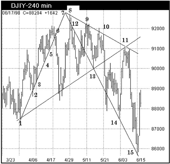
Figure 4.5
From point 1, draw a support trend line to connect points 3, 4, and 5, and then mark a resistance level at point 6 prior to a decline. The important aspect of this trend line is knowing how to work with the spike or key reversal at point 2. More often than not, in my experience, the spikes are better left ignored in favor of connecting the high or low that immediately follows the spike. At point 2 the spike drops through the trend line, but the market low that follows in the next bar is on the trend line that defines support for points 3, 4, and 5. Point 7 becomes the key to this puzzle as the descending trend line of greatest importance originates from the apex just left of the price high. The apex was formed by connecting points 1 to 5 and then 8 to 11, then extending the trend lines as far as possible in both directions. Always extend trend lines as the point where trend lines bisect may mark the timing of a market turn.
I will repeat myself to emphasize this point. Not only do you want to extend trend lines forward to find a price level for future market support or resistance, but also to find the location where trend lines bisect because that point will frequently project the timing of a market turn before it has occurred. In Figure 4.6 a daily chart of the S&P 500 futures market shows trend lines that have been extended forward as far right as possible. Each trend line is numbered at its point of origin. All the trend lines in this chart, with the exception of trend line 4, illustrate the prior discussion in that it can be seen that trend lines should start from the price extreme that is behind the key reversal or spike rather than from the actual price low or high. Study the origins of these trend lines carefully. On your own, you should evaluate how the market reacts to touching the trend lines because the information is very straightforward to interpret.
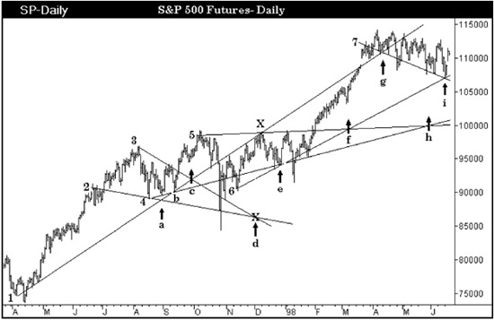
Figure 4.6
Source: TradeStation. © TradeStation Technologies, Inc.
Frequently traders overlook what happens in the market when two trend lines cross over one another.
In Figure 4.6 there are seven trend lines that cross over at 10 different points within the chart. Let’s start by looking at point a where trend lines 1 and 2 cross. A trend line must be tested by the market a third time in order to use an intersection point as a warning that a market turn may develop. Trend lines 1 and 2 have both been tested three times so the crossover at point a was a valid alarm to watch for a possible trend change. When trend lines 1 and 4 cross at point b, the market is testing trend line 4 the third time, and the crossover can also be used as a possible timing signal for a reversal. Trend lines 1 and 3 cross at point c and would have been useful in alerting a trader to watch for a trend change near this time period. The operative word here is near this point, as our other tools must provide us with the actual signal to buy or sell.
The intersection of two trend lines is a wake-up call that we need to examine our other indicators very closely. Just past intersection c, trend lines 3 and 4 cross. The crossover is not labeled, and someone will wonder why it has been omitted. Trend line 3 has been deliberately drawn incorrectly to illustrate where the higher probability point is located from which to draw a trend line. So please skip past this intersection and move to point d. At point d trend lines 2 and 3 intersect. The intersection is marked with an X. Move your eye upward to the price high in December 1997 marked X. The intersection at point d is very premature. Either this intersection has been incorrectly drawn or it is one that did not work very well. While the intersection is close to a pivot in the market as a price high does follow shortly, there is a problem with trend line 3 that we will look at separately in a moment. At intersection e trend lines 4 and 6 cross. Trend line 6 is being tested for the third time by the market and can be used as a timing signal now as well as a support level. Moving along to intersection f where trend lines 5 and 6 cross will emphasize that the crossover is a timing signal for a market pivot and not just a support or resistance price objective. The market has a minor setback that corresponds to point f and is of value only as a timing signal as the market does not use these trend lines as a support level. Point g is not a timing signal as the price levels near g have been used to establish trend line 7. However, point i where trend line 7 crosses 6 is an extremely important time projection for a possible trend reversal. The final point on this chart h is where trend lines 4 and 5 cross. This point illustrates why the intersection point is suggested to be a time estimate for a possible market turn, not a precise forecast. Use other indicators and methods in conjunction with this method. I should add that I use this method only in longer horizon charts, such as daily, weekly, and monthly bar charts. It is this tool that helps me keep my perspective when I view shorter time horizon charts. It is the two-by-four across the head that I need sometimes to warn me to back up and take a closer look at the longer horizon charts when I become too fixated on the shorter horizon view.
Let’s go back to trend line 3 which produced the only questionable timing signal in this daily chart. In Figure 4.6 the origin of trend line 3 is at the price high just one bar behind the actual market high. However, earlier it was stated that in my experience key reversals and spikes should be ignored when you start to draw a trend line. Look what happens in Figure 4.7 when the price high behind the key reversal is used to start the trend line. The key reversal itself is a market failure above the trend line. That is exactly what a key reversal is: a market failure. The angle for trend line 2 has not been touched in Figure 4.7 from where it was placed in Figure 4.8. However, changing the origin of trend line 3 alters the timing when trend lines 2 and 3 cross. The new intersection becomes a very significant change. Now the crossover of trend lines 2 and 3 marks one of the more important market turns as it was the start of the rally in 1998. Draw trend lines so that key reversals and spike pivots are consistent for what we already know them to be: market failure patterns that denote a possible trend change.
Figure 4.7
Source: TradeStation. © TradeStation Technologies
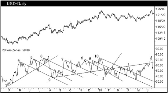
Figure 4.8
At the end of this chapter there will be a few more chart quizzes for you to try. Trend lines that you see drawn in a finished chart will rob you of the opportunity to evaluate where the lines might have been drawn using your own mind’s eye, so know that a few more quizzes will be offered. But first we need to discuss trend lines on indicators so that they can be included.
Oscillators, like price data, can have extreme highs connected to define areas of resistance or oscillator lows connected to define areas of support. However, as with trend lines on price data, there is another way that will produce targets of greater significance for oscillators. The end result will show that the oscillator will respect these trend lines more often than just a conventional line that connects extremes. Here is the difference: Draw trend lines only from oscillator peaks or troughs that mean something to us. Therefore, draw trend lines from oscillator peaks or troughs that form bullish or bearish divergence with price. As recommended for trend lines on prices, we will extend the trend lines as far forward as possible on oscillators.
Figure 4.8 shows a daily chart for U.S. Bond futures. All the trend lines are drawn by using two oscillator lows or highs that formed divergences with the closing-price bars. Trend lines 1, 2, and 3 are bullish divergences with price. The oscillator makes a higher low when the corresponding closing price makes a lower low. Trend lines 4 through 10 are all associated with bullish divergences. The first and second oscillator peaks form lower highs, but corresponding closing prices are higher. While Figure 4.8 uses this method of drawing trend lines on the RSI, the method can be applied to any oscillator.
Before we move away from Figure 4.8, it should be noted that the scale used to plot RSI or any oscillator is important. The range RSI plotted in Figure 4.8 is altered from the standard default of 0 to 100. If the normal range for an oscillator is 0 to 100, vendors will always plot the indicator using this maximum scale. You want to see the indicator as large as possible. So if the range is within a bull market, you might change the default to a range of 25 to 90. In a bear market the scale might be 15 to 70. You never want to limit the details available for interpretation by compressing the scale of your indicator. In addition, the computer system you use should allow for an oscillator to be viewed in at least 50 percent of the computer screen’s height. Otherwise, you are likely to be working from a tickertape-size indicator that fits in a small narrow band at the bottom of the screen. On such a scale, it would be difficult to differentiate an electroencephalogram versus the RSI. The most one can hope to interpret from either chart displayed in this manner would be that neither had become a flat line! The same can be said for published chart books that add for our convenience a squashed indicator at the bottom of the page. These charts are for people who want to know only when an indicator is at an extreme. There is limited value in viewing indicators in this manner.
Let’s move forward and discuss using horizontal trend lines on oscillators. There are two kinds of oscillator: those that have been normalized and will confine the travel of the indicator to stay within a range such as 0 to 100, and those whose formulas allow movement to any extreme. There is great value in using one of each type of oscillator to compensate for a rather serious problem inherent with normalized oscillators such as the RSI and Stochastics.
The following question illustrates the problem with normalized oscillators: “An atom always moves one-half the distance from its current location toward a fixed object. How many times will it have to move from a distance of 1 mile presently to reach the fixed object?” As the atom moves only one-half the distance, it will not reach the fixed object until the diameter of its own size represents more than one-half of the remaining distance. The rate of travel toward the fixed object will become extremely slow the closer the atom gets as the distance covered is smaller and smaller. This is how normalized indicators function, and it is why a normalized oscillator at an extreme oversold or overbought position can appear locked while a market produces a meltdown or ballistic rally against what would seem impossible to the oscillator.
In Figure 4.9 an 80-minute bar chart of the Japanese Yen per U.S. Dollars is displayed. Below the price data is the Composite Index. The Composite Index is a custom formula that will be discussed separately, but for now it is important to know that it is a formula that has not been normalized. This oscillator is capable of traveling below zero or above 100. Plotted below the Composite Index is the RSI using a 14-period interval. There are several key oscillator lows that have been labeled with the letters a through k. In the Composite Index a horizontal trend line has been drawn to connect the oscillator lows at points a, b, and c. A similar horizontal trend line is drawn on the RSI using points f and h. Why was the line drawn at points f and h and not from the low at point g for the RSI? If you look to the far left, the RSI tested the same level as f and h once before. In addition, we are using this horizontal trend line in a different way. The horizontal line needs to be drawn at the level that shows the greatest number of oscillator lows. The line is then viewed as the normal range for the oscillator within present market conditions. At point g the RSI makes a minor violation of this trend line. A trend line that the market used as its major support level will nearly always be tested.
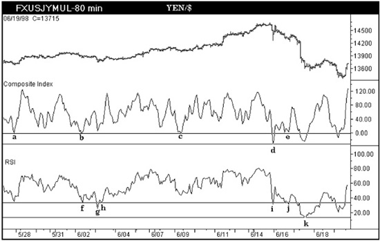
Figure 4.9 Aerodynamic Investments Inc., © 1996–2011, www.aeroinvest.com
Source: TradeStation. © TradeStation Technologies
In the case of interpreting the RSI, one could establish a long dollar position at point h as the old range is being tested. Keep in mind that oscillators plot prices only on the close, and a sharp spike down that closed at current levels would have the same oscillator position. This is not a buy-sell signal. Now move your eye to point i on the RSI. The low the RSI makes at i can be interpreted as a test of this trend line. The same market move, however, moved the Composite Index to point d, which warns that the market conditions are changing. What follows from point d is an advance, and the Composite Index then pulls back as the Yen strengthens (chart prices decline). While the Composite Index forms a W, or double bottom, at point e, the RSI once again tests the trend line at point j. If only the RSI were viewed, the second test at point j could easily be interpreted as a completed correction in a slightly overextended, but secure, uptrending market. Instead, the Composite Index has warned that market conditions may be changing, and once the prior support level is tested at point e, the character of the market should be carefully observed.
In this situation the oscillator advances from point e without the price data following proportionately. If you pick up only a single notion from this book, let it be the following: When an oscillator advances or declines disproportionately to the markets’ movement, you are on the wrong side of the market if you are positioned with the oscillator. In market downtrends, oscillators will travel rapidly upward as a market correction develops, and the opposite will be true for uptrending markets. In Figure 4.9 the Composite Index begins to advance rapidly beyond point e and, though the oscillator is capable of advancing, prices fail to exceed minimum objectives for a rally. Intervention then occurs to support the Yen, showing that the market drop could have been technically forecasted. The RSI does not warn that conditions changed until after the fact at point k, which is too late.
If the oscillator low at point d is a new extreme move for the indicator, a horizontal trend line should be drawn and maintained on the chart. If the prior range resumes and this oscillator low scrolls off the screen to the left, it will no longer be in view. However, over the life of the market or contract, the level will be recorded. Should the market drop to new extremes, it is frequently to these prior levels, and the old horizontal trend line would once again become visible. The same should be done for oscillator peaks.
One last comment about trend lines on oscillators: it was demonstrated how the intersection of trend lines drawn on price could be used as an indication of the timing of a market reversal. This is less so for oscillators unless a change is made. To increase the probability of trend lines forecasting market turns from an oscillator, the indicator should be plotted by hand. The reason for resorting to manual drafting is that the oscillator scale versus time will be linear. Computer screens are not linear. The x axis and y axis are never a 1:1 ratio for their grid lines. A computer with approximately 240 characters from side to side will only have 24 lines from top to bottom. This will vary with screen resolution. If the effort is made to chart oscillators by hand for longer horizon work, it will be found that intersecting trend lines will have greater accuracy and importance than those drawn on price or indicator by a computer.
The time has come to test some of the concepts discussed in this chapter. There are no wrong or right answers concerning trend lines, but one method of drawing a line could prove to be of greater value to the trader than another. There will be two charts with which you can test your own eye.
Figure 4.10 is the German DAX Index. Find these trend lines:
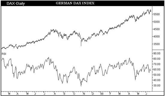
Figure 4.10
• The four major trend lines on price that show why the double top in prices has occurred in the most recent data
• Two significant levels of support for this same market with which to identify the nearby objectives for a pullback
• In the RSI, the trend lines that mark the levels of greatest current interest for this indicator
Figure 4.11 displays the trend lines that I would have favored for this chart. There are numerous small arrows to show you that, once a trend line is started, the angle of the line is set by using key points that fall in the middle or midsection of the chart in an effort to minimize errors that would occur in the most recent data. The T under the RSI pivot is a time projection that has become a support level. When we address price objectives, we will reverse engineer a price target from the oscillator. Clearly, if the oscillator could decline to point T, it would be of value to know beforehand at what market price the oscillator would realize point T. That is a topic we will approach at another time.
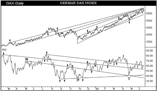
Figure 4.11
Let’s move on to the last trend line quiz and discuss Figure 4.12, displaying a 20-minute bar chart for the September U.S. Bond market. This time you have the Composite Index and the RSI plotted against price. We have discussed drawing trend lines on oscillators that diverge with prices, but trend lines can also be drawn from divergences between indicators. In Figure 4.12 a few key bullish and bearish divergences between the oscillators are already marked so that you may be introduced to this concept. As a short-horizon trader, you have two critical questions to answer:
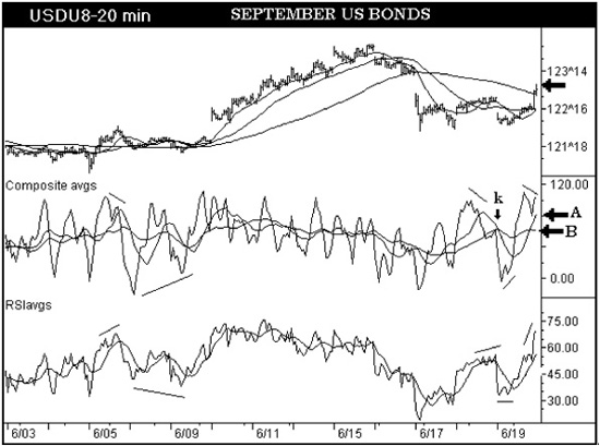
Figure 4.12 Aerodynamic Investments Inc., © 1996–2011, www.aeroinvest.com
Source: TradeStation. © TradeStation Technologies
1. What trend line is present within the price data to have caused the bond market high in the last bar to stall? The market has already exceeded the nearby moving average displayed on price; visually you will want to see why the market has not advanced further (marked with a black arrow on the price scale).
2. If the market pulls back from this trend line that caused the market to stall, what moving average in the Composite Index, marked with arrows A and B, will the oscillator likely decline toward? If you know the moving average that is most likely to be the target, you will be able to calculate a price objective beforehand or recognize the price level once the indicator has declined. The Composite Index graph has an indicator peak marked with a black arrow. The peak forms underneath the point where two moving averages cross over. This is a major signal which will be discussed in the next chapter. The trend line you draw on the Composite Index should bisect this important peak. (The RSI in this case is used to find the divergences that form in the Composite Index. You will find that the trend lines on the RSI will be less informative as to the preceding questions.)
In Figure 4.13, trend line A marks the reason that prices have stalled at current levels. Trend lines 1 and 2 on the Composite oscillator are drawn from divergences between the RSI and the Composite Index. Trend line 1 is derived from a major bullish divergence formation and, projected forward, it actually identifies the oscillator peak of greatest value to start trend line 3. As trend line 3 originates from a peak that respects trend line 1 and crosses the peak marked with the black arrow, it is moving average B that would offer a price objective for bonds.
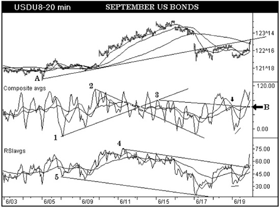
Figure 4.13
Both the Price and Oscillator windows have included moving averages. In Figure 4.12 the RSI displays only a single moving average so that the RSI can be more easily seen. In Figure 4.13 both averages calculated from the RSI are displayed. Using averages on indicators is extremely valuable and will be the topic for discussion in Chapter 5.
Before moving away from trend lines, we need to take a look at a specific application derived from gaps. Gaps actually help us identify the most important angles to establish channels within the price data.
The more experience I acquired with Gann analysis, the more often I observed a curious correlation to Gann angles that tracked parallel channels through markets with frequent gaps. The angles became so useful that fast estimates could be created by utilizing the gaps alone.
Figure 4.14 is a daily chart of the Corn futures market. The grain markets often form gaps from a session closing price to the next open. Breakaway, running, and exhaustion gaps are discussed in most books. For this discussion a gap is a gap without further differentiation. The angle of the line drawn at points A1 and A2 is determined by connecting the bottom of each gap. Then the line is extended right. Figure 4.14 shows you at point A3 what value this angle can be for future levels of price support or resistance.
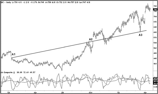
Figure 4.14
However, the value of this first angled line is significantly increased when you create a parallel line. If your software can duplicate the first line, your task is simply to drag the new line, being very careful not to change the angle, into a new location. Do not touch the first line at any time. If you do not have a feature to copy the first line, just draw a line directly on top of the first and then drag the copy to a new location.
Figure 4.15 demonstrates the new parallel line that was set by using only one point at B1. B1 was selected as it begins a significant decline in this market. The line is the same length as the first as it is created by duplicating the first. I really should have extended both lines to the right into infinity, but it is easier now for you to see that one was created from the other. The new line locates the support level of the secondary retracement at B3. It is interesting that the same angle that located support at A3 in Figure 4.14 defines the next major area of support that follows. This is no accident as I have witnessed this relationship for several years in a real-time environment. When my software does not offer real Gann tools, this technique is a useful visual guide to estimate where a Gann confluence area may fall within the chart.
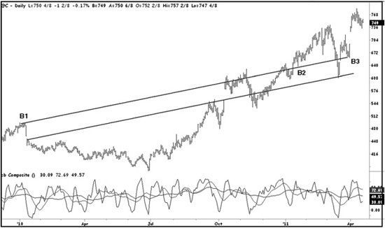
Figure 4.15 Aerodynamic Investments Inc., © 1996–2011, www.aeroinvest.com
Source: TradeStation. © TradeStation Technologies
Do not stop after you have created a simple channel with two parallel lines. Duplicate one of the lines again and be careful that it remains parallel to the first. In Figure 4.16 the new third line is set by using points C1, C2, and C3. Whenever possible use points where the market challenges the line as both support and resistance early in the data set when gaps are not being connected. The line extends to October 2010 where it shows C4 is tested two full days before launching into a strong rally. Recall that the first line was created by using the gap above C4; therefore, the market decline to C5 was a move in the future of when the original angle was drawn. The decline into C5 is accurate and important for a trader to recognize that a significant entry level has been realized.
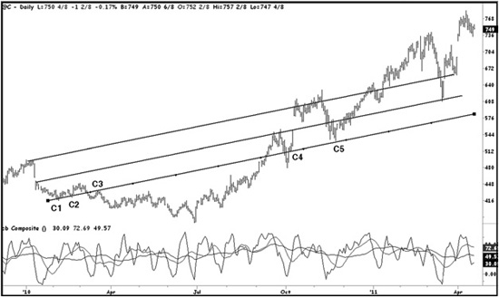
Figure 4.16 Aerodynamic Investments Inc., © 1996–2011, Daily Market Report, www.aeroinvest.com
Source: TradeStation. © TradeStation Technologies
Contents described within books are guarded by book publishers’ contracts. So let me add that the point at C5, a diagonal target, is likely confirmed by a Fibonacci confluence target on the horizontal price axis. The method to calculate Fibonacci confluence targets is detailed in my book, Fibonacci Analysis (Bloomberg Press). If you bought Corn at C5 a stop does not go under the October low just to the left of C4. This would be a foolish place to enter a stop because such pivots often have voids under them. It is common practice to use trailing stops under prior swing extremes. This is a very risky practice because there is often no support of any kind just under the pivot. The same problem exists for markets declining. Use the Fibonacci technique to create a support or resistance grid through the market data and put stops under the confluence zone identified. Your risk exposure is to the next target zone, thereby making it measurable. This is a much better approach to risk management than conventions of trailing stops under price pivot extremes.
The final illustration creates the first line using A1, A2, and A3 in Figure 4.17. This remains a demonstration using the daily Corn futures. A1 through to A2 is a consolidation that can be connected by using the price low at A1 and then truncating the small key reversal at A2. Truncating key reversal directional signals is very useful in methods that utilize geometry analysis. The line angle is then set at the gap A3. This is useful when the market only displays one gap. The line is then extended to the right and points A4, A5, and the gap start at A6 all fall on this same angled line.
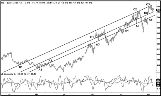
Figure 4.17 Aerodynamic Investments Inc., © 1996–2011, Daily Market Report, www.aeroinvest.com
Source: TradeStation. © TradeStation Technologies
Now create a duplicate line. As you are not changing its angle, only one point is needed to anchor the new line. The most important is to use the top of the gap at B1. What follows is that B2 tries to hold the market, fails, and defines a key reversal between B2 and A5. The market immediately closes back above B2. This is extremely important and is often how key reversals are defined. Then B3 marks the top of another gap showing you there are geometric relationships between gaps.
The final line from C1 is again just a duplicate of the first line “A”. The line was projected forward using only one point at C1 because it is the end of a clear five-wave Elliott wave pattern from the price high to the left of C1. The same angle defines resistance levels at C2 and C3 a year later. Most would use convention and connect the high to the left of C1 and the pivot high just above B1. This would have been a deadly error because the line would cross at point A6 and a trader might be lured into thinking it was a resistance area to sell into after the drop from B3. Instead they would short just at the bottom of the A6 gap. Connecting highs and connecting extreme lows offers a definition of market trend, but does not identify the most important geometric proportions developing within a market.