Chapter | 5
SIGNALS FROM MOVING AVERAGES ARE FREQUENTLY ABSENT IN REAL-TIME CHARTS
“How did I miss such an obvious signal like that one?” Chances are that you did not miss the signal; it may not have been present when you were considering the trade. Many traders suspect that signals may have appeared differently to them in real time, but few take the time to really explore the character of the indicators from which they trade. What do I mean by the “character of an indicator”? The character of an indicator is how it moves across the computer screen relative to other indicators or data. The character is also the psychological change we experience because the computer changes the y-axis scale to display for us a range defined by the maximum high and low within a fixed number of bars. As new data enter on the right side of our screen and old data scroll off on the left, new extreme highs or lows in price or an indicator may lead to a new y-axis scale to accommodate the data.
Technical analysis software allows traders to scroll backward to view historical data. Scrolling offers an interesting means to observe indicators. Scroll forward from the first bar in your database as fast as possible toward the most current data. It will be important to scroll forward and watch the movement that occurs nearest the new data entering the screen on the right. Clearly, not much will be gained from a monthly chart as the objective is to scroll through as many new data points as possible for this exercise. As an example, view a 15-minute chart that has 500 bars in its history. The character you will see in your indicators in a 15-minute bar chart will be a subset or micropicture for what will develop in longer time-horizon bar charts for the same market. In a sense you will be animating the still pictures that are normally viewed as static charts except for the changes that occur in the most current bar.
By not looking at specifics and animating our indicators, just for the purposes of observation, we are able to see that the undulations of our indicators may dramatically change their relative positions and scale as new data are added to the right-hand side of the computer screen. Traders must know if the indicators they trade from rescale or operate within fixed boundaries. Do the indicators we use as graph additions on prices or other indicators shift their positions over time?
As mentioned earlier, I often take a snapshot or freeze-frame picture of a trading screen just after an order has been entered. The purpose is to allow a later evaluation of why the trigger was pulled at that precise moment to enter or exit the trade. These figures are extremely short horizon as this discussion was appropriate for the markets in 1998. However, the figures remain true to the principles being discussed. Markets in 2011 require longer intraday periods. I use 22 and 88-minutes together as a 1 to 4 ratio filters false signals and improves timing. I recall the day the DJIA fell nearly 1,000 points and recovered much of the loss in a single day. Incredibly, I was trading intraday off the monthly chart support and resistance levels. Just recognize please these examples remain to to their concepts, though market ranges have changed dramatically.
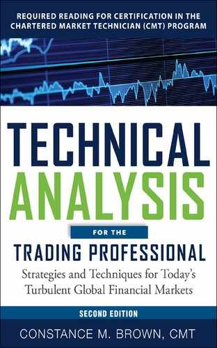
Figures 5.1, 5.2, and 5.3 are all intraday charts. Figure 5.1 is a three-minute S&P bar chart. A good point of reference is the 11:06 time grid mark on the x axis. Figures 5.2 and 5.3 are much longer intraday bar charts for different markets that remain anonymous. All three examples have an oscillator high or low that is marked T1 in the left window and T2 on the right. In each figure pairing, you are looking at the exact same indicator and market. T1 shows the appearance of the indicator at time 1. The T2, or time 2, label is the same indicator peak or low viewed at a later time. Slow Stochastics, MACD, or for that matter any indicator that has a smoothed variable in its formula calculated by applying a moving average, is capable of experiencing the dramatic changes demonstrated in Figures 5.1 through 5.3. The degree to which you will see such a dramatic shift will depend on the following:
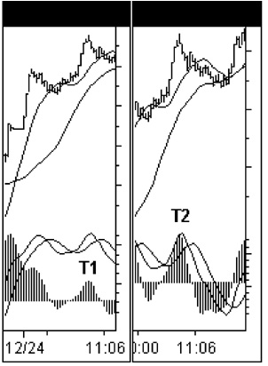
Figure 5.1
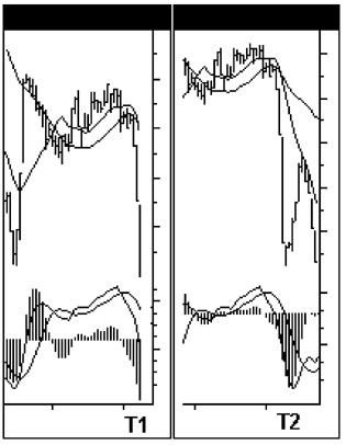
Figure 5.2
Figure 5.3
1. Consider the formula of the indicator and the type of moving average that is used. Does it use a simple or exponential average, for example? The impact on the current period will be affected by the type of weighting applied to the number of bars being averaged. The smoothing technique selected will also determine how significant it will be for the current bar when extreme ranges drop out of the moving average calculation.
2. The time period or number of bars to be averaged remains the same, but the time interval is volatile. Also, the fewer the elements averaged, the greater will be the displacement that occurs. Short moving averages are extremely dynamic.
3. The size of the window you have chosen to display an indicator will define the number of bars used to chart the y-axis scale.
In Figures 5.1 through 5.3, the charts are all narrow-width windows displaying a limited number of bars at any one time. This was deliberately done to exaggerate the distortion possible with indicators plotted from intraday data on a computer using Microsoft’s Windows 95/98 platform. As soon as we are given the ability to define our own dimensions for a chart’s size, our natural tendency is to overdo our adjustments. If you like your trading screens to display a mosaic of numerous small windows at one time, just beware that you may want to enlarge a single smaller window to full screen size before making a final judgment.
In Figure 5.1 the oscillator peak is nowhere near the moving averages charted above the oscillator at time interval T1. However, at time interval T2, the exact same oscillator peak appears much larger in scale and has moved directly under the moving averages, allowing an interpretation in hindsight that the oscillator was peaking directly under resistance. In real time it was not. The reason T2 is so different from T1 in Figure 5.1 is that the histogram indicator with the highest peak to the far left of T1 has now scrolled off the screen and the computer has rescaled the y axis to plot the histogram. (The histogram in all three of the figures is the spread or differential between the two moving averages on prices that are charted in the top window.) There is also a dramatic change between the T1 and T2 moving averages relative to the oscillator histogram. The change occurs when the look-back period for the averages no longer uses extremes in its rolling forward calculations as the oldest data drops out of the formulas for simple moving averages. Simple moving average periods using the common Fibonacci numbers of five and eight are extremely vulnerable to displacement. They are of great value, but a trader should be cognizant of the dynamic character of shorter period simple moving averages and make allowances in their interpretation of them in realtime environments.
In Figure 5.2 a sharp market decline develops. The most recent bar at T1 records the oscillator and moving averages as they appeared in real time. Stochastics, RSI, and MACD—in fact, most indicators—use the closing price to calculate the indicator. Some indicators do not see current bars as they cannot calculate the position of the indicator until the next bar forward. In Figure 5.2 the indicators for T1 are actually off by one bar because of the nature of their formulas, and they do not know that the market is in a freefall. The averages near T2 have been recalculated, and it appears that ideal support was tested by an oversold oscillator in hindsight. This was not the case at T1, and what complicates the matter is that the histogram is the differential of the two moving averages on price. So now T1 is at least two bars behind. The MACD operates in this manner. T1 was in fact an oscillator at an extreme low equal to the low of a prior oscillator extreme recorded a few weeks earlier for the same time interval charted.
Recall the discussion about using a horizontal trend line to mark historical displacement extremes of maximum resistance and support for oscillators. In this case an “extreme” trend line marked a couple of weeks earlier would reappear as the computer rescales the y axis. When markets are in extreme conditions, I will use indicators that have been expressly tested for extreme situations only and ignore those that are known to perform poorly in a different climate. Sometimes the same indicator is used, but the interpretation can be different. In this situation only the histogram is viewed and the averages are ignored. An oscillator tracking intraday data that are currently at an extreme position that has not been seen in over two weeks is a major piece of technical information. Add an Elliott wave pattern or a price projection system to this oscillator extreme, and we know a signal to buy exists at T1 that could lead to a sharp slingshot rebound. As the oscillator had declined to the extremes made over two weeks ago and had entered a new range for the indicator, it would also be known that the oscillator would most likely decline to test the prior support lows that defined the range for the last week. Such an indicator move would likely produce a new price low. If you did not know how this indicator performed in different market situations, a trader might have sold at the precise low of T1 just prior to a short squeeze rally. The breakout trader is the most vulnerable to this type of trap. It will also be a high-risk scenario for the Elliott wave trader who relies on price patterns alone. By understanding the high-probability patterns that develop in oscillators, we can anticipate the next indicator signals before they even appear on the screen.
Once market direction is anticipated, price projection methods can be applied, allowing trades in the market from both sides or at least allowing a market position to be entered with the larger trend that has a minimal capital exposure because we can use tighter stops. There are specific oscillator patterns that will warn us that such a rebound is a countertrend rally in addition to the range rules defined for oscillators. There are oscillator patterns that will be discussed in the price projection section of this book which will offer confirmation that the larger trend will resume.
In Figure 5.3 the oscillator at T1 shows bullish divergence compared to the new price lows that develop. Once the oscillator extreme to the left of T1 scrolls out of view, the moving averages jump up and move to just under the oscillator at point T2. It may seem hard to believe that T1 and T2 are identical indicators that are being viewed at a later time.
This demonstration does not discredit technical analysis; it does, however, discredit some display setups and warns that extremely short horizon trading is even more vulnerable to these differences between real-time trade decisions and postmortem evaluations. Most analysts are unaware of the dynamic nature that surrounds the current bar on our trading screens. However, the analyst or trader who does have intimate knowledge about the indicators used and understands how their quote vendor calculates and incorporates current data into their formulas will be able to forecast the future travel of their indicators and the market.
It is important to recognize that indicators on prices, or indicators on other indicators, are dynamic and will change their positions once the most recent bar moves to the left and becomes a part of the historical record constantly building. In some cases, we must knowingly jump in front of the indicator signals because we know they will appear perfectly aligned once 10 bars or so of new data have been added to the screen. As an example, we may decide to buy when the market has declined to an objective but the price data remains much higher than the moving average that was being monitored. The knowledge that the moving average will in fact shift upward into a permanent position will allow a trader to pull the trigger with confidence because the signal in real time can be correctly interpreted. While the shift will appear minor in weekly charts, the capital exposure in question will be far greater, so weekly position traders are not excluded from this discussion, especially if they use moving averages to define initial or trailing stop placement.
We must know how our indicators are constructed, the impact of our trading time horizon on these indicators, the scale that is normal for charting an indicator, and then, how the indicator responds in normal and extreme market movements in real-time conditions. It is only after endless hours of careful observation that these indicator changes become finely woven into the fabric of our intuition.
Is intuition a gut feeling, some sixth sense, or inner wisdom that some traders are blessed to have had since birth? I think not, as a direct knowing without conscious use of reasoning can come only after extensive training and preparation. Intuitive knowing is the essential key for success in fast-paced environments. We do not have the luxury of time to think. Three-time Super Bowl Most Valuable Player Joe Montana once stated, “If I ever stopped to think about what happens after the ball hits my hands, it might screw up the whole process.” Yogi Berra, baseball legend, stated, “How can you think and hit at the same time?” Both sports legends had to practice thousands of times until their actions became intuitive. As traders, if we have to worry about how an indicator might change with the passing of time, the critical timing of making the trade will be destroyed and will minimize the results. We need to know our indicators through such elaborate study that what we learn becomes effortless and automated. The easiest part of our job is to pick up the phone and say “Buy” or “Sell.” Some readers will be disturbed by the dramatic displacement of the indicators displayed in the first three figures. If this information about indicator dynamics is new to you, it will open the door to many hours of hard work that must be done. You will need to resolve the questions this discussion will undoubtedly leave behind with you about your own indicators in real-time scenarios. Answer the indicator questions before the markets answer them for you. Either way, the questions will be answered over time.
It is also helpful to apply indicators to markets that we normally do not trade so that we can experience how our indicators will respond to market movements and conditions that we may not be accustomed to viewing. This will train and prepare us for those occasions when our principal market changes its character and begins to adopt some other market’s action. An example would be the recent transition that occurred in the 1990s in the S&P 500, which now acts more like a commodity market rather than a financial market as it did in the 1980s.
With the knowledge that moving averages on oscillators or prices will be dynamic in real-time conditions, we can now move forward and discuss using moving averages profitably. There are numerous discussions elsewhere in published books that detail the different kinds of moving averages and comparisons of how to use alternatives to closing prices. I have elected not to cover ground here that has already been well traveled. But if you need to reinforce your understanding of the different types of averages used in our industry, a good reference can be found in Perry Kaufman’s book, The New Commodity Trading Systems and Methods. For now, our discussion will focus on applying moving averages to three oscillators: Stochastics, the RSI, and the custom oscillator Composite Index. Adding moving averages to traditional plots for the RSI or Stochastics will require some custom setup changes to most quote vendors’ software.
In Figure 5.4 are the PowerEditor formulas required to add moving averages to Omega’s TradeStation. Other vendors will gladly convert these equations for you to fit their system’s charting conventions. The periods that work best for you should replace the unknown variables X, Y, and Z within the first lines that state LENGTH(X), PERIOD(Y), and PERIOD2(Z). The RSI will use a fixed period of 14 for reasons that will be addressed later. Now that you know how the charts can be constructed, let’s take a detailed look at the results and interpretation.
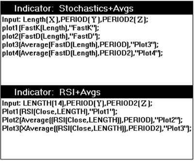
Figure 5.4 Aerodynamic Investments Inc., © 1996–2011, www.aeroinvest.com
Source: TradeStation. © TradeStation Technologies
In Figure 5.5 the Weekly German Deutsche Mark per U.S. Dollar is charted with a Fast Stochastics study that includes two moving averages. When a Slow Stochastics is used, or %D is smoothed, it is smoothed by a moving average. This chart alternative simply offers more flexibility. Both of these industry leaders add two moving averages to their oscillators because doing so adds tremendous clarification and depth in the oscillators’ interpretation that may otherwise be easily overlooked.
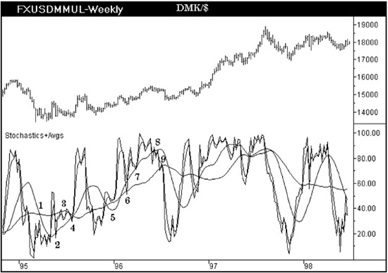
Figure 5.5
Source: TradeStation. © TradeStation Technologies
In Figure 5.5 the Stochastics study has a short- and longer period moving average. We begin the chart evaluation at point 1, which is where the Stochastics study has rolled up to test the point where two moving averages are crossing over one another. If the shorter moving average is crossing down through the longer period, the signal is bearish if the indicator fails at this intersection. In real time the shorter moving average would most likely not have crossed the longer period average, but Stochastics would still be failing under the averages. The sharp angle of descent in the shorter period moving average would be accurate, and one can easily see that an intersection would form if the oscillator failed to break above the longer average. At point 2 the moving average is tested by Stochastics after the indicator breaks above the longer average and fails. The important difference is that at point 2 the Stochastics indicator is staying above the shorter average, and in previous attempts the Stochastics indicator was below the short-period average. As we know, short-period moving averages will shift upward into their permanent chart positions from the real-time chart position, and the Stochastics indicator would have been slightly higher than the short-period average, giving a stronger signal than that which is present in this chart.
Point 3 shows a double top in the indicator under the longer moving average. An M pattern in the indicator can be interpreted as a double top provided the pattern forms under the trending average. Is Stochastics really under the average at point 3? The slower component of Stochastics remains under resistance so it is viewed as a market failure signal. At point 4 the faster component %K breaks below the moving average, but the slower %D stays above the average. The angle of ascent in the shorter period is important as it is soon to intersect the slower moving average. Therefore, point 4 occurs at an intersection and is a stronger signal. Oscillators frequently respond to such formations in the same way as one would jump from a trampoline. The market accelerates from signals like point 4, as the dollar does in this chart. The oscillator then travels into highs that form an M-pattern top and breaks sharply. Note where the oscillator stalls briefly near the averages and then breaks below. This break requires the use of more than one method and a knowledge about the normal character of currency markets. Using the Elliott Wave Principle, a trader would suspect a series of first and second waves is developing. Whether you knew this or not, a trader should know that currency markets commonly form deep retracements early in their transition to a trend change. Second waves very often retrace nearly all of the early first waves.
There is an extremely important juxtaposition in the Stochastics oscillator lows that develop just prior to point 5 compared to point 4. The oscillator low at point 4 is higher than the current Stochastics position, but the prices on close for these corresponding lows are higher. Therefore, the indicator is becoming oversold at higher price levels, which denotes growing market strength. At point 4 the oscillator stays above the longer moving average for the first time, and it is a trader’s last warning that the trend reversal is now in force. The Stochastics pullback at point 5 is at the support zone for a bull market, testing the 45 level in this situation. The information at point 5 is overwhelming that the dollar wants to attempt a rally. However, because most traders do not read information from the Stochastics other than divergences at extremes, they would not be aware of this important signal. The Stochastics indicator then jumps upward and pulls back a second time to test the longer moving average. Notice at point 6 that the %D component of Stochastics is above the shorter moving average while %K tests the slower moving average. This relationship would have been important in real time as more likely the %D would have been testing the longer average. The signal is the same, but the shift in hindsight could have been anticipated.
At point 7 Stochastics remains above both the moving averages, which is where it would have been in real time as the angle of ascent for both averages has been in force for some time without change. At points 8 and 9 a gradual trend shift develops as the indicator rolls under the averages. As the oscillator then breaks sharply to the screen lows opposite point 2, but with prices staying much higher than those that formed at point 2, the decline is confirmed to be a correction within a developing uptrend. Points 1 through 9 detail most of the important patterns that will be seen between moving averages on a Stochastics study. Note the series of three W bottoms that form in Stochastics after the oscillator low in 1996. The third W forms near the 75 level, which conforms to an earlier statement that one would have permission to buy the market when the Stochastics pulled back to the 75 level in an uptrend. Confirmation of the signal is present because the two moving averages have a positive differential; that is to say that the shorter period average is higher than the longer period. This is a price projection that accompanies this pullback and will be discussed later. But in a quick summary the market has only attained half the distance it will achieve from the prices that developed at the oscillator lows in 1996 up to the price highs that followed prior to the current buy signal in Stochastics. We will go into more detail on price projections at another time. Let’s take a look at a chart applying the RSI indicator.
The weekly DMK/$* chart is again displayed in Figure 5.6, but this time with a 14-period RSI that includes two moving averages. The two averages in this chart use the exact same period, but one is a simple moving average while the other is an exponential moving average. In my own charts I will use one fast simple moving average and one slower exponential moving average. In Figure 5.6 the signals are discussed for the RSI as the indicator relates to a single average. You need to decide if you prefer to use the simple or exponential moving average formula. In Figure 5.4 the true formula I use has been given to you, but Figure 5.6 shows that you may elect to use two exponential averages or two simple averages. It becomes a matter of how you want the real-time displacement to be handled relative to this indicator, which can be determined only if you evaluate the differences on your own.
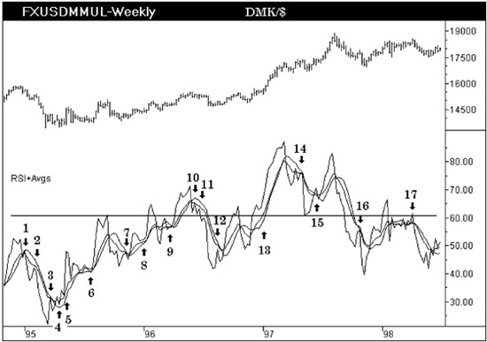
Figure 5.6
In Figure 5.6 a horizontal line near the 60 level has been added to help your eye see when the RSI is failing at the upper zone for a bear market or using the zone as support in a bull market environment. The same market and chart was used with just the RSI when we discussed detecting trend reversals in Chapter 1. This chart interpretation adds another dimension of detail. Points 1, 2, and 3 are all RSI pivots that occur below the moving average. Points 4, 5, and 6 are also straight forward, showing the RSI pivots developing above the averages.
The RSI at point 7 is more difficult to interpret in this chart. Is point 7 a failure to exceed the averages that will lead to a market decline? This is the same point that was so distinctive and clearly a buy signal for Figure 5.5 when the Stochastics were discussed. So is something wrong with the RSI, or is this a contradiction between oscillator formulas? What is wrong is that the slower exponential RSI is not displayed in this chart but, if it were present, it would show that the RSI was forming a buy signal at the same time as the Stochastics. But the difficulty is not in the omission of an average; it is in making a blatant observation about an oscillator relative to a moving average without giving it further consideration once the first interpretation has been made. How often are we satisfied because we have formed “an answer” to the puzzle at hand, after which we confidently move on to something else?
There is a wealth of information developing at and around point 7 that has been overlooked:
1. The two RSI oscillator lows that straddle the high at point 7 form bullish divergences with prices.
2. This divergence occurs above the 40 to 45 support zone defined as the lower range for a bull market.
3. In addition, the price level on close associated with the oscillator peak at point 3 is the same price area that forms the bullish divergence oscillator lows surrounding point 7. An oscillator that once formed a peak at a price level that later develops an oscillator low is a market that has found a former resistance level of great significance and the former area of resistance has become support. These signals can occur at extreme oscillator lows, or they can develop in the midpoint of travel and become hidden signals. The hidden signals are in fact far more powerful than the patterns that form at the oscillator extremes because they are frequently confirming signals that developed earlier in the same chart or within the chart time horizon that is longer than the present chart. In other words, this signal in a weekly chart may be confirming a signal that formed in the monthly chart much earlier.
With or without the slower moving average on the RSI, the signal is bullish. The pivot high at point 7 is just a stall for time. We need to consider this signal that develops in the lows surrounding point 7 further. It was stated above that frequently these hidden signals are confirmations for an earlier signal located in a longer horizon chart. It is this transfer and confirmation of signals from long-time horizon charts right down into shorter time horizons that increases the probability of the signal in the shortest time horizon used to decide when the position should be entered. A similar formation seen in a 60-minute chart may in fact be the last hidden warning of a ballistic rally that has been building within a market for months. The progression of signals that develops from month, week, day, intraday charts, and through the different time horizons we use for trading a market is in essence a domino effect. A few dominos being out of sequence is the warning we need to find an alternative path that a market may travel in order to realign all these domino signals into their correct sequential order. This is how more complex market corrections can be detected before they develop and how patterns such as time-consuming triangles versus sharp quick pullbacks can be anticipated before they develop.
Often I have been asked, “How could you have possibly known a complex correction would have developed instead of a fairly quick simple one?” It is this struggle to understand how all the pieces of the domino puzzle will fit together that brings results. This aspect of fitting different time horizons together into a sequential order is exactly what I do in my analytic work between international markets. An example of how this method is applied is offered in Appendix A, where the Yen/$ has been identified as the key to understanding the next major move for the American S&P 500 Index. The indicators in fact were ignored for the S&P in favor of believing that the Yen/$ would be the first trigger signal that would cause the chain reaction of falling domino signals throughout the global financial complex and ultimately dictate the short-horizon direction for the S&P 500. Our markets are interlinked and complex. Companies that strongly believe each market is an independent entity have not kept pace with the expanding global communication highways that are tying us all more closely together. Technical analysis offers us a universal language to assimilate the masses of fundamental reports printed in foreign languages. Without the techniques offered by technical analysis, we could not possibly process all the global fundamental factors in time to make a correct decision about probable market direction. It is for this reason that the number of people using technical analysis is growing.
Returning to Figure 5.6, points 8 and 9 show oscillator lows over a moving average which are easily interpreted as buy signals preceding a dollar rally. However, take a look at the oscillator pivot low that forms between points 8 and 9. The oscillator low is below point 8, though at a corresponding higher price. This is confirmation of an uptrend as the oscillator became oversold at a higher price showing market strength. Points 10, 11, and 12 all form oscillator peaks below the average. The averages again clearly make the indicator easier to interpret. The reentry signal to buy the market does not actually develop until point 13. An exit signal forms at point 14. When an M pattern forms under an average in the oscillator, it is generally viewed a major sell signal; similarly, a W just above an average would be viewed as a buy signal. In this situation the M pattern declines to the 60 level and uses the old resistance zone for oscillators in a bear market as a support zone, adding confidence that the market will remain in an uptrend. At point 15 confirmation develops, and the rally resumes with renewed enthusiasm. Points 15, 16, and 17 all become important considerations for a major trend reversal that was discussed in Chapter 1. The saving grace for the U.S. Dollar is that the oscillator after pivot high 17 leads to the support zone defined for a bull market, the 40 to 45 area for the RSI. The danger area for the dollar will come if the next advance fails to push the RSI through the 60 level. Such an oscillator pattern could lead to a long-term bear market for the dollar as the Deutsche Mark strengthened.
Up until this juncture, global rates have been largely ignored in the chart examples. Let’s correct this imbalance now and focus on a daily chart for London’s Gilt Bond futures market in Figure 5.7. Now we are beginning to apply all the techniques discussed at great length in the first five chapters. Averages are added to prices and oscillators; cycles have been identified. (In Figure 5.8, we will add trend lines to this same market to see how they might contribute additional information to the details we obtain from Figure 5.7.) Figure 5.7 includes the RSI with two averages that use the exact same period, but one is simple and the other is exponential. As I mentioned earlier, I would normally use a longer period for the exponential moving average on the RSI, but in this market the longer average makes it hard to see the RSI in a black-and-white image. So the two averages in the chart allow you to explore the differences between simple and exponential weightings. The RSI uses a 14-period interval. The middle indicator is the Composite Index with two simple moving averages added to the oscillator: one short and one longer period. Starting at point 1 on the Composite Index, there is a sharp divergence between the angle of the peaks that form in the RSI. Bearish divergence at an extreme is a sell signal that leads toward bullish divergence between indicators at point 2. The RSI remains below the short-period averages, but it declines only to the 45 level in the RSI, indicating a correction in a bull market. The Composite Index has unlimited range between its upper and lower displacement, so range rules will not apply to this indicator normally. At point 3 the RSI is testing the averages, and the Composite Index is maintaining its distance above the shorter moving average. Both signals are correctly bullish for London Bonds. Moving along to point 4 is bearish divergence between the Composite Index and the RSI. The RSI travels under the double line, staying above the moving averages, and it offers no warning. The cycles on price remain up. There are only two warnings present in this chart that a decline will soon follow: the first is the bearish divergence between the RSI and the Composite Index; the second is the price advance from the bar marked with the first cycle low into the high that corresponds to point 4 in the Composite Index, which is a very clear five-wave rally, applying the Elliott Wave Principle. The fact that the Composite Index has topped warns that a correction is nearby. Point 4 is marked to show that no matter how much detail and experience one can develop with a single indicator or method, we are certain to be blindsided by the market if we do not develop multiple noncorrelating methods. In this case, the RSI is clearly at an extreme, but it offers no further information about the degree to which the bond market will decline or of its timing. The correction allows both oscillators to alleviate their overbought condition, and the first bounce in the market is foretold by a bullish divergence between indicators that forms at point 5.
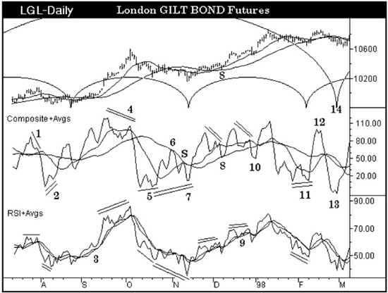
Figure 5.7
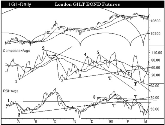
Figure 5.8
At point 6 the Composite Index fails to exceed the long-period moving average, which is a little easier to read than the formation that forms in the RSI. Move to the oscillator peak that develops at point S in the Composite Index. The Composite Index is directly under the crossover point of two moving averages, which warns that the buy signal at point 5 is premature. The RSI has a similar warning as it is unable to exceed the moving averages. The RSI then declines to new lows, but the Composite Index does not form a bullish divergence a second time at point 7 with the RSI. Point 7 coincides with a cycle low in price that is important coincidental evidence.
Following point 7 in Figure 5.7, both oscillators break above their moving averages before prices are able to exceed their own averages. This is a lead that should not be missed. Minor divergence between the Composite Index and the RSI leads to a pullback toward point 8. Point 8 in the Composite Index holds above the longer moving average. At point 9 the trend in the RSI is not broken, but it leads to a push that forms a divergence with the Composite Index. Point 10 is an oscillator low that has broken the averages in the Composite Index. However, note that point 10 is lower than point 8, but the oscillator is at a higher price at point 10. The market has become oversold at a higher price level, denoting strength. The RSI forms a similar pattern between the new low and point 9. The RSI is the first to cross back down through the averages, offering the first warning.
At point 11 a bullish divergence develops, and a rally soon follows into point 12. Point 12 is an M pattern in both the RSI and the Composite Index that warns that the cycle low approaching at point 14 will soon be seen. The oscillators then form a W bottom at point 13 which coincides with the cycle low at point 14. The cycle at point 14 is clearly a cycle that could be viewed in a weekly chart, and it is significant that the oscillators form a signal near this same cycle bottom.
Now take the same market and add trend lines from the oscillator lows and highs that have formed bullish or bearish divergences. Figure 5.8 shows that many of the pivots in the oscillators that were not discussed in Figure 5.7 have major support or resistance now at previously overlooked pivots. Trend lines 2, 3, and 5 on the Composite Index have become extremely valuable additions. Trend lines 1, 2, and 3 have also become valuable as drawn on the RSI. While it would be difficult to see all the notations drawn in Figures 5.7 and 5.8 in one black-and-white chart, the lines are easily differentiated with systems that use color.
Now that we have a strong arsenal of tools from which to define market direction, we are ready to discuss various price projection methods, which is necessary because knowing the market direction alone is insufficient.