Chapter | 8
PRICE OBJECTIVES DERIVED FROM POSITIVE AND NEGATIVE REVERSALS IN THE RSI
Of all the methods in the first edition, this method of recognizing positive and negative reversal signals in RSI was the most often incorrectly applied technique by early readers. Part of the problem is the change in market volatility. But the primary reason for the misunderstanding is not recognizing when a method is an analytic method versus a trading technique. I had written that this is one of the methods I use along with Fibonacci, Elliott and Gann analysis, but I never gave you a detailed example to show when a method changes its weighting and becomes far less favored when it becomes part of the decision tree for trading. Therefore, I now have the opportunity to clarify the use of reversal signals in general and to develop a new discussion about the differences between tools that help us analyze markets versus those better suited to trade them.
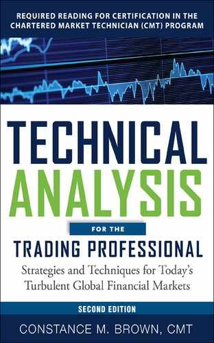
The original discussion defining the signals themselves remains valid. The signals form in all markets and all time horizons from long term to very short intraday intervals. Even the example using the Deutsche Mark is valid because there is a very real risk the EURUSD will uncouple and cease to exist in its present form. Figure 8.1 uses bold lines to mark the conventions of bullish and bearish divergences present in this weekly DMK/$ chart between the price data and indicator. Bearish divergence occurs when the market forms a new price high on close that is not confirmed by the indicator. In this chart the RSI is clearly at a lower peak when the closing price high is recorded. Conversely, bullish divergence will occur when the market makes a new price low on close and the indicator does not. This must be firmly rooted now within your technical skills before moving on. If you are still training your eye to recognize divergences, consider skipping this chapter until a later time. Reversal signals and divergence signals develop in oscillators on opposite sides of a momentum channel. Therefore, focus first on divergence relationships between oscillators and price before tackling reversal signals relative to price.
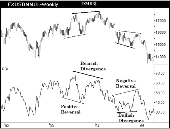
Figure 8.1 Aerodynamic Investments Inc., © 1996–2011, www.aeroinvest.com
Source: TradeStation. © TradeStation Technologies
Figure 8.1 conveniently has both bullish and bearish divergences in the same chart and displays examples of the new RSI signals that offer rough estimate price projections. The new signals are called reversals. There are positive and negative reversals. In a positive reversal, the RSI will develop a new oscillator low relative to a former oscillator low when the price data is at a higher pivot low. Look at the positive reversal in Figure 8.1. It makes perfect sense that this indicator pattern would be bullish as the oscillator is becoming oversold when the market is trading at a higher level. This tells us that the market is building underlying strength when this indicator formation is present. Conversely, a negative reversal develops when the RSI is able to develop a new momentum peak relative to a prior oscillator peak, but the closing price associated with the new oscillator peak is at a lower price level. As the oscillator is becoming overbought when prices are at a lower level, it warns that the market is beginning to erode and become weaker.
In Figure 8.1 a positive reversal pattern is labeled that forms from fairly blatant oscillator lows. Reversal signals do not have to be at oscillator peaks and troughs that form extremes. The negative reversal in Figure 8.1 shows that the first RSI peak is not at an obvious extreme pivot. However, the second RSI pivot high on the right side of this negative reversal signal is clearly associated with a lower closing price. This will be clearer when the price projection method is discussed. When an RSI reversal signal occurs within the larger trend for the oscillator, it is called a hidden signal, and they can be much stronger market signals than reversals that form at blatantly obvious pivot extremes. (This observation can be said about most oscillators. The strongest signals are often those more subtle and closer to the zero line or under two averages crossing over on the oscillator.)
The positive reversal in Figure 8.2 is the same signal introduced to you in Figure 8.1. It now has three oscillator pivots labeled: two oscillator lows I have arbitrarily called pivots W and X, then an oscillator high marked Y that is the highest momentum extreme located between points W and X. Frequently the momentum high will not be the closing price high as oscillators form divergences with price. We will always look for the momentum peak that is the highest level for the positive reversal price projection calculation. Keep in mind that the closing price for a price bar is used, not the high or low, when we want to know the associated price for the oscillator pivot. Any method that only sees closing prices cannot be used for trading purposes and should never be used to calculate or assess stop placement. That is why this is only an analysis method. The negative reversal has three oscillator pivots labeled W, X, and Y, where Y is the extreme momentum low between points W and X. As described for a positive reversal, the momentum extreme at point Y in the RSI may not be the actual price low because divergence may be present. The oscillator will always determine the correct closing price to use.
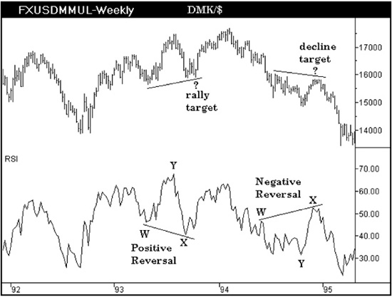
Figure 8.2 Aerodynamic Investments Inc., © 1996–2011, www.aeroinvest.com
Source: TradeStation. © TradeStation Technologies
To make a price projection from a positive reversal signal, use the following formula:
(X − W) + Y = the new price target
In Figure 8.3 the closing price associated with the RSI low at point W is 1.5835. The closing price associated with the RSI low at point X is 1.5957. In a positive reversal the closing price associated with point X must always be greater than or equal to the closing price associated with the RSI pivot at point W. It is this positive differential that defines a positive reversal signal in the indicator. Therefore, the price projection from near 1.5957 is (1.5957 – 1.5835) = 0.0122 + Y. The differential is then added to the closing price associated with the momentum extreme at point Y. The closing price that corresponds to the momentum high at Y is 1.7415. Therefore, the final target is the differential 0.0122 + 1.7415 = 1.7537. The actual price at close on February 11, 1994 was 1.7540, and it marked the end of the dollar rally at that time.
Figure 8.3 Aerodynamic Investments Inc., © 1996–2011, www.aeroinvest.com
Source: TradeStation. © TradeStation Technologies
The formula to use for calculating an estimated market decline from a negative reversal is as follows:
Y − (W − X) = the new price target
In a negative reversal the second pivot high at point X will always be less than or equal to the associated closing price at point W. Therefore, the points that create the differential are switched, and the result must be subtracted from the closing price associated with the RSI oscillator extreme at point Y. The signal in Figure 8.4 is actually a negative reversal that follows a series of price projection signals within this decline. We will look at each of these negative reversal signals and the price targets that develop in Figure 8.5.
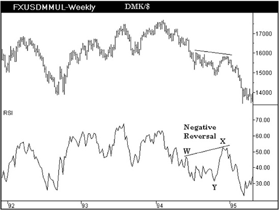
Figure 8.4 Aerodynamic Investments Inc., © 1996–2011, www.aeroinvest.com
Source: TradeStation. © TradeStation Technologies
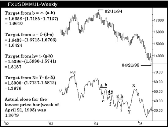
Figure 8.5 Aerodynamic Investments Inc., © 1996–2011, www.aeroinvest.com
Source: TradeStation. © TradeStation Technologies
There are four negative reversals labeled in Figure 8.5. (There are actually eight signals present. Can you locate the other four?) The three pivots that we use to make the price projection will name the signal being described. The negative reversals labeled in this chart are signals abc, def, ghi, and bXY. There are also signals at eXY and hXY. EXY is in fact the same signal marked in Figure 8.4 as WXY.
The target from the RSI pivot b is calculated c – (a – b) to obtain the new price objective. Therefore, 1.6658 – (1.7185 – 1.7137) = 1.6610. The target from the RSI pivot e will equal f – (d – e), or 1.6433 – (1.6715 – 1.6706), which equals 1.6424. The third target is from pivot h. The formula to use is i – (g – h). The results are 1.5396 – (1.5980 – 1.5741), giving a 1.5157 objective for DMK/$. Finally, the last signal is bXY, where the price objective from X is calculated using the formula Y – (b – X). Therefore, 1.5000 – (1.7137 – 1.5813) offers an objective at 1.3676. As mentioned in the beginning, the actual close for the price bar that ended the decline was 1.3678. Because of the range rules that define a trend using a 14-period RSI discussed in the first chapter, a 14 period should always be used for RSI in all time horizons.
Sometimes Forex traders ask, “Why are my spot prices different from yours?” Some traders who have been in the business for years are unfamiliar with how their Spot market data is created. So I had better digress for a moment and explain why differences can occur.
The major quote vendors—Reuters, Bloomberg, TradeStation, and CQG, to name just a few—must create Forex spot market quotes from contributing banks and major financial institutions which report their trades to the vendor. This information is gathered in several ways. Some contributors have trades captured and electronically transmitted directly to the vendor with exclusive agreements. Other data vendors collect trades in secondary ways. Sometimes it is the bid and ask that is reported by a contributor and not an actual market level that was traded. Regardless, the more contributors a vendor has reporting trades, the more accurate will be their market indication. Reuters has the largest number of contributors reporting Forex market levels at this time. Bloomberg was second when last I checked before the 2008 bank implosion. Software vendors are constantly trying to collect as many contributors as possible for their exclusive databases so that the more esoteric cross rates and secondary markets can be given fair market value indications. What this means is that if you are working with TradeStation data, as an example, you may have different price ranges from a Forex trader using Reuters. If you have a vendor that is primarily a retail stock specialist, the data for a Forex trader using the same quote system may find significant differences at times that do not meet your needs. Some of these products allow third-party data feeds and that solves the problem. But this is just a heads-up that problems with limited and different data sources into the various software platforms will exist. Futures traders must have access to the spot market. Targets and technical analysis should be done in both if you trade futures only.
The weekly DMK/$ chart in Figure 8.5 offered a perfect example that was chosen to introduce you to reversal signals in RSI. But there should be a lot of questions in your mind before the signals can be used in a real-time environment. Questions I would raise about any method or formula that was new to me are the following:
1. Does the indicator work equally well for any market in any time horizon? The method and techniques you favor should work in any market. However, you may find one method could be favored over another when markets accelerate versus stall in consolidation ranges. For example, a simple detrended moving average plotted as an oscillator is useful in strong trending environments.
2. Is the indicator as useful in a rising market as it is in a declining market? How would you check this? Use the cross-hairs on your pointer and then scan from right to left across the entire history of data available. Look at the amplitude of the signals as a displacement from zero. Look at the pattern of the signal. Does the oscillator form a simple inverted ^ top and then require a W-shaped bottom before the market actually turns? At momentum extremes do you find these align with the ends of third waves in price and then divergence is needed to fit the timing where a fifth wave move ends before a bigger trend change develops?
3. Does the signal or method work equally well in times of low and high volatility? Keep in mind markets moving day after day in a straight line have low volatility. When markets chop back and forth with wild swings the volatility is high. Volatility does not imply trend. Here is where RSI reversal signals do not perform consistently well. When markets chop or see-saw back and forth, how accurate is the price objective so you know where you are wrong in a timely manner? RSI cannot see price ranges because RSI uses closing prices in its calculation.
The calculation developed by J. Welles Wilder for RSI is stated as follows:
RSI = 100 − [100/1 + RS]
where RS = Average of n period closes up / Average of n period closes down.
The formula begins with calculations for average gain and average loss over the past 14 averaged periods. The average gain and loss is determined by using closing prices only.
• First average gain = sum of gains over the past 14 periods/14
• First average loss = sum of losses over the past 14 periods/14
Reversal signals only ‘see’ the closing prices and are therefore better suited to analysis work than risk management in trading applications. In Wilder’s formula when RSI is 0 the average gain equals zero. In a 14-period RSI a zero value would mean all 14 days within the formula had closing prices that moved lower. It never knows if the DJIA experienced a 1,000 point swing before the market close.
4. How much time after any signal does the market take to react? Consider opportunity costs as a risk exposure variable when you evaluate a technique. Sitting on a position going nowhere is costly if other markets are moving in fast trends that you would have traded had your capital not been tied to a ship anchor.
5. Is this a signal that has merit as a trading signal? This is the question I did not list in the first edition. A signal can keep you on the right side of a market trend, but it may not improve your market timing to enter and exit positions. Trading signals limit your capital drawdown exposure and allow you to react quickly and see follow-through in the market shortly after. The NYSE Advance-Decline line is not a trading tool as it can stay at extremes for very long periods of time with no reaction in price. It has no ability to time the market. For outright buy/sell position traders the VIX is not a trading tool as the extremes give you no help on correct market entry or exit timing. Option traders will speak out loudly against this view, but they trade implied volatility and cannot enter stops based on market levels. The VIX is of little value to a futures trader who simply wants to buy and sell outright positions.
Positive and Negative RSI reversal patterns cannot “see” the full price range of a bar. Therefore using the price targets derived from these signals as a place to hide stops would be an inappropriate use of the technique. However, the reversal patterns themselves give guidance with merit in trends and transitions. Therefore they are of value in strategy development and better left off the battlefield.
6. Why does an indicator work and how do you increase the probability of its accuracy? Under what conditions will the indicator fail? What is the probability it will fail? A signal that fails with high probability can also be valuable because it is consistently wrong.
Use this indicator pattern within the RSI to explore some of these questions. We know the weekly DMK/$ chart offered a perfect scenario from which to learn how to identify future market objectives from the RSI reversal signals. But do these signals work equally well in other markets? Figure 8.6 is a weekly chart of the S&P 500 futures market. This example uses a weekly time horizon to keep the time interval the same, only changing the market for comparison. The April 1997 low allowed the RSI to form a low that was below the oscillator extreme recorded in 1996. As the oscillator pivot at point X is produced from a higher price level, there is another positive reversal signal present. The target the signal offered at 911.35 was realized and then was significantly exceeded. It confirmed the trend, but if you exited the trend because of the target from this signal, how would you reenter the position? The market keeps going with no significant retracement. Strong trends actually need indicators that are not normalized in a 4:1 time comparison. Moving on, we need to consider how this indicator performs when a monthly chart is evaluated or an intraday time interval is the focus.
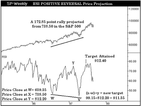
Figure 8.6 Aerodynamic Investments Inc., © 1996–2011, www.aeroinvest.com
Source: TradeStation. © TradeStation Technologies
The monthly chart of the S&P 500 Index is displayed in Figure 8.7. The positive reversal signal that formed in 1997 in the weekly chart was just one signal within an entire series of positive reversals that had developed throughout the monthly chart. Signals abc, bde, fgh, and ijk have all had their price objectives realized by the market. The method is true to the trend indicated, but gives no indication as to how rough a ride it could be toward the target. The signals do not give a sense of how strong the trend will be that follows. That is true of any oscillator, but the positive reversal has a pivot low within the target calculation that fails to mark the exact market entry. Pivots b, d, g, and j are not the final price lows before the larger trend resumes. Therefore this again shows that this method is better suited to analysis work that develops strategy rather than market entry/exit trading applications, because it has limited value for execution tactics.
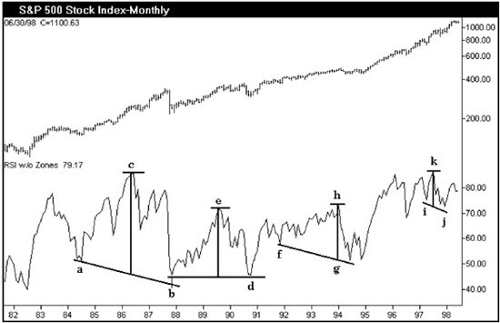
Figure 8.7 Aerodynamic Investments Inc., © 1996–2011, www.aeroinvest.com
Source: TradeStation. © TradeStation Technologies
There are numerous smaller signals not marked in this chart, but as their price projections are inconsequential now, they are not labeled. The crash of 1987 produced an enormous positive reversal signal in the RSI with point b forming a bottom above the 40 level, which we know is the support range for the RSI within the context of a bull market. Then we see that the three signals that follow develop at higher levels. The RSI pivots that form at i and j are at a higher level on the RSI y axis than the pivots that form at points f and g. This is an interesting observation that would make one wonder at what point could these signals warn of an end to the expansion cycle in the market and the uptrend. This question can be answered by comparing signals that form along the same horizontal level. Does the market always respect the signals that develop in the same range where pivots i and j are located? Can you determine a probability from such a comparison? The answer is yes. Study how many times a signal develops on a specific support or resistance level within the indicator.
Be aware that the amplitude, or distance between the momentum highs from the RSI pivot lows, are becoming narrower. The rise from point b to c is much wider than the rise from point d to e. Each has a narrower rise than the previous signal. Now we are beginning to actually think about what makes an indicator work and to question what has to occur when it has its best performance. Another observation is that the number of periods that separate points i and j are less than the spread between points f and g, which in turn is less than the spread between b and d or a and b. Therefore the element of time has entered our evaluation of the signals. When signals develop quickly they have a higher probability of being correct.
Our curiosity should prompt us to ask if these same characteristics can be observed in different markets with uptrends? What happens in downtrends?
Figure 8.8 is a segment of the weekly S&P market that developed a positive reversal signal. Segments of the signal are labeled so a statistician could study them. Does the amplitude impact on the signal’s accuracy? Does the spread or delta of X minus W make a difference? The answer is yes because the tighter, or the less time the pivots need to form the signal, the higher the probability that the signal’s targets will be realized. You will find segments of five hand-drawn RSI charts on the last five pages of Chapter 14 to illustrate the concluding Zen story. They show you how detailed my examination of RSI signals was in the early years of my career.
Do signals of this nature develop in other formulas? Yes they do. You can take the spread of two simple moving averages and find reversal signals develop in any detrended oscillator.

Figure 8.8 Aerodynamic Investments Inc., © 1996–2011, www.aeroinvest.com
Source: TradeStation. © TradeStation Technologies
Figure 8.9 is the monthly Gold chart captured on August 2, 2011. It is a real-time working chart with wave structure and targets still displayed. The rally is believed to be working toward the end of wave iii up with the implication that the uptrend is incomplete but starting to get a little over extended. There are three different oscillators under the data: my Composite Index which has momentum imbedded within a very fast RSI (more will follow on this oscillator in Chapter 12); the middle oscillator is the Wilder 14-period RSI with two averages; and the bottom oscillator is the simplest one of all as it is a detrended average.
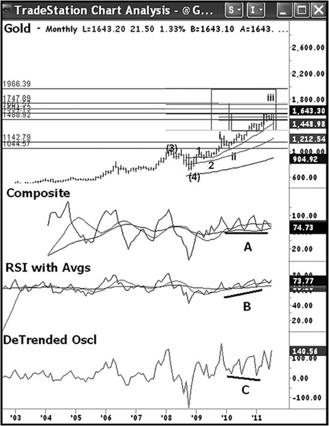
Figure 8.9 Aerodynamic Investments Inc. Daily Market Report.
Source: TradeStation. © TradeStation Technologies, Inc., 2001–2011. All rights reserved. No investment or trading advice, recommendation or opinion is being given or intended.
A detrended average uses two moving averages on price. I used a one-period average that simply connects the closing prices, then a fairly fast moving average like a 13-period simple moving average. When the slower moving average is at the point where the two averages are the same value (the slower average is about to cross through the faster average), the spread between the two averages is zero. When the two averages separate, the spread is positive when the faster average is above the slower. It is vice versa for downtrends, as the faster average will track below the slower moving average, yielding a negative spread between the two. Plot the spread of the averages as a displacement from zero and you have created the simplest oscillator possible. In flash crash scenarios this is the best oscillator to use. However, all oscillator indicators are similar. They all use the difference between two. When plotted as a spread differential above or below zero it is considered to be a detrended technique. However, not all will be normalized by forcing them to track between zero and 100.
In Figure 8.9 there is a strong uptrend in Gold in 2010. A line has been drawn under the three different oscillators labeled A, B, and C. In this strong uptrend the only oscillator that did not develop positive reversal signals was the 14-period RSI along the line B under the RSI indicator. The detrended oscillator in C produces the reversal signals that are the most pronounced and easiest to read. I read the signals forming in the Composite Index and detrended oscillator as confirmation of the uptrend. However, I have no interest in calculating their respective price objectives because I know I have other methods that are far more accurate that we have discussed in earlier chapters. We also have the new Gann chapter approaching in Chapter 9 that will reveal far more to you than was released in the first edition. Between Gann and Fibonacci confluence targets this method does not come close for developing trading targets. However, the pattern formation remains of value and forces us to look deeper into our other methods when these formations develop.
This chart in Figure 8.9 happens to contain a method using boxes to make geometric targets along with Fibonacci projections that are more accurate. The boxes are projections from internal wave structures which use full price ranges within earlier parts of the move. It is like a swing trader projecting equality relationships to earlier price swings, but this method utilizes the mid-point of the developing trend to project the future swings and subset corrections that will develop based on geometric relationships. This method is fully detailed in my book Fibonacci Analysis.
RSI was not the only formula for developing positive reversal signals to reinforce and confirm the trend, but the RSI is the only formula that tracks the ranges discussed in Chapter 1. The RSI lows along line B also hold the moving averages on the RSI indicator. This offers a place to add or reestablish a position that may have been scaled back.
Recognize that the simple detrended oscillator with signals along line C just outperformed the RSI signals in this Gold chart. Oscillator lows along lines A and C are positive reversal signals in formulas that are not normalized. This means they can travel as far away from zero as required in a strong trend to separate two moving averages. Oscillators in the style of line C can be used to compare historic crashes.
This is an extremely important study. The week of November 10, 1929 established an oscillator extreme that was used as a comparative bench mark in future market extreme events. With the extreme in place near −75 from the 1929 Crash, a horizontal line is drawn to record the extreme placement in Figure 8.10. What followed from this momentum low was the historic 50 percent counter-trend retracement in the Dow Jones Industrial Average that lead to the devastating slide into the 1932 lows. The declining swings that followed the rally into the weekly high of April 15, 1930, never again moved the oscillator to such an extreme displacement below zero as occurred in the first swing down into the November 1929 low.
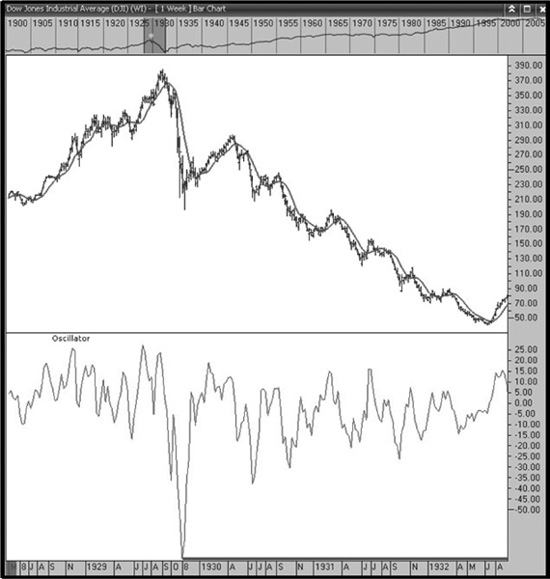
Figure 8.10 Aerodynamic Investments Inc., © 1996–2011, Daily Market Report, www.aeroinvest.com
Source: Charts by Market Analyst 6, © 1996–2011
In Figure 8.11 the history of the weekly oscillator in the DJIA market does not challenge the 1929 extreme displacement again until the week of November 28, 1973. A new historic momentum low is established. Take notice that the old extreme displacement created in 1929 must be tested again as support before a major market reversal can be sustained. The challenge to the 1929 extreme displacement occurred the week of September 10, 1974 and from this momentum low begins the multi-decade bull market that follows. It is important to see the pattern that old extremes are tested after new historic lows are made.
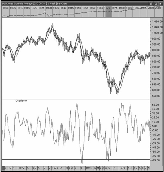
Figure 8.11 Aerodynamic Investments Inc., © 1996–2011, Daily Market Report, www.aeroinvest.com
Source: Charts by Market Analyst 6, © 1996–2011
Figure 8.12 shows history challenges the old 1929 momentum extreme in the 1980’s, but it is not until the October crash of 1987 that a new extreme momentum low is established. The heavy line under much of the history of this oscillator is the old extreme established in 1929. The 1929 extreme was important support for the DJIA prior to the 1987 crash and it defined support again after the crash.
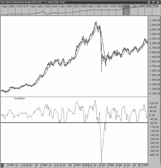
Figure 8.12 Aerodynamic Investments Inc., © 1996–2011, Daily Market Report, www.aeroinvest.com
Source: Charts by Market Analyst 6, © 1996–2011
After the 1987 crash, the old displacement established during the 1929 crash becomes the perfect support level for market entry throughout the balance of the 1980’s. The new oscillator extreme in October 1987 was established near −478. It was tested again in August of 1998. September 11, 2001 established a new historic extreme near −1511. But once again the rally did not form a recovery until a test was made near −478, the prior historic momentum extreme low.
These old extremes become very important levels to begin reversal trends. However, in Figure 8.13 the DJIA chart established a new momentum extreme low in October 2008 at a level of −2296. As of November 2011 the old historic extreme at −1511 has not been retested. If history repeats; and we know it does, the bear market of 2008 is not over and the rally unfolding cannot build a long horizon bull market. Only time will tell if we are about to see a negative reversal develop that carries an historic message of what lies ahead.
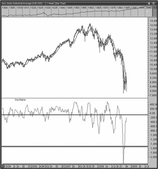
Figure 8.13 Aerodynamic Investments Inc., © 1996–2011, Daily Market Report, www.aeroinvest.com
Source: Charts by Market Analyst 6, © 1996–2011