Chapter | 11
VOLATILITY BANDS ON OSCILLATORS
By the end of Part 3, you will feel certain that no conventional indicator is safe in my hands. I will invert it, smooth it, compound it, disassemble it, superimpose it, and even imbed it—all in an effort to understand it.
—Technical Analysis for the Trading Professional, First Edition
It never occurred to me that some people would tabulate all the indicators I referenced throughout the book to see if they could identify the Composite Index. The Composite Index was the only imbedded formula. Momentum has been added to a fast RSI to break the limitations of normalization when an oscillator must travel in a fixed range of zero to one hundred. I never use volatility bands on an oscillator that has unrestricted movement. Volatility bands prevent detrended averages from defining historical extremes, as was demonstrated in chapter 8.
Many consider common indicators such as the MACD, Stochastics, and the RSI as sacred entities. Most believe an underlying formula must never be altered. Not even the conventional display of an indicator should be changed. But what if Stochastics shouts out a signal to you more clearly if one line is plotted as a histogram? Would you not change it? Chances are high that you do not know because you may not have considered looking at a conventional indicator plotted in an unconventional manner. Therefore, in Part Three my mission is to challenge your perceptions about indicators. The time has come to push the boundaries of convention, to show you that we can mix and match the elements we like and then, more importantly, discard or minimize the elements we do not like. The last three chapters will, I hope, give you greater flexibility and broaden your options.
In this chapter we look at a method with which to address a specific market problem. The problem is, “Just how overbought or oversold can a market become?” Specific questions of this nature are sometimes answered by indicator formulas expressly designed to answer that one particular question. The method or indicator is used only when the question arises in the market. It is monitored for only one specific signal at one critical market juncture. The rest of the time you might ignore the indicator or method entirely. For example, the momentum extreme histogram displayed in the reverse-engineering chapter is one method that compliments the method we are about to look at now.
Using volatility bands with indicators rather than on prices can answer the question, “Just how overbought or oversold can a market become?” It will not answer the question every time, but when this method steps forward and makes a statement, it should be respected.
The formula for volatility bands that I use was given to me by Manning Stoller. Sadly we have lost him, but one of the things he asked me to change if this book went into a second edition was to give you the TradeStation formula he used on prices. The method I had described omitted his use of two volatility bands on price data. I think his formula is easier to apply as well. So let me fix this now before we move forward.
While the formula below is in TradeStation format other vendors will be able to modify it to fit their standard specifications. Please call them STARC Bands. It was their original name (Stoller True Average Range Convergence Bands).
[LegacyColorValue = true];
input:av(6), atrlen(15), factor1 (2), factor2 (3);
var:atr (0), mav (0), top1 (0), top2 (0), bot1 (0), bot2 (0);
atr = average(truerange,atrlen);
mav = average (c, av);
top1 = mav + (factor1*atr);
top2 = mav + (factor2*atr);
bot1 = mav − (factor1*atr);
bot2 = mav − (factor2*atr);
if top2 > 0 then plot1 (top2, “StollerHi”);
if top1 > 0 then plot2 (top1, “StollerHi2”);
if bot1 > 0 then plot3 (bot1, “StollerLo”);
if bot2 > 0 then plot4 (bot2, “StollerLo2”);
The AvgTrueRange is used to smooth out price bars with volatility that is higher or lower than normal. TrueRange is defined as the larger of the following:
• The distance between today’s High and today’s Low.
• The distance between today’s High and yesterday’s Close.
• The distance between today’s Low and yesterday’s Close.
The value for the Length input parameter should always be a positive whole number greater than 0. You will find more about this in the book by Wilder, Welles, Jr. New Concepts in Technical Trading Systems, McLeansville, NC: Trend Research, 1978.
Manning Stoller used this formula only on price data. It is an alternative to Bollinger Bands because extreme price moves do not exceed STARC bands. There is only one signal that I look for in STARC Bands. The signal is when the market data pulls off the volatility band and then fails to reach the band in a retest attempt. Years later I realized this was a signal similar to what George Lane used when he said to wait for divergence with lower volume to enter. He therefore needed a third divergence signal to gain permission to execute an order. If you really think about these signals they are no different than how someone who favors volume uses it as confirmation. I never display volume because I read oscillators in a way that they deliver the same message.
I had applied Manning Stoller’s volatility bands with a modification for use with oscillators. Figure 11.1 is a weekly chart for German Government Bund futures. A 14-period RSI is plotted with volatility bands. The reason I like this formula is that it gives very few signals that warrant attention. But it produces one particular signal that nearly always demands respect and states, “Pay attention and look at other methods now because a trend reversal could be near, and you may be missing it.” I need blatant signals, especially at emotional market extremes—not ones that can be easily missed after an exhausting week of trading when you are doing analysis at all hours of the night as well. This one signal is a good wake-up call.
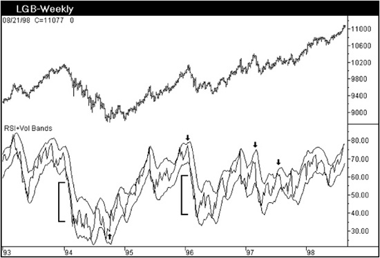
Figure 11.1
The signal itself is very simple. Look at the upper and lower extreme ranges for the RSI. When the RSI is near an extreme high or low and is touching the volatility band, the indicator will follow the strong move with a pullback from the band. The market signal occurs when the RSI attempts to resume the former trend and fails to challenge or reach the outer band a second time. That is it. Period. Nothing more to add. The RSI does not necessarily have to display divergence or create a reversal signal—just fails to touch the outer band on a second attempt. There are four signals in Figure 11.1 that have been highlighted by black arrows. Other interpretive relationships you might extract elsewhere between the RSI and outer bands in this chart are not used because other methods we have covered offer better timing. Just monitor the extremes for this signal and keep it simple.
Look at the upper band relative to the RSI. The RSI violates the upper boundary only four times in a five-and-a-half-year period. That is a correct setup placement for this band. Now look at the lower band. There are two square brackets to mark an area where the RSI travels outside the boundary of the lower volatility band for a period of time. You do not want this to occur. The RSI may travel in extreme moves along the boundary of the band, but not outside of it—at least not until you are familiar with the character of this signal.
It is important for volatility band formulas to accommodate separate coefficients for the upper and lower bands. It is for this reason that I do not care for band formulas that operate on moving average envelopes or moving standard deviation bands from a simple moving average.
The formula that creates the band displacement in Figure 11.2 is derived from an average of the true range of prices to accommodate data gaps. Each band then applies a separate coefficient so that the user has independent control of the upper and lower perimeters. The modified formula in Figure 11.2 continues to use Stoller’s original 6-period average with a 15-period average true range.
Indicator: RSI+Vol Bands
Input: Coefdwn(2.1),Coefup(2.3);
Plot1((Average((RSI(Close,14)),6))+(Coefup*(Average
(TrueRangeCustom((RSI(Close,14)),(RSI(Close,14)),
(RSI(Close,14))),15))),“Plot1”);
Plot2((Average((RSI(Close,14)),6))-(Coefdwn*(Average
(TrueRangeCustom((RSI(Close,14)),
(RSI(Close,14)),(RSI(Close,14))),15))),“Plot2”);
Plot3((RSI(Close,14)),“Plot3”);
If CheckAlert Then Begin
If Plot1 Crosses Above Plot2 or Plot1 Crosses Below Plot2
or Plot1 Crosses Above Plot3 or Plot1 Crosses Below Plot3
or Plot2 Crosses Above Plot3 or Plot2 Crosses Below Plot3
Then Alert=True;
End;
The coefficients that I start with are 2.1 for the lower band and 2.3 for the upper band. I find that one pair of bands is sufficient when you use Stoller’s formula on RSI.
The same weekly chart for the German Bund futures is displayed in Figure 11.3. The lower band is now using a coefficient of 3.1 instead of 2.3. The 3.1 was selected by appearance alone knowing that the RSI should rarely exceed the band. The upper band has been “tweaked” by using a coefficient of 2.5 instead of 2.1.
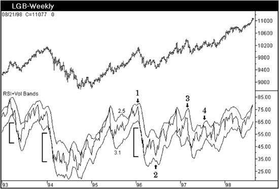
Figure 11.3
The lower band now shows the RSI traveling down the same boundary as the band in the areas marked by square brackets. At signals 1, 2, 3, and 4, the signal forms with an M or W pattern in the RSI, showing the second peak or trough failing to reach the outer band. The width of the oscillator pivots within the M or W pattern will vary considerably. The personality of the W or M will remain fairly consistent for an individual market, however.
Signal 3 shows the second peak well under the rise of the band. The first peak did not touch the band. This is an example of how you would examine the relative displacement of RSI to the outer band.
Figure 11.4 contains a very strong signal because of the double bottom that RSI formed. But RSI has a major flaw that will be addressed in the next chapter. RSI often misses the big picture extreme trend reversals. The signal first develops in the monthly S&P 500 Index and is then repeated in the monthly London FTSE Index and German Dax. These signals are the cleanest, strongest, examples you will experience using these bands. The RSI is forming a bottom between a range of 40 and 50. The zone between 40 to 45 marks the end of a correction within the context of a larger bull market. This is the range rule concept that was demonstrated in Chapter 1.
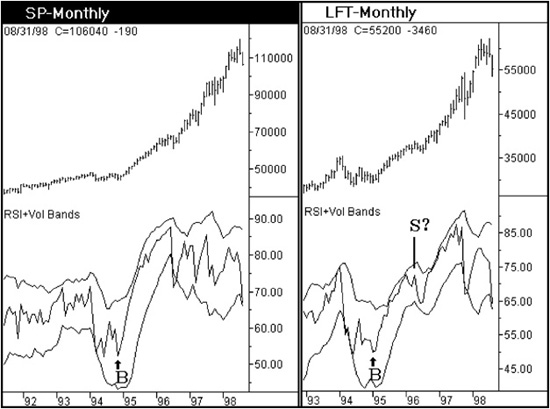
Figure 11.4
There is a sell signal marked in the London FTSE data that has a question mark. This one signal has been highlighted to reinforce the importance of not staying short when the indicator declines and the price fails to follow. The indicator falls nearly to the lower band, and the price just fights the indicator all the way down by forming a choppy corrective pattern. But it is more important to recognize that the RSI declined to the 65 level, which is the upper zone that defines resistance for a bear market. A market that can allow an indicator to hold this level generally explodes into a third wave in prices and allows the indicator to break into a new higher range for that time horizon. When you consider that all this was coming together in a monthly chart, it was a massive buy signal.
Figure 11.5 is used to show that Bollinger Bands applied to prices are very different in character from the band formula applied to the RSI. This would be true even if the band formula on the RSI were displayed with prices. In the monthly FTSE chart the standard deviation bands on prices offer an analytic tool, but timing is a problem. The market is able to track the upper boundary for several years. The Bollinger Band narrowing in conjunction with a choppy price decline, which corresponds to signal 3 in the RSI relative to the upper volatility band, is of value. But, if timing is important, Bollinger Bands alone will offer limited help.
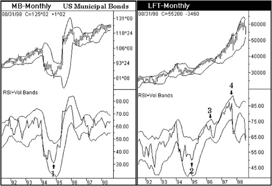
Figure 11.5
Let me strongly caution you about the RSI signal within volatility bands. It is essential that they be used with a price projection system. To simply buy or sell based on this indicator pattern alone would be financial suicide. Please keep in mind that these signals are based on an indicator that sees only a closing price! This is a perfect example of a method being only an analytic method and not a trading signal.
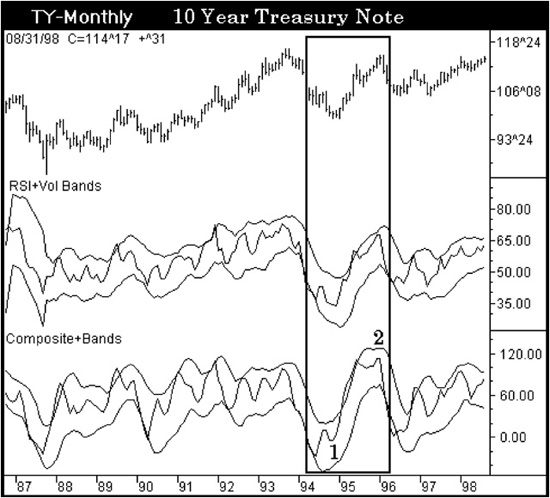
Figure 11.6 is a chart showing the 10-Year Treasury Note market in a monthly time horizon. The band formula can be applied to other indicators, but how much value it really adds is questionable. Signals 1 and 2 display the pattern that is watched for, but it is the divergence between the RSI and Composite Index that offers the stronger signal. More is not necessarily better.