Chapter | 1
OSCILLATORS DO NOT TRAVEL BETWEEN 0 AND 100
“Why does it appear that conventional technical indicators are failing us as we approach the twenty-first century? What has changed?” Thirteen years ago this was an opening which did not know the volatility changes that would be ahead. However, this method of describing oscillator movement to determine trend and entry/exits in volatile conditions has stood up to the test of time. I believe strongly that a method you favor should be able to handle market changes; therefore, the original text requires no revision. The only suggestion I would offer is to stop reading occasionally and study how a 14-period Relative Strength Index (RSI) has moved in your own charts. Take any time horizon or market. Study global indexes, Gold, Oil, Bonds, and Forex trend or trendless markets, as the method described here will stand up to the challenge. The ranges defined in this chapter remain valid and of value. However, the astute analyst and trader will know there are times when the RSI will fail to give any divergence warning of a coming major trend reversal. For this there is a solution: this time the chapter on the Composite Index will be fully disclosed and both the Composite Index and RSI will be displayed in more current charts. Therefore, this chapter will accurately describe the methodology for you and Chapter 12 will continue the discussion in a more current market environment.
I am asked these two questions by professional traders before a lecture or seminar far more frequently than any others. The implications are that the technical studies that brought a trader prior success have changed. Traders employed by major institutions throughout Europe, Asia, and the United States seem puzzled by this same phenomenon. The traders affected utilize both eastern and western technical analysis; the problem is clearly widespread and undiscriminating. Have the indicators failed, or have the markets changed, making older methods obsolete? Neither suggestion is true. Technical analysis has proved that it will hold up to whatever the world puts in front of us. But technology makes everything more tightly connected. We are waking up to the new awareness that for my country to do well, so must you. No one should look at markets in isolation.
How did this group become so tightly linked together when they were working independently with their own technical tools? All quote vendors use the same default variables within their analysis software; professional systems and retail software products alike still use the exact same defaults. Think about that statement for a moment. Every quote system shipped to a new location anywhere in the world with charting capabilities starts off with the exact same setup periods and formulas. Less experienced traders rarely change these default variables as they are overwhelmed with the long list of indicators available to them by the click of a mouse button. It is all too easy to set up a chart and then read a quick description in a manual that proclaims, “Sell your Stochastics when it rolls over and crosses the 80 line with divergence, and buy when you roll back up through the 20 line.” In mass, the orders from the same signal pour in with instantaneous execution.
I do not fear what the professional trader might do. Nor do I have strong views about market realities such as S&P programs that are triggered when the spread between the S&P Cash and Futures market becomes out of line. Now programs are triggered because the German Dax and Dow Jones Industrial Averages are out of line. The problem is not with the professional but with the growing mass of novice technical traders who operate as one large institutional wildcard. The professional trader who fails to move forward beyond this group is unknowingly operating within this new technically armed and dangerous mass. The impact of this new breed of mass psychology is indicator failure and capital erosion. This group cannot only be avoided but also used to the professional’s advantage. The time has come to change conventional thinking about technical indicators. However, the professional faces a new risk. The buzzword is “alpha.” With the collapse in the financial banking sector around the world, institutions are farming out their research to third parties. Alpha is the new model and this model is of little value if the majority rely on the defaults that failed them in the past.
The 1990s brought dramatic changes to the way technicians and traders apply their tools. At the same time the need for technical analysis grew because it became increasingly difficult to manage the global volume of fundamental factors and cross-market ramifications. More people continue to discover the value of charting techniques. However, to evolve beyond the foundations of technical analysis, we must change the way we utilize technical studies.
Traders still working under the premise that there are two groups of technical indicators—indicators for trending markets like moving averages and then indicators for nontrending markets such as the oscillators MACD, RSI, and Stochastics—are now very outdated. The books that segregated indicators into two primary groups are not wrong. Do not lose sight of the fact that the original works provided us with the foundation on which our industry is growing today. The important distinction is that early books on technical analysis will eventually be viewed as classics, but traders who fail to evolve beyond these original concepts face a far less pleasant fate: extinction.
A good place to begin to dispel some of the common beliefs about our technical indicators is with oscillators. The mainstream believe that oscillators generally travel between a scale of zero and 100. Generally 20 and below is viewed as oversold, and 80 or above is an overbought market. This is incorrect.
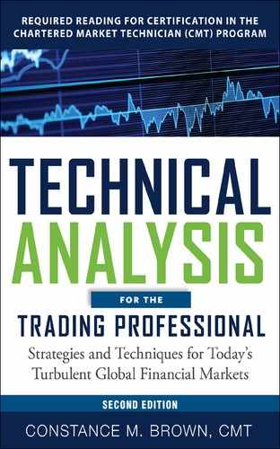
In Figure 1.1 the standard default period of 14 is used for the RSI with a daily bar chart of Yen futures. The Yen is falling in a bear market within this time horizon. The graph showing the RSI indicator has an upper black band marking a range of resistance from 60 to 65. A lower band marks 23 to 28 to highlight a support zone for the indicator. Study the indicator tops closely. At no time is the Yen strong enough to push the RSI oscillator successfully through the 65 level. (Spot traders need to keep in mind that this is a Futures chart, which will be inverted from the spot market.) Each time the indicator tests the range from 55 to 65, the Yen renews its former downtrend and establishes new lows against the dollar. The oscillator then declines to a support zone within a range of 20 to 30. There will be many more examples to reinforce this concept. The general rule to follow for a bear market is that RSI will oscillate within a range of 20 to 30 at the low end of the scale up to an upper resistance zone of 55 to 65. This is true regardless of market or time horizon.
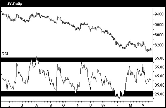
Figure 1.1 Aerodynamic Investments Inc., © 1996–2011, www.aeroinvest.com
In a bull market the RSI will shift and begin to oscillate within a range marked by a support zone of 40 to 50 toward an upper resistance zone of 80 to 90. Figure 1.2 shows the same Yen futures market but over a weekly time horizon when the Yen is in a bull market or the dollar is weak. Each time the Yen declines, the oscillator falls to a support zone near 40 to 50. The 40 level is never broken. The strong Yen rallies push the oscillator into the 80s. Even minor advances that lead to more complex consolidations allow the RSI to decline only as far back as the 40 to 50 zone.
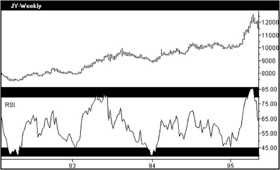
Figure 1.2 Aerodynamic Investments Inc., © 1996–2011, www.aeroinvest.com
Do these RSI ranges defining bull and bear markets apply to other oscillators? Yes, when the period used for the indicator has been correctly defined. We will cover how to find the correct period in the next chapter, and we will readdress the issue of buy and sell ranges as other oscillators are discussed. As an example, in Chapter 14 a price projection method is described for the Stochastic Oscillator which gives the trader permission to buy a market when the Stochastics indicator falls from an extreme high down toward the 75 area. Yes, buy, as the signal will warn the trader that the market could target an additional move equal to the rally that preceded the minor pullback which allowed the indicator to decline from its extreme high over 80. This is only one example of instances when it would be incorrect to sell just because the Stochastics indicator has crossed the 80 range. Conversely a trader would have permission from Stochastics to sell the market when the oscillator moves back up to the 25 zone as the market would then target a new price low equal to the decline that preceded the minor rebound from the oversold condition. Examples for this price projection method from Stochastics will be offered in their correct context in Chapter 14, but the point to make at this time is that oscillators can be used to forecast market trends, which is contrary to popular belief today.
Let’s build on the introduction of the range rules for RSI by moving on to Figure 1.3 showing a weekly Dow Jones Industrial Average chart. The chart shows clearly that the market corrections in 1996 and 1997 all pressed the RSI down to the lower support zone defined for a trending bull market. The indicator holds the 40 to 50 support zone and signals correctly that the market will rally toward new highs. The oscillator moves to the upper range for a bull market in each follow-up advance and then finds resistance at the 75 level or higher. Asian, European, and North American equity indexes will all display this characteristic of predetermined range rules that help to define a market’s trend. A dramatic example can be seen in Figure 1.4, which charts Hong Kong’s Hang Seng Equity Index in both a daily and monthly time horizon. This market entered a sharp decline in 1997 when the Asian currencies had to contend with a weakening Yen. The Hong Kong dollar peg and concerns about the strength of the fixed Chinese renminbi triggered a chain reaction which was ultimately felt throughout the Asian stock markets. The Asian woes contributed to the global equity correction that unfolded in late October 1997 in Europe and North America. The daily chart in Figure 1.4 shows the decline in the Hang Seng Index from March to June of 1998. The range rules warn that the decline is incomplete as of June 3, 1998, when this chart was captured for this book. The RSI oscillator fails to exceed the 55 to 65 resistance level throughout the advance in February and March. A market that can press the RSI only to the 55 to 65 zone is indicating a topping formation within a bear market.
Figure 1.3 Aerodynamic Investments Inc., © 1996–2011, www.aeroinvest.com
Figure 1.4
The monthly chart shows a brighter picture as the severe decline is within the context of a larger bull market. The RSI in the monthly chart has fallen only to the 40 to 50 support zone. It can be said about the Hang Seng that the daily chart in Figure 1.4 warns that a price bottom is not in place as of June 3, 1998, and a sharp freefall in the daily time horizon could occur, but in the context of the monthly chart such a capitulation spike down could then form a key bottom as the 45 zone is being tested a second time now and a third test seems required.
How can you tell when the trend is about to change? The bear market illustrated in the daily Hang Seng chart allows the RSI oscillator to travel between 20 and 65, consistent with the range rules for a bear market. When the market’s trend is about to reverse, so too will the oscillator ranges. In the case of the Hang Seng daily chart, the oscillator will develop the following RSI pattern when it is ready to trigger a transition from a bear market to a bull market (not presently shown in the current chart data offered in Figure 1.4). After an RSI failure at the upper boundary for a bear market, 55 to 65, the market will then decline. The first indication of a trend reversal will come when the market moves the RSI only to the lower support zone reserved for a bull market between 40 to 50. That is why this market does not have a bottom in place within this chart. When a bottom is forming, the RSI will not break 40. True, sharp secondary declines that fail to make a new price low can produce a similar indicator formation. Elliott wave traders would call such a decline a “deep second wave down” or a “fifth wave failure,” depending on the internal structure of the decline, but in both the market would fail to establish a new price low.
Regardless of a new price low or only a double bottom, the market decline will move the RSI to the support zone near 40 only if it is ready to reverse its former trend. An actual price projection method will be discussed in Chapter 10, so let’s not stray from this discussion about trend reversals at this time. An RSI indicator that declines to 39 or 38 will still fit this transition phase, so use some common sense. Use the market’s past history to define more accurately the range that will be tested in the transition. If the support range for this market was 37 to 45 in prior bull market trends, use that as your guide. The market that is making a transition will clearly find support for the first time at this prior zone. The rally that follows will likely be insufficient to press the RSI through the upper resistance range defined for a bear market. The failed attempt to exceed 65 will be met with another price decline that moves the RSI oscillator back to support within the 40 to 50 range once again. Should the market produce an RSI oscillator decline that successfully holds the 40 to 50 support zone a second time, it should be interpreted as a clear warning to a sleeping bear–biased trader that conditions are changing. The market is attempting to reverse and will eventually produce a price rally from this oscillator position that is strong enough to press the RSI into the upper resistance range reserved for a bull market—75 to 85 and higher. It is not necessary for a market to test the new lower boundary more than once before successfully breaking out into the higher range, but it is a common occurrence to see double bottoms develop, especially in longer horizon charts such as weekly, monthly, and quarterly time intervals. The reverse would be true for a market preparing a transition from a trending bull market to a bear market. It is so important to know how to interpret an approaching trend reversal that we will go through this transition step by step with the next chart.
Our discussion about trend reversals using the RSI indicator will now focus on one of the largest markets in the world: Deutsche Marks per U.S. Dollar (DMK/$). The weekly DMK/$ chart in Figure 1.5 covers a five-year time interval which includes a trend reversal from a bear market for the dollar prior to April 1995 to the bull market that follows into 1998. The levels at 40 and 80 are marked with a double line that denotes the approximate range the RSI will travel within a trending bull market. The 30 and 65 levels have solid single lines that mark where the RSI will travel within a bear market. The discussion that follows addresses each of the oscillator pivot levels that are numbered on the RSI in Figure 1.5:
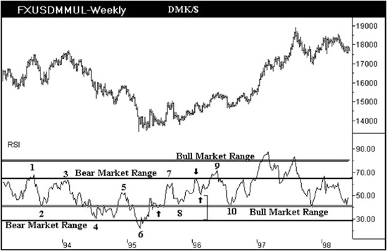
Figure 1.5 Aerodynamic Investments Inc., © 1996–2011, www.aeroinvest.com
Point 1. The RSI pivot at point 1 has occurred near the upper resistance zone reserved for a trending bear market. The dollar declines and moves the oscillator down to point 2.
Point 2. The market finds support, allowing the RSI to form a double bottom near the 40 level. The ability of the RSI to stay above 40 should warn us that the dollar has sufficient strength to attempt a new high and that the prior trend remains in force. At this point we would not know that a trend reversal was developing unless the support zone at point 2 was broken. The dollar proceeds to rally and makes a marginal new high relative to the high that occurred when the RSI topped at point 1.
Point 3. As the dollar squeaks past the prior high, the RSI forms a bearish divergence pattern. Point 3 in the oscillator is lower than point 1 though the dollar closes at higher levels. While the less experienced technical trader will likely catch the divergence between price and the oscillator suggesting that another minor correction could develop in the dollar, the trader with more experienced judgment should see that point 3 is an oscillator peak that occurs within the 55 to 65 resistance zone denoting a bear market. This is of far greater value and significance. The dollar then begins to weaken, or it might be more favorably stated that the Deutsche Mark becomes stronger, as the RSI oscillator declines to the 40 level. The RSI tests the 40 level three times before it is finally broken and declines to the 30 level, which is normal support for this indicator in a bear market.
Point 4. The dollar attempts a rebound from point 4 in Figure 1.5, and the oscillator becomes trapped between the 30 and 40 levels as a market consolidation occurs. The market actually forms a bearish contracting triangle over this same period of time, and the fact that the RSI was unable to break above the lower boundary used for a bull market is extremely bearish. A downward resolution could have been favored, and the chart shows that the dollar makes a new low as the RSI forms a second test of the 30 level just beyond the pivot low that was labeled point 4. If you do not see the small contracting triangle in the price data, do not worry at this time, as we will be introducing other tools and indicators that will be far more obvious. Just focus on the oscillator ranges.
Point 5. The dollar then rebounds, allowing the RSI to form an M pattern well below the upper resistance zone defining a bear market. This particular indicator pivot at point 5 is occurring at an extremely interesting level. Some readers will see it with just the naked eye. Measure the distance between the two single black lines that denote a bear market oscillator range. The pivot high in the RSI at point 5 is a 0.618 Fibonacci retracement of the zone. Do not measure the oscillator high at point 3 and then take the oscillator low at point 4 to determine the Fibonacci relationship as we would with price data; instead, use the range itself. The oscillator is also forming a very bearish M pattern at the peak that is forming at a precise Fibonacci retracement level within the bear market range. The chart is signaling to traders to sell dollars for Deutsche Marks immediately.
What do traders use to easily calculate the Fibonacci ratios on a paper chart? Call an engineering or drafting supply store, and ask to purchase a tool called a proportional divider. These tools are constructed from one of two materials, stainless steel or aluminum. Do not buy the stainless steel variety as they are excessively heavy. You will also want to buy a divider that is at least eight inches in length. There are several financial firms selling a 7½-inch divider that is too small for use with most computer screens or for charts printed on a full page. Most art supply stores will be clueless if you ask to buy a proportional divider, as this is an engineering tool. One brand that is particularly easy to handle is made by a German company called Alvin (at least “Alvin” is the name stamped on the instrument being distributed in the United States). Mine shows its age as it is stamped “Alvin—West Germany.” The exact same tool is also called a precision ratio compass (PRC) by many in the financial industry. But many traders who try to purchase a PRC from their local engineering or drafting supply store will find that the store does not know what they are talking about. Just call it a proportional divider to avoid the headache.
This is how to use it in a very fast summary: Set the grid line on the moveable prongs to 10 on the scale called circles. Tighten the screw, which also serves to keep the two prongs of the tool together. Some models will have a grid line labeled “GS” which stands for “Golden Section,” which is the same ratio as a divider with a “10” grid line. Both the 10 and GS line will be just off-center relative to the length of the tool. To use it, measure the distance by opening the two sharp points on the ends of the long side. Then flip the divider over without changing the measured ratio. The points on the opposite side will mark an exact 0.618 ratio of the original measurement within 0.1 mm. To use the tool for calculating other Fibonacci relationships, please refer to one of the many books already published on the subject. Just one last note about a divider: don’t drop it—very painful.
Point 6. Back to the DMK/$ chart and the oscillator low at point 6 in Figure 1.5. There is nothing very notable at point 6 except that it is an extreme low that occurs below the bear market support zone. The market will allow the support level at 30 to be tested after a minor rebound whenever the market has fallen through this zone and become extremely oversold. The tight back-and-fill chop that forms in the market after this oscillator squeezes the RSI back over the 30 level and subtly tests the 30 zone before the dollar begins to rebound. Focus on the oscillator movement exactly half way between points 6 and 7. The dollar has a small rally and immediately pulls back. The RSI tries to hold support on the lower range defining a bull market at the 40 level.
Point 7. Point 7 is an oscillator high under the resistance zone for a bear market. The M pattern in the indicator is also significant. The dollar fails and moves the RSI down to point 8.
Point 8. The oscillator is clearly at the support zone reserved for a bull market. This is actually the second time the market has tried to develop support at this zone, but the first attempt was subtle as it developed between points 6 and 7. If you miss this transitional signal that the dollar is developing a major trend reversal, move along the chart to point 9.
Point 9. The dollar rallies and the RSI breaks above the bear market resistance line. The breakout is only briefly maintained, and a decline unfolds in the dollar from point 9.
Point 10. Now the bull trend is in force with confirmation. Point 10 shows the RSI once again holding the support zone for a market correction within a trending bull market. The dollar remains in an uptrend, and the RSI travels between the 40 and 90 levels.
There is one subtlety that can be pointed out now without risk of breaking the discussion about the trend transition that develops from points 8 to 10. Between points 8 and 9 there is an oscillator peak in the middle of these points that develops exactly at the 60 level. Follow the oscillator down from this pivot high marked with an arrow. The oscillator low that follows the peak at the 60 level occurs exactly at a 0.382 retracement of the bear market range. Use your proportional divider to see that the distance from the RSI pivot low relative to the support zone for a bear market is an exact 0.618 measurement. Because we know that the space under the RSI pivot to the support zone is exactly 0.618, we know without further measurement that the oscillator has found support at the 0.382 retracement level from the 60 level. Lost on this point? It will be discussed again later in greater detail. The important points to grasp from Figure 1.5 are the trend reversal signals. As the chapters build concepts, you will begin to focus on different levels of detail within the same indicator. We have only begun to discuss technical indicators, and I suspect many might already be surprised at the depth of information available to us. Let’s keep digging deeper.
About now the stock trader may be feeling somewhat left out of the examples discussed so far. All that has been defined up to this point will apply to individual stock charts. Figure 1.6 shows the weekly chart for Caterpillar. The stock is clearly in a bull market, and the oscillator lows show that each correction in this stock was within the context of a trending bull market. The RSI is traveling between 40 and 70+, denoting a bull market. The oscillator highs directly below line 2 are developing under the 60 level. This could be a warning that would have to be watched closely for a transition into a bear market if a pullback breaks below the 40 level from this danger zone. Individual stocks will abide by the range guidelines described at length in the prior figures. However, it should be asked if synthetic indices can be expected to follow these same ranges when they themselves are never actually traded?
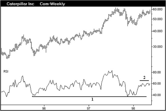
Figure 1.6 Aerodynamic Investments Inc., © 1996–2011, www.aeroinvest.com
Figure 1.7 shows a monthly chart for the S&P sector Beverages (Soft Drinks). Regardless of the sector evaluated, the range rules will apply. The sector consolidates in 1988 and 1994, but the RSI declines only to the support zone within the 40 to 50 range. There is ample warning in 1988 that a major rally will follow. You might be thinking that this particular sector is itself more like a stock as it is heavily weighted toward Coca-Cola stock. Regardless of the S&P sector’s compositional weighting of stocks, these trend ranges will still occur.
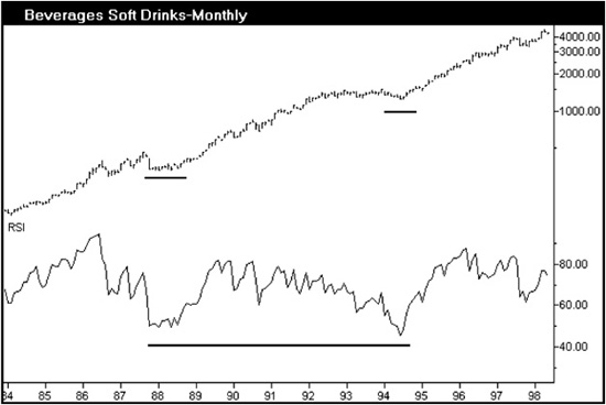
Figure 1.7
So let’s test this premise in a tougher market environment. We will create a synthetic market by developing a bar chart of relative performance between two markets. In Figure 1.8 we have a monthly bar chart created by dividing the S&P sector for Electric Companies by the Cash S&P Index. The data are in a downtrend, which is interpreted as a severe underperformance for this sector relative to the S&P 500 Index. Had the data shown an uptrend, the chart would have implied that the sector was outperforming the S&P 500 Index. The RSI at points 2, 3, and 4 show characteristic pivots for a trending bear market. The critical support zone at 45 to 55 is continually broken as the sector underperforms the Cash S&P 500 and displays all the characteristics discussed previously for a bear market.
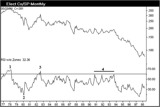
Figure 1.8 Aerodynamic Investments Inc., © 1996–2011, www.aeroinvest.com
About now you might see that the range rules clearly apply to various financial markets, but you can rightfully ask now if similar formations will occur within various time horizons. Figure 1.9a is the weekly chart for the stock Novell. For comparison, Figure 1.9b offers the daily chart for the U.S. Treasury 30-Year Yields. U.S. rates have been falling in a market action that is similar in appearance to Novell. Clearly there is no relationship between these two charts, and none is implied except that both markets are presently in bear markets. While the markets are different and the time horizons displayed vary, the ranges that the RSI oscillator is traveling is the same for both markets. While the boundaries may be very slightly different as bond rates use 25 to 35 as their RSI support zone, when the stock establishes 30 to 35 as the support zone, the guidelines first introduced at the start of this chapter remain in effect. The resistance zone at 55 to 65 marks trouble for both markets.
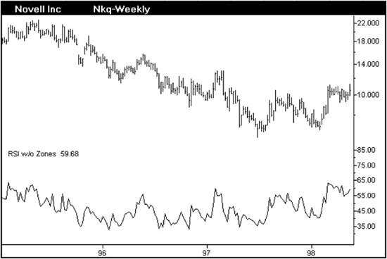
Figure 1.9a
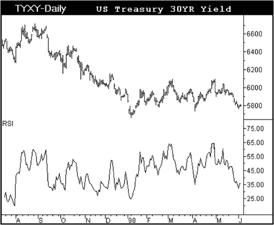
Figure 1.9b
The market action we have not discussed up to this point is a sideways or range-bound consolidation. The monthly chart for Bethlehem Steel covers a period of 15 years in Figure 1.10. Over this period of time Bethlehem Steel has been range bound in a listless drift. It has been tradable, however. The oscillator peaks are all at the 55 to 65 resistance zone, and the key oscillator lows display the characteristic support zone for a bear market. The transition from this extremely long consolidation will be no different from what was discussed in detail for DMK/$.
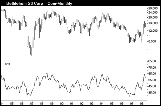
Figure 1.10
Has there been a nagging question in your mind as the series of charts for various markets and time horizons has been discussed? “What period is being used for RSI in all these charts? Are we seeing different time periods in order to fit the oscillator to the example to create an ideal range?” No. Every chart regardless of market or time horizon has displayed an RSI with a 14-period interval. Every single one of them. Now let me ask you, “What would be wrong with using these range rules to establish the correct time period?” Nothing, except you will later discover that the RSI has a specific price projection capability that is best applied to a 14-period RSI. For this reason all of these charts use the same interval within the RSI formula.
We can conclude this chapter on an upbeat note with Figure 1.11. The weekly Du Pont stock is the image to keep in mind for an ideal bull market. The 75 to 85 range has marked the tops while the 40 to 50 support zone has marked all the pullbacks within the developing bull market. The chart also shows an immediate buy signal at the time of this screen capture. A new price high is indicated as long as the 55 to 65 level is exceeded and the 40 level is not broken. However, a rally will then lead to a pattern of great risk as we will see when we discuss wave interpretations much later in this book. Indicators require us to develop a choreographed balance of different methods. We still have much to explore together.
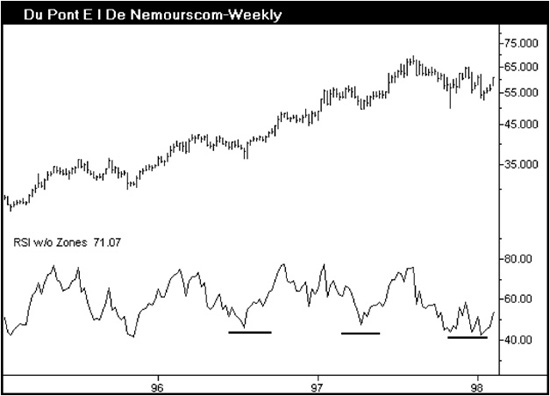
Figure 1.11 Aerodynamic Investments Inc., © 1996–2011, www.aeroinvest.com
As a final revised note Du Pont has not returned to the price highs of 1998 as of 2011. RSI established a resistance level near 66 for ten years in a monthly chart. For the first time RSI has moved above this horizontal line of resistance, but its sector sees the move as a lone wolf. We can read probability in a global environment; the key is to always bundle and measure cash flows internally and externally that influence a single market. This will be discussed in Chapter 12 to add to this original discussion about RSI range movement. The method does not change, but we have become more sophisticated in how we do what we do successfully.