
Simple but Powerful Big Data Techniques
Outline
Only theory can tell us what to measure and how to interpret it.
Albert Einstein
Background
It may come as something of a shock, but most Big Data analysis projects can be done without the aid of statistical or analytical software. A good deal of the value in any Big Data resource can be attained simply by looking at the data and thinking about what you’ve seen.
It is said that we humans have a long-term memory capacity in the petabyte range and that we process many thousands of thoughts each day. In addition, we obtain new information continuously and rapidly in many formats (visual, auditory, olfactory, proprioceptive, and gustatory). Who can deny that humans qualify, under the three v’s (volume, velocity, and variety), as Big Data resources incarnate?
The late, great Harold Gatty was one of the finest Big Data resources of his time. Harold Gatty gained fame, in 1931, when he navigated an 8-day flight around the world. During World War II, he taught navigation and directed air transport for the Allies in the Pacific campaign. His most enduring legacy has been his book “Finding Your Way Without Map or Compass,” in which he explains how to determine your location and direction, the time of day, the season of the year, the day of the month, and the approaching weather through careful observation and deduction.91
Location and direction can be established by observing the growth of branches on trees: upward-growing branches on the northern side of a tree, sideways-growing branches on the southern side of a tree. Open branches coalescing as pyramids pointing to the top of the tree are found in northern latitudes to catch lateral light; branches coalescing to form flat or round-topped trees are found in temperate zones to capture direct light. Broad-leafed branches are found in the tropics to shield heat and light. At sea, the number of seabirds in the sky can be estimated by latitude; the further away from the equator, the greatest number of seabirds. The paucity of seabirds in the tropics is a consequence of the fish population; the greatest numbers of fish are found in cold water in higher latitudes.
Gatty’s book contains hundreds of useful tips, but how does any of this relate to Big Data? The knowledge imparted by Harold Gatty was obtained by careful observations of the natural world, collected by hundreds of generations of survivalists living throughout the world. In most cases, observations connected data values measured by one of the five human senses: the distinctive reflection of snow on an overhead cloud as seen from a distance, the odor of a herd of camel grazing at an oasis, the interval between a shout and its echo, the feel of the prevailing wind, or the taste of fresh water. All of these measurements produced a collective Big Data resource stored within human memory. The conclusions that Gatty and his predecessors learned were correlations (e.g., the full moon rises at sunset, the last quarter moon rises at midnight). Many samples of the same data confirmed the correlations.
Gatty cautions against overconfidence in correlations, insisting that navigators should never depend on a single observation “as it may be an exception to the general rule. It is the combined evidence of a number of different indications which strengthens and confirms the conclusions.”91
In this chapter, you will learn to conduct preliminary analyses of Big Data resources without the use of statistical packages and without advanced analytical methods (see Glossary item, Deep analytics). Keen observational skills and a prepared mind are sometimes the only tools necessary to reach profoundly important conclusions from Big Data resources.
Look At the Data
Before you choose and apply analytic methods to data sets, you should spend time studying your raw data. The following steps may be helpful.
1. Find a free ASCII editor. When I encounter a large data file, in plain ASCII format, the first thing I do is open the file and take a look at its contents. Unless the file is small (i.e., under about 20 megabytes), most commercial word processors fail at this task. They simply cannot open really large files (in the range of 100—1000 megabytes). You will want to use an editor designed to work with large ASCII files (see Glossary item, Text editor). Two of the more popular, freely available editors are Emacs and vi (also available under the name vim). Downloadable versions are available for Linux, Windows, and Macintosh systems. On most computers, these editors will open files of several hundred megabytes, at least.
If you are reluctant to invest the time required to learn another word processor, and you have a Unix or Windows operating system, then you can read any text file, one screen at a time, with the “more” command, for example, on Windows systems, at the prompt:
c:>type huge_file.txt |more
The first lines from the file will fill the screen, and you can proceed through the file by pressing and holding the <Enter> key.
Using this simple command, you can assess the format and general organization of any file. For the uninitiated, ASCII data files are inscrutable puzzles. For those who take a few moments to learn the layout of the record items, ASCII records can be read and understood, much like any book.
Many data files are composed of line records. Each line in the file contains a complete record, and each record is composed of a sequence of data items. The items may be separated by commas, tabs, or some other delimiting character. If the items have prescribed sizes, you can compare the item values for different records by reading up and down a column of the file.
2. Download and study the “readme” or index files, or their equivalent. In prior decades, large collections of data were often assembled as files within subdirectories, and these files could be downloaded in part or in toto via ftp (file transfer protocol). Traditionally, a “readme” file would be included with the files, and the “readme” file would explain the purpose, contents, and organization of all the files. In some cases, an index file might be available, providing a list of terms covered in the files, and their locations, in the various files. When such files are prepared thoughtfully, they are of great value to the data analyst. It is always worth a few minutes time to open and browse the “readme” file. I think of “readme” files as treasure maps. The data files contain great treasure, but you’re unlikely to find anything of value unless you study and follow the map.
In the past few years, data resources have grown in size and complexity. Today, Big Data resources are often collections of resources, housed on multiple servers. New and innovative access protocols are continually being developed, tested, released, updated, and replaced. Still, some things remain the same. There will always be documents to explain how the Big Data resource “works” for the user. It behooves the data analyst to take the time to read and understand this prepared material. If there is no prepared material, or if the prepared material is unhelpful, then you may want to reconsider using the resource.
3. Assess the number of records in the Big Data resource. There is a tendency among some data managers to withhold information related to the number of records held in the resource. In many cases, the number of records says a lot about the inadequacies of the resource. If the total number of records is much smaller than the typical user might have expected or desired, then the user might seek her data elsewhere. Data managers, unlike data users, sometimes dwell in a perpetual future that never merges into the here and now. They think in terms of the number of records they will acquire in the next 24 hours, the next year, or the next decade. To the data manager, the current number of records may seem irrelevant.
One issue of particular importance is the sample number/sample dimension dichotomy. Some resources with enormous amounts of data may have very few data records. This occurs when individual records contain mountains of data (e.g., sequences, molecular species, images, and so on), but the number of individual records is woefully low (e.g., hundreds or thousands). This problem, known as the curse of dimensionality, will be further discussed in Chapter 10.
Data managers may be reluctant to divulge the number of records held in the Big Data resource when the number is so large as to defy credibility. Consider this example. There are about 5700 hospitals in the United States, serving a population of about 313 million people. If each hospital served a specific subset of the population, with no overlap in service between neighboring hospitals, then each would provide care for about 54,000 people. In practice, there is always some overlap in catchment population, and a popular estimate for the average (overlapping) catchment for U.S. hospitals is 100,000. The catchment population for any particular hospital can be estimated by factoring in a parameter related to its size. For example, if a hospital hosts twice the number of beds than the average U.S. hospital, then one would guess that its catchment population would be about 200,000.
The catchment population represents the approximate number of electronic medical records for living patients served by the hospital (one living individual, one hospital record). If you are informed that a hospital, of average size, contains 10 million records (when you are expecting about 100,000), then you can infer that something is very wrong. Most likely, the hospital is creating multiple records for individual patients. In general, institutions do not voluntarily provide users with information that casts doubt on the quality of their information systems. Hence, the data analyst, ignorant of the total number of records in the system, might proceed under the false assumption that each patient is assigned one and only one hospital record. Suffice it to say that the data user must know the number of records available in a resource and the manner in which records are identified and internally organized.
4. Determine how data objects are identified and classified. The identifier and the classifier (the name of the class to which the data object belongs) are the two most important keys to Big Data information. Here is why. If you know the identifier for a data object, you can collect all of the information associated with the object, regardless of its location in the resource. If other Big Data resources use the same identifier for the data object, you can integrate all of the data associated with the data object, regardless of its location in external resources. Furthermore, if you know the class that holds a data object, you can combine objects of a class and study all of the members of the class. Consider the following example:
75898039563441 name G. Willikers
75898039563441 is_a_class_member cowboy
94590439540089 name Hopalong Tagalong
94590439540089 is_a_class_member cowboy
Merged Big Data resource 1 + 2
75898039563441 name G. Willikers
75898039563441 is_a_class_member cowboy
The merge of two Big Data resources combines data related to identifier 75898039563441 from both resources. We now know a few things about this data object that we did not know before the merge. The merge also tells us that the two data objects identified as 75898039563441 and 94590439540089 are both members of class “cowboy”. We now have two instance members from the same class, and this gives us information related to the types of instances contained in the class.
The consistent application of standard methods for object identification and for class assignments, using a standard classification or ontology, greatly enhances the value of a Big Data resource (see Glossary item, Identification). A savvy data analyst will quickly determine whether the resource provides these important features.
5. Determine whether data objects contain self-descriptive information. Data objects should be well specified. All values should be described with metadata, all metadata should be defined, and the definitions for the metadata should be found in documents whose unique names and locations are provided (see Glossary item, ISO/IEC 11179). The data should be linked to protocols describing how the data was obtained and measured.
6. Assess whether the data is complete and representative. You must be prepared to spend many hours moving through the records; otherwise, you will never really understand the data. After you have spent a few weeks of your life browsing through Big Data resources, you will start to appreciate the value of the process. Nothing comes easy. Just as the best musicians spend thousands of hours practicing and rehearsing their music, the best data analysts devote thousands of hours to studying their data sources. It is always possible to run sets of data through analytic routines that summarize the data, but drawing insightful observations from the data requires thoughtful study.
An immense Big Data resource may contain spotty data. On one occasion, I was given a large hospital-based data set, with assurances that the data was complete (i.e., containing all necessary data relevant to the project). After determining how the records and the fields were structured, I looked at the distribution frequency of diagnostic entities contained in the data set. Within a few minutes I had the frequencies of occurrence of the different diseases, assembled under broad diagnostic categories. I spent another few hours browsing through the list, and before long I noticed that there were very few skin diseases included in the data. I am not a dermatologist, but I knew that skin diseases are among the most common conditions encountered in medical clinics. Where were the missing skin diseases? I asked one of the staff clinicians assigned to the project. He explained that the skin clinic operated somewhat autonomously from the other hospital clinics. The dermatologists maintained their own information system, and their cases were not integrated into the general disease data set. I inquired as to why I had been assured that the data set was complete when everyone other than myself knew full well that the data set lacked skin cases. Apparently, the staff were all so accustomed to ignoring the field of dermatology that it had never crossed their minds to mention the matter.
It is a quirk of human nature to ignore anything outside one’s own zone of comfort and experience. Otherwise fastidious individuals will blithely omit relevant information from Big Data resources if they consider the information to be inconsequential, irrelevant, or insubstantial. I have had conversations with groups of clinicians who requested that the free-text information in radiology and pathology reports (the part of the report containing descriptions of findings and other comments) be omitted from the compiled electronic records on the grounds that it is all unnecessary junk. Aside from the fact that “junk” text can serve as important analytic clues (e.g., measurements of accuracy, thoroughness, methodologic trends, and so on), the systematic removal of parts of data records produces a biased and incomplete Big Data resource. In general, data managers should not censor data. It is the job of the data analyst to determine what data should be included or excluded from analysis, and to justify his or her decision. If the data is not available to the data analyst, then there is no opportunity to reach a thoughtful and justifiable determination.
On another occasion, I was given an anonymized data set of clinical data, contributed from an anonymized hospital (see Glossary item, Anonymization versus deidentification). As I always do, I looked at the frequency distributions of items on the reports. In a few minutes, I noticed that germ cell tumors, rare tumors that arise from a cell lineage that includes oocytes and spermatocytes, were occurring in high numbers. At first, I thought that I might have discovered an epidemic of germ cell tumors in the hospital’s catchment population. When I looked more closely at the data, I noticed that the increased incidence occurred in virtually every type of germ cell tumor, and there did not seem to be any particular increase associated with gender, age, or ethnicity. Cancer epidemics raise the incidence of one or maybe two types of cancer and may involve a particular at-risk population. A cancer epidemic would not be expected to raise the incidence of all types of germ cell tumors, across ages and genders. It seemed more likely that the high numbers of germ cell tumors were explained by a physician or specialized care unit that concentrated on treating patients with germ cell tumors, receiving referrals from across the nation. Based on the demographics of the data set (the numbers of patients of different ethnicities), I could guess the geographic region of the hospital. With this information, and knowing that the institution probably had a prestigious germ cell clinic, I guessed the name of the hospital. I eventually confirmed that my suspicions were correct.
The point here is that if you take the time to study raw data, you can spot systemic deficiencies or excesses in the data, if they exist, and you may gain deep insights that would not be obtained by mathematical techniques.
7. Plot some of the data. Plotting data is quick, easy, and surprisingly productive. Within minutes, the data analyst can assess long-term trends, short-term and periodic trends, the general shape of data distribution, and general notions of the kinds of functions that might represent the data (e.g., linear, exponential, power series). Simply knowing that the data can be expressed as a graph is immeasurably reassuring to the data analyst.
There are many excellent data visualization tools that are widely available. Without making any recommendation, I mention that graphs produced for this book were made with Matplotlib, a plotting library for the Python programming language; and Gnuplot, a graphing utility available for a variety of operating systems. Both Matplotlib and Gnuplot are open source applications that can be downloaded, at no cost, and are available at sourceforge.net (see Glossary item, Open source).
Gnuplot is extremely easy to use, either as stand-alone scripts containing Gnuplot commands, or from the system command line, or from the command line editor provided with the application software. Most types of plots can be created with a single Gnuplot command line. Gnuplot can fit a mathematically expressed curve to a set of data using the nonlinear least-squares Marquardt—Levenberg algorithm.92,93 Gnuplot can also provide a set of statistical descriptors (e.g., median, mean, standard deviation) for plotted sets of data.
Gnuplot operates from data held in tab-delimited ASCII files. Typically, data extracted from a Big Data resource is ported into a separate ASCII file, with column fields separated with a tab character, and rows separated by a newline character. In most cases, you will want to modify your raw data before it is ready for plotting. Use your favorite programming language to normalize, shift, transform, convert, filter, translate, or munge your raw data as you see fit. Export the data as a tab-delimited file, named with a .dat suffix.
It takes about a second to generate a plot for 10,000 data points (see Figure 8.1).
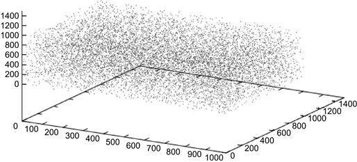
The data for Figure 8.1 was created with a seven-line script using the Perl programming language, but any scripting language would have been sufficient.19 Ten thousand data points were created, with the x, y, and z coordinates for each point produced by a random number generator. The point coordinates were put into a file named xyz_rand.dat. One command line in Gnuplot produced the graph shown in Figure 8.1:
splot ’c:ftpxyz_rand.dat’
It is often useful to compartmentalize data by value using a histogram. A histogram contains bins that cover the range of data values available to the data objects, usually in a single dimension. For this next example, each data object will be a point in three-dimensional space and will be described with three coordinates: x, y, and z. We can easily write a script that generates 100,000 points, with each coordinate assigned a random number between 0 and 1000. We can count the number of produced points whose x coordinate is 0, 1, 2, 3, and so on until 999. With 100,000 generated values, you would expect that each integer between 0 and 1000 (i.e., the 1000 bins) would contain about 100 points. Here are the histogram values for the first 20 bins.
We can create a histogram displaying all 1000 bins (see Figure 8.2).
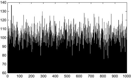
Figure 8.2 Histogram consisting of 1000 bins, holding a total of 100,000 data points whose x, y, and z coordinates fall somewhere between 0 and 1000.
Looking at Figure 8.2, we might guess that most of the bins contain about 100 data points. Bins with many fewer data points or many more data points would be hard to find. With another short script, we can compute the distribution of the numbers of bins containing all possible numbers of data points. Here is the raw data distribution (held in file x_dist.dat):
0 0 0 0 0 0 0 0 0 0 0 0 0 0 0 0 0 0 0 0 0 0 0 0 0 0 0 0 0 0 0 0 0 0 0 0 0 0 0 0
0 0 0 0 0 0 0 0 0 0 0 0 0 0 0 0 0 0 0 0 0 0 0 0 0 0 0 0 0 0 0 0 3 1 3 0 3 2 7 4
6 6 10 8 17 11 11 19 20 28 26 24 28 41 29 37 31 30 38 40 36 36 34 38 39 43 27 25
34 22 21 24 25 21 18 7 15 11 4 6 4 5 2 8 2 3 2 0 0 0 2 1 1 1 0 0 0 0 0 0 0 0 0
0 0 0 0 0 0 0 0 0 0 0 0 0 0 0 0 0 0 0 0 0 0 0 0 0 0 0 0 0 0 0 0 0 0 0 0 0 0 0 0
What does this data actually show?
Zero bins contained 0 data points
Zero bins contained 1 data points
Zero bins contained 2 data points
Three bins contained 74 data points
One bin contained 75 data points
Three bins contained 76 data points
Zero bins contained 77 data points
The distribution is most easily visualized with a simple graph. The Gnuplot command producing a graph from our data is
plot ’x_dist.dat’ smooth bezier
This simple command instructs Gnuplot to open our data file, “x_dist.dat,” and plot the contents with a smooth lined graph. The output looks somewhat like a Gaussian distribution (see Figure 8.3).
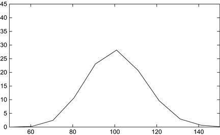
Figure 8.3 The distribution of data points per bin. The curve resembles a normal curve, peaking at 100.
We could have also created a cumulative distribution wherein the value of each point is the sum of the values of all prior points (see Figure 8.4). A minor modification of the prior Gnuplot command line produces the cumulative curve:
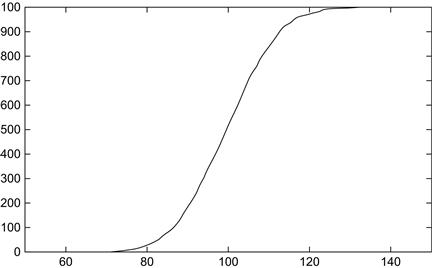
Figure 8.4 A cumulative distribution having a typical appearance of cumulative distribution for a normal curve.
plot ’x_dist.dat’ smooth cumulative
It is very easy to plot data, but one of the most common mistakes of the data analyst is to assume that the available data actually represents the full range of data that may occur. If the data under study does not include the full range of the data, the data analyst will often reach a completely erroneous explanation for the observed data distribution.
Data distributions will almost always appear to be linear at various segments of their range (see Figure 8.5).
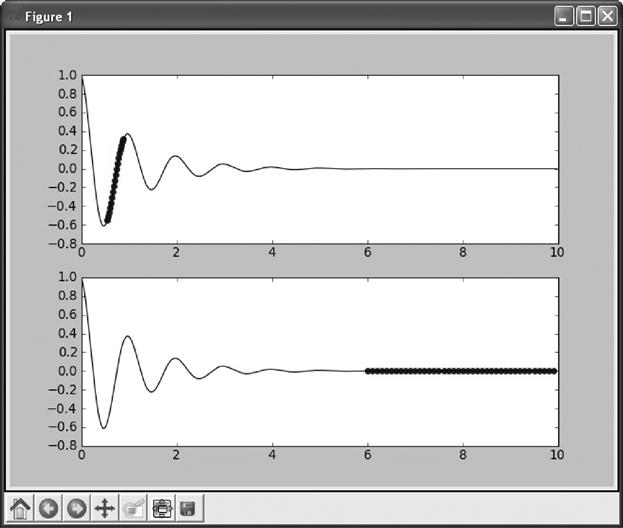
Figure 8.5 An oscillating wave reaching equilibrium. The top graph uses circle points to emphasize a linear segment for a half-cycle oscillation. The bottom graph of the same data emphasizes a linear segment occurring at equilibrium.
As demonstrated in Figure 8.5, an oscillating curve that reaches equilibrium may look like a sine wave early in its course and a flat line later on. In the larger oscillations, it may appear linear along the length of a half-cycle. Any of these segmental interpretations of the data will miss observations that would lead to a full explanation of the data.
An adept data analyst can eyeball a data distribution and guess the kind of function that might model the data. For example, a symmetric bell-shaped curve is probably a normal or Gaussian distribution. A curve with an early peak and a long, flat tail is often a power law distribution. Curves that are simple exponential or linear can also be assayed by visual inspection. Distributions that may be described by a Fourier series or a power series, or that can be segmented into several different distributions, can also be assessed (see Glossary items Power law, Power series, Fourier series, Fourier transform).
8. Estimate the solution to your multimillion dollar data project on day 1. This may seem difficult to accept, and there will certainly be exceptions to the rule, but the solution to almost every multimillion dollar analytic problem can usually be estimated in just a few hours, sometimes minutes, at the outset of the project. If an estimate cannot be attained fairly quickly, then there is a good chance that the project will fail. If you do not have the data for a quick-and-dirty estimate, then you will probably not have the data needed to make a precise determination.
We have already seen one example of estimation when we examined word-counting algorithms (see Chapter 7). Without bothering to acquire software that counts the words in a text file, we can get an approximation by simply dividing the size of the file (in bytes) by 6.5, the average number of characters contained in a word plus its separator character (space). Another example comes from the field of human epidemiology. The total number of humans on earth is about 7 billion. The total number of human deaths each year is about 60 million, roughly 1% of the living population. Modelers can use the 1% estimate for the percentage of people expected to die in a normal population. The same 1% estimate can be applied to the number of deaths from any cause compared to the number of deaths from all causes. In any field, adept data analysts apply simple estimators to their problems at hand.
The past several decades have witnessed a profusion of advanced mathematical techniques for analyzing large data sets. It is important that we have these methods, but in most cases, newer methods serve to refine and incrementally improve older methods that do not rely on powerful computational techniques or sophisticated mathematical algorithms.
As someone who was raised prior to the age of handheld calculators, personal computers, and smartphones, I was taught quick-and-dirty estimation methods for adding, subtracting, multiplying, and dividing lists of numbers. The purpose of the estimation was to provide a good idea of the final answer before much time was spent on a precise solution. If no mistake was introduced in either the estimate or the long calculation, then the two numbers would come close to one another. Conversely, mistakes in the long calculations could be detected if the two calculations yielded different numbers.
If data analysts go straight to the complex calculations, before they perform a simple estimation, they will find themselves accepting wildly ridiculous calculations. For comparison purposes, there is nothing quite like a simple and intuitive estimate to pull an overly eager analyst back to reality. Often, the simple act of looking at a stripped-down version of the problem opens a new approach that can drastically reduce computation time.94
In some situations, analysts will find that a point is reached when higher refinements in methods yield diminishing returns. When everyone has used their most advanced algorithms to make an accurate prediction, they may sometimes find that their best effort offers little improvement over a simple estimator.
The next sections introduce some powerful estimation techniques that are often overlooked.
Data Range
Determine the highest and the lowest observed values in your data collection. These two numbers are often the most important numbers in any set of data—even more important than determining the average or the standard deviation. There is always a compelling reason, relating to the measurement of the data or to the intrinsic properties of the data set, to explain where and why the data begin and end.
Here is an example. You are looking at human subject data that includes weights. The minimum weight is a pound (the round-off weight of a viable but premature newborn infant). You find that the maximum weight in the data set is 300 pounds, exactly. There are many individuals in the data set who have a weight of 300 pounds, but no individuals with a weight exceeding 300 pounds. You also find that the number of individuals weighing 300 pounds is much greater than the number of individuals weighing 290 pounds. What does this tell you? Obviously, the people included in the data set have been weighed on a scale that tops off at 300 pounds. Most of the people whose weight was recorded as 300 will have a false weight measurement. Had we not looked for the maximum value in the data set, we would have assumed, incorrectly, that the weights were always accurate.
It would be useful to get some idea of how weights are distributed in the population exceeding 300 pounds. One way of estimating the error is to look at the number of people weighing 295 pounds, 290 pounds, 285 pounds, etc. By observing the trend, and knowing the total number of individuals whose weight is 300 pounds or higher, you can estimate the number of people falling into weight categories exceeding 300 pounds.
Here is another example where knowing the maxima for a data set measurement is useful. You are looking at a collection of data on meteorites. The measurements include weights. You notice that the largest meteorite in the large collection weighs 66 tons (equivalent to about 60,000 kg) and has a diameter of about 3 meters. Small meteorites are more numerous than large meteorites, but almost every weight category is accounted for by one or more meteorites, up to 66 tons. After that, nothing. Why do meteorites have a maximum size of about 66 tons?
A little checking tells you that meteors in space can come in just about any size, from a speck of dust to a moon-sized rock. Collisions with earth have involved meteorites much larger than 3 meters. You check the astronomical records and you find that the meteor that may have caused the extinction of large dinosaurs about 65 million years ago was estimated at 6 to 10 km (at least 2000 times the diameter of the largest meteorite found on earth).
There is a very simple reason why the largest meteorite found on earth weighs about 66 tons, while the largest meteorites to impact the earth are known to be thousands of times heavier. When meteorites exceed 66 tons, the impact energy can exceed the energy produced by an atom bomb blast. Meteorites larger than 66 tons leave an impact crater, but the meteor itself disintegrates on impact.
As it turns out, much is known about meteorite impacts. The kinetic energy of the impact is determined by the mass of the meteor and the square of the velocity. The minimum velocity of a meteor at impact is about 11 km/second (equivalent to the minimum escape velocity for sending an object from earth into space). The fastest impacts occur at about 70 km per second. From this data, the energy released by meteors, on impact with the earth, can be easily calculated.
By observing the maximum weight of meteors found on earth, we learn a great deal about meteoric impacts. When we look at the distribution of weights, you can see that small meteorites are more numerous than larger meteorites. If we develop a simple formula that relates the size of a meteorite with its frequency of occurrence, we can predict the likelihood of the arrival of a meteorite on earth, for every weight of meteorite, including those weighing more than 66 tons, and for any interval of time.
Here is another profound example of the value of knowing the maximum value in a data distribution. If you look at the distance from the earth to various cosmic objects (e.g., stars, black holes, nebulae), you will quickly find that there is a limit for the distance of objects from earth. Of the many thousands of cataloged stars and galaxies, none of them have a distance that is greater than 13 billion light years. Why? If astronomers could see a star that is 15 billion light years from earth, the light that is received here on earth must have traveled 15 billion light years to reach us. The time required for light to travel 15 billion light years is 15 billion years, by definition. The universe was born in a big bang about 14 billion years ago. This would imply that the light from the star located 15 billion miles from earth must have begun its journey about a billion years before the universe came into existence. Impossible!
By looking at the distribution of distances of observed stars and noting that the distances never exceed about 13 billion years, we can infer that the universe must be at least 13 billion years old. You can also infer that the universe does not have an infinite age and size; otherwise, we would see stars at a greater distance than 13 billion light years. If you assume that stars popped into the universe not long after its creation, then you can infer that the universe has an age of about 13 or 14 billion years. All of these deductions, confirmed independently by theoreticians and cosmologists, were made without statistical analysis by noting the maximum number in a distribution of numbers.
Sometimes fundamental discoveries come from simple observations on distribution boundaries. Penguins are widely distributed throughout the Southern Hemisphere. Outside of zoos and a few islands on the border of the Southern and Northern Hemispheres, penguins have never ventured into the northern half of this planet. In point of fact, penguins have never really ventured anywhere. Penguins cannot fly; hence they cannot migrate via the sky like most other birds. They swim well, but they rear their young on land and do not travel great distances from their nests. It is hard to imagine how penguins could have established homes in widely divergent climates (e.g., frigid Antarctic and tropical Galapagos).
Penguins evolved from an ancestral species, around 70 million years ago, that lived on southern land masses broken from the Pangaean supercontinent, before the moving continents arrived at their current locations. At this point, the coastal tips of South America and Africa, the western coast of Australia, and the length of Zealandia (from which New Zealand eventually emerged) were all quite close to Antarctica.
By observing the distribution of penguins throughout the world (knowing where they live and where they do not live), it is possible to construct a marvelous hypothesis in which penguins were slowly carried away when their ancient homeland split and floated throughout the Southern Hemisphere. The breakup of Pangaea, leading to the current arrangement of continents, might have been understood by noting where penguins live, and where they do not.
On occasion, the maxima or minima of a set of data will be determined by an outlier value (see Glossary item, Outlier). If the outlier were simply eliminated from the data set, you would have a maxima and minima with values that were somewhat close to other data values (i.e., the second-highest data value and the second-lowest data values would be close to the maxima and the minima, respectively). In these cases, the data analyst must come to a decision—to drop or not to drop the outlier. There is no simple guideline for dealing with outliers, but it is sometimes helpful to know something about the dynamic range of the measurements (see Glossary item, Dynamic range). If a thermometer can measure temperature from - 20 to 140 degrees Fahrenheit and your data outlier has a temperature of 390 degrees Fahrenheit, then you know that the data must be an error; the thermometer does not measure above 140 degrees. The data analyst can drop the outlier, but it would be prudent to determine why the outlier was generated.
Denominator
Denominators are the numbers that provide perspective to other numbers. If you are informed that 10,000 persons die each year in the United States from a particular disease, then you might want to know the total number of deaths, from all causes. When you compare the death from a particular disease with the total number of deaths from all causes (the denominator), you learn something about the relative importance of your original count (e.g., an incidence of 10,000 deaths/350 million persons). Epidemiologists typically represent incidences as numbers per 100,000 population. An incidence of 10,000/350 million is equivalent to an incidence of 2.9 per 100,000.
Likewise, if you are using Big Data collected from multiple sources, your histograms will need to be represented as fractional distributions for each source’s data, not as value counts. The reason for this is that a histogram from one source will probably not have the same total number of distributed values compared with a histogram created from another source. To achieve comparability among the histograms, you will need to transform values into fractions, by dividing the binned values by the total number of values in the data distribution, for each data source. Doing so renders the bin value as a percentage of total rather than a sum of data values.
Denominators are not always easy to find. In most cases, the denominator is computed by tallying every data object in a Big Data resource. If you have a very large number of data objects, the time required to reach a global tally may be quite long. In many cases, a Big Data resource will permit data analysts to extract subsets of data, but analysts will be forbidden to examine the entire resource. As a consequence, the denominator will be computed for the subset of extracted data and will not accurately represent all of the data objects available to the resource.
Big Data managers should make an effort to supply information that summarizes the total set of data available at any moment in time. Here are some of the numbers that should be available to analysts: the number of records in the resource, the number of classes of data objects in the resource, the number of data objects belonging to each class in the resource, the number of data values that belong to data objects, and the size of the resource in bytes.
There are many examples wherein data analysts manipulate the denominator to produce misleading results; one of the most outrageous examples comes from the emotionally charged field of crime reporting. When a crime is recorded at a police department, a record is kept to determine whether the case comes to closure (i.e., is either solved or is closed through an administrative decision). The simple annual closure rate is the number of cases closed in a year divided by the total number of cases occurring in the year. Analytic confusion arises when a crime occurs in a certain year, but is not solved until the following year. It is customary among some police departments to include all closures, including closures of cases occurring in preceding years, in the numerator.95 The denominator is restricted to those cases that occurred in the given year. The thought is that doing so ensures that every closed case is counted and that the total number of cases is not counted more than once.
As it happens, including closures from cases occurring in prior years may be extraordinarily misleading when the denominator is decreasing (i.e., when the incidence of crime decreases). For example, imagine that in a certain year there are 100 homicides and 30 closures (a simple closure rate of 30%). In the following year, the murderers take a breather, producing a scant 40 homicides. Of those 40 homicides, only 10 are closed (a simple closure rate of 25%), but during this period, 31 of the open homicide cases from the previous year are closed. This produces a total number of current-year closures of 10 + 31, or 41; yielding an impossible closure rate of 41/40 or about 103%—not bad!
January is a particularly good month to find a closure rate that bodes well for the remainder of the year. Let’s say that the homicide incidence does not change from year to year; that the homicide rate remains steady at 100 per year. Let’s say that in year 1, 30 homicide cases are closed, yielding a simple closure rate of 30%. In the month of January in year 2, 9 homicides occur. This represents about one-twelfth of the 100 homicides expected for the year. We expect that January will be the month that receives the highest number of closures from the prior year’s open-case pool. Let’s say that in January there are 10 cases closed from prior year homicides, and that none of the homicides occurring in January were closed (i.e., 0% simple closure rate for January). We calculate the closure rate by taking the sum of closures (10 + 0 = 10) and dividing by the number of homicides that occurred in January 9 to yield a closure rate of 10/9 or a 111% closure rate.
Aside from yielding impossible closure rates, exceeding 100%, the calculation employed by many police departments provides a highly misleading statistic. Is there a method whereby we can compute a closure rate that does not violate the laws of time and logic, and that provides a reasonable assessment of crime case closures? Actually, there are many ways of approaching the problem. Here is a simple method that does not involve reaching back into cases from prior years or reaching forward in time to collect cases from the current year that will be solved in the future.
Imagine the following set of data for homicide cases occurring in 2012. There are 25 homicides in the data set. Twenty of the cases were closed inside the year 2012. The remaining cases are unclosed at the end of the calendar year. We know the date that each case occurred and the number of days to closure for each of the closed cases. For the 5 cases that were not closed, we know the number of days that passed between the time that the case occurred and the end of the year 2012, when all counting stopped.
Summary of 25 homicide cases
The simple closure date is 20/25 or 80%. Now, let us plot the time until closure for cases (see Figure 8.6).
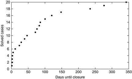
We see that all but 3 of the solved cases were solved within 150 days of the homicide occurrence. Of the 5 unclosed cases remaining at the end of 2012, 3 had not been solved in 250 days or more. These cases are highly unlikely to be solved. One had gone unsolved for only 10 days. This time period is so short that the likelihood that it will be solved is likely to be close to the simple closure rate of 80%. One case had gone unsolved for 100 days. Only 5 of the 20 solved cases were closed after 100 days, and this would represent about one-quarter (5/20) of the simple 80% closure rate.
Can we assign likelihoods of eventual closure to the five cases that were unclosed at the end of 2012?
Unclosed at 10 days—likelihood of eventual closure 80%
Unclosed at 100 days—likelihood of eventual closure 0.25 × 0.80 = 20%
Unclosed at 250 days—likelihood of eventual closure 0%
The expected number of eventual closures from the 5 unclosed cases is 0.8 + 0.2 = 1. This means that the predicted total closure rate for 2012 is 20 cases (the number of cases that were actually closed) + 1 cases (the number of cases likely to be closed anytime in the future), or 21/25, or 84%. Without going into the statistical formalities for predicting likelihoods, we can summarize closure rates with two easily computed numbers: the simple closure rate and the predicted closure rate.
There are elegant statistical approaches, including Kaplan—Meier estimators,96 which could provide a more rigorous analysis of the Washington, DC, homicide data. The point here is that reasonable estimations can be performed by simply studying the data and thinking about the problem. Big Data resources are in constant flux—growing into the past and the future. Denominators that make sense in a world of static measurements may not make sense in an information universe that is unconstrained by space and time.
Frequency Distributions
There are two general types of data: quantitative and categorical. Quantitative data refers to measurements. Categorical data is simply a number that represents the number of items that have a feature. For most purposes, the analysis of categorical data reduces to counting and binning.
Categorical data typically conforms to Zipf distributions. George Kingsley Zipf (1902—1950) was an American linguist who demonstrated that, for most languages, a small number of words account for the majority of occurrences of all the words found in prose. Specifically, he found that the frequency of any word is inversely proportional to its placement in a list of words, ordered by their decreasing frequencies in text. The first word in the frequency list will occur about twice as often as the second word in the list, three times as often as the third word in the list, and so on. Many Big Data collections follow a Zipf distribution (e.g., income distribution in a population, energy consumption by country, and so on).
Zipf’s distribution applied to languages is a special form of Pareto’s principle, or the 80/20 rule. Pareto’s principle holds that a small number of causes may account for the vast majority of observed instances. For example, a small number of rich people account for the majority of wealth. This would apply to localities (cities, states, countries) and to totalities (the planet). Likewise, a small number of diseases account for the vast majority of human illnesses. A small number of children account for the majority of the behavioral problems encountered in a school. A small number of states hold the majority of the population of the United States. A small number of book titles, compared with the total number of publications, account for the majority of book sales. Much of Big Data is categorical and obeys the Pareto principle. Mathematicians often refer to Zipf distributions as Power law distributions (see Glossary items, Power law, Pareto’s principle, Zipf distribution).
Let’s take a look at the frequency distribution of words appearing in a book. Here is the list of the 30 most frequent words in the book and the number of occurrence of each word:
As Zipf would predict, the most frequent word, “the,” occurs 3977 times, roughly twice as often as the second most frequently occurring word, “and,” which occurs 1689 times. The third most frequently occurring word, “class,” occurs 1091 times, or very roughly one-third as frequently as the most frequently occurring word.
What can we learn about the text from which these word frequencies were calculated? As discussed in Chapter 1, “stop” words are high-frequency words that separate terms and tell us little or nothing about the informational content of text. Let us look at this same list with the “stop” words removed:
What kind of text could have produced this list? As it happens, these high-frequency words came from a book that I previously wrote entitled “Taxonomic Guide to Infectious Diseases: Understanding the Biologic Classes of Pathogenic Organisms.”49 Could there be any doubt that the list of words and frequencies came from a book whose subject is the classification of organisms causing human disease? By glancing at a few words, from a large text file, we gain a deep understanding of the subject matter of the text. The words with the top occurrence frequencies told us the most about the book, because these words are typically low frequency (e.g., hierarchy, protebacteria, organism). They occurred in high frequency because the text was focused on a narrow subject (i.e., infectious disease taxonomy).
A clever analyst will always produce a Zipf distribution for categorical data. A glance at the output always reveals a great deal about the contents of the data.
Let us go one more step, to produce a cumulative index for the occurrence of words in the text, arranging them in order of descending frequency of occurrence:
01 003977 0.0559054232618291 the
02 001680 0.0795214934352948 and
03 001091 0.0948578818634204 class
04 000946 0.108155978520622 are
05 000925 0.121158874300655 chapter
06 000919 0.134077426972926 that
07 000884 0.146503978183249 species
08 000580 0.154657145266946 virus
09 000570 0.162669740504372 with
10 000503 0.169740504371784 disease
11 000434 0.175841322499930 for
12 000427 0.181843740335686 organisms
13 000414 0.187663414771290 from
14 000412 0.193454974837640 hierarchy
15 000335 0.198164131687706 not
16 000329 0.202788945430009 humans
17 000320 0.207287244510669 have
18 000319 0.211771486406702 proteobacteria
19 000309 0.216115156456465 human
20 000300 0.220332311844584 can
21 000264 0.224043408586128 fever
22 000263 0.227740448143046 group
23 000248 0.231226629930558 most
24 000225 0.234389496471647 infections
25 000219 0.237468019904973 viruses
26 000219 0.240546543338300 infectious
27 000216 0.243582895217746 organism
28 000216 0.246619247097191 host
29 000215 0.249641541792010 this
30 000211 0.252607607748320 all
8957 000001 0.999873485338356 acanthaemoeba
8958 000001 0.999887542522984 acalculous
8959 000001 0.999901599707611 academic
8960 000001 0.999915656892238 absurd
8961 000001 0.999929714076865 abstract
8962 000001 0.999943771261492 absorbing
8963 000001 0.999957828446119 absorbed
8964 000001 0.999971885630746 abrasion
In this cumulative listing, the third column is the fraction of the occurrences of the word along with the preceding words in the list as a fraction of all the occurrences of every word in the text.
The list is truncated after the 30th entry and picks up again at entry number 8957. There are a total of 8966 different, sometimes called unique, words in the text. The total number of words in the text happens to be 71,138. The last word on the list, “abasence,” has a cumulative fraction of 1.0, as all of the preceding words, plus the last word, account for 100% of word occurrences. The cumulative frequency distribution for the different words in the text is shown in Figure 8.7. As an aside, the tail of the Zipf distribution, which typically contains items occurring once only in a large data collection, is often “mistakes.” In the case of text distributions, typographic errors can be found in the farthest and thinnest part of the tail. In this case, the word “abasence” occurs just once, as the last item in the distribution. It is a misspelling for the word “absence.”
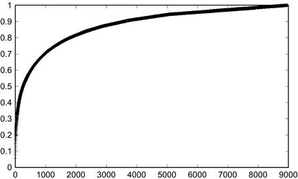
Figure 8.7 A cumulative frequency distribution of word occurrences from a sample text. Bottom coordinates indicate that the entire text is accounted for by a list of about 9000 different words. The steep and early rise indicates that a few words account for the bulk of word occurrences. Graphs with this shape are sometimes referred to as Zipf distributions.
Notice that though there are a total of 8957 unique words in the text, the first 30 words account for more than 25% of all word occurrences. The final 10 words on the list occurred only once in the text. When the cumulative data is plotted, we see a typical cumulative Zipf distribution, characterized by a smooth curve with a quick rise, followed by a long flattened tail converging to 1.0. Compare this with the cumulative distribution for a normal curve (see Figure 8.4). By comparing plots, we can usually tell, at a glance, whether a data set behaves like a Zipf distribution or like a Gaussian distribution.
Mean and Standard Deviation
Statisticians have invented two numbers that tell us most of what we need to know about data sets in the small data realm: the mean and the standard deviation. The mean, also known as the average, tells us the center of the bell-shaped curve, and the standard deviation tells us something about the width of the bell.
The average is one of the simplest statistics to compute: simply divide the sum total of data by the number of data objects. Though the average is simple to compute, its computation may not always be fast. Finding the exact average requires that the entire data set be parsed; a significant time waste when the data set is particularly large or when averages need to be recomputed frequently. When the data can be randomly accessed, it may save considerable time to select a subset of the data (e.g., 100 items), compute the average for the subset, and assume that the average of the subset will approximate the average for the full set of data.
In the Big Data realm, computing the mean and the standard deviation is often a waste of time. Big Data is seldom distributed as a normal curve. The mean and standard deviation have limited value outside of normal distributions. The reason for the non-normality of Big Data is that Big Data is observational, not experimental.
In small data projects, an experiment is undertaken. Typically, a uniform population may be split into two sets, with one set subjected to a certain treatment and the other set serving as a control. Each member of the treated population is nearly identical to every other member, and any measurements on the population would be expected to be identical. Differences among a population of nearly identical objects are distributed in a bell-shaped curve around a central average. The same is true for the control population. Statisticians use the magnitude of data points and their mean location to find differences between the treated group and the control group.
None of this necessarily applies to Big Data collections. In many instances, Big Data is non-numeric categorical data (e.g., presence or absence of a feature, true of false, yes or no, 0 or 1). Because categorical values come from many different objects, there is no special reason to think that the output will be distributed as a normal curve, as you might expect to see when a quantified measurement is produced for a population of identical objects.
In the prior section, we saw an example of a Zipf distribution, in which a few objects or classes of objects account for most of the data in the distribution. The remaining data values trail out in a very long tail (Figure 8.7). For such a distribution, the average and the standard deviation can be computed, but the numbers may not provide useful information. When there is no bell-shaped curve, the average does not designate the center of a distribution, and the standard deviation does not indicate the spread of the distribution around its average value.
Big Data distributions are sometimes multimodal, with several peaks and troughs. Multimodality always says something about the data under study. It tells us that the population is somehow nonhomogeneous. Hodgkin lymphoma is an example of a cancer with a bimodal age distribution (see Figure 8.8). There is a peak in occurrences at a young age, and another peak of occurrences at a more advanced age. This two-peak phenomenon can be found whenever Hodgkin lymphoma is studied in large populations.19
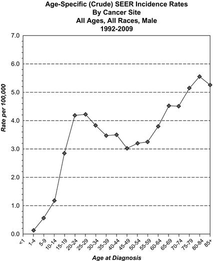
Figure 8.8 Number of occurrences of Hodgkin lymphoma in persons of different ages. There are two peaks, one at about 35 years of age and another at about 75 years of age. The distribution appears to be bimodal. Source of graph: The National Cancer Institute’s Surveillance Epidemiology End Results, available from http://seer.cancer.gov/.97
In the case of Hodgkin lymphoma, lymphomas occurring in the young may share diagnostic features with the lymphomas occurring in the older population, but the occurrence of lymphomas in two separable populations may indicate that some important distinction may have been overlooked: a different environmental cause, different genetic alterations of lymphomas in the two age sets, two different types of lymphomas that were mistakenly classified under one name, or there may be something wrong with the data (i.e., misdiagnoses, mix-ups during data collection). Big Data, by providing a large number of cases, makes it easy to detect data incongruities (such as multimodality) when they are present. Explaining the causes for data incongruities is always a scientific challenge.
The importance of inspecting data for multimodality also applies to black holes. Most black holes have mass equivalents under 33 solar masses. Another set of black holes are supermassive, with mass equivalents of 10 or 20 billion solar masses. When there are objects of the same type, whose masses differ by a factor of a billion, scientists infer that there is something fundamentally different in the origin or development of these two variant forms of the same object. Black hole formation is an active area of interest, but current theory suggests that lower mass black holes arise from preexisting heavy stars. The supermassive black holes presumably grow from large quantities of matter available at the center of galaxies. The observation of bimodality inspired astronomers to search for black holes whose masses are intermediate between black holes with near-solar masses and the supermassive black holes. Intermediates have been found and, not surprisingly, they come with a set of fascinating properties that distinguish them from other types of black holes. Fundamental advances in our understanding of the universe may sometimes follow from simple observations of multimodal data distributions.
The average behavior of a collection of objects can be applied toward calculations that would exceed computational feasibility if applied to individual objects. Here is an example. Years ago, I worked on a project that involved simulating cell colony growth using a Monte Carlo method (see Glossary item, Monte Carlo simulation).98 Each simulation began with a single cell that divided, producing two cells, unless the cell happened to die prior to cell division. Each simulation applied a certain chance of cell death, somewhere around 0.5, for each cell, at each cell division. When you simulate colony growth, beginning with a single cell, the chance that the first cell will die on the first cell division would be about 0.5; hence there is about a 50% chance that the colony will die out on the first cell division. If the cell survives the first cell division, the cell might go through several additional cell divisions before it dies, by chance. By that time, there are other progeny that are dividing, and these progeny cells might successfully divide, thus enlarging the size of the colony. A Monte Carlo simulation randomly assigned death or life at each cell division, for each cell in the colony (see Glossary item, Monte Carlo simulation). When the colony manages to reach a large size (e.g., 10 million cells), the simulation slows down, as the Monte Carlo algorithm must parse through 10 million cells, calculating whether each cell will live or die, assigning two offspring cells for each simulated division, and removing cells that were assigned a simulated “death.” When the computer simulation slows to a crawl, I found that the whole population displayed an “average” behavior. There was no longer any need to perform a Monte Carlo simulation on every cell in the population. I could simply multiply the total number of cells by the cell death probability (for the entire population), and this would tell me the total number of cells that survived the cycle. For a large colony of cells, with a death probability of 0.5 for each cell, half the cells will die at each cell cycle and the other half will live and divide, producing two progeny cells; hence the population of the colony will remain stable. When dealing with large numbers, it becomes possible to dispense with the Monte Carlo simulation and to predict each generational outcome with a pencil and paper.
Substituting the average behavior for a population of objects, rather than calculating the behavior of every single object, is called mean-field approximation (see Glossary item, Mean-field approximation). It uses a physical law telling us that large collections of objects can be characterized by their average behavior. Mean-field approximation has been used with great success to understand the behavior of gases, epidemics, crystals, viruses, and all manner of large population problems.
Estimation-Only Analyses
The sun is about 93 million miles from the earth. At this enormous distance, light hitting the earth arrives as near-parallel rays, and the shadow produced by the earth is nearly cylindrical. This means that the shadow of the earth is approximately the same size as the earth itself. If the earth’s circular shadow during a lunar eclipse has a diameter about 2.5 times the diameter of the moon itself, then the moon must have a diameter approximately 1/2.5 times that of the earth. The diameter of the earth is about 8000 miles, so the diameter of the moon must be about 8000/2.5 or about 3000 miles.
The true diameter of the moon is smaller, about 2160 miles. Our estimate is inaccurate because the earth’s shadow is actually conical, not cylindrical. If we wanted to use a bit more trigonometry, we’d arrive at a closer approximation. Still, we arrived at a fair approximation of the moon’s size from one simple division based on a casual observation made during a lunar eclipse. The distance was not measured; it was estimated from a simple observation. Credit for the first astronomer to use this estimation goes to the Greek astronomer Aristarchus of Samos (310 BCE-230 BCE). In this particular case, a direct measurement of the moon’s distance was impossible. Aristarchus’ only option was the rough estimate. His predicament was not unique. Sometimes estimation is the only recourse for data analysts.
A modern-day example wherein measurements failed to help the data analyst is the calculation of deaths caused by heat waves. People suffer during heat waves, and municipalities need to determine whether people are dying from heat-related conditions. If deaths occur, then the municipality can justifiably budget for supportive services such as municipal cooling stations, the free delivery of ice, increased staffing for emergency personnel, and so on. If the number of heat-related deaths is high, the governor may justifiably call a state of emergency.
Medical examiners perform autopsies to determine causes of death. During a heat wave, the number of deceased individuals with a heat-related cause of death seldom rises as much as anyone would expect.99 The reason for this is that stresses produced by heat cause death by exacerbating preexisting nonheat-related conditions. The cause of death can seldom be pinned on heat. The paucity of autopsy-proven heat deaths can be relieved, somewhat, by permitting pathologists to declare a heat-related death when the environmental conditions at the site of death are consistent with hyperthermia (e.g., a high temperature at the site of death and a high body temperature of the deceased measured shortly after death). Adjusting the criteria for declaring heat-related deaths is a poor remedy. In many cases, the body is not discovered anytime near the time of death, invalidating the use of body temperature. More importantly, different regions may develop their own criteria for heat-related deaths (e.g., different temperature threshold measures, different ways of factoring night-time temperatures and humidity measurements). Basically, there is no accurate, reliable, or standard way to determine heat-related deaths at autopsy.99
How would you, a data estimator, handle this problem? It’s simple. You take the total number of deaths that occurred during the heat wave. Then you go back over your records of deaths occurring in the same period, in the same geographic region, over a series of years in which a heat wave did not occur. You average that number, giving you the expected number of deaths in a normal (i.e., without heat wave) period. You subtract that number from the number of deaths that occurred during the heat wave and that gives you an estimate of the number of people who died from heat-related mortality. This strategy, applied to the 1995 Chicago heat wave, estimated that the number of heat-related deaths rose from 485 to 739.100
Use Case: Watching Data Trends with Google Ngrams
Ngrams are ordered word sequences.
Ngrams for the prior sentence are:
ordered word sequences (3-gram)
Ngrams are ordered word (4-gram)
Google has undertaken a Big Data effort to enumerate the ngrams collected from the scanned literature dating back to 1500. The public can enter their own ngrams into Google’s Ngram Viewer and view a graph of the occurrences of the phrase, in published literature, over time. Figure 8.9 is the Google result for a search on the 2-gram “yellow fever.”
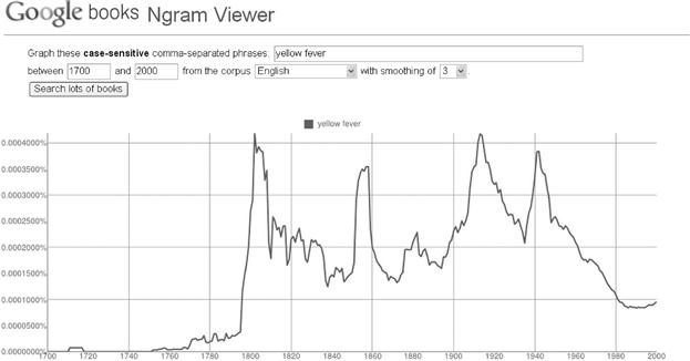
Figure 8.9 The frequency of occurrences of the phrase “yellow fever” in a large collection of literature from the years 1700 to 2000. The graph was automatically rendered by the Google Ngram Viewer.
We see that the term “yellow fever” (a mosquito-transmitted hepatitis) appeared in the literature beginning about 1800 (shortly after an outbreak in Philadelphia), with several subsequent peaks (around 1915 and 1945). The dates of the peaks correspond roughly to outbreaks of yellow fever in Philadelphia (epidemic of 1793), New Orleans (epidemic of 1853), with U.S. construction efforts in the Panama Canal (1904—1914), and World War II Pacific outbreaks (about 1942). Following the 1942 epidemic, an effective vaccine was available, and the incidence of yellow fever, as well as the occurrences of the “yellow fever” 2-gram, dropped precipitously. In this case, a simple review of ngram frequencies provides an accurate chart of historic yellow fever outbreaks.
Sleeping sickness is a disease caused by a protozoan parasite transmitted by the tsetse fly, and endemic to Africa. The 2-gram search on the term “sleeping sickness” demonstrates a sharp increase in the frequency of occurrence of the term at the turn of the 20th century (see Figure 8.10). The first, and largest, peak, about the year 1900, coincided with a historic epidemic of sleeping sickness. At that time, a plague decimated the population of rinderpest, the preferred animal reservoir of the tsetse fly, resulting in an increase in human bites; hence an increase in sleeping sickness. Once again, the ngram data set has given us insight into a human epidemic.
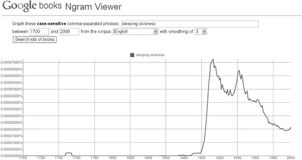
Figure 8.10 The frequency of occurrences of the term “sleeping sickness” in literature from the years 1700 to 2000. The graph was automatically rendered by the Google Ngram Viewer, available at http://books.google.com/ngrams.
Following the epidemic near the year 1900, the frequency of literary occurrences of “sleeping sickness” had a generally downwards trend, punctuated by a second, smaller peak about the time of World War II and a steady decline thereafter.
The Google Ngram Viewer supports simple lookups of term frequencies. For advanced analyses, such as finding co-occurrences of all ngrams against all other ngrams, data analysts would need to download the ngram data files, available at no cost from Google, and write their own programs suited to their tasks.
Use Case: Estimating Movie Preferences
Imagine you have all the preference data for every user of a large movie subscriber service, such as Netflix. You want to develop a system whereby the preference of any subscriber, for any movie, can be predicted. Here are some analytic options, listed in order of increasing complexity, omitting methods that require advanced mathematical skills.
1. Ignore your data and use experts. Movie reviewers are fairly good predictors of a movie’s appeal. If they were not good predictors, they would have been replaced by people with better predictive skills. For any movie, go to the newspapers and magazines and collect about 10 movie reviews. Average the review scores and use the average as the predictor for all of your subscribers. This method assumes that there is not a large divergence in preferences, from subscriber to subscriber, for most movies.
You can refine this method a bit by looking at the average subscriber scores, after the movie has been released. You can compare the scores of the individual experts to the average score of the subscribers. Scores from experts that closely matched the scores from the subscribers can be weighted a bit more heavily than experts whose scores were nothing like the average subscriber score.
2. Use all of your data, as it comes in, to produce an average subscriber score. Skip the experts—go straight to your own data. In most instances, you would expect that a particular user’s preference will come close to the average preference of the entire population in the data set, for any given movie.
3. Lump people into preference groups based on shared favorites. If Ann’s personal list of top-favored movies is the same as Fred’s top-favored list, then it’s likely that their preferences will coincide. For movies that Ann has seen but Fred has not, use Ann’s score as a predictor.
In a large data set, find an individual’s top 10 movie choices and add the individual to a group of individuals who share the same top 10 list. Use the average score for members of the group, for any particular movie, as that movie’s predictor for each of the members of the group.
As a refinement, find a group of people who share the top 10 and the bottom 10 scoring movies. Everyone in this group shares a love of the same top movies and a loathing for the same bottom movies.
4. Focus your refined predictions. For many movies, there really isn’t much of a spread in ratings. If just about everyone loves “Star Wars,” “Raiders of the Lost Ark,” and “It’s a Wonderful Life,” then there really is no need to provide an individual prediction for such movies. Likewise, if a movie is universally loathed or universally accepted as an “average” flick, then why would you want to use computationally intensive models for these movies?
Most data sets contain easy and difficult data objects. There is seldom any good reason to develop predictors for the easy data. In the case of movie predictors, if there is very little spread in a movie’s score, you can safely use the average rating as the predicted rating for all individuals. By removing all of the “easy” movies from your group-specific calculations, you reduce the total number of calculations for the data collection.
This method of eliminating the obvious has application in many different fields. As a program director at the National Cancer Institute, I was peripherally involved in efforts to predict cancer treatment options for patients diagnosed in different stages of disease. Traditionally, large numbers of patients, at every stage of disease, were included in a prediction model that employed a list of measurable clinical and pathological parameters (e.g., age and gender of patient, size of tumor, the presence of local or distant metastases). It turned out that early models produced predictions where none were necessary. If a patient had a tumor that was small, confined to its primary site of growth, and minimally invasive at its origin, then the treatment was always limited to surgical excision; there were no other options for treatment, and hence no reason to predict the best option for treatment. If a tumor was widely metastatic to distant organs at the time of diagnosis, then there were no available treatments that were known to cure the patient. By focusing their analyses on the subset of patients who could benefit from treatment, and for whom the best treatment option was not predetermined, the data analysts reduced the size and complexity of the data and simplified the problem.
References
19. Berman JJ. Methods in medical informatics: fundamentals of healthcare programming in Perl, Python, and Ruby. Boca Raton, FL: Chapman and Hall; 2010.
49. Berman JJ. Taxonomic guide to infectious diseases: understanding the biologic classes of pathogenic organisms. Waltham: Academic Press; 2012.
91. Gatty H. Finding your way without map or compass. Mineola: Dover; 1958.
92. Levenberg K. A method for the solution of certain non-linear problems in least squares. Q App Math. 1944;2:164–168.
93. Marquardt DW. An algorithm for the least-squares estimation of nonlinear parameters. SIAM J Appl Math. 1963;11:431–441.
94. Lee J, Pham M, Lee J, et al. Processing SPARQL queries with regular expressions in RDF databases. BMC Bioinform. 2011;12(Suppl. 2):S6.
95. Thompson CW. The trick to D.C police force’s 94% closure rate for 2011 homicides. The Washington Post February 19, 2012.
96. Kaplan EL, Meier P. Nonparametric estimation from incomplete observations. J Am Statist Assn. 1958;53:457–481.
97. SEER. Surveillance epidemiology end results. National Cancer Institute April 22, 2013; Available from: http://seer.cancer.gov/; April 22, 2013; viewed.
98. Berman JJ, Moore GW. The role of cell death in the growth of preneoplastic lesions: a Monte Carlo simulation model. Cell Prolif. 1992;25:549–557.
99. Perez-Pena R. New York’s tally of heat deaths draws scrutiny. The New York Times August 18, 2006.
100. Chiang S. Heat waves, the “other” natural disaster: perspectives on an often ignored epidemic. Global Pulse American Medical Student Association 2006.
![]() “To view the full reference list for the book, click here”
“To view the full reference list for the book, click here”