
Advanced Output and Pen Settings
Learning Objectives
In this chapter, we introduce and thoroughly cover the concept of advanced output, which includes the concept of the ctb pen settings file. We specifically discuss
By the end of the chapter, you will be well versed in applying this critical concept to your design work.
Estimated time for completion of chapter: 1 hour.
19.1 Introduction to Advanced Output and Pen Settings
This chapter is the last of three that talk about some aspect of printing and output. Although general and advanced printing was already explored in Chapters 9 and 10, a crucial piece of information was omitted. This information concerns pen settings and other advanced output techniques, essential knowledge for professional-looking output. The reasons we are doing this are outlined next.
Most designs are rather complex when everything has been added to the drawing. Lines cross other lines and text is everywhere. The eye needs to be able to quickly and easily focus on what is essential, for example, the outlines of the walls of a floor plan or the outline of the mechanical part among the many other elements in the design.
This is analogous to a mix of a rock song. Not every instrument can be the loudest; something has to give, and a balance needs to be found so the nuances and color of the music can stand out. Usually, when the singer sings, other instruments have to be turned down a bit, but when a guitar solos, its volume gets turned up, and so on. Otherwise, it would be a loud, obnoxious mess with all sounds competing for attention.
Such is the situation with a pencil and paper drawing. All lines cannot be the same thickness and darkness. Such a monochrome mess would be confusing to look at. Draftspersons have known this for as long as the profession has been around and, as a result, have numerous pencils at their disposal, ranging from lightest (hard lead) to darkest (soft lead) and everything in between. They use the darkest for the primary design and the lighter leads for all else.
AutoCAD has a similar philosophy. Lines must have differences in thickness for some to stand out more than others. But, how do we show these differences, now that we no longer use pencil leads? The answer is to use color. Colors are then assigned line thicknesses, and assuming of course a consistent and intelligent pattern of use on the part of the designer, differences in line thickness can easily be incorporated into the design by assigning certain colors to the primary geometry. As you can see, colors play a dual role. They allow you to tell geometries apart not only on the screen but also on paper. The challenge then is to set up a table that assigns colors to certain line thicknesses, and most important, stick to using these colors properly and consistently.
19.2 Setting Standards
The thing you need to determine before anything gets touched in AutoCAD is what colors will be used to represent the most important geometry. You actually did this back in Chapter 3, when layers were introduced. This, of course, is something done once by the CAD manager and usually is applied to all drawings. All we are really doing is establishing a “pecking order,” so to speak, for colors. This order corresponds from the most important (hence, thickest) to the least important (the thinnest) pen setting. There are no hard rules here as far as what colors to use; it is more or less arbitrary, although convention favors some colors over others.
Let us say (based on common convention) that green is the A-Walls layer color in our architecture plan and is assigned the thickest lineweight. The A-Windows layer is typically red and the A-Doors layer yellow. Both those objects are almost as important as the walls but can be set a bit thinner. The A-Furniture and A-Appliances layer is magenta and thinner still. A-Text and A-Dims layers are cyan and thinner yet. Finally in our hypothetical example is hatch. Those dense patterns really need to be light, so as not to overwhelm the drawing, so we assign them a gray color and the thinnest lineweight of all.
Although this is just an arbitrary example, it is also exactly the thought process you need to go through to have a rough idea of how things will look. Once this is generally documented, you can move on to the actual settings.
19.3 The CTB File
The CTB file is the file that needs to be modified to set the pen settings. It is where you assign pen thickness to a color and where we spend our time for the remainder of the chapter. We open the CTB file, give it a name, modify settings, and save. Then, as you set up plots, you assign the CTB file to those plots, which is a permanent, “do- once” action.
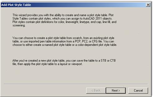
There are two ways to set up the CTB file: either by accessing it in the Page Setup Manager or as a separate action, which is what we do. Select Tools→Wizards→Add Plot Style Table… from the drop-down menu. The dialog box shown in Figure 19.1 appears.
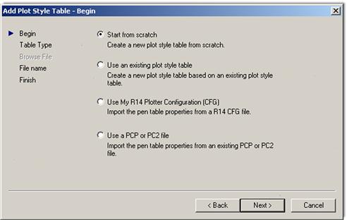
Press Next>and you are taken to the next page of this dialog box (Figure 19.2), where you select the first option, Start from scratch. This begins a new line setting procedure from the default base values.
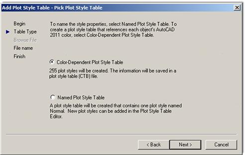
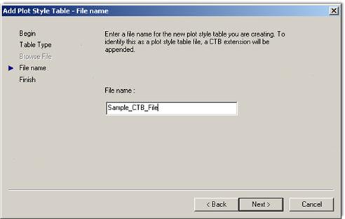
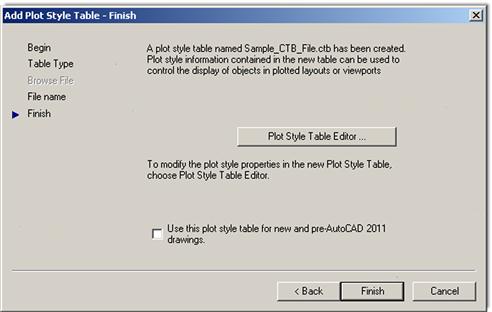
Press Next>and you are taken to the next page of this dialog box (Figure 19.3); select the Color-Dependent Plot Style Table choice. This is the only choice we look at; the named plot styles are not covered and are rarely used. Press Next>and you are taken to the next page of this dialog box (Figure 19.4). Give the new CTB file a descriptive name, like StandardCTB, ColorCTB, or anything else that will be recognized. Here, it is Sample_CTB_File.
Press Next>for the final step (Figure 19.5). Here, we are interested in the Plot Style Table Editor… to actually set the lineweights. Press that button and you are taken to our final destination, the actual Plot Style Table Editor, shown in Figure 19.6.
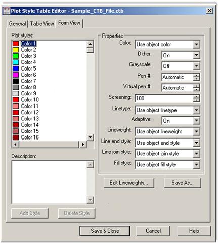
Here is where we set the colors, weights, and a few other tricks. Stay in the default Form View (referring to the tabs on top), as we do not need the information in any other format. Familiarize yourself with this editor. On the left is the palette of the available 255 colors, and on the right is a variety of effects and settings you can impart on whatever color or colors you select from the palette. All the tools are there; you just need to proceed carefully.
Step 1
The first thing you need to do is to set all the colors in the color palette to black. As the default settings are now, each color is interpreted literally, which means that if you are sending your design to a color plotter, all the linework will come out in color, exactly as seen on the screen. This is a very desirable outcome in certain situations but not in most (we talk about this more later on). For now, we need to monochrome everything so we can work on line thicknesses.
![]() Select all the colors (1–255) in the palette by clicking your mouse in the empty white area just to the right of the colors, holding down the button, and sweeping top to bottom. Holding down the Shift key and clicking the first and last entry accomplishes the same thing.
Select all the colors (1–255) in the palette by clicking your mouse in the empty white area just to the right of the colors, holding down the button, and sweeping top to bottom. Holding down the Shift key and clicking the first and last entry accomplishes the same thing.
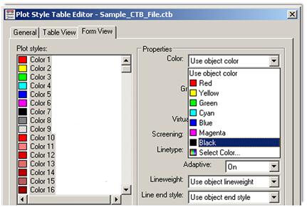
![]() Then, as all the colors are highlighted blue, select the very first drop-down choice in Properties, called Color:, and select Black (Figure 19.7). All colors are assigned black ink.
Then, as all the colors are highlighted blue, select the very first drop-down choice in Properties, called Color:, and select Black (Figure 19.7). All colors are assigned black ink.
![]() Clear the palette choices by clicking randomly anywhere in the white empty area of the left side of the palette, and test out your changes by clicking random colors. They should all be black.
Clear the palette choices by clicking randomly anywhere in the white empty area of the left side of the palette, and test out your changes by clicking random colors. They should all be black.
Step 2
Next we need to set the actual thicknesses. This is done in the Lineweight: drop-down menu, about halfway down the list on the right. Currently, it says Use object lineweight, which simply means nothing is set specifically and all lineweights are the same (the default value is 0.1900 mm).
Here, we need to discuss a major point you must understand in working with this feature. The actual line sizes are of secondary importance to the relative differences between the sizes. This means that you need not worry too much about how big 0.2 mm or 0.15 mm is, although that is the range of sizes that happen to look just right on paper. What is more important is that there is a large enough difference between the choices (0.2 mm vs. 0.15 mm as opposed to 0.2 mm vs. 0.18 mm), so the eye can notice this difference. You can just as easily use 0.25 mm and 0.3 mm, but as you get up in the higher numbers, all lines end up being overly thick, so it is best to stick to the range of 0.25 mm on the upper end and 0.05 mm on the lower end.
Let us put this all to use and set some values:
![]() Click on and select color 3 (green); set Lineweight to 0.2500 mm.
Click on and select color 3 (green); set Lineweight to 0.2500 mm.
![]() Click on and select color 1 (red); set Lineweight to 0.1900 mm.
Click on and select color 1 (red); set Lineweight to 0.1900 mm.
![]() Click on and select color 2 (yellow); set Lineweight to 0.1900 mm.
Click on and select color 2 (yellow); set Lineweight to 0.1900 mm.
![]() Click on and select color 4 (cyan); set Lineweight to 0.1500 mm.
Click on and select color 4 (cyan); set Lineweight to 0.1500 mm.
![]() Click on and select color 6 (magenta); set Lineweight to 0.1500 mm.
Click on and select color 6 (magenta); set Lineweight to 0.1500 mm.
![]() Click on and select color 9 (gray); set Lineweight to 0.1000 mm.
Click on and select color 9 (gray); set Lineweight to 0.1000 mm.
Now, to put it all together, recall the Level 1 apartment drawing. The A-Walls layer was colored green and appears darkest (0.2500 mm) as required. The A-Doors and A-Windows layers were yellow and red, respectively, and are slightly lighter (0.1900 mm), followed by the A-Text and the A-Appliances (or A-Furniture) layers, colored cyan and magenta, respectively, lighter still (0.1500 mm). Last were the gray-colored hatch patterns coming in at (0.1000 mm).
So, will these particular lineweight choices look good? The drawing will certainly look more professional and features will stand apart from each other. The exact values and colors are all determined by the architect, engineer, or designer, as this person inspects the results and tweaks the lineweights as needed. This is an extensive trial and error procedure, and not all individuals select the same settings; however, in any professional office, these techniques must be used regardless of exactly what specific settings are set. Nothing screams amateur more than a monochrome drawing with equal lineweights.
Step 3
To complete the procedure, press Save & Close and Finish in the Add Plot Style Table - Finish dialog box. Then, open a drawing, such as the Level 1 floor plan, if available. Type in plot and set the drawing up for plotting or printing as outlined in Chapter 10, being sure this time to select Sample.ctb instead of monochrome.ctb in the appropriate field.
19.4 Additional CTB File Features
We briefly cover two other useful features about which you should know. The first one was already alluded to earlier. When you selected all the colors and turned them to black, you could have left a few out. These colors would then have been plotted in color. So this action is certainly not an “all color” or “all black” deal. You can mix and match, and what is typically done in a piping or electrical plan (for example) is that the entire floor or site plan is monochrome, but the pipes or cables and wiring are left in vivid red, blue, or green (yellow and cyan do not show up well on white paper). The intent of the design is much clearer. It is a great effect, although it can obviously be derailed by not having a color capable printer or plotter.
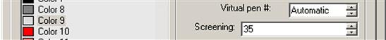
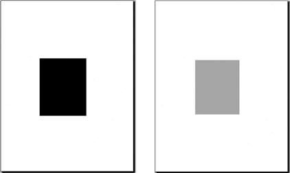
The second feature has to do with the screening effect. What this does is lighten any color of your choosing so less ink is put on the paper during printing. It is literally “faded out” and is a very useful trick, as we will see with an example. The color most often chosen to be screened is color 9 (gray), as it is a natural for this effect and already looks faded, although any color can be used.
To screen a color, select it in the editor as outlined just previously, and go to the Screening field (as seen in Figure 19.8). Then, use the arrows or type in a value. Typically, the screening effect is most useful around 30–40%. Then proceed as before with saving and plotting.
So, what is the effect like? Figure 19.9 shows two solid fills on the same solid white color: one with no screening (left), meaning it is 100%, and one with the 35% screening (right) as viewed through the plot preview window.
It is a great trick to use. Here are some ideas where you can do this:
![]() In a key plan, where the area of work is grayed out and screened, yet the underlying architecture is still visible.
In a key plan, where the area of work is grayed out and screened, yet the underlying architecture is still visible.
![]() In an area of work on a demolition plan, where the area to be demolished for a redesign is grayed out, with all the features still visible.
In an area of work on a demolition plan, where the area to be demolished for a redesign is grayed out, with all the features still visible.
![]() As a rendering tool, to create contrasting shading.
As a rendering tool, to create contrasting shading.
![]() As a rendering tool, to give a sense of depth or solidness to exterior elevations.
As a rendering tool, to give a sense of depth or solidness to exterior elevations.
There are many more applications.
19.5 The LWT Option
An additional Lineweight (LWT) option is available to you, and it is one often noticed first because of its visibility. It is found all the way on the right among your bottom of the screen menu choices, as shown in Figure 19.10.
This is not the same as covered earlier in this chapter. The CTB file and setting the lineweights in that manner gets you only plotted results. This means that on screen all the lines remain the same size, regardless of the settings. The results of the CTB settings can be seen only on paper.
In contrast, the LWT option allows you to set line thickness that is actually visible on screen. It is a rather interesting effect. Once set, the lines remain at that thickness regardless of how much you zoom in or out. Opinions on this effect vary among AutoCAD users. Some think it is very useful and accurately reflects what will be printed, while others see it as a distraction and are perfectly fine remembering what colors are set to what line thickness via the CTB method.
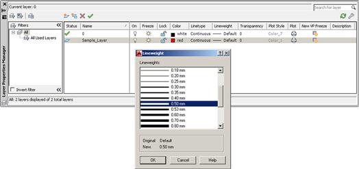
It is up to you to experiment and see where you stand. To set the line thickness using this option, you need to go to the Layers dialog box, create a new layer (usually with a color), and set the value under the Lineweight header, as seen in Figure 19.11 (with 0.50 mm used for clarity). The result is seen in Figure 19.12.
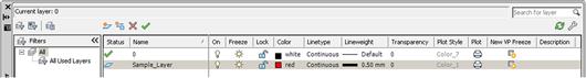
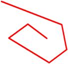
After setting this layer as current, draw something. Notice that the line is thin, as if nothing happened. Now press in the LWT button; the line suddenly turns thicker, as seen in Figure 19.13. This is exactly how it will print. Note, however, that CTB settings supersede the LWT settings, and you would leave the CTB settings as default if you are inclined to use this LWT feature instead.
19.6 Level 2 Drawing Project (9 of 10): Architectural Floor Plan
For Part 9 of the drawing project, you do two things. You first set up a master title block that contains attributes. It is reused numerous times when we set up full Paper Space layout tabs in Part 10, in the next chapter. Then, use what you learned in this chapter to create a useable CTB file.
Step 1. Apply attributes to create an intelligent title block. You can use a modified version of the title block first created in Chapter 10. Start out with that basic template, insert it into a Paper Space tab, and add some extra lines to the lower right part of the title block (see Figure 19.14). Then, following what you learned in Chapter 18, add text for the following categories, followed by the attributes themselves. Make sure you are drawing on a title block layer (color: white).
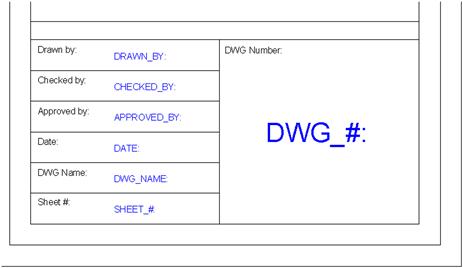
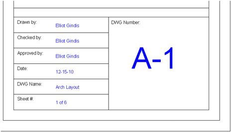
Step 2. When you have filled everything in, make a block of the entire title block and either fill in the Xs right away or leave them as variables until you set up the rest of the Paper Space layout in the next chapter. Figure 19.15 shows the title block filled in with information after it was made into a block.
Step 3. The next step is to assign proper lineweights to the CTB file of the architectural design. Assume the standard we have been following and make green the darkest line, followed by yellow and red, then all the others. The exact values are up to you.
Summary
You should understand and know how to use the following concepts before moving on to Chapter 20:
Exercise
1. For practice, create a brand-new CTB file. Call it Ch_19_Sample_File. Monochrome all colors and assign the following thicknesses to the listed colors as seen next:
![]() Color 5, blue, use object lineweight
Color 5, blue, use object lineweight
![]() Color 9, gray, use object lineweight
Color 9, gray, use object lineweight
Screen color 9 to 30%. (Difficulty level: Easy; Time to completion:<10 minutes.)