
Anomaly-Based Detection with Statistical Data
Abstract
Network Security Monitoring is based upon the collection of data to perform detection and analysis. With the collection of a large amount of data, it makes sense that a SOC should have the ability to generate statistical data from existing data, and that these statistics can be used for detection and analysis. In this chapter we will discuss methods for generating statistical data that can be used to support detection, including near real-time detection and retrospective detection. This will focus on the use of various NetFlow tools like rwstats and rwcount. We will also discuss methods for visualizing statistics by using Gnuplot and the Google Charts API. This chapter will provide several practical examples of useful statistics that can be generated from NSM data.
Keywords
Network Security Monitoring; Analysis; Detection; Statistics; Statistical Analysis; Rwcount; Rwfilter; Rwstats; NetFlow; Gnuplot; Google Charts; Afterglow; Link Graph; Line Graph
Chapter Contents
Furthering Detection with Statistics
Visualizing Statistics with Gnuplot
Visualizing Statistics with Google Charts
Network Security Monitoring is based upon the collection of data to perform detection and analysis. With the collection of a large amount of data, it makes sense that a SOC should have the ability to generate statistical data from existing data, and that these statistics can be used for detection and analysis. In this chapter we will discuss methods for generating statistical data that can be used to support detection, including near real-time detection and retrospective detection.
Statistical data is data derived from the collection, organization, analysis, interpretation and presentation of existing data1. With the immense amount of data that an NSM team is tasked with parsing, statistical data can play a large role in detection and analysis, from the analysis of the traffic generated by a particularly hostile host, to revealing the total visibility for a new sensor. In the current NSM landscape, the big name vendors most prominently push statistical data in the form of dashboards within dashboards. While this is used partly for justifying wall mounting 70 inch plasma TV’s in your SOC and to wow your superior’s superior, it turns out that this data can actually be immensely useful if it is applied in the right way.
Top Talkers with SiLK
A simple example of statistical data is a list of top talkers on your network. This list identifies the friendly devices that are responsible for the largest amount of communication on a monitored network segment. The NSM team within a SOC can use top talker statistics to identify things like devices that have a suspiciously large amount of outbound traffic to external hosts, or perhaps to find friendly hosts that are infected with malware connecting to a large number of suspicious external IP addresses. This is providing detection that signatures cannot, because this is a true network anomaly.
The ability to generate a top talkers list can be challenging without the right tools and access to network data. However, session data analysis tools like SiLK and Argus make this task trivial.
In Chapter 4, we discussed various methods for collection of session data and basic methods of parsing it. There we discussed SiLK, a tool used for the efficient collection, storage and analysis of flow data. Within SiLK there are a number of tools that are useful for generating statistics and metrics for many scenarios. SiLK operates by requiring the user to identify the data they want to use as the source of a data set, then allowing the user to choose from a variety of tools that can be used for displaying, sorting, counting, grouping, and mating data from that set. From these tools, we can use rwstats and rwcount to generate a top talkers list. Let’s look at how we can do this.
While many people will use SiLK for directly viewing flow data, rwstats is one of the most powerful ways to really utilize session data for gaining a better understanding of your environment, conducting incident response, and finding evil. In every environment that I’ve seen SiLK deployed, rwstats is always the most frequently used statistical data source. We will start by using rwstats to output a list of top talkers.
As with all uses of SiLK, I recommend that you begin by generating an rwfilter command that you can use to verify the data set you intend to use to generate statistics. Generally, this can be as easy as making the filter and piping the resultant data to rwcut. This will output the results of the rwfilter command so that you can be sure the data set you are working with is correct. If you aren’t familiar with rwfilter usage and piping output between rwtools, then now might be a good time to review Chapter 4 before reading further. For the majority of these examples, we’ll be using basic examples of rwfilter queries so that anyone can follow along using their current “out of the box” SiLK deployment.
Rwstats only requires that you specify three things: an input parameter, a set of fields that you wish to generate statistics for, and the stopping condition by which you wish to limit the results. The input parameter can either be a filename listed on the command line, or in the more common case, data being read from standard input from the result of an rwfilter command. This input should be fed straight from rwfilter without being parsed by the rwcut command. The set of fields that you specify represents a user-defined key by which SiLK flow records are to be grouped. Data that matches that key is stored in bins for each unique match. The volume of these bins (be it total bytes, records, packets, or number of distinct communication records) is then used to generate a list ordered by that volume size from top to bottom (default), or from bottom to top, depending on the user’s choosing. The stopping condition is used to limit the results that you’re generating and can be limited by defining a total count (print 20 bins), a value threshold (print bins whose byte count is less than 400), or a percentage of total specified volume (print bins that contain at least 10% of all the packets).
Now that we have an understanding of how rwstats works, the first step toward generating a list of top talkers is to make a functional rwfilter command that will generate the data that we want to examine. Following that, we use the pipe symbol to send that data to rwstats. That command looks like this:
rwfilter --start-date = 2013/08/26:14 --any-address = 102.123.0.0/16 --type = all --pass = stdout | rwstats --top --count = 20 --fields = sip,dip --value = bytes
In this example, the rwfilter command gathers all of the flow records collected during the 1400 hour of August 8th, and only examines traffic in the 102.123.0.0/16 IP range. That data is piped to rwstats, which will generate a list of the top 20 (--count = 20) source and destination IP address combinations (--fields = sip,dip) for the data in that filter, sorted by bytes (--value = bytes).
Another way to achieve the same results is to pass the results of the rwfilter command to a file, and then use rwstats to parse that file. These two commands will do this, using a file named test.rwf:
rwfilter --start-date = 2013/08/26:14 --any-address = 102.123.0.0/16 --type = all --pass = stdout > test.rwf
rwstats test.rwf --top --count = 20 --fields = sip,dip --value = bytes
The results from these commands are shown in Figure 11.1.
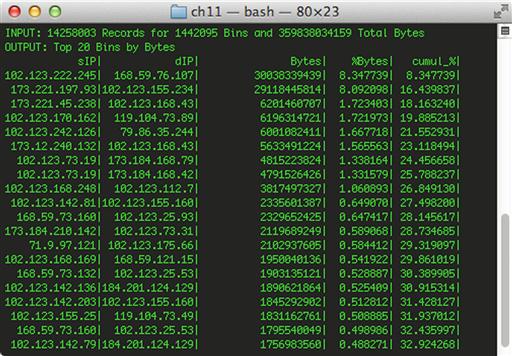
In the data shown in Figure 11.1, there are several extremely busy devices on the local network. In cases where this is unexpected, this should lead to further examination. Here, we see that the host 102.123.222.245 appears to be responsible for a large amount of traffic being generated. We can generate more statistics to help narrow down its communication.
By running the same command, this time substituting the CIDR range for our top talkers IP address in the rwfilter statement, we can see the hosts that it is communicating with that are responsible for generating all of this traffic.
rwfilter --start-date = 2013/08/26:14 --any-address = 102.123.222.245 --type = all --pass = stdout | rwstats --top --count = 5 --fields = sip,dip --value = bytes
The statistics generated by this query are shown in Figure 11.2.
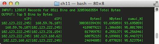
This helps identify the “who” in relation to this anomalous high amount of traffic. We can identify the “what” by changing our search criteria to attempt to identify common services observed from the communication between these devices.
rwfilter --start-date = 2013/08/26:14 --any-address = 102.123.222.245 --type = all --pass = stdout | rwstats --top --count = 5 --fields = sip,sport,dip --value = bytes
In this command, we use the same set of data, but tell rwstats to use the source port field as another criterion for statistics generation. Figure 11.3 shows us the results of this query.
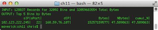
It appears that our culprit is associated with some type of SSH connection, but before consulting with the user or another data source to verify, let’s generate some more statistics that can help us identify the “when” regarding the timing of this communication. In order to do this, we’re going to step away from rwstats briefly and use rwcount to identify the time period when this communication was taking place. Rwcount is a tool in the SiLK analysis package that summarizes SiLK flow records across time. It does this by counting the records in the input stream and grouping their bytes and packet totals into time bins. By default, piping an rwfilter command directly to rwcount will provide a table that represents the volume of records, bytes, and packets seen in every 30 second interval within your rwfilter results. Using the --bin-size option will allow you to change that by specifying a different second value. With that in mind, we will use the following command:
rwfilter --start-date = 2013/08/26:14 --any-address = 102.123.222.245 --sport = 22 --type = all --pass = stdout | rwcount --bin-size = 600
Since we’re trying to identify when this port 22 traffic occurred, we have edited the rwfilter to use the --sport = 22 option, and we have replaced rwstats with rwcount to evaluate the time unit where the data exists. We’ll talk more about rwcount later in this chapter, but for now we have used the --bin-size option to examine the traffic with 10 minute (600 second) bins. The results of this command are shown in Figure 11.4.

We can see here that the data transfer appears to be relatively consistent over time. This would indicate that the SSH tunnel was probably being used to transfer a large chunk data. This could be something malicious such as data exfiltration, or something as simple as a user using the SCP tool to transfer something to another system for backup purposes. Determining the true answer to this question would require the analysis of additional data sources, but the statistics we’ve generated here should give the analyst an idea of where to look next.
Service Discovery with SiLK
Rwstats can also be used for performing discovery activities for friendly assets on your own local network. In an ideal situation, the SOC is notified any time a new server is placed on a production network that the SOC is responsible for protecting. In reality, analysts are rarely presented with this documentation in a timely manner. However, as long as these servers fall into the same range as what you are responsible for protecting, you should have mechanisms in place to detect their presence. This will not only help you keep tabs on friendly devices that have been deployed, but also on unauthorized and rogue servers that might be deployed by internal users, or the adversary.
We can use rwstats can identify these servers with relative ease. In this example, I’ll identify a number of key servers that regularly communicate to devices outside of the local network. This process begins with creating an rwfilter to gather the data set you would like to generate statistics from. In an ideal scenario, this type of query is run on a periodic basis and examined continually. This can help to catch rogue servers that might be put in place only temporarily, but then are shut down.
In this example, we will be working with a file generated by rwfilter so that we can simply pass it to rwstats rather than continually generating the data set and piping it over. To do this, we can use a filter like this that will generate a data set based upon all of the traffic for a particular time interval and pass that data to a file called sample.rw.
rwfilter --start-date = 2013/08/28:00 --end-date = 2013/08/28:23 --type = all --protocol = 0- --pass = sample.rw
With a data set ready for parsing, now we have to determine what statistic we want to generate. When generating statistics, it is a good idea to begin with a question. Then, you can write out the question and “convert” it to rwstats syntax to achieve the data you are looking for. As a sample of this methodology, let’s ask ourselves, “What local devices communicate the most from the common server ports, 1-1024?” This question has multiple potential answers. The delineation of what defines “top” in “top talker” can be a determining factor in getting the real results you want. In this example we’ll rephrase the question to say, “What are the top 20 local devices that talk from source ports 1-1024 to the most distinctly different destination IP addresses outside of my local network?” Converted to an rwstats command, this question looks like this:
rwfilter sample.rw --type = out,outweb --sport = 1-1024 --pass = stdout | rwstats --fields = sip,sport --count = 20 --value = dip-distinct
The results of this query are shown in Figure 11.5.

This query provides results showing the top 20 local servers (--count = 20) by Source IP address and port (--fields = sip,sport) as determined by recognizing the amount of external devices that these servers communicated with (--value = dip-distinct). The data set this query is pulled from is limited by running rwfilter on the sample.rw data set we’ve already generated, and only passing the outbound traffic from ports 1-1024 to rwstats (--type = out,outweb --sport = 1-1024).
This gives us some of the data we want, but what about server traffic that doesn’t involve communication from external hosts? If your flow collector (a sensor or a router) is position to collect internal to internal traffic, we can include this as well by adding int2int to the –type option.
Another thing we can do to enhance the quality of this data and to set us up better for statistical data we will generate later, is to limit it to only source IP addresses that exist within the network ranges we are responsible for protecting. This will usually be the values that are defined in the SiLK sensor.conf file as the internal IP blocks. The best way to handle this is to create a set consisting of those internal IP blocks. SiLK rwtools use set files to reference groups of IP addresses. To create a set file, simply place all of the IP addresses (including CIDR ranges) in a text file, and then convert it to a set file using this rwsetbuild command:
rwsetbuild local.txt local.set
Here, rwsetbuild takes in the list of IP blocks specified in the local.txt file, and outputs the set file named local.set. With the set file created, we can use the following command to get the data we want:
rwfilter sample.rw --sipset = local.set --type = int2int,out,outweb --sport = 1-1024 --pass = stdout | rwstats --fields = sip,sport --count = 20 --value = dip-distinct
Notice here that the --sipset option is used with the rwfilter command to limit the data appropriately to only source IP addresses that fall within the scope of the network we are responsible for protecting.
With minimal modifications to the methods we’ve already used, you can narrow these commands to fit into your own environment with incredible precision. For instance, while we’re only examining the top 20 matches for each query, you might determine that any device resembling a server should be considered in your query if it communications with at least 10 unique devices. In order to get a list of devices matching that criteria, simply change --count = 20 to --threshold = 10. You can manipulate the results more by focusing the port range or making new set files to focus on. It is important to note here that we’re searching with a focus on the service, and in specifying --fields = sip,sport, it means that you are displaying the top source address and source port combinations. If the idea is to identify top talking servers in general by total number of distinctly different destination IP addresses, it is important to remove the sport field delimiter in the previous rwstats command in order to sum up the total amount of connections that each particular device talks to entirely, like this:
rwfilter sample.rw --sipset = local.set --type = all --sport = 1-1024 --pass = stdout| rwstats --fields = sip --count = 20 --value = dip-distinct
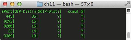
Taking the results of this query and performing additional rwstats commands to drill down on specific addresses (as seen in previous examples) will yield more information regarding what services are running on devices appearing in the lists we’ve generated. For instance, if you wanted to drill down on the services running on 192.168.1.21, you could identify a “service” by individual source ports with at least 10 unique outbound communications. You can narrow the rwfilter to include this address and change the rwstats command to consider this threshold parameter:
rwfilter sample.rw --saddress = 192.168.1.21 --type = all --pass = stdout| rwstats --fields = sport --threshold = 10 --value = dip-distinct
The output from this command is shown in Figure 11.6.
There is an excellent article about performing this type of asset identification using session data written by Austin Whisnant and Sid Faber2. In their article, “Network Profiling Using Flow”, they walk the SiLK user through a very detailed methodology for obtaining a network profile of critical assets and servers via a number of SiLK tools, primarily leveraging rwstats for discovery. They even provide a series of scripts that will allow you to automate this discovery by creating a sample of data via rwfilter (as seen above in creating sample.rw). Following their whitepaper will result in the development of an accurate asset model as well as specific sets to aid in further SiLK queries. This is useful for building friendly intelligence (which is discussed in Chapter 14) and for detection. Their paper serves as a great compliment to this chapter.
The examples Whisnant and Faber provide also do a good job of making sure that what you’re seeing is relevant data with high accuracy. As an example of this accuracy, I’ve converted some of the query statements from “Network Profiling Using Flow” into quick one-liners. Give these a try to obtain detail on services hosted by your network:
Web Servers
rwfilter sample.rw --type = outweb --sport = 80,443,8080 --protocol = 6 --packets = 4- --ack-flag = 1 --pass = stdout|rwstats --fields = sip --percentage = 1 --bytes --no-titles|cut -f 1 -d “|”|rwsetbuild > web_servers.set ; echo Potential Web Servers:;rwfilter sample.rw --type = outweb --sport = 80,443,8080 --protocol = 6 --packets = 4- --ack-flag = 1 --sipset = web_servers.set --pass = stdout|rwuniq --fields = sip,sport --bytes --sort-output
Email Servers
echo Potential SMTP servers ;rwfilter sample.rw --type = out --sport = 25,465,110,995,143,993 --protocol = 6 --packets = 4- --ack-flag = 1 --pass = stdout|rwset --sip-file = smtpservers.set ;rwfilter sample.rw --type = out --sport = 25,465,110,995,143,993 --sipset = smtpservers.set --protocol = 6 --packets = 4- --ack-flag = 1 --pass = stdout|rwuniq --fields = sip --bytes --sort-output
DNS Servers
echo DNS Servers: ;rwfilter sample.rw --type = out --sport = 53 --protocol = 17 --pass = stdout|rwstats --fields = sip --percentage = 1 --packets --no-titles|cut -f 1 -d “|”| rwsetbuild > dns_servers.set ;rwsetcat dns_servers.set
VPN Servers
echo Potential VPNs: ;rwfilter sample.rw --type = out --protocol = 47,50,51 --pass = stdout|rwuniq --fields = sip --no-titles|cut -f 1 -d “|” |rwsetbuild > vpn.set ;rwfilter sample.rw --type = out --sipset = vpn.set --pass = stdout|rwuniq --fields = sip,protocol --bytes --sort-output
FTP Servers
echo -e “ Potential FTP Servers”; rwfilter sample.rw --type = out --protocol = 6 --packets = 4- --ack-flag = 1 --sport = 21 --pass = stdout|rwstats --fields = sip --percentage = 1 --bytes --no-titles|cut -f 1 -d “|”|rwsetbuild > ftpservers.set ;rwsetcat ftpservers.set ; echo FTP Servers making active connections: ;rwfilter sample.rw --type = out --sipset = ftpservers.set --sport = 20 --flags-initial = S/SAFR --pass = stdout|rwuniq --fields = sip
SSH Servers
echo -e “ Potential SSH Servers"; rwfilter sample.rw --type = out --protocol = 6 --packets = 4- --ack-flag = 1 --sport = 22 --pass = stdout|rwstats --fields = sip --percentage = 1 --bytes --no-titles|cut -f 1 -d “|"|rwsetbuild > ssh_servers.set ;rwsetcat ssh_servers.set
TELNET Servers
echo -e “ Potential Telnet Servers”; rwfilter sample.rw --type = out --protocol = 6 --packets = 4- --ack-flag = 1 --sport = 23 --pass = stdout|rwstats --fields = sip --percentage = 1 --bytes --no-titles|cut -f 1 -d “|”|rwsetbuild > telnet_servers.set ;rwsetcat telnet_servers.set
Leftover Servers
echo Leftover Servers: ;rwfilter sample.rw --type = out --sport = 1-19,24,26-52,54-499,501-1023 --pass = stdout|rwstats --fields = sport --percentage = 1
In a detection scenario, these commands would be run on a routine basis. The results of each run should be compared with previous runs, and when a new device running as a server pops up, it should be investigated.
Furthering Detection with Statistics
For most organizations, alert data and near real-time analysis provides the majority of reportable incidents on a network. When a new alert is generated, it is can be useful to generate statistical queries using session data that might help to detect the existence of similar indicators on other hosts.
As an example, let’s consider the alert shown in Figure 11.7.
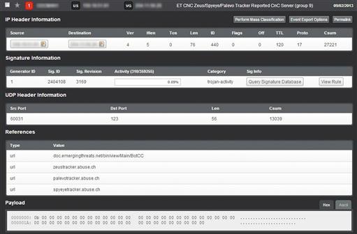
This alert was generated due to evidence of communications with a device known to be associated with Zeus botnet command and control. At first glance, this traffic looks like it might only be NTP traffic since the communication occurs as UDP traffic over port 123.
If you don’t have access to the packet payload (which might be the case in a retrospective analysis), then this event might be glossed over by some analysts because there are no other immediate indicators of a positive infection. There is a potential that this traffic is merely masking its communication by using the common NTP port. However, without additional detail this can’t be confirmed. For more detail, we need to dig down into the other communication of the host. To do this we’ll simply take the unique details of the alert and determine if the host is talking to additional “NTP servers” that might appear suspicious. We also add the destination country code field into this query, since we only expect our devices to be communicating with US-based NTP servers. The yields the following command:
rwfilter --start-date = 2013/09/02 --end-date = 2013/09/02 --any-address = 192.168.1.17 --aport = 123 --proto = 17 --type = all --pass = stdout | rwstats --top --fields = dip,dcc,dport --count = 20
This command utilizes rwstats to display the devices that 192.168.1.17 is communicating with over port 123. The results are shown in Figure 11.8. In this figure, some IP addresses have been anonymized.
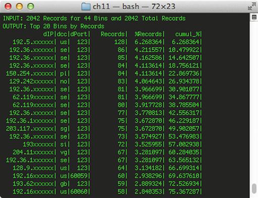
As you can see, the internal host in question appears to be communicating with multiple external hosts over port 123. The number of records associated with each host and the sheer amount of communication likely indicate that something malicious is occurring here, or at the very least, that this isn’t actually NTP traffic. In a typical scenario, a host will only synchronize NTP settings with one or a few easily identifiable hosts. The malicious nature of this traffic can be confirmed by the existence of foreign (Non-US) results, which wouldn’t be typical of NTP synchronization from a US-based host/network.
At this point, we have an incident that can be escalated. With that said, we also have an interesting indicator that can give us insight into detecting more than our IDS rules can provide. As before, we need to evaluate what we want before we jump into the data head first. In this event, we searched for all session data where 192.168.1.17 was a source address and where communication was occurring over UDP port 123. The overwhelming amount of UDP/123 traffic to so many external hosts led us to conclude that there was evil afoot. We can create a filter that matches these characteristics for any local address. That filter looks like this:
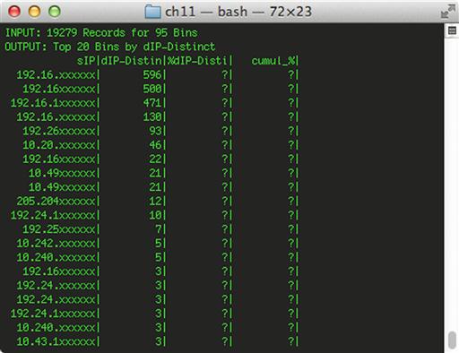
rwfilter --start-date = 2013/09/02 --end-date = 2013/09/02 --not-dipset = local.set --dport = 123 --proto = 17 --type = all --pass = stdout | rwstats --top --fields = sip --count = 20 --value = dip-distinct
The command above says to only examine data from 2013/09/02, what is not destined for the local network, and what is destined for port 123 using the UDP protocol. This data is sent to rwstats, which generates statistics for the top 20 distinct local IP addresses meeting these criteria (Figure 11.9).
We can narrow this filter down a bit more by giving it the ability to match only records where UDP/123 communication is observed going to non-US hosts, which was one of the criteria that indicated the original communication was suspicious. This query builds upon the previous one, but also passes the output of the first rwfilter instance to a second rwfilter instance that says to “fail” any records that contain a destination code of “us”, ensuring that we will only see data that is going to foreign countries.
rwfilter --start-date = 2013/09/02 --end-date = 2013/09/02 --not-dipset = local.set --dport = 123 --proto = 17 --type = all --pass = stdout | rwfilter --input-pipe = stdin --dcc = us --fail = stdout | rwstats --top --fields = sip --count = 20 --value = dip-distinct
Further examination of these results can lead to the successful discovery of malicious logic on other systems that are exhibiting a similar behavior as the original IDS alert. While an IDS alert might catch some instances of something malicious, it will catch all of them, which is where statistical analysis can come in handy. The example shown here was taken from a real world investigation where the analysis here yielded 9 additional infected hosts that the original IDS alert didn’t catch.
Visualizing Statistics with Gnuplot
The ability to visualize statistics provides useful insight that can’t always be as easily ascertained from raw numbers. One globally useful statistic that lends itself well to detection and the visualization of statistics is graphing throughput statistics. Being able to generate statistics and graph the total amount of throughput across a sensor interface or between two hosts is useful for detection on a number of fronts. Primarily, it can serve as a means of anomaly-based detection that will alert an analyst when a device generates or receives a significantly larger amount of traffic than normal. This can be useful for detecting outbound data exfiltration, an internal host being used to serve malware over the Internet, or an inbound Denial of Service attack. Throughput graphs can also help analysts narrow down their data queries to a more manageable time period, ultimately speeding up the analysis process.
One of the more useful tools for summarizing data across specific time intervals and generating relevant statistics is rwcount. Earlier, we used rwcount briefly to narrow down a specific time period where certain activity was occurring. Beyond this, rwcount can be used to provide an idea of how much data exists in any communication sequence(s). The simplest example of this would be to see how much data traverses a monitored network segment in a given day. As with almost all SiLK queries, this will start with an rwfilter command to focus on only the time interval you’re interested in. In this case, we’ll pipe that data to rwcount which will send the data into bins of a user-specified time interval in seconds. For example, to examine the total amount of Records, Bytes, and Packets per minute (--bin-size = 60) traversing your interface over a given hour, you can use the following command:
rwfilter --start-date = 2013/09/02:14 --proto = 0- --pass = stdout --type = all | rwcount --bin-size = 60
Variations of the original rwfilter will allow you to get creative in determining more specific metrics to base these throughput numbers on. These tables are pretty useful alone, but it can be easier to make sense of this data if you can visualize it.
As an example, let’s look back to the example in the previous section with the suspicious NTP traffic. If we dig further into the results shown in Figure 11.9 by using rwcount like the command above, we can see that multiple external IP addresses in the 204.2.134.0/24 IP range are also soliciting NTP client communications, which might indicate rogue devices configured to use non-local NTP servers. If we dig down further and examine the traffic over the course of the day, we just see equivalent amounts of data per minute (Figure 11.10); a table that doesn’t give much support in explaining the traffic:

In order to really visualize this data on a broad scale, we can literally draw the big picture. Since SiLK doesn’t possess the capability of doing this, we’ll massage the results of the SiLK query and pipe it to gnuplot for graphing. Gnuplot (http://www.gnuplot.info/) is a portable command-line driven graphing application. It isn’t the most intuitive plotting interface, but once you have a configuration to read from existing data, it is easily scripted into other tools.
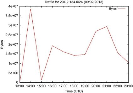
To make the data shown above more useful, our goal is to build a graph that represents the volume of bytes per hour for session data containing any address from the 204.2.134.0/24 IP range. We begin by using the same rwcount command as above, but with a bin size of 3600 to yield “per hour” results. The output of the rwcount command is sent through some command line massaging to generate a CSV file containing only the timestamp and the byte value for each timestamp. The command looks like this:
rwfilter --start-date = 2013/09/02 --any-address = 204.2.134.0/24 --proto = 0- --pass = stdout --type = all | rwcount --bin-size = 3600 –delimited =, --no-titles| cut -d “,” -f1,3 > hourly.csv
The resulting data look like this:
2013/09/02T13:00:00,146847.07
2013/09/02T14:00:00,38546884.51
2013/09/02T15:00:00,1420679.53
2013/09/02T16:00:00,19317394.19
2013/09/02T17:00:00,16165505.44
2013/09/02T18:00:00,14211784.42
2013/09/02T19:00:00,14724860.35
2013/09/02T20:00:00,26819890.91
2013/09/02T21:00:00,29361327.78
2013/09/02T22:00:00,15644357.97
2013/09/02T23:00:00,10523834.82
Next, we need to tell Gnuplot how to graph these statistics. This is done by creating a Gnuplot script. This script is read line-by-line, similar to a BASH script, but instead relies on Gnuplot parameters. You will also notice that it calls Gnuplot as its interpreter on the first line of the script. The script we will use for this example looks like this:
#! /usr/bin/gnuplot
set terminal postscript enhanced color solid
set output “hourly.ps”
set title “Traffic for 204.2.134.0/24 (09/02/2013)”
set xlabel “Time (UTC)”
set ylabel “Bytes”
set datafile separator “,”
set timefmt ‘%Y/%m/%dT%H:%M:%S’
set xdata time
plot ‘hourly.csv’ using 1:2 with lines title “Bytes”
If the postscript image format won’t work for you, then you can convert the image to a JPG in Linux via the convert command:
convert hourly.ps hourly.jpg
Finally, you are left with a completed Gnuplot throughput graph, shown in Figure 11.11.
You could easily use this example to create a BASH script to automatically pull data based on a date and host and generate a Gnuplot graph. An example of this might look like this:
#!/bin/bash
#traffic.plotter
echo “Enter Date: (Example:2013/09/02)”
read theday
echo “Enter Host: (Example:192.168.5.0/24)”
read thehost
if [ -z “theday” ]; then
echo “You forgot to enter the date.”
exit
fi
if [ -z “thehost” ]; then
echo “You forgot to enter a host to examine.”
exit
fi
rm hourly.csv
rm hourly.ps
rm hourly.jpg
rwfilter --start-date = $theday --any-address = $thehost --proto = 0- --pass = stdout --type = all -- | rwcount --bin-size = 3600 --delimited =, --no-titles| cut -d “,” -f1,3 > hourly.csv
gnuplot < < EOF
set terminal postscript enhanced color solid
set output “hourly.ps”
set title “Traffic for $thehost ($theday)”
set xlabel “Time (UTC)”
set ylabel “Bytes”
set datafile separator “,”
set timefmt ‘%Y/%m/%dT%H:%M:%S'
set xdata time
plot ‘hourly.csv’ using 1:2 with lines title “Bytes”
EOF
convert hourly.ps hourly.jpg
exit
This script will allow you to pick a particular date to generate a “bytes per hour” throughput graph for any given IP address or IP range. This script should be fairly easy to edit for your environment.
Visualizing Statistics with Google Charts
Another way to display throughput data and more is to leverage the Google Charts API (https://developers.google.com/chart/). Google offers a wide array of charts for conveying just about any data you can think of in an understandable and interactive fashion. Most of the charts generated with the API are cross-browser compatible and the Google Charts API is 100% free to use.
The biggest difference between Google Charts and Gnuplot for plotting SiLK records across time is the abundance of relevant examples. Gnuplot has been supported and under active development since 1986, and as such will do just about anything you could ever want as long as you’re able to gain an understanding of the Gnuplot language. Because Gnuplot has been the go-to plotting and charting utility for so long, there are endless examples of how to get what you want out of it. However, Google Charts is fairly new, so fewer examples exist for showing how to use it. Luckily, it is rapidly growing in popularity, and it is designed to easily fit what people want out of the box. In order to aid in adoption, Google created the Google Charts Workshop, which allows a user to browse and edit existing examples to try data in-line before going through the effort of coding it manually. The term “coding” is used loosely with Google Charts in that its syntax is relatively simple. For our purposes, we’re going to use simple examples where we take data from rwcount and port it to an HTML file that leverages the Google Charts API file. Most modern browsers should be able to display the results of these examples without the use of any add-ons or extensions.
As an example, let’s look at the same data that we just used in the previous Gnuplot example. We will use this data to generate a line chart. The first thing that you’ll notice when you examine the Google Charts API for creating a line chart is that the data it ingests isn’t as simple as a standard CSV file. The API will accept both JavaScript and Object Literal (OL) notation data tables. These data formats can be generated with various tools and libraries, but to keep this simple, we’ll go back to using some command line Kung Fu to convert our CSV output into OL data table format.
In the previous example we had a small CSV file with only 11 data points. In addition to that data, we need to add in column headings to define the independent and dependent variable names for each data point. In other words, we need to add “Data,Bytes” to the top of our csv file to denote the two columns, like this:
Date,Bytes
2013/09/02T13:00:00,146847.07
2013/09/02T14:00:00,38546884.51
2013/09/02T15:00:00,1420679.53
2013/09/02T16:00:00,19317394.19
2013/09/02T17:00:00,16165505.44
2013/09/02T18:00:00,14211784.42
2013/09/02T19:00:00,14724860.35
2013/09/02T20:00:00,26819890.91
2013/09/02T21:00:00,29361327.78
2013/09/02T22:00:00,15644357.97
2013/09/02T23:00:00,10523834.82
Now, we can reformat this CSV file into the correct OL data table format using a bit of sed replacement magic:
cat hourly.csv | sed “s/(.*),(.*)/[‘1’, 2],/g”|sed ‘$s/,$//’| sed “s/, ([A-Za-z].*)],/, ‘1’],/g”
At this point, our data look like this, and is ready to be ingested by the API:
[‘Date’, ‘Bytes’],
[‘2013/09/02T13:00:00’, 146847.07],
[‘2013/09/02T14:00:00’, 38546884.51],
[‘2013/09/02T15:00:00’, 1420679.53],
[‘2013/09/02T16:00:00’, 19317394.19],
[‘2013/09/02T17:00:00’, 16165505.44],
[‘2013/09/02T18:00:00’, 14211784.42],
[‘2013/09/02T19:00:00’, 14724860.35],
[‘2013/09/02T20:00:00’, 26819890.91],
[‘2013/09/02T21:00:00’, 29361327.78],
[‘2013/09/02T22:00:00’, 15644357.97],
[‘2013/09/02T23:00:00’, 10523834.82]
Now we can place this data into an HTML file that calls the API. The easiest way to do this is to refer back to Google’s documentation on the line chart and grab the sample code provided there. We’ve done this in the code below:
< html >
< head >
< script type = “text/javascript” src = “https://www.google.com/jsapi” > </script >
< script type = “text/javascript”>
google.load(“visualization”, “1”, {packages:[“corechart”]});
google.setOnLoadCallback(drawChart);
function drawChart() {
var data = google.visualization.arrayToDataTable([
[‘Date’, ‘Bytes’],
[‘2013/09/02 T13:00:00’, 146847.07],
[‘2013/09/02 T14:00:00’, 38546884.51],
[‘2013/09/02 T15:00:00’, 1420679.53],
[‘2013/09/02 T16:00:00’, 19317394.19],
[‘2013/09/02 T17:00:00’, 16165505.44],
[‘2013/09/02 T18:00:00’, 14211784.42],
[‘2013/09/02 T19:00:00’, 14724860.35],
[‘2013/09/02 T20:00:00’, 26819890.91],
[‘2013/09/02 T21:00:00’, 29361327.78],
[‘2013/09/02 T22:00:00’, 15644357.97],
[‘2013/09/02 T23:00:00’, 10523834.82]
]);
var options = {
title: ‘Traffic for 204.2.134.0-255’
};
var chart = new google.visualization.LineChart(document.getElementById(‘chart_div’));
chart.draw(data, options);
}
</script >
</head >
<body >
< div id = “chart_div” style = “width: 900px; height: 500px;” > </div >
</body >
</html >
Figure 11.12 shows the resulting graph in a browser, complete with mouse overs.

Just as we were able to script the previous Gnuplot example, we can also automate this Google Chart visualization. The methods shown below for automating this are crude for the sake of brevity, however, they work with little extra interaction.
From a working directory, we’ve created a directory called “googlecharts”. Within this directory we plan to build a number of templates that we can insert data into. The first template will be called linechart.html.
< html >
< head >
< script type = “text/javascript” src = “https://www.google.com/jsapi” > </script >
< script type = “text/javascript”>
google.load(“visualization”, “1”, {packages:[“corechart”]});
google.setOnLoadCallback(drawChart);
function drawChart() {
var data = google.visualization.arrayToDataTable([
dataplaceholder
]);
var options = {
title: ‘titleplaceholder’
};
var chart = new google.visualization.LineChart(document.getElementById(‘chart_div’));
chart.draw(data, options);
}
</script >
</head >
< body >
< div id = “chart_div” style = “width: 900px; height: 500px;” > </div >
</body >
</html >
You’ll notice that our linechart.html has two unique placeholders; one for the data table we’ll create (dataplaceholder) and one for the title that we want (titleplaceholder).
Now, in the root working directory, we’ll create our plotting utility, aptly named plotter.sh. The plotter utility is a BASH script that will generate graphs based on a user supplied rwfilter and rwcount command. It will take the output of these commands and parse it into the proper OL data table format and insert the data into a temporary file. The contents of that temporary file will be used to replace the data place holder in the googlecharts/linechart.html template. Since we also have a title place holder in the template, there is a variable in the plotter script where that can be defined.
##EDIT THIS##################################
title = ‘Traffic for 204.2.134.0-255’
rwfilter --start-date = 2013/09/02 T1 --any-address = 204.2.134.0/24 --type = all --proto = 0- --pass = stdout | rwcount --bin-size = 300 --delimited =, |
cut -d “,” -f1,3 |
#############################################
sed “s/(.*),(.*)/[‘1’, 2],/g”|sed ‘$s/,$//’| sed “s/, ([A-Za-z].*)],/, ‘1’],/g” > temp.test
sed '/dataplaceholder/{
s/dataplaceholder//g
r temp.test
}' googlechart/linechart.html | sed “s/titleplaceholder/${title}/g”
rm temp.test
}
linechart
When you run plotter.sh, it will use the template and insert the appropriate data into linechart.html.
The script we’ve shown here is simple and crude, but can be expanded to allow for rapid generation of Google Charts for detection and analysis use.
Visualizing Statistics with Afterglow
It is easy to get deep enough into data that it becomes a challenge to effectively communicate to others what that data represents. In fact, sometimes it is only in stepping back from the data that you can see really what is going on yourself. Afterglow is a Perl tool that facilitates the generation of link graphs that allow you to see a pictorial representation of how “things in lists” relate to each other. Afterglow takes two or three column CSV files as input and generates either a dot attributed graph language file (required by the graphviz library) or a GDF file that can be parsed by Gephi. The key thing to note is that Afterglow takes input data and generates output data that can be used for the generation of link graphs. The actual creation of those link graphs is left to third party tools, such as Graphviz which we will use here. There are numerous examples of how to use Afterglow to find relationships in a number of datasets on the Internet; PCAP and Sendmail are examples shown on Afterglow’s main webpage.
Before getting started with Afterglow, it is a good idea to first visit http://afterglow.sourceforge.net/ to read the user manual and get an idea of how it functions. Essentially, all you need to get going is a CSV file with data that you want to use, and if you pipe it to Afterglow correctly, you’ll have a link graph in no time.
First, download Afterglow and place it in a working directory. For this example, you’ll want to make sure you have access to SiLK tools in order to make these examples seamless. After downloading and unzipping Afterglow, you might need to install a Perl module (depending on your current installation). If you do need it, run the following:
sudo /usr/bin/perl -MCPAN -e‘install Text::CSV’
We’ll be using visualization tools provided by Graphviz, which can be installed with the package management utility used by your Linux distribution. Graphviz is an open source visualization software from AT&T Research that contains numerous graphing utilities that can each be used to provide their own interpretation of link graphs. For documentation on each graphing tool included with Graphviz, visit http://www.graphviz.org/Documentation.php. To install Graphviz in Security Onion, we can use APT:
sudo apt-get install graphviz
At this point you should be in the Afterglow working directory. Afterglow will require that you use a configuration file, but a sample.properties file has been included. I recommend adding the line xlabels = 0 to this file to ensure that labels show up properly. While generating data, be mindful of the two “modes” mentioned before, two-column and three-column. In two-column mode, you only have a “source” (source IP address) and a “target” (destination IP address). If a third column is present, the arrangement now becomes “source, event, target”.
To begin generating a link graph, let’s start by generating a CSV file of data traversing your local network over the course of an hour using SiLK. For this example, we’ll use 184.201.190.0/24 as the network that we are examining. To generate this data with SiLK, we’ll use some additional rwcut options to limit the amount of data massaging that we have to do:
rwfilter --start-date = 2013/09/06:15 --saddress = 184.201.190.0/24 --type = all --pass = stdout | rwcut --fields = sip,dip --no-titles --delimited =, | sort -u > test.data
After running the command shown above, examine the file “test.data” to confirm that you have data containing “source IP, destination IP” combinations in each line. If data is present, you’ve completed the hard part. To generate the link graph you can do one of two things. The first option is to run your data through Afterglow and generate a DOT file with the -w argument, which Graphviz utilities such as Neato will parse for graph creation. Another option is to pipe the output of Afterglow straight to Neato. Since you’re likely going to be utilizing Afterglow exclusively for feeding data to a graphing utility of your choice, our example will focus on piping the output of Afterglow straight to Graphviz utilities.
To generate our graph, run the following command:
cat test.data | perl afterglow.pl -e 5 -c sample.properties -t | neato -Tgif -o test.gif
The -e argument defines how “large” the graph will be. The -c argument specifies a configuration file to use, which in this case is the sample file that is included with Afterglow. The -t argument allows you to specify that you’re using “two-column” mode. Finally, that data is piped to neato, which uses the –T argument to specify that a GIF file should be created, and the –o argument that allows the file name to be specific. The result is test.gif, which is shown in Figure 11.13.
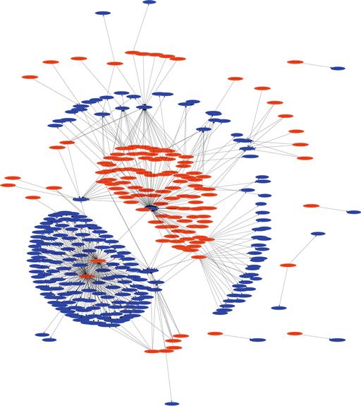
If you are following along at home, you should now have something similar to the figure above, although possibly with different colors. The colors used by Afterglow are defined in the sample.properties file. This sample file is preconfigured to use specific colors for RFC 1918 addresses. In the event that you’re not using one of these ranges (as in with our example), the “source” nodes will show up in red. Examine the sample configuration carefully as you’ll no doubt be making changes to color codes for your local ranges. Keep in mind that the configuration file works on a “first match wins” basis regarding the color-coding. For instance, all source nodes will be blue if your source color configuration lines read as below, due to the fact that the top statement is read as “true”, and thus matches first;
color.source = “blue”
color.source = “greenyellow” if ($fields[0] = ~/∧192.168.1..*/);
color.source = “lightyellow4” if ($fields[0] = ~/∧172.16..*/);
Now that you’ve been able to create some pretty data, let’s generate some useful data. In this next example we’ll generate our own configuration file and utilize three-column mode. In this scenario, we’ll take a look at the outbound connections from your local address range during non-business hours. We’ll generate a configuration file that will allow us to visually identify several anomalies. In this scenario, we don’t expect end users to be doing any browsing after hours, and we don’t expect a lot of outbound server chatter outside of a few responses from external hosts connecting in. As before, we need to have an idea of what we’re using as our data set moving forward. We’re going to be identifying several things with this graph, so I’ll explain the columns as I walk through the configuration. In this example, I’ll also show you how this can be streamlined into a one-line command to generate the graph.
We will begin by creating a configuration file. To make sure that our labels don’t get mangled, we’ll start with the line xlabels = 0. In this scenario, we’re going to generate a link graph that gives us a good picture of how local devices are communicating out of the network, whether it is through initiating communication or by responding to communication. In doing so we’ll assume that all local addresses are “good” and define color.source to be “green”.
To pick out the anomalies, our goal is to have the target node color be based on certain conditions. For one, we want to identify if the communication is occurring from a source port that is above 1024 in order to try and narrow down the difference between typical server responses and unexpected high port responses. If we see that, we’ll color those target nodes orange with color.target = “orange” if ($fields[1] > 1024). This statement tells Afterglow to color the node from the third column (target node) orange if it determines that the value from the second column (event node) is a number over 1024. Referencing the columns in the CSV file is best done by referencing fields, with field 0 being the first column, field 1 being the second column, and so on.
Next, we’d like to see what foreign entities are receiving communications from our hosts after hours. In this case, we’ll try to identify the devices communicating out to China specifically. Since these could very well be legitimate connections, we’ll color these Chinese nodes yellow with color.target = “yellow” if ($fields[3] = ~/cn/). Remember that based on the way Afterglow numbers columns, field 3 implies that we’re sourcing some information from the fourth column in the CSV file. While the fourth column isn’t used as a node, it is used to make references to other nodes in the same line, and in this case we’re saying that we’re going to color the node generated from the third column yellow if we see that the fourth column of that same row contains “cn” in the text.
We’d also like to escalate certain nodes to our attention if they meet BOTH of the previous scenarios. If we identify that local devices are communicating outbound to Chinese addresses from ephemeral ports, we will highlight these nodes as red. In order to do that, we identify if the source port is above 1024 AND if the fourth column of the same row contains “cn” in the text. In order to make this AND operator, we’ll use color.target = “red” if (grep($fields[1] > 1024,$fields[3] = ~/cn/)). As mentioned before, it is the order of these configuration lines that will make or break your link graph. My recommendation is that you order these from the most strict to the most lenient. In this case our entire configuration file (which we’ll call config.properties) will look like this:
##Place all labels within the nodes themselves. xlabels = 0
##Color all source nodes (first column addresses) green color.source = “green”
##Color target nodes red if the source port is above 1024 and ##4th column reads “cn” color.target = “red” if (grep($fields[1] > 1024,$fields[3] = ~/cn/))
##Color target nodes yellow if the 4th column reads “cn” color.target = “yellow” if ($fields[3] = ~/cn/)
##Color target nodes orange if the source port is above 1024 color.target = “orange” if ($fields[1] > 1024)
##Color target nodes blue if they don't match the above statements color.target = “blue”
##Color event nodes from the second column white color.event = “white”
##Color connecting lines black with a thickness of “1” color.edge = “black” size.edge = 1;
To generate the data we need for this graph, we will use the following command:
rwfilter --start-date = 2013/09/06:15 --saddress = 184.201.190.0/24 --type = out,outweb --pass = stdout |
rwcut --fields = sip,sport,dip,dcc --no-titles --delimited =,| sort -u |perl afterglow.pl -e 5 -c config.properties -v |
neato -Tgif -o test.gif
Notice that the type argument in the rwfilter command specifies only outbound traffic with the out and outweb options. We also generate the four columns we need with the --fields = sip,sport,dip,dcc argument. The output of this data is piped directly to Afterglow and Neato to create test.gif, shown in Figure 11.14.

The power and flexibility that Afterglow provides allow for the creation of a number of link style graphs that are useful in a variety of situations where you need to examine the relationships between entities. Hopefully this exercise has shown you some of that power, and will give you a jump start on creating link graphs of your own.
Conclusion
Understanding the gradual flow of data in your environment as it relates to the user and the network as a whole is challenging. However, there are a number of statistical data measures that can be taken to ensure that as your organization matures, so does your knowledge of its data network and the communication occurring on it. The overarching theme of this chapter is that you can make better data out of the data you already have. This new data revolves around stepping back a few feet in order to refocus and see the big picture. Sometimes the big picture is making lists that generalize large quantities of data. Other times, the big picture is really just a big picture. While the direction provided here doesn’t tell you how to create statistics or visualizations for all of the scenarios you might face when performing NSM detection or analysis, our hope is that it will help you get over the initial hump of learning some of these tools, and that it will plant a seed that will allow you to generate useful statistics for your environment.
1Dodge, Y. (2006) The Oxford Dictionary of Statistical Terms, OUP. ISBN 0-19-920613-9