... the wisest prophets make sure of the event first. | ||
| --Horace Walpole | ||
...The user should feel in control of the computer; not the other way around. This is achieved in applications that embody three qualities: responsiveness, permissiveness, and consistency. | ||
| --Inside Macintosh, Volume 1 Apple Computer, Inc. 1985 | ||
All the better to see you with my dear. | ||
| --The Big Bad Wolf to Little Red Riding Hood | ||
In this chapter you’ll learn:
<objective>Design principles of graphical user interfaces (GUIs).
</objective> <objective>How to create graphical user interfaces.
</objective> <objective>How to process events in response to user interactions with GUI controls.
</objective> <objective>The namespaces that contain the classes for GUI controls and event handling.
</objective> <objective>How to create and manipulate various controls.
</objective> <objective>How to add descriptive ToolTips to GUI controls.
How to process mouse and keyboard events.
</objective> </feature><feature> <supertitle>Outline</supertitle> </feature>A graphical user interface (GUI) allows a user to interact visually with a program. A GUI (pronounced “GOO-ee”) gives a program a distinctive “look” and “feel.” Providing different applications with a consistent set of intuitive user-interface components enables users to become productive with each application faster.
Look-and-Feel Observation 14.1

Consistent user interfaces enable a user to learn new applications more quickly because the applications have the same “look” and “feel.”
As an example of a GUI, consider Fig. 14.1, which shows a Visual C# Express Edition window containing various GUI controls. Near the top of the window, there’s a menu bar containing the menus File, Edit, View, Project, Build, Debug, Data, Tools, Window, and Help. Below the menu bar is a tool bar of buttons, each with a defined task, such as creating a new project or opening an existing project. There are two tabs below the tool bar—these present information in a tabbed view and allow users to switch between them. These controls form a user-friendly interface through which you have been interacting with the IDE.
GUIs are built from GUI controls (which are sometimes called components or widgets—short for window gadgets). GUI controls are objects that can display information on the screen or enable users to interact with an application via the mouse, keyboard or some other form of input (such as voice commands). Several common GUI controls are listed in Fig. 14.2—in the sections that follow and in Chapter 15, we discuss each of these in detail. Chapter 15 also explores the features and properties of additional GUI controls.
Table 14.2. Some basic GUI controls.
Control | Description |
|---|---|
| Displays images or uneditable text. |
| Enables the user to enter data via the keyboard. It can also be used to display editable or uneditable text. |
| Triggers an event when clicked with the mouse. |
| Specifies an option that can be selected (checked) or unselected (not checked). |
| Provides a drop-down list of items from which the user can make a selection either by clicking an item in the list or by typing in a box. |
| Provides a list of items from which the user can make a selection by clicking one or more items. |
| A container in which controls can be placed and organized. |
| Enables the user to select from a range of numeric input values. |
Windows Forms are used to create the GUIs for programs. A Form is a graphical element that appears on your computer’s desktop; it can be a dialog, a window or an MDI window (multiple document interface window)—discussed in Chapter 15. A component is an instance of a class that implements the IComponent interface, which defines the behaviors that components must implement, such as how the component is loaded. A control, such as a Button or Label, has a graphical representation at runtime. Some components lack graphical representations (e.g., class Timer of namespace System.Windows.Forms—see Chapter 15). Such components are not visible at run time.
Figure 14.3 displays the Windows Forms controls and components from the C# Toolbox. The controls and components are organized into categories by functionality. Selecting the category All Windows Forms at the top of the Toolbox allows you to view all the controls and components from the other tabs in one list (as shown in Fig. 14.3). In this chapter and the next, we discuss many of these controls and components. To add a control or component to a Form, select that control or component from the Toolbox and drag it on the Form. To deselect a control or component, select the Pointer item in the Toolbox (the icon at the top of the list). When the Pointer item is selected, you cannot accidentally add a new control to the Form.
When there are several windows on the screen, the active window is the frontmost and has a highlighted title bar. A window becomes the active window when the user clicks somewhere inside it. The active window is said to “have the focus.” For example, in Visual Studio the active window is the Toolbox when you’re selecting an item from it, or the Properties window when you’re editing a control’s properties.
A Form is a container for controls and components. When you drag items from the Toolbox onto the Form, Visual Studio generates code that creates the object and sets its basic properties. This code is updated when the control or component’s properties are modified in the IDE. Removing a control or component from the Form deletes the corresponding generated code. The IDE maintains the generated code in a separate file using partial classes—classes that are split among multiple files and assembled into a single class by the compiler. We could write this code ourselves, but it’s much easier to allow Visual Studio to handle the details. We introduced visual programming concepts in Chapter 2. In this chapter and the next, we use visual programming to build more substantial GUIs.
Each control or component we present in this chapter is located in namespace System.Windows.Forms. To create a Windows application, you generally create a Windows Form, set its properties, add controls to the Form, set their properties and implement event handlers (methods) that respond to events generated by the controls. Figure 14.4 lists common Form properties, methods and a common event.
Table 14.4. Common Form properties, methods and an event.
Description | |
|---|---|
Common Properties | |
|
|
|
|
|
|
| Border style for the |
| Font of text displayed on the |
| Text in the |
Common Methods | |
| Closes a |
| Hides a |
| Displays a hidden |
Common Event | |
| Occurs before a |
When we create controls and event handlers, Visual Studio generates much of the GUI-related code. In visual programming, the IDE maintains GUI-related code and you write the bodies of the event handlers to indicate what actions the program should take when particular events occur.
Normally, a user interacts with an application’s GUI to indicate the tasks that the application should perform. For example, when you write an e-mail in an e-mail application, clicking the Send button tells the application to send the e-mail to the specified e-mail addresses. GUIs are event driven. When the user interacts with a GUI component, the interaction—known as an event—drives the program to perform a task. Common events (user interactions) that might cause an application to perform a task include clicking a Button, typing in a TextBox, selecting an item from a menu, closing a window and moving the mouse. All GUI controls have events associated with them. Objects of other types can also have associated events as well. A method that performs a task in response to an event is called an event handler, and the overall process of responding to events is known as event handling.
The Form in the application of Fig. 14.5 contains a Button that a user can click to display a MessageBox. In line 6, notice the namespace declaration, which is inserted for every class you create. We’ve been removing these from earlier simple examples because they were unnecessary. Namespaces organize groups of related classes. Each class’s name is actually a combination of its namespace name, a dot (.) and the class name. This is known as the class’s fully qualified class name. You can use the class’s simple name (the unqualified class name—SimpleEventExample) in the application. If you were to reuse this class in another application, you’d use the fully qualified name or write a using directive so that you could refer to the class by its simple name. We’ll use namespaces like this in Chapters 15 and Chapters 21. If another namespace also contains a class with the same name, the fully qualified class names can be used to distinguish between the classes in the application and prevent a name conflict (also called a name collision).
Example 14.5. Simple event-handling example.
 1   // Fig. 14.5: SimpleEventExampleForm.cs
 2   // Simple event handling example.
 3   using System;
 4   using System.Windows.Forms;
 5
 6   namespace SimpleEventExample
 7   {
 8      // Form that shows a simple event handler
 9      public partial class SimpleEventExampleForm : Form
10      {
11         // default constructor
12         public SimpleEventExampleForm()
13         {
14            InitializeComponent();
15         } // end constructor
16
17         // handles click event of Button clickButton
18         private void clickButton_Click( object sender, EventArgs e )
19         {
20            MessageBox.Show( "Button was clicked." );
21         } // end method clickButton_Click
22      } // end class SimpleEventExampleForm
23   } // end namespace SimpleEventExample
Using the techniques presented in Chapter 2, create a Form containing a Button. First, create a new Windows application. Next, rename the Form1.cs file to SimpleEventExample.cs in the Solution Explorer. Click the Form in the designer, then use the Properties window to set the Form’s Text property to "Simple Event Example". Set the Form’s Font property to Segoe UI, 9pt. To do so, select the Font property in the Properties window, then click the ellipsis (...) button in the property’s value field to display a font dialog.
Drag a Button from the Toolbox onto the Form. In the Properties window for the Button, set the (Name) property to clickButton and the Text property to Click Me. You’ll notice that we use a convention in which each variable name we create for a control ends with the control’s type. For example, in the variable name clickButton, “Button” is the control’s type.
When the user clicks the Button in this example, we want the application to respond by displaying a MessageBox. To do this, you must create an event handler for the Button’s Click event. You can create this event handler by double clicking the Button on the Form, which declares the following empty event handler in the program code:
private void clickButton_Click( object sender, EventArgs e ) { } |
By convention, the IDE names the event-handler method as objectName_eventName (e.g., clickButton_Click). The clickButton_Click event handler executes when the user clicks the clickButton control.
Each event handler receives two parameters when it’s called. The first—an object reference typically named sender—is a reference to the object that generated the event. The second is a reference to an event arguments object of type EventArgs (or one of its derived classes), which is typically named e. This object contains additional information about the event that occurred. EventArgs is the base class of all classes that represent event information.
To display a MessageBox in response to the event, insert the statement
MessageBox.Show( "Button was clicked." ); |
in the event handler’s body. The resulting event handler appears in lines 18–21 of Fig. 14.5. When you execute the application and click the Button, a MessageBox appears displaying the text "Button was clicked".
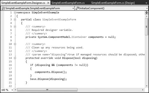
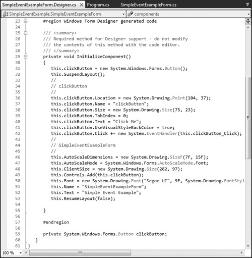
Visual Studio places the auto-generated GUI code in the Designer.cs file of the Form (SimpleEventExampleForm.Designer.cs in this example). You can open this file by expanding the node in the Solution Explorer window for the file you’re currently working in (SimpleEventExampleForm.cs) and double clicking the file name that ends with Designer.cs. Figs. 14.6 and 14.7 show this file’s contents. The IDE collapses the code in lines 23–57 of Fig. 14.7 by default—you can click the + icon next to line 23 to expand the code, then click the – icon next to that line to collapse it.
Now that you have studied classes and objects in detail, this code will be easier to understand. Since this code is created and maintained by Visual Studio, you generally don’t need to look at it. In fact, you do not need to understand most of the code shown here to build GUI applications. However, we now take a closer look to help you understand how GUI applications work.
The auto-generated code that defines the GUI is actually part of the Form’s class—in this case, SimpleEventExample. Line 3 of Fig. 14.6 (and line 9 of Fig. 14.5) uses the partial modifier, which allows this class to be split among multiple files, including the files that contain auto-generated code and those in which you write your own code. Line 59 of Fig. 14.7 declares the clickButton that we created in Design mode. It’s declared as an instance variable of class SimpleEventExampleForm. By default, all variable declarations for controls created through C#’s design window have a private access modifier. The code also includes the Dispose method for releasing resources (lines 14–21) and method InitializeComponent (lines 29–55), which contains the code that creates the Button, then sets some of the Button’s and the Form’s properties. The property values correspond to the values set in the Properties window for each control. Visual Studio adds comments to the code that it generates, as in lines 33–35. Line 42 was generated when we created the event handler for the Button’s Click event.
Method InitializeComponent is called when the Form is created, and establishes such properties as the Form title, the Form size, control sizes and text. Visual Studio also uses the code in this method to create the GUI you see in design view. Changing the code in InitializeComponent may prevent Visual Studio from displaying the GUI properly.
Error-Prevention Tip 14.1

The code generated by building a GUI in Design mode is not meant to be modified directly, which is why this code is placed in a separate file. Modifying this code can prevent the GUI from being displayed correctly in Design mode and might cause an application to function incorrectly. Modify control properties only through the Properties window.
The control that generates an event is known as the event sender. An event-handling method—known as the event handler—responds to a particular event that a control generates. When the event occurs, the event sender calls its event handler to perform a task (i.e., to “handle the event”).
The .NET event-handling mechanism allows you to choose your own names for event-handling methods. However, each event-handling method must declare the proper parameters to receive information about the event that it handles. Since you can choose your own method names, an event sender such as a Button cannot know in advance which method will respond to its events. So, we need a mechanism to indicate which method is the event handler for an event.
Event handlers are connected to a control’s events via special objects called delegates. A delegate object holds a reference to a method with a signature that is specified by the delegate type’s declaration. GUI controls have predefined delegates that correspond to every event they can generate. For example, the delegate for a Button’s Click event is of type EventHandler (namespace System). If you look at this type in the online help documentation, you’ll see that it’s declared as follows:
public delegate void EventHandler( object sender, EventArgs e ); |
This uses the delegate keyword to declare a delegate type named EventHandler, which can hold references to methods that return void and receive two parameters—one of type object (the event sender) and one of type EventArgs. If you compare the delegate declaration with clickButton_Click’s header (Fig. 14.5, line 18), you’ll see that this event handler indeed meets the requirements of the EventHandler delegate. The preceding declaration actually creates an entire class for you. The details of this special class’s declaration are handled by the compiler.
An event sender calls a delegate object like a method. Since each event handler is declared as a delegate, the event sender can simply call the appropriate delegate when an event occurs—a Button calls the EventHandler delegate that corresponds to its Click event in response to a click. The delegate’s job is to invoke the appropriate method. To enable the clickButton_Click method to be called, Visual Studio assigns clickButton_Click to the delegate, as shown in line 42 of Fig. 14.7. This code is added by Visual Studio when you double click the Button control in Design mode. The expression
new System.EventHandler(this.clickButton_Click); |
creates an EventHandler delegate object and initializes it with the clickButton_Click method. Line 42 uses the += operator to add the delegate to the Button’s Click event. This indicates that clickButton_Click will respond when a user clicks the Button. The += operator is overloaded by the delegate class that is created by the compiler.
You can actually specify that several different methods should be invoked in response to an event by adding other delegates to the Button’s Click event with statements similar to line 42 of Fig. 14.7. Event delegates are multicast—they represent a set of delegate objects that all have the same signature. Multicast delegates enable several methods to be called in response to a single event. When an event occurs, the event sender calls every method referenced by the multicast delegate. This is known as event multicasting. Event delegates derive from class MulticastDelegate, which derives from class Delegate (both from namespace System).
For the GUI application in Fig. 14.5, you double clicked the Button control on the Form to create its event handler. This technique creates an event handler for a control’s default event—the event that is most frequently used with that control. Controls can generate many different events, and each one can have its own event handler. For instance, your application can also provide an event handler for a Button’s MouseHover event, which occurs when the mouse pointer remains positioned over the Button for a short period of time. We now discuss how to create an event handler for an event that is not a control’s default event.
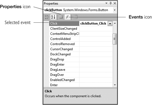
You can create additional event handlers through the Properties window. If you select a control on the Form, then click the Events icon (the lightning bolt icon in Fig. 14.8) in the Properties window, all the events for that control are listed in the window. You can double click an event’s name to display the event handler in the editor, if the event handler already exists, or to create the event handler. You can also select an event, then use the drop-down list to its right to choose an existing method that should be used as the event handler for that event. The methods that appear in this drop-down list are the Form class’s methods that have the proper signature to be an event handler for the selected event. You can return to viewing the properties of a control by selecting the Properties icon (Fig. 14.8).
A single method can handle multiple events from multiple controls. For example, the Click events of three Buttons could all be handled by the same method. You can specify an event handler for multiple events by selecting multiple controls and selecting a single method in the Properties window. If you create a new event handler this way, you should rename it appropriately. You could also select each control individually and specify the same method for each one’s event.
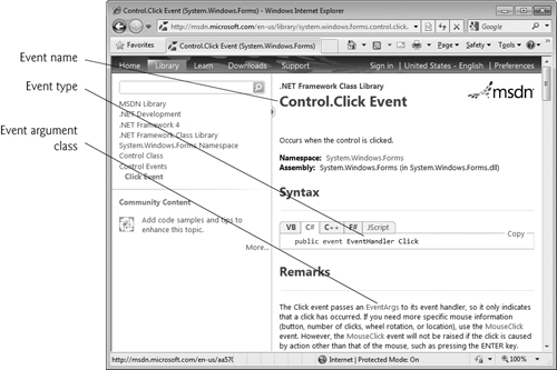
Read the Visual Studio documentation to learn about the different events raised by each control. To do this, select a control in the IDE and press the F1 key to display that control’s online help (Fig. 14.9). The web page that is displayed contains basic information about the control’s class. In the left column of the page are several links to more information about the class—Members, Constructor, Methods, Properties and Events. This list may vary by class. The Members link displays a complete list of the class’s members. This list includes the events that the class can generate. Each of the other links displays a subset of the class’s members. Click the link to the list of events for that control (Button Events in this case) to display the supported events for that control.
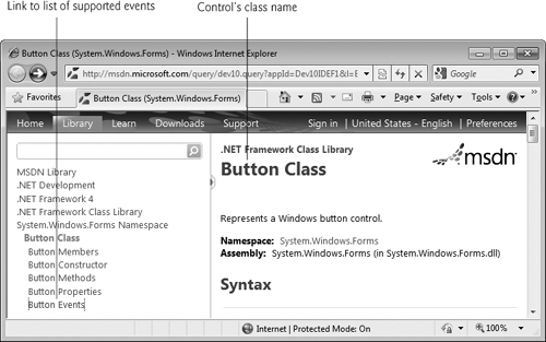
Next, click the name of an event to view its description and examples of its use. We selected the Click event to display the information in Fig. 14.10. The Click event is a member of class Control, an indirect base class of class Button. The Remarks section of the page discusses the details of the selected event. Alternatively, you could use the Object Browser to look up this information. The Object Browser shows only the members originally defined in a given class. The Click event is originally defined in class Control and inherited into Button. For this reason, you must look at class Control in the Object Browser to see the documentation for the Click event. See Section 10.12 for more information regarding the Object Browser.
This section overviews properties that are common to many controls. Controls derive from class Control (namespace System.Windows.Forms). Figure 14.11 lists some of class Control’s properties and methods. The properties shown here can be set for many controls. For example, the Text property specifies the text that appears on a control. The location of this text varies depending on the control. In a Form, the text appears in the title bar, but the text of a Button appears on its face.
Table 14.11. Class Control properties and methods.
Description | |
|---|---|
Common Properties | |
| The control’s background color. |
| The control’s background image. |
| Specifies whether the control is enabled (i.e., if the user can interact with it). Typically, portions of a disabled control appear “grayed out” as a visual indication to the user that the control is disabled. |
| Indicates whether the control has the focus. |
| The |
| The control’s foreground color. This usually determines the color of the text in the |
| The tab order of the control. When the Tab key is pressed, the focus transfers between controls based on the tab order. You can set this order. |
| If |
| The text associated with the control. The location and appearance of the text vary depending on the type of control. |
| Indicates whether the control is visible. |
Common Methods | |
| Hides the control (sets the |
| Acquires the focus. |
| Shows the control (sets the |
The Select method transfers the focus to a control and makes it the active control. When you press the Tab key in an executing Windows application, controls receive the focus in the order specified by their TabIndex property. This property is set by Visual Studio based on the order in which controls are added to a Form, but you can change the tabbing order. TabIndex is helpful for users who enter information in many controls, such as a set of TextBoxes that represent a user’s name, address and telephone number. The user can enter information, then quickly select the next control by pressing the Tab key.
The Enabled property indicates whether the user can interact with a control to generate an event. Often, if a control is disabled, it’s because an option is unavailable to the user at that time. For example, text editor applications often disable the “paste” command until the user copies some text. In most cases, a disabled control’s text appears in gray (rather than in black). You can also hide a control from the user without disabling the control by setting the Visible property to false or by calling method Hide. In each case, the control still exists but is not visible on the Form.
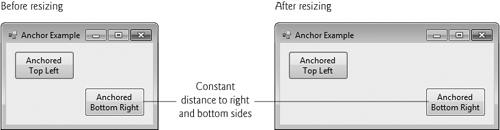
You can use anchoring and docking to specify the layout of controls inside a container (such as a Form). Anchoring causes controls to remain at a fixed distance from the sides of the container even when the container is resized. Anchoring enhances the user experience. For example, if the user expects a control to appear in a particular corner of the application, anchoring ensures that the control will always be in that corner—even if the user resizes the Form. Docking attaches a control to a container such that the control stretches across an entire side or fills an entire area. For example, a button docked to the top of a container stretches across the entire top of that container, regardless of the width of the container.
When parent containers are resized, anchored controls are moved (and possibly resized) so that the distance from the sides to which they’re anchored does not vary. By default, most controls are anchored to the top-left corner of the Form. To see the effects of anchoring a control, create a simple Windows application that contains two Buttons. Anchor one control to the right and bottom sides by setting the Anchor property as shown in Fig. 14.12. Leave the other control with its default anchoring (top, left). Execute the application and enlarge the Form. Notice that the Button anchored to the bottom-right corner is always the same distance from the Form’s bottom-right corner (Fig. 14.13), but that the other control stays its original distance from the top-left corner of the Form.

Sometimes, it’s desirable for a control to span an entire side of the Form, even when the Form is resized. For example, a control such as a status bar typically should remain at the bottom of the Form. Docking allows a control to span an entire side (left, right, top or bottom) of its parent container or to fill the entire container. When the parent control is resized, the docked control resizes as well. In Fig. 14.14, a Button is docked at the top of the Form (spanning the top portion). When the Form is resized, the Button is resized to the Form’s new width. Forms have a Padding property that specifies the distance between the docked controls and the Form edges. This property specifies four values (one for each side), and each value is set to 0 by default. Some common control layout properties are summarized in Fig. 14.15.
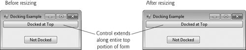
Table 14.15. Control layout properties.
| Description |
|---|---|
| Causes a control to remain at a fixed distance from the side(s) of the container even when the container is resized. |
| Allows a control to span one side of its container or to fill the remaining space in the container. |
| Sets the space between a container’s edges and docked controls. The default is |
| Specifies the location (as a set of coordinates) of the upper-left corner of the control, in relation to its container’s upper-left corner. |
| Specifies the size of the control in pixels as a |
| Indicates the minimum and maximum size of a |
The Anchor and Dock properties of a Control are set with respect to the Control’s parent container, which could be a Form or another parent container (such as a Panel; discussed in Section 14.6). The minimum and maximum Form (or other Control) sizes can be set via properties MinimumSize and MaximumSize, respectively. Both are of type Size, which has properties Width and Height to specify the size of the Form. Properties MinimumSize and MaximumSize allow you to design the GUI layout for a given size range. The user cannot make a Form smaller than the size specified by property MinimumSize and cannot make a Form larger than the size specified by property MaximumSize. To set a Form to a fixed size (where the Form cannot be resized by the user), set its minimum and maximum size to the same value.
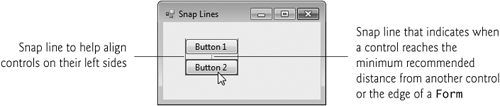
Visual Studio helps you with GUI layout. When you drag a control across a Form, blue snap lines appear to help you position the control with respect to others (Fig. 14.16) and the Form’s edges. This feature makes the control you’re dragging appear to “snap into place” alongside other controls. Visual Studio also provides the Format menu, which contains options for modifying your GUI’s layout. The Format menu does not appear in the IDE unless you select one or more controls in design view. When you select multiple controls, you can align them with the Format menu’s Align submenu. The Format menu also enables you to modify the space between controls or to center a control on the Form.
Labels provide text information (as well as optional images) and are defined with class Label (a derived class of Control). A Label displays text that the user cannot directly modify. A Label’s text can be changed programmatically by modifying the Label’s Text property. Figure 14.17 lists common Label properties.
A textbox (class TextBox) is an area in which either text can be displayed by a program or the user can type text via the keyboard. A password TextBox is a TextBox that hides the information entered by the user. As the user types characters, the password TextBox masks the user input by displaying a password character. If you set the property UseSystemPasswordChar to true, the TextBox becomes a password TextBox. Users often encounter both types of TextBoxes, when logging into a computer or website—the username TextBox allows users to input their usernames; the password TextBox allows users to enter their passwords. Figure 14.18 lists the common properties and a common event of TextBoxes.
Table 14.18. TextBox properties and an event.
Description | |
|---|---|
Common Properties | |
| If |
| If |
| If |
| For multiline textboxes, this property indicates which scrollbars appear ( |
| The |
| When |
Common Event | |
| Generated when the text changes in a |
A button is a control that the user clicks to trigger a specific action or to select an option in a program. As you’ll see, a program can use several types of buttons, such as checkboxes and radio buttons. All the button classes derive from class ButtonBase (namespace System.Windows.Forms), which defines common button features. In this section, we discuss class Button, which typically enables a user to issue a command to an application. Figure 14.19 lists common properties and a common event of class Button.
Table 14.19. Button properties and an event.
| Description |
|---|---|
Common Properties | |
| Specifies the text displayed on the |
| Modifies a |
Common Event | |
| Generated when the user clicks the |
Figure 14.20 uses a TextBox, a Button and a Label. The user enters text into a password box and clicks the Button, causing the text input to be displayed in the Label. Normally, we would not display this text—the purpose of password TextBoxes is to hide the text being entered by the user. When the user clicks the Show Me Button, this application retrieves the text that the user typed in the password TextBox and displays it in a Label.
Example 14.20. Program to display hidden text in a password box.
 1   // Fig. 14.20: LabelTextBoxButtonTestForm.cs
 2   // Using a TextBox, Label and Button to display
 3   // the hidden text in a password TextBox.
 4   using System;
 5   using System.Windows.Forms;
 6
 7   namespace LabelTextBoxButtonTest
 8   {
 9      // Form that creates a password TextBox and
10      // a Label to display TextBox contents
11      public partial class LabelTextBoxButtonTestForm : Form
12      {
13         // default constructor
14         public LabelTextBoxButtonTestForm()
15         {
16            InitializeComponent();
17         } // end constructor
18
19         // display user input in Label
20         private void displayPasswordButton_Click(
21            object sender, EventArgs e )
22         {
23            // display the text that the user typed
24            displayPasswordLabel.Text = inputPasswordTextBox.Text;
25         } // end method displayPasswordButton_Click
26      } // end class LabelTextBoxButtonTestForm
27   } // end namespace LabelTextBoxButtonTest
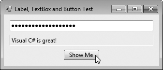
First, create the GUI by dragging the controls (a TextBox, a Button and a Label) on the Form. Once the controls are positioned, change their names in the Properties window from the default values—textBox1, button1 and label1—to the more descriptive displayPasswordLabel, displayPasswordButton and inputPasswordTextBox. The (Name) property in the Properties window enables us to change the variable name for a control. Visual Studio creates the necessary code and places it in method InitializeComponent of the partial class in the file LabelTextBoxButtonTestForm.Designer.cs.
We set displayPasswordButton’s Text property to “Show Me” and clear the Text of displayPasswordLabel so that it’s blank when the program begins executing. The BorderStyle property of displayPasswordLabel is set to Fixed3D, giving our Label a three dimensional appearance. We also changed its TextAlign property to MiddleLeft so that the Label’s text is displayed centered between its top and bottom. The password character for inputPasswordTextBox is determined by the user’s system settings when you set UseSystemPasswordChar to true. This property accepts only one character.
We create an event handler for displayPasswordButton by double clicking this control in Design mode. We added line 24 to the event handler’s body. When the user clicks the Show Me Button in the executing application, line 24 obtains the text entered by the user in inputPasswordTextBox and displays the text in displayPasswordLabel.
GroupBoxes and Panels arrange controls on a GUI. GroupBoxes and Panels are typically used to group several controls of similar functionality or several controls that are related in a GUI. All of the controls in a GroupBox or Panel move together when the GroupBox or Panel is moved. Furthermore, a GroupBoxes and Panels can also be used to show or hide a set of controls at once. When you modify a container’s Visible property, it toggles the visibility of all the controls within it.
The primary difference between these two controls is that GroupBoxes can display a caption (i.e., text) and do not include scrollbars, whereas Panels can include scrollbars and do not include a caption. GroupBoxes have thin borders by default; Panels can be set so that they also have borders by changing their BorderStyle property. Figures 14.21–14.22 list the common properties of GroupBoxes and Panels, respectively.
Table 14.22. Panel properties.
| Description |
|---|---|
| Indicates whether scrollbars appear when the |
| Sets the border of the |
| The set of controls that the |
Look-and-Feel Observation 14.3
Panels and GroupBoxes can contain other Panels and GroupBoxes for more complex layouts.
Look-and-Feel Observation 14.4
You can organize a GUI by anchoring and docking controls inside a GroupBox or Panel. The GroupBox or Panel then can be anchored or docked inside a Form. This divides controls into functional “groups” that can be arranged easily.
To create a GroupBox, drag its icon from the Toolbox onto a Form. Then, drag new controls from the Toolbox into the GroupBox. These controls are added to the GroupBox’s Controls property and become part of the GroupBox. The GroupBox’s Text property specifies the caption.
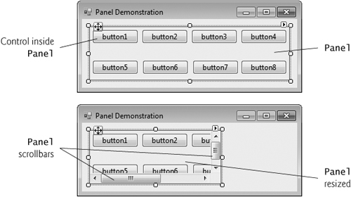
To create a Panel, drag its icon from the Toolbox onto the Form. You can then add controls directly to the Panel by dragging them from the Toolbox onto the Panel. To enable the scrollbars, set the Panel’s AutoScroll property to true. If the Panel is resized and cannot display all of its controls, scrollbars appear (Fig. 14.23). The scrollbars can be used to view all the controls in the Panel—both at design time and at execution time. In Fig. 14.23, we set the Panel’s BorderStyle property to FixedSingle so that you can see the Panel in the Form.
Look-and-Feel Observation 14.5
Use Panels with scrollbars to avoid cluttering a GUI and to reduce the GUI’s size.
The program in Fig. 14.24 uses a GroupBox and a Panel to arrange Buttons. When these Buttons are clicked, their event handlers change the text on a Label.
Example 14.24. Using GroupBoxes and Panels to arrange Buttons.
 1   // Fig. 14.24: GroupboxPanelExampleForm.cs
 2   // Using GroupBoxes and Panels to arrange Buttons.
 3   using System;
 4   using System.Windows.Forms;
 5
 6   namespace GroupBoxPanelExample
 7   {
 8      // Form that displays a GroupBox and a Panel
 9      public partial class GroupBoxPanelExampleForm : Form
10      {
11         // default constructor
12         public GroupBoxPanelExampleForm()
13         {
14            InitializeComponent();
15         } // end constructor
16
17         // event handler for Hi Button
18         private void hiButton_Click( object sender, EventArgs e )
19         {
20            messageLabel.Text = "Hi pressed"; // change text in Label
21         } // end method hiButton_Click
22
23         // event handler for Bye Button
24         private void byeButton_Click( object sender, EventArgs e )
25         {
26            messageLabel.Text = "Bye pressed"; // change text in Label
27         } // end method byeButton_Click
28
29         // event handler for Far Left Button
30         private void leftButton_Click( object sender, EventArgs e )
31         {
32            messageLabel.Text = "Far left pressed"; // change text in Label
33         } // end method leftButton_Click
34
35         // event handler for Far Right Button
36         private void rightButton_Click( object sender, EventArgs e )
37         {
38            messageLabel.Text = "Far right pressed"; // change text in Label
39         } // end method rightButton_Click
40      } // end class GroupBoxPanelExampleForm
41   } // end namespace GroupBoxPanelExample
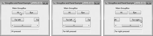
The mainGroupBox has two Buttons—hiButton (which displays the text Hi) and byeButton (which displays the text Bye). The Panel (named mainPanel) also has two Buttons, leftButton (which displays the text Far Left) and rightButton (which displays the text Far Right). The mainPanel has its AutoScroll property set to true, allowing scrollbars to appear when the contents of the Panel require more space than the Panel’s visible area. The Label (named messageLabel) is initially blank. To add controls to mainGroupBox or mainPanel, Visual Studio calls method Add of each container’s Controls property. This code is placed in the partial class located in the file GroupBoxPanelExample.Designer.cs.
The event handlers for the four Buttons are located in lines 18–39. Lines 20, 26, 32 and 38 change the text of messageLabel to indicate which Button the user pressed.
C# has two types of state buttons that can be in the on/off or true/false states—CheckBoxes and RadioButtons. Like class Button, classes CheckBox and RadioButton are derived from class ButtonBase.
A CheckBox is a small square that either is blank or contains a check mark. When the user clicks a CheckBox to select it, a check mark appears in the box. If the user clicks the CheckBox again to deselect it, the check mark is removed. You can also configure a CheckBox to toggle between three states (checked, unchecked and indeterminate) by setting its Three State property to true. Any number of CheckBoxes can be selected at a time. A list of common CheckBox properties and events appears in Fig. 14.25.
Table 14.25. CheckBox properties and events.
Description | |
|---|---|
Common Properties | |
| By default, this property is set to |
| Indicates whether the |
| Indicates whether the |
| Specifies the text displayed to the right of the |
| When this property is |
Common Events | |
| Generated when the |
| Generated when the |
The program in Fig. 14.26 allows the user to select CheckBoxes to change a Label’s font style. The event handler for one CheckBox applies bold and the event handler for the other applies italic. If both CheckBoxes are selected, the font style is set to bold and italic. Initially, neither CheckBox is checked.
Example 14.26. Using CheckBoxes to change font styles.
 1   // Fig. 14.26: CheckBoxTestForm.cs
 2   // Using CheckBoxes to toggle italic and bold styles.
 3   using System;
 4   using System.Drawing;
 5   using System.Windows.Forms;
 6
 7   namespace CheckBoxTest
 8   {
 9      // Form contains CheckBoxes to allow the user to modify sample text
10      public partial class CheckBoxTestForm : Form
11      {
12         // default constructor
13         public CheckBoxTestForm()
14         {
15            InitializeComponent();
16         } // end constructor
17
18         // toggle the font style between bold and
19         // not bold based on the current setting
20         private void boldCheckBox_CheckedChanged(
21            object sender, EventArgs e )
22         {
23            outputLabel.Font = new Font( outputLabel.Font,
24               outputLabel.Font.Style ^ FontStyle.Bold );
25         } // end method boldCheckBox_CheckedChanged
26
27         // toggle the font style between italic and
28         // not italic based on the current setting
29         private void italicCheckBox_CheckedChanged(
30            object sender, EventArgs e )
31         {
32            outputLabel.Font = new Font( outputLabel.Font,
33               outputLabel.Font.Style ^ FontStyle.Italic );
34         } // end method italicCheckBox_CheckedChanged
35      } // end class CheckBoxTestForm
36   } // end namespace CheckBoxTest
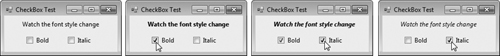
The boldCheckBox has its Text property set to Bold. The italicCheckBox has its Text property set to Italic. The Text property of outputLabel is set to Watch the font style change. After creating the controls, we define their event handlers. Double clicking the CheckBoxes at design time creates empty CheckedChanged event handlers.
To change a Label’s font style, set its Font property to a new Font object (lines 23–24 and 32–33). Class Font is in the System.Drawing namespace. The Font constructor that we use here takes the current font and new style as arguments. The first argument—outputLabel.Font—uses outputLabel’s original font name and size. The style is specified with a member of the FontStyle enumeration, which contains Regular, Bold, Italic, Strikeout and Underline. (The Strikeout style displays text with a line through it.) A Font object’s Style property is read-only, so it can be set only when the Font object is created.
Styles can be combined via bitwise operators—operators that perform manipulation on bits of information. Recall from Chapter 1 that all data is represented in the computer as combinations of 0s and 1s. Each 0 or 1 represents a bit. The FontStyle (namespace System.Drawing) is represented as a set of bits that are selected in a way that allows us to combine different FontStyle elements to create compound styles, using bitwise operators. These styles are not mutually exclusive, so we can combine different styles and remove them without affecting the combination of previous FontStyle elements. We can combine these various font styles, using either the logical OR (|) operator or the logical exclusive OR (^) operator (also called XOR). When the logical OR operator is applied to two bits, if at least one bit of the two has the value 1, then the result is 1. Combining styles using the logical OR operator works as follows. Assume that FontStyle.Bold is represented by bits 01 and that FontStyle.Italic is represented by bits 10. When we use the logical OR (|) to combine the styles, we obtain the bits 11.
01 = Bold 10 = Italic -- 11 = Bold and Italic |
The logical OR operator helps create style combinations. However, what happens if we want to undo a style combination, as we did in Fig. 14.26?
The logical exclusive OR operator enables us to combine styles and to undo existing style settings. When logical exclusive OR is applied to two bits, if both bits have the same value, then the result is 0. If both bits are different, then the result is 1.
Combining styles using logical exclusive OR works as follows. Assume, again, that FontStyle.Bold is represented by bits 01 and that FontStyle.Italic is represented by bits 10. When we use logical exclusive OR (^) on both styles, we obtain the bits 11.
01 = Bold 10 = Italic -- 11 = Bold and Italic |
Now, suppose that we would like to remove the FontStyle.Bold style from the previous combination of FontStyle.Bold and FontStyle.Italic. The easiest way to do so is to reapply the logical exclusive OR (^) operator to the compound style and FontStyle.Bold.
11 = Bold and Italic 01 = Bold -- 10 = Italic |
This is a simple example. The advantages of using bitwise operators to combine FontStyle values become more evident when we consider that there are five FontStyle values (Bold, Italic, Regular, Strikeout and Underline), resulting in 16 FontStyle combinations. Using bitwise operators to combine font styles greatly reduces the amount of code required to check all possible font combinations.
In Fig. 14.26, we need to set the FontStyle so that the text appears in bold if it was not bold originally, and vice versa. Line 24 uses the bitwise logical exclusive OR operator to do this. If outputLabel.Font.Style is bold, then the resulting style is not bold. If the text is originally italic, the resulting style is bold and italic, rather than just bold. The same applies for FontStyle.Italic in line 33.
If we didn’t use bitwise operators to compound FontStyle elements, we’d have to test for the current style and change it accordingly. In boldCheckBox_CheckedChanged, we could test for the regular style and make it bold; test for the bold style and make it regular; test for the italic style and make it bold italic; and test for the italic bold style and make it italic. This is cumbersome because, for every new style we add, we double the number of combinations. Adding a CheckBox for underline would require testing eight additional styles. Adding a CheckBox for strikeout would require testing 16 additional styles.
Radio buttons (defined with class RadioButton) are similar to CheckBoxes in that they also have two states—selected and not selected (also called deselected). However, RadioButtons normally appear as a group, in which only one RadioButton can be selected at a time. Selecting one RadioButton in the group forces all the others to be deselected. Therefore, RadioButtons are used to represent a set of mutually exclusive options (i.e., a set in which multiple options cannot be selected at the same time).
Look-and-Feel Observation 14.6
Use RadioButtons when the user should choose only one option in a group.
Look-and-Feel Observation 14.7
Use CheckBoxes when the user should be able to choose multiple options in a group.
All RadioButtons added to a container become part of the same group. To divide RadioButtons into several groups, they must be added to separate containers, such as GroupBoxes or Panels. The common properties and a common event of class RadioButton are listed in Fig. 14.27.
Table 14.27. RadioButton properties and an event.
| Description |
|---|---|
Common Properties | |
| Indicates whether the |
| Specifies the |
| Generated every time the |
Software Engineering Observation 14.1

Forms, GroupBoxes, and Panels can act as logical groups for RadioButtons. The RadioButtons within each group are mutually exclusive to each other, but not to RadioButtons in different logical groups.
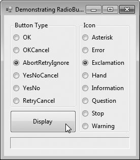
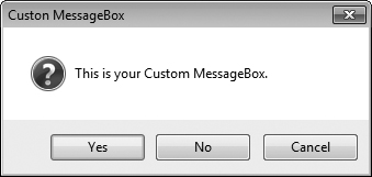
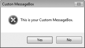
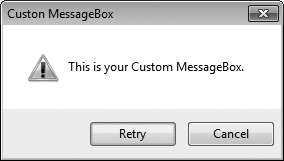
The program in Fig. 14.28 uses RadioButtons to enable users to select options for a MessageBox. After selecting the desired attributes, the user presses the Display Button to display the MessageBox. A Label in the lower-left corner shows the result of the MessageBox (i.e., which Button the user clicked—Yes, No, Cancel, etc.).
Example 14.28. Using RadioButtons to set message-window options.
 1   // Fig. 14.28: RadioButtonsTestForm.cs
 2   // Using RadioButtons to set message window options.
 3   using System;
 4   using System.Windows.Forms;
 5
 6   namespace RadioButtonsTest
 7   {
 8      // Form contains several RadioButtons--user chooses one
 9      // from each group to create a custom MessageBox
10      public partial class RadioButtonsTestForm : Form
11      {
12         // create variables that store the user's choice of options
13         private MessageBoxIcon iconType;
14         private MessageBoxButtons buttonType;
15
16         // default constructor
17         public RadioButtonsTestForm()
18         {
19            InitializeComponent();
20         } // end constructor
21
22         // change Buttons based on option chosen by sender
23         private void buttonType_CheckedChanged(
24            object sender, EventArgs e )
25         {
26            if ( sender == okRadioButton ) // display OK Button
27               buttonType = MessageBoxButtons.OK;
28
29            // display OK and Cancel Buttons
30            else if ( sender == okCancelRadioButton )
31               buttonType = MessageBoxButtons.OKCancel;
32
33            // display Abort, Retry and Ignore Buttons
34            else if ( sender == abortRetryIgnoreRadioButton )
35               buttonType = MessageBoxButtons.AbortRetryIgnore;
36
37            // display Yes, No and Cancel Buttons
38            else if ( sender == yesNoCancelRadioButton )
39               buttonType = MessageBoxButtons.YesNoCancel;
40
41            // display Yes and No Buttons
42            else if ( sender == yesNoRadioButton )
43               buttonType = MessageBoxButtons.YesNo;
44
45            // only on option left--display Retry and Cancel Buttons
46            else
47               buttonType = MessageBoxButtons.RetryCancel;
48         } // end method buttonType_CheckedChanged
49
50         // change Icon based on option chosen by sender
51         private void iconType_CheckedChanged( object sender, EventArgs e )
52         {
53            if ( sender == asteriskRadioButton ) // display asterisk Icon
54               iconType = MessageBoxIcon.Asterisk;
55
56            // display error Icon
57            else if ( sender == errorRadioButton )
58               iconType = MessageBoxIcon.Error;
59
60            // display exclamation point Icon
61            else if ( sender == exclamationRadioButton )
62               iconType = MessageBoxIcon.Exclamation;
63
64            // display hand Icon
65            else if ( sender == handRadioButton )
66               iconType = MessageBoxIcon.Hand;
67
68            // display information Icon
69            else if ( sender == informationRadioButton )
70               iconType = MessageBoxIcon.Information;
71
72            // display question mark Icon
73            else if ( sender == questionRadioButton )
74               iconType = MessageBoxIcon.Question;
75
76            // display stop Icon
77            else if ( sender == stopRadioButton )
78               iconType = MessageBoxIcon.Stop;
79
80            // only one option left--display warning Icon
81            else
82               iconType = MessageBoxIcon.Warning;
83         } // end method iconType_CheckedChanged
84
85         // display MessageBox and Button user pressed
86         private void displayButton_Click( object sender, EventArgs e )
87         {
88            // display MessageBox and store
89            // the value of the Button that was pressed
90            DialogResult result = MessageBox.Show(
91               "This is your Custom MessageBox.", "Custon MessageBox",
92               buttonType, iconType );
93
94            // check to see which Button was pressed in the MessageBox
95            // change text displayed accordingly
96            switch (result)
97            {
98               case DialogResult.OK:
99                  displayLabel.Text = "OK was pressed.";
100                 break;
101              case DialogResult.Cancel:
102                 displayLabel.Text = "Cancel was pressed.";
103                 break;
104              case DialogResult.Abort:
105                 displayLabel.Text = "Abort was pressed.";
106                 break;
107              case DialogResult.Retry:
108                 displayLabel.Text = "Retry was pressed.";
109                 break;
110              case DialogResult.Ignore:
111                 displayLabel.Text = "Ignore was pressed.";
112                 break;
113              case DialogResult.Yes:
114                displayLabel.Text = "Yes was pressed.";
115                break;
116             case DialogResult.No:
117                displayLabel.Text = "No was pressed.";
118                break;
119          } // end switch
120       } // end method displayButton_Click
121     } // end class RadioButtonsTestForm
122  } // end namespace RadioButtonsTest
a)
b)
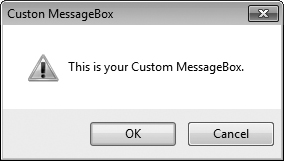
c) OKCancel button type
d) OK button type

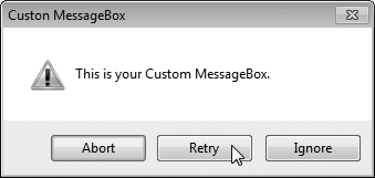
e) AbortRetryIgnore button type
f) YesNoCancel button type
g) YesNo button type
h) RetryCancel button type
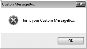
To store the user’s choices, we create and initialize the iconType and buttonType objects (lines 13–14). Object iconType is of type MessageBoxIcon, and can have values Asterisk, Error, Exclamation, Hand, Information, None, Question, Stop and Warning. The sample output shows only Error, Exclamation, Information and Question icons.
Object buttonType is of type MessageBoxButtons, and can have values AbortRetryIgnore, OK, OKCancel, RetryCancel, YesNo and YesNoCancel. The name indicates the options that are presented to the user in the MessageBox. The sample output windows show MessageBoxes for all of the MessageBoxButtons enumeration values.
We created two GroupBoxes, one for each set of enumeration values. The GroupBox captions are Button Type and Icon. The GroupBoxes contain RadioButtons for the corresponding enumeration options, and the RadioButtons’ Text properties are set appropriately. Because the RadioButtons are grouped, only one RadioButton can be selected from each GroupBox. There’s also a Button (displayButton) labeled Display. When a user clicks this Button, a customized MessageBox is displayed. A Label (displayLabel) displays which Button the user pressed within the MessageBox.
The event handler for the RadioButtons handles the CheckedChanged event of each RadioButton. When a RadioButton contained in the Button Type GroupBox is checked, the corresponding event handler sets buttonType to the appropriate value. Lines 23–48 contain the event handling for these RadioButtons. Similarly, when the user checks the RadioButtons belonging to the Icon GroupBox, the corresponding event handler associated with these events (lines 51–83) sets iconType to the appropriate value.
The Click event handler for displayButton (lines 86–120) creates a MessageBox (lines 90–93). The MessageBox options are specified with the values stored in iconType and buttonType. When the user clicks one of the MessageBox’s buttons, the result of the message box is returned to the application. This result is a value from the DialogResult enumeration that contains Abort, Cancel, Ignore, No, None, OK, Retry or Yes. The switch statement in lines 96–119 tests for the result and sets displayLabel.Text appropriately.
A PictureBox displays an image. The image can be one of several formats, such as bitmap, GIF (Graphics Interchange Format) and JPEG. A PictureBox’s Image property specifies the image that is displayed, and the SizeMode property indicates how the image is displayed (Normal, StretchImage, Autosize, CenterImage or Zoom). Figure 14.29 describes common PictureBox properties and a common event.
Table 14.29. PictureBox properties and an event.
| Description |
|---|---|
Common Properties | |
| Sets the image to display in the |
| Enumeration that controls image sizing and positioning. Values are |
Common Event | |
| Occurs when the user clicks a control. When you double click this control in the designer, an event handler is generated for this event. |
Figure 14.30 uses a PictureBox named imagePictureBox to display one of three bitmap images—image0.bmp, image1.bmp or image2.bmp. These images are provided in the Images subdirectory of this chapter’s examples directory. Whenever a user clicks the Next Image Button, the image changes to the next image in sequence. When the last image is displayed and the user clicks the Next Image Button, the first image is displayed again.
Example 14.30. Using a PictureBox to display images.
 1   // Fig. 14.30: PictureBoxTestForm.cs
 2   // Using a PictureBox to display images.
 3   using System;
 4   using System.Drawing;
 5   using System.Windows.Forms;
 6
 7   namespace PictureBoxTest
 8   {
 9      // Form to display different images when PictureBox is clicked
10      public partial class PictureBoxTestForm : Form
11      {
12         private int imageNum = -1; // determines which image is displayed
13
14         // default constructor
15         public PictureBoxTestForm()
16         {
17            InitializeComponent();
18         } // end constructor
19
20         // change image whenever Next Button is clicked
21         private void nextButton_Click( object sender, EventArgs e )
22         {
23            imageNum = ( imageNum + 1 ) % 3; // imageNum cycles from 0 to 2
24
25            // retrieve image from resources and load into PictureBox
26            imagePictureBox.Image = ( Image )
27               ( Properties.Resources.ResourceManager.GetObject(
28               string.Format( "image{0}", imageNum ) ) );
29         } // end method nextButton_Click
30      } // end class PictureBoxTestForm
31   } // end namespace PictureBoxTest
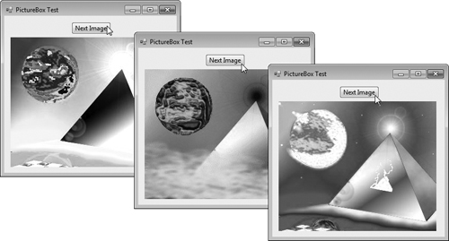
In this example, we added the images to the project as resources. This causes the compiler to embed the images in the application’s executable file and enables the application to access the images through the project’s Properties namespace. By embedding the images in the application, you don’t need to worry about wrapping the images with the application when you move it to another location or computer.
If you’re creating a new project, use the following steps to add images to the project as resources:
After creating your project, right click the project’s Properties node in the Solution Explorer and select Open to display the project’s properties.
From the tabs on the left, click the Resources tab.
At the top of the Resources tab, click the down arrow next to Add Resource and select Add Existing File... to display the Add existing file to resources dialog.
Locate the image files you wish to add as resources and click the Open button. We provided three sample images in the
Imagesfolder with this chapter’s examples.Save your project.
The files now appear in a folder named Resources in the Solution Explorer. We’ll use this technique in most examples that use images going forward.
A project’s resources are stored in its Resources class (of the project’s Properties namespace). The Resources class contains a ResourceManager object for interacting with the resources programmatically. To access an image, you can use the method GetObject, which takes as an argument the resource name as it appears in the Resources tab (e.g., "image0") and returns the resource as an Object. Lines 27–28 invoke GetObject with the result of the expression
string.Format( "image{0}", imageNum ) |
which builds the name of the resource by placing the index of the next picture (imageNum, which was obtained earlier in line 23) at the end of the word "image". You must convert this Object to type Image (namespace System.Drawing) to assign it to the PictureBox’s Image property (line 26).
The Resources class also provides direct access to the resources you define with expressions of the form Resources. resourceName, where resourceName is the name you provided to the resource when you created it. When using such an expression, the resource returned already has the appropriate type. For example, Properties.Resources.image0 is an Image object representing the first image.
In Chapter 2, we demonstrated tool tips—the helpful text that appears when the mouse hovers over an item in a GUI. Recall that the tool tips displayed in Visual Studio help you become familiar with the IDE’s features and serve as useful reminders for each toolbar icon’s functionality. Many programs use tool tips to remind users of each control’s purpose. For example, Microsoft Word has tool tips that help users determine the purpose of the application’s icons. This section demonstrates how to use the ToolTip component to add tool tips to your applications. Figure 14.31 describes common properties and a common event of class ToolTip.
Table 14.31. ToolTip properties and an event.
| Description |
|---|---|
Common Properties | |
| The amount of time (in milliseconds) that the tool tip appears while the mouse is over a control. |
| The amount of time (in milliseconds) that a mouse must hover over a control before a tool tip appears. |
| The amount of time (in milliseconds) between which two different tool tips appear (when the mouse is moved from one control to another). |
Common Event | |
| Raised when the tool tip is displayed. This event allows programmers to modify the appearance of the tool tip. |
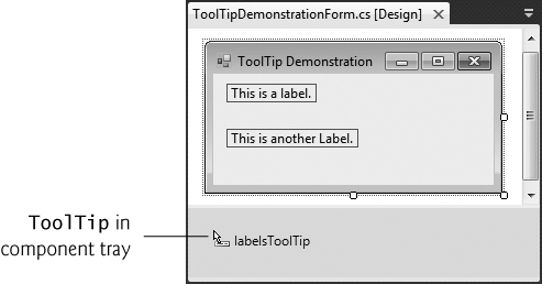
When you add a ToolTip component from the Toolbox, it appears in the component tray—the gray region below the Form in Design mode. Once a ToolTip is added to a Form, a new property appears in the Properties window for the Form’s other controls. This property appears in the Properties window as ToolTip on, followed by the name of the ToolTip component. For instance, if our Form’s ToolTip were named helpfulToolTip, you would set a control’s ToolTip on helpfulToolTip property value to specify the control’s tool tip text. Figure 14.32 demonstrates the ToolTip component. For this example, we create a GUI containing two Labels, so we can demonstrate different tool tip text for each Label. To make the sample outputs clearer, we set the BorderStyle property of each Label to FixedSingle, which displays a solid border. Since there’s no event-handling code in this example, we did not show the code for the Form class.
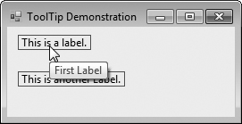

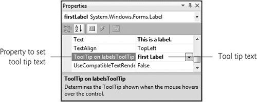
In this example, we named the ToolTip component labelsToolTip. Figure 14.33 shows the ToolTip in the component tray. We set the tool tip text for the first Label to “First Label” and the tool tip text for the second Label to “Second Label”. Figure 14.34 demonstrates setting the tool tip text for the first Label.
At times, you’ll want to restrict a user’s input choices to a specific range of numeric values. This is the purpose of the NumericUpDown control. This control appears as a TextBox, with two small Buttons on the right side—one with an up arrow and one with a down arrow. By default, a user can type numeric values into this control as if it were a TextBox or click the up and down arrows to increase or decrease the value in the control, respectively. The largest and smallest values in the range are specified with the Maximum and Minimum properties, respectively (both of type decimal). The Increment property (also of type decimal) specifies by how much the current value changes when the user clicks the arrows. Property DecimalPlaces specifies the number of decimal places that the control should display as an integer. Figure 14.35 describes common NumericUpDown properties and an event.
Table 14.35. NumericUpDown properties and an event.
| Description |
|---|---|
Common Properties | |
| Specifies how many decimal places to display in the control. |
| Specifies by how much the current number in the control changes when the user clicks the control’s up and down arrows. |
Largest value in the control’s range. | |
| Smallest value in the control’s range. |
| Modifies the alignment of the up and down |
| The numeric value currently displayed in the control. |
Common Event | |
| This event is raised when the value in the control is changed. This is the default event for the |
Figure 14.36 demonstrates a NumericUpDown control in a GUI that calculates interest rate. The calculations performed in this application are similar to those in Fig. 6.6. TextBoxes are used to input the principal and interest rate amounts, and a NumericUpDown control is used to input the number of years for which we want to calculate interest.
Example 14.36. Demonstrating the NumericUpDown control.
 1   // Fig. 14.36: InterestCalculatorForm.cs
 2   // Demonstrating the NumericUpDown control.
 3   using System;
 4   using System.Windows.Forms;
 5
 6   namespace NumericUpDownTest
 7   {
 8      public partial class InterestCalculatorForm : Form
 9      {
10         // default constructor
11         public InterestCalculatorForm()
12         {
13            InitializeComponent();
14         } // end constructor
15
16         private void calculateButton_Click(
17            object sender, EventArgs e )
18         {
19            // declare variables to store user input
20            decimal principal; // store principal
21            double rate; // store interest rate
22            int year; // store number of years
23            decimal amount; // store amount
24            string output; // store output
25
26            // retrieve user input
27            principal = Convert.ToDecimal( principalTextBox.Text );
28            rate = Convert.ToDouble( interestTextBox.Text );
29            year = Convert.ToInt32( yearUpDown.Value );
30
31            // set output header
32            output = "Year	Amount on Deposit
";
33
34            // calculate amount after each year and append to output
35            for ( int yearCounter = 1; yearCounter <= year; yearCounter++ )
36            {
37               amount = principal * ( ( decimal )
38                  Math.Pow( ( 1 + rate / 100 ), yearCounter ) );
39               output += ( yearCounter + "	" +
40                  string.Format( "{0:C}", amount ) + "
" );
41            } // end for
42
43            displayTextBox.Text = output; // display result
44         } // end method calculateButton_Click
45      } // end class InterestCalculatorForm
46   } // end namespace NumericUpDownTest
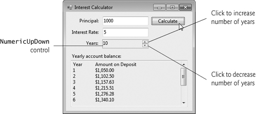
For the NumericUpDown control named yearUpDown, we set the Minimum property to 1 and the Maximum property to 10. We left the Increment property set to 1, its default value. These settings specify that users can enter a number of years in the range 1 to 10 in increments of 1. If we had set the Increment to 0.5, we could also input values such as 1.5 or 2.5. If you don’t modify the DecimalPlaces property (0 by default), 1.5 and 2.5 display as 2 and 3, respectively. We set the NumericUpDown’s ReadOnly property to true to indicate that the user cannot type a number into the control to make a selection. Thus, the user must click the up and down arrows to modify the value in the control. By default, the ReadOnly property is set to false, but the IDE changes this to true when you drag a NumericUpDown onto the Form. The output for this application is displayed in a multiline read-only TextBox with a vertical scrollbar, so the user can scroll through the entire output.
This section explains how to handle mouse events, such as clicks and moves, which are generated when the user interacts with a control via the mouse. Mouse events can be handled for any control that derives from class System.Windows.Forms.Control. For most mouse events, information about the event is passed to the event-handling method through an object of class MouseEventArgs, and the delegate used to create the mouseevent handlers is MouseEventHandler. Each mouse-event-handling method for these events requires an object and a MouseEventArgs object as arguments.
Class MouseEventArgs contains information related to the mouse event, such as the mouse pointer’s x- and y-coordinates, the mouse button pressed (Right, Left or Middle) and the number of times the mouse was clicked. The x- and y-coordinates of the MouseEventArgs object are relative to the control that generated the event—i.e., point (0,0) represents the upper-left corner of the control where the mouse event occurred. Several common mouse events and event arguments are described in Fig. 14.37.
Table 14.37. Mouse events and event arguments.
Mouse events and event arguments | |
|---|---|
Mouse Events with Event Argument of Type | |
| Occurs when the mouse cursor enters the control’s boundaries. |
| Occurs when the mouse cursor hovers within the control’s boundaries. |
| Occurs when the mouse cursor leaves the control’s boundaries. |
Mouse Events with Event Argument of Type | |
| Occurs when a mouse button is pressed while the mouse cursor is within a control’s boundaries. |
| Occurs when the mouse cursor is moved while in the control’s boundaries. |
| Occurs when a mouse button is released when the cursor is over the control’s boundaries. |
Class | |
| Specifies which mouse button was pressed ( |
| The number of times that the mouse button was clicked. |
| The x-coordinate within the control where the event occurred. |
| The y-coordinate within the control where the event occurred. |
Figure 14.38 uses mouse events to draw on a Form. Whenever the user drags the mouse (i.e., moves the mouse while a mouse button is pressed), small circles appear on the Form at the position where each mouse event occurs during the drag operation.
Example 14.38. Using the mouse to draw on a Form.
 1   // Fig. 14.38: PainterForm.cs
 2   // Using the mouse to draw on a Form.
 3   using System;
 4   using System.Drawing;
 5   using System.Windows.Forms;
 6
 7   namespace Painter
 8   {
 9      // creates a Form that is a drawing surface
10      public partial class PainterForm : Form
11      {
12         bool shouldPaint = false; // determines whether to paint
13
14         // default constructor
15         public PainterForm()
16         {
17            InitializeComponent();
18         } // end constructor
19
20         // should paint when mouse button is pressed down
21         private void PainterForm_MouseDown (
22            object sender, MouseEventArgs e )
23         {
24            // indicate that user is dragging the mouse
25            shouldPaint = true;
26         } // end method PainterForm_MouseDown
27
28         // stop painting when mouse button is released
29         private void PainterForm_MouseUp ( object sender, MouseEventArgs e )
30         {
31            // indicate that user released the mouse button
32            shouldPaint = false;
33         } // end method PainterForm_MouseUp
34
35         // draw circle whenever mouse moves with its button held down
36         private void PainterForm_MouseMove(
37            object sender, MouseEventArgs e )
38         {
39            if ( shouldPaint ) // check if mouse button is being pressed
40            {
41               // draw a circle where the mouse pointer is present
42               using ( Graphics graphics = CreateGraphics() )
43               {
44                  graphics.FillEllipse(
45                     new SolidBrush( Color.BlueViolet ), e.X, e.Y, 4, 4 );
46               } // end using; calls graphics.Dispose()
47            } // end if
48         } // end method PainterForm_MouseMove
49      } // end class PainterForm
50   } // end namespace Painter
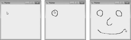
In line 12, the program declares variable shouldPaint, which determines whether to draw on the Form. We want the program to draw only while the mouse button is pressed (i.e., held down). Thus, when the user clicks or holds down a mouse button, the system generates a MouseDown event, and the event handler (lines 21–26) sets shouldPaint to true. When the user releases the mouse button, the system generates a MouseUp event, shouldPaint is set to false in the PainterForm_MouseUp event handler (lines 29–33) and the program stops drawing. Unlike MouseMove events, which occur continuously as the user moves the mouse, the system generates a MouseDown event only when a mouse button is first pressed and generates a MouseUp event only when a mouse button is released.
Whenever the mouse moves over a control, the MouseMove event for that control occurs. Inside the PainterForm_MouseMove event handler (lines 36–48), the program draws only if shouldPaint is true (i.e., a mouse button is pressed). In the using statement, line 42 calls inherited Form method CreateGraphics to create a Graphics object that allows the program to draw on the Form. Class Graphics provides methods that draw various shapes. For example, lines 44–45 use method FillEllipse to draw a circle. The first parameter to method FillEllipse in this case is an object of class SolidBrush, which specifies the solid color that will fill the shape. The color is provided as an argument to class SolidBrush’s constructor. Type Color contains numerous predefined color constants—we selected Color.BlueViolet. FillEllipse draws an oval in a bounding rectangle that is specified by the x- and y- coordinates of its upper-left corner, its width and its height—the final four arguments to the method. The x- and y- coordinates represent the location of the mouse event and can be taken from the mouse-event arguments (e.X and e.Y). To draw a circle, we set the width and height of the bounding rectangle so that they’re equal—in this example, both are 4 pixels. Graphics, SolidBrush and Color are all part of the namespace System.Drawing. Recall from Chapter 13 that the using statement automatically calls Dispose on the object that was created in the parentheses following keyword using. This is important because Graphics objects are a limited resource. Calling Dispose on a Graphics object ensures that its resources are returned to the system for reuse.
Key events occur when keyboard keys are pressed and released. Such events can be handled for any control that inherits from System.Windows.Forms.Control. There are three key events—KeyPress, KeyUp and KeyDown. The KeyPress event occurs when the user presses a key that represents an ASCII character. The specific key can be determined with property KeyChar of the event handler’s KeyPressEventArgs argument. ASCII is a 128-character set of alphanumeric symbols, a full listing of which can be found in Appendix C.
The KeyPress event does not indicate whether modifier keys (e.g., Shift, Alt and Ctrl) were pressed when a key event occurred. If this information is important, the KeyUp or KeyDown events can be used. The KeyEventArgs argument for each of these events contains information about modifier keys. Figure 14.39 lists important key event information. Several properties return values from the Keys enumeration, which provides constants that specify the various keys on a keyboard. Like the FontStyle enumeration (Section 14.7), the Keys enumeration is represented with a set of bits, so the enumeration’s constants can be combined to indicate multiple keys pressed at the same time.
Table 14.39. Keyboard events and event arguments.
Key Events with Event Arguments of Type | |
| Generated when a key is initially pressed. |
| Generated when a key is released. |
Key Event with Event Argument of Type | |
| Generated when a key is pressed. Raised after |
Class | |
| Returns the ASCII character for the key pressed. |
Class | |
| Indicates whether the Alt key was pressed. |
| Indicates whether the Ctrl key was pressed. |
| Indicates whether the Shift key was pressed. |
| Returns the key code for the key as a value from the |
| Returns the key code for a key combined with modifier information as a |
| Returns the key code as an |
| Returns a |
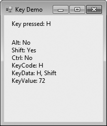
Figure 14.40 demonstrates the use of the key-event handlers to display a key pressed by a user. The program is a Form with two Labels that displays the pressed key on one Label and modifier key information on the other.
Example 14.40. Demonstrating keyboard events.
 1   // Fig. 14.40: KeyDemo.cs
 2   // Displaying information about the key the user pressed.
 3   using System;
 4   using System.Windows.Forms;
 5
 6   namespace KeyDemo
 7   {
 8      // Form to display key information when key is pressed
 9      public partial class KeyDemo : Form
10      {
11         // default constructor
12         public KeyDemo()
13         {
14            InitializeComponent();
15         } // end constructor
16
17         // display the character pressed using KeyChar
18         private void KeyDemo_KeyPress(
19            object sender, KeyPressEventArgs e )
20         {
21            charLabel.Text = "Key pressed: " + e.KeyChar;
22         } // end method KeyDemo_KeyPress
23
24         // display modifier keys, key code, key data and key value
25         private void KeyDemo_KeyDown( object sender, KeyEventArgs e )
26         {
27            keyInfoLabel.Text =
28               "Alt: " + ( e.Alt ? "Yes" : "No" ) + '
' +
29               "Shift: " + ( e.Shift ? "Yes" : "No" ) + '
' +
30               "Ctrl: " + ( e.Control ? "Yes" : "No" ) + '
' +
31               "KeyCode: " + e.KeyCode + '
' +
32               "KeyData: " + e.KeyData + '
' +
33               "KeyValue: " + e.KeyValue;
34         } // end method KeyDemo_KeyDown
35
36         // clear Labels when key released
37         private void KeyDemo_KeyUp( object sender, KeyEventArgs e )
38         {
39            charLabel.Text = "";
40            keyInfoLabel.Text = "";
41         } // end method KeyDemo_KeyUp
42      } // end class KeyDemo
43   } // end namespace KeyDemo

b) F7 pressed
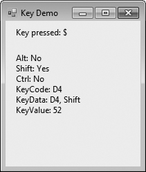
c) $ pressed

d) Tab pressed
Control charLabel displays the character value of the key pressed, whereas keyInfoLabel displays information relating to the pressed key. Because the KeyDown and KeyPress events convey different information, the Form (KeyDemo) handles both.
The KeyPress event handler (lines 18–22) accesses the KeyChar property of the KeyPressEventArgs object. This returns the pressed key as a char, which we then display in charLabel (line 21). If the pressed key is not an ASCII character, then the KeyPress event will not occur, and charLabel will not display any text. ASCII is a common encoding format for letters, numbers, punctuation marks and other characters. It does not support keys such as the function keys (like F1) or the modifier keys (Alt, Ctrl and Shift).
The KeyDown event handler (lines 25–34) displays information from its KeyEventArgs object. The event handler tests for the Alt, Shift and Ctrl keys by using the Alt, Shift and Control properties, each of which returns a bool value—true if the corresponding key is pressed and false otherwise. The event handler then displays the KeyCode, KeyData and KeyValue properties.
The KeyCode property returns a Keys enumeration value (line 31). The KeyCode property returns the pressed key, but does not provide any information about modifier keys. Thus, both a capital and a lowercase “a” are represented as the A key.
The KeyData property (line 32) also returns a Keys enumeration value, but this property includes data about modifier keys. Thus, if “A” is input, the KeyData shows that both the A key and the Shift key were pressed. Lastly, KeyValue (line 33) returns an int representing a pressed key. This int is the key code. The key code is useful when testing for non-ASCII keys like F12.
The KeyUp event handler (lines 37–41) clears both Labels when the key is released. As we can see from the output, non-ASCII keys are not displayed in charLabel, because the KeyPress event is not generated. For example, charLabel does not display any text when you press the F7 or Tab keys, as shown in Fig. 14.40(b) and (d). However, the KeyDown event still is generated, and keyInfoLabel displays information about the key that is pressed. The Keys enumeration can be used to test for specific keys by comparing the key pressed to a specific KeyCode.
Software Engineering Observation 14.2
To cause a control to react when a particular key is pressed (such as Enter), handle a key event and test for the pressed key. To cause a Button to be clicked when the Enter key is pressed on a Form, set the Form’s AcceptButton property.
By default, a keyboard event is handled by the control that currently has the focus. Sometimes it’s appropriate to have the Form handle these events. This can be accomplished by setting the Form’s KeyPreview property to true, which makes the Form receive keyboard events before they’re passed to another control. For example, a key press would raise the Form’s KeyPress, even if a control within the Form has the focus instead of the Form itself.
This chapter introduced several common GUI controls. We discussed event handling in detail, and showed how to create event handlers. We also discussed how delegates are used to connect event handlers to the events of specific controls. You learned how to use a control’s properties and Visual Studio to specify the layout of your GUI. We then demonstrated several controls, beginning with Labels, Buttons and TextBoxes. You learned how to use GroupBoxes and Panels to organize other controls. We then demonstrated CheckBoxes and RadioButtons, which are state buttons that allow users to select among several options. We displayed images in PictureBox controls, displayed helpful text on a GUI with ToolTip components and specified a range of numeric input values for users with a NumericUpDown control. We then demonstrated how to handle mouse and keyboard events. The next chapter introduces additional GUI controls. You’ll learn how to add menus to your GUIs and create Windows applications that display multiple Forms.
A graphical user interface (GUI) allows a user to interact visually with a program.
By providing different applications with a consistent set of intuitive user-interface components, GUIs enable users to become productive with each application faster.
GUIs are built from GUI controls.
GUI controls are objects that can display information on the screen or enable users to interact with an application via the mouse, keyboard or some other form of input.
Windows Forms are used to create the GUIs for programs.
A
Formis a graphical element that appears on the desktop; it can be a dialog, a window or an MDI (multiple document interface) window.A component is an instance of a class that implements the
IComponentinterface, which defines the behaviors that components must implement, such as how the component is loaded.A control has a graphical representation at runtime.
Some components lack graphical representations (e.g., class
Timerof namespaceSystem.Windows.Forms). Such components are not visible at runtime.When there are several windows on the screen, the active window is the frontmost and has a highlighted title bar. A window becomes the active window when the user clicks somewhere inside it.
The active window is said to “have the focus.”
A
Formis a container for controls and components.
Normally, a user interacts with an application’s GUI to indicate the tasks that the application should perform.
GUIs are event driven.
When the user interacts with a GUI component, the interaction—known as an event—drives the program to perform a task. Common events include clicking a
Button, typing in aTextBox, selecting an item from a menu, closing a window and moving the mouse.A method that performs a task in response to an event is called an event handler, and the overall process of responding to events is known as event handling.
An event handler executes only when the user performs the specific event.
Each event handler receives two parameters when it’s called. The first—an
objectreference typically namedsender—is a reference to the object that generated the event. The second is a reference to an event arguments object of typeEventArgs(or one of its derived classes), which is typically namede. This object contains additional information about the event that occurred.EventArgsis the base class of all classes that represent event information.
Visual Studio generates the code that creates and initializes the GUI that you build in the GUI design window. This auto-generated code is placed in the
Designer.csfile of theForm.The auto-generated code that defines the GUI is part of the
Form’s class. The use of thepartialmodifier in the class declaration allows the class to be split among multiple files.The
Designer.csfile declares the controls you create in Design mode. By default, all variable declarations for controls created through C#’s design window have aprivateaccess modifier.The
Designer.csfile includes theDisposemethod for releasing resources and methodInitializeComponent, which sets the properties of theFormand its controls.Visual Studio uses the code in
InitializeComponentto create the GUI you see in design view. Changing the code in this method may prevent Visual Studio from displaying the GUI properly.
The control that generates an event is known as the event sender.
An event-handling method—known as the event handler—responds to a particular event that a control generates.
When an event occurs, the event sender calls its event handler to perform a task.
The .NET event-handling mechanism allows you to choose your own names for event-handling methods. However, each event-handling method must declare the proper parameters to receive information about the event that it handles.
Event handlers are connected to a control’s events via special objects called delegates.
A delegate object holds a reference to a method with a signature specified by the delegate type’s declaration.
GUI controls have predefined delegates that correspond to every event they can generate.
An event sender calls a delegate object like a method.
Since each event handler is declared as a delegate, the event sender can simply call the appropriate delegate when an event occurs. The delegate’s job is to invoke the appropriate method.
Event delegates represent a set of delegate objects that all have the same signature.
When an event occurs, its sender calls every method referenced by a multicast delegate. Multicast delegates enable several methods to be called in response to a single event.
Event delegates derive from class
MulticastDelegate, which derives from classDelegate(both from namespaceSystem).
Double-clicking a control on the
Formin the designer creates an event handler for a control’s default event.Typically, controls can generate many different events, and each can have its own event handler.
You can create additional event handlers through the Properties window.
If you select a control on the
Form, then click the Events icon (the lightning bolt icon) in the Properties window, all the events for that control are listed in the window. You can double click an event’s name to display the event handler in the editor, if the event handler already exists, or to create the corresponding event handler.You can select an event, then use the drop-down list to its right to choose an existing method that should be used as the event handler for that event. The methods that appear in this dropdown list are the
Formclass’s methods that have the proper signature to be an event handler for the selected event.A single event handler can handle multiple events from multiple controls.
Read the Visual Studio documentation to learn about the different events raised by each control. To do this, select a control in the IDE and press the F1 key to display that control’s online help.
The web page that is displayed contains basic information about the control’s class. Click the link to the list of events for that control to display the supported events for that control.
Controls derive from class
Control(of namespaceSystem.Windows.Forms).The
Selectmethod transfers the focus to a control and makes it the active control.The
Enabledproperty indicates whether the user can interact with a control to generate an event.A programmer can hide a control from the user without disabling the control by setting the
Visibleproperty tofalseor by calling methodHide.Anchoring causes controls to remain at a fixed distance from the sides of the container even when the control is resized.
Docking attaches a control to a container such that the control stretches across an entire side or fills all the remaining space.
Forms have aPaddingproperty that specifies the distance between the docked controls and theFormedges.The
AnchorandDockproperties of aControlare set with respect to theControl’s parent container, which could be aFormor other parent container (such as aPanel).The minimum and maximum
Form(or otherControl) sizes can be set via propertiesMinimumSizeandMaximumSize, respectively.When dragging a control across a
Form, blue lines (known as snap lines) appear to help you position the control with respect to other controls and theForm’s edges.Visual Studio also provides the Format menu, which contains several options for modifying your GUI’s layout.
Labels provide text information (as well as optional images) that the user cannot directly modify.
A textbox (class
TextBox) is an area in which text either can be displayed by a program or in which the user can type text via the keyboard.A password
TextBoxis aTextBoxthat hides the information entered by the user. As the user types, the passwordTextBoxmasks the user input by displaying a password character (usually*). If you set theUseSystemPasswordCharproperty totrue, theTextBoxbecomes a passwordTextBox.A button is a control that the user clicks to trigger an action in a program or to select an option.
All the button classes derive from class
ButtonBase(namespaceSystem.Windows.Forms), which defines common button features.
GroupBoxes andPanels arrange controls on a GUI.GroupBoxes andPanels are typically used to group several controls of similar functionality or several controls that are related in a GUI.GroupBoxes can display a caption (i.e., text) and do not include scrollbars, whereasPanels can include scrollbars and do not include a caption.GroupBoxes have thin borders by default;Panels can be set so that they also have borders, by changing theirBorderStyleproperty.The controls of a
GroupBoxorPanelare added to the container’sControls property.To enable a
Panel’s scrollbars, set thePanel’sAutoScrollproperty totrue. If thePanelis resized and cannot display all of its controls, scrollbars appear.
CheckBoxes andRadioButtons can be in the on/off or true/false states.Classes
CheckBoxandRadioButtonare derived from classButtonBase.A
CheckBoxis a small square that either is blank or contains a check mark. When aCheckBoxis selected, a check mark appears in the box. Any number ofCheckBoxes can be selected at a time.A
CheckBoxcan be configured to have three states—checked, unchecked, and indeterminate—by setting itsThreeStateproperty totrue.Font styles can be combined via bitwise operators, such as the logical OR (
|) operator or the logical exclusive OR (^) operator.RadioButtons (defined with classRadioButton) are similar toCheckBoxes in that they also have two states: selected and not selected (also called deselected).RadioButtons normally appear as a group, in which only oneRadioButtoncan be selected at a time. The selection of oneRadioButtonin the group forces all the others to be deselected. Therefore,RadioButtons are used to represent a set of mutually exclusive options.All
RadioButtons added to a container become part of the same group.
A
PictureBoxdisplays an image.The
Imageproperty specifies the image that is displayedThe
SizeModeproperty indicates how the image is displayed (Normal,StretchImage,Autosize,CenterImage, orZoom).You can embed images into a project as resources.
Embedded image files appear in a folder named Resources in the Solution Explorer.
The
Resourcesclass (of a project’s properties namespace) stores a project’s resources.Class
ResourceManagerprovides methods for programmatically accessing a project’s resources.To access an image (or any other resource) in the project’s resources, you use the method
GetObjectof classResourceManager, which takes as an argument the resource name as it appears in the Resources tab and returns the resource as anObject.The
Resourcesclass also provides direct access to the resources you define with expressions of the formResources. resourceName, where resourceName is the name you provided to the resource when you created it. When using such an expression, the resource returned already has the appropriate type.
Tool tips help you become familiar with a
Form’s features and serve as useful reminders for each control’s functionality. In the Properties window, you can specify a tool tip for a control by setting the ToolTip on componentName entry, where componentName is the name of theToolTipcomponent.The
ToolTipcomponent can be used to add tool tips to your application.The component tray is the gray region below the
Formin Design mode.
At times you’ll want to restrict a user’s input choices to a specific range of numeric values. This is the purpose of the
NumericUpDowncontrol.The
NumericUpDowncontrol appears as aTextBox, with two smallButtons on the right side, one with an up arrow and one with a down arrow. By default, a user can type numeric values into this control as if it were aTextBoxor click the up and down arrows to increase or decrease the value in the control, respectively.The largest and smallest values in the range are specified with the
MaximumandMinimumproperties, respectively (both are of typedecimal).The
Incrementproperty (of typedecimal) specifies by how much the current number in the control changes when the user clicks the control’s up and down arrows.Setting a
NumericUpDowncontrol’sReadOnlyproperty totruespecifies that the user can only use the up and down arrows to modify the value in theNumericUpDowncontrol.
Mouse events, such as clicks and moves, are generated when the mouse interacts with a control.
Mouse events can be handled for any subclass of
System.Windows.Forms.Control.Class
MouseEventArgscontains information related to the mouse event, such as the x- and y coordinates of the mouse pointer, the mouse button pressed (Right,LeftorMiddle) and the number of times the mouse was clicked.Whenever the user clicks or holds down a mouse button, the system generates a
MouseDownevent.When the user releases the mouse button (to complete a “click” operation), the system generates a single
MouseUpevent.Whenever the mouse moves over a control, the
MouseMoveevent for that control is raised.
Keyevents occur when keys on the keyboard are pressed and released.There are three key events—
KeyPress,KeyUpandKeyDown.The
KeyPressevent occurs when the user presses a key that represents an ASCII character. The specific key can be determined with propertyKeyCharof the event handler’sKeyPressEventArgsargument.The
KeyPressevent does not indicate whether modifier keys were pressed when a key event occurred. If this information is important, theKeyUporKeyDownevents can be used.
Checkedproperty of classCheckBoxCheckedproperty of classRadioButtonCheckedChangedevent of classRadioButtonCheckStateproperty of classCheckBoxCheckStateChangedevent of classCheckBoxevent handler
FlatStyleproperty of classButtonmouse press
SizestructureTabStopproperty of classControlUpDownAlignproperty of classNumericUpDownValueproperty of classNumericUpDown
14.3 | Extend the program in Fig. 14.26 to include a | |
14.4 | Create the GUI in Fig. 14.41 (you do not have to provide functionality). | |
14.5 | Create the GUI in Fig. 14.42 (you do not have to provide functionality). | |
14.6 | (Temperature Conversions) Write a temperature conversion program that converts from Fahrenheit to Celsius. The Fahrenheit temperature should be entered from the keyboard (via a
| |
14.7 | (Enhanced Painter) Extend the program of Fig. 14.38 to include options for changing the size and color of the lines drawn. Create a GUI similar to Fig. 14.43. The user should be able to draw on the application’s | |
14.8 | (Guess the Number Game) Write a program that plays “guess the number” as follows: Your program chooses the number to be guessed by selecting an I have a number between 1 and 1000--can you guess my number? Please enter your first guess. A | |
14.9 | (Fuzzy Dice Order Form) Write an application that allows users to process orders for fuzzy dice. The application should calculate the total price of the order, including tax and shipping. |
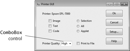
14.10 | (Ecofont) Ecofont (www.ecofont.eu/ecofont_en.html)—developed by SPRANQ (a Netherlands-based company)—is a free, open-source computer font designed to reduce by as much as 20% the amount of ink used for printing, thus reducing also the number of ink cartridges used and the environmental impact of the manufacturing and shipping processes (using less energy, less fuel for shipping, and so on). The font, based on sans-serif Verdana, has small circular “holes” in the letters that are not visible in smaller sizes—such as the 9- or 10-point type frequently used. Download Ecofont, then install the font file inputTextBox.Font = new Font( inputTextBox.Font.FontFamily, inputTextBox.Font.SizeInPoints + 1 ); This changes the |
14.11 | (Project: Typing Tutor—Tuning a Crucial Skill in the Computer Age) Typing quickly and correctly is an essential skill for working effectively with computers and the Internet. In this exercise, you’ll build an application that can help users learn to “touch type” (i.e., type correctly without looking at the keyboard). The application should display a virtual keyboard that mimics the one on your computer and should allow the user to watch what he or she is typing on the screen without looking at the actual keyboard. Use You can test your program by typing a pangram—a phrase that contains every letter of the alphabet at least once—such as “The quick brown fox jumped over a lazy dog.” You can find other pangrams on the web. To make the program more interesting you could monitor the user’s accuracy. You could have the user type specific phrases that you’ve prestored in your program and that you display on the screen above the virtual keyboard. You could keep track of how many keystrokes the user types correctly and how many are typed incorrectly. You could also keep track of which keys the user is having difficulty with and display a report showing those keys. |