
7. Designing Powerful User Interfaces
The Android platform has matured over time, especially when it comes to the user experience. We’ve already talked about many of the user interface controls you can leverage in your applications. Now we take a broader look at some of the user interface features available in the Android SDK, including various kinds of menus, action bars, styles, and themes. We also talk about the Android development team’s new initiative to document a set of guidelines and best practices for Android application design.
Following Android User Interface Guidelines
When we wrote the first edition of this book several years ago, design was not the focus, and really it still isn’t—not for us developers with little artistic sense whatsoever, anyway. That’s what designers are for. As the platform has matured, design patterns have arisen. Some have succeeded, others have failed. It’s hard to keep up and developers have expressed no small amount of frustration over the number of UI overhauls that have occurred with each new revision of the Android platform. In early 2011, the Android development team launched a new Android developer education initiative called Android Design. Android Design is a website where you can learn all about the user interface principles recommended by the platform designers. These are recommendations, not requirements, but they are generally sound. That doesn’t mean you can’t break the mold and do something innovative, but it provides a nice baseline that will help developers with or without design talent raise the bar in terms of application user interface design. Check out Android Design at http://d.android.com/design/.

We cover some of the most commonly used platform user interface features in this chapter, but there are many we do not have the space to cover. For more information, see the Resources listed at the end of this chapter.

There’s a famous quote by the late Steve Jobs that is appropriate here:
“People think it’s this veneer—that the designers are handed this box and told, ‘Make it look good!’ That’s not what we think design is. It’s not just what it looks like and feels like. Design is how it works.”
From the November 30, 2003, New York Times article, “The Guts of a Machine.” http://goo.gl/6WiMe.
Working with Menus
You need to be aware of several types of application menus for use within your Android applications. The way menus have worked on the Android platform have changed over time, especially as we have seen devices move from hardware buttons to software buttons and action bars. The three main menu types available in Android are:
• The options menus (replaced by action bars as of API Level 11)
• The context menu (replaced by contextual action modes as of API Level 11)
• The popup menu (added in API Level 11)
Each type of menu has a special purpose, and each is used in different circumstances. It is best described in terms of scope. The scope of an options menu is the screen or the application at large—its actions apply in general. The scope of a context menu is the item for which the menu is attached to—for example, each item in a ListView might have a context menu for editing or deleting the item. Finally, popup menus are like secondary context menus—they are tied to a View control on the screen, but they should not provide actions that directly affect that item as a context menu would. Let’s look at each of these menu types in more detail.
Using Options Menus
Options menus are an older style menu used primarily on devices running Android 2.3 and earlier. These devices normally have physical buttons for actions like Home and Menu. The Android SDK provides a method for users to bring up a menu in an Activity by pressing the Menu button, as shown in Figure 7.1. This is the traditional options menu behavior. Applications that target later versions of the Android SDK should use action bars instead, as discussed later in this chapter.
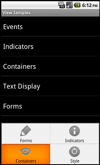
Figure 7.1. Traditional options menu behavior (up to Android 2.3).
You can use options menus in your application to bring up help, to navigate, to provide additional controls, or to configure options. The options menu items can contain icons, submenus, and keyboard shortcuts.
For an options menu to show when a user presses the Menu button on his device, you need to override the implementation of onCreateOptionsMenu() in your Activity. Here is a sample implementation that gives the user three menu items to choose from:
public boolean onCreateOptionsMenu( android.view.Menu menu) {
super.onCreateOptionsMenu(menu);
menu.add("Forms")
.setIcon(android.R.drawable.ic_menu_edit)
.setIntent(new Intent(this, FormsActivity.class));
menu.add("Indicators")
.setIntent(new Intent(this, IndicatorsActivity.class))
.setIcon(android.R.drawable.ic_menu_info_details);
menu.add("Containers")
.setIcon(android.R.drawable.ic_menu_view)
.setIntent(new Intent(this, ContainersActivity.class));
return true;
}
For each of the items that are added, we also set a built-in icon resource and assign an Intent to each item. We give the item title with a regular text string, for clarity. You can also use a resource identifier. For this example, there is no other handling or code needed. When one of these menu items is selected, the Activity described by the Intent starts.
This type of options menu can be useful for navigating to important parts of an application, such as the help page, from anywhere within your application. Another great use for an options menu is to allow configuration options for a given screen. The user can configure these options in the form of checkable menu items. The initial menu that appears when the user presses the Menu button does not support checkable menu items. Instead, you must place these menu items on a SubMenu control, which is a type of Menu that can be configured in a menu. SubMenu objects support checkable items but do not support icons or other SubMenu items. Building on the preceding example, the following is code for programmatically adding a SubMenu control to the previous Menu:
SubMenu style_choice = menu.addSubMenu("Style")
.setIcon(android.R.drawable.ic_menu_preferences);
style_choice.add(style_group, light_id, 1, "Light")
.setChecked(isLight);
style_choice.add(style_group, dark_id, 2, "Dark")
.setChecked(!isLight);
style_choice.setGroupCheckable(style_group, true, true);
This code would be inserted before the return statement in the implementation of the onCreateOptionsMenu() method. It adds a single menu item with an icon to the previous menu, called “Style.” When the “Style” option is clicked, a menu with the two items of the SubMenu control is displayed. These items are grouped together and the checkable icon, by default, looks like the radio button icon. The checked state is assigned during creation time.
To handle the event when a menu option item is selected, we also implement the onOptionsItemSelected() method, as shown here:
public boolean onOptionsItemSelected(MenuItem item) {
if (item.getItemId() == light_id) {
item.setChecked(true);
isLight = true;
return true;
} else if (item.getItemId() == dark_id) {
item.setChecked(true);
isLight = false;
return true;
}
return super.onOptionsItemSelected(item);
}
This method must call the super class’s onOptionsItemSelected() method for basic behavior to work. The actual MenuItem object is passed in, and we can use that to retrieve the identifier that we previously assigned to see which one is selected and performs an appropriate action. Here, we switch the values and return. By default, a Menu control goes away when any item is selected, including checkable items. This means it’s useful for quick settings but not as useful for extensive settings where the user might want to change more than one item at a time.
As you add more menu items to your options menu, you might notice that a “More” item automatically appears. This happens whenever more than six items are visible. If the user selects this, the full menu is shown. The full, expanded menu doesn’t show menu icons and although checkable items are possible, you should not use them here. Additionally, the full title of an item doesn’t display. The initial menu, also known as the icon menu, shows only a portion of the title for each item. You can assign each item a condensedTitle attribute, which shows instead of a truncated version of the regular title. For example, instead of the title “Instant Message,” you can set the condensedTitle attribute to “IM” as a common short form.
Using Context Menus
The ContextMenu class (android.view.ContextMenu) is a subtype of Menu that you can configure to display when a long press is performed on a View. As the name implies, the ContextMenu provides for contextual menus to display to the user for performing additional actions on selected items. This method of providing context-based actions is most appropriate for applications running API Level 10 or lower.
ContextMenu objects are slightly more complex than OptionsMenu objects. You need to implement the onCreateContextMenu() method of your Activity for one to display. However, before that is called, you must call the registerForContextMenu() method and pass in the View for which you want to have a context menu. This means each View on your screen can have a different context menu, which is appropriate as the menus are designed to be highly contextual.
Here we have an example of a Chronometer timer, which responds to a long click with a context menu:
registerForContextMenu(timer);
After the call to the registerForContextMenu() method has been executed, the user can then long click on the View to open the context menu. Each time this happens, your activity gets a call to the onCreateContextMenu() method, and your code creates the menu each time the user performs the long click.
The following is an example of a context menu for the Chronometer control, as previously used:
public void onCreateContextMenu(
ContextMenu menu, View v, ContextMenuInfo menuInfo) {
super.onCreateContextMenu(menu, v, menuInfo);
if (v.getId() == R.id.Chronometer01) {
getMenuInflater().inflate(R.menu.timer_context, menu);
menu.setHeaderIcon(android.R.drawable.ic_media_play)
.setHeaderTitle("Timer controls");
}
}
Recall that any View control can register to trigger a call to the onCreateContextMenu() method when the user performs a long press. This means we have to check which View control it was for and which user tried to get a context menu. Next, we inflate the appropriate menu from a menu resource that we defined with XML. Because we can’t define header information in the menu resource file, we set a stock Android SDK resource to it and add a title. Here is the menu resource that is inflated:
<menu
xmlns:android="http://schemas.android.com/apk/res/android">
<item
android:id="@+id/start_timer"
android:title="Start" />
<item
android:id="@+id/stop_timer"
android:title="Stop" />
<item
android:id="@+id/reset_timer"
android:title="Reset" />
</menu>
This defines three menu items. If this weren’t a context menu, we could have assigned icons. However, context menus do not support icons, submenus, or shortcuts.
Now we need to handle the ContextMenu clicks by implementing the onContextItemSelected() method in our Activity. Here’s an example:
public boolean onContextItemSelected(MenuItem item) {
super.onContextItemSelected(item);
boolean result = false;
Chronometer timer = (Chronometer)findViewById(R.id.Chronometer01);
switch (item.getItemId()){
case R.id.stop_timer:
timer.stop();
result = true;
break;
case R.id.start_timer:
timer.start();
result = true;
break;
case R.id.reset_timer:
timer.setBase(SystemClock.elapsedRealtime());
result = true;
break;
}
return result;
}
Because we have only one context menu in this example, we find the Chronometer for use in this method. This method is called regardless of which context menu the selected item is on, though, so you should take care to have unique resource identifiers or keep track of which menu is shown. This can be accomplished because the context menu is created each time it’s shown.
Using Popup Menus
Introduced in API Level 11, the PopupMenu class (android.widget.PopupMenu) is a modal window that pops up and floats near a View control. Touching outside the popup dismisses it. Popup menus should be used when action bar options menus and context menus are not appropriate. See the Android SDK documentation for more details.
Enabling Action Bars
Action bars are a relatively new navigational user interface mechanism introduced in Android 3.0 (API Level 11). Action bars replace the traditional application title bar, but provide a much richer set of features, allowing the user to traverse the screens and features of your applications more quickly, with fewer clicks, and with less confusion. Action bars have also helped standardize application navigation as newer types of Android devices like tablets have been moving away from having physical hardware buttons to software buttons.
Many of the code examples provided in this section are taken from the SimpleActionBars application. This source code for the SimpleActionBars application is provided for download on the book’s websites.
The concept of the action bar is straightforward. If your application has an options menu—that is, a menu of action items that comes up when the user presses the Menu button—then your application can easily take advantage of the action bar features in Android 3.0, which basically modify the application title bar to include those actions previously shown in the options menu in an easy-to-use way, as shown in Figure 7.2.
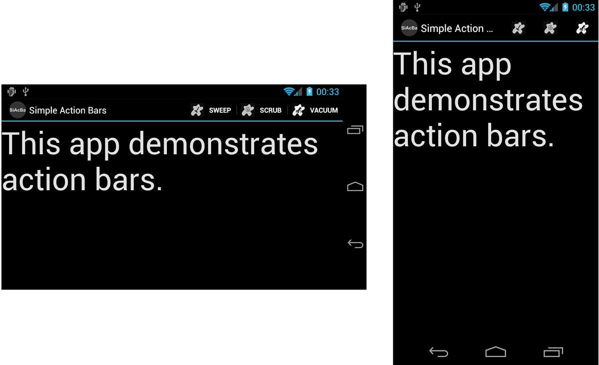
Figure 7.2. Action bar demonstration showing dynamic behavior.
One tricky thing about action bars is that they look and behave differently, depending on the Android platform version.
Building Basic Action Bars
Let’s look at a simple example. Let’s assume we have an application with four screens: a main Activity to launch into, and three other “cleaning” Activity classes for sweeping, scrubbing, and vacuuming. Now, we add an options menu to our main Activity that enables the user to jump to the three “cleaning” features easily, as shown in Figure 7.3.
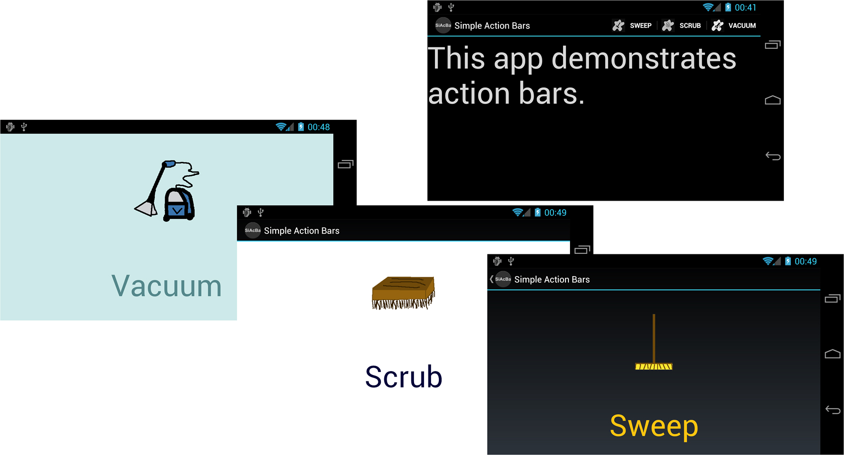
Figure 7.3. A simple app with an options menu and four screens.
The two basic components of this application are the options menu resource file and the main Activity class. The other Activity classes simply display an ImageView and a TextView control. The options menu resource file simply defines the options menu items:
<?xml version="1.0" encoding="utf-8"?>
<menu
xmlns:android="http://schemas.android.com/apk/res/android">
<item
android:id="@+id/sweep"
android:icon="@drawable/ic_menu_sweep"
android:title="@string/sweep"
android:onClick="onOptionSweep" />
<item
android:id="@+id/scrub"
android:icon="@drawable/ic_menu_scrub"
android:title="@string/scrub"
android:onClick="onOptionScrub" />
<item
android:id="@+id/vacuum"
android:icon="@drawable/ic_menu_vac"
android:title="@string/vacuum"
android:onClick="onOptionVacuum" />
</menu>
The main Activity class loads this menu resource as an options menu, and defines the onClick() handlers for each options menu item, as follows:
public class SimpleActionBarsActivity extends Activity {
@Override
public void onCreate(Bundle savedInstanceState) {
super.onCreate(savedInstanceState);
setContentView(R.layout.main);
}
@Override
public boolean onCreateOptionsMenu(Menu menu) {
MenuInflater inflater = getMenuInflater();
inflater.inflate(R.menu.cleaningoptions, menu);
return true;
}
public void onOptionSweep(MenuItem i)
{
startActivity(new Intent(this, SweepActivity.class));
}
public void onOptionScrub(MenuItem i)
{
startActivity(new Intent(this, ScrubActivity.class));
}
public void onOptionVacuum(MenuItem i)
{
startActivity(new Intent(this, VacuumActivity.class));
}
}
We aren’t doing anything fancy here, so we technically do not need to set the application’s Android manifest file to a high target API level. So let’s say we simply set it to something older, such as API Level 9, as shown here:
<uses-sdk android:minSdkVersion="9" />
When we run this “legacy” application on a device running API Level 11 and later, the system bar shows a fourth icon that looks like a grid. This is the software button equivalent of the Menu button found on traditional Android phones. Clicking it displays the options menu, much as it would on an older smartphone, as shown in Figure 7.4. The title bar at the top of the screen is simply a skinny bar that shows the application’s title.
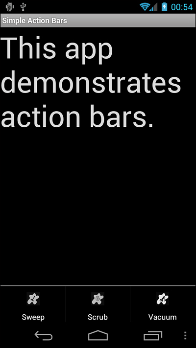
Figure 7.4. Legacy options menu application behavior on later SDKs.
If we modify the target API level of the application’s Android manifest file and set it to API Level 11 (Honeycomb), then the action bar mechanism is automatically applied to the application.
<uses-sdk android:minSdkVersion="11" />
By default, the title bar is now thicker. It shows the application icon, the application name, and what is called the overflow menu icon. Clicking this icon results in a textual menu that lists the options menu items, as shown in Figure 7.5.
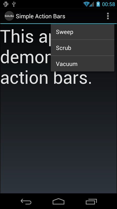
Figure 7.5. Action bar behavior on a device with API Level 11 and later.
Customizing Your Action Bar
When your application targets the Honeycomb platform or later, you can really start to take advantage of what the action bar widget has to offer by placing your option menu items right on the action bar to make things easier for the user. The primary menu item attribute that controls this behavior is the android:showAsAction attribute. This attribute can be any of the following values:
• always: This value causes the menu item to always be shown on the action bar.
• ifRoom: This value causes the menu item to be shown on the action bar if there is sufficient room.
• never: This value causes the menu item to never be shown on the action bar.
• withText: This value causes the menu item to be displayed with its icon and its menu text.
You can modify the options menu resource file to use this attribute in different ways. First, if you look back at Figure 7.2, this is what the action bar looks like if you set each menu item to display if there’s room, along with its name. In other words, each menu item has the following attribute:
android:showAsAction="ifRoom|withText"
Another reasonable setting is to display each menu item on the action bar, provided there is space, but without the clutter of the text. In other words, each menu item has the following attribute:
android:showAsAction="ifRoom"
Figure 7.6 shows what this change achieves on your typical device with API Level 11 or later.
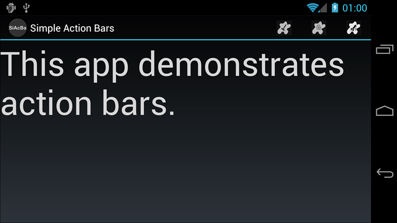
Figure 7.6. Showing menu items on the action bar when room is available, not including text.
Finally, let’s say that we never want to see the Vacuum menu item on the action bar.
android:showAsAction="never"
This results in two menu items on the action bar: Sweep and Scrub. Then, in the far-right corner, you’ll see the overflow menu again. Click it to see any menu items set to never (such as Vacuum) and any other menu items that might not have fit on the action bar, as shown in Figure 7.7.
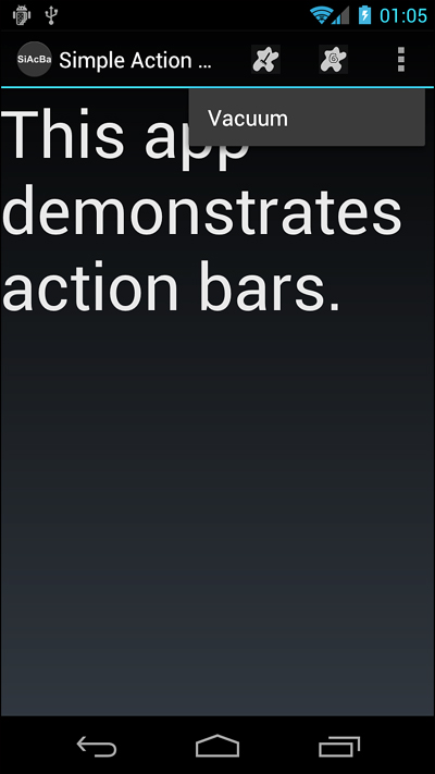
Figure 7.7. Showing some menu items on the action bar while others never show (instead appear in the overflow menu).
Handling Application Icon Clicks on the Action Bar
Another feature of the action bar is that the user can click the application icon in the top-left corner. Although clicking does nothing by default, adding a custom “home” functionality, perhaps to your launch screen, is easy. Let’s say you want to update the default action bar in the ScrubActivity class so that clicking the application icon causes the user to return to the main launch activity (clearing the activity stack at the same time).
To do this, you would simply implement the onOptionsItemSelected() method for the ScrubActivity class and handle the special menu item identifier called android.R.id.home, like this:
@Override
public boolean onOptionsItemSelected(MenuItem item)
{
switch (item.getItemId())
{
case android.R.id.home:
Intent intent = new Intent(this, ActOnThisActivity.class);
intent.addFlags(Intent.FLAG_ACTIVITY_CLEAR_TOP);
startActivity(intent);
return true;
default:
return super.onOptionsItemSelected(item);
}
}
That’s all there is to it (refer to Figure 7.3, bottom center). You can also display a little arrow to the left of the application icon to identify that you are moving back up the screen hierarchy of your application by using the setDisplayHomeAsUpEnabled() method in your onCreate() method of the Activity in conjunction with implementing the special home menu item click handler.
ActionBar bar = getActionBar();
bar.setDisplayHomeAsUpEnabled(true);
The resulting action bar, if we were to enable it on the Sweep screen, is shown in Figure 7.8.
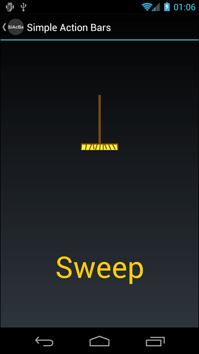
Figure 7.8. An action bar with a clickable Home button and an up indicator.
Working with Screens That Do Not Require Action Bars
Once you’ve set your application target to API 11 or higher, all your screens will have action bars by default. However, you can remove the action bar from a screen in several ways. Perhaps the simplest way is to turn it off programmatically from within your activity class. For example, we can turn off the action bar on the Vacuum screen with the following two lines of code added to the onCreate() method of the activity class:
ActionBar bar = getActionBar();
bar.hide();
This code removes the entire bar from the top of the screen (Figure 7.3, bottom, left). The application name is not shown at all. You can also hide the action bar easily in layout files by creating a special custom theme. See the Android SDK documentation about action bars for details.
Introducing Contextual Action Mode
In Android 3.0 and later, the design guidelines recommend developers use contextual action bars instead of the context menus you learned about in the previous section. Contextual action mode can be enabled for a single View in response to an action, such as a long click. An ActionMode.Callback instance is assigned to handle creation and click handling on the contextual action mode action bar. As with other menus, creation of the menu is usually handled through a MenuInflater. Clicks are handled through the onActionItemClicked() method and when the action is complete, the mode is returned to normal through a call to the finish() method of the ActionMode class.
With ListView and GridView controls, multiple items can be selected. Here you set the control to multiple choice mode and then register a MultiChoiceModeListener() instance on the view control. This combines the selection handling and the contextual action mode listening into one callback class.
Using Advanced Action Bar Features
There’s a lot more you can do with action bars. Action bars can be styled, including change features such as the background graphic and other customizations. They also support several other more sophisticated view types and widgets, beyond those menu items found in the options menu, such as tabs and dropdowns. You can even add other types of view controls to create functional areas of the action bar. See the Android SDK documentation on action bars for details.
Working with Styles
Android user interface designers can group layout element attributes together in styles. A style is a group of common View attribute values that can be applied jointly to any user interface control. Styles can include such settings as the font to draw with or the color of text. The specific attributes depend on the View drawn. In essence, though, each style attribute can change the look and feel of the particular object drawn.
You can use a style to define your application’s standard TextView attributes once and then reference to the style either in an XML layout file or programmatically from within Java. Styles are typically defined within the /res/values/styles.xml resource file using the <style> tag.
Building Simple Styles
Here’s an example of a simple style resource file /res/values/styles.xml containing two styles: one for mandatory form fields and one for optional form fields on TextView and EditText objects:
<?xml version="1.0" encoding="utf-8"?>
<resources>
<style name="mandatory_text_field_style">
<item name="android:textColor">#000000</item>
<item name="android:textSize">14pt</item>
<item name="android:textStyle">bold</item>
</style>
<style name="optional_text_field_style">
<item name="android:textColor">#0F0F0F</item>
<item name="android:textSize">12pt</item>
<item name="android:textStyle">italic</item>
</style>
</resources>
Many useful style attributes are colors and dimensions. It is more appropriate to use references to resources. Here’s the styles.xml file again; this time, the color and text size fields are available in the other resource files colors.xml and dimens.xml:
<?xml version="1.0" encoding="utf-8"?>
<resources>
<style name="mandatory_text_field_style">
<item name="android:textColor"
>@color/mand_text_color</item>
<item name="android:textSize"
>@dimen/important_text</item>
<item name="android:textStyle">bold</item>
</style>
<style name="optional_text_field_style">
<item name="android:textColor"
>@color/opt_text_color</item>
<item name="android:textSize"
>@dimen/unimportant_text</item>
<item name="android:textStyle">italic</item>
</style>
</resources>
Now, if you can create a new layout with a couple of TextView and EditText text controls, you can set each control’s style attribute by referencing it as such:
style="@style/name_of_style"
Here we have a form layout called /res/layout/form.xml that does that:
<?xml version="1.0" encoding="utf-8"?>
<LinearLayout
xmlns:android=
"http://schemas.android.com/apk/res/android"
android:orientation="vertical"
android:layout_width="fill_parent"
android:layout_height="fill_parent"
android:background="@color/background_color">
<TextView
android:id="@+id/TextView01"
style="@style/mandatory_text_field_style"
android:layout_height="wrap_content"
android:text="@string/mand_label"
android:layout_width="wrap_content" />
<EditText
android:id="@+id/EditText01"
style="@style/mandatory_text_field_style"
android:layout_height="wrap_content"
android:text="@string/mand_default"
android:layout_width="fill_parent"
android:singleLine="true" />
<TextView
android:id="@+id/TextView02"
style="@style/optional_text_field_style"
android:layout_width="wrap_content"
android:layout_height="wrap_content"
android:text="@string/opt_label" />
<EditText
android:id="@+id/EditText02"
style="@style/optional_text_field_style"
android:layout_height="wrap_content"
android:text="@string/opt_default"
android:singleLine="true"
android:layout_width="fill_parent" />
<TextView
android:id="@+id/TextView03"
style="@style/optional_text_field_style"
android:layout_width="wrap_content"
android:layout_height="wrap_content"
android:text="@string/opt_label" />
<EditText
android:id="@+id/EditText03"
style="@style/optional_text_field_style"
android:layout_height="wrap_content"
android:text="@string/opt_default"
android:singleLine="true"
android:layout_width="fill_parent" />
</LinearLayout>
The resulting layout has three fields, each made up of one TextView for the label and one EditText where the user can input text. The mandatory style is applied to the mandatory label and text entry. The other two fields use the optional style. The resulting layout looks something like Figure 7.9.
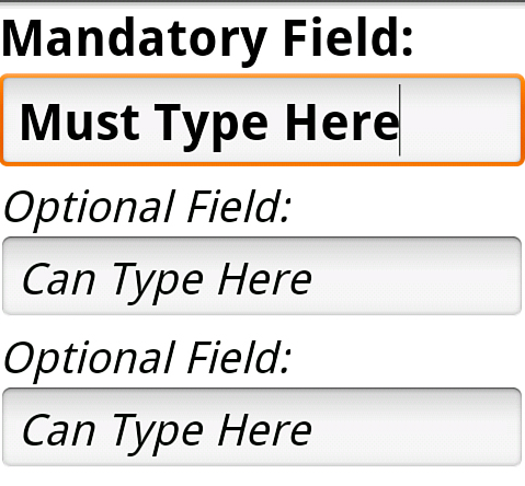
Figure 7.9. A layout using two styles, one for mandatory fields and another for optional fields.
Styles are applied to specific layout controls such as TextView and Button objects. Usually, you want to supply the style resource id when you call the control’s constructor. For example, the style named myAppIsStyling would be referred to as R.style.myAppIsStyling.
Leveraging Style Inheritance
Styles support inheritance; therefore, styles can also reference another style as a parent. This way, they pick up the attributes of the parent style. Let’s look at another example to illustrate how style inheritance works. Here we have two different styles:
<?xml version="1.0" encoding="utf-8"?>
<resources>
<style name="padded_small">
<item name="android:padding">2dp</item>
<item name="android:textSize">8dp</item>
</style>
<style name="padded_large">
<item name="android:padding">4dp</item>
<item name="android:textSize">16dp</item>
</style>
</resources>
When applied, the padded_small style sets the padding to 2 dp and the textSize to 8 dp. The following is an example of how it is applied to a TextView from within a layout resource file:
<TextView
style="@style/padded_small"
android:layout_width="fill_parent"
android:layout_height="wrap_content"
android:text="Small Padded" />
The following is an example of how you might use style inheritance:
<style name="red_padded">
<item name="android:textColor">#F00</item>
<item name="android:padding">3dp</item>
</style>
<style name="padded_normal" parent="red_padded">
<item name="android:textSize">12dp</item>
</style>
<style name="padded_italics" parent="red_padded">
<item name="android:textSize">14dp</item>
<item name="android:textStyle">italic</item>
</style>
Here you find two common attributes in a single style and a reference to them from the other two styles that have different attributes. You can reference any style as a parent style; however, you can set only one style as the style attribute of a View. Applying the padded_italics style that is already defined makes the text 14 dp in size, italic, red, and padded. The following is an example of applying this style:
<TextView
style="@style/padded_italics"
android:layout_width="fill_parent"
android:layout_height="wrap_content"
android:text="Italic w/parent color" />
As you can see from this example, applying a style with a parent is no different than applying a regular style. In fact, a regular style can be used for applying to View controls and used as a parent in a different style.
<style name="padded_xlarge">
<item name="android:padding">10dp</item>
<item name="android:textSize">100dp</item>
</style>
<style name="green_glow" parent="padded_xlarge">
<item name="android:shadowColor">#0F0</item>
<item name="android:shadowDx">0</item>
<item name="android:shadowDy">0</item>
<item name="android:shadowRadius">10</item>
</style>
Here the padded_xlarge style is set as the parent for the green_glow style. All six attributes are then applied to any view that this style is set to.
When in the Graphical Layout editor or the XML editor for layouts, you can use the Android Development Tools plug-in quick-fix capability to quickly make styles. When editing a view, simply add properties directly on it. Get them all correct. Then choose the quick fix option for Extract as Style. This displays a dialog for you to name the style and choose which properties go in it. The tool then creates the style, sets it on the control you chose to do the action on, and removes all of the properties that were included in the style.
Working with Themes
Themes are much like styles, but instead of being applied to one layout element at a time, they are applied to all elements of a given Activity or the application as a whole. Themes are defined in exactly the same way as styles. Themes use the <style> tag and should be stored in the /res/values directory. The only difference is that instead of applying that named style to a layout element, you define it as the theme attribute of an Activity in the Android manifest file.
A theme is a collection of one or more styles (as defined in the resources) but instead of applying the style to a specific control, the style is applied to all View objects in a specified Activity. Applying a theme to a set of View objects all at once simplifies making the user interface look consistent and can be a great way to define color schemes and other common control attribute settings.
You can specify the theme programmatically by calling the Activity method setTheme() with the style resource identifier. Each attribute of the style is applied to each View within that Activity, as applicable. Styles and attributes defined in the layout files explicitly override those in the theme.
For instance, consider the following style:
<style name="right">
<item name="android:gravity">right</item>
</style>
You can apply this as a theme to the whole screen, which causes any view displayed within that Activity to have its gravity attribute right-justified. Applying this theme is as simple as making the method call to the setTheme() method from within the Activity, as shown here:
setTheme(R.style.right);
You can also apply themes to specific Activity instances by specifying them as an attribute within the <activity> element in the AndroidManifest.xml file, as follows:
<activity android:name=".myactivityname"
android:label="@string/app_name"
android:theme="@style/myAppIsStyling">
Unlike applying a style in an XML layout file, multiple themes can be applied to a screen. This gives you flexibility in defining style attributes in advance while applying different configurations of the attributes based on what might be displayed on the screen. This is demonstrated in the following code:
setTheme(R.style.right);
setTheme(R.style.green_glow);
setContentView(R.layout.style_samples);
In this example, both the right style and the green_glow style are applied as a theme to the entire screen. You can see the results of green glow and right-aligned gravity, applied to a variety of TextView controls on a screen, as shown in Figure 7.10. Finally, we set the layout to the Activity. You must do this after setting the themes. That is, you must apply all themes before calling the method setContentView() or the inflate() method so that the themes’ attributes can take effect.
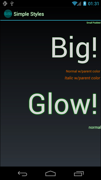
Figure 7.10. Packaging styles for glowing text, padding, and alignment into a theme.
A combination of well-designed and thought-out themes and styles can make the look of your application consistent and easy to maintain. Android comes with a number of built-in themes that can be a good starting point. These include such themes as Theme_Black, Theme_Light, and Theme_NoTitleBar_Fullscreen, as defined in the android.R.style class. They are all variations on the system theme, Theme, which built-in apps use.
Summary
The Android platform constantly changes as old user interface features are retired and new ones take their place. We are currently in a transitional period where most devices on the market still rely upon the legacy menu types, but more and more devices, especially tablets, use the new methods.
This chapter introduced you to the types of menus available in the Android SDK and what each menu’s purpose is. You also learned about action bars and how they behave under different circumstances. Finally, you learned how to use styles and themes to provide a consistent user experience to your applications by “bottling up” groups of View attributes for reuse.
References and More Information
Android Design website:
http://d.android.com/design/index.html
Article: “Add Horizontal Paging to Your Android Applications:”
http://www.developer.com/ws/android/programming/add-horizontal-paging-to-your-android-applications.html (http://goo.gl/ujTwu)
Android Dev Guide: “Action Bar”:
http://d.android.com/guide/topics/ui/actionbar.html
Android Dev Guide: “Styles and Themes”: