4. Designing Interfaces
The iOS SDK helps you craft user interfaces in a variety of ways. This chapter introduces the visual classes you’ll work with and discusses their roles in the interface design process. You read about controllers, how they work with visual classes, and how they handle tasks such as device reorientation. Then you move on to solutions for laying out and customizing interfaces. You learn about hybrid solutions that rely both on Interface Builder–created interfaces and Objective-C-centered ones. By the time you finish this chapter, you’ll have discovered many approaches that you can apply to your own application design.
UIView and UIWindow
Nearly everything that appears on an iOS device’s screen represents a child of the UIView class. Views act like little canvases that you can draw on with colors, pictures, and buttons. You can move them around the screen. You can resize them. You can layer them. Views provide the basic component of user interfaces.
The typical iOS design pattern goes like this: one window, many views. If you keep that idea in mind, the iOS interface design scenario simplifies. Metaphorically speaking, UIWindow is the TV set, and UIViews are the actors on your favorite show. They can move around the screen, appear, and disappear, and may change the way they look and behave over time.
The TV set, on the other hand, normally stays still. It has a set screen size that doesn’t change even if the virtual world you see through it is practically unlimited. You may even own several TVs in the same household (just like you can create several UIWindow instances in the same application), but you can watch just one at a time. With newer versions of the SDK, you can also create windows for external screens. External screens are accessed through a Video Out cable attached to an iOS device.
Note
AirPlay, an over-the-air technology that streams media from your device to Apple TV, speaker docks, and other enabled receivers, allows you to create and write to windows wirelessly.
UIViews are user interface building blocks. They provide visual elements that are shown onscreen and invite user interaction. Every iOS user interface is built from UIViews displayed within a parent UIWindow, which is a specialized kind of UIView. The window acts as a container; it is the root of a display hierarchy. It holds a collection of visible application components within itself.
Beyond UIView and UIWindow, you find a wealth of specialized views, such as UIImageView and UITextView, that allow you to build your interfaces from predesigned components. This section provides a rundown of those views. The Interface Builder library makes these views available to you, allowing you to place them in your application interfaces to build your GUIs.
Note
The “UI” at the beginning of certain classes (such as UIView) stands for User Interface.
Views That Display Data
One of the most important things a view can do is provide a visual representation of data. In Cocoa Touch, the following classes show information onscreen:
• The UITextView class presents passages of text to your users and/or allows them to type in their own text using the keyboard. You choose whether to set the view text as editable. Text views use a single font with a single text size throughout. Text views are explored in great detail in Chapter 10, “Working with Text.”
• UILabel instances present short, read-only text views. As the name implies, this class is used to statically label items on your screen. You choose the color, font size, and font face for your labels by setting view properties. The words “Fahrenheit” and “Celsius,” shown in figures later in the chapter, are created by UILabels.
• UIImageViews show pictures. You load them with UIImage objects, which are instances of an abstract image storing class. Once these are loaded, you specify the view’s location and size. The UIImageView automatically scales its contents to fit those bounds. A special feature of this class allows you to load a sequence of images rather than a single picture and animate them on demand.
• When you want to display HTML, PDFs, or other advanced web content, the UIWebView class provides all the functionality you need. UIWebView instances offer a powerhouse of display capabilities, allowing you to present nearly any data type supported by the built-in Safari browser. These views offer simple web browsing with a built-in history, essentially giving you a canned, usable Safari-style object you can insert into your programs. Sometimes developers use UIWebView instances to present blocks of stylized text. As a bonus, these support zoom and scroll with no additional work.
• MKMapViews (MK stands for Map Kit) embed maps into your applications. Users can view map information and interact with the map contents, much as they would with the Maps application. This class, which was introduced in the 3.0 SDK, lets you annotate the map with custom information using the MKAnnotationView and MKPinAnnotationView classes.
• UIScrollView instances allow you to present content that is larger than the normal size of an application window. Users can scroll through that content to view it all, using horizontal and/or vertical scrolling. Scroll views support zooming, so you can use standard iOS pinch and spread gestures to resize content.
Views for Making Choices
iOS offers two core classes that offer choices to users. The UIAlertView class produces those blue pop-up windows you see in many iPhone and iPod touch applications, and the more restrained popover presentations used on iPads. You choose the message and customize their buttons to ask users questions. For example, you might ask a user to confirm or cancel an action in your program. In addition to questions, you can present information. When just one button is offered (typically “Okay”), alert views provide a simple way to show text to users.
The second choice-based class is UIActionSheet, which offers menus that scroll up from the bottom of the screen on iPhones or pop over from menu bars on the iPad. Action sheets display a message and present buttons for the user to choose from. Although these sheets look different from alert views, functionally they perform in a similar manner and historically they used to be a lot closer in terms of class inheritance than they are now. As a rule, use action sheets when you have a number of options to choose from and use alert views when you are presenting just two or three choices at most.
Both these presentations are modal on iPhones and iPod touches, and partially modal on the iPad. They require users to tap a button before proceeding in the former case. On the iPad, users can also cancel out of a presentation by touching anywhere onscreen outside the popover.
For this reason, it’s polite to offer a cancel option for any iPhone- or iPod touch-based alert or action sheet requiring a choice. (You can omit a “cancel” for an alert view that simply presents text; an Okay button suffices for dismissing the view.) On the iPad, users can cancel out of an action sheet by tapping outside the sheet’s bounds; for that reason, iPad action sheets do not display the cancel button you specified when creating the sheet.
Controls
Controls are onscreen objects that transform user touches into callback triggers. They may also provide numeric or text values consumed by your application. Controls include buttons, switches, and sliders, among others. They correspond closely to the same kinds of control classes used in desktop programming, and are discussed at length in Chapter 9, “Building and Using Controls.” Here’s a quick rundown of the major classes provided by Cocoa Touch and what each control offers:
• UIButton instances provide onscreen buttons. Users can press them to trigger a callback via target/action programming. You specify how the button looks, the text it displays, and how the button triggers. The most typical trigger used is “touch up inside,” where the user’s touch ends inside the button’s bounds. If it seems strange to trigger with touch up rather than touch down, consider that the de facto standard on iOS allows users to cancel a button press by sliding their finger away from the button before lifting it.
In Interface Builder, buttons are called Round Rect Buttons. In the IB editor, you also encounter buttons that look like views and act like views but are not, in fact, views. Bar button items (UIBarButtonItem) store the properties of toolbar and navigation bar buttons but are not buttons themselves. The bars use these descriptions to build themselves; the actual button views are not generally accessible to you as a developer.
Note
In Interface Builder, you can search the view library by class name (for example, UIButton) or by IB’s description (for example, round or button).
• The UISegmentedControl offers a row of equally sized buttons that act like the old-fashioned radio buttons in a car—namely, only one button can be selected at a time. You can present these buttons as images or text. An option (called “momentary”) lets you replace the radio button behavior with a style that prevents the buttons from showing which button was last selected. A related class, the UIStepper, introduces a small bar with two segments: + and -, allowing users to raise or lower the control’s value.
• In Cocoa Touch, the UISwitch class provides a simple binary control. This class presents on/off choices and looks a little like a standard light switch you’d see on a wall. The switch was redesigned in iOS 5 for a more compact presentation and a smaller round toggle area.
• The UISlider class lets users choose a value from a specified range by sliding an indicator along a horizontal bar. The indicator (called the “thumb”) represents the current setting for the control. The value is set by the thumb’s relative placement. iOS’s onscreen volume slider in the iPod/Music application represents a typical slider instance. Starting in iOS 5, you can assign a minimum and maximum color tint to the slider to create a gradient effect.
• Page controls let users move between pages, usually as part of a UIScrollView implementation. The UIPageControl class offers a series of small dots (like the ones you see on iOS’s home page) showing the current page and letting users navigate to the next or previous page.
• UITextFields are a kind of control that let you enter text. These fields offer just a single line for input and are meant to solicit short text items (such as usernames and passwords) from users.
Tables and Pickers
Tables present a scrolling list of choices. The UITableView class provides the most commonly used table style, which you see, for example, in the Contacts, YouTube, and iPod/Music applications. Tables offer rows of information (provided by the UITableViewCell class), which users scroll through and can select.
The UIPickerView class offers a kind of table, where users can select choices by scrolling individual wheels. A specialized version of this class is the UIDatePicker, which comes preloaded with date- and time-specific behavior and is used extensively in the Calendar and Clock applications.
Bars
The iOS offers four kinds of bar-style views. Bars are compact views (typically shorter than 50 points in height) that extend from one side of the screen to the other. Bar usage is device dependent. The structured view hierarchies common on iPhone and iPod touch do not play as important a role on the iPad.
The most commonly used bar view for iPhone and iPod touch is the UINavigationBar, which is presented on top of many interfaces to provide navigation state. As a developer, you almost never work directly with instances of these views. Instead, the view is generated and managed by UINavigationController instances, which you read about in chapter sections that follow this one. Navigation controllers help you collapse large interfaces into a small window presentation. Navigation bars can be used on the iPad as well but they are more typically used to present menu choices rather than to shrink interfaces.
Tab bars offer the kinds of choices you see at the bottom of the YouTube and iPod/Music applications, such as Featured, Most Viewed, Albums, and Podcasts. Like navigation bars, they are used to shrink an application’s interface into manageable pieces and are used primarily on iPhone and iPod touch rather than on the iPad. Search bars (UISearchBar) add a text-based view meant to be shown on the top navigation bar of a table, as used in iOS Contacts application. As with navigation bars, you normally work through UITabBarControllers and UISearchDisplayControllers instead of building and managing the view directly.
Of all the iOS bars, only the UIToolbar class is meant for direct use. It provides a series of buttons similar to segmented controls but with a different look. Toolbars are limited to a momentary highlighting style. The role of toolbars is to provide a vocabulary of actions that act on the current view. The toolbar used in the Mail application allows you to delete messages or to reply to messages. Toolbars present monochrome images on their default buttons.
Although iPhone and iPod touch toolbars usually appear at the bottom of the screen, iPad toolbars should be placed toward the top of the interface. The iPad’s greater screen real estate allows you to group all your toolbar buttons together in one bar interface element. This allows you to design past common iOS patterns such as undo/redo buttons at the top of the screen and action choices at the bottom to bring all user manipulation into a single UI element.
If your design ideas include tab bars and toolbars, take the time to read Apple’s Human Interface Guidelines, available as part of the standard iOS documentation library. Apple regularly rejects applications that use bars in a manner inconsistent with these guidelines.
Note
As with bar button items, navigation items appear in Interface Builder and can be placed in your projects as you would place views. Like their cousins, navigation items are not views themselves. They store information about what items go on navigation bars and are used to build the bar that does appear.
Progress and Activity
Cocoa Touch provides two classes meant to communicate an ongoing activity to the user. The UIActivityIndicatorView offers a spinning-style wheel, which is shown during an ongoing task. The wheel tells the user that the task may finish at some point, but it does not determine when that time will end. When you want to communicate progress to a user, use the UIProgressView class. Instances offer a bar that fills from left to right, indicating how far a task has progressed.
View Controllers
On iOS, view controllers centralize certain kinds of view management. They provide practical utility by linking views into the pragmatic reality of your device. View controllers, which are discussed in depth in Chapter 5, “Working with View Controllers,” handle reorientation events such as when users tip the iOS device on its side to landscape mode, navigation issues such as when users need to move their attention from view to view, and memory issues about responding to low-memory warnings.
View controllers aren’t views. They are abstract classes with no visual representation; only views offer visual canvases. Instead, they help your views live in a larger application design environment. Do not set a frame the way you would with a normal UIView. UIViews use initWithFrame:; UIViewControllers use init.
The iOS SDK offers many view controller classes. These classes range from the general to the specific. In a way, specialized controllers are both a blessing and a curse. On the positive side, they introduce enormous functionality, essentially with no additional programming burden. On the downside, they’re so specialized that they often hide core features that developers might prefer to work with.
Apple is, however, responsive to feature requests from developers. In earlier releases of the SDK, developers could not directly access camera features and were forced to use the image picker controller class. In more modern SDK updates, developers are now able to directly pull camera data and use it in their applications. Chapter 7, “Working with Images,” demonstrates how.
Here’s a quick guide to a subset of the view controllers you’ll encounter while building your iOS application interfaces.
UIViewController
UIViewController is the parent class for view controllers and the one you use to manage your primary views. It’s the workhorse of view controllers. You may spend a large part of your time customizing this one class. The basic UIViewController class manages each primary view’s lifetime from start to finish and takes into account the changes that the view must react to along the way.
For example, UIViewControllers handle reorientation tasks, letting you program for both landscape and portrait orientation. UIViewControllers decide whether to change their orientation when a user tilts the device, and specify how that orientation change occurs. They do this via instance methods such as shouldAutorotateToInterfaceOrientation:. Without a view controller, your interface won’t support automatic orientation updates. Many developers have found it difficult trying to rotate UIViews directly without the help of a view controller class.
UIViewController instances are responsible for setting up how a view looks and what subviews it displays. Often they rely on loading that information from .xib files. A variety of instance methods such as loadView and viewDidLoad let you add behavior while or after a view sets up.
Reacting to views being displayed or dismissed is another job that view controllers handle. These are the realities of belonging to a larger application. Methods such as viewDidAppear: and viewWillDisappear: let you finish any bookkeeping associated with your view management. You might preload data in anticipation of being presented or clean up memory that won’t be used when the view is not onscreen via viewDidUnload:.
Each of the tasks mentioned here specifies how a view fits into an enveloping application and works on a particular device. The UIViewController mediates between views and these external demands, allowing the view to change itself to meet these needs.
UINavigationController
As the name suggests, navigation controllers allow you to drill up and down through tree-based view hierarchies, which is an important primary interface design strategy on smaller members of the iOS device family and a vital supporting one on the iPad. Navigation controllers create the solid-colored navigation bars that appear at the top of many standard iOS applications. You see navigation controllers in use whenever you drill through some sort of hierarchy, whether using the Contacts application or the on-iOS App Store. Both of these applications are built using navigation controllers.
On the iPhone and iPod touch, navigation controllers let you push new views into place and automatically generate “back” buttons showing the title of the calling view controller. All navigation controllers use a “root” view controller to establish the top of their navigation tree, letting those back buttons lead you back to a primary view. Navigation controllers and their trees are discussed in greater detail later in this chapter. On the iPad, you can use a navigation controller-based interface to work with bar-button-based menu items, to present popover presentations, or to integrate with UISplitViewController instances for a master-detail presentation experience. Split view controllers are described later in this section.
Handing off responsibility to a navigation controller lets you focus your design work on creating individual view controller screens. You don’t have to worry about specific navigation details other than telling the navigation controller which view to move to next. The history stack and the navigation buttons are handled for you. Chapter 5 discusses navigation controllers in further detail and offers recipes for their use.
UITabBarController
Another small-device solution, UITabBarController, lets you control parallel views in your iPhone or iPod touch application. (Tab bar controllers are not recommended for iPad applications, except for use in occasional popover elements or as part of a split view pane.) These parallel views are like stations on a radio. A tab bar helps users select which UIViewController to “tune in to,” without there being a specific navigation hierarchy. You see this best in applications such as YouTube and Music, where users choose whether to see a “Top 25” list or decide between viewing albums or playlists. Each parallel world operates independently, and each can have its own navigation hierarchy. You build the view controller or navigation controller that inhabits each tab, and Cocoa Touch handles the multiple-view details.
For example, when tab bar instances offer more than five view controller choices at a time, users can customize them through the More > Edit screen. The More > Edit screen lets users drag their favorite controllers down to the button bar at the bottom of the screen. No extra programming is involved. You gain editable tabs for free. All you have to do is request them via the customizableViewControllers property. See Chapter 5 to read more about implementing tab-bar-based applications and setting the images that adorn each button.
Split View Controllers
Meant for use on iPad applications, the UISplitViewController class offers a way to encapsulate a persistent set of data (typically a table) and associate that data with a detail presentation. You can see split views in action in the iPad’s mail application. When used in landscape orientation, a list of messages appears on the left; individual message content appears on the right. The detail view (the message content in Mail) on the right is subordinate to the master view (Mail’s message list) on the left. Tapping a message updates the right-hand view with its contents.
In portrait orientation, the master view is hidden. It is accessed by a popover, which is reached by tapping the left button of the split view’s top bar.
Page View Controller
Page view controllers are containers for other view controllers. They create a book-like presentation where you set the book’s “spine,” typically along the left or top of the view. Build your “book” by adding individual content controllers. Each “page” transitions to the next using a style that’s theoretically customizable but is limited to a page curl in the iOS 5.0 Beta SDK.
The UIPageViewController forms the core for one of Xcode’s new project styles, the page-based application, which you see as an option whenever you create a new project.
Popover Controllers
Specific to the iPad, popover controllers create transient views that pop over other existing interface content. These controllers present information without taking over the entire screen, the way that modal views normally do. The popovers are usually invoked by tapping a bar button item in the interface (although they can be created using other interaction techniques) and are dismissed either by interacting with the content they present or by tapping outside their main view.
Popovers are populated with UIViewController instances. (The iPad’s implementation of action sheets also uses popovers, but this approach is not exposed via iOS SDK.) Build the view controller and assign it as the popover’s contentViewController property, before presenting the popover. This allows popovers to present any range of material that you can design into a standard view controller, offering exceptional programming flexibility.
Table Controllers
Table view controllers simplify using tables in your iOS projects. The UITableViewController class provides a standard already-connected UITableView instance and automatically sets delegation and data sources to point to itself. All you have to do is supply those delegate and data source methods to fill up the table with data and react to user taps. UITableViewController is discussed at length in Chapter 11, “Creating and Managing Table Views.”
The search display controller is a kind of table view but one that offers a built-in search bar via UISearchBar. With it, you allow users to search data that is provided by another view controller, called its “contents controller.” As users update the search information, the contents controller adjusts its data source to include only those items that match the search query.
It may seem odd to force another controller to perform that work, but in practice, it works out very neatly. The contents controller is almost always a table view controller, which displays the search controller on demand. The search then weeds through the original table’s data and shows a subset of that information until the search is dismissed.
The NSFetchedResultsController also provides a kind of table-based controller. Although strictly speaking, not a view controller, this class helps populate a UITableView with objects fetched from a Core Data store. See Chapter 12, “A Taste of Core Data,” for an example that shows this class in action.
Address Book Controllers
The Address Book user interface framework (AddressBookUI.framework) provides several view controllers that let you select a person from your address book, view his or her details, and add a new person or modify an existing person’s entry. These view controllers tie into the C-based ABAddressBook framework, which provides functions that query and update iOS’s built-in address book.
Image Picker
This utility controller allows users to select images from onboard albums or to snap a photo or shoot video using iOS camera. With it, you gain full access to most of the organizational features made available to users via the Camera and Photos applications. In truth, there are not two separate applications. There is just one application that poses as those two utilities, just as the single controller offers access to both camera and photo selection features.
For selecting pictures, Apple has added an advanced image-selection interface. Users can navigate up and down the photo album hierarchy until they find the image they want to use. The picker automatically handles access to the onboard photo album, leaving you little more to do than decide how to use the picture it picks.
The photo/video interface is equally impressive. The controller even lets the users optionally orient and zoom an image before finishing, providing user-defined “edits” on the picture they snap. Full discussions of this class, including how-to’s for both the selection and camera versions, appear in Chapter 7.
Mail Composition
The MFMailComposeViewController lets you create mail messages that users can customize from directly in your program. Although iOS has long supported mailto: URLs to send mail messages, this class offers far more control over mail contents and attachments. What’s more, users can continue working within your program without being forced to leave to access the Mail application.
The mail composition controller is simple to use and is used in Chapter 7 to mail photographs and in Chapter 10 to send text and data. It is part of the MessageUI framework; the MF prefix stands for Message Framework.
Document Interaction Controller
The UIDocumentInteractionController class allows developers to preview and open files. The controller presents a list of options that includes the preview option, a choice of copying the file to the system pasteboard, and the names of any application that can open and work with the file. Between this controller and SDK features for declaring supported file types in an application’s Info.plist file, users are able to share files between third-party applications.
GameKit Peer Picker
The GameKit peer picker provides a standard GUI for discovering and connecting to other iOS devices. It offers a slick interface, listing other units that are available and can be linked to. Although this controller is part of GameKit, its technology is readily adaptable to nongame uses, including file transfer, messaging, and so forth.
You can configure the picker to select whether to use a Bluetooth or Internet (TCP/IP and UDP) connection. (As an alternative to Bluetooth, Wi-Fi connections on the same network are available from the 3.1 firmware and later.) When presented to the user, only the supported connections appear. Note that users cannot control that choice themselves using this interface.
Media Player Controllers
The Media Player framework offers several controllers that allow you to choose and play music and movies. The MPMediaPickerController provides a media-selection GUI that allows users to choose music, podcasts, and audio books. You choose which media to present, and you can play back that media via an MPMusicPlayerController instance.
When your user needs to watch a movie or listen to audio, an MPMoviePlayerController instance does the trick. Just supply it with a path to the media resource and push the controller into view. The controller provides a Done button for the user or automatically returns a delegate call when playback finishes.
View Design Geometry
The iOS hardware is not theoretically limited to a 320-by-480, 640-by-960, or 768-by-1024-pixel display. Always design your applications to be as resolution-independent as possible. That having been said, certain facts of geometry do play a role in the design of current generation iOS applications, particularly when you need to hand specs to a graphic designer to take to Photoshop.
Here is a rundown of the onscreen elements whose geometry can mostly be counted on to stay set when building your interfaces. Try not to rely on these sizes where possible, but rather design around them while keeping their proportions and aspect ratios in mind.
Keep in mind that future iPhone and iPad models and related iOS devices may not use the same screen size or shape. All the measurements in this section apply specifically to current members of the iOS family, all of which use either a 320×480 or 768×1024 geometry. Even those iPhone/iPod devices with Retina displays use a 320×480 geometry. That’s because the geometry is defined in floating-point addresses, not in physical pixels.
Note
As this book is being written, rumors of the iPad 3 with a possible 2048-by-1536 Retina display are being floated, but there are no supporting facts yet. Always try to design your apps beyond existing unit specifications with scalable art and resolution-independent layout so you can easily adapt those resources when new models debut.
Status Bar
The status bar at the very top of the iOS screen shows the time, connectivity, battery status, and carrier (iPhones and iPad 3Gs) or model (iPods or iPads) of the unit. It offers quick access to the unit’s notification center and built-in widgets. This bar is 20 points in height for normal use. It zooms to 40 points high during phone calls or when messages are displayed; note that double-height status bars appear to be a portrait-only feature. Unfortunately, the SDK does not offer any public hooks into the message display system, so you can’t display your own messages. You can see these 40-point colorful status displays when you pause a Voice Memo recording, use Nike+, or tether on 3G or later units.
Figure 4-1 shows an iPhone status bar for portrait, landscape, and 40-point-high message modes. (The iPad bars are similar.) You can hide the status bar from your users, but doing so at a minimum eliminates their access to seeing the time and battery information unless you supply that information elsewhere in your application’s user interface. You can set the status bar to display in gray, black, or translucent black. The latter allows the view behind it to bleed through to better coordinate colors with your application.
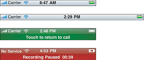
Figure 4-1. The status bar is normally 20 points high, regardless of whether the iOS device is using portrait or landscape orientation. At times, the status bar zooms to 40 points in height to indicate an ongoing system operation such as a phone call or a paused recording.
If you’d rather free up those 20 points of screen space for other use, you can hide the status bar entirely. Use this UIApplication call: [UIApplication sharedApplication] setStatusBarHidden:YES animated:NO]. Alternatively, set the UIStatusBarHidden key to <true/> in your application Info.plist file. Be aware that Apple frowns on gratuitous status-bar hiding; users generally like seeing the status bar in their applications. If you do opt to do so, consider displaying at least the time in some other fashion as an end-user option.
With the status bar displayed, your application has 320×460 or 768×1004 points to work with in portrait mode, and 480×300 or 1024×748 points in landscape mode. These numbers change depending on whatever other elements you add into the interface, such as navigation bars, tab bars, and so forth. And as already mentioned, the standard iPhone, iPod, and iPad geometries may change over time as Apple releases new models and new related touch-based products that run iOS.
The status bar plays a role in both landscape and portrait orientations, adjusting to fit as needed. To run your application in landscape-only mode, set the status bar orientation to landscape. Do this even if you plan to hide the status bar (that is, [[UIApplication sharedApplication] setStatusBarOrientation: UIInterfaceOrientationLandscapeRight]). Alternatively, set UIInterfaceOrientation in your Info.plist to the string UIInterfaceOrientationLandscapeLeft or UIInterfaeOrientationLandscapeRight. These options force windows to display side to side and produce a proper landscape keyboard.
A few further points:
• Although you can submit landscape-only or portrait-only iPad applications to the App Store, these apps must run in both landscape (left and right) modes or both portrait (standard and upside down) modes. Apple prefers applications that provide usable interfaces in all orientations.
• You can now create custom input views to replace standard keyboards, as described in Chapter 10. The geometry of these custom views must match the device orientation.
• You can hide and show the status bar during the life of your application. The UIApplication method setStatusBarHidden:withAnimation: allows you to animate the status bar in and out of view.
Note
Use Hardware > Toggle In Call Status Bar to test your interfaces in the simulator using the 40-point-high status bar.
Navigation Bars, Toolbars, and Tab Bars
By default, UINavigationBar objects (see Figure 4-2) are 44 points in height in iPhone and iPod portrait mode and for both portrait and landscape mode on the iPad. They are 32 points high in landscape mode on iPhone and iPod touch. They stretch from one side of the screen to the other, so their full dimensions are 320×44 or 768×44 points and 480×32 or 1024×44 points.
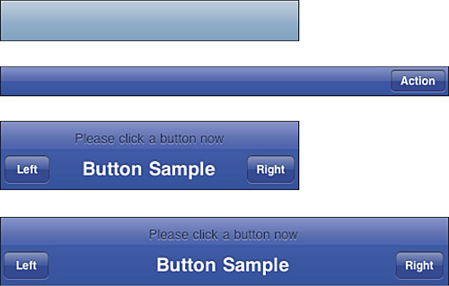
Figure 4-2. Navigation bars stretch from one side of the screen to the other. Their height is fixed at 44 points (32 points for landscape on iPhone and iPod touch). The rarely used prompt feature (shown in the bottom two images) zooms the bar to 74 points high.
Navigation bars offer a seldom-used “prompt” mode that extends the height by 30 points. In portrait mode, the bar occupies 320×74 or 768×74 points, and in landscape, 480×74 or 1024×74, using a 44-point-high navigation bar for the landscape iPhone and iPod touch rather than the normal 32-point-high version.
Note
To add a prompt to a navigation bar, edit the view controller’s navigation item—that is, self.navigationItem.prompt = @"Please click a button now";.
Tab bars are 48 points high in both orientations: 320×48 points and 480×48 points. I do not give the equivalent iPad dimensions (they are 768×48 points and 1024×48 points) because Apple guidelines suggest that you do not use tab bars directly in your iPad applications. You may feature them, however, in your popovers, using whatever widths you require. Sticking to iPhone/iPod dimensions for popovers provides a familiar geometry.
According to Apple, the individual items on tab bars should be designed with a minimum 44×44-point hit region to provide sufficient space for users to tap. That corresponds to individual art of about 30×30 points.
Figure 4-3 shows a typical tab bar and its near-cousin class, the toolbar. Toolbars use the same 44-point spacing as navigation bars but, like tab bars, they’re meant to be displayed at the bottom of the screen on iPhone and iPod units and incorporated into a bar at the top of the screen for iPad devices.
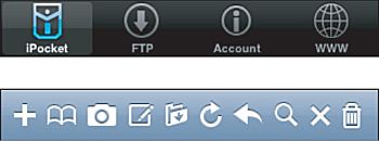
Figure 4-3. Tab bars are 48 points high for 320×480-point iPhone and iPod units (top). Toolbars use the same 44-point spacing as standard navigation bars.
These two UI elements aren’t generally meant for landscape mode use. You can see this with both the iPod and YouTube applications on iPhone and iPod touch. These apps swap out a toolbar-based portrait view for a completely separate landscape presentation: Coverflow for iPod, movies for YouTube.
Between status bars, navigation bars, tab bars, and toolbars, you need to apply some basic math to calculate the remaining proportions available to background design. A typical application with a navigation bar and status bar leaves a central area of 320×416 or 768×960 for portrait display and 480×268 or 1024×704 for landscape. On the iPhone or iPod touch, using tab bars or toolbars effectively diminishes the available height by another 48 or 44 points and the resulting proportions change accordingly. On the iPad, toolbars are generally incorporated into the top navigation bar and the central area remains unaffected.
Note
Tab bars have a specifically intended use: to switch between application modalities. Tab bars are not meant to be used as a Safari-like bookmark bar.
Keyboards and Pickers
The standard iPhone and iPod touch keyboard uses 320×216 points for portrait presentation and 480×162 for landscape. The standard iPad keyboard is 768×264 points for portrait presentation and 1024×352 for landscape. You can also add custom input accessory views to add buttons (such as a Done button) and other controls on top of the keyboard whenever it is presented for certain text fields and views. The height of that accessory view adds to the space occupied by the keyboard. Adding a simple 44-point toolbar to a standard iPhone keyboard leaves almost no room whatsoever in landscape mode, so use accessory views cautiously.
Figure 4-4 shows a set of keyboards in their default configuration in both its orientations as well as an accessorized keyboard in a portrait orientation. When a text element becomes active in your application, the keyboard displays over any elements at the bottom of the screen, leaving a shortened space at the top for interaction. Complex keyboard layouts using custom accessory views or even a completely custom input view (see Chapter 9) may occupy even more onscreen room.
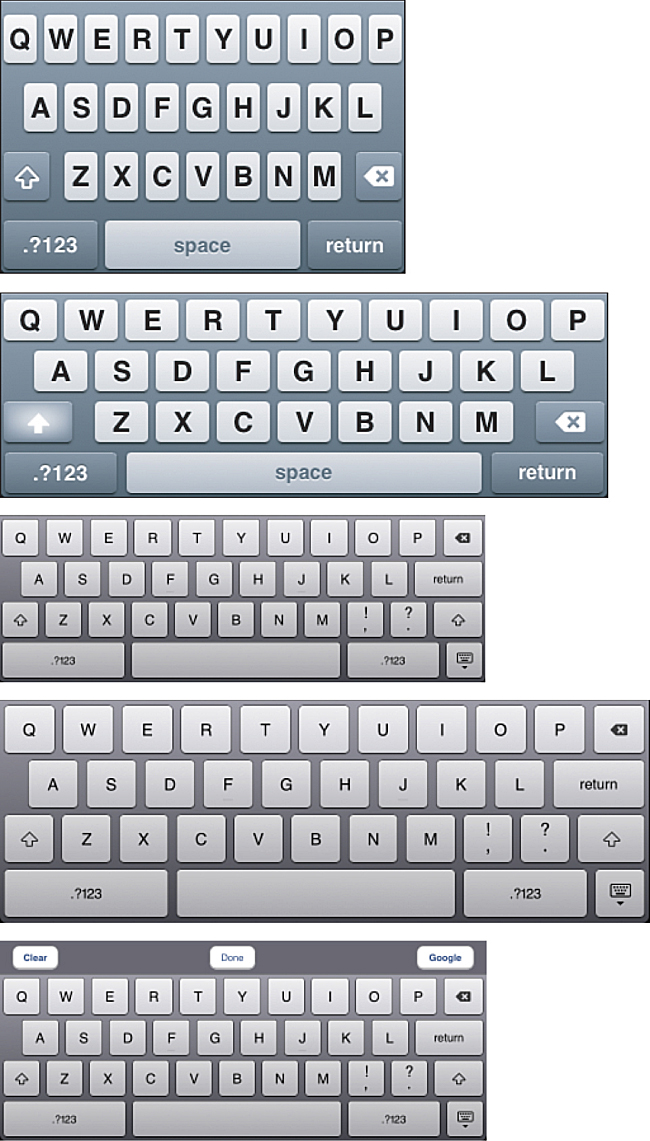
Figure 4-4. Both the portrait and landscape keyboards occupy a large part of the iOS screen. Design your applications accordingly. Here you see an iPhone/iPod touch keyboard in portrait (A) and landscape (B) orientation, an iPad keyboard in portrait (C) and landscape (D) orientation, and a portrait iPad keyboard using a custom accessory view (E).
You may want to resize your main view when the keyboard displays. When you have several onscreen elements to edit, a shortened scrolling view works best. This lets your users access all possible areas by scrolling and won’t leave text fields or text views hidden behind the keyboard. Solutions are demonstrated at length in several recipes in Chapter 10, along with ways to ensure that your user can dismiss the keyboard.
Note
UISegmentedControls are typically 44 points high in their standard text-based form.
Text Fields
When working with UITextField instances, allocate at least 30 points in height. This allows users enough room to enter text using the default font size without clipping.
The UIScreen Class
The UIScreen object acts as a stand-in for iOS’s physical screen, which you can access via [UIScreen mainScreen]. This object maps standard window layout boundaries into pixel space. It takes into account any toolbars, status bars, and navigation bars in use.
To recover the size of the entire screen, use [[UIScreen mainScreen] bounds]. This returns a rectangle defining the full point size of iOS’s screen. As mentioned earlier in this chapter, an iOS device screen may not always be 320×480 or 768×1024 points in size should Apple introduce new units.
Another method call returns the central application space. Call [[UIScreen mainScreen] applicationFrame] to query this value. On an iPhone or iPod touch, for an application that uses a status bar and a navigation bar, this might return a size of 320×416 points, taking into account the 20-point status bar and 44-point navigation bar. Use these numbers to calculate the available space on your iPhone screen and lay out your application views when not using Interface Builder.
iOS allows you to attach additional screens to your iOS device through the use of external cables. Retrieve an array of screen objects by sending the screens class method to the UIScreen class. The first item in that array is equivalent to the mainScreen screen. You can query each screen’s bounds and applicationFrame independently.
Building Interfaces
There’s more than one way to build an interface. With iOS SDK, you can build a GUI by hand using Objective-C, or you can lay it out visually using Xcode’s Interface Builder. When coding, you programmatically specify where each element appears onscreen and how it behaves. With Interface Builder, you lay out those same elements using a visual editor. Both approaches offer benefits. As a developer, it’s up to you to decide how to balance these benefits.
In the end, both technologies take you to the same place. The code used in Objective-C corresponds directly to the layout used in Interface Builder, and the callback behavior set up in Interface Builder produces identical results to those designed in Objective-C.
Yes, the implementation details differ. A hand-built version might use viewDidLoad to add its interface elements to the default view, or loadView to create a view from scratch. In contrast, a storyboard-based view controller often finishes setting itself up in viewDidLoad after loading a prebuilt interface from a .storyboard or .xib file. Cocoa Touch supports both these approaches, plus you can use a hybrid approach, loading .storyboard or .xib files via direct Objective-C commands.
The next few sections show you various ways to use these tools. You learn how to build a basic storyboard, walk through a full IB application approach, and then a full Xcode one. After, you’ll find a pair of further hybrid solutions. All these walkthroughs produce identical end products, offering identical functionality, and could be applied to both iPhone and iPad interfaces.
Note
Make sure you have worked through the Hello World examples in Chapter 3, “Building Your First Project,” so you have a starting point for understanding Xcode and Interface Builder. The examples in this chapter go into greater depth but assume you’ve already learned some of the basic vocabulary for using these tools.
Walkthrough: Building Storyboard Interfaces
New to the iOS 5 SDK, storyboards allow you to lay out all the screens of your application using a single editor. Storyboards contain an entire UI in a single file, letting you design both the look of each screen and the way screens transition from one to another. By default, Interface Builder creates separate iPhone/iPod touch and iPad storyboards so you can customize your GUI for each deployment platform.
In this walkthrough you create a new storyboard application and learn how to create “scenes,” the views that you see, and “segues,” the process of moving from one scene to the next. For conciseness, these steps focus on the iPhone storyboard rather than creating a mirrored project on the iPad.
Create a New Project
Launch Xcode and choose File > New > New Project > iOS > Application > Single View Application. Click Next. Enter Hello World as the project name, and if you have not yet done so, set up your company identifier (for example, com.sadun). Set the Device Family to Universal (even though this walkthrough will not use the iPad storyboard) and leave Include Unit Tests unchecked. Set Hello_World as your prefix, with the underscore between the words. Click Next. Specify where to save your project (for example, the desktop) and click Create. Xcode opens a new browser containing your project.
The project consists of two storyboards—one for iPhone, one for iPad—as well as an app delegate class and a view controller class. Click MainStoryboard_iPhone.storyboard to open the storyboard in Interface Builder. With the default settings, the storyboard consists of a single scene made up of a basic view controller.
Add More View Controllers
Open the Utility pane by selecting View > Utilities > Show Utilities. This presents the inspector view at the top of the pane and the library view at the bottom. Use the search bar in the library to locate a navigation controller and drag it into your IB workspace, onto the grid-pattern background. Even while using a iPhone storyboard, as opposed to a much larger iPad one, you will instantly see why it helps to invest in a very large monitor to perform this kind of design work. Go ahead and hide the Navigator pane (View > Navigators > Hide Navigator) to make a little more room. Figure 4-5 shows what your Xcode window will look like at this point.
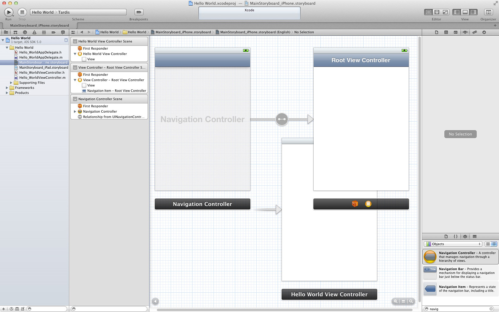
Figure 4-5. You’ll need quite a large monitor to work with Interface Builder’s new storyboard layout mode. This storyboard includes three scenes, as shown in the left column, consisting of a Navigation Controller and two view controllers.
Notice how the navigation controller is automatically attached to a view controller. A line with an arrow connects them. The Navigation Controller background is translucent; the Root View Controller is opaque white. This storyboard includes three scenes, as shown in the left column, consisting of a navigation controller and two view controllers. Now search for “view controller” in the library and add two more view controllers to the interface. This gives you a total of four view controllers and one navigation controller. Interface Builder lists all five scenes in the column at the left.
Organize Your Views
Set these elements up in the drawing space in the following way. Create a line of the Navigation Controller followed by the Root View Controller followed by the two new view controllers. Place the Hello World View Controller underneath the Root View Controller. To see all your elements at once, double-click the grid background. This shrinks down the elements to a more manageable size. You cannot edit your views in this presentation but it’s easier to organize them. Figure 4-6 shows the layout you are aiming for. In the IB editor, notice that the Hello World View Controller at the bottom has an incoming arrow connected to nothing else. This indicates that the view is currently set as the storyboard’s entry point. You will update this later.
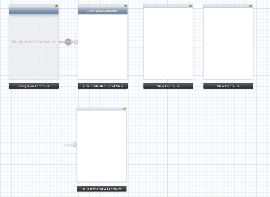
Figure 4-6. Organize your views in preparation for customizing and connecting them up.
Organizing your views allows you to get a sense of how they’re going to connect to each other. In this case, you’re going to build a fairly standard Navigation Controller presentation along the top row, with a modal “settings” view using the bottom controller. The class for each controller (Navigation Controller, View Controller, Hello World View Controller) appears at the bottom of each scene in a floating dock that moves along with its view.
Update Classes
By default, Xcode uses a primary custom class when creating its template. That’s why the Hello World View Controller belongs to a different class than the two view controllers you pulled from the library. Select one of the two other controllers and open the identity inspector (View > Utilities > Show Identity Inspector or click the third item at the top of the Utilities pane). Use the Custom Class > Class pop-up at the top of the inspector to change the controller’s class to Hello_WorldViewController. The controller updates and should now match the one on the other row. Repeat for the remaining controller and the one attached to the Navigation Controller so all four controllers are members of the same Hello_WorldViewController class.
The identity inspector lets you detect which class any IB item belongs to and reassign that class to another member of the same family. Hello_WorldViewController descends from UIViewController, so the class identity can be updated from the parent class to the child without affecting any of the instance variables or methods required by that class. After you change the class for your view controllers, your storyboard consists of one navigation controller and four instances of the Hello World View Controller class.
Name Your Scenes
Naming each element in the storyboard lets you instantly know its role. Do this using the same identity inspector. Select the first view controller, the one connected to the Navigation Controller. Look in the Utilities pane below the “Custom Class” used above. Change the Identity > Label from the grayed-out “Xcode Specific Label” to Yellow. In the scene list, its title updates from Hello World View Controller Scene to Yellow Scene. Repeat for the next view controller, changing its label to Green, and the next to Red. Finally, change the controller on the other row to Blue. Double-click the checked background to bring the entire storyboard back into editing mode.
Edit View Attributes
This walkthrough does not create a functional application, but what you’re about to do is color in each view’s background so it’s instantly recognizable which view is on-screen at any time. Click the view background of the Yellow scene and open the attributes inspector. It’s the fourth of the six items at the top of the Utilities pane. (You can also choose View > Utilities > Show Attributes Inspector.) Make sure the gray bar at the very top of the utilities pane, just under the button toolbar, says “View.” If it does not (for example, if it says Simulated Metrics), you’ve clicked the wrong part of the view. You want to click in the white background.
In the attributes inspector, locate View > Background and click the background swatch. A color palette appears. Pick a yellow color; the view’s background updates to match it. Repeat for the other three controllers, matching each background to the color name. If you are severely color-blind, use shades of gray or otherwise accommodate as needed; you can update the controller names to match (for example, dark gray, light gray, black, white). The key lies in knowing exactly which scene you are looking at with a glance.
Add Navigation Buttons
In the library, search for Bar Button Item. Drag one onto the bar that currently says “Root View Controller.” Double-click it and change its text from Item to Green. Control-drag (or right-button-drag) from the Green button to the Green view controller (see Figure 4-7).
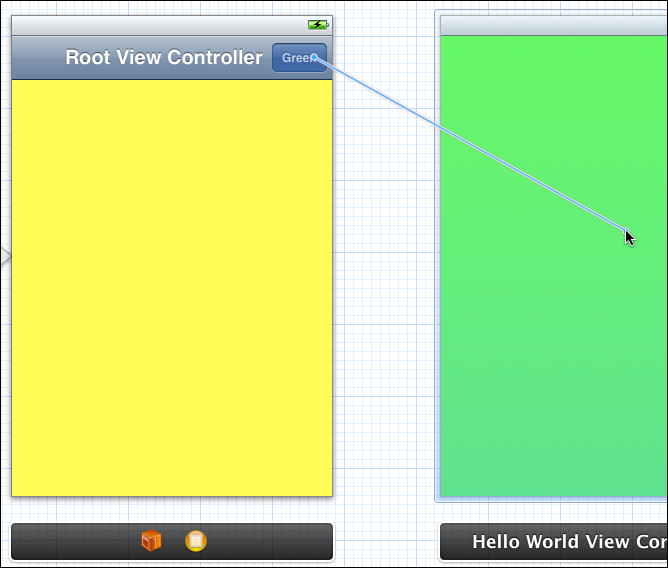
Figure 4-7. Use Control-drag (right-button-drag) to connect elements in Interface Builder. A line follows your drag, showing which object connects to the other.
A pop-up appears allowing you to select Push, Modal, or Custom. Select Push. The green scene flashes briefly and an arrow appears between the two view controllers (see Figure 4-8). The image in the circle indicates the role of the connection:
• A line with a dot on each end shows ownership. In Figure 4-8, the Navigation Controller owns its Root View Controller.
• A box with an arrow pointing left in it means that the destination controller pushes itself onto the navigation stack, over the previous view controller. When the user taps the Green button in the Root View Controller’s navigation bar, the green controller will push onscreen and take control.
• A box with a square in it indicates a modal presentation. When connected up in this fashion, the new view controller is presented modally, over the calling controller. You can use a number of transitions to do this, which are set in the Storyboard Segue > Transition pop-up in the attributes inspector.
• A circle with curly brackets (that is, {}) indicates a custom segue style, one that is created in code outside of Interface Builder.
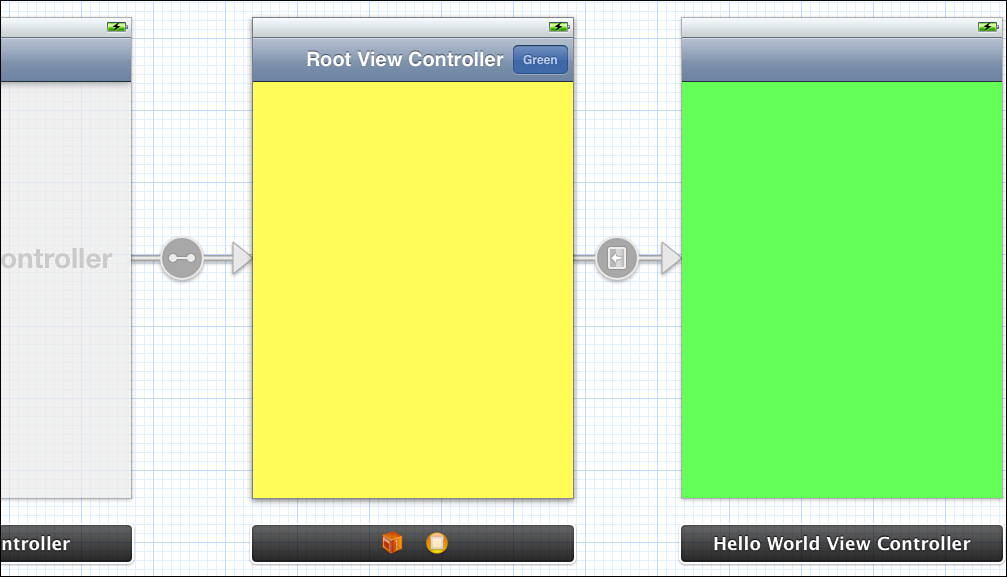
Figure 4-8. Segue arrows indicate how scenes are connected together.
Examine connection types in the attributes inspector by selecting the segue. As you saw with the initial connection pop-up, you can pick Push, Modal, and Custom styles. The modal style offers four transition options: cover vertical, flip horizontal, cross-dissolve, and partial curl. For now, leave the segue style as Push.
As Figure 4-8 shows, connecting the green view controller to the yellow one has added a navigation bar. The green scene is now part of the navigation controller’s hierarchy. The navigation bar appeared as a courtesy.
Repeat the previous steps to add a bar button to the green controller. Edit it from Item to Red. Control-drag to connect it to the red controller.
Add Another Navigation Controller
Drag a new Navigation Controller out from the library onto the IB workspace. Select just the new Root View Controller and delete it, leaving just the Navigation Controller. Move the new controller to the left of the blue scene and Control-drag from it to the blue scene. A pop-up appears as before. This time choose rootViewController. This is a property of the Navigation Controller. The new connection that appears shows the double-dotted line in its circle. Finally, a navigation bar appears in the blue controller. Drag a bar button item to its right side and then edit its text to Done.
Name the Controllers
Next, name each Navigation Controller. Select the one in the top row, open the identity inspector, and change its Identity > Label to Primary Navigation. In the bottom row, name the new controller Modal Navigation. Although labeling objects is not used outside of Xcode, these labels help you better organize objects within your storyboards, providing at-a-glance identification.
View controllers can have titles, whose text appears in the center of the navigation bar while an application runs. Double-click in each navigation bar in the center and edit its title. Use the same names (that is, Yellow, Green, Red, and Blue) that identify these controllers in your storyboard. These titles are used to create “back” buttons during the application’s execution.
In addition, add identifier names to each view controller. Select the controller and open the attributes inspector. Locate the View Controller > Identifier field. The View Controller section appears below the Simulated Metrics section. Identifiers allow you to extract scenes from storyboard files, which is a very handy tool in your developer arsenal. Make a habit of adding identifiers to allow you to access individual scenes from code.
Tint the Navigation Bars
I’m not a big fan of the blue-gray standard navigation bars. You can easily change this tint for each of your two Navigation Controller hierarchies. Use the scene list on the left side of Interface Builder to access the navigation bars. Select the navigation controller (it is an amber circle with a gray-blue shape in it) and open its disclosure triangle. The navigation bar is listed below. Select it.
Use the attributes inspector to change the Navigation Bar > Tint. You may have to use the scene list on the left. Click the color swatch to open the color picker and choose a medium gray instead.
Notice that the navigation bar belongs to the Navigation Controller but that each navigation item belongs to a View Controller. This mirrors how you access these objects in code.
Note
From code, you can globally set a default tint across an entire class using the new UIAppearance protocol—for example, [[UINavigationBar appearance] setTintColor:[UIColor blackColor]];. This call affects all instances of that class, both existing and yet-to-be-created.
Add a Button
Drag a bar button item into the left slot of the yellow controller’s navigation bar. Open the attributes inspector and change Bar Button Item > Identifier to Bookmarks. The updated button looks like a small open book. Control-drag from the info button to the modal navigation controller, and connect it up as you did before. This time, the arrow snakes its way around to the next row to connect to the controller scene.
Click the segue to select it. It’s easiest to do this by clicking the arrowhead next to the Modal Navigation scene. In the attributes inspector, change the style from Push to Modal and from Default to Flip Horizontal. This option means that the view will flip around on when the info button is clicked.
Change the Entry Point
As you can tell from its incoming arrow, the blue scene is still the entry point for your application. Change that by selecting the primary navigation controller. Open the attributes inspector. Check View Controller > Initial Scene > Is Initial View Controller. You do not have to edit the blue scene. Its status automatically updates and its incoming arrow disappears.
You can actually see the incoming arrow best when you zoom out to the miniaturized overview. In this presentation, the trailing end of the arrow narrows and then disappears. This offers a better visual indication of the arrow’s role than the standard full view
Add Dismiss Code
You need to add a little code to allow the modal blue scene to dismiss itself. Before you do this, you need to make room. Hide the Utility pane (View > Utilities > Hide Utilities). Then show the assistant view (View > Assistant Editor > Show Assistant Editor). Click the blue scene. The editor updates to show the Hello_WorldViewController.h source code file.
Here’s the fun part. Control-drag from the new Done button into the code itself, between the @interface and @end lines (see Figure 4-9). A pop-up appears. Set the Connection type to Action, leave the Object as Blue, edit the name to dismissModalController:, and leave the type as id. Click Connect. Xcode automatically adds a new method declaration in the header and creates an empty method skeleton in the implementation file:
@interface Hello_WorldViewController : UIViewController
- (IBAction)dismissModalController:(id)sender;
@end
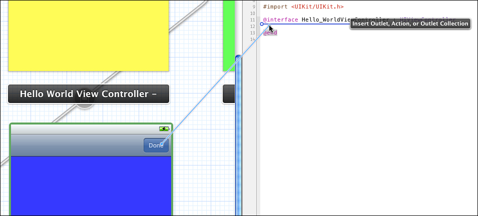
Figure 4-9. Xcode allows you to create button actions by dragging between the visual Interface Builder presentation and source code files.
Switch over to the code’s counterpart (that is, its implementation file) by typing Control-Command-Up Arrow. (Control-Command-Down Arrow also works.) Locate the dismissModalController: method and edit it to say the following:
- (IBAction)dismissModalController:(id)sender
{
[self dismissModalViewControllerAnimated:YES];
}
When the Done button is pressed, it will now cause the modal view (itself) to be dismissed, returning control to the primary Navigation Controller.
Run the App
Save all your work. Locate the scheme menu just to the right of the Run and Stop buttons in the top Xcode toolbar. Use the right side of that pop-up menu to select iPhone Simulator as your destination. Click Run and wait for Xcode to launch the app.
As described in these steps, the application you built consists of a three-stage navigation drill, from yellow to green to red. You can push your way forward through these screens and pop your way back. When viewing the yellow screen, you can also flip to the blue modal presentation and back. This project demonstrated several common design patterns for very simple iPhone/iPod touch applications.
Popover Walkthrough
You’ve seen how to create and connect view controllers for both navigation drilling and modal presentation. Now it’s time for the iPad to take center stage. The iPad differs from the iPhone in several ways. First, and most obviously, the screen is much, much bigger. If you thought storyboarding with iPhone scenes was screen hogging, iPad views are going to blow your mind. Second, iPads allow you to use more than one scene onscreen at a time, especially with constructs such as the split view controller and popovers.
In this walkthrough, you’re going to build a popover and use it with a basic navigation view controller. It will show you how to embed a view controller into a popover and access it using IB. The results you’ll build are shown in Figure 4-10. This walkthrough uses the same project as the previous one, customizing the iPad storyboard instead of the iPhone one. Make sure you open the Navigator pane and click MainStoryboard_iPad.storyboard to get started. Show the Utilities pane and then optionally hide the navigator, depending on the screen space available to you.
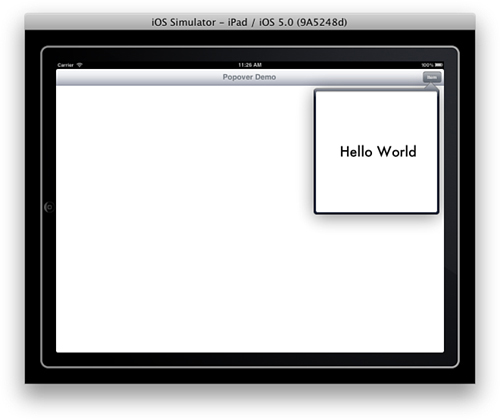
Figure 4-10. You cannot entirely create iPad popovers only using Interface Builder. Some coding is required.
Add a Navigation Controller
Drag in a new Navigation Controller from the library to the drawing area. Either click on the background to scale the new item into view or use the magnifying glass tools in the bottom-right of the IB editor window. Add a new bar button to the Root View Controller’s right slot. Rename the button text from item to Popover. This button will be used to open a new popover when it is pressed. Edit the bar text from Root View Controller to Popover Demo.
Next, switch the Entry Point Controller. Select the Navigation Controller. Open the attributes inspector and check View Controller > Is Initial View Controller. This allows your Navigation Controller to take charge as the application is first launched on an iPad.
Change the View Controller Class
With the view controller selected, open the identity inspector and change its class from UIViewController to Hello_WorldViewController. To manage a popover, the controller is going to need to add some custom behavior. Using a UIViewController subclass allows your app to add the behaviors it needs to the subclass.
Customize the Popover View
The original Hello World View Controller scene will provide your popover view. It needs to be much smaller than it is now. Select the view controller and open the attributes inspector. Set its size from Inferred to Freeform. This change allows you to resize the view independently of the device dimensions.
Next, select its view and open the size inspector (View > Utilities > Show Size Inspector). Change both its width and height to 320. Drag a label into the reduced-size view and edit its text to “Hello World.” If you like, you can add in some other controls or tint the background, and so on. If you choose to use different dimensions (other than 320 by 320), make sure to reflect this when you set the popover’s content size in Listing 4-1.
Make the Connections
Control-drag from the Popover button in the main demo view controller to the smaller view controller that will be the actual popover and add a new segue. Once it is added, select the segue and open the attributes inspector. Change the segue style from Push to Popover. Edit the Identifier name to “basic pop” (no quotes). Leave the other options as the defaults. When the button is pressed during runtime, and after you do a little code-fu editing, it will launch a new popover presentation.
Edit the Code
To make the popovers work without crashing horribly during runtime, you will need to edit the Hello_WorldViewController class code. Listing 4-1 shows the code you will need to add for both the interface and implementation. Make your changes in Xcode to reflect this listing.
This code adds a retained property called popoverController that holds onto the newly created popover during its lifetime. You need to do this because without an owner, the popover is quickly released and your application encounters a runtime crash. By holding onto it, your controller ensures that the popover remains available until it is dismissed.
This code also sets the owning view controller as the popover’s delegate, allowing it to handle both creation and dismissal details. Should another popover be created while one already exists, the older one is dismissed, allowing double-taps on the popover button as well as multiple popover source points within the application.
The popover’s content size is set in code as well, as IB does a fairly poor job (at least at the time this book is being written) of allowing you to predefine it there. Apple should have added it to the view controller’s size inspector because it is a native view controller attribute.
Upon dismissing the popover—in this case, when the user has tapped outside the popover onto the background—the view controller relinquishes its ownership, allowing the popover’s memory to be returned.
Listing 4-1. Supporting an IB-Created Popover Controller in Code
/*
Contents of Hello_WorldViewController.h
*/
#import <UIKit/UIKit.h>
// Implement the popover controller delegate protocol
@interface Hello_WorldViewController : UIViewController
<UIPopoverControllerDelegate>
// from prior walk-through
- (IBAction)dismissModalController:(id)sender;
// retain the popover during its lifetime
@property (strong) UIPopoverController *popoverController;
@end
/*
Contents of Hello_WorldViewController.m
*/
#import "Hello_WorldViewController.h"
@implementation Hello_WorldViewController
@synthesize popoverController;
- (void)prepareForSegue:(UIStoryboardSegue *)segue sender:(id)sender
{
// dismiss existing popover and release it
if (self.popoverController)
{
[self.popoverController dismissPopoverAnimated:NO];
self.popoverController = nil;
}
// retain the popover and set its content size
if ([segue.identifier isEqualToString:@"basic pop"])
{
UIStoryboardPopoverSegue *popoverSegue =
(UIStoryboardPopoverSegue *)segue;
UIPopoverController *thePopoverController =
[popoverSegue popoverController];
UIViewController *contentVC =
thePopoverController.contentViewController;
contentVC.contentSizeForViewInPopover =
CGSizeMake(320.0f, 320.0f);
[thePopoverController setDelegate:self];
self.popoverController = thePopoverController;
}
}
// Release ownership of the popover when dismissed
- (void)popoverControllerDidDismissPopover:
(UIPopoverController *)thePopoverController
{
self.popoverController = nil;
}
// From previous walk-through
- (IBAction)dismissModalController:(id)sender
{
[self dismissModalViewControllerAnimated:YES];
}
// Allow autorotation to all orientations
- (BOOL) shouldAutorotateToInterfaceOrientation:
(UIInterfaceOrientation)toInterfaceOrientation
{
return YES;
}
@end
Walkthrough: Building an iOS-based Temperature Converter with IB
Interface Builder, with its interactive GUI layout tools, helps lay out visual content. The last two walkthroughs introduced storyboards, demonstrating how you can lay out multiscene content in your applications. The next few walkthroughs shift the focus away from storyboards and to application creation. You will build a classic Fahrenheit-to-Celsius converter using a variety of Xcode/IB design approaches. In this first version the interface is laid out entirely in Interface Builder with a minimum of coding in Xcode.
If you compare this walkthrough with ones published in earlier editions of this book, you’ll recognize that the steps have become quite streamlined. That’s a side effect of the new storyboard redesign in Interface Builder. It is now far easier to create these simple utility apps using Xcode’s updates.
Create a New Project
Launch Xcode and create a new project. Choose File > New > New Project > iOS > Application > Single View Application and then click Next. Enter Hello World as the product name, edit your company identifier (mine is com.sadun), select Universal, check Use Storyboard, and uncheck Include Unit Tests. Click Next. Select where to save your project (I recommend the desktop). Leave any Source Control option enabled or disabled according to your current defaults; version control will not be discussed here. Click Create. A new project window opens in Xcode.
The iPhone/iPod deployment info appears in the center of the project window. Enable all supported device orientations by activating Upside Down, the only option disabled by default.
Add Media
Next, you’ll add some basic media to the project from the Supporting Artwork folder with the sample code for this chapter. Inside you’ll find a number of PNG images for your use. Locate the iPhone/iPod Deployment Info in your Project Summary.
Drag icon.png to the left App Icons box. Check Copy Items into Destination Group’s Folder (If Needed) and click Finish. Next, add [email protected] to the right box, marked Retina Display, and then Default.png to the left iPhone Launch Images and [email protected] to the right.
Scroll down to the iPad deployment section. Confirm that the main storyboard is set to MainStoryboard-iPad. Set the icon to Icon-iPad.png and the two launch images to the portrait and landscape Default images.
Note
When you use a single asset in multiple projects, you can add that file without copying. This maintains a single source version that you can update, and its changes are reflected in each of the projects that use it. On the downside, if you remove the file from any project, you might accidentally delete the original, which can affect multiple projects.
These art files provide the image used for the application icon on iOS’s home screen (icon) and the image displayed as the application launches (Default). Each application you build should contain art for these. The size and name of the art varies by platform. IOS uses a 57×57-pixel icon.png file for standard displays and 114×114 for Retina displays. The iPad uses a 72×72-pixel image. The roles of these images are discussed in further detail in Chapter 1, “Introducing the iOS SDK.”
Organize your media by creating a new group. Right-click (or Control-click) Hello World in the project navigator and choose New Group from the pop-up. Rename it Art and drag in all seven files. Close up the group and move it into the Supporting Files subgroup. This greatly declutters your navigator.
Interface Builder
Locate MainStoryboard_iPhone.storyboard and select it to open the file in Interface Builder. As with the previous walkthroughs, the storyboard consists of a single UIViewController instance. Below the controller’s plain white view is a floating black dock. Inside it are two icons. To the left is the First Responder, to the right is the View’s Owner (namely, the UIViewController that owns the view). You can hover your mouse over each item to reveal its name. Chapter 3 introduced these two items and explained their roles in Interface Builder.
To get started, delete the already-built view controller scene and drag in a new navigation controller, using the same steps from the first two walkthroughs. After doing this, you will have a single navigation controller and a single view controller in your workspace. Change the identity of your view controller’s class to Hello_WorldViewController, as before. You do not have to set the launch controller; it will default to the navigation controller, and a green outline should confirm this for you.
Make the following changes to the view controller: Double-click the middle of the blue bar and type Converter. Drag a bar button item from the library (Tools > Library, Command-Shift-L) onto the right side of the bar. Double-click and change the word “Item” to “Convert.” Figure 4-11 shows the bar after these actions have been performed.
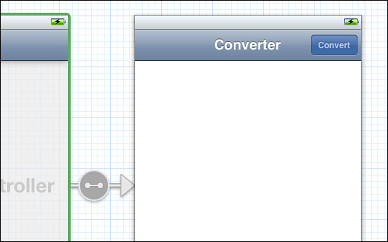
Figure 4-11. You can edit the navigation controller bar directly and add buttons to it.
Add Labels and Views
Drag two text fields and two labels into the view from the library. Then double-click the labels and edit the text, labeling the top one Fahrenheit and the bottom Celsius.
It’s important to specify how you want each text field to interact with users. Among other features, you can choose which keyboard to display, whether a prompt appears in the text box, whether words are autocorrected, autocapitalized, and so forth.
Select the top text field. In the attributes inspector, choose Text Field > Keyboard > Numbers and Punctuation. This ensures that a numeric keyboard is presented when the user taps the top field. Choose Text Field > Clear Button > Is Always Visible. This adds a circled “X” clear button to your text field whenever text has been entered. Choose Text Field > Correction > No, disabling autocorrection.
Select the bottom field, which will be used to display the converted Celsius value. Uncheck Control > Content > Enabled. The bottom field shows results and should not be editable by users.
Save your changes.
Note
As you add more elements to your Interface Builder view, it becomes difficult to select the correct one by clicking it. One handy tip is to Control-Shift-click any view in an Interface Builder edit window to display a list of all views stacked at that point. You can choose an item from that list to select it.
Enable Reorientation
Open the Hello_WorldViewController.m file and locate the shouldAutorotateToInterfaceOrientation: method. Edit this to always return YES and save your changes.
Test the Interface
Choose the iPhone simulator as your current scheme in the top-left of the Xcode window, just to the right of the Run and Stop buttons. Click Run to build your project as-is and run it in the simulator. While the project is running, make sure that the top field opens a numbers-based keyboard and that the bottom field cannot be edited. You can click the Convert button, but it does not do anything yet. So long as your project can be compiled, you can always check your current progress in the simulator and/or on a device. Make sure to rotate the interface to ensure it works in all orientations.
Add Outlets and an Action
Outlets and actions play important roles in Interface Builder design. Outlets connect interfaces to objects; they essentially act as instance variable stand-ins. Actions are methods that your IB-created interfaces can invoke. They specify target/action pairs, sending callbacks from control views to objects. For this project you need to create two outlets and one action.
Again, this part of the walkthrough starts with the iPhone connections. With the iPhone storyboard open and displayed in Interface Builder, click the Assistant Editor button at the top-right of the Xcode screen. It is the middle of the three Editor buttons. When this button is clicked, the assistant automatically opens the counterpart for the file you’re editing. In this case, Hello_WorldViewController.h should appear to the right of the IB editor.
Preparing for Creating Outlets
By default, your view controller header file looks something like this:
#import <UIKit/UIKit.h>
@interface Hello_WorldViewController : UIViewController
@end
You will greatly simplify your life with Interface Builder by manually adding braces and a little spacing, like this:
#import <UIKit/UIKit.h>
@interface Hello_WorldViewController : UIViewController
{
}
@end
This gives you lots of room to work with when adding outlets by dragging them to your code. You can edit the extraneous carriage returns out later to create a tighter presentation.
Adding Outlets
Next, create your outlet. Press and hold the Control key and drag from the top text field to the interface header file, as shown in Figure 4-12. The drag has to end inside the interface declaration, and when it does, the outlet pop-up appears.
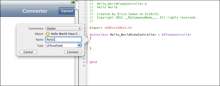
Figure 4-12. Control-drag from a text field to an interface counterpart editor in order to add an outlet. The pop-up appears when the Control-drag is released within the @interface declaration.
Ensure that the Connection is set to Outlet, that the type is set to UITextField, and then enter the name field1. Click Connect. This does two things. First, it creates the new outlet code for you in the text of the header file. Second, it adds the actual connection to your .xib data. Ensure that your drag ends inside the curly braces; otherwise, Xcode will add a property as well as a simple outlet. Repeat the Control-drag from the bottom field to inside the braces to add field2.
These actions added two instance variables to the class definition. The same approach works for adding actions by Control-dragging from buttons and other controls. Control-drag from the convert button to the interface definition, this time ending outside the curly braces. Set the connection to Action, the name to convert: (don’t forget the colon), leave the type as id, and click Connect. Your interface should now read as follows, with all the internal storyboard hookups properly created:
@interface Hello_WorldViewController : UIViewController
{
IBOutlet UITextField *field1;
IBOutlet UITextField *field2;
}
- (IBAction)convert:(id)sender;
@end
Note
Control-click (right-click) objects to open a pop-up showing many of the same details that normally display in the connections inspector.
Add the Conversion Method
Select Hello_WorldViewController.m and replace the convert: method with the following. Then save and test your application on both the iPhone and iPad simulators. The program now converts Fahrenheit values into Celsius. Test with values of 32 (0 Celsius), 98.6 (37 Celsius), and 212 (100 Celsius).
- (IBAction) convert: (id) sender
{
float invalue = [[field1 text] floatValue];
float outvalue = (invalue - 32.0f) * 5.0f / 9.0f;
[field2 setText:[NSString stringWithFormat:@"%3.2f", outvalue]];
[field1 resignFirstResponder];
}
Update the Keyboard Type
Newer versions of the SDK (4.1 and later) have introduced a keyboard that includes a decimal point called the “decimal pad.” In use, this keyboard appears as a number pad on the iPhone/iPod and as a standard keyboard on the iPad. Unfortunately, this keyboard style still does not appear in Interface Builder in the current Xcode 4 releases at the time this book is being written. (The NumberPad points to a no-decimal-number pad on the iPhone and to the numbers and punctuation presentation on the iPad.) To set the keyboard to the decimal pad, open RootViewController.m in the Xcode editor pane and add the field1 keyboard assignment shown in this snippet:
- (void)viewDidLoad
{
[super viewDidLoad];
// Do any additional setup after loading the view from its nib.
field1.keyboardType = UIKeyboardTypeDecimalPad;
}
Instead of displaying a standard keyboard with numbers selected on the iPhone, this option displays digits, a decimal point, and a delete key (see Figure 4-13). This provides a much better match for the task at hand—namely entering floating-point numbers for Fahrenheit-to-Celsius conversion.
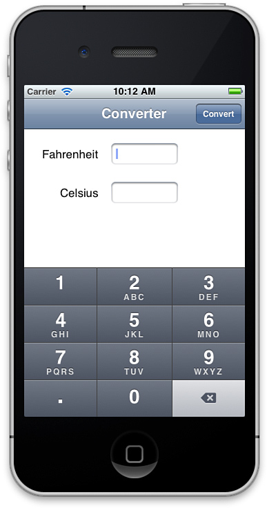
Figure 4-13. By assigning UIKeyboardTypeDecimalPad to a field’s keyboard type, you allow this keypad-style keyboard to limit a user’s entry to numbers and a decimal point.
Connecting the iPad Interface
As far as this simple application is concerned, there’s really not much of a difference between the iPhone and iPad implementations. You may want to update interface elements to make them larger, or add some art, but for this walkthrough you can just copy and paste the two labels and text fields from the iPhone version to the iPad one.
After, it takes just three connections to bring your iPad version to life. Once again Control-drag from your top text field to the interface file, but this time connect to the already-defined outlet field1, as shown in Figure 4-14. When the proper field highlights and the Connect Outlet pop-up appears, let go. Repeat for the bottom field (field2) and the convert button (convert:).
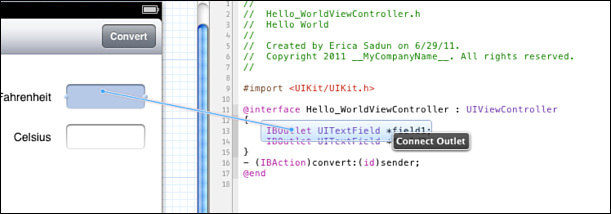
Figure 4-14. You can Control-drag to existing outlets and actions as well as create new ones.
Save your work and test your changes on the iPad simulator. After, you may want to go back and edit your iPad interface to be a bit bigger and more iPad-y.
Walkthrough: Building a Converter Interface by Hand
Anything that can be designed in Interface Builder can be implemented directly using Objective-C and Cocoa Touch. The code in Listing 4-2 duplicates the converter project you just built. Instead of loading an interface from a storyboard file, it manually lays out the elements in the loadView method.
The code matches the approach you used in Interface Builder. It adds two labels and two text fields. It sets the label texts to Fahrenheit and Celsius, tells the first field to use a numbers-and-punctuation keyboard, and disables the second. The locations and sizes for these items use view frames derived from the previous walkthrough.
To finish the layout, it adds a Convert button to the navigation bar. The button uses the same convert: callback as the IB project and calls the same code.
Listing 4-2. Code-Based Temperature Converter
#import <UIKit/UIKit.h>
// Handy bar button creation macro
#define BARBUTTON(TITLE, SELECTOR) [[UIBarButtonItem alloc]
initWithTitle:TITLE style:UIBarButtonItemStylePlain target:self
action:SELECTOR]
@interface HelloWorldController : UIViewController
{
UITextField *field1; // Fahrenheit
UITextField *field2; // Celsius
}
-(void) convert: (id)sender;
@end
@implementation HelloWorldController
// Convert to Celsius
- (void) convert: (id) sender
{
float invalue = [[field1 text] floatValue];
float outvalue = (invalue - 32.0f) * 5.0f / 9.0f;
[field2 setText:[NSString stringWithFormat:@"%3.2f", outvalue]];
[field1 resignFirstResponder];
}
- (void)loadView
{
// Create the view
self.view = [[UIView alloc] initWithFrame:
[[UIScreen mainScreen] applicationFrame]];
self.view.backgroundColor = [UIColor whiteColor];
// Establish two fields and two labels
field1 = [[UITextField alloc] initWithFrame:
CGRectMake(185.0, 16.0, 97.0, 31.0)];
field1.borderStyle = UITextBorderStyleRoundedRect;
field1.keyboardType = UIKeyboardTypeDecimalPad;
field1.clearButtonMode = UITextFieldViewModeAlways;
field2 = [[UITextField alloc] initWithFrame:
CGRectMake(185.0, 72.0, 97.0, 31.0)];
field2.borderStyle = UITextBorderStyleRoundedRect;
field2.enabled = NO;
UILabel *label1 = [[UILabel alloc] initWithFrame:
CGRectMake(95.0, 19.0, 82.0, 21.0)];
label1.text = @"Fahrenheit";
label1.textAlignment = UITextAlignmentLeft;
label1.backgroundColor = [UIColor clearColor];
UILabel *label2 = [[UILabel alloc] initWithFrame:
CGRectMake(121.0, 77.0, 56.0, 21.0)];
label2.text = @"Celsius";
label2.textAlignment = UITextAlignmentLeft;
label2.backgroundColor = [UIColor clearColor];
// Add items to content view
[self.view addSubview:field1];
[self.view addSubview:field2];
[self.view addSubview:label1];
[self.view addSubview:label2];
// Set title and add convert button
self.title = @"Converter";
self.navigationItem.rightBarButtonItem =
BARBUTTON(@"Convert", @selector(convert:));
}
// Allow app to work in all orientations
- (BOOL) shouldAutorotateToInterfaceOrientation:
(UIInterfaceOrientation)toInterfaceOrientation
{
return YES;
}
@end
@interface TestBedAppDelegate : NSObject <UIApplicationDelegate>
{
UIWindow *window;
}
@end
@implementation TestBedAppDelegate
- (void)applicationDidFinishLaunching:(UIApplication *)application
{
window = [[UIWindow alloc] initWithFrame:
[[UIScreen mainScreen] bounds]];
UINavigationController *nav = [[UINavigationController alloc]
initWithRootViewController:[[HelloWorldController alloc] init]];
window.rootViewController = nav;
[window makeKeyAndVisible];
}
@end
int main(int argc, char *argv[])
{
@autoreleasepool {
UIApplicationMain(argc, argv, nil, @"TestBedAppDelegate");
}
}
Putting the Project Together
Building this project means adapting one of Xcode’s built-in templates. Start by selecting File > New > New Project (Command-Shift-N) > iOS > Application > Empty Application. Click Next. Name the new project Hello World, set the Device Family to Universal, unselect Use Core Data, unselect Include Unit Tests, and click Next. Save to the desktop.
This template-based project demands a little file bookkeeping. Entirely delete both AppDelegate files. They will not be used in this demonstration. Next, drag main.m out of the supporting files folder into the top-level Hello World group.
Select the Hello World project and view its Summary tab. As with the previous walkthrough, set the app icons and launch images for both iPhone/iPod and iPad deployment. Leave “Copy items into destination group’s folder (if needed)” checked. Create a new Art group, move the default and icon images into that group, and then move the group itself into Supporting Files to get it out of the way.
To finish, open the main.m file, paste in the code from Listing 4-2 (it’s in the sample code folder), compile the project, and run it in the simulator. What you’ll find is an application that both looks and acts identical to the IB version. Instead of loading the interface from a storyboard file, this version creates it programmatically in the view controller class implementation.
In the real world, of course, you do not program your applications in main.m. You use industry coding standards and break your code into modular class units. Throughout this book, you’ll find each recipe, each coding story, primarily told in a single main.m file. Pedagogically it helps to have the entire concept presented in a unified manner in a single place, with only one file to look through. This cookbook trusts you to know what to do with the ideas once you’ve learned about them, and it attempts to simplify the presentation of those ideas, so you don’t have to wade through half a dozen or more files at a time to understand what is motivating them.
Walkthrough: Creating, Loading, and Using Hybrid Interfaces
One of the great things about Cocoa Touch is that you don’t have to program entirely by hand or entirely using Interface Builder. You can leverage IB’s visual layout and combine it with Xcode-based programming for a better, hybrid solution. This combines the static loading of .xib or .storyboard files provided by IB with a more reusable programmatic dynamic loading approach.
You can integrate IB files into your development without centering your design on a primarily IB approach. How you do so depends on whether you need to extract entire view controllers or just views. You may choose to load a storyboard from code and extract a view controller implementation from there. You might use individual XIB files instead of storyboard and create views from that XIB.
For lightweight reusable views, such as items you might superimpose on the screen for alerts and status updates, you’re best going with the XIB approach. Storyboards center on view controllers. Although you can theoretically pull out a view from one of these controllers, you end up fighting Cocoa Touch rather than working with its strengths. Using XIBs helps you create interface elements that aren’t tied to controllers. This walkthrough explores creating views from .xib files.
Note
Use storyboardWithName:bundle: to load .storyboard files from your application bundle. When working with .storyboard files, make sure you set scene (view controller) identifiers in the identity inspector before trying to extract controllers. Then you can use instantiateViewControllerWithIdentifier: to build the controller from code.
Create a New XIB Interface File
Cocoa Touch lets you recover objects from .xib files by calling loadNibNamed:owner:options:. This method returns an array of objects initialized from the XIB bundle, which you can then grab and use in your program. Use this feature to load an IB-designed interface from an otherwise hand-built application.
To get started, copy the project from the second walkthrough, the one built entirely by code. You adapt this hand-built code to use an XIB-designed view. Create an .xib file by choosing File > New > New File > iOS > User Interface > Empty. (Not Empty Storyboard.) Click Next. Set the device family to iPhone (it can be used on both platforms, fear not) and then click Next. Name it ConverterView, set it so it’s added to the Hello World group, with Hello World as its target, and click Save. Xcode adds the file and opens Interface Builder.
Add a View and Populate It
Drag a new UIView (not a view controller) in from the library to your workspace. It helps to search for UIView even though the Xcode “name” of the class is View. This cuts down on the false hits in the Library’s search results because “View” matches pretty much every object in the UIKit library.
With the view created, you need to add its contents. For simplicity, open the first converter walkthrough project in a new workspace, the one that used IB. Select both labels and text fields and copy them to memory. Close that project and paste those items into your new view. Presto, a fully populated view.
Open the attributes inspector and make sure that the top text field is set to No Correction and that the clear button is always visible. For the bottom field, uncheck Enabled.
Tag Your Views
Tagging views assigns numbers to them. All view classes provide a tag field. Tags are integers that you can utilize to identify view instances. You choose what number to use. Once views are tagged, you can retrieve them from a parent view by calling viewWithTag:.
Select the top text field. In the attributes inspector, edit View > Tag to 11. Select the bottom text field and set View > Tag to 12. These are arbitrary numbers. This code uses values higher than 10 to avoid conflict with any possible Apple-introduced tags.
Edit the Code
Save your changes and turn your attention back to the main.m code file. Replace the Hello World Controller class implementation with Listing 4-3. The loading code relies on the fact that there is just one actual view object in that XIB, the main UIView. The order of the items in the XIB file array mirrors the order of the items in Interface Builder’s project window. Because this XIB contains exactly one top-level item, the code could just as easily use objectAtIndex:0 as lastObject.
Notice how much more succinct Listing 4-3 is compared to the much longer Listing 4-2, which laid out all interface elements. What’s more, you can keep editing the XIB interface without updating your code. This provides a great balance of orthogonality with convenience. This approach is far less tied into IBOutlets and IBActions, but at the same time it does add the burden of tag management.
Listing 4-3. Loading Interfaces from IB Files
@implementation HelloWorldController
- (void) convert: (id) sender
{
float invalue = [[field1 text] floatValue];
float outvalue = (invalue - 32.0f) * 5.0f / 9.0f;
[field2 setText:[NSString stringWithFormat:@"%3.2f", outvalue]];
[field1 resignFirstResponder];
}
- (void)loadView
{
self.view = [[[NSBundle mainBundle]
loadNibNamed:@"ConverterView" owner:self options:NULL]
lastObject];
field1 = (UITextField *)[self.view viewWithTag:11];
field2 = (UITextField *)[self.view viewWithTag:12];
field1.keyboardType = UIKeyboardTypeDecimalPad;
// Set title and add convert button
self.title = @"Converter";
self.navigationItem.rightBarButtonItem =
BARBUTTON(@"Convert", @selector(convert:));
}
- (BOOL) shouldAutorotateToInterfaceOrientation:
(UIInterfaceOrientation)toInterfaceOrientation
{
return YES;
}
@end
Designing for Rotation
On iOS, device orientation changes are a fact of life. How you decide your application should respond to those changes presents a common design challenge. Do you resize onscreen elements, letting them grow and shrink in place like Safari does? Do you move them to new locations to accommodate the different view proportions? Or do you present an entirely different view, like the YouTube and iPod/Music apps do? Each of these choices presents a possible design solution. The one you pick depends on your application’s needs and the visual elements in play.
The following sections explore these design approaches. You learn about autosizing and manual view placement as well as view-swapping approaches. In the distant past, Apple indicated it would eventually support separate landscape and portrait views in the SDK. At the time of writing, this functionality has not yet been implemented. On the iPad, the split view controller touches on a unified portrait and landscape design method, but it does so by showing and hiding a secondary panel rather than introducing a way to specify fixed view locations.
Enabling Reorientation
UIViewController instances decide whether to respond to iOS orientation by implementing the optional shouldAutorotateToInterfaceOrientation: method. This method returns either YES or NO, depending on whether you want to support autorotation to a given orientation. To allow autorotation to all possible orientations, simply return YES:
- (BOOL)shouldAutorotateToInterfaceOrientation:
(UIInterfaceOrientation)interfaceOrientation
{
return YES;
}
Possible iOS orientations passed to this method include the following:
• UIDeviceOrientationUnknown
• UIDeviceOrientationPortrait
• UIDeviceOrientationPortraitUpsideDown
• UIDeviceOrientationLandscapeLeft
• UIDeviceOrientationLandscapeRight
• UIDeviceOrientationFaceDown
Of these orientations, the portrait and landscape varieties influence how a view autorotates. If your application is portrait only or landscape only, it might allow flipping between the two available orientations. This code uses the logical OR symbol (||) to combine tests into a single return value:
- (BOOL)shouldAutorotateToInterfaceOrientation:
(UIInterfaceOrientation) interfaceOrientation
{
return ((interfaceOrientation == UIDeviceOrientationPortrait) ||
(interfaceOrientation ==
UIDeviceOrientationPortraitUpsideDown))
}
When returning YES, the view controller uses several flags to determine how the autorotation takes place. For example, you might want to stretch subviews both horizontally and vertically:
contentView.autoresizesSubviews = YES;
contentView.autoresizingMask = (UIViewAutoresizingFlexibleWidth |
UIViewAutoresizingFlexibleHeight);
These flags correspond exactly to settings made available in Interface Builder’s size inspector, which is discussed in the next section.
You can set an application’s initial interface orientation by editing its Info.plist file. The UIInterfaceOrientation key (also called “Initial interface orientation” when not using raw keys and values) can be set to the following:
• UIInterfaceOrientationPortrait—Portrait (bottom home button)
• UIInterfaceOrientationPortraitUpsideDown—Portrait (top home button)
• UIInterfaceOrientationLandscapeLeft—Landscape (left home button)
• UIInterfaceOrientationLandscapeRight—Landscape (right home button)
In addition, you can choose which orientations are supported by the application. Set the UISupportedInterfaceOrientations key (“Supported interface orientations”) to an array of orientations. For a landscape-only application, add the two landscape items. Xcode 4 provides a lovely supported device orientation settings pane when you select your project and choose the Summary tab. You can set supported orientations separately for iPad- and iPhone-style deployment. Figure 4-15 shows the deployment setting options for the iPhone. Scroll down that pane to find the iPad settings.
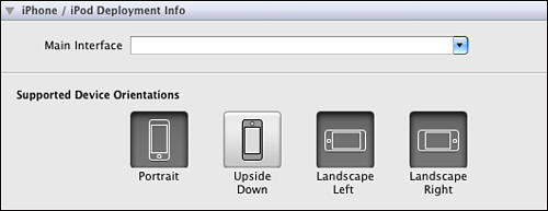
Figure 4-15. New to Xcode 4, you can choose your supported orientations for each deployment platform without having to edit the Info.plist file directly.
On iOS, you may develop App Store apps that are fixed to a single landscape or portrait orientation. On the iPad, Apple requires that users be able to use the device in more than one orientation. What this comes down to, at the time this book is being written, is the following:
• You can submit iPad applications that are landscape-only or portrait-only but they must run in both possible orientations. That is, your application must support both landscape-left and landscape-right or it must support both portrait and portrait-upside-down orientations.
• All supported orientations must be usable. If your application uses both portrait and landscape layouts, you must provide some level of usable interface for each of these presentations.
• If you do use a split view design for your application, the contents of the left pane shown in landscape mode should be available via a left-side bar button popover in portrait mode. That is, when a user taps on the top-left bar button in portrait orientation, a popover should appear that duplicates the contents of the left pane that is otherwise hidden.
• Match your Default.png choices to the orientations you plan to use. For landscape-only use, consider using a landscape-only Default-Landscape.png. You can even submit separate left and right versions, although I cannot think why you would really need to do so. When you are deploying only to the iPad, avoid submitting a single Default.png file. Apple’s Technical Q&A QA1588 notes that “[The Default.png’s] usage is strongly discouraged, use more specific launch images instead.”
Autosizing
When you tilt an iPhone on its side in Safari, the Safari browser view adjusts its proportions to match the new orientation. It does this through autosizing. Autosizing adds rules to a view telling it how to reshape itself. It can stretch, stay the same size, and/or be pinned a certain distance from the edge of its parent. These properties can be set by hand in code or in Interface Builder’s size inspector, which is shown in Figure 4-16.
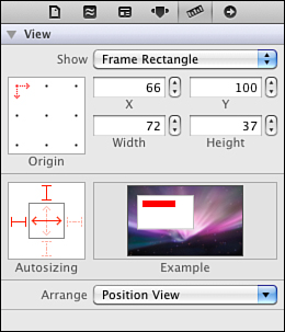
Figure 4-16. Interface Builder’s Autosizing pane sets a view’s autoresizingMask.
This pane adjusts a view’s autosizing rules. The control consists of an inner square with two double-arrowed lines and an outer square with four blunt-ended lines. Each item can be set or unset via a click. When enabled, they appear in bright red; when disabled they are dim red in color.
The four outer lines are called “struts.” They establish a fixed distance between a view and its parent’s edge. Imagine setting a view at 40 points from the top and left of the superview. Enabling the top and left struts (as shown in Figure 4-16) fixes that view at that position. It basically pins the view in place. When you use a right or bottom strut, those distances are also maintained. The view must either move or resize to stay the same point distance from those sides.
The two inner lines are called “springs.” They control how a view resizes itself. The example shown in Figure 4-16 has its horizontal spring set, allowing the view to resize horizontally in proportion to the parent view’s size.
To allow a view to float—that is, to set it as both unpinned and without automatic resizing—unset all six struts and springs. This option is only available for subviews. The primary view defined in Interface Builder must be set with both springs on.
If you prefer to set these traits by hand, the two properties involved are autoresizesSubviews, a Boolean value that determines whether the view provides subview resizing, and autoresizingMask, an unsigned integer composed of the following flags, which are combined using the bitwise OR operator (|) to produce a value for the property:
• UIViewAutoresizingNone means the view does not resize.
• UIViewAutoresizingFlexibleLeftMargin, UIViewAutoresizingFlexibleRightMargin, UIViewAutoresizingFlexibleTopMargin, and UIViewAutoresizingFlexibleBottomMargin allow a view to resize by expanding or shrinking in the direction of a given margin without affecting the size of any items inside. These correspond to the four struts of Interface Builder’s Autosizing pane (refer to Figure 4-16) but act in the opposite way. In IB, struts fix the margins; the flags allow flexible resizing along those margins.
• UIViewAutoresizingFlexibleWidth and UIViewAutoresizingFlexibleHeight control whether a view shrinks or expands along with a view. These correspond directly with Interface Builder’s springs. Springs allow flexible resizing, as do these flags.
On the iPad, you can avoid a lot of orientation design headaches if you’re willing to ditch about one-third of your available pixel space. A fixed 748-by-748-point view will fit in both portrait and landscape mode, with allowances made for the 20-point-high status bar. (If the status bar is hidden, a 768-by-768-point view can be used instead.) This approach, which is best used for simple utilities rather than complex applications, allows you to disable autoresizing (UIViewAutoresizingNone) for the view and its children, and simply rotate it as needed to match the current orientation. I have used this approach in production code and have had no problem with Apple review, but be sure to use good design common sense when handling what you do with the remaining portion of your screen.
Autosizing Example
Consider the view shown in Figure 4-17. It consists of one main view and three subviews—namely the title, a white background splash, and a small piece of art. These subviews represent three typical scenarios you’ll encounter while designing applications. The title wants to stay in the same place and maintain its size regardless of orientation. The white splash needs to stretch or shrink to match its parent’s geometry, and the butterfly art should float within its parent.
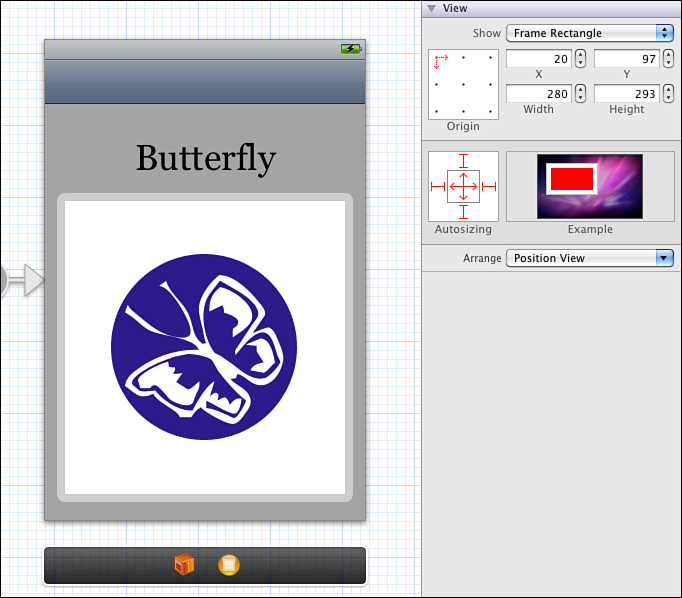
Figure 4-17. Setting view autosizing in Interface Builder.
The autosizing behavior of each subview is set in the size inspector. The title requires only a single strut at the top. The splash needs to resize while maintaining its distance from each edge. Setting all six struts and springs (shown in Figure 4-17) produces this result. The art subview uses the opposite setting, with none of the six struts or springs in use.
In theory, you can test the view in its opposite orientation by selecting the Landscape orientation from Simulated Metrics > Orientation in the attributes inspector. (This is like clicking the small curved arrow at the top-right of the view editor window in Xcode 3’s Interface Builder.) In reality, at least at the time of writing this update, it’s better to test using the simulator or even on the device, providing more accurate rotation updates than the Simulated Metrics approach, which has a high probability of messing up your design.
Figure 4-18 shows the landscape version of this view using these settings, when run in the iPhone simulator. Simulating and switching between portrait and landscape presentation helps you realize how your autoresizing choices work.
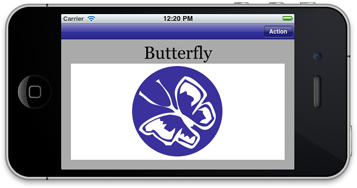
Figure 4-18. This is the landscape version of the view shown in Figure 4-17 using the described autosizing choices. Use the simulator’s movement options of Hardware > Rotate Left (Command-left arrow) and Hardware Rotate Right (Command-right arrow) to test your views in various orientations.
Evaluating the Autosize Option
Some iOS classes work well with autosizing. Some do not. Large presentation-based views provide the best results. Web views and text views autosize well. Their content easily adapts to the change in view shape.
Small controls, especially text fields, fare more poorly. These views are not naturally elastic. Moving from landscape to portrait, or portrait to landscape, often leaves either too much room or not enough room to accommodate the previous layout. For these views you might place each item in a custom position rather than depend on autosizing. That’s not to say that autosize solutions cannot work for simple layouts, just that as a general rule more complex views with many subviews do not always lend themselves to autosizing.
Image views are another class that doesn’t work well with autosizing. Most pictures need to maintain their original aspect ratios. On the iPhone platform, for example, a 320×480 image shown originally in portrait orientation must shrink to 213×320 for landscape. That leaves you with just 45% of the portrait size. Consider swapping out art to a landscape-appropriate version rather than trying to stretch or resize portrait-based originals.
When working with autosizing, always take the keyboard into account. If your main view does not scroll or provide provisions for moving its views into accessible places, a keyboard may hide some of the views it’s trying to service. Test your interfaces as you design them, both with Interface Builder’s orientation selector and (preferably) in the simulator, to ensure that all elements remain well placed and accessible.
Moving Views
If autosizing provides a practically no-work solution to orientation changes, moving views offers a fix with higher-bookkeeping responsibilities. The idea works like this: After a view controller finishes its orientation, it calls the delegate method didRotateFromInterfaceOrientation:. Listing 4-4 implements a method that manually moves each view into place. As you can see, this approach quickly gets tedious, especially when you are dealing with more than four subviews at a time.
Listing 4-4. Positioning Views in Code
- (void)didRotateFromInterfaceOrientation:
(UIInterfaceOrientation) fromInterfaceOrientation
{
// Move the Fahrenheit and Celsius labels and fields into place
switch ([UIDevice currentDevice].orientation)
{
case UIInterfaceOrientationLandscapeLeft:
case UIInterfaceOrientationLandscapeRight:
{
flabel.center = CGPointMake(61,114);
clabel.center = CGPointMake(321, 114);
ffield.center = CGPointMake(184, 116);
cfield.center = CGPointMake(418, 116);
break;
}
case UIInterfaceOrientationPortrait:
case UIInterfaceOrientationPortraitUpsideDown:
{
flabel.center = CGPointMake(113, 121);
clabel.center = CGPointMake(139, 160);
ffield.center = CGPointMake(236, 123);
cfield.center = CGPointMake(236, 162);
break;
}
default:
break;
}
}
The big advantage of this moving-subviews approach over presenting two separate views is that you maintain access to your original subviews. Any instance variables in your view controller that point to, say, a text field, continue to do so regardless of where that field is placed onscreen. The data structure of your view controller remains unchanged and independent of location, which is very Model-View-Controller compliant. The disadvantage lies in needing to specify each component’s position in advance, in code, with laborious testing to update any element. If you want to move an item around to see where it looks good, Interface Builder offers a superior what-you-see-is-what-you-get approach.
Recipe: Moving Views by Mimicking Templates
There’s a much simpler way to accomplish the same movement with less work. That’s by creating templates. Using a storyboard-based template allows each view to update itself to match a design that you set in Interface Builder. Here’s how it works.
Start with the IB Converter base project. Duplicate it and open it in Xcode. Add tags to each item in the main view. The exact numbers aren’t important—what matters is that each view has a unique tag and that those tags exceed the value 10. The over-10 numbering is not official; it’s a convention I use to avoid conflicting with any occasional Apple built-in tagging scheme.
Add two new view controllers. Use the attributes inspector to set their storyboard identifiers to Portrait and Landscape. Change Portrait’s Simulated Metrics > Orientation to Portrait, and Landscape’s to Landscape. Match the metrics to how each view will be used. For here, set the Top Bar to Navigation Bar, just as the real view does.
Select all items in the main view, which will be all four subviews. Copy those to memory and then paste them into both the portrait and landscape items. When copied, each view retains its tag, which is the critical element. Lay out the copied items in each view, exactly the way you want them to appear in that orientation, as shown in Figure 4-19.
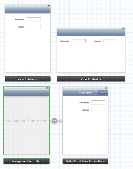
Figure 4-19. Add layout templates to your storyboards to easily respond to interface reorientation events.
Recipe 4-1 keeps using your original view and subviews after orientation changes. What you do is use those extra two view controllers as templates to determine where to place each subview. You move objects into position by matching their location in each template. This approach introduces two enormous advantages. You don’t hard-code locations, and you can update the layouts in Interface Builder as needed.
Recipe 4-1. Moving Views into Place by Matching Against a Template
// Return all subviews via recursive descent
NSArray *allSubviews(UIView *aView)
{
NSArray *results = [aView subviews];
for (UIView *eachView in [aView subviews])
{
NSArray *theSubviews = allSubviews(eachView);
if (theSubviews)
results = [results arrayByAddingObjectsFromArray:theSubviews];
}
return results;
}
@implementation Hello_WorldViewController
// Respond to interface re-orientation by updating layout
- (void)didRotateFromInterfaceOrientation:
(UIInterfaceOrientation)fromInterfaceOrientation
{
BOOL isPortrait = UIDeviceOrientationIsPortrait(
[[UIDevice currentDevice] orientation]);
UIViewController *templateController = [self.storyboard
instantiateViewControllerWithIdentifier:
isPortrait ? @"Portrait" : @"Landscape"];
if (templateController)
{
for (UIView *eachView in allSubviews(templateController.view))
{
int tag = eachView.tag;
if (tag < 10) continue;
[self.view viewWithTag:tag].frame = eachView.frame;
}
}
}
- (void) viewDidAppear:(BOOL)animated
{
[self didRotateFromInterfaceOrientation:0];
}
- (BOOL)shouldAutorotateToInterfaceOrientation:
(UIInterfaceOrientation)interfaceOrientation
{
return YES;
}
- (IBAction) convert: (id) sender
{
float invalue = [[field1 text] floatValue];
float outvalue = (invalue - 32.0f) * 5.0f / 9.0f;
[field2 setText:[NSString stringWithFormat:@"%3.2f", outvalue]];
[field1 resignFirstResponder];
}
@end
Here are a few points about this approach:
• This code ignores untagged views and tags with a value under 10. Apple rarely tags views, but when it does so, it uses small numbers such as 1, 2, and 3. Make sure to tag your views starting with numbers from 10 and up.
• This example uses the storyboard to provide immediate access to the templates. The instantiated view controller selected is based on the device orientation.
• The update method is called both when the view first appears onscreen and whenever a new orientation is detected.
• Unfortunately, you cannot just use the main view as your portrait template. Once rotated, it loses all memory of the proper portrait view positions. At the same time, don’t worry too much about making your main view pretty. So long as the proper items with the correct tags are somewhere in the view, it doesn’t really matter where they are. The user will never see that layout.
One More Thing: A Few Great Interface Builder Tips
It never hurts to have a few extra tricks up your sleeve when developing with Interface Builder and Xcode. Here are some favorite IB tricks that I use on a regular basis:
• Selecting from stacked views—You can use the object hierarchy view to drill down into Interface Builder’s view tree. Another way to find and select subviews is by Control-Shift-clicking a view. This exposes all the views layered at that point (see Figure 4-20) and lets you select whichever item you want, regardless of whether it is the top view.
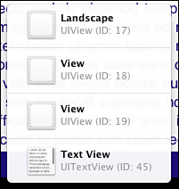
Figure 4-20. Shift-Control-click a view to pop up a view-selection dialog.
• Naming views—Tired of seeing each new item called “View Controller Scene” in your scene list? Give your views more meaningful names. Edit the Interface Builder Identity > Label field. The strings you assign are not used outside of Xcode, but they do help you organize your visual components.
• Moving and resizing scenes—Drag in the status bar of each scene to move views out of the way. Use the magnifying glasses at the bottom right of the Interface Builder editor to zoom out for an overview or in for detail work.
• Pulling in media—Interface Builder’s Media library lists the media currently available in your Xcode project. It’s found in the Library browser at the bottom of Xcode’s Utility pane (View > Utilities > Show Media Library). You can drag artwork from there and drop it onto a view. Interface Builder automatically creates a new UIImageView instance, adding the art (as a UIImage) to that view.
• Moving objects—When you’re moving subviews, the arrow keys move you one point in any direction. Hold down the Shift key to move by 5 points at a time.
• Copy objects—Option-drag any object to copy it.
• Show object layout—Select any onscreen view. Hold down the Option key and hover the mouse over either the selected object or any other view to reveal the pixel-accurate layout information shown in Figure 4-21.
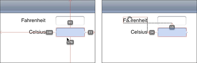
Figure 4-21. Holding the Option key while moving the mouse over views reveals how each view is placed in the view container and how views relate to the selected object in terms of distance.
Summary
This chapter introduced the basics of iOS interface design. You discovered numerous ways to build interfaces: using Interface Builder, using code, and blending the two approaches. You saw reorientation in action and learned about different ways to update your views to live in both the portrait and landscape worlds.
Before moving on to the next chapter, here are a few points to consider about laying out interfaces:
• Interface Builder excels at laying out the content of UIView instances. Use its tools to connect those instances to the view controllers in your program and use Interface Builder to refine WYSIWYG-style interfaces such as the temperature converter example covered in this chapter.
• Know when Interface Builder isn’t the right solution. When you’re building tab bars and navigation controllers with minimal window design (such as for table-based or text-based applications), you don’t especially need IB’s view layout tools.
• Some views work beautifully under multiple orientations. Some do not. Don’t feel that you must provide a landscape version of your application that exactly matches either the look or the functionality of the portrait one, especially when you’re working on smaller screen sizes. It’s okay to provide different portrait and landscape experiences.
• Always, always save your work in Interface Builder. Until you do so, your project will not be updated with the current version of your files.
• There’s no “right” way to design and implement portrait and landscape layouts. Choose the approach that works best for your needs and provides the best experience for your users.