
3. Content Reference Wireframes
“A journey of a thousand li starts beneath one’s feet.”
—LAOZI, DAO DE JING
In the early days of web design, wireframes—sometimes called schematics—were simple drawings with boxes indicating where page components would go on the page. They were the precursors to mockups, a way to quickly try out content placement to get a feel for the general skeleton of the page. Nowadays, wireframes are often exceedingly detailed. They often contain actual content. Some actually look like almost-finished websites, devoid only of color, imagery, and typography. The layout is done. Decisions have been made about the content and the placement of this content.
At the risk of sounding like a grumpy old man saying, “Back in my day...,” I find the current strain of intricate wireframes a very odd and limiting deliverable (Figure 3.1). The people who create them (often interaction designers) have done a lot of visual design thinking. Visual designers often receive these wireframes with a disclaimer that they’re not intended to represent final designs. Yet this is exactly how some clients perceive them. I once had a client question whether I had sufficiently familiarized myself with the project materials because my visual design was so different from the wireframes made several months earlier. In the end, I was asked to use the wireframes as a basis for the layout. This sort of thing happens often enough that it’s frustrating. Disclaimers of the “this is not the final design” variety are thus either untrue, or they render the entire deliverable useless. It doesn’t represent the final design, but it might if the client really likes it. If the wireframe does represent the design, then it’s a design, not a wireframe. If it doesn’t, then why so much detail?
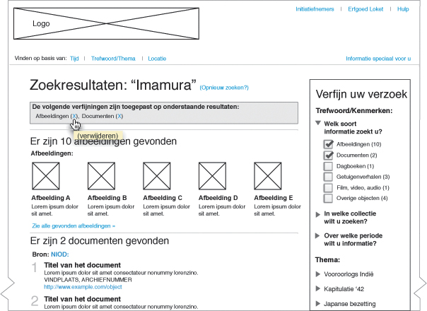
Figure 3.1. Some wireframes look like finished pages, in some cases reducing the designer’s job to a color-by-numbers exercise.
The problem with intricate wireframes, disclaimer or not, occurs when clients see them. If your wireframes are for team use only, disclaim them all you want. But as in the experience I noted above, when you show wireframes to a client, you’re presenting a visualization; it’s logical that the client might have expectations based on what they see. On the other hand, I’ve been involved on the flip side of the wireframe problem: more than once I’ve had clients and interaction designers actually negatively review my design proposals because they looked too much like the wireframes. How’s that for a rock and a hard place? What if the interaction designer already came up with the best solution for something? So for some projects, designers are damned if they follow the wireframes too closely and damned if they don’t. And that’s damned frustrating.
Stop making this stuff so complicated
Detailed wireframes were presumably brought to life as a result of clients making fundamental changes when the design was already in the mockup stage. This is logical; changing a mockup can be an unholy amount of work. In fact, that’s one of the primary reasons I changed my workflow and wrote this book. But creating a colorless, imageless “pre-mockup” in a different application is not the answer. The answer, as designer Mark Boulton says, is to stop going for the big reveal. Take your clients by the hand from the very beginning, and allow them to walk through your entire workflow with you. You won’t need intricate wireframes. You just need to go back to using them the way they used to be: old-school wireframes.
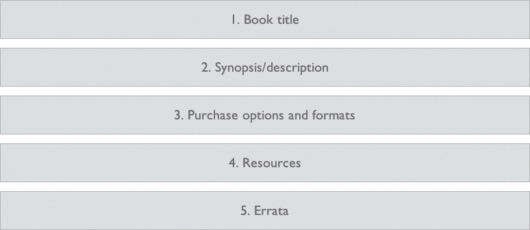
I like to call those old-school wireframes content reference wireframes (Figure 3.2). I prefer that name because it describes how the wireframes deal with content: they simply refer to it as opposed to depicting it. Every step in the responsive workflow is based on a simple idea; where step one involves making a simple list of content to be used, this step involves making simple wireframes that are nothing more than box drawings containing references to specific pieces of content.
What I propose in this book is that we stop heaping responsibility on the shoulders of wireframes. Let’s use them to start visualizing content placement and relative importance in differing screen environments. Let’s leave definitive layout and interaction design choices for later when we have a proper stage for them. In the workflow set forth in this book, low-fi wireframes will eventually evolve into hi-fi prototypes that can be studied, tested, revised, and client-approved.
Baby steps: Creating low-fi web-based wireframes
The first thing I’ll ask you to do is to forget your pet application for creating wireframes, unless it’s a text editor. We’ll be using a text editor, HTML, CSS, and a browser to create our low-fi wireframes. Don’t worry—it’s easy.
For the book site, the content reference wireframe will be easy to make, not only because we’re making just one instead of many, but also because we’ll start with structured content first.1
1 The idea of starting with structured content is similar to methodologies like Luke Wroblewski’s Mobile First, where the visual lowest common denominator is the starting point. In this case, it’s about starting with a basic content rather than a smaller screen size.
At this point, we’re just sketching an impression of the layout in the browser, so the linear layout is a great place to start.
Setting up your base markup
To start, you’ll need a basic HTML document. I’m assuming you have some HTML knowledge and can divert from my examples and use your own boilerplates as you wish. If you don’t have HTML experience, you might want to copy (or preferably, type) the code in my examples exactly.
Open your text editor and create a basic, boilerplate HTML document similar to this one:
<!DOCTYPE html>
<html lang="en">
<head>
<meta charset="utf-8">
<title>Responsive Design Workflow</title>
</head>
<body>
</body>
</html>
Next, look at your content inventory and prioritize the content. Consider a browsing environment where you’d be limited to viewing content in a linear fashion (and those environments are common enough). Which content is important enough to be at the top? What’s not as important and should be underneath?
Another way of thinking about it is this: imagine that your job is to turn the content into a printed document, such as a book. Your content inventory suggests sections. Many of these sections will have a heading, and some of the sections might have subsections with headings of their own. How would you structure the content? What would come first? What would come last?
Let’s take a look at the book site content inventory again:
1. Title
2. Book synopsis/description
3. Purchase options and available formats
4. Resources
5. Errata
This one is pretty simple. It seems logical and in the correct order in terms of priority. Let’s go ahead with it.
Remember to work together. Linear content order is something that should be discussed among visual and graphic designers, content strategists, interaction designers, and clients, all of whom have valuable input or considerations to add to the discussion.
Tip
Simple examples make things easy to learn. These techniques do work for complex projects. Throughout the book, think about how you could apply the various principles to your own projects.
The next step is to create container elements in the HTML document that will represent the content from our inventory in the order we’ve determined. In the case of the book site, we’ll place these elements in the body element:
<body>
<div id="page">
<section id="book-title"></section>
<section id="synopsis"></section>
<section id="purchase"></section>
<section id="resources"></section>
<section id="errata"></section>
</div>
</body>
The id attributes are optional, but as your wireframe evolves into a more detailed prototype, it makes reading your own code easier. Id attributes identify elements in your code, so this use—while optional—is totally appropriate.
Note
Classification in the document can be by class or ID. An ID is like a proper name and should be unique on the page. Thus, if you have reviews on your page, you might have a section with an ID of “reviews,” with each review being another element (perhaps article) within that section with a class of “review.” Many elements can share the same class.
With applications such as OmniGraffle and Photoshop, you’d have no HTML elements at all, so while some bit of HTML semantics is arguably better than none, your wireframe code becomes more important if you’ll be using it as a basis for production later on. In that case, stick with your normal coding conventions (as long as they’re good).
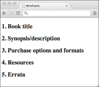
If you save your HTML document and open it in a web browser, you won’t see anything, since we haven’t added any textual content. Let’s add some headings to the sections and number them, which will allow us to look at the page and see how the sections in the wireframe correspond to the content inventory:
<body>
<div id="page">
<section id="book-title"><h1>1. Book title</h1></section>
<section id="synopsis"><h1>2. Synopsis/description</h1></section>
<section id="purchase"><h1>3. Purchase options and formats</h1></section>
<section id="resources"><h1>4. Resources</h1></section>
<section id="errata"><h1>5. Errata</h1></section>
</div>
</body>
Now when you view the document you’ll see the content inventory displayed as HTML headings (Figure 3.3).
Next, we need to add some wireframe styles. To keep things clean, we’ll add a special class attribute to the body element, which we’ll remove later when the wireframe becomes a prototype:
<body class="wireframe">
This will ensure that the CSS rules you write for the wireframe won’t be carried over into the prototype.
Setting up your base styles
Create a style sheet for styles that will almost always be used, regardless of viewport size. Call the document base.css and place it either in a folder with your HTML document or in a subfolder called “styles,” “css,” or whatever you prefer. If you’re a developer, it’s fine to stick with your own naming conventions, but be aware that the examples here assume there’s a directory called “styles” in the same folder as your HTML file.
Note
If you prefer to use a CSS reset or normalize and are aware of the pros and cons, go right ahead.
Now open base.css in your text editor and give the body element a background color:
body {
background-color: white;
font-family: sans-serif;
}
Next, add some style to the wireframe sections. These styles are purely for the purposes of your wireframes, so they mostly deal with how blocks are presented. You might choose a border, a background, or a combination of the two. Keep it simple! Here’s an example (also see Figure 3.4), but feel free to create your own styles:
.wireframe section {
background-color: whitesmoke;
border: 1px solid gainsboro;
}
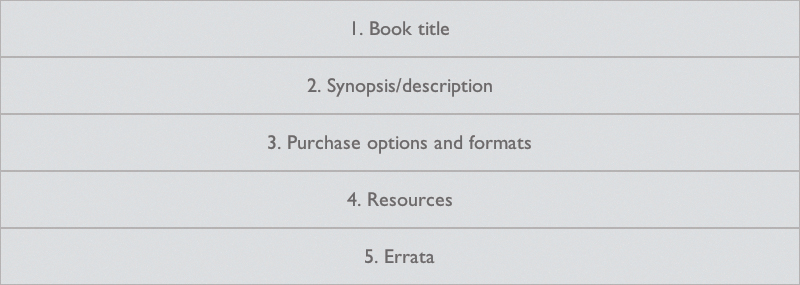
I’m using CSS color names here, but of course you can use any colors you please. These styles will be applied to sections only when the body element has the class wireframe, which is used only during the wireframe stage. This is the reason we set the font family: to make sure the wireframe styles don’t conflict with any styles we’ll add when the wireframe evolves into a full-blown design prototype.
Note
I’m namespacing the wireframe styles in these examples by using the class “wireframe” on the body element. You could just as easily choose to have no class on the body and link to a separate wireframe.css style sheet, which you can remove when you move on to the design.
To see how this looks in the browser, link to the style sheet from your HTML file:
<head>
<meta charset="utf-8">
<title>Responsive Design Workflow</title>
<link rel="stylesheet" href="styles/base.css" media="screen">
</head>
Now open the file in your browser. We’re getting there, but there’s a bit of tweaking to do. The headings are pretty large, dark, and flush left. I think centering the text in this case might make it slightly easier to read at a glance. Let’s change that a bit:
.wireframe section {
background-color: whitesmoke;
border: 1px solid gainsboro;
font: small sans-serif;
text-align: center;
color: silver;
}
.wireframe h1 {
font-weight: 100;
}
The reason I’m using small for the font size instead of a specific unit (such as px or em) is that in cases like this where I simply want text to appear smaller, keywords like small are quick to use without even thinking about it. The key to making wireframes this way is to work as quickly as possible; detail is not yet important.
Next, let’s add margins, and remove the default padding and margins on the body element:
.wireframe {
margin: 0;
padding: 0;
}
.wireframe section {
margin: 1em;
background-color: whitesmoke;
border: 1px solid gainsboro;
font: small sans-serif;
text-align: center;
color: silver;
}
.wireframe h1 {
font-weight: 100;
}
This is looking reasonable (Figure 3.5). Depending on your own code, you may need to add or remove certain styles, such as adding some padding to the sections if you’ve chosen not to use borders.
This entire process of setting up wireframe base documents should take no more than a couple of minutes. After you’ve done it once, you can use the same setup for each project, which you’ll then have up and running almost instantly.
Note that while I’ve walked through this step by step, it’s very basic CSS and quite easy to do, even for beginners. You now have a linear, flexible-width wireframe that you can open and demonstrate in web browsers, even on mobile devices.
Note
Of course, resizing the browser window as a quick check to be sure that your style sheets are working properly is good practice so you can move quickly. But ideally, you should start checking all your files (even wireframes) on actual devices as soon as you can; it’s a useful habit that can save you headaches down the road.
Adjusting the wireframe to be “mobile first”
If you can, either put your files on a web server and open the HTML page on a smartphone browser or use a mobile emulator. Whenever possible, try to test files on actual devices (yes, even wireframes). If you’re unable to do one of the above, you can simply make your browser window smaller, but this is a poor substitute.
What you’ll see is your wireframe in its current state: a listing of your content in a given order, and each content section displayed as a block on the page. The height of each block is determined by the size of the heading within it. This is not very realistic.
Focusing on how the wireframe looks in a linear fashion, as it will on many phones, try to estimate roughly how long you’ll expect each section to be. It doesn’t matter at this point if your estimate is correct. We know only that the defaults are not correct. So we estimate very roughly, and add some styles to the specific sections to reflect these estimates. We’ll target the specific sections using their IDs, and continue namespacing with the wireframe class to avoid conflicts.
.wireframe #book-title { height: 5em; }
.wireframe #synopsis { height: 30em; }
.wireframe #purchase { height: 20em; }
.wireframe #resources { height: 50em; }
.wireframe #errata { height: 40em; }
An interactive way of adjusting these values is to use your browser’s developer tools to adjust the CSS in the browser until you feel the height is about right, and then transfer that value into your style sheet (Figure 3.6).
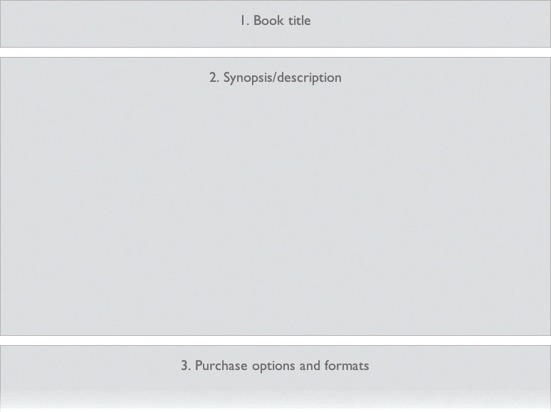
Figure 3.6. Estimating the heights of content blocks helps you to quickly visualize what might happen with actual content.
Again, look at what happens in the browser. The values might be way off, but the feeling is somewhat more realistic, as the sections are not all the same size. Sections take up more space than headings alone, and these heights may vary significantly. Note that this process keeps moving back to the content. You’re asking questions about the content and thinking about the content’s effects on the page. If you’re designing a web application (as opposed to a more informational web page such as our example), you’ll already be thinking about things like the relative size of user interface (UI) elements and how much information you’ll need to pack onto the screen. You might get some insight into future design choices such as a scrollable screen area versus multiple screens.
In fact, after the last changes you might have noticed the first problem our current wireframe has brought to light: in this linear format, we’re forced to scroll down to get to any of the bottommost sections (such as buying the book). We’ve forgotten to add navigation!
Adding navigation
Navigation on small screens can be tough, with a lot of variables to consider. If we simply add navigation at the top of the page under the title or logo, that navigation might take up too much vertical space, in effect showing no more than menu items until the user scrolls down. Some developers solve this problem by collapsing the menu items with JavaScript, which works only if JavaScript is supported. My preferred method is to put the navigation at the bottom of the page and have a Menu link or button at the top of the page, which lets users jump down to the menu. This allows you to enhance the experience in environments where JavaScript is supported: the navigation is moved to the top and collapsed until the user clicks or taps the Menu link, which will show the menu items in a drop-down menu.
Thinking about navigation at this stage seems contrary to “keeping things simple,” but it’s good practice. You’ll want to visualize how the navigation changes when the wireframe becomes responsive and is viewed at different screen widths.
Navigation involves interaction, and this is an opportunity for interaction designers, visual designers, and front-end developers to get together and think through the pros and cons of the different design options. This will also help later on if the client has questions about why certain choices were made. The moment when the completed wireframes are shown to the client is a wonderful time to start explaining (and demonstrating!) these considerations, that is, early in the design process.
Let’s implement this bottom-of-page navigation pattern. If we decide later on that a different navigation model is necessary, we can change it fairly quickly, since the visualization in CSS takes only a few moments.
First, we’ll add a section for navigation after the content sections:
<nav>
<h1 id="nav">Navigation links</h1>
</nav>
Then add a link to enable jumping to that navigation. We’ll put it above the sections, just within the “page” div:
<div id="page">
<a href="#nav" class="menu">Menu</a>
...
</div>
We’ll give the navigation the same styles as content sections:
.wireframe section,
.wireframe nav,
.wireframe .menu {
background-color: whitesmoke;
border: 1px solid gainsboro;
font: small sans-serif;
text-align: center;
color: gray;
margin: 1em;
}
Also, we’ll add a rule to move the menu link to the top right of the page.
.wireframe .menu {
position: absolute;
top: 0;
right: 0;
background-color: gainsboro;
padding: 0.5em;
}
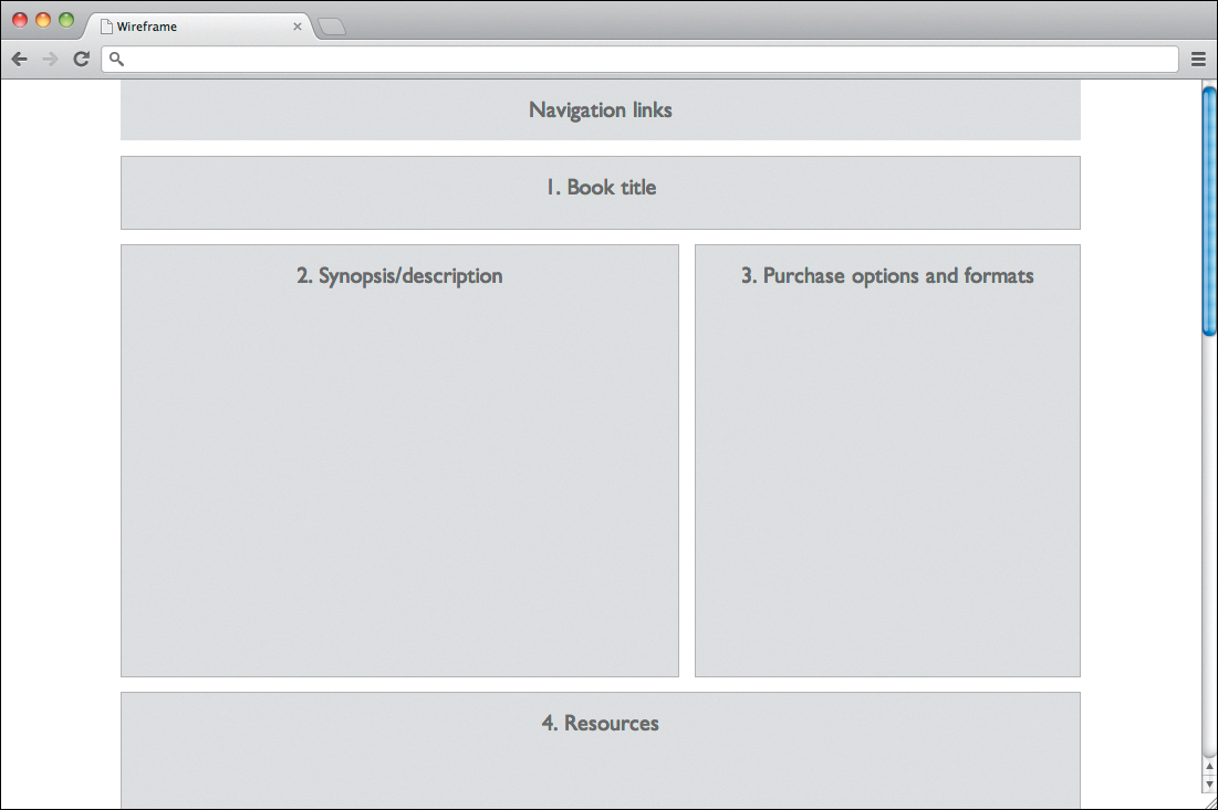
Now we have a linear wireframe with a link at the top right, which when clicked will bring us to the navigation block at end of the page (Figure 3.7). We can give this navigation block a height:
.wireframe nav { height: 10em; }
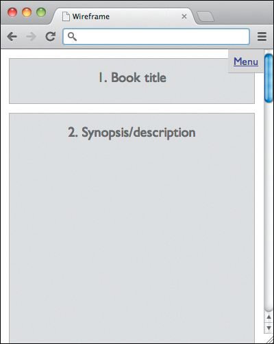
Figure 3.7. On small screens, it’s common to provide a link at the top to jump to the navigation at the bottom of the page.
Again, we’re just making a rough guess at this point. Although it’s possible to do more complex things with small-screen layouts, please consider not skipping over the linear layout, as that’s the default for users who get no layout at all.
A linear wireframe isn’t all that interesting. While it did prompt us to think about things like linear content order and navigation, we haven’t really had to start thinking about layout, which is something you’ll normally do more of for larger screens. Now things get a bit more interesting: we’re going to start wireframing this page for larger screens.
Creating variants for larger screen sizes
Imagine for the book site example that we want a layout that will work well on most smartphones and tablets, and in most desktop environments. We’re not concerned with specifics yet; we want to start thinking about general layout issues, which we’ll continue to refine throughout the design process.
What we’re not going to do is look up sizes of specific devices. This may seem strange, but we’re going to let the content dictate where our layout changes. Eventually, as we proceed, the points where these changes should occur (the breakpoints) will become clear (more on this in Chapter 6, “Breakpoint Graphs”). For the moment, we’ll simply make some estimates, check the wireframes in a few devices, and adjust accordingly. This isn’t an exact science. Sometimes, design is about what feels right.
The linear layout was just fine for small screens, now let’s aim for the tablets. How big is that? Well, that varies. That’s one reason why Ethan Marcotte stresses the importance of using a fluid layout grid when doing responsive design: device classes don’t have set pixel-widths. They fall within ranges, and believe me when I say that those ranges will change constantly. So while I mention smartphones, tablets, and desktops specifically, don’t take that too literally. You might be designing for TVs or portable game consoles. Designer Bryan Rieger recommends thinking in terms of device classes rather than specific devices. That’s why you won’t read anything in this book about how to get something to look a certain way on an iPhone or an Android device. The only way to know with any certainty how your layout will work on these devices is to test on them. Working with device classes is all about inclusion. We want to make sites and apps that are accessible to as many people with web-enabled devices as possible, regardless of device type or operating system.
There are actually two viewports we have to deal with on mobile devices: the visual viewport, which is basically the screen of the device, and the layout viewport, which is essentially equal to the width of the page being shown. (See the tip about PPK’s two-part series on viewports for more on this.) For responsive design, we’re interested in the width of the screen on smaller devices, and the window on devices and in browsers that support them. We need to tell the browser that when we say “min-width,” the “width” of the page should be the width of the device (or the window). We do this by adding a meta element to the HTML (you can place it above the title element):
<meta name="viewport" content"width=device-width,initial-scale=1.0">
This both sets the width of the page to the width of the screen or window and sets the zoom to 100% (1.0), while allowing the user to zoom in if needed.
So our next step is to create a second style sheet for “tablet-ish” devices, with which we’ll override some styles when the viewport reaches a certain width. Expand your browser window to the point where you feel the layout might need changing (this is still a bit of guesswork since we don’t have actual content yet). Let’s say that point is 600px. Use that as a starting point. Some tablet-ish devices will have larger viewports than that, and those might be better served by the desktop styles. That’s the beauty of using device classes: it doesn’t matter what the device is.
Tip
To learn more about viewports, especially on mobile devices, check out Peter-Paul Koch’s A Tale of Two Viewports (http://www.quirksmode.org/mobile/viewports.html).
Create a new style sheet called medium.css and link to it from within the HTML.
<link rel="stylesheet" href="styles/medium.css" media="only screen and (min-width: 600px)">
Put this beneath the link to your first CSS file, so we can take advantage of the CSS cascade.
One thing we can immediately change—which is probably obvious—is the navigation. At 600px, it’s likely we won’t need to keep all the links at the bottom of the page. So we’ll make some room for them and add them to the top by adding a couple of rules to our new style sheet. These rules will override the rules in our first style sheet, only if our new style sheet is applied. We’ll also hide the menu link:
.wireframe #page {
padding-top: 3.5em;
}
.wireframe .menu {
display: none;
}
.wireframe nav {
position: absolute;
top: 0;
width: 100%;
height: auto;
margin: 0;
border: none;
}
Now if you open this page in a modern desktop browser and make the window narrow, you’ll see the menu at the top right. Upon expanding the window, when it becomes 600px wide you’ll see that link disappear and the navigation jump to the top. You can test this page in a few devices and tweak the media query as necessary.
My suspicion is that no other layout changes are necessary for this content at 600px, because it won’t be wide enough to accommodate, for example, two columns of this particular content. But at about 900px, that’s exactly what we’re going to do.
Next, we’ll create one more style sheet for our desktop styles and link to it in the HTML file:
<link rel="stylesheet" href="css/base.css" media="screen">
<link rel="stylesheet" href="css/medium.css" media="only screen and (min-width: 600px)">
<link rel="stylesheet" href="css/large.css" media="only screen and (min-width: 900px)">
This third style sheet will be applied when the viewport width exceeds 900px. It’s roughly at this point that we’ll need to make some other layout changes. First of all, when we start dealing with actual content, we’ll have to adjust the width of text columns for readability; that’s something that should be repeatedly tested and adjusted. However, since we’re not yet dealing with the rendering of actual content, we’ll focus on layout changes. I think I’d like to have the book description and the purchase options side by side. I don’t have to be sure, as visualizing this change is trivial. In large.css we can quickly try this out:
.wireframe section {
margin: 1em 0;
}
.wireframe #page {
position: relative;
width: 80%;
margin: 0 auto;
}
.wireframe #synopsis {
float: left;
width: 58%;
margin-top: 0;
}
.wireframe #purchase {
float: right;
width: 40%;
height: 30em;
margin-top: 0;
}
.wireframe #purchase+section {
clear: both;
}
Hopefully, it’s fairly clear what we’re doing here, but for the sake of those less familiar with CSS, let’s walk through it quickly:
• We remove the side margins on the sections because we’re adding margins to the page by setting the width of the content to 80 percent of the viewport.
• #page is relatively positioned to create a new positioning context for the navigation.
When we use position: relative; on #page, #page then becomes the positioning context for elements absolutely positioned within it. For these elements, top: 10px; right: 10px; would now refer to 10px from the top and right of #page.
• The synopsis and purchase information are floated left and right, respectively; height and margins are adjusted.
• The section following #purchase clears the floats. CSS trivia: I used an adjacent sibling combinator (the + sign) for this, so it applies to any section that immediately follows the purchase section. In this way, if we wanted to swap Resources with Errata we could do so without changing the CSS.
These changes result in a layout as depicted in Figure 3.8. You can test this first in a desktop browser by resizing the window (that’s okay at this stage). If it’s working, I encourage you to interact with the wireframe on various actual devices as well.
• The idea that interaction designers should make wireframes
• The idea that wireframes should contain detailed information about content
Some questions also arise:
• Does thinking about wireframes in this way limit design choices?
• Isn’t it too early to think about layout?
• What should I wireframe?
• When do I involve the client (a.k.a. “Where’s my fancy deliverable?”)
Let’s take a look at these to help alleviate some doubts, in case you’re having them.
Interaction designers should make wireframes
I take issue with this. First, the role of the interaction designer is critical; he does not need a specific deliverable and should not be confined by it. On the contrary, good interaction designers are involved with every deliverable. Because most decisions affect interaction, the interaction designer should be involved throughout the design process. Since wireframes are exploratory studies of rough content placement, they involve design (layout), content strategy, and interaction, with a touch of front-end development expertise. All these disciplines can—and should—be involved in the process. You’ll have to look within your team to decide who can best create the actual code. As you can see by looking at the HTML examples, the wireframes are created using elementary code that any web designer should be able to write in no time. It’s the thinking about the content and other issues that requires time and discussion. And that’s the most important part. Once that’s done, these wireframes can be created very quickly. No ideas in them are set in stone.
How you approach this process depends on your team. You may sketch in a meeting and ask a front-end developer to work out the actual wireframe based on the resulting sketches. I recommend thinking about and creating the wireframes with the various disciplines in one sitting—and quickly. Remember that you can quickly iterate if new insights on content or ideas arise. Stop seeing wireframes as a polished client deliverable and start seeing them as a tool for thinking rather than the end result of thinking.
Wireframes should be detailed
No. Detailed wireframes involve too many design choices that are made in isolation from other important design choices. They introduce so many factors that discussions about them with clients can potentially spiral into design, content, typography (yes, it happens), and anything else under the sun, while still leaving a lot to speculation. I once had several members of a client team launch into a full-blown argument about one of the pieces of text—a single sentence—in a detailed wireframe. It’s absolutely pointless. It overloads your clients with information in an attempt to get them to sign off on decisions that can only properly be considered when other factors, like the rest of the design and actual content, are at play. It’s totally unfair to your clients and can result in changes at later stages of the project when everyone sees how things will actually be and are thus able to make sound decisions. Baby steps!
Do content reference wireframes limit design choices?
Absolutely not. The type of wireframe we’ve been playing with in this chapter gives a general indication of things like layout and navigation, but in fact it’s about content order and priority. It’s taking nothing and giving it a very simple form that can be built on. Since content reference wireframes are so quick to build, even drastic changes won’t have much effect on your time or project schedule. They’re best seen as sketches that will be fleshed out later. Content reference wireframes are 99.99 percent less limiting than the current popular brand of detailed—sometimes even “clickable”—wireframes that are designed to get sign-off from clients. It’s very hard to deviate from something so detailed that’s been seen and possibly approved by a client.
So, limiting? Nope.
Isn’t it too early to think about layout?
Too early compared to what? We’re not making definitive layout choices here. It’s a sketch. We’re starting to consider some things like layout. This kind of thinking, without going into too much detail, probably fits somewhere in between the thumbnail sketches and rough sketches graphic designers make. Sure, like many designers, I sketch on paper; these wireframes are a way to start transferring these types of sketches into the browser.
During the wireframe process, some valuable insights might make themselves apparent (like how I completely “forgot” navigation in our example). Most important, these wireframes inspire you to start thinking about the shape of your content, both literally and figuratively.
What should I wireframe?
You’re free to wireframe as much as you want. I can only tell you what I do: I wireframe pages that represent page types. Websites are systems rather than collections of uniquely designed pages; most websites have a relatively small number of page types. When differences in content, goals, and functionality are big enough that the user interface or layout must change significantly, that’s a new page type. Consider a registration page versus a product display; those are two different page types. If we see the anatomy of a web page as a combination of a page type and components (or modules), then wireframes are about page types. Most websites and apps don’t have very many, even the largest websites. The most important pages are the ones people will use most often. These are the most-used screens in web apps and content pages in websites. Sure, you’ll want to wireframe a home page because it’s a different page type.
With content reference wireframes, wireframing anything more than the various page types is unnecessary. If you want to visualize more pages of the same type, you can do that when you create mockups. Later in this book, you’ll see that the wireframes will evolve into full-blown mockups.
This workflow is designed to streamline the web design process, making some things quicker and easier to do while removing some unnecessary steps. Remember the 80/20 principle: 20 percent of the effort yields 80 percent of the result. Do as little as possible and stop feeling guilty about it.
When do I involve the client (a.k.a. “Where’s my fancy deliverable?”)
There’s no fancy deliverable here. However, you should consider involving your client from the very beginning of this workflow and throughout all the steps. You won’t necessarily ask for approval of these wireframes. They’re not really that kind of deliverable. Feel free to ask the client’s opinion, show the wireframes on different devices, and use them as a tool to prepare the client for how the web works and how responsive web design works. Content reference wireframes will get your client to think more about content in the same way they’ll get you to think more about content.
Content reference wireframes are the second step in a cumulative and iterative design process. Iterations at each step are relatively small and painless; each step builds on the last, each giving a better glimpse into what the design will become.
Try it out
You might have (should have!) played around with the example wireframe we built up throughout this chapter. It was a deliberately simple example, designed to explain how I approach the process of creating content reference wireframes. As always, your job is to take the ideas that work for you and make them your own. You might want to style your wireframes differently. Your content is different than the content of the book website, so you’ll likely have more page types and thus more wireframes to make.
Your estimates about the size of content will be different than mine. You might estimate your breakpoints differently. You might do many things differently, and that’s just fine.
The important thing about these wireframes is to see them as quick, box-like sketches in the browser. Try creating a few wireframes for a project you’re currently working on, just for fun. I’m sure you will find them fun and easy to make.
In the next chapter, we’ll take some actual content and pour it into our wireframe. Another fun and easy step in the process, so get ready!