
4. Designing in Text
“Plain text is the underlying content stream to which formatting can be applied. [...] Plain text is public, standardized, and universally readable.”
—THE UNICODE STANDARD, VERSION 6.1
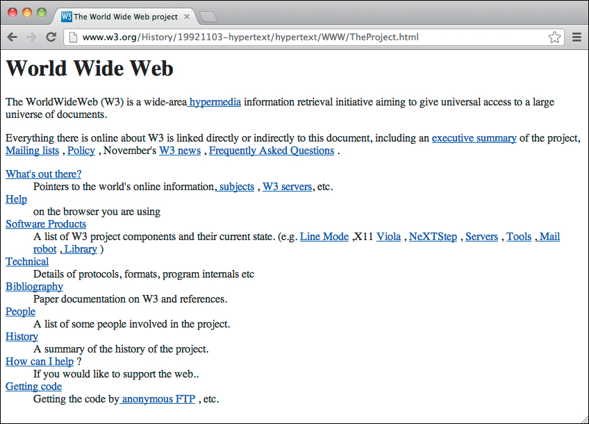
The world’s first web page was practically mobile ready. And that was in a time when there were no tablets or smartphones. There’s one simple reason for this: the web page consisted of plain text. Actually, it consisted of structured text with hyperlinks. This was how the web started, and the premise of structured content is still the basic foundation of the web (Figure 4.1).
We’ve added to the basic building blocks of the web, which were essentially (structured) plain text, hyperlinks, and images. We have technologies like JavaScript and SVG that let us draw on the screen, or even create entire user interfaces. Many developers advocate creating a distinction between web apps and web documents, referring to information-based websites, such as the W3C’s first web page—or your blog—as web documents.
It’s all content
We need not concern ourselves with the heated discussions about apps versus documents. For our purposes, if it’s on the web, it’s probably both. Most websites composed of documents are run by an application such as a content management system that requires a user interface. This tends to be the case even if the site’s purpose is informational.
By the same token, I’ve never seen a web app without content. No app simply contains buttons with nothing on them, text fields without labels, and absolutely no text on the page.
Web accessibility means that all people can access web content and services regardless of disability. It can also benefit those with technological limitations, such as an old browser or slow internet connection.
One of the biggest problems in web accessibility is that many people start with the advanced user interface, take that as a given, and try to “add accessibility.” Many websites are designed from the UI in rather than from the content out.
Take a geographical mapping application such as Open Street Maps or Google Maps as an example. It’s easy for developers to plot out company locations on a map. When embedding these types of apps within a web page, there may be a focus on making that interface accessible—ensuring that the user can navigate with nothing more than a keyboard, for example. This is great, but there’s a problem: technically complex or advanced user interfaces can’t be viewed or used on every device. There’s only one type of content that can be viewed on virtually any web-enabled device, and that is plain text, or rather, plain text that’s been structured with HTML. Like it or not, HTML is the way we structure plain text for the web, because HTML is the single most portable and universally readable format at the time of this writing. Anything that can show websites can read and display HTML.
This means that there’s an alternative approach to accessibility for complex interfaces, and for making any content universally available: start with the text-based foundation of the website or application you’re designing, and then add the complex interface as a layer on top of this text base.
This might sound weird at first, but when you think about it, a mapping application does contain actual data and textual content. It’s simply obscured from the user. We have to deal with a layer of abstraction to get to that information. Responsive design starts at the base: the structured content level. This allows sites and apps to respond to the user’s environment, rather than expecting the user to respond to the interface (perhaps by grabbing a different device so she can actually use what we’ve built).
The way to do this is to start with the data, that is, the plain old textual content that’s always available somewhere. Don’t bury this under an avalanche of UI, but expose it from the very beginning. Allow that content to be the base on which you build.
So what about those company location maps? Well, the base data is probably a list of company location addresses, and perhaps other data such as phone numbers and URLs. My opinion? Don’t hide this data in a map. If you need or want a map, that’s fine, but leave the textual data open for the user as well, instead of taking perfectly accessible data and hiding it from some users.
If you think this sounds a lot like progressive enhancement, you’re absolutely right. That’s what it is. And of course there are exceptions; there always are. But generally, many web apps are web forms at their core. Many websites are simply structured text at their core. By starting the design at the core, we can build websites that are more accessible and more usable by more and larger groups of people.
Starting design with plain text
Designer Bryan Rieger shares my love of plain text. During some correspondence with me about the subject, he shared these thoughts:
“One technique I’ve used for years is to ‘design in text’... not necessarily describing everything in textual form [...] essentially what is the message that needs to be communicated if I was only able to provide the user with unstyled HTML?”
—BRYAN RIEGER
Rieger’s statement embodies most of what this book is all about: creating from the most basic, important content and working from that point forward. The technique of designing in text—that is, unstyled HTML—has some absolute benefits:
• As in content inventory and content reference wireframes, the focus is on content. In the case of designing in text, it’s all about the structure of the textual content. Irrelevant content becomes easy to spot, as it’s not hidden by the design.
• Designing in text utilizes one of the most important building blocks of the web: HTML.
When I say linear here, I’m referring to content in a specific order, stacked from top to bottom, generally with the most important piece at the top.
• The linear form of structured text prepares us for the starting point for responsive design: the smallest screens with the least capabilities. (Remember the web’s first page!)
• Clients familiar with word processors are probably familiar with the idea of linear, structured content (although some require an explanation of the difference between visual and structural formatting). It’s relatively easy to convert word processor documents into structured plain text.
When you create a page with unstyled HTML, you have created a web page that’s mobile ready. From a design standpoint, it’s also mobile first. With the default width of 100%, you might say it’s on a single-column, flexible grid. This is a perfect starting point for responsive design.
Where content reference wireframes get us thinking about content at a block level, designing in text shifts the focus to the smaller bits of content. Let’s take a look at how these ideas apply to the book website.
Marking up plain text
As Rieger pointed out, it’s not enough to simply use plain text. We need to structure our textual content with HTML. There are several ways to do this, from writing the HTML by hand in a text editor to using a WYSIWYG editor. However, my preference is plain text markup, for which I use Markdown, although many other plain text markup languages exist.1
1 To learn more about Markdown, check out:
http://daringfireball.net/projects/markdown/
http://en.wikipedia.org/wiki/Markdown
http://en.wikipedia.org/wiki/Lightweight_markup_language
(contains information about alternatives).
Plain text markup languages like Markdown let you write text in a very human-readable way (similar to how you would write in a text-based email program) and offer you tools to convert this human-readable format to HTML quickly and easily. Simple conventions denote structure. For example, a hash symbol (#) in Markdown denotes a level 1 heading. A word enclosed in asterisks (*hello*) denotes emphasis, in the same way you might use italics in a word processor.
The best thing about using plain text markup is this: if your client or another party has created the content you’ll use in your design, using a plain text markup syntax means all you have to do is copy the textual content, paste it into a text editor, and make use of the simple markup conventions. This is much simpler than, say, turning the text into HTML by hand.
The book page text in Markdown
The following is some text we’ll use for the book site design. This is the minimum amount of content I’d like to use to communicate with visitors to the page. Save the following text (or your own example text) to your project folder and call it whatever you please. Since it represents the content of a home page, I’m calling it index.markdown.
# Responsive Design Workflow
by Stephen Hay
In our industry, everything changes quickly, usually for the better. We have more and better tools for creating websites and applications that work across multiple platforms. Oddly enough, design workflow hasn't changed much, and what has changed is often for worse. Through the years, increasing focus on bloated client deliverables has hurt both content and design, often reducing these disciplines to fill-in-the-blank and color-by-numbers exercises, respectively. Old-school workflow is simply not effective on our multiplatform web.
Responsive Design Workflow explores:
- A content-based approach to design workflow that's grounded in our multiplatform reality, not fixed-width Photoshop comps and overproduced wireframes.
– How to avoid being surprised by the realities of multiplatform websites when practicing responsive web design.
– How to better manage client expectations and development requirements.
– A practical approach for designing in the browser.
– A method of design documentation that will prove more useful than static Photoshop comps.
## Purchase the book
Responsive Design Workflow is available in paperback or as an e-book. The book is available now and can be ordered through one of the booksellers below.
– [Order from Amazon.com]
– [Order from Peachpit Press]
– [Order from Barnes & Noble]
## Resources
[Lists of resources per chapter?]
## Errata
[Lists of errata per chapter?]
Now this is interesting. In previous chapters, we discussed how problems can arise from insufficient thinking about how content will actually work—think back to the example where I “forgot” that we might need some sort of navigation. This may seem an unlikely example, but we’ve all experienced situations where we realize that things have been omitted or not thought through. Working in small steps from the content out can expose issues and avoid these problems. This Markdown document exposes a flaw in my thinking about resources and errata that becomes clear when we start designing the page in text. If I have both resources and errata for some of the same chapters, I’ll get something like this:
## Resources
* [Chapter 1](http://www.example.com/resources/chapter1)
* [Chapter 2](http://www.example.com/resources/chapter2)
* [Chapter 3](http://www.example.com/resources/chapter3)
## Errata
* [Chapter 1](http://www.example.com/errata/chapter1)
* [Chapter 2](http://www.example.com/errata/chapter2)
* [Chapter 3](http://www.example.com/errata/chapter3)
Although this won’t get us arrested, it’s redundant. It makes more sense to have a page for each chapter, and having anything relevant to a given chapter on that particular chapter’s page. This means that I’m going to change my mind at this point in the process (clients tend to do that, as you probably know).
Keep in mind that any mind-changing going on at this point is not only not a problem, it’s also a good thing. Better to make content-related and structural changes now.
Instead of Resources and Errata, I want a list of chapters, with each item being a link to that particular chapter’s page, which can contain sections for Resources and Errata. Come to think of it, we’ll need to put up code samples as well, so the chapter pages are a great place to put those.
What changes mean at this point
Changes at this point in the process entail relatively non-labor-intensive edits to one or more of three things: the content inventory, the content reference wireframes, and the structured text design (that is, your Markdown document).
Tip
It’s easy to forget that clients don’t always think the way we do. We’re influenced by our experience with technology and the heavy use of abstraction in modern web work. Be patient with clients and explain things in plain language, like a chef giving a tour of his kitchen to a guest.
Of course, since our example is currently one page, changing these is simple. Remember that most websites, no matter how big, are a combination of user interfaces for interaction and containers for content that’s poured in from a database. The focus of the first three steps in this workflow is these larger entities: types of pages, types of user interfaces, and types of content. While you’re free to use these steps to design individual pages, you probably won’t want to do that for the individual articles in a site like nytimes.com.
Think in terms of types. Think in terms of components. There are never many page types, so don’t think too much about pages. One of my most challenging conversations with a client involved me explaining that I didn’t have to redesign their site’s 10,000 pages. Rather, we had to spend a lot of time analyzing their content, and then I would design about 10 or 12 pages (plus a battery of small components). I would be designing a system. Not individual pages.
The change I’ve made to the book page means there’s another page type, since the content of that page type dictates that it should be different than the home page. That last point is important. There’s been a lot written about designing the user interface first. I agree in most cases, but not all. The user interface serves a purpose and contains content relevant to that purpose.
Both purpose and content are the foundation of the interface. And that thinking is also part of the whole design process.
Before we make the changes to our example, let’s think about what these changes mean for us while utilizing the responsive workflow:
1. We need to create a content inventory for the second page type and change the existing one accordingly. This would have to be done within any workflow that involves content inventories, not just the workflow described in this book.
2. We need to create a new wireframe and modify the existing one. In plain English: we need to remove one box from our existing wireframe and create another HTML page with a few boxes on it. Oh, the pain.
3. We need to change the last section of the Markdown document and create an additional one. Since we don’t actually have resources or errata yet, we’ll have to define the “shape” of that content by coming up with a real-world example we can test and discuss with the client.
These steps are not difficult. If you’re a graphic or visual designer, you may not find it exciting. In fact, someone else can do these steps. But that person is absolutely part of design, and as I mentioned previously, all parties should be involved. Yes, the client, too—especially the client. You’ll reap the benefits later.
Now, contrast this with the waterfall process. In the traditional workflow, there is no designing in text step. The wireframes are detailed and intricate. The content inventory may or may not exist. So the problems with changes start with wireframes. Sure, we need to change the text in the Markdown document, much as we’d change text in a complex wireframe. But the main difference is that when designing in text, the changes we make are text-based. Detailed wireframes contain text, but this text is still presented in a highly visual form in relation to other elements on the page. There may be no color, but there is typography. There is layout, to a certain extent. By contrast, plain text markup is all the same font and denotes only textual structure. Changes in a Markdown document don’t require typographical changes or changes in layout. New pages don’t require a new layout. We’re not at that point in our process yet, so changes are much easier to make.
Content reference wireframes are also very easy to change. After all, they’re just boxes, aren’t they? They become more important down the line, but for now, we’re compartmentalizing changes. Content changes should be content changes, not content-typography-layout changes.
This approach allows us to “help” the content. In return, content will help us down the line. Because we’ve given it the attention it deserves, it will help us with layout, with determining breakpoints, and with many other aspects of the design. There are always cases where huge changes to a project will come during the final stages of design, and this process is designed to minimize the chance of those changes occurring—and minimizing the impact of those changes if they do occur.
It’s about thinking
Again, the book page is a very simple example, but this could just as easily have been a sign-up page for a product or service (or any other page or component), where designing in text might help you make better decisions. As with content inventory and content reference wireframes, designing in text gives you an opportunity to change things before doing so endangers the schedule or results in high costs.
We’re designing in text here simply by putting text down in a Markdown document. That fact should make it clear that the process of designing in text is not about Markdown; it’s about thinking. It’s (as in the first two steps) about content and its structure.
Personally, this is one of my favorite steps in the workflow. The beauty is not only in its simplicity, but also in the fact that once you convert this document into HTML, you have a mobile-ready mockup of a web page in structured text that you can load into virtually any browser that parses HTML. This is a huge advantage.
Tip
Remember the Tool Rule. If Markdown isn’t your thing, or you’re just interested in exploring some other options, see http://en.wikipedia.org/wiki/Lightweight_markup_language for an overview of similar markup languages.
Converting plain text to HTML
Practically every plain text markup language has a way to convert structured text into HTML. In fact, Markdown might be one of the most complex, because there are so many different versions of Markdown itself. (These versions are often called flavors. Don’t ask me why—hungry techies, perhaps.)
The original Markdown lacks an equivalent for every single element available in HTML. This is actually a strong point: it contains equivalents for the most commonly used text elements, and lets you use plain HTML when needed. In that sense, Markdown is not a language of its own; it’s a front end for HTML.
This means that if you want tables, you can enter them in HTML and that’s a totally legal Markdown document.
But this makes Markdown just that much more difficult for nontechnical people (perhaps even your clients) who’ll be preparing the documents for this step in the workflow. As I was developing this particular workflow, I toyed with the idea of using a more “complete” text markup language, but I was already so familiar with Markdown from use in email and other applications that I wasn’t too keen on switching. Luckily for me, as I mentioned, there are several different implementations of Markdown.2
2 http://en.wikipedia.org/wiki/List_of_Markdown_implementations
Some of the Markdown implementations are simply conversion tools, allowing one to convert Markdown into HTML or vice versa. Others are both conversion tools and extensions of Markdown itself, adding the ability to denote an expanded set of elements in plain text, such as tables and more.
I chose an implementation called Pandoc.3 Pandoc supports the original Markdown and offers extremely useful optional extensions, such as definition lists, numbered example lists, tables, and more. Pandoc can convert to and from a bunch of file formats, which is wonderful and has so many uses beyond web design workflow.
3 http://johnmacfarlane.net/pandoc/ If you’re interested in Pandoc, you can try it before installing it at http://johnmacfarlane.net/pandoc/try.
This will be the first of several instances in this workflow when you’ll be typing things into the command line. In case you’re not familiar with the command line, you’ll most likely be using the Terminal application on OS X or Cygwin on Windows. If you use Linux, there’s a good chance you’ve already used your terminal application at some point.
Using the command line
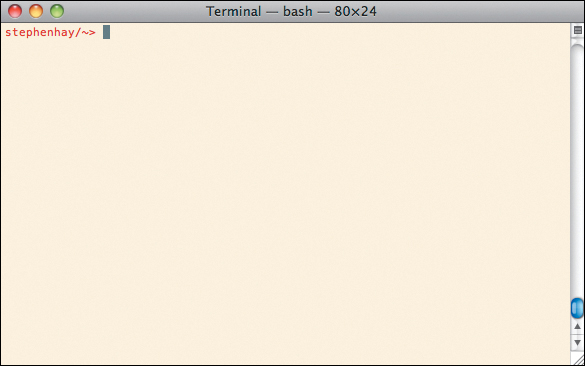
The command line interface (CLI) provides a simple means of interacting with your computer. Its design is actually quite elegant: on the screen there’s a prompt, at which you can tell the computer what you want it to do, and it will do what you ask (Figure 4.2). If it doesn’t understand your command, it will tell you so.
People like to bring up the potential drawbacks of the CLI: yes, there are commands that will erase your entire hard disk or a portion thereof. Just don’t type those commands. In the graphical interface of your computer you wouldn’t willingly select all your folders, move them to the trash, and then empty the trash.
The argument is that it’s easier to do something stupid like that in the command line. And arguably it is. In fact, many things are easier to do in the command line, not just stupid things. Commands aren’t difficult, though some of them can be difficult to remember. But practice helps with memorization, just as it does when you need to remember which submenu item to choose in a graphical interface.
So don’t be afraid. The command line is a very useful tool, just as graphical applications can be. And as with any computer interface, you need to think about what you’re doing. Just remember that the command line does what you tell it to, nothing more, nothing less. Don’t tell it to do stupid things and it won’t.
The beauty of the command line is that you don’t need to know everything about it. It helps to know some basic commands—such as those allowing you to navigate around your system and create, copy, move, and delete files and folders—but mostly what you’ll need to know are the commands specific to the software you’re using.
Note
I’m making the assumption that you either have a terminal application or are capable of installing one. Linux and OS X have terminals built in. Windows users can install Cygwin from www.cygwin.com.
If you’re skeptical, consider Adobe Photoshop (Figure 4.3). Photoshop—which this workflow deems unnecessary for creating design mockups for the web—is one of the most complex and sophisticated pieces of software available to consumers today. There are hundreds of books on how to use Photoshop, as well as whole books that cover only a specific functionality. If you’re a designer, you’ve most likely used Photoshop. So there you are, proficient in this really advanced piece of software, but worried about the command line. Believe me, you are absolutely smart enough to learn commands in the command line. And someday when you discover more command line tools and are able to do things like resize fifty images in about three seconds, you’ll feel the power that your developer friends do. If you’re a developer and reading this, yes, go ahead and gloat.
Figure 4.3. Graphical interfaces like Photoshop’s provide buttons and other inputs to let you tell it what to do. While visual, they’re not necessarily simpler than the command line.
I recommend that you consult a resource like Zed Shaw’s CLI Crash Course to become familiar with the command line. The online version is free, easy to follow, and you really will learn all the basics.4
4 http://cli.learncodethehardway.org
That said, there are few commands you should know now: pwd, cd, and ls. Go on, open up your terminal application. This puts you in a shell. On OS X, the system I currently work with, the standard shell is called Bash.5
5 Bash stands for “Bourne-again shell”. See http://en.wikipedia.org/wiki/Bash_(Unix_shell)
As a web worker, you’ve very likely seen a terminal before, but if you’re not familiar, that little blurb of text you see to the left of the cursor is called a prompt. It’s customizable, and it tends to look different depending on both the system and the user. It may or may not tell you information about the system or the folder you’re in. No matter. You type commands at the point where the cursor is. Type one now: pwd. You’ll see something like this:
$ pwd
Note
Throughout this book, the command line prompt is denoted with a dollar sign ($). It represents your own prompt; you should not type it in as part of the command.
Now press the Return key. The CLI returns a path. Just like paths on a web server, this is a path of folders on your computer. The path you see leads from the root folder of your computer to the folder you’re currently in. pwd means print working directory. The command tells the computer to print the working directory, which is the folder you’re currently working in. This is useful because, in contrast to your system’s graphical interface, you don’t always have a visual clue of where you are when you’re in the command line. This is what I get when I execute pwd:
$ pwd
/Users/stephenhay
$
Yours will be different, unless your name is Stephen Hay (in which case, nice name!). No problem; now you know where you are. Let’s see what’s in this folder. We can list the files in the current folder with ls:
$ ls
Applications Documents Library Movies
Pictures Desktop Downloads Mail
Music Public
$
Your results might be shown differently, depending on how many files you have and the width of your terminal window.
You’ll also want to change your directory, which you can do with cd:
$ cd Applications
$
This puts me in the Applications folder. You might not have the same folder; just enter the same command in one of your own folders.
My own prompt contains information about where I am (it actually contains the name of the folder I’m in), but I’ve customized it to do so. You needn’t worry about that at this point. As you become more comfortable with the command line, you can learn how to customize your environment.6
6 Many years ago I learned how to customize my own prompt by reading Daniel Robbins’s easy-to-understand article on the subject, which can be found at http://www.ibm.com/developerworks/linux/library/l-tip-prompt/.
So moving down is easy: just type ls, note the directory you’d like to move to, and cd to that directory. Also note that many shells let you use the tab key for completion. This means that instead of typing the full word Applications in the previous example, I could type an A or Ap followed by the Tab key, which would complete the word for me. When the completion matches several words, these will be shown and you’ll need to add one or more letters accordingly before pressing Tab again. This is a huge time-saver:
$ cd A [press Tab key]
$ cd Applications [press Return key]
$
Now you know how to move down a directory. Moving up is easier. A single dot is the symbol for the current directory, and two dots is the symbol for the parent directory. Moving up a directory is done thus:
$ cd ..
followed by pressing the Return key. Moving up two directories would entail:
$ cd ../..
and so forth.
That’s enough to get you started. If you have no previous CLI experience, try these commands out for a while. You can’t do anything bad to your system, because these commands don’t alter anything.
Converting to HTML
The first step in using a command line tool—unless it comes with your system—is to install it. I’m assuming Pandoc doesn’t come with your system, so you’ll need to install it if you’re planning to follow along in the book. On Linux, you might find it and be able install it via your package manager. For OS X or Windows, there are install packages available.7 Go ahead and install Pandoc (or your preferred plain text converter) and then come back.
7 http://johnmacfarlane.net/pandoc/installing.html
Once you’ve installed Pandoc, use cd to navigate to the folder that contains your Markdown document. Then type the following command:
$ pandoc index.markdown -o index.html
This says, “run Pandoc on the file index.markdown, convert it to HTML, and save the output of this command as index.html.” If you run ls, you should see that index.html has been created (Figure 4.4). Open this file in a web browser. Your structured content is now HTML. And it works on practically every device.
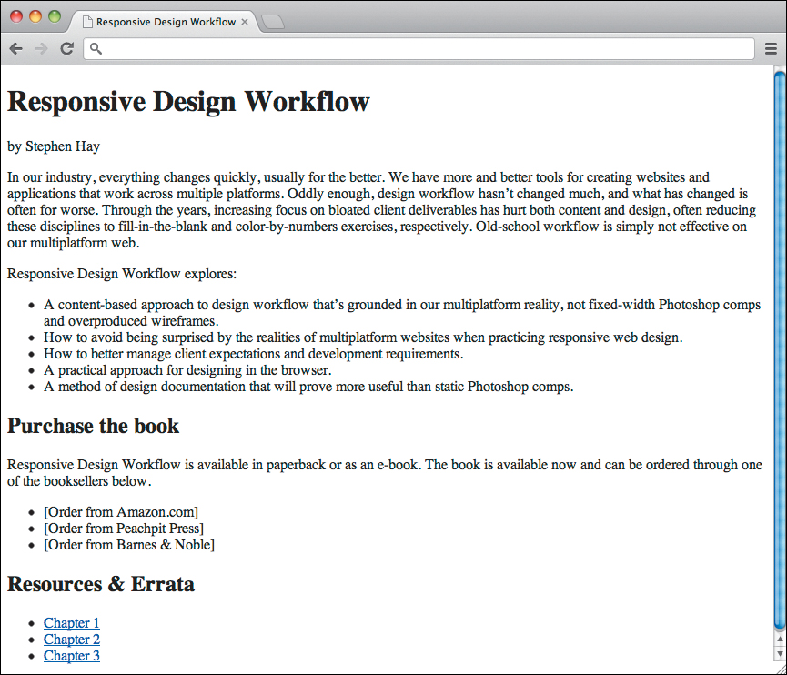
Figure 4.4. Using a command line tool like Pandoc, it takes only a second to turn plain-text markup into a basic HTML page. This can be a huge time-saver.
It just doesn’t look very pretty yet, so let’s do something about that. In the following chapter, we’ll start thinking about the more visual aspects of the design process, using this content as a base.