
5. Linear Design
“It’s pretty simple. On a phone, full-size websites suck.”
—PAUL CAMPBELL
On most small viewports—such as those on phones—we can only view the content of a web page in a linear fashion. It’s possible to place things side-by-side on many devices, but not all of them. It depends on both the size of the device and the level of CSS support. In this chapter, we’ll look at determining breakpoints for our design and content based on device classes and what the content and design do at certain screen widths.
Note
When I speak of linear design, I mean the design of linear content. Color, type, and images may be used, but the design has no layout other than that the content is stacked vertically.
First, though, we need to accept the fact that the lowest common denominator of devices will allow us to view only structured text content, similar to what we produced by converting our Markdown documents to HTML. The earliest web-enabled phones should be able to handle this content, even though it’s not pretty—the text will display even where CSS support is absent. Text browsers also fit into this device class. One step above these are devices on which CSS is supported. We’ll still use the structured text content, but CSS lets us apply some visual aspects to the design. Because CSS support varies from device to device, our approach should be like a layer cake. Even at this level, progressive enhancement is important.
Developing a design language
Bryan Rieger has written about the importance of a reference design.1 A reference design is the design of a website or app at one or more strategically chosen sizes based on carefully chosen device groups. You can look to these when creating a responsive design, without having to design for every single screen width. This is where the process gets personal. Many people will want to create a desktop design and then make the linear design a derivative of that. You’re free to do so, but it defeats the purpose of this workflow. I recommend a process that takes us incrementally and cumulatively from the smallest and simplest aspect of our design to the largest and most complex variable.
1 http://mobiforge.com/designing/story/effective-design-multiple-screen-sizes
A reference design could be a single image or sketch that inspires the design at every screen size. It could also be several sketches, for example, one at roughly 320px, one at 600px, and one at 900px, each approximating how the site should look when close to a given width.
So while the approach Rieger outlined a few years ago is still sound and you can use it effectively today, I’m going to challenge you to start designing your content without yet fully knowing what your “desktop” version will look like. This takes the idea of mobile first pretty seriously from a design standpoint, and will absolutely feel like walking around in the dark.
We’ll be using a variation of Rieger’s process where the design of the content within a linear presentation is the reference design. Scary, right?
Even though the workflow described in this book makes changing things less of a problem than in a waterfall workflow, we still need to be careful. We have to consider other screen widths and browser environments, even though we’re postponing their design. We can do this by developing a design language. Graphic designers will probably know what I mean by this. For the more technology-driven reader: a design language is like any other language—it gives you the building blocks to create practically anything you want.
I tend to think of visual language as consisting of four components (listed here in no particular order):
• Layout (general usage and composition of space and elements)
• Color
• Typography
• Imagery (whether photography or illustration)
Some designers will disagree, citing more components or fewer. That’s fine. I think in terms of these four, and I’ll use these in my examples.
Using the Design Funnel
Seldom can a designer make arbitrary choices regarding the components of design language, haphazardly injecting fonts and colors without starting from some kind of base. Spontaneity may be desirable in art, but it’s usually not in design. Design solves a problem. So what problem are you trying to solve?
The Design Funnel, my pet name for the process I follow to create the design language, involves the things designers do that can’t be seen (Figure 5.1).2 It moves the vague client exclamations about goals and values (“we’re professional, trustworthy, and we want a dynamic website”) through an imaginary funnel that turns them into a concrete design language. It’s not a new method, but it’s surprising how many designers skip the crucial first steps. They jump into creating a design and extract the design language from the design after the fact. That’s a horribly ineffective way to work (though I’ve also been guilty of it, so I’ll be the last to judge).
2 http://changethis.com/manifesto/show/48.04.DesignFunnel
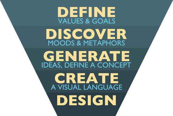
Figure 5.1. The Design Funnel helps translate abstract goals and values to concrete design language.
The Design Funnel distills what you’ve learned from your client into a tangible language you can use to create your designs.
A Great Example of Design Language: MailChimp
4 Aarron Walter describes in detail his thoughts on making the human connection in design in his book Designing for Emotion, in which he also discusses the MailChimp design (http://www.abookapart.com/products/designing-for-emotion).
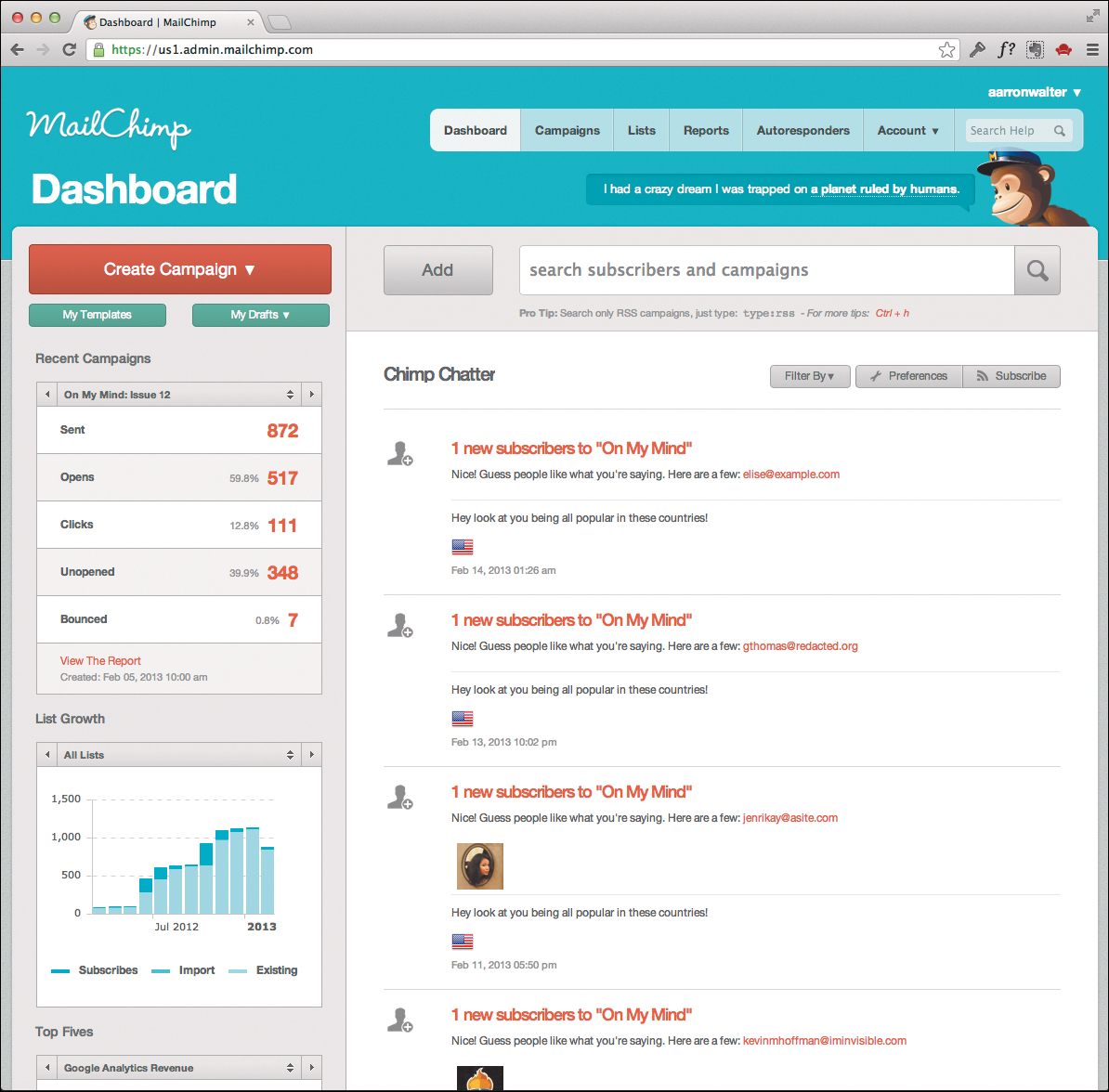
Ask lots of questions. To some the word professional is associated with sans-serif fonts, the color blue, and a stock image of a smiling woman on a phone, but to others a site like MailChimp is very professional. Some clients have branding guidelines that define the sandbox in which you’re required to work. It’s the designer’s job to translate the client’s story into design components that are easily associated with that story. It’s hard to do, but hey, that’s why they call it work. Still, it can be a lot of fun. Play around and test the associations people come up with when they see your design.
This book is about web design workflow, not design, so I won’t go on too long about this. But remember that finding a process that lets you develop a design language is very important. You’ll pull out the pieces of the language you need to create the story of your website or application.
Serve your design to actual devices
Either you’ve heard this a lot, or you’re going to: use actual devices to view your design. Do it no matter where you are in the design process. Put your designs on a web server somewhere and bother people wherever you are by asking them if you could—just for a minute—borrow their unusual device to check out a design. (Only do that with people you know—although it could be a nice way to meet new people, too.)
Later in this book, we’ll discuss when and how you can show your design to your clients in an actual browser, on an actual device. Even though you’re “just designing,” get in the browser.
To do that, you’ll need to put your project folder on a web server or serve it locally from your own computer. This allows you to point your (mobile) device’s browser to your file. A web server (on the internet) is best, obviously, especially for checking remotely with borrowed devices. If you don’t have access to a web server or don’t know how to set one up, you can start up a simple ad hoc web server in your project folder as described below.
Starting an Ad Hoc Web Server
If you don’t know how to set up a web server or you don’t have access to one, you can follow the steps below to start a simple web server that serves your project folder. You’ll need to install the Python programming language if it’s not installed already. I can really recommend the ad hoc server, which is simple to start up and you can immediately view your design on actual devices, provided they’re all running on the same local network.
You’ll need to know your computer’s IP address on your local network in order to access it from browsers on other devices. One method to find it is to type the following in your terminal:
ifconfig | awk '/inet / { print $2 }'
This command should output a number of IP addresses. In most cases, you’ll want to note the one starting with 192.168.
Once you know what your local IP address, you can start a simple web server by executing the following command in your terminal application (from within your project folder—check with pwd):
$ python -m SimpleHTTPServer 8000
This starts a web server that’s good enough for our static files at port 8000. You can now open a browser on another device (say, your phone) and enter the following URL:
http://[your IP address]:8000
Obviously, you’ll replace [your IP address] with the IP address you noted from the steps above. If all went well, you should see your design on the phone. You can do the same thing with as many devices as you like.
To stop the web server, simply press CTRL-D.
This little command is wonderful, and lets you check your design on any device on your network. Sometimes, an emulator or simulator can be useful.
I know I’ve said it’s critical to test on actual devices, but there may be times when an emulator is useful or times when you have no better option. In general, however, emulators (or simulators) should simply be stand-ins until you’re able to test on actual devices, or a way to check things quickly or when device differences are less important (such as when creating the wireframes we made in Chapter 3, “Content Reference Wireframes”).
We’re starting off with very simple CSS. My expectation is that we’ll lose some CSS for older phones, but the structured content will be available and there are some simple changes we can make to our CSS to get the site looking just fine on older phones.
Also, remember that this book is about design process, not development. I won’t get into all the things that need to be done to get a site working and looking good on most devices. Our purpose here is to use some development knowledge and techniques in order to:
1. Help designers who’ve been locked into a visual environment better understand the medium for which they’re designing.
2. Enable designers to experience the real-world impact of the design choices they make.
Enhancing your structured content
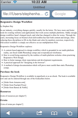
Now that you’ve got your device or emulator ready, open the index.html file you generated with Pandoc in Chapter 4, “Designing in Text,” in the device’s or emulator’s browser. This is not what you expected! The page is wide, and the text is very, very small. It appears as if you’re looking at a normal desktop web page that’s been shrunk down to fit on this browser (Figure 5.3). And that’s exactly what’s happening.
Note
Some mobile browsers both shrink the page and put the text into a narrow column.
Remember the wireframe we made in Chapter 3? Open that in your mobile browser. Big difference, right? This is what the site is supposed to look like.
This all has to do with the differences between the visual viewport and the layout viewport, which we discussed in Chapter 3. If you recall, we used the meta element to tell the browser to set the viewport width to the device width. The index.html file we got from Pandoc contains only the actual Markdown content converted to HTML; there is no HTML DOCTYPE or <head> in the document, thus no metadata.
There are two obvious things we could do at this point:
1. Change this HTML file so it contains a DOCTYPE and a <head> with the meta element.
2. Paste the converted content from the Pandoc index.html into the wireframe.
The problem with both of these options is that they go against the philosophy of the responsive workflow that making changes should be as easy as possible until as late as possible in the design process. What happens if there are changes to the wireframe? We would be changing both wireframe and content. What happens if we change content? We would be forced to cut and paste small content changes into the appropriate places in the wireframe.
I’d like to keep the HTML as a simple block of markup rather than a complete page, but at this stage I want to test it as a page without combining it with the wireframe (we’ll do that in a later chapter). The answer is to use a template.
Introducing templates
Templates are boilerplate pieces of code—containers of code, if you will—into which your code will be “poured.” Think of a template as a cup. You create the type of cup you need and pour your markup into it. Our cup, at the moment, is very simple and matches the code we used when we first started creating our wireframe:
<!DOCTYPE html>
<html lang="en">
<head>
<meta charset="utf-8">
<meta name="viewport" content="width=device-width,initial-scale=1.0">
<title>Responsive Design Workflow</title>
<link rel="stylesheet" href="styles/base.css" media="screen">
</head>
<body>
$body$
</body>
</html>
Type this code into a text editor and save the file with a name that indicates that it’s a template (so you remember). I usually create a new folder in my current project folder. I call that folder templates, and in it I save this template file as default.html.
If you’re not familiar with templating, you’ve probably wondered why the word body is in there with the dollar signs on either side. That is called a variable, a placeholder for specific content. It’s the hollow part of the cup. What do you think will be put into the $body$ variable in this case? Yup, the entire HTML contents of your converted Markdown.
The reason we’re using a template is this: the things in the template will not often change, but the HTML that’s going into $body$ might. More importantly, this template can be used for practically any page we design for this project, not just the home page we’ve been using as an example.
Using the Template with Pandoc
To tell Pandoc to use the template, we need to add a little bit to the pandoc command we’ll be typing:
$ pandoc index.markdown --template templates/default.html -o index.html
Note
If you’re using something other than Pandoc, you’ll need to read your converter’s documentation to see if templates are supported. If you’re a more experienced web developer, you can get creative and use any templating system you like. Pandoc is written in Haskell, but there are template syntaxes for practically every language imaginable. Personally, I like Pandoc’s simple dollar sign syntax just fine.
Try this out. Make sure you’re in the main project folder that contains index.markdown. Remember that you can enter the pwd command if you’re not completely sure which folder you’re in, and cd .. will take you to the parent folder of the one you’re currently in.
New to the Command Line?
If these exercises are your first adventure into using the command line, look at the command carefully and try to read it, translated into plain English.
pandoc index.markdown --template templates/default.html -o index.html
It says, “Run Pandoc on index.markdown, combine that with the template default.html which is in the templates folder, and create an output file called index.html.”
Reading commands in this way helps you not only understand exactly what they do, but also remember them.
Once you’ve typed the command and hit the Return key, your index.html will be replaced with a new one. To confirm this, open the file in a text editor. You should now see your template code, with the converted HTML from your Markdown file between the <body></body> tags. If this is not the case, go back through the steps in this chapter and make sure you followed each one exactly.
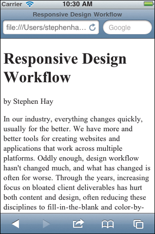
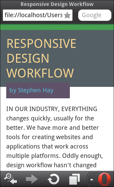
If you open the new HTML file in your emulator (or access it from your device), you’ll see that the page shows up as it should, with the width of the page equal to the width of the device (Figure 5.4). This is our starting point.
Templates are Not Required, but They’re Useful
Most often, you’ll be designing more than one page. While you could always make an HTML file for each different page, you’ll be repeating a lot of the information in those files (the stuff we put into the template). Using templates allows you to have a series of Markdown files that contain only content, which keeps things nicely separated until you run Pandoc on them. If content changes in one of the files, you simply run Pandoc on that file again. If you decide to change something in the template—the link to the style sheet, for example—you only have to change it in one place and run Pandoc on each of your files again. And there’s another benefit: since Markdown is such an easy-to-understand form of markup, you can have content authors prepare them for you.
I realize that for some readers the introduction of templates adds another layer of complexity. I ask you to give it some time to sink in. If you find the “geeky” stuff in this chapter hard to swallow, just let it rest for now and come back and reread the chapter at your leisure. Also, be advised that later chapters will be even geekier, so this is my way of getting your toes in the water, so to speak. All of this more technical stuff is really useful to know—or at least to know about. Should you decide to use some of these tools, they have the potential to increase your effectiveness. And really, nothing we’ve handled so far is hard to do; it might just be different than what you’re used to.
Your project folder so far
Before we start our design work, let’s sync up for a minute and make sure your files and folders are set up the way mine are. If you had any problems with the previous sections, these might have been due to trying commands or saving files in the wrong folder. Your project folder should look something like this:
project-folder
|- inventory.txt
|- wireframe.html
|- styles
| |- base.css
| |- medium.css
| `- large.css
|- index.markdown
|- index.html
`- templates
`- default.html
Note
The names of these files and folders can be tailored to your personal preferences; you’ll need to replace the names I’ve used in various examples with your own.
Think and sketch
Take a good, long look at the content in a mobile browser. Scroll down and think about it. Hopefully, you’ve already defined goals and values, and are aware of any visual requirements such as branding and identity guidelines (or the personal color preferences of your client—it happens). Don’t skip this step.
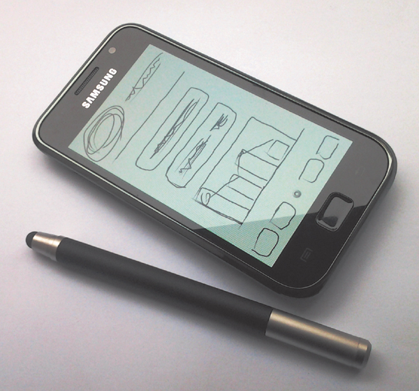
It’s a sign of my age, but I sketch on paper, or on the screen with a Wacom pen tablet (but not in Photoshop). I also sketch on actual devices like phones and tablets with one of those pens designed for touch devices, a neat little trick I learned from Stephanie Rieger (Figure 5.5). Used with a full-screen drawing program on the device, these pens are great for sketching actual-size wireframes and thinking about various design options.
That’s what I do, but everyone’s different.
Now that you have some structured content to look at, you know what it will look like if no CSS is applied. That’s your starting point. Now it’s time to jump into your own creative process, whether on paper or in a software tool, and start sketching what you want things to look like.
Full disclosure: This workflow encourages creating mockups for small-screen devices first, but that doesn’t mean you can’t think about and sketch your ideas for larger screens right away. I do that myself, and I find it useful to at least sketch and consider what I’ll want things to look like on the desktop. Feel free to do the same.
As I’ve mentioned, this book is not about how to design; it’s about how to visualize your design in the most effective way. Right now, you need to do the most challenging part of this process: design. Think. Sketch. And when you’re confident you have some ideas you’d like to mock up, you’re ready to continue.
Playing with type and color
One of the biggest problems I have with designing in tools like image editors is the disconnect between the tool and the actual web. Tools like Photoshop create images. The web displays content, and the rendering varies from platform to platform and browser to browser. It’s important to get in the browser as early as possible, so you can see what your design actually does on the web. This will allow you to make adjustments as necessary, potentially giving you the opportunity to improve your designs and, by extension, your skill as a designer.
One of the easiest ways to get started is with type. Typography, as you probably know, is a huge subject, full of complexities. It has been argued that typography is the most important aspect of web design.5 (It’s also one of the most frustrating, as type rendering can vary so drastically on the web.) I find that type is a great place to start designing. Many years ago when I art directed print, the first thing I did on each project was think about type. Let’s start with type here as well.
5 Oliver Reichenstein, “Web Design is 95% Typography.” iA Blog. http://informationarchitects.net/blog/the-web-is-all-about-typography-period.
The first thing I’d ask you to think about is whether the majority of your type will be in a serif or a sans-serif font. If you’ve already sketched out a design, you’ll most likely have made that choice by now. For our book site example, I’ve chosen to go with a sans-serif typeface, since I’ve seen the comps for the book’s cover, which also use sans-serif type. This informed my decision, the same way typographical guidelines from a style manual might lead your decision in a given project.
We’re going to specify a font stack for the page we’re working on, based on the choice for a sans-serif typeface.
We specify the font stack in base.css. Open that file and take a look at it; you’ll see the wireframes styles we had put in there. Those style declarations were namespaced; they apply only to HTML elements with the class wireframe. We want our type to apply universally, so we don’t need to namespace. Above the wireframe styles, type in the following declaration:
body {
font-size: 100%;
font-family: Gill Sans, Helvetica, Arial, sans-serif;
}
h1,h2,h3,h4,h5,h6 {
font-weight: 200;
}
Please note that these styles are for our example site; for your own design you would use the font declarations of your choice.
When you refresh the page in your browser, you’ll see the font styles applied. If you’re looking at the page in a desktop browser, make the browser window narrow, so it approximates the width of a smartphone. I would recommend opting for an emulator as we discussed earlier.
Start Sculpting
For your own project, you should have made some sketches by now and know how you want your design to look. For most web designers, this is the point in the workflow when you’d normally start working in Photoshop, with two differences:
1. Instead of working in Photoshop you’ll continue working with CSS, possibly changing something in your HTML every once in a while.
2. You’ll be applying styles incrementally, such that their cumulative effect will be to visualize the design(s) you’ve sketched. You’ll do this by starting with the narrow screen design using simple CSS.
The first part of creating your responsive design is the linear design, the application of simple CSS (namely, type and color) to create the base styles that will be used with all screen widths. This means no layout yet, as that applies only to screens large enough and browsers capable of showing it. The key in this phase is to go just one small step further than Bryan Rieger’s method. We’re still communicating with HTML, but it’s no longer unstyled HTML.
The idea is to start sculpting the unstyled HTML until you get the typography and color treatment on par with your design sketches. Do it methodically. Add to your CSS only if it contributes to the design, with perhaps some simple margins and padding. You can add background colors if you like, but here are some things I prefer to avoid at this stage:
Sculpting is simply the word I use to describe the act of turning a page of stacked content into a linear design. It’s a matter of many small, incremental changes—margins here, padding there, type choices—which together transform visually boring content into something with a distinct style.
• Any form of layout whatsoever (no columns!)
• CSS effects such as box-shadows, text-shadows, border-radius, and gradients
• Font embedding (@font-face)
So, to be clear, in this phase we’re simply setting the stage for more complex CSS later. We want something that reads like a linear document but which has some type and color applied to it. You’ll be implementing your full-blown design in later steps. Easy does it.
Add Some Images
You probably want some images in your design. This includes things like a company logo, photographs, or icons. This is a good time to put these into your mockup. For images that are actually part of the content (read: not background images), the right place for those is in the HTML. Put them where they make the most sense if this linear layout were the only layout available. Obviously, you can create or edit these images in Photoshop or another image editor. After all, that’s what image editors were made for.
Note
It could be that the developer(s) will later choose to use only one image, but performance is extremely important on all devices, and in the event you eventually do need multiple sizes of an image, you’ll be ready.
Try to create versions of your images that fit into this linear design on a small device. In other words, don’t make large images and shrink them with HTML or CSS. Actually create versions of the images that are the correct size for your current reference device. It’s advisable to start with a larger image and export it as a smaller image from your image editor of choice. This lets you experiment and see how large or small your images need to be on a small screen. That is valuable information.
Form Elements and Touch Devices
Assuming your small-screen reference device is a touch device, and if you have forms in your design (or you’re designing a web application and have various UI elements such as buttons), this is the time to start getting a feel for how big these things really are. You can almost always make them larger. This goes for type as well. Don’t do anything with layout just yet, but you can play with the dimensions of things. Adjust until it feels right, until it feels comfortable when touching the element with your finger (if you try it on at least one device, which I can’t stress enough). Think about the amount of white space between elements (above and below). Adjust until you have a clean, usable linear design on your reference device.
Don’t do too much just yet
When you’ve looked at your linear design on a mobile device, look at it again on another, different device. What’s different? Note some of the issues you might have with certain types of devices; change small things as necessary. And remember, don’t do too much at this point—no layout allowed.
When you’re satisfied with the result, you should have an HTML document that reads in a linear fashion and contains some basic styling of structural elements using some of the color and type ideas you sketched (Figure 5.6).
In the next chapter, we’ll look at how to set the stage for making the design responsive, by estimating and visualizing various breakpoints: the points the design will respond to when various conditions are met.
I’ve mentioned that the way the content behaves within a certain context should determine the breakpoints. In preparation for thinking about these breakpoints (and breakpoints in general), I recommend using your linear design to start exploring at what points you think your design might need to change.
View your linear design on as many devices as you can and see how the content looks at various screen sizes. Are the text columns too narrow? Too wide? Does the text remain readable, or is it too small on some devices?
You might even want to jot down some notes about your breakpoint studies for use in the next step. Breakpoints need not denote big layout changes, even small things might need to change. Indeed, one breakpoint might only trigger some text resizing. Try to get a feel for what needs to be done, and use your browser’s developer tools to play around with possible changes.
This exploration is optional, but can help you going forward. And now, breakpoints!