
6. Breakpoint Graphs
“The most important function of a spec is to design the program.”
—JOEL SPOLSKY
You may have noticed a common thread running through the steps in the responsive design workflow: the deliverables in each step are primarily meant to aid the design process as opposed to being client-centric deliverables based on a hidden design process. Another characteristic of the workflow deliverables is that most of them can be construed as a form of documentation, whether on their own or in combination with the results of other steps in the workflow. Joel Spolsky, in a blog post that’s as relevant today as it was when he wrote it in 2000, said:
“Writing a spec is a great way to nail down all those irritating design decisions, large and small, that get covered up if you don’t have a spec. Even small decisions can get nailed down with a spec.”1
1 Painless Functional Specifications—Part 1: Why Bother? http://www.joelonsoftware.com/articles/fog0000000036.html
The word documentation (or variants like specification, or spec) doesn’t excite many people, although I’ve known some who love creating it. The word conjures up images of hours or days of writing, of describing the way things work in horrific detail. The oft-heard saying “a picture is worth a thousand words,” however, suggests that documentation needn’t always read like an instruction manual. This is especially true of breakpoint graphs, the topic of this chapter.
A specification is a form of documentation that describes how something should work, and how it should be implemented. Thus, a CSS spec describes how CSS should be implemented in browsers by the browser makers (the implementers, in this case).
Looking back on the previous steps in the workflow, you can see that the deliverables not only help create the design, but also can be incorporated into the design documentation. For this documentation to be seamless and make more sense to the reader, you’ll need to write some background on the project and tie the various steps together. However, much of the documentation can be surprisingly visual.
The content inventory is documentation in and of itself, and can also serve as part of a much larger documentation suite. This also applies to content reference wireframes and structured text designs. While not every workflow deliverable is useful as standalone documentation, each somehow documents a part of the design process. We’ll look at how to tie all these deliverables together to create overarching design documentation later in this book.
Whenever possible, I prefer to go the visual route when creating documentation. You may have also found in your own projects that documentation containing images seems much more effective.
Aside from the fact that accessibility concerns may lead you to write everything in detail anyway, many things can be communicated more clearly with images. And even if you write everything out, starting with images might help clarify what you need to write.
Note
Terms like identity guidelines and style guides often refer to the same thing, but not always. People often interchange these terms and their meanings, perhaps a result of the convergence of the development and design fields.
This same principle applies to both user documentation and design documentation. I dare say that most designers are familiar with identity/branding guidelines, commonly called style manuals or style guides at the time of this writing. These documents traditionally describe which elements are available for an organization’s visual identity (logos, type, illustrations, and so on), under what circumstances each can be used, and how each of these elements should be used. I’ve seen style manuals that were hundreds of pages long. What gets you through these manuals, as a reader, is the fact that they’re so visual. There’s a textual description of how white space should be used with the logo, as well as a picture, complete with measurements. The important point here is that any accompanying text should provide additional details that cannot be conveyed through an image. (At worst, the text can be completely unnecessary, save for reasons of making this information accessible to those who can’t understand the image for whatever reason.) In any case, we should start with an image where possible, and then describe what that image means in text. This can be a huge time-saver and make for much more effective documentation.
Documentation for breakpoints
I have a thing for data visualization. I don’t mean those modified bar charts you see in newspapers where the bars are replaced with barrels of oil or whatever else is being measured. I mean visually simple and clear expressions of data presented in a way that helps the reader understand that data intuitively, often without explanation—the kind of visualization that lets the reader gain insight or draw conclusions from the data based on that understanding.
And since it’s all about understanding, the visualizations should not be fancy (to impress) or unnecessarily complex.
Breakpoint graphs are my way of visualizing breakpoints. They start as design tools and become a form of documentation. As in the earlier steps in the workflow, I start with educated guesses in the initial design phase and make reality-based revisions later.
A breakpoint graph is a graphic depiction of various breakpoints and the changes that occur at these breakpoints within a responsive design.
But before we get into breakpoint graphs and how to create them, it’s important to be clear on the definition of a breakpoint.
Anatomy of a breakpoint
Breakpoints are often described as the points at which CSS media queries are activated and thus when changes to the page styles are applied. While this is a true statement, it’s not a full definition. A broader, technology-independent definition can be helpful.
I’ve come to define breakpoints as the points when certain aspects of a website or web application change depending on specified conditions. Three factors are candidates for change when a breakpoint is reached:
1. Aspects of visual design and layout
2. Aspects of functionality
3. Aspects of content
These things might need to change (or you might want them to change) based on various conditions. The points at which those conditions are true are breakpoints. Here’s an example in plain language:
“When the viewport width is at least 600 pixels wide, use a two-column layout instead of a one-column layout.”
This follows the simple syntax of “if [condition], then [change].” Again, the point at which the condition is true is the breakpoint, in this case, when the viewport is at least 600px wide. This makes understanding the CSS media query syntax easy:
@media only screen and (min-width: 600px) {
/* Do stuff */
}
This should be pretty easy to read. The only keyword simply “hides” the media query from browsers that don’t support it. Other than that, the query simply reads:
“When using a screen with a viewport that is at least 600px wide, do stuff.”
Note
Be aware that the “media queries” in JavaScript are evaluated only once by the browser, while CSS media queries are evaluated continually.
Another reason to consider a more full definition of breakpoints is that CSS is not the only method used to implement changes when a breakpoint has been reached. JavaScript can also be used to determine this. The following examples mean basically the same thing as the CSS media query above:
if (document.documentElement.clientWidth >= 600) {
// Do stuff
}
or
if (window.matchMedia("(min-width: 600px)").matches) {
// Do stuff
}
In general, it shouldn’t matter how you do it. The important thing is that you’ll most likely have several different ways of testing conditions, and several things you’ll want to change based on those conditions. On complex sites, these conditions and changes are worth keeping track of. Even on simple websites, documenting breakpoints is a useful practice.
While on-breakpoint changes in web projects fall into the aforementioned categories (visual design/layout, functionality, and content), there are few limits on what can constitute a breakpoint. Media features available in CSS media queries—width and device orientation, for example—are just the beginning (though not all enjoy enough browser support). Support for technologies like JavaScript might also be included in your strategy. Device features such as a camera might determine which functions are available to an application. There are many possibilities for breakpoints, not all of which can be triggered by CSS.
This implies that there are a lot of different things to consider when determining breakpoints. Some of them are marginally related to design. All of them have something to do with design; the designer should at least know what effects breakpoint changes will have on the whole experience. Determining breakpoints is, once again, a team effort.
Visualizing breakpoints
I’ve often found myself writing breakpoints in a simple table format. As a big fan of data visualization, I was excited to come across Stephen Few’s bullet graph specification (Figure 6.1).2

Figure 6.1. Bullet graphs were created to communicate a large amount of information in a small amount of space.
A bullet graph is a type of bar graph that (to me, at least) resembles a thermometer. They can be placed either horizontally or vertically. They combine a quantitative scale with qualitative ranges and use markers for specific measures.
Bullet graphs were developed for data dashboards, such as those used by sales teams, so they have virtually nothing in common with responsive design breakpoints. However, I liked how bullet graphs included so much information in such a small amount of space. Could I make something similar to describe breakpoints in a visual manner? Sure, a spreadsheet might work, but hey, I’m a visual guy. Hence, the breakpoint graph.
Breakpoint graphs are an easy way to visualize progressive enhancement: from basic HTML to the most advanced CSS and JavaScript, from simple to complex, from a list of addresses to an interactive map, and, of course, from small screen layouts to large screen layouts.
Breakpoint graph components
My breakpoint graphs usually contain only a small number of simple components (Table 6.1).
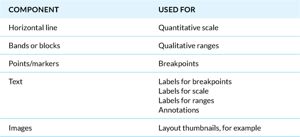
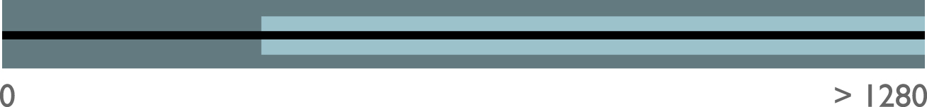
With quantitative scale, I’m referring to a simple ordinal scale such as small, medium, and large. The horizontal line represents this scale, which is arbitrary and can be whatever you need it to be depending on what you’re communicating with your breakpoint graph (Figure 6.2). In its obvious form, the horizontal line would imply a scale of viewport widths from, say, 0px to >1280px or 0em to >50em or something similar.

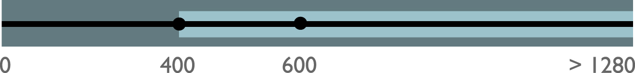
Qualitative ranges have no intrinsic order; indeed, they may have nothing to do with one another. You may have bands or blocks that represent “when JavaScript is available” or “the device has a camera” (Figure 6.3). Not all ranges will map directly to your chosen quantitative scale. For example, viewport width has nothing directly to do with the amount of JavaScript support. Thus, your horizontal line and colored blocks or bands should somehow be related. Otherwise, you might need more than one breakpoint graph, which we’ll discuss shortly.
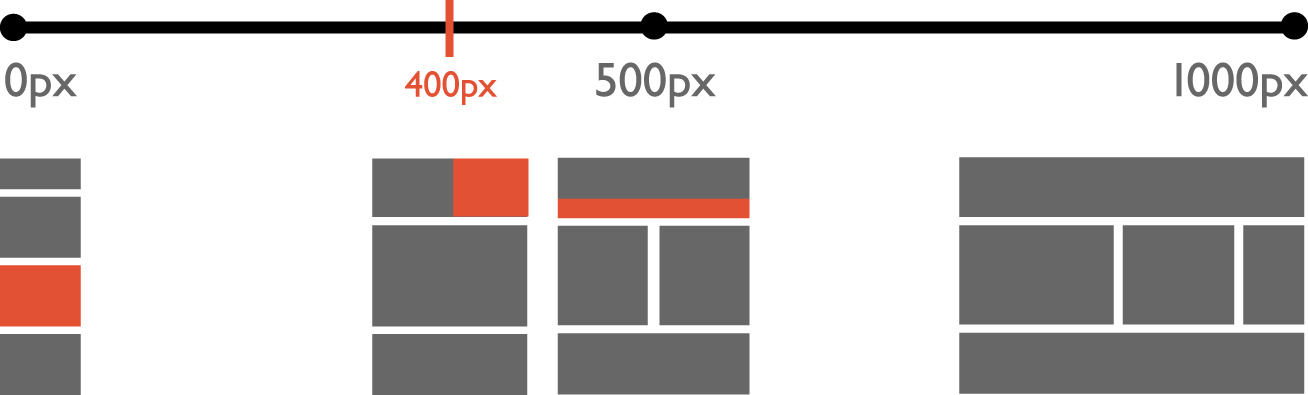
The actual breakpoints (the points at which changes in your design will take place) are placed as markers on the horizontal line—and thus also on top of your blocks or bands—to indicate where the change takes place (Figure 6.4). The bands and lines are conditions; the markers indicate the change points. The number of breakpoints will vary by project, and whether or not you choose to include major breakpoints (huge changes) and minor breakpoints (changes to specific elements) in the same graph.
Of course, you’ll usually want to label your breakpoints and may include an annotation or two for clarity.
Small pictures can be used to visually indicate the types of changes that will take place. This increases the physical size of the graph, but makes up for it in communicative impact. Thumbnail images of layout changes, for example, make it immediately clear what will happen at a given breakpoint and can eliminate the need for detailed textual explanation (Figure 6.5).

In practice you’ll use only the components you need, and you might add some of your own. However you do it, try to keep your breakpoint graphs as simple as possible.
After extolling the virtues of images as an effective way to communicate, it’s probably about time for a visual example. Let’s take a look at how we would make a simple breakpoint graph for the book site.
Creating a simple breakpoint graph
As with all steps in this book, I encourage you to follow along with the examples. Even if you decide not to use a specific idea, following along is very useful; it helps you understand exactly what’s going on and lets you experience the potential advantages or drawbacks of a particular approach for your own projects and style of working. As always, the Tool Rule applies here: use the tool you feel most comfortable with. Since breakpoint graphs are visuals, an image editor or illustration application would work perfectly. Who knows, you might even prefer to sketch them first with pen and paper! What a thought!
When you create breakpoint graphs for the first time in the design process, it will mainly be guesswork based on experience. Once you’ve started working on your web-based comp, you can base your estimates on the way the content is rendered. When dealing with breakpoints based on viewport widths (obviously common in responsive design), the temptation is to start off with actual device screen sizes. I strongly discourage this practice. In his article Fanfare for the Common Breakpoint, Jeremy Keith wrote,
“If we begin with some specific canvases (devices), they’re always going to be arbitrary. There are so many different screen sizes and ratios out there that it doesn’t make sense to favour a handful of them out of tradition. 320, 480, 640... those numbers aren’t any more special than any other screen widths.”3
3 http://adactio.com/journal/5425/
The fact is that we don’t know which devices people will use to interact with our websites now or in the future, even if we convince ourselves otherwise. This is true not only for viewport widths, but also for other factors such as various device capabilities. Keith sums it up nicely later in the same article:
“I think our collective obsession with trying to nail down ‘common’ breakpoints has led to a fundamental misunderstanding about the nature of responsive design: it’s not about what happens at the breakpoints—it’s about what happens between the breakpoints.”
This is why I tend to “default guess” breakpoints at 600px and 900px in the beginning. These values have little to do with specific devices. I’ve even used them in media queries of actual projects because they happened to work so well. It really will depend on your project. Almost always, I end up converting the values to ems (see Tip).4
4 Read Lyza Gardner’s wonderful little post on em-based media queries at http://blog.cloudfour.com/the-ems-have-it-proportional-media-queries-ftw/.
Tip
When designing responsively, consider using ems as opposed to pixels for your scale (and thus for your media queries later on). There’s nothing wrong with pixels (especially in this phase), but ems have their advantages when used correctly.
Moving on to our example, let’s create a breakpoint graph that describes major layout changes based on viewport width.
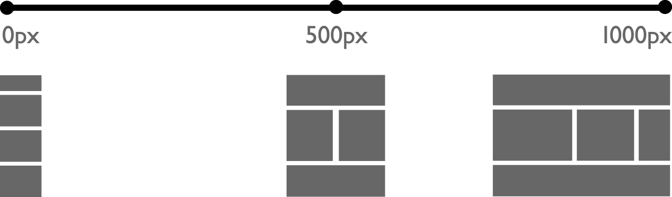
First, draw a horizontal line. Try not to quiver at this extremely difficult step. This horizontal line will be your scale. In this case, it will show the units you’re using for the viewport width. If you’re using pixels, the leftmost point of the line represents 0px. In responsive design, the rightmost point often represents the last breakpoint before “infinite,” as in “greater than 1000px” or something similar, but if your design suddenly “stops” for whatever reason, you can just end your responsive universe at your measure of choice.
Now place some points where you think the breakpoints will be. Don’t worry about being wrong; you’ll most certainly change these breakpoints later because your content will tell you to. Place the points more or less on the correct place on your scale. For example, if your scale is from 0px to (>)1000px and you have a breakpoint at 500px, place your point in the middle of the horizontal line. Label the points (Figure 6.6).

That was easy, right?
Now that you’ve shown where the breakpoints are, you need to indicate what will happen at those breakpoints. This is, after all, part of your design documentation! For this particular type of graph, I like to use thumbnail images based on the content reference wireframes (Figure 6.7). These are simple, easy to make, and easy to understand.
This graph already communicates a reasonable amount of information in a relatively small space, and is understandable with no textual explanation or chartjunk.5 For smaller or less complex websites, this might be all you need. Many projects, though, will require more information.
5 http://en.wikipedia.org/wiki/Chartjunk
Chartjunk refers to visual elements in charts and graphs that are not necessary for the reader to comprehend the information represented in the graph, or that distract the reader from this information.
Major and minor breakpoints
So far we’ve marked only major breakpoints: those points where changes have an impact on, as in the previous example, the whole layout. But there are many potential minor breakpoints. It could be that certain elements on the page change in some way at a certain point, while the rest of the page remains the same. This is often the case when a page is still wide enough to keep a given page layout, where one block of content still must switch from a single column of text to multiple columns and vice versa. Or consider that when a column becomes slightly too small to render navigation horizontally, some change to that navigation is made (smaller type, moved under the logo, whatever) while the general design of the page remains the same.
While this book is about responsive design workflow, it’s not about the basics of responsive design, in which fluid layout plays an important role. Much of the flexibility “between the breakpoints” to which Jeremy Keith refers is afforded us by fluid layout. Switching between several fixed-width layouts is not responsive design.6
6 To learn more about fluid layout and the basics of responsive design, read Ethan Marcotte’s article on the subject at http://www.alistapart.com/articles/responsive-web-design/. His book Responsive Web Design (A Book Apart, 2011) is also invaluable.
These breakpoints can also be included in your breakpoint graph, though I recommend creating a visual differentiation between major and minor breakpoint markers (Figure 6.8).
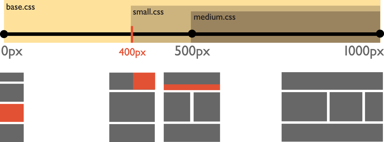
It’s also possible to use color-filled areas to indicate major content or functionality changes, or to emphasize them. These areas are useful for indicating ranges within which certain conditions apply. This can be anything. For example, we might want to indicate which CSS files are applied at any given screen width (Figure 6.9). Ranges are a great way to do this, although this is a simple example. Ranges become even more useful when mapping things other than width-related factors.
Adding more complexity
For complex projects, a single breakpoint graph might not be enough. You could try it, but it would become very cluttered, which defeats the whole purpose of the breakpoint graph in the first place. For these complex situations—and because breakpoint graphs take up relatively little space—I recommend making more than one for different aspects of the design and stacking them on top of one another.
Remember the basic things a breakpoint graph communicates:
1. What is going to change
2. What conditions trigger those changes
Let’s say you want to graph functionality based on device capabilities in addition to layout changes. You could plot layout to screen widths on one graph, and content to capabilities on another. This is a good idea, since the one doesn’t necessarily have anything to do with the other. Let’s examine that with a more complex example.
A more complex example: A podcast player
Let’s say our client publishes podcasts, and would like a podcast player on her website. The display of an audio player is not possible in every situation, but the conditions have little or nothing to do with the width of the viewport. In this case, we choose to graph the changes in layout in one graph and the progressive enhancement scheme for the audio player in another graph.
The layout graph is done exactly as in our previous example, so there’s no need to repeat that exercise. We’ll focus on the graph for the audio player. At first glance, this might seem technical to some designers, something best left to developers to handle: just design a nice-looking audio player and be done with it. Sure, you could do that. But if you share my opinion that the design of contingencies is also part of design, read on.
In this case, we’ll use the breakpoint graph as a tool to think about and plan our progressive enhancement strategy for this audio player. When we’re done, we’ll have documentation of that strategy.
As always, it’s important to consider the restraints. In this case, the client has only MP3 files and doesn’t want to convert them or use any alternate formats. Also, the whole project team and client have opted for HTML5 audio when possible, with a Flash or Silverlight player fallback when possible.
Let’s think about what this means:
1. Some devices/browsers have no support for HTML5 audio, and no support for Flash or Silverlight. For these, you might like to present the user with a download link, perhaps in the form of a button. Upon the user’s touching or clicking the button, many devices will ask the user how and with which application they’d like to open the file, offering the device’s default player as an option. Some devices, depending on the settings, will open an MP3 file automatically in the device’s default player. This will be your base functionality: a link works everywhere HTML is supported. This default will also be used in cases where HTML5 audio is supported but the browser does not support the MP3 format.
2. Some browsers will support Flash or Silverlight but not HTML5 audio (or HTML5 audio but not MP3). We’ll provide these browsers with Flash or Silverlight players (which look like the HTML5 audio player), respectively. We’ll basically “fake” HTML5 support with these technologies. We’ll use JavaScript to determine which support is available and apply the corresponding technology.
3. Some browsers support HTML5 audio and the MP3 format. These will get our shiny HTML5 player.
Now, you could simply write all this down, but I just wrote it, and it’s tough even for me to get my head around the plan, let alone a client. You could make a flowchart, but that’s not as cool. You’ve already used a breakpoint graph to describe layout changes, so creating one for the audio player gives you a way to consistently visualize any type of progressive enhancement.
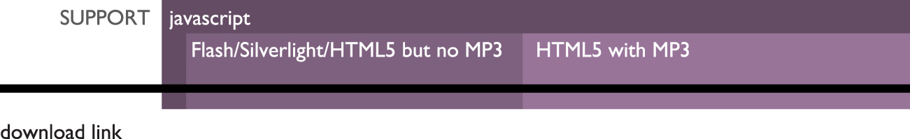
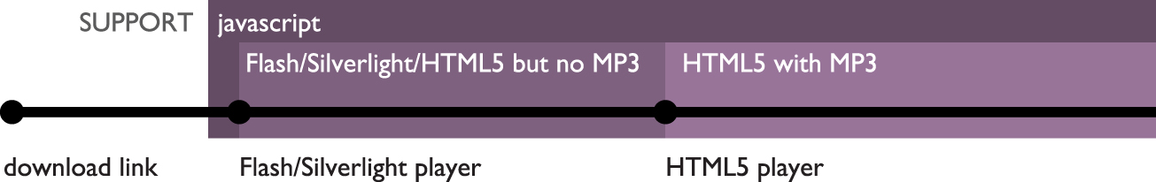
To graph this, start off once again with a horizontal line. This time the horizontal line represents the range of “least capable” browser to “most capable” browser, with the least capable applying the accessible default (the link/button) and the most capable applying the HTML5 audio player. Before you insert the breakpoint markers, though, add some qualitative ranges using rectangular areas to indicate device capabilities or feature support.
What are these ranges? For one, JavaScript is necessary for pretty much every option you can think of except the plain old Download button (Figure 6.10). In the same way, MP3 support is needed for all but the button.

Figure 6.10. The base functionality consists of a Download button, which is replaced when JavaScript is available.
Next, there’s a range where Flash and/or Silverlight is supported. And finally, there’s a range of browsers supporting HTML5 audio (and MP3) (Figure 6.11).
With the ranges in place, it’s fairly easy to place the breakpoints; they’re typically on the starting end of the range of conditions that trigger them. To add extra visual clarity, you could add some small images indicating how the audio will be handled at the various breakpoints (Figure 6.12).
There you have it, a visualization of a progressive enhancement strategy for dealing with an HTML5 audio player. While it’s not about screen widths, it’s still about being responsive, and there are still breakpoints—even though the breakpoints here have nothing to do with layout. This is so much clearer than a textual description of how you’ll deal with the audio player under specific conditions. As a bonus, these visuals encourage you to consider an accessible approach to design, and can alert you to contingencies you otherwise might not have considered.
What we’ve covered
In this chapter, we discussed what breakpoint graphs are and how to draw them, including:
• The importance of documentation
• The importance of visuals in documentation
• What a breakpoint is
• What a breakpoint graph is, and what components comprise a breakpoint graph
• The difference between major and minor breakpoints
• How to create a simple breakpoint graph to visualize layout changes at various viewport widths
• How to use breakpoint graphs to visualize progressive enhancement strategies for non-layout-related factors like device capabilities
Now that you’ve guesstimated your breakpoints (probably based on the design sketches you’ve made and your original wireframes), everything’s set for revisiting your major layout breakpoints and revising or finishing up your design thoughts for those specific points. In the next chapter, we’ll cover a brief step in this workflow in which you’ll combine your linear design and your original wireframes to analyze the feasibility of your estimated breakpoints, and simultaneously prepare to create web-based comps.
So, get ready to jump back into some HTML and CSS!