
8. Creating a Web-Based Design Mockup
“My name is web design, and I have a problem.”
—STEPHANIE RIEGER
By now my opinion on static mockups should be clear: they’re not practical for responsive design. They’re not effectively scalable. Once you have a static mockup, creating a second doesn’t double work time, but both time and cost will be increased—all the more as multiples increase. Many changes have to be made manually, which is ridiculous when we have technology that can make it easier for us.
Note
A great advantage of using web-based mockups is that while viewing them in the browser, you can open up your browser’s developer tools and make changes on the fly. This is great for trying out ideas.
Imagine being asked by a client to change the font sizes of all your headings. To do this in a Photoshop document, you’d have to bump up the size of every single heading, and adjust the margins and spacing around them. You might also have to change the placement of other text or images to accommodate the new heading sizes and make the document bigger so everything will fit. Now imagine that when you’ve finished making those changes, you still need to make the same changes for the mobile and tablet versions.
Now picture opening a CSS file, changing one or two style rules for headings, saving that file, and opening up a single web page in your browser to see the changes immediately. Imagine opening that same page on a smartphone and magically seeing those changes applied to the mobile design. That alone makes the case for using web-based mockups for responsive web design, as opposed to image editor files. If you choose to journey down this path, you’ll find that there are many more advantages.
Throughout this book, you’ve been preparing to create a web-based mockup. You got representative content into the browser as early as possible. You created (responsive!) wireframes in the browser. You created a working linear design in the browser. And you sketched and developed ideas for your design at various breakpoints. Now you’re ready, at least materially, to combine these efforts into a working prototype. Once you have your prototype, you’ll further visualize the sketches you made in the previous chapter with CSS. From that point on, all your design revisions will be done in the browser. Changes will be tracked with version control. You can still be creative, sketching any changes you might want to make before implementing them with CSS. But you’ll have the reality check of viewing in actual browsers. You’ll be able to utilize time-saving developer tools. You’ll be setting the stage for the creation of auto-updating design documentation (which we’ll discuss later). Most importantly, you’ll keep your sanity when changes come.
Note
Web-based mockups are, in effect, prototypes of web pages or screens, since they’re in the browser. To emphasize that fact, I use the terms mockup and prototype interchangeably in this chapter.
Hurdles to acceptance
As with any change, there’s work to be done to make everyone on the project comfortable with a new way of working. Results may be convincing, but those tend to come later in the process.
Clients (generally) don’t care
Clients don’t care what tools you use, as long as you get the job done. They probably won’t see the difference between an image from Photoshop or a screenshot from a browser, except for the fact that the latter will most likely be more realistic, since it’s what the design actually looks like in the browser. No more selling clients pretty pictures now and making concessions later. No more annoying surprises for clients and frustrating discussions about differences between what the browser renders and what the client signed off on.
“Demonstrating our designs to clients as XHTML/CSS pages rather than as static Photoshop or Fireworks has streamlined our workflow and helped us to set and manage a client’s expectations better than ever before.”
—ANDY CLARKE1
1 Andy Clarke, “Time to stop showing clients static design visuals | Stuff & Nonsense,” Stuff & Nonsense, september 22, 2008, http://www.stuffandnonsense.co.uk/blog/about/time_to_stop_showing_clients_static_design_visuals/.
This all sounds great, but you’ll probably still encounter some hurdles when you do web-based mockups—at least until they become the norm. As always, the biggest problems are people problems, and people with an aversion to this approach can cause you some frustration.
There are two types of people, other than clients, whose aversion might make this approach challenging:
1. Other people
2. You
Let’s examine the problems with both.
Other people
Other people—project managers, developers, and the like—might be uncomfortable with tossing old-school, waterfall-based deliverables in favor of new-school, iterative deliverables. After all, some people expect to see details worked out in wireframes before anything is built. Some developers are afraid of anyone else doing HTML and CSS, even if they don’t have to use it.
Not long ago, I was hired to lead the design of a large, information-rich government website. Another company was responsible for implementing the content management system and translating the design to HTML/CSS templates. They requested Photoshop templates. I said no (I have to say that a lot); they would be getting web-based prototypes in HTML and CSS, with a tiny bit of JavaScript. They had trouble dealing with the idea, and our conversation went something like this:
“That will take more time to do; we can’t use your markup and CSS. Our CMS outputs different markup.”
“You don’t have to use my markup. I use it to create the prototype. I’m not creating the templates. You’re free to do those as you please.”
“But it’s more work for us.”
“How, exactly? How do you normally go from Photoshop to HTML and CSS?”
“We measure everything and we slice out images as necessary.”
Slicing. Old school. So, as most front-end developers probably work today, they’re using the eyedropper to get color values, the ruler for measuring margins. They’re selecting text and studying the values in the text palette to get the values they need for their CSS.
“So I’m giving you the images you need, web-ready, and I’m giving you CSS which has the values you need right there. How does that create more work for you?”
Note
If the client or developer is absolutely set on getting images as a deliverable instead of web-based mockups, you can always take screenshots of the mockups and deliver the screenshots (see Chapter 9, “Presentation, Round One: Screenshots”). You’ll be able to provide image assets, but no Photoshop files.
“Well, okay, it’s probably not more work. But it’s not less work either.”
Fair enough. I’ve had this discussion with several developers over the past couple of years. These are web professionals who probably do their work well. They’re also resistant to change, which is logical. The fact is that once they get used to these deliverables, they will save time. It’s a matter of practice. At least they were willing to go along with the process. That’s the important thing—daring to try something new that might help improve things.
You
While other people might be an obstacle to trying something new, I regularly come across designers and developers who are pretty terrified of the process. They’re the web designer equivalent of a kid who’s never eaten salad declaring that she doesn’t like salad. You know what happens? They all end up loving salad (cough).
If you’re a visual or interaction designer with little or no coding experience, it’s possible that this book has freaked you somewhat. To be clear: I’m asking you to learn HTML and CSS and to use these as design tools in much the same way you learned to use vector drawing applications or image editors such as Photoshop or GIMP (Figure 8.1). I’ve already asked you to use a plain text editor and some simple, easy-to-write commands in your computer’s terminal emulator, a.k.a. the dreaded command line. You’ve recovered, haven’t you?
To some, this is hellishly scary. After all, you’re “not technical.” You’re creative. Not technical? Really? Remember Photoshop and all those palettes, options, and buttons that look like Darth Vader’s bathroom? Photoshop is an incredibly powerful application. You probably know how to adjust color through Levels and Curves. You work with layout grids and manipulate objects across layers and edit colors through channels. You have tricks for creating things like special borders and shadows that you could otherwise create with one or two lines of CSS. You may know about color spaces and color theory. In fact, there’s a whole book about the Photoshop LAB color space—a whole book. And basic HTML and CSS is too technical? Come on. Print designers know about ink and paper and things like dot gain. They do technical preflight checks on the documents they send to the printer. You could memorize the most common HTML elements in less than an hour and learn basic CSS styling in another. It can take you days to get your head around the interface of a complex image manipulation program like Photoshop, and months or years to master it.
Admittedly, advanced HTML and CSS will also take years to master, and they are now (officially) changing all the time. But that’s what web designs are made of, so the more you know, the better you’ll get at applying your design ideas to the web. They’re like any other tool, or even a musical instrument. You want to get to the point that you’re no longer thinking to make the notes; you just want to focus on the nuances of the piece you’re playing. That takes a long time. That said, I can guarantee you that learning HTML and CSS (if you don’t already know them)—and perhaps even some JavaScript—will almost never be a waste of time. As with anything, the more you know about how the web is made, the more you’ll be able to create a mental map of what’s possible, the more you’ll be able to educate your clients and stakeholders, and the less time you’ll spend revising things in layered pictures across tens or hundreds of documents.
My point is this: don’t doubt your abilities. You’re technical enough. You’re smart enough. Nobody’s asking you to be a programmer. If you learned Photoshop, you can learn basic HTML and CSS. And you’ll learn to love what you can do with them, in addition to Photoshop.
After learning to create mockups in the form of HTML and CSS prototypes, you’ll see that using Photoshop for creating image assets and playing around with ideas frees your creative mind. You can think creatively and use your newfound knowledge to test your visual hypotheses in the browser, the actual medium in which your work will be published. That’s an incredible opportunity that’s absolutely unique to web design.
Of course, if you’re a weird sort of hybrid designer-developer type like me, you might be quick to warm up to the idea of web technologies as design tools.
Presenting your mockups
Presenting designs to clients (and others) is an art form. It involves the ability to read or infer what others are thinking by looking for the right clues, and taking steps to emphasize the effectiveness of the design and address or alleviate any concerns your client might have.
I often call the processes and methods around client presentations presentation psychology. One of the key issues when presenting web-based prototypes is the very real risk that the client will get the impression that you’re further along in the design or development process than you actually are.
We’ll discuss presenting in detail, including how to overcome this common obstacle, in Chapter 9, “Presentation, Round One: Screenshots,” and Chapter 10, “Presentation, Round Two: In the Browser.” First, let’s go through the process of developing a web-based mockup.
Note
Remember, my goal is to recommend tools that are free to use and easy to acquire, so that anyone with a computer and web access can use them. There’s much you can create without spending a dime!
Let’s get to work
To create web-based design mockups, there are a few things you’ll need:
• A text editor (not to be confused with a word processor).
• A modern web browser
• Some basic knowledge of HTML and CSS (JavaScript knowledge is a plus but not essential) or access to a friendly front-end developer who’s willing to help you out.
In this chapter, you’ll also learn about software that can help you create prototypes more quickly and easily, and which admittedly has a learning curve: a static site generator. I’m using Dexy (which is in fact not a static site generator, but documentation software that has that functionality) for the examples in this book, but there are many different static site generators available using many different programming languages.2
A static site generator lets you create content in separate documents, from which you can generate a website that doesn’t require a content management system.
Of course, there are many other tools you can use, especially if you’re a bit more technically inclined, such as CSS preprocessors. Preprocessors like Sass or LESS can greatly speed up your prototyping work. Use of preprocessors is optional. However, they can provide you with a massive speed increase and thus are well worth the effort involved in learning them.
Evolving your responsive wireframe
Now it’s time to dust off the content reference wireframes we made in Chapter 3, “Content Reference Wireframes,” and morph them into static prototypes. The wireframes aren’t much more than boxes within a layout. They already have a responsive base, which makes our job a bit easier.
When we made the wireframes in Chapter 3, our purpose wasn’t necessarily to create a finished layout. Our goal was to prioritize content and illustrate a general idea of where things could be placed on the screen. In Chapter 7, “Designing for Breakpoints,” we actually sketched out the design and you might even have put together some mood boards, made some studies in an image editor like Photoshop, or created some image assets.
Tip
It might be good to start with something other than the home page. Many websites and applications have one layout that’s used for the majority of pages or screens. Try to find that particular design and the corresponding wireframe and compare them.
The design thinking determines what we’ll visualize via mockups. The wireframes, however, might give us a good starting point for the base HTML.
The first thing to do is compare the basic page layout of our design from Chapter 7 with your original wireframes. The idea isn’t to look at the layout of components, but rather the building blocks of the page: things like the header, the footer, the main content area, and any other large blocks or columns. Are your design sketches different from your wireframes? Note the differences so you have a list of things you’ll need to change.
If the building blocks are basically the same, you’re good to go. If not, you’ll need to adjust the HTML of the wireframes to fit the newest version of your design. In our book site, we don’t have to change the actual structure of the HTML, though we’ll certainly be changing the CSS to fit the design.
The process of developing a mockup from this point is straightforward:
1. Copy the various pieces of content from your linear design and paste them into the correct containers in the wireframe; save this as a new HTML file so you don’t accidentally overwrite your wireframe (but save it in the same folder so it still points to the right style sheets). If you look at this file in a browser, you’ll see a combination of your wireframe with your linear design, only without much style.
2. Remove the wireframe class from the body element.
3. Adjust the CSS so the elements on the page correspond to your newest design.
These steps aren’t always trivial (especially the last one), but when you’ve finished you’ll have a working, web-based mockup of your design for narrow viewports. During this process, you should constantly be looking at your page in real browsers, preferably several different ones. If you can do this on different platforms and different devices, even better. Repeat this process for every page type you want to include in your design. Simple, right?
It’s not fair of me to gloss over point three, “adjust the CSS,” like that, is it? It’s the most involved, so let’s look at that step in more detail.
Adding Style
Unless you came up with totally different typographical style ideas in Chapter 7, your linear design styles are a good place to start shaping your CSS. Remember base.css? Copy all the styles from your linear design and paste them into base.css under your wireframe styles.
Note
Theoretically, you could remove the wireframe styles now if you like. I usually leave them in and remove them when I’m completely finished with the mockup.
The rest comes down to sculpting your CSS so that your page, when viewed in a narrow viewport, matches your vision of how that should look. Start with mobile first: open the design on a smartphone or an emulator (or your desktop browser with a narrow window) and look at the page. Work as quickly as you can, editing your HTML file to adjust structure, content, and attributes like class and id as needed. Work only in base.css for style, unless you prefer to use a preprocessor.
Don’t fall into the trap of feeling that you have to develop a complete, working static website just because you’re working with HTML and CSS. This is one of the arguments used against designing in the browser, but if you work efficiently, you should be able to work just as quickly, if not more quickly, than you would in Photoshop.
Once you’ve completed the “mobile” version of this page, start expanding your browser window until something doesn’t look right. It could be that your main text column is less readable because it contains too many characters, or perhaps your logo looks too small compared to the rest of the page. Form input fields might become too wide for your taste. When you get to one of these points, stop. It’s time for a breakpoint.
Whip out Your Breakpoint Graph
If you’ve been working through the chapters with me, you estimated what your breakpoints would be on a breakpoint graph. Now’s the time to see if your estimates were correct. Open your browser’s developer tools/web inspector and look at the “computed styles” (Figure 8.2). Find the width of the html element. Compare this value to the value of the first breakpoint on your breakpoint graph. It may or may not be close to your estimate. It doesn’t matter.
Most browsers come with developer tools built in; some you can install as extensions (such as the well-known Firebug). They let you inspect the elements on a page, alter CSS and HTML, debug JavaScript, and much, much more. Check your browser’s documentation.
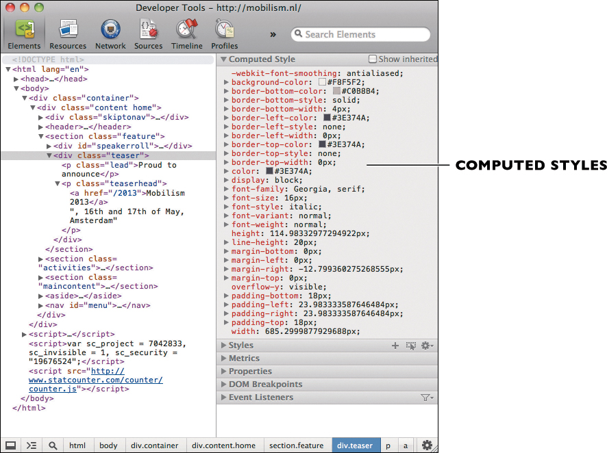
Figure 8.2. The Computed Styles view in your browser’s developer tools lets you see how the browser actually applies your CSS.
The breakpoint graph contains estimates of where we would put our breakpoints. I didn’t really expect the estimates to be totally accurate; they were useful just to get us thinking about what changes we might make. What we’ve done at this point is expanded the viewport to the point that our layout “breaks” and found out how wide the viewport is by looking at the computed styles. Play with your browser window a bit and choose a point just before the point where your design breaks. Now replace the estimate for the first breakpoint on your graph with this new value. This transforms the breakpoint graph from an estimate into part of your design documentation (more on that in Chapter 11, “Creating Design Guidelines”). It also means that we’re setting breakpoints based on what the designed content is doing, which is a good thing.
Now that you know what that first breakpoint is and have changed your breakpoint graph accordingly, you can also change the min-width value of your first breakpoint in the HTML:
<link rel="stylesheet" href="styles/medium.css" media="only screen and (min-width: [your breakpoint])">
Tip
The Computed Style view in your browser’s developer tools is useful for multiplatform design. As opposed to the regular Style view, which shows the CSS as it should be applied to the page, Computed Style shows the styles as interpreted by the browser. Check this when you want to see why something looks the way it does in a given browser.
Since medium.css will contain the styles we use between this breakpoint and the next, you can start adding CSS to that file. Try to think in terms of “additive CSS,” building up from the basic styles you already have (a form of progressive enhancement). In fact, you use this file to describe the style exceptions compared to base.css. I often use base.css for all styles that need to be applied to a given site regardless of the layout and as such it’s relatively larger, while medium.css contains predominantly layout changes and is usually smaller. large.css is often the smallest.
Thus many of the changes in medium.css will be changes in the positioning and size of elements. Margins might get wider, padding may be adjusted, and the menu might be moved to the top of the screen from its original home at the bottom of the page. One column might become two. Elements that were originally positioned vertically might now be positioned horizontally. Remember the first tenet of responsive design and keep to a fluid layout grid, using relative units so your design can expand sufficiently. When you’re finished, your page should look like what you designed for your first breakpoint.
Note
There are plenty of ways to see how wide your viewport is, from browser extensions specifically for that purpose, to writing your own JavaScript to print the current viewport width on your page.
Tackling the Remaining Major Breakpoints
In many cases, you’ll need only three major breakpoints. I’ve never had to use more than four. However many you use, you’ll simply repeat the process described above for each of them:
1. Expand the browser window until the design no longer works.
2. Adjust the window to the point just before that breakpoint.
3. Note the viewport width.
4. Replace the value in both your breakpoint graph and the link element in your HTML.
5. Add and adjust styles in the relevant style sheet until the page matches your design for that breakpoint.
Meanwhile, keep seeing each breakpoint as a range, rather than as a frozen image. If your first breakpoint is at 400px and your second at 900px, then you design for the first breakpoint is what people will experience in any situation where they view your site between 400px and 900px. That’s why fluid layout is so important: the page needs to “feel” right throughout that entire range, not only at 400px and 900px.
From static page to static site generator
You can create each mockup page by hand if you like, going through the above process. Each mockup will be a separate HTML file, each containing its own header and footer, each linking to the appropriate assets such as style sheets and images. All of your content, real and simulated, will be hard-coded in HTML.
For one or two mockups, this is just fine. For more (and many projects need more), this process doesn’t offer a significant increase in speed or maintainability compared to Photoshop comps. It does offer the important benefits of responsiveness and realism, but we have an opportunity to increase the benefit of web-based mockups by using a static site generator.
Static site generators (SSGs) are software applications that generate a website from a series of files. There are many types of SSGs, from the bare-bones variety for very simple sites to full-featured apps that offer things like tagging and archives for blogs. There are SSGs in practically every commonly used programming language (and each language has several to choose from). Nanoc, a popular SSG, maintains quite a large list of SSGs for various languages on its website (they’re obviously not afraid of the competition).3 However, a quick web search will uncover many more options.
3 http://nanoc.stoneship.org/docs/1-introduction/#similar-projects
One factor that should influence your decision is the choice of templating language.
Templating
A templating language in this context is a language (however small) that lets you create templates. Templates, in turn, allow you to insert placeholders for other content. Take the following sentence as an example:
The book will be called {{title}}.
In this sentence, the templating language I’m using is called Jinja, and {{title}} is a variable. The idea is that the templating system will replace the variable with the content it represents. In this case, that is the title of the book.
Templates can also contain logic, which can allow you, for example, to loop through a list of items in order to create an HTML list. You might use this logic at some point, but it does complicate things. Avoid logic in your templates until you feel completely comfortable with templating in general.
Many static site generators provide or work with existing templating systems. Templating is important, because it lets you use plain text markup on pieces of content and include those pieces of content in HTML documents via templates. This makes it easy for people to provide you with content, or for you to mock up your own and then edit it without wading through HTML. HTML isn’t hard, but plain text markup is that much simpler.
When choosing a static site generator, you’ll want to examine and make sure you like the templating system it uses.
Choosing an SSG
The SSG I currently use is the same software I use for creating style guides and other types of documentation. This was an important factor for me. Once you do a bit of research, you’ll find factors that are important to you. Consider things like:
• Programming language: This is necessary if you want to extend your SSG’s capabilities, and sometimes to write configuration files.
• Templating system/language: This is often tied to the SSG’s programming language.
• Markup language(s): If you prefer Markdown and your SSG supports only reStructuredText,4 you’ll have to extend the SSG or find a different one.
4 http://docutils.sourceforge.net/rst.html
• Configuration: Most SSGs use some sort of configuration file. Do you have to know a specific programming language to create one?
• Ease of use: Remember, this is just a tool, so you don’t want to spend too much time fiddling around with it unless you get a huge return on that investment. Some tools are great but have little or difficult-to-understand documentation. If there are no other resources, you might base your decision in part on how quickly you can pick up the basics.
If you’re unfamiliar with SSGs, simply follow along with me, using the same software I use. You won’t need any prior knowledge. Once you become comfortable with it, you can experiment with other software that fits your requirements (or you might decide to stick with this one!).
If you have a preferred SSG, you can follow along and execute similar steps using that software.
Be aware that we’re going to recreate the above process of creating a web-based mockup, only now we’re going to do that with the help of a static site generator. If you happened to code along with me earlier in this chapter, remember that in actual projects you’ll either do static HTML mockups or use an SSG. You don’t need to do both.
Introducing Dexy
The software I currently use for creating both mockups and documentation is called Dexy. Dexy is open-source software for documentation and automated documents. It just so happens that a static “website” is one of the document types that Dexy supports. This means that I don’t have to use separate tools for mockups and style guides, which fits my own workflow nicely. Dexy is written in Python, which makes it easily available on many platforms. It also utilizes other useful software like Pygments for syntax highlighting of code (useful for style guides) and Jinja templates (useful for creating content placeholders in mockups and documentation).
Dexy is very young software and is in very active development at the time of this writing. You can think of it as software that takes files, does stuff with them, and then produces an output folder with the results of the “stuff it did.” That “stuff” can be as simple as doing nothing at all, copying a file, putting it into a template, or piping it through other software and presenting the result. To do this stuff with files, Dexy provides filters. Dexy filters do things with files (or parts of them) on their own, or they can use other software to do this work. The filters then give back the result of what they executed. You can use this result in your documents. In some cases, the result might be a new file. Some examples might be appropriate here:
1. Take some Markdown files, inject each of them into a basic HTML template, and link the files together to create a simple website. (We’ll be doing that!)
2. Take some CSS code snippets, insert them into some predefined placeholders in a Markdown file, and convert the file into HTML. And, oh yeah, give those code snippets some pretty colors in the final HTML file. (We’ll be doing that too, in Chapter 11.)
3. Run some code in the command line, put the result of that command into a preexisting Markdown file, and then convert that to a PDF. Oh yeah, and Word, because your boss likes Word. (No, we’ll skip that one.)
4. Visit the pages of a site in a browser and change the viewport size three times, taking a screenshot of certain elements in the page at each size. Put these screenshots into a preexisting Markdown document using templates, pull in syntax-highlighted CSS code that corresponds to each screenshot, and create an HTML page from all of that. (Yep, we’ll be doing that as well when we make our style guide in Chapter 11.)
This is just the tip of the iceberg of what Dexy can do with its many filters (at the time of this writing, there are 135). And with each of the examples above, once you get everything set up (which can take a while), you’ll simply type dexy in the command line and press Enter. Dexy will then do all the work for you. This makes changes easy.
If this sounds too technical already, breathe. Breathe in, breathe out—everything will be OK. I’ll walk you through it—I promise. Since doing is learning and learning is doing, let’s dive right in.
Installing Dexy
You already learned a bit about the command line a few chapters ago. That was the hard part. Installing Dexy is really easy, provided you have Python installed.
Python has a package manager called pip. To find out if you have it, type
$ pip install dexy
Note
If you don’t have Python installed, you can find it at http://python.org/download/ and follow the installation instructions.
If you don’t have the correct permissions on your system you may need to type sudo before this command and then enter your system password. If this works, you’ll see that Dexy and its dependencies are being downloaded and installed. This can take a few minutes. The process is finished when you see a message like this:
Successfully installed dexy PyYAML chardet idiopidae jinja2 mock nose ordereddict pexpect pygments python-modargs requests zapps
Cleaning up...
$
Note
Throughout these examples, the prompt is represented by a dollar ($) sign.
This message (or something similar claiming successful installation) should be followed by your command line prompt.
If so, congratulations! You just installed Dexy. To use some of the Dexy filters that rely on external software, you’ll need to download and install that software as well. I’m assuming that by now you have Pandoc, so that’s enough for right now. We’ll install others later if necessary.
If you got an error doing pip install dexy because pip isn’t on your system, you can type easy_install pip to install it, then try pip install dexy again. (Actually, you can do easy_install dexy and be done with it, but pip is pretty handy, and the more you do in the command line, the more comfortable you’ll be).
Note
If you don’t have Pandoc or think I’m referring to documents about cooking equipment, you might want to check out Chapter 5, “Linear Design.”
Are you with me? Okay, let’s make our mockup. We need an HTML skeleton, a navigation template, header and footer snippets, two configuration files, and a nice cup of coffee. To keep you sane, I’ll provide you with everything but the coffee. First, install the base template I created for you:
$ pip install dexy_rdw
When that’s complete, you can run:
$ dexy gen --t rdw:mockup --d [directory]
where [directory] is the name of the folder you want to create for your mockup. This folder will be created. Use cd to move into that folder once it’s made. Now you’ll see the following files and folders:
• _base.html
This file contains the base HTML document with some Jinja templates for things like the head element, navigation, and main content template. You’ll almost never need to touch this file.
This is the main page template, which will pull in your main content from markdown files. Unless you’re picky about the HTML element that holds your content, you won’t need to touch this one either.
• dexy.conf
This one tells Dexy to use its so-called “website reporter.” Basically, it turns Dexy into a static site generator when we run dexy in this folder. There’s no need to mess with this one.
• dexy.yaml
You’ll be spending some time in this file, which we’ll discuss shortly. This file tells Dexy what to do to specific files when it’s run. Here’s where you tell Dexy which filters to run, and on which files.
• index.markdown
You can consider this file to be the “home page” of your mockup. If your mockup is only one page, your content will go in this one. If your mockup is several pages, you’ll have several Markdown documents, perhaps even in their own folders.
• macros/_footer.html
This footer element will automatically be placed in every page in your mockup. You’ll likely want to edit this one, but since it will show up on all pages, you only have to do it once.
• macros/_head.html
This is the <head> element for all your pages. Here, we’ll be linking to style sheets, as we did earlier in the <head> of our wireframes and linear design. Again, you need only do this once.
• macros/nav.jinja
This consists of some Jinja macros that take advantage of Dexy’s website reporter and automatically generate site navigation for us, based on the folders we use. You won’t need to do anything with this file, which is called from _base.html. If you don’t like or need the provided navigation, then simply remove the first line in _base.html that references it.
There. Aren’t you glad all you had to do was provide the coffee?
Believe it or not, we already have a working web mockup, but none of our own content is in it yet. Type the following text in the command line:
$ dexy setup
This creates a couple of folders that Dexy uses to do its thing. Now simply run:
$ dexy
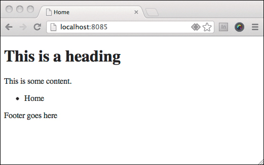
If you run ls, then you’ll see that when Dexy was run, it created a couple of new folders. One of these is the output-site folder, and Dexy has created a basic mockup for us and put it in there. You could open the index.html file from that folder in your browser, but Dexy provides a simple web server to make things easier. Just run dexy serve. You’ll see a message similar to this one:
serving contents of output-site on http://localhost:8085
type ctrl+c to stop
Open your browser to the URL in the message and you’ll see the default mockup page (which has practically no content and uses no style sheets). It’s not much, but it’s a working static web page. You’ll add your own content and style sheets (Figure 8.3). Go ahead and type CTRL-C in your terminal to stop the web server.
• A content inventory
• At least one responsive content reference wireframe (and perhaps more)
• A linear design, which you converted from Markdown to HTML using Pandoc
• At least one breakpoint graph
• Sketches of what you’d like the site to look like at the various breakpoints
Since this mockup folder is new (it was created by Dexy when you ran dexy gen), we need to add assets like images and CSS to it. Copy your images folder (if you have one) and your styles folder from the project folder that contains your linear design and wireframes. In this mockup folder, you should now have images and styles folders in the same folder as dexy.yaml. If you have other assets, or folders you use if you use a CSS preprocessor, then you can copy them over them same way.
You can copy folders from the command line, if you like, by using cp -r.
Including style sheets
It’s possible that you’ve already created the style sheets for your mockup. Whether or not you do, you’ll still need to link to these files. Earlier I mentioned that the head part of your HTML is managed by the _head.html file, which is in the macros folder. Open that in a text editor:
<head>
<meta charset="utf-8">
<meta name="viewport" content="width=device-width,initial-scale=1.0">
{% if page_title == '' -%}
<title>Home</title>
{% else -%}
<title>{{ page_title }}</title>
{% endif %}
</head>
Now add the links to your style sheets:
<head>
<meta charset="utf-8">
<meta name="viewport" content="width=device-width,initial-scale=1.0">
{% if page_title == '' -%}
<title>Home</title>
{% else -%}
<title>{{ page_title }}</title>
{% endif %}
<link rel="stylesheet" href="styles/base.css" media="screen">
<link rel="stylesheet" href="styles/medium.css" media="only screen and (min-width: 600px)">
<link rel="stylesheet" href="styles/large.css" media="only screen and (min-width: 900px)">
</head>
Tip
Starting and stopping dexy serve can get annoying, so you can open a second terminal and simply keep it running from there, or if you’re more experienced with command line utilities, you can use something like GNU Screen.
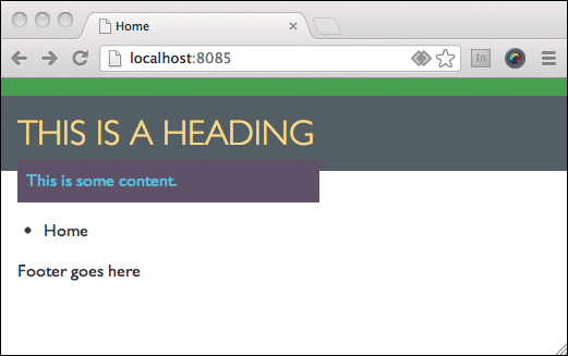
Whenever you want to run Dexy again, you have to reset Dexy’s cache. The easiest way to do that is by running dexy -r, which clears all the Dexy stuff from the current run, and then reruns Dexy. Try it now, followed again by dexy serve. Now refresh the page in your browser. The non-content is still there, but you should see that your styles have been applied (Figure 8.4).
Adding content
Now comes the fun part (well, OK, one of the fun parts; all of this is fun, right?). Replace my index.markdown with your own—the one you made for your linear design. It must still be called index.markdown. Now run dexy -r again, and make sure you have a Dexy server running.
When you refresh the page in your browser, you’ll see your narrow-width design.
Note
dexy serve is simply Python’s SimpleHTTPServer serving the contents of the output-site folder. But it sure is a lot easier to type.
Sectioning content
In order to lay things out on the screen (and yes, to denote content semantics), we’re using the HTML <section> element to contain things, just like in the wireframe. Earlier I mentioned that you could copy each piece of content and paste it into its corresponding <section>. Since HTML is perfectly legal Markdown, a quick way to do this is to take the HTML that you already generated with Pandoc—everything between <body> and </body>—and paste it into index.markdown. That’s not very elegant, though, because we don’t get the advantages of Markdown.
Another way to do it is to use hybrid HTML/Markdown, where you use the sections from the wireframes in index.markdown, but you fill each with the corresponding Markdown text. This is hard to explain, so here’s an example:
<section id="synopsis">
In our industry, everything changes quickly, usually
for the better. We have more and better tools for creating
websites and applications that work across multiple
platforms. Oddly enough, design workflow hasn't changed
much, and what has changed is often for worse. Through
the years, increasing focus on bloated client deliverables
has hurt both content and design, often reducing these
disciplines to fill-in-the-blank and color-by-numbers
exercises, respectively. Old-school workflow is simply not
effective on our multiplatform web.
Responsive Design Workflow explores:
- A content-based approach to design workflow that's
grounded in our multi-platform reality, not fixed-width
Photoshop comps and overproduced wireframes
- How to avoid being surprised by the realities of
multi-platform websites when practicing responsive web
design
- How to better manage client expectations and
development requirements
- A practical approach for designing in the browser
- A method of design documentation that will prove more
useful than static Photoshop comps
</section>
We’re using Markdown as usual, but surrounding certain content areas with the right section (or div if your prefer). This is flexible, since we don’t need to change our templates, and it’s still very human-readable and easy to edit, even for nontechnical people. Let’s keep things as simple as possible and use this method here.
There is a third method, which the more technically inclined might prefer, and that is to separate the content of a page into chunks, and include these chunks in a template file. This requires more extensive knowledge of both Jinja and Dexy, but it offers consistency in your sectioning. If you look at _base.html, you can see how the includes are done. Here, you can see how the footer is included:
{% block footer -%}
{% include 'macros/_footer.html' %}
{%- endblock %}
If you opted for this last method, you would add these types of includes for each section, and you do that in _template.html, or you could alternatively create several different templates for different types of pages. You would then need to use the dexy.yaml file to tell Dexy what to do with all those snippets.
While this method is useful for larger sites, we already have so many good things going for us solely by doing a web-based design; since our design is only a few mockup pages, let’s simplify by doing our sectioning in Markdown files. Jinja templates are quite powerful, so feel free to research them more if you like!
In summary, to section your content, surround chunks of content in your Markdown file with the corresponding section elements from your wireframe, as in the example above. You’ll end up with something like this:
<section id="book-title">
# Responsive Design Workflow
by Stephen Hay
</section>
<section id="synopsis">
[ some content ]
</section>
<section id="purchase">
[ some content ]
</section>
<section id="resources">
[ some content ]
</section>
<section id="errata">
[ some content ]
</section>
Your content will be between the section tags. Since only the sections are in HTML, this makes for a very readable file. Even nontechnical people will be able to edit it.
Keep in mind that Pandoc has to figure out what’s HTML and what needs to become HTML, and that’s not always simple, so Pandoc might get it wrong. My experience is that it’s a good idea to leave a blank line before a closing HTML tag, as in the above example.
Note that we’re using Pandoc, and if you choose to use another Markdown implementation, you’ll have to go about things a bit differently to get the HTML/markdown combination working correctly. One thing I like about Pandoc is that it converts the things between normal HTML tags into HTML. Plain Markdown does not.
When you’ve finished sectioning your content, it’s time to take a look at the configuration file.
Dexy’s command center: The dexy.yaml file
When Dexy runs, it reads a configuration file. A few different formats are supported, from plain text to JSON. Arguably the most useful is YAML, which is human-readable yet structured.5
The dexy.yaml that I’ve included in the RDW template looks like this:
site:
- .markdown|pandoc:
- pandoc: { args: '-t html5' }
assets:
- .css
- .js
- .png
- .jpg
You can see that YAML consists of entries in the form:
Something:
- sub-something
These are key/value pairs. In this configuration file we have two things: the pages of our site and the assets we’ll use. Those are the main sections of the file. The assets section is a simple list of file types. Dexy will copy anything we list and do not pass through a filter. So, in this case, we’re saying, “Copy all files with these extensions. These are our assets.” It doesn’t matter that the assets might be in different folders; Dexy will copy the enclosing folders over as well.
The site section is a little different, and it’s a small sample of how powerful Dexy really is. Let’s look at it again:
site:
- .markdown|pandoc:
- pandoc: { args: '-t html5' }
This says, “Our ‘site’ should be built from any pages with the .markdown extension. Find these pages and pass them through Pandoc. When you run Pandoc, run it with the argument -t html5.”
If you’ve come to the conclusion that this does the exact same thing as running Pandoc straight from the command line, you are correct. In this simple example, that is indeed the case. But by Chapter 11, that will certainly not be the case. Plus, Dexy’s “website reporter” is taking care of all the Jinja templating in our template files, adding things like navigation, the main content, and the footer. Thus, we’re achieving more than simply using Pandoc at this point.
Use this simple default I’ve made for you, but play around a bit. If you use SVG images in your mockup, what should you do? Just add a line to your assets section:
assets:
- .css
- .js
- .png
- .jpg
- .svg
Relatedly, if you’re a hardcore nerd and want to hand-code all the HTML in your mockup, your configuration is simpler because you don’t need a filter:
site:
- .html
In this scenario, of course, you would have index.html instead of index.markdown.
We’ll be doing a lot more with filters in Chapter 11 when we create a style guide.
Finishing your design mockup with CSS
At this point, we’ve fiddled around with a tool for long enough. You’ll need to go through the steps we walked through in this chapter, adding to and changing your CSS so the page looks like your design at and between each breakpoint. The difference is that now you’ll be doing this within Dexy as opposed to doing it in a static HTML file. Keep a Dexy server running, and you can update by running dexy -r and refreshing your page in your browser (Figure 8.5).
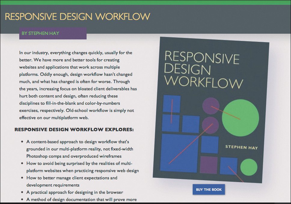
Figure 8.5. A finished design mockup. If you squint your eyes, it looks a bit like a Photoshop comp.
Remember that the hard part of design is the thinking part. It’s coming up with the design in the first place. You’ve done that already. All you’re doing now is creating a version of that design which is responsive and easily maintainable.
Multiple pages
Let’s look at one more trick that Dexy and the RDW template offer you before we move on: you can (and often will) have a mockup that consists of several pages, and they’ll be linked up automatically. When you looked at your page in the browser after Dexy was done with it, you should have noticed a single bullet point above the footer: “Home.” This, believe it or not, is a menu with a single item—not very useful, in fact, unless you have more than one page in your mockup.
The navigation is offered out of the box, and can be useful in many cases (Figure 8.6). Let’s say you’re doing a mockup of a home page, but also a mockup of a login page. The menu, which you can style as you please, allows you or your client to click back and forth between the pages. Then later, when you also mock up a registration form, the menu will pick it up automatically.
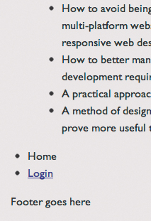
Let’s try it. In your mockup directory (the folder that contains dexy.yaml) create a folder called login. Put a file in there called index.markdown, and add a heading, just so we can verify later that it is in fact the login page:
# This is the login page
Now run dexy -r again and visit the home page again in the browser. You should now see that the navigation includes a link to the login page, and the login page includes a link to the home page.
That’s it—it’s pretty simple. Of course, you’re free to add a menu any way you please. You can hard-code them if you really, really want to. If you want to get rid of the default menu functionality for whatever reason, just remove the following line from the top of _base.html:
{% from 'macros/nav.jinja' import menu with context -%}
Jinja-geeks are also free to change the nav.jinja template to their heart’s content.
What we’ve covered
In this chapter, you’ve learned how to combine your wireframes with your linear layout to form the foundation of a web-based mockup. You learned how to combine these two deliverables within the context of an SSG (static site generator). You’ve been introduced to Dexy and learned how to install it as well as how to pull in your existing assets. You learned what templates are and got a tiny glimpse into Dexy’s configuration file and how filters work. And finally, you learned how to take advantage of Dexy’s built-in optional site menu templates, making it child’s play to add extra pages to your mockup and have Dexy generate a menu automatically.
Once you get your mockup done, it’s time to present your design to your clients, your team, your stakeholders, and others. How you present web-based design mockups is every bit as important as the design itself. We’ll talk about how to do this in the next chapter.