
11. Creating Design Guidelines
“As much as I love things in flux, I love them within a frame of reference—a consistent reassurance that at least and at last I am the one responsible for every detail.”
—MASSIMO VIGNELLI
One day in college my graphic design professor brought in a set of design guidelines from Apple Computer. We’d been working on logos and identity design, and here was this book (it was literally a book) with rules regarding the Apple style and how to use it. This was back when Apple had the multicolored logo, an apple with a rainbow in it—at least, that’s the way it appeared to me. I was struck by how complete it seemed. It described an entire design system. This was light years ahead of what we were doing in class: spending weeks and weeks to come up with a logo and create some simple stationery with it. This was the real work.
After studying that manual for days—how type was used, how ads were created—I started thinking about the manual itself. What a crazy amount of work it must have been to write the book, design it, and create it. All the design decisions had been painstakingly recorded so that other designers, anyone implementing Apple’s design system, could do so in a way that was consistent with everything else that had been done. The book solidified all of that creativity into a set of rules, a recipe of sorts. It was amazing to me.
Years later, I found myself creating similar guidelines, though admittedly on a smaller scale than the Apple manual. I didn’t much like doing that work. The creative part was finished, I had designed the building blocks for identity systems, and documenting them wasn’t my favorite activity. In fact, on most projects, I didn’t have to. So when it wasn’t requested of me, I didn’t document. When I had to account for additional parts of the system, say, when we were asked to create an annual report, I would simply look at all the other stuff I had done for the same client and try to extract the system out of that. Let me tell you, that takes a lot of time.
Had I taken the time to document the system, I would have had a set of building blocks that I could pull out and use as a basis for my design. The saying “good judgment comes from experience, and experience comes from bad judgment,” which has been attributed to just about everybody, applies here. I began documenting the systems I designed, even if only for my own use in future projects for the same client.
Design manuals and the web
Design guidelines, style manuals, design standards, identity guidelines—they all mean basically the same thing, and they’ve been created for print design for many years. However, for websites, they’re a bit less commonplace. That’s changing at the time of this writing; articles like the one that Anna Debenham wrote for 24ways.org have sparked interest in the subject within the web design industry.1
1 Anna Debenham, “Front-end Style Guides”, 24 Ways, http://24ways.org/2011/front-end-style-guides.
Documenting design systems for websites is at least as important as for print. Since websites aren’t always designed by the same people who design print collateral, we can’t always expect that a traditional design standards manual will include all the necessary information about the web design. Of course, it will depend on the client, the design firm, and the type of project, but we as web designers need to seriously consider burning design documentation into our workflow and making it part of the whole design package. It should be part of every design budget. Web design is system design.
The web offers advantages over printed manuals. For one, browser-based manuals cost less to make. They might not cost much less to design (although unfortunately I find many web-based design guidelines to be less well-designed than their printed counterparts), but they cost much less to produce. I mean, you don’t have to print and produce a book. When changes or additions are made to the design system, these web-based design guidelines can be quickly, easily, and cheaply updated with the newest information (Figure 11.1). Why printed manuals even exist anymore is beyond my comprehension, except maybe for their own sake. After all, traditionally, many of the printed manuals are beautiful objects in and of themselves.
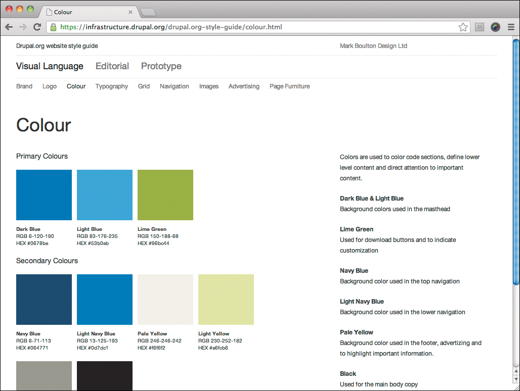
Figure 11.1. Design guidelines on the web, such as this style guide for Drupal.org by Mark Boulton Design, offer many advantages compared to printed manuals.
Another advantage that the web offers is that it’s easy to provide and link to design assets. Creating an ad? Choose Advertising from a menu, read how ads are constructed, and download the necessary materials. Since all print design workflow is now digital, all kinds of assets can be offered online, from logos and layout grid templates to color profiles and prepress application settings. The same goes for websites. In addition to the basic rules of the design system, assets such as icons, fonts, imagery, and CSS snippets can be made available for use by designers.
The main reason I include the creation of design documentation in the responsive workflow is that web-based mockups, while sufficient for communicating the basics of a design to clients and developers, are not sufficient for communicating a design system. The mockups show only specific applications of the system; they neither explain the system itself, nor show how to use that system to create other applications. This is why I often say that web-based mockups and design documentation together are the dynamic duo of the new workflow and are a potential replacement for Photoshop comps. Though to be honest, I never really felt that Photoshop comps alone were enough to communicate a system, either.
Web-based design documentation can do this. But we have to write it first.
The content and structure of design guidelines
There are no real guidelines to creating guidelines, though every designer who has made them could probably come up with his own. Massimo Vignelli’s New York Transit Authority Graphics Standards Manual (1970) is one of my favorites (Figure 11.2). By looking through the table of contents you can see that it’s really tailor-made to the project.2
2 http://thestandardsmanual.com
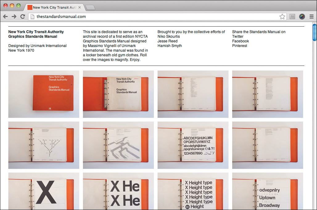
Figure 11.2. This 1970 design standards manual for the New York City Transit Authority shows how content can cater to specific use cases.
This will be true for you as well, but here are some topics to consider including in your design guidelines, depending on their relevance to your project and the project scope:
• Design philosophy/background information
• Layout/grid system
• Typography
• Color and texture
• Imagery (whether illustrative or photographic)
This format is used for the table of contents in some manuals. However, it’s completely acceptable (and perhaps more logical) to cover these topics, but structure your manual according to the sections or components of a website.
The idea is to describe the available design elements, explain when it’s appropriate to use them, and show how to use them in those situations. It’s like, “You can use these types of pieces to build a model airplane. Here’s how to do that.”
When creating your own guidelines, don’t grab someone else’s table of contents: closely examine the needs of your project and the materials you’ve created for it. There are no set rules.
Websites are different
It’s very possible that, when you create design guidelines for your website, you’ll have a section about the color palette and how to use it. This color palette will be used in many places, however, so you’ll want to document how the various colors should appear in a specific context. For example, you might write a section about links and buttons, and show the color usage there in addition to the general overview of color. In the end, which colors are important, but where and how they should be used is more important.
Set up a structure that makes sense for your particular project. You’ll also want to choose whether your guidelines will consist of a (perhaps fairly long) one-page document or become a small website in and of itself. You’ll need to decide whether or not you need a table of contents, with each item linking to its corresponding section. There is no right or wrong. The most important thing is that your guidelines communicate and thus aid in consistency and collaboration.
My wish list for design guideline software
The easiest way to create guidelines for websites is with software. I don’t mean use a word processor or anything else you might type into. The easiest way to explain what I mean is to reveal my wish list for web-based design documentation software.
1. It should be freeform writable.
A lot of documentation software requires you to do weird things like write all your documentation as comments in the source code itself. I find this nonintuitive and restrictive. I want to be able to simply write a document in a plain text format such as Markdown, and be able to place images, HTML, or code in there when necessary.
2. Taking of screenshots should be automated.
Ideally, a good documentation system would let me choose between adding live HTML examples or screenshots. I tend to use screenshots more often, as I know exactly what the reader of the guidelines is seeing. For a given project, you might have tens or hundreds of screenshots. I really don’t want to make those by hand—having to do a number of them again each time a change is made. I want this to be an automated process.
3. Code snippets should update themselves when the mockup changes.
Similar to screenshots, I want the code in the documentation to be updated whenever I make changes to the mockup. See the sidebar for why I use code in design guidelines in the first place.
4. Elements and components should be extracted from the mockups.
Some toolkits for creating style guides and pattern libraries require you to put each element or group of elements into separate files. If a site has many elements this is a maintainability issue. I would find it much easier to extract each element I want to document straight from a mockup and have that code placed into my documentation at the appropriate spot.
5. Code snippets should be syntax highlighted.
Syntax highlighting makes code easier to read and understand. Your clients might just gloss over code snippets, but developers who have to create new pages based on your design will have a much easier time of it if your code is easy to read. In fact, with relatively easy-to-understand languages like CSS, syntax highlighting can even enable nontechnical people to understand what the code means. While not an absolute necessity, syntax-highlighting libraries are available and they’re a nice thing to have.
I haven’t found a single piece of software that does all of these things out of the box. But remember how we used Dexy in Chapter 8, “Creating a Web-Based Mockup,” to create our mockups? I use Dexy for design guidelines, too. In fact, design documentation is the reason I started using Dexy in the first place; that I could also use it for mockups was just a bonus, and allowed me to keep my toolset smaller by using the same tool for different things. While Dexy doesn’t do everything I want, it utilizes other software applications through its filters. This gives me all the functionality I currently want and more.
Creating your design documentation
Now let’s walk through the process of creating design guidelines using Dexy. Once you get the hang of it, you can tweak it to suit your taste. For now, just relax and follow along. The process for creating your design guidelines is remarkably similar to how you created your mockup in Chapter 8.
First, in the command line, move into your project folder and run:
$ dexy setup
Now Dexy is ready to run when you need it, and Dexy’s artifacts and logs folders have been created (you don’t need to worry about these; Dexy uses them).
As with the mockups, I prefer my files to contain only the main content, and keep the header and footer in separate files. I could have run the same dexy gen command I ran in Chapter 8, but since the example design guidelines will be very simple (a single web page), we’ll just create a simple header and footer by hand. Start with the header. Create a file called _header.html in your project folder. The content of this file will be almost identical to the content of the template we made for use with Pandoc in Chapter 4, “Designing in Text”:
<!DOCTYPE html>
<html lang="en">
<head>
<meta charset="utf-8">
<meta name="viewport" content="width=device-width, initial-scale=1">
<title>Design Guidelines</title>
<link rel="stylesheet" href="styles/guidelines.css" media="screen">
</head>
<body>
You can probably guess that you’ll also need to create a file called _footer.html. And indeed, this will contain the following content:
</body>
</html>
Note
If you want a design manual with multiple pages, you can set up Dexy with the same approach as in Chapter 8, using the rdw:mockup template. The templates are more complex, but the idea is similar. Also, keep an eye on responsivedesignworkflow.com, as new templates may be added in the future and existing ones updated.
Now that you have a header and a footer, you need a file for the main content of the style guidelines. You could just call this guidelines.markdown. That’s simple and clear: this is the place for the design guidelines. Go ahead and make this file now, which will sit in the project folder along with _header.html and _footer.html. Later, Dexy will combine these three files to create a single HTML file containing the design guidelines.
Writing the documentation
No matter what tools and tricks you use, software can’t write the documentation for you. Writing is the hard part. It’s the important part of documentation. Well-written documentation makes software easy to use. It makes design guidelines easy to follow and thus makes designs easer to implement. It improves communication within the team. Spend plenty of time on getting it right. The writing should be the main part of your documentation.
Style guides are not novels, and most people won’t read them from cover to cover, so to speak, so make sure nothing’s hidden. Think about what situations your reader might be confronted with that would lead them to consult your guide. Provide basic principles for using your designs as well as detailed information for the various situations you think up. Repetition and cross-references are fine and encouraged.
Examples are great, and a lot of this chapter focuses on automating the inclusion of examples in your design documentation. Please don’t think that this focus means examples are more important. They’re not. Examples, such as screenshots and code snippets and even live, working code, are simply aids to understanding well-written text.
I recommend starting with this content as well, in much the same way I recommend starting the responsive design workflow with content. Content first counts just as much for design guidelines as it does for your mockups.
It could be that this content is not written by you. This is one good reason to use Markdown: anyone with five minutes of training can write content in Markdown. The actual text might be written after the design is created, but if you or a fellow designer is writing it, it might be written during the making of the design. In my experience, it’s both: some parts of the guidelines are written during the design phase (such as philosophy and background information) and some parts are written after the mockups have been completed (mainly because that’s when the client has approved everything and you know it’s safe to include).
Either way, guidelines.markdown is where this documentation will go, if you’re creating a one-page doc as we’re doing in the example for this chapter. You’ll be creating guidelines that describe the design in your mockups, but let’s create a really simple document just to understand how all the pieces fit together. First, put a little bit of text into the Markdown file:
# Responsive Design Workflow book site: design guidelines
This page contains the design standards used in creating the book site. These guidelines can be used to create subsequent pages or other web projects related to the book.
## Background
The site has been designed to be a companion to the book, in terms of both visuals and content. The basic color palette, typography, and other aspects of the book's design language have been ported to the web, while attempting to remain consistent with the look and feel of the book. The biggest difference between the book site and the design of the book itself is in regard to layout: the website uses a responsive approach, in which the layout may change depending on the size of the user's screen. Content remains consistent regardless of the device.
## Responsiveness and breakpoints
There are three major breakpoints for the page layout: `400px`, `600px` and `900px`. The following examples show how the website looks at these three viewport widths:
Now we come to the point when an example must be inserted. It might not be desirable to stop at every example, so while writing, simply insert a placeholder where you want to put the example, something like:
[[INSERT SCREENSHOTS HERE]]
You can then go back and add your examples later.
Note
Pixels are used here for consistency with our example breakpoints when we took screenshots in Chapter 9. If you took your screenshots using other units like ems, then by all means use those here as well.
Inserting example material
There are many different types of examples you might use in your documentation:
• Illustrations, such as breakpoint graphs
• Screenshots of whole pages or specific sections or elements
• Actual code, such as a block of CSS
• Actual rendered code, like an actual button or animation
Of course, you can include anything you would in HTML, such as video. Remember that Markdown is a front end for HTML, so you’re allowed to use HTML in your Markdown, should you wish to do so.
Continuing with the example documentation above, we want to include three screenshots of the page, one at each major breakpoint. Luckily we already have the screenshots we made in Chapter 9, “Presentation, Round One: Screenshots.” So to get these into the documentation, we need only link to them:


This is exactly the same effect as using the <img> element in HTML: it simply pulls in an existing image. We can use the power of Dexy combined with CasperJS to create screenshots of everything we need, pulling them into the documentation at the placeholders automatically. This gives us the advantage of not having to change anything by hand if edits are made in the original design; running Dexy will take care of updating the screenshot and inserting it into the documentation.
Let’s try it out.
Creating screenshots
To create the screenshots in this example, you’ll need a slightly modified version of the script you made to take screenshots for presentation mockups in Chapter 9. You can either make a copy of that screenshot script (in your mockup folder) and put it in your project folder, or you can make a new one. You can keep the name screenshots.js, as this won’t conflict with the one in your mockup folder. The script should look like this:
var casper = require('casper').create();
casper.start();
var baseUrl = 'http://localhost:8085'; // <- Should be the host Dexy names when running "dexy serve"
var breakpoints = [400, 600, 900];
casper.open(baseUrl).then(function () {
breakpoints.forEach(function(breakpoint) {
casper.viewport(breakpoint, 800).capture('images/' + breakpoint + '.png', {
top: 0,
left: 0,
width: breakpoint,
height: casper.evaluate(function(){ return document.body.scrollHeight; })
});
});
});
casper.run();
This one is a lot simpler, because we don’t have to loop through a list of pages. (If you decide that you want that, then you could simply use the same script we used in Chapter 9.) This script opens up the home page of the mockup that’s being served via dexy serve and takes a screenshot at each of the breakpoints in the breakpoints array. The name of the saved file is [breakpoint].png and the file is placed in the images folder. So we have to change the links in the Markdown document:


It’s that short and sweet. Now in order to get Dexy to run the CasperJS script, we have to tell it what to do by using a dexy.yaml file.
Making the Dexy configuration file
Dexy reads a configuration file so it knows what to do. This file is required for every Dexy project. Make a new, empty file in your project folder and call it dexy.yaml. We’ll walk through the creation of this file step by step. First, let’s tell Dexy what we want to happen to guidelines.markdown:
guidelines.markdown|pandoc|hd|ft:
- partials
- screenshots
Here, we’re saying, “Run guidelines.markdown through Pandoc, then Dexy’s header (hd) filter, then Dexy’s footer (ft) filter. The file utilizes partials and screenshots.” Right now, Dexy doesn’t know what partials are (they’re the files we’re using as a header and a footer, and we’re just calling them partials) or where the screenshots are:
guidelines.markdown|pandoc|hd|ft:
- partials
- screenshots
partials:
- _*.html
This last line tells Dexy that a partial is any file in the project folder that starts with an underscore and ends with the extension .html, in this case, the header and footer files. Next, we have to tell Dexy about the screenshots:
guidelines.markdown|pandoc|hd|ft:
- partials
- screenshots
partials:
- _*.html
screenshots:
- screenshots.js|casperjs
This says to run screenshots.js through casperjs. Now we should be good to go. Save this whole thing and we’ll test the project.
Testing your Dexy project
Since you want to take screenshots of your mockup, you need to run dexy serve from within the mockup folder. But you will also need to run Dexy while you’re doing that. Since that’s not possible to do in one terminal, you’ll need to either use a tool like GNU Screen if you’re familiar with it or open a new terminal (in a new tab or a new window; either is fine). In one terminal, navigate to your mockup folder (the one that also contains a dexy.yaml you made in Chapter 8) and run dexy serve. Go to the address Dexy gives you in a browser to confirm that it’s working. If so, then switch to the other terminal, make sure you’re in the folder with guidelines.markdown, and run dexy.
Dexy should complete within a few seconds. If you look in your project folder, you’ll see that Dexy added an output folder. Open that folder, and you’ll see some files and an images folder. The file guidelines.html is the design guidelines web page Dexy generated for you. Open the file in a browser and take a look (Figure 11.3). It’s not pretty yet, but you can see that Dexy has:
• Converted the Markdown content to HTML
• Created the screenshots that are called up by the converted HTML content
• Wrapped the converted HTML content with a header and a footer, creating a proper web page

Figure 11.3. Dexy has generated an unstyled HTML document from Markdown content and created and imported screenshots.
The guidelines document still needs styling of its own (we already prepared for that by linking to guidelines.css in _header.html; you can make this file and use it to style your guidelines doc), and will also require more content. There’s no need to create a complete style guide out of our example, but let’s do just enough to show you how to include screenshots of specific page elements, live HTML from your mockup, and pieces of code.
Taking screenshots of specific elements
You now know how to insert screenshots of whole pages into your design documentation. But what if you only want to include part of a page? Remember that Dexy isn’t actually taking screenshots; it’s running CasperJS for you. This means that all the screenshots you want to take and how you want to take them are determined by screenshots.js. Let’s see how we can use CasperJS’s captureSelector() function to capture screenshots of specific elements.
Note
There’s a lot you can do with CasperJS, so for the really fancy stuff I must refer you to the CasperJS documentation (which is quite clearly written), as the details are outside the scope of this book. See http://casperjs.org/.
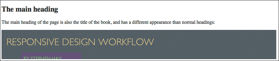
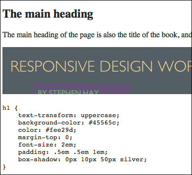
Until now, we’ve been using the capture() function, which captures a whole page. captureSelector() takes a selector as an argument and captures only the selected element. This can be extremely useful, and by combining the breakpoint looping we’ve been doing with captureSelector(), it’s even possible to take screenshots of specific elements when the page is at different widths. For now, let’s just grab an image of the h1 heading from the page. First, we need to add some content to the documentation, since we’re talking about the heading. Under the images you added earlier, add some text about the h1:


## The main heading
The main heading of the page is also the title of the book, and has a different appearance than normal headings:

I think you know where we’re going with this. We need to adjust screenshots.js so it will capture a shot of the heading in addition to the full-page screenshots we already have.
Note
You’ll have to add something to screenshots.js for every screenshot you want, but you’ll usually have to do it only once. Remember, if your mockup changes, then your changes will be in new screenshots in the updated documentation when you run Dexy again!
Add the desired screenshot to screenshots.js using the captureSelector() function:
casper.open(baseUrl).then(function () {
breakpoints.forEach(function(breakpoint) {
casper.viewport(breakpoint, 800).capture('images/' + breakpoint + '.png', {
top: 0,
left: 0,
width: breakpoint,
height: casper.evaluate(function(){ return document.body.scrollHeight; })
});
});
});
casper.then(function() {
this.captureSelector('images/h1.png', 'h1'),
});
casper.run();
The function takes two arguments: the name of the file to be saved and the selector, in this case simply h1. If you’re familiar with CSS selectors, you know everything you need to know: #foo will select the element with an id of foo. CasperJS will even allow XPath expressions, if you prefer.
Look carefully at that casper.then() function block we just added. To make things easy to change, if I need screenshots of 20 different elements, I’ll simply place 20 of these function blocks under one another, each capturing a different element. It won’t win you any JavaScript awards, but hey, we’re making design guidelines, not a mission-critical JavaScript app.
Now run dexy -r, which resets Dexy and runs it again. When you open guidelines.html, you should see the text about the heading and the screenshot included (Figure 11.4).
Including rendered HTML
Sometimes you might want to have actual working, rendered code show up in the browser as part of your design guidelines. For example, you might have a button that has a certain hover effect, and you don’t feel that a screenshot is sufficient. Adding this kind of code is possible, and one way to do it is to use Dexy’s htmlsections filter (yes, Dexy has a lot of filters, and you can even make your own).
I don’t do this often. We already have mockups that contain these elements if someone needs to hover above a button. It’s good practice to link to the mockup from the design documentation anyway. In fact, the mockups are, in my opinion, an essential part of the design documentation.
Inserting rendered HTML into your docs takes more time than screenshots, because you need to place special comments in the mockup surrounding the parts you want to extract. Not only that, but unless you use the same CSS for both your design docs and your mockup, you’ll need to devise your own method of styling the elements you import, since they won’t have the mockup styling by default. However, should you want to do it, here’s how.
To keep the example simple, let’s say you don’t want a screenshot of the h1, but you want the actual h1 in your docs. You need to tell Dexy that the h1 is what you want. Open the mockup HTML file from which you want to extract the h1, and add comments above and below the code you want to extract:
<!-- section "h1" -->
<h1>Responsive Design Workflow</h1>
<!-- section "end" -->
Note
If you use htmlsections to pull out HTML code for rendering and you add the special comments to your Dexy-generated mockup file, they’ll disappear when you update your mockup. You’ll need to add the comments to your original markdown file and run dexy -r in your mockup folder first, then move to your project folder and run dexy -r there as well.
Then you need to adjust your dexy.yaml file to tell it to run your mockup HTML through the htmlsections filter:
guidelines.markdown|pandoc|hd|ft|jinja:
- partials
- screenshots
- sources
partials:
- _*.html
screenshots:
- screenshots.js|casperjs
sources:
- mockup/output-site/index.html|htmlsections
Here we’ve added a new input source for the guidelines document, from which we’ll extract the HTML we want. You can’t call up the h1 in the same way you called up an image. For this, you’re going to use a Jinja snippet. Dexy offers a way to see which snippets are available: the dexy viewer (Figure 11.5). Start by running Dexy again so your changes are processed:
$ dexy -r
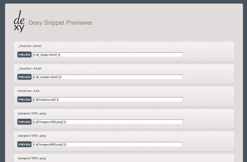
Figure 11.5. Dexy’s handy snippet previewer (dexy viewer) makes it easy to find the Jinja snippets you need to copy and paste them into your docs.
Now run:
$ dexy viewer
This will return a URL that you can open in your browser. You’ll see a page with a bunch of Jinja snippets; look for the htmlsections snippets. Copy the h1 snippet and paste it into your guidelines.markdown file:
{{ d['mockup/output-site/index.html|htmlsections']['h1'] }}
This works the same way as pulling in an image, only now it pulls in the HTML snippet. Run dexy -r again and open the guidelines.html document again (or refresh). You should now see the actual h1 at the bottom of the page.
It might take some getting used to the process, but you can see how easy it is to pull screenshots or HTML snippets into your documentation.
Now let’s look at how to pull another useful type of information into your design documentation: code.
Including syntax-highlighted code
There are many reasons you might want to include actual code in your design docs. You might have sections of your document in which you explain and annotate code from your website or application, CSS to complete the description of an element, code for the reader to copy and paste, or live examples of running code with the corresponding code displayed.
As mentioned, for each element I import CSS snippets in addition to a high-level description and screenshot. For example, next to a screenshot of the h1, I’ll import and display the CSS to show which styles apply to h1. The CSS provides a very specific description of how the h1 is styled. It might seem quite technical to use CSS in this way, but depending on how you write your CSS, it can be a very effective way to describe the visual rules that should be applied to an element. margin: 1em; is almost as understandable as, “The h1 must have a margin of 1em applied to it.”
Of course, you might choose to display only a high-level description of the visual rules of an element, but make the CSS available specifically for those looking for the styles that should be applied to display the element properly. Since the documentation is a plain HTML document, you can do anything you want with it, such as adding a bit of JavaScript to collapse these CSS code snippets so that nontechnical readers aren’t directly confronted with them. Interested readers can expand the snippets. That’s one of the great things about using web technology and tools like Dexy: you can completely tailor your own workflow.
In much the same way you can import code to render, you can import raw code to display. You still need to tell Dexy which code snippets you want to import. The syntax is slightly different than when we used the htmlsections filter. For importing CSS code, we’ll be using the idiopidae filter, which I’ll refer to as idio.
idio lets you cut code into sections by adding comments in the code. It works for many languages. To use it in your CSS, open your mockup’s CSS file and add comments surrounding each section you want to pull into your design doc, like this:
/*** @export "h1" css */
h1 {
text-transform: uppercase;
background-color: #45565c;
color: #fee29d;
margin-top: 0;
padding: .5em;
}
/*** @end */
Notice in the code above that you define an export by using @export "[name]", and ending it with @end. If the code blocks you’re using immediately follow each other, the start of a new code block implies the end of the previous, so in that case you can omit the @end. Just keep in mind that Dexy counts everything following an @export as a code block to be exported until it finds either a new block or an @end.
It’s important to use three asterisks to start your comments. Also, at the time of this writing, you’re required to add the name of the language after the name of your snippet; in this case, that’s CSS, of course. Depending on the code language, idio also works with single-line comment syntax, such as:
/// @export "foo" (does not work with CSS)
Go ahead and delineate a single code block in your mockup’s CSS using idio comments, as I’ve done above. Save the file. Now, as you might have guessed, we have to tell dexy.yaml that we’re using idio for CSS, and we have to indicate that we’ll be using yet another input source for our guidelines.markdown file:
guidelines.markdown|pandoc|hd|ft|jinja:
- partials
- screenshots
- sources
partials:
- _*.html
screenshots:
- screenshots.js|casperjs
sources:
- mockup/output-site/index.html|htmlsections
- mockup/styles/base.css|idio
Run dexy -r and then dexy viewer, then open the browser to the URL Dexy displays. You should see an updated snippets page, with a section for your CSS. Find the snippet with h1 in it and paste that into your guidelines.markdown file at the bottom:
{{ d['mockup/styles/base.css|idio']['h1'] }}
You’ll probably recognize by now that this snippet will pull in this particular bit of CSS at this spot in your document. Try it out by running dexy -r again and then opening the resulting guidelines.html file (or refreshing the one you had open) in your browser. When you scroll down to the bottom, you should see a bit of CSS code with the h1 styles (Figure 11.6).
Note
You may have noticed a dexy.yaml in your mockup folder and one in your main project folder. To update your design documentation and create a new guidelines. html, run dexy -r in the project folder. To update your mockup, run dexy -r in your mockup folder. Dexy reads the YAML file from the folder from which you run it and acts accordingly.
This is already pretty cool; we can pull in screenshots or actual HTML of an element, and we can pull in the CSS that describes the styles of that element. If we do this for most or all of our elements, we have put all the moving parts in place to generate a good portion of our design documentation on the fly. When you make a change in your mockup, run dexy -r again and voilà, you have updated documentation. Both screenshots and code are updated.
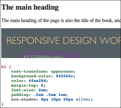
Now you’ve got this CSS code in your docs, but it’s all black. It would be nice to syntax highlight this code. Because of the idio comments we used in the CSS, idio knows we’re pulling in CSS code. idio also supports syntax highlighting out of the box, using Python’s Pygments syntax highlighting library.3 To take advantage of this, let’s edit _header.html and a little bit of Jinja that will pull in a syntax highlighting style sheet. Put the following in the <head> element:
<style>
{{pygments['pastie.css']}}
</style>
Save the file. Here you can see that we’re inserting a Pygments style sheet called pastie.css. This gives us highlighting in certain colors. There are other style sheets to choose from; you can find out more at the Pygments website. For now, just use pastie.css. Now run dexy -r again and refresh guidelines.html again. Scroll down and look at the CSS. It’s syntax highlighted (Figure 11.7)!
Making the documentation your own
When creating your own documentation (your own style guide, if you will), you’ll want to design it as well. It’s a normal web page, so you can link to your own style guide CSS from within _header.html (Figure 11.8). You can add scripts, a table of contents, and anything else you need. You can create a multipage style guide by doing everything we’ve discussed above, but using the rdw:mockup template as we did with the mockup instead of the single markdown file we used in this example.
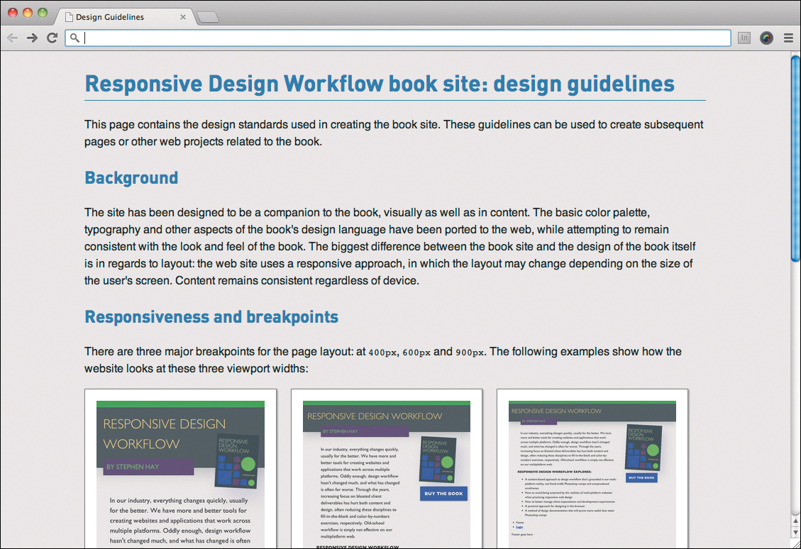
Figure 11.8. Since the style guide is just HTML, it’s easy to add your own style to make your docs fit your client’s brand.
It can take a little while to wrap your head around the way Dexy works and keep track of the moving parts. The key is to do as we’ve done in this chapter: start with a simple Markdown file, add the header and footer, and slowly add and try out each piece to see how it works.
And by all means, if you like doing your style guides in Word, InDesign, or PowerPoint, more power to ya (but you might see me out having fun while you’re still updating your docs by hand). This chapter presented some of the building blocks you can use to automate a good portion of your design documentation. It’s up to you to take it where you want it to go.
Now it’s time to go
This marks the end of this book, how I end my responsive design workflow. It also marks a beginning: the beginning of your own experimentation. You might feel comfortable with the entire workflow. On the other hand, maybe you are very happy with your own current workflow, but perhaps find one or two ideas in this book that could be useful additions to your own way of doing things. You might know of other tools to accomplish the same things I’ve done here, or even better, you might build some of these tools.
You might do as I’ve done and find tools that were originally designed for other purposes, and use them for your own purposes. Some parts of this workflow might come across as too much too soon; many people have an aversion to using web technology as a design tool. Some will embrace it, as I have, though truthfully it did take me a while; I had the same aversion!
So turn the page and you’ll see, one last time, the steps in this workflow:
1. Create a content inventory (Chapter 2).
2. Make content reference wireframes (Chapter 3).
3. Design in structured text (Chapter 4).
4. Create a linear design (Chapter 5).
5. Determine breakpoints and document them using breakpoint graphs (Chapter 6).
6. Sketch and develop designs for the major breakpoints (Chapter 7).
7. Develop a web-based mockup of your design (Chapter 8).
8. Take and present screenshots of your design as your initial design presentation (Chapter 9).
9. Present and iterate on your web-based mockup for subsequent presentations (Chapter 10).
10. Create a style guide (Chapter 11).
When you’ve completed these steps and gotten your client’s approval, you can hand over your deliverables and be confident that you’ve done work that keeps the medium in mind, is based on structured content, embraces progressive enhancement, and is rooted in the responsive nature of the web.
As creative legend Paul Arden said,
“If you can’t solve a problem, it’s because you’re playing by the rules.”
Find out which web design rules aren’t working for you.
Then go break them.