
14. Building Pages with Dynamic Elements
A common feature of modern websites is widespread user interactivity enabled by extensive use of CSS and JavaScript. This allows applications that run inside a web browser to offer the kind of responsiveness that was once reserved for native applications.
In Dreamweaver CS3, Adobe added a library of widgets to enable web builders to make their sites look like cutting-edge destinations. This library—also referred to as a framework—was named Spry. In Dreamweaver CS5, Adobe expanded the program’s ability to use other, more popular frameworks (Spry never really caught on outside Dreamweaver), such as jQuery. In Dreamweaver CC, Spry has been eliminated in favor of widgets drawn from the jQuery UI project. No matter the framework, you don’t need to know anything about CSS or JavaScript to use widgets.
In this chapter, we’ll focus on working with jQuery UI widgets, showing you three examples. We’ll end the chapter by showing you CSS3 transitions, which allow fancy dynamic effects without any JavaScript at all.
What Is jQuery?
Before you start using jQuery widgets, it helps to know a little bit more about JavaScript frameworks and how they work behind the scenes.
A (brief) history of frameworks
When people first started adding JavaScript to pages, they quickly realized that a lot of the work they were doing was the same stuff over and over and over again. In recent years, it’s become common to let JavaScript handle more and more of the user interface (UI) duties. This means that websites have become smarter and more flexible, but it’s also been a lot more work for people who write code. Programmers tend to hate writing new code when they know someone else has already solved that particular problem. Instead, they go looking for free code offered by others, and in return offer their own solutions. The result is shared libraries of code that can handle most of the usual user interface requirements.
However, programmers also tend to have definite (and idiosyncratic) opinions about the “right” way to write code, and the result of that has been the creation of many different frameworks. If you’ve ever heard of libraries such as Dojo, YUI, or Prototype, they’re all more or less the same thing, built by developers who thought that their way of doing things was better than what already existed. Originally, Adobe jumped on the framework bandwagon by creating their own framework, called Spry, with the hope that it would be taken up by the programmer community. That didn’t happen, for a variety of reasons. So Adobe had a problem: Dreamweaver needed a framework, and their homegrown framework hadn’t caught on.
Adobe’s answer to this challenge was to embrace the most popular of the frameworks, jQuery, and add a user interface for jQuery widgets in Dreamweaver CC. A widget is a collection of code snippets (both CSS and JavaScript) that when added to your pages creates some standard effects.
About jQuery
The jQuery framework (jquery.com) is a freely downloadable, open-source set of utilities and controls that help you build interactive web applications. We think it’s one of the best, and since it’s become the most popular framework, it appears most other folks agree. These are some of jQuery’s strengths:
 Lightweight: It’s considerably smaller than many of its competitors, which means sites using it load more quickly.
Pre-made user interface widgets: A related open-source project, jQuery UI (jqueryui.com) is a set of user interface interactions and widgets built on top of the jQuery framework. Dreamweaver CC adds several of the jQuery UI widgets to a new category of the Insert panel, making it easy to add the widgets to your pages without any coding at all.
Ubiquitous: It’s very easy to integrate jQuery into your websites. You can host it on your own server, but many people prefer to use a link to jQuery hosted on one of the content delivery networks (CDNs), which are systems of servers spread throughout the Internet’s infrastructure, connected by fast pipes. When the user needs jQuery, the CDN serves it up from the closest server to them, making the page more responsive. Google and Microsoft both host the latest version (and some older versions) of jQuery on their CDNs. Best of all, if the user has recently visited a page that uses jQuery, they may already have some of the jQuery files cached, making your site appear to be amazingly fast.
Active development community: If you have a question, you can ask it in their forum and get a fast response, or you can search the archives to see if it’s a FAQ.
Plug-in architecture: If you need a feature that isn’t in jQuery, there’s a good chance that someone’s written it as a plug-in. An additional benefit of plug-ins is that you’re only adding them to your site when they’re needed—that is, you don’t have their added weight on every page.
Speed: Even in tests created by its competition, jQuery comes out ahead.
Ease of use for non-geeks: Because its selection queries are based on CSS, someone who isn’t a full-time professional programmer can easily drop into jQuery, add some functionality to their site, and have it work the way they expect.
For all of the above reasons, jQuery has become one of the—if not the—most popular JavaScript frameworks available.
Tip
If after working with jQuery you decide that you want to learn more about JavaScript, we recommend another book we’ve written: JavaScript: Visual QuickStart Guide, Eighth Edition (Peachpit, 2012).
Adding jQuery UI Elements
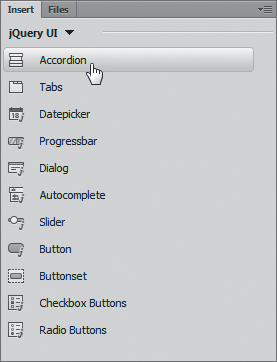
New to Dreamweaver CC is a set of jQuery UI widgets, which you can find in the new jQuery UI category of the Insert panel. Some of the widgets can work alone on a page, such as the Accordion, Tabs, and Dialog widgets. Others are meant to help you add extra interactive zing to forms, such as the Datepicker, Autocomplete, and Button widgets. We don’t have the space to document all of the widgets, so we’ve picked three as good examples: Accordion (as an informational element on the page), Autocomplete (to help fill out a form), and Datepicker (to easily choose a date in a form).
Using the Accordion widget
An Accordion widget is a set of panels in which one (and only one) is displayed at a time. When the user clicks a panel control, the panel opens or closes, with an animated effect. It’s a handy way to present several discrete chunks of information in a limited space.
To add an Accordion widget
1. In Design view, decide where you want the accordion on your page, and click the Accordion button in the jQuery UI category of the Insert panel  .
.
Begin adding an Accordion widget by choosing it from the Insert panel.
The accordion appears on the page  . By default, the accordion has three sections, each with a header and content area. If you click the accordion’s blue tab to select it, the Property inspector changes to show the widget’s specific controls
  .
.
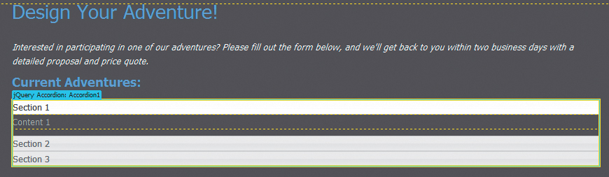
The accordion appears on the page, with its three default panels.
Clicking the accordion reveals its controls in the Property inspector.
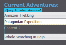
The first thing you need to do is change the section names. To do that, you select and type over each name.
2. Select and type over the first content section  .
.
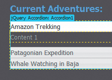
Replace the section names of the panels with the names you want.
3. To close the first content section and open the second content section for editing, move the mouse pointer to the right edge of the second header until the eye icon appears, with the tool tip “Click to show panel content.” Click the eye icon  .
.
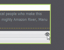
To show the content area for a closed panel, click its eye icon.
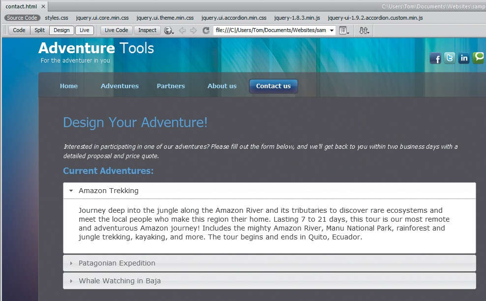
The second content area appears  .
.
With the second content area open, you can replace the placeholder text with your content.
4. Select and type over the second content section.
5. Repeat steps 3 and 4 for the third content section.
6. To see your work, click the Live View button  or preview in a browser.
In Live view, you can see the accordion in action and test how the panels open and close.
Tip
The Accordion widget doesn’t automatically take on the styling of the rest of the page; you have to style it to match using the CSS Designer panel.
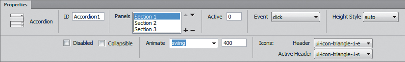
The Property inspector changes to show the Accordion controls  . These controls are as follows:
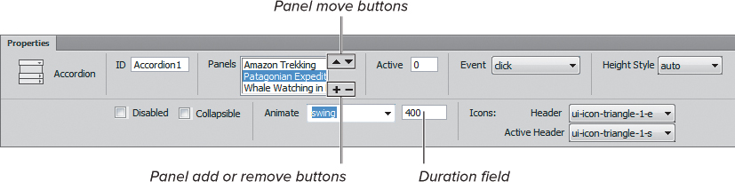
Use the Property inspector’s controls to change how the accordion acts.
 ID: Shows the name of the accordion, for use in targeting CSS and JavaScript.
Panels: Shows the names of each of the accordion’s panels, based on entries in each panel’s section areas.
Panel move buttons: Moves selected panels up or down in the list.
Panel add or remove buttons: Adds or removes panels from the accordion.
Active: the panel to be displayed by default. Numbering begins at 0, as is the way in JavaScript, so if you want the first panel to be active when the page loads, this field must contain 0.
Event: What user event you want to trigger a panel animation. Your choices are click and mouseover.
Height Style: Controls the height of the accordion and each panel. Your choices are auto, in which all panels will be set to the height of the tallest panel; fill, which makes each panel expand to the available height based on the accordion’s parent height; and content, which sets each panel to be only as tall as its content.
Disabled: Selecting this disables the accordion’s actions. Useful if you want to have an accordion on the page but disable it in certain circumstances, perhaps using a script to enable it when certain conditions are met. Note that selecting this does not remove the accordion from the page; it just keeps it from working.
Collapsible: If this is selected, then the user will be able to collapse all sections of the accordion. If unselected, one section will always remain open. We prefer to have this selected; the first section will always appear open when the page loads.
Animate: Allows you to choose the kind of animation the accordion uses.
Duration: The animation duration, in milliseconds. The default is 400 milliseconds, or four tenths of a second.
Icons: Allows you to choose the header and active header icons.
2. Adjust the controls in the Property inspector to make the changes you want. To move a panel up or down in the accordion, select its name in the Panels list and click the up or down buttons. To add more panels, click the plus (+) button, then enter the section name and content.
Tip
To remove an Accordion widget, click its blue tab to select it and then press Delete.
Tip
If you need more information about any of the jQuery UI widgets, you can find it at the jQuery UI website (jqueryui.com). In fact, clicking the Help button in the Property inspector when you have a jQuery UI widget selected takes you not to the Adobe site for more information, as is usual, but to the jQuery UI site. If you look at a particular widget’s page and click the link to see the API documentation, you’ll get detailed information on the widget’s options, methods, and events.
Using the Autocomplete widget
The jQuery Autocomplete widget consists of a form field that has a pre-populated list of values. As a user types in the field, the list appears and the number of items in the list filter down and shrink to match the user’s entries  . In Dreamweaver, you can either supply a list of values for the autocomplete list, or you can pull the data in from a remote source by supplying its URL.
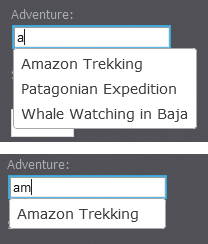
Typing the first letter shows all three entries in the list, because all of them contain the letter “a.” Continuing to type filters the list down to the only selection that includes the string “am.”
To add an Autocomplete widget
1. In Design view, decide where you want the autocomplete field within a form on your page, and click the Autocomplete button in the jQuery UI category of the Insert panel  .
.
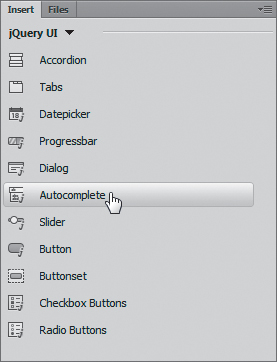
Use the Insert panel to insert the autocomplete field.
The autocomplete field appears in your layout  , and the Property inspector changes
  . The controls in the Property inspector are as follows:
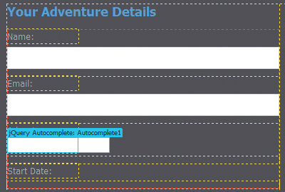
The autocomplete field appears in your layout. Make sure that you click its blue tab to select it and make its controls available in the Property inspector.
You must enter a value or URL in the Source field for the autocomplete field to work.
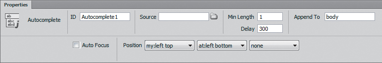
ID: Shows the name of the autocomplete field, for use in targeting CSS and JavaScript.
Source: The values of the autocomplete list, either typed into the field or a URL to a list of values.
Min Length: The minimum number of characters a user must type before a search is performed.
Delay: The delay in milliseconds between when a keystroke occurs and when a search is performed.
Append To: The element the menu should be appended to. The default is body.
Auto Focus: If this is selected, the first item in the list will automatically be selected when the menu is shown.
Position: These controls set the position of the suggestions menu in relation to the autocomplete field.
2. You must specify a source for the autocomplete widget to work. In the Source field, enter a list of values in the form ["value1", "value2", "value3"]. In our example, we used the following values: ["Amazon Trekking", "Patagonian Expedition", "Whale Watching in Baja"].
or
Enter a URL in quotes, such as "http://www.example.com". The URL resource must be able to return data in JSON format.
3. To see your work, click the Live View button or preview in a browser.
Tip
The values list automatically filters as the user types, but the user can also do the following: click the arrow keys to move the selection up and down the list; press the Enter (Return) key to close the list; and press the Enter key to select the current item and close the list.
Using the Datepicker widget
The Datepicker widget makes an interactive calendar appear in a small overlay next to a form input field  . The user can navigate in the calendar, and when they select a date by clicking it, the date appears in the form field. You can choose how many months appear in the overlay, and you can control the date formatting and several other aspects of the calendar.
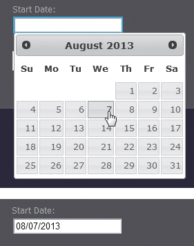
Clicking or tabbing into the field causes the calendar pop-up to appear. When the user makes a selection, the date appears in the field.
To add a Datepicker widget
1. In Design view, decide where you want the datepicker field within a form on your page, and click the Datepicker button in the jQuery UI category of the Insert panel  .
.
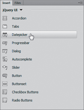
Use the Insert panel to insert the datepicker field.
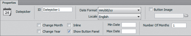
The autocomplete field appears in your layout, and the Property inspector changes  . The controls in the Property inspector are as follows:
You can change the functionality and appearance of the calendar overlay with the Property inspector.
ID: Shows the name of the datepicker field, for use in targeting CSS and JavaScript.
Date Format: Pick the date format you want from this pop-up menu.
Locale: Pick the calendar language.
Button Image: If this is selected, you can then specify an image to use for the button that appears with the form field. Clicking the button makes the calendar appear.
Change Month: If this is selected, the month name in the calendar becomes a pop-up menu that allows the user to select any month.
Change Year: If this is selected, the year in the calendar becomes a pop-up menu that allows the user to select a range of years.
Inline: If this is selected, the calendar appears instead of the form field.
Show Button Panel: If this is selected, a panel with Today and Done buttons appears below the calendar.
Min Date: The minimum selectable date, in the number of days. For example, if you wanted to prevent the selection of a date more than two days ago, you would enter –2; days previous to that will not be selectable in the calendar. If this field is empty, there is no minimum.
Max Date: The maximum selectable date, in the number of days. For example, if you want to prevent the selection of a date more than two weeks in the future, you would enter 14; subsequent days will not be selectable in the calendar. If this field is empty, there is no maximum.
Number Of Months: Allows you to choose to show more than one month in the calendar pop-up.
2. Adjust the settings in the Property inspector so the calendar appears as you want.
3. To see your work, click the Live View button or preview in a browser.
Adding CSS3 Transitions
You’ve seen how you can change a CSS property when the user performs some action. For example, in Chapter 8, you saw how to use CSS to make navigation menus without needing JavaScript. In that case, when the user hovered the cursor over a menu, the CSS property was changed instantly and the menu appeared or disappeared. But what if you wanted to have the CSS change from one property to another over time, creating an animation effect? You can do that with a CSS3 feature introduced with Dreamweaver CS6: CSS transitions. Transitions are designed to smoothly change properties when triggered by the user’s interactions (hovering, clicking, and the like), and you have a lot of control over the effect’s duration and how the effect changes over time.
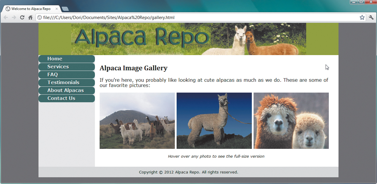
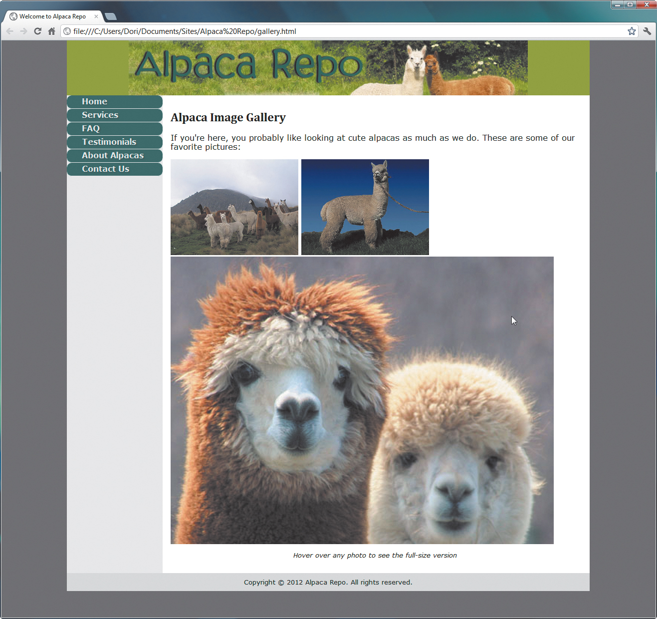
Here’s a page with a lovely gallery of alpacas , but we’d like to allow viewers to see an image at a larger scale when they hover the cursor over it. The image smoothly grows from its initial size to its final size. Here’s how to make it happen.
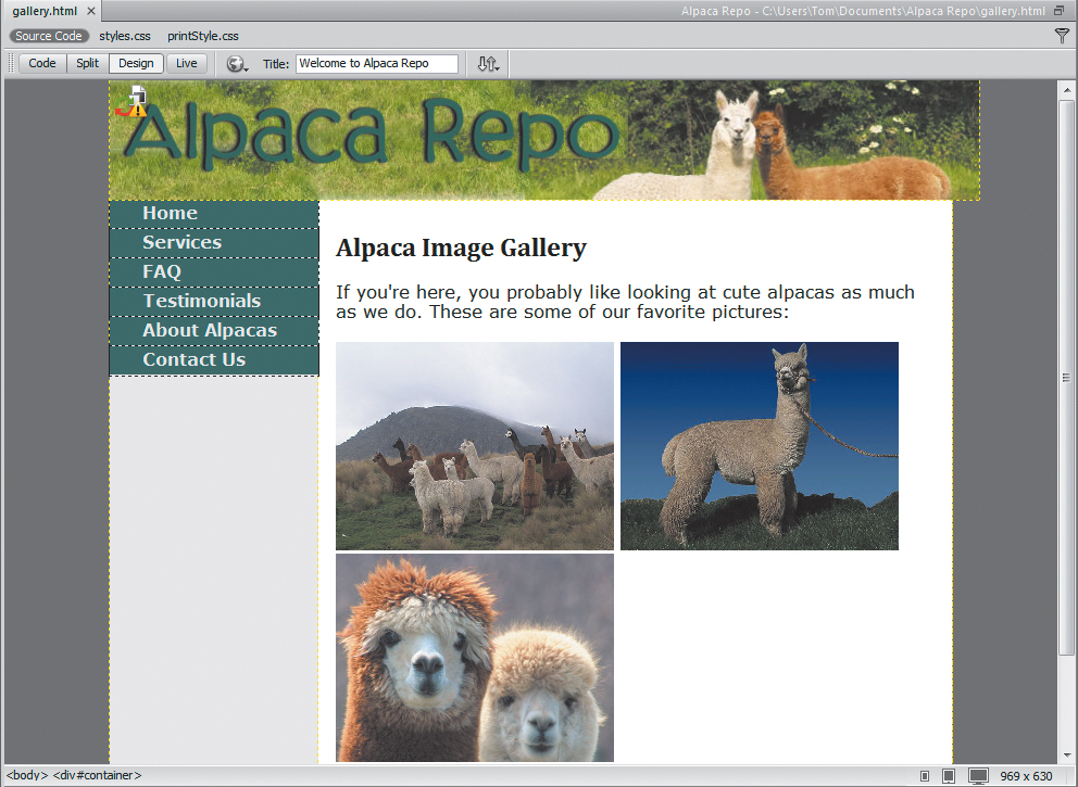
We want to apply a CSS transition visual effect to each of the pictures in this gallery.
To add a CSS3 transition
1. Open the gallery page in Dreamweaver, and choose Window > CSS Transitions.
The CSS Transitions panel appears . It may appear as a floating panel. You can use it in this way, or you can drag it into the same tab group as the CSS Designer panel, as we’ve done here.
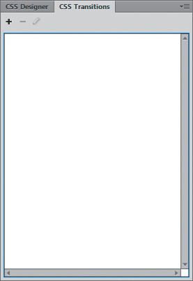
Begin with CSS transitions by opening the panel of the same name, which we’ve docked in a tab group with the CSS Designer panel.
2. In the CSS Transitions panel, click the + to bring up the New Transition dialog, which is where all the work gets done .
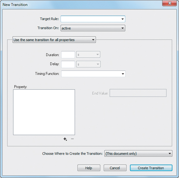
The CSS transition is created entirely in this dialog.
3. As always with CSS, start by figuring out the target rule. In this case, the action should happen on all images that are inside paragraphs, so the target rule is p img .
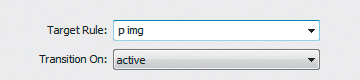
You first need to specify the target rule, either by choosing it from the pop-up menu or by typing it into the Target Rule field. Because we’ve chosen a compound rule here, we needed to type it in.
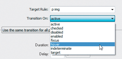
4. Transition On is the pop-up menu where you set when you want your transition to occur :
active is triggered when an element is engaged or activated.
checked is triggered when an element (such as a check box or radio button) is selected.
disabled is triggered when a UI element is disabled.
enabled is triggered when a UI element is enabled.
focus is triggered when an element on the page is given focus.
hover is triggered when a user moves the cursor over an element but has not yet clicked it.
indeterminate is triggered when the browser can’t tell if a UI element has been enabled or disabled.
target allows one element on the page to modify another.
Pick the event that will trigger your CSS transition.
We want things to happen when users hover over the images, so we set Transition On to hover.
5. We could make the image’s height and width expand and shrink at different rates, but that would be obnoxious, so we’ll leave the default, “Use the same transition for all properties,” selected .
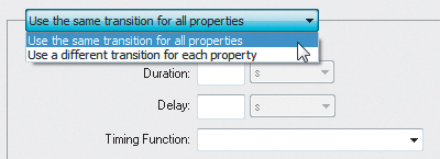
You have the choice of using the same or different transitions for each property.
6. The Duration setting is how long an effect takes to complete, and the Delay setting is how long the browser should wait before beginning the effect. Either can be set in seconds or microseconds; we’ll set Duration to 2 seconds and leave Delay alone .
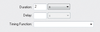
Enter the duration and delay of the transition effect.
7. Unless you can handle how Bezier curves work in your sleep, the Timing Function setting can be a little complex . Here’s a high-level cheat sheet:
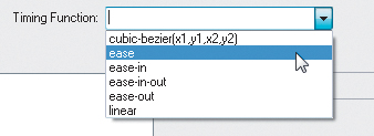
The choices in the Timing Function pop-up menu describe the speed of the transition effect over time.
cubic-bezier(x1,y1,x2,y2): Allows more technical users to set their own values.
ease: Transition starts moderately slowly, picks up speed, and then slows down gradually. Equivalent to cubic-bezier(0.25, 0.1, 0.25, 1.0).
ease-in: Transition starts slowly, then speeds up at the end. Equivalent to cubic-bezier(0.42, 0.0, 1.0, 1.0).
ease-in-out: Transition starts slowly, speeds up in the middle, and then slows down again at the end. Equivalent to cubic-bezier(0.42, 0.0, 0.58, 1.0).
ease-out: Transition starts quickly, then slows down at the end. Equivalent to cubic-bezier(0.0, 0.0, 0.58, 1.0).
linear: Transition occurs at a steady rate. Equivalent to cubic-bezier(0.0, 0.0, 1.0, 1.0).
The default is ease, so that’s what we’ll stick with.
8. Property is where you choose the properties that you want to modify. Click the + button under Property to select your choice from the pop-up menu . Dreamweaver lets you set each property’s end value, so the choices available on the right will vary depending on which property you’re changing (for example, the visibility property has the end values shown in the pop-up menu in ).
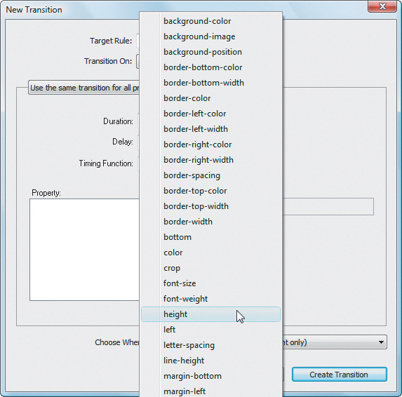
Pick the property you want to modify with the CSS transition. If you have more than one property you want to modify, you’ll be using this pop-up menu for each property.
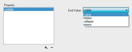
The choices available for End Value change to match the allowable values for the selected property. For the visibility property, for example, the End Value choices are included in a simple pop-up menu.
Here, we’re going to set two properties (height and width), and our end values will be three times the size of the current value. That is, our image width of 256 pixels and image height of 192 pixels become 768 and 576, respectively .
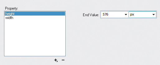
Here, we are setting the end value of the height property to 576 pixels. As usual in Dreamweaver, you can choose different units from the pop-up menu, such as points, ems, percentage, and the like.
Repeat this step for each property of the target rule that needs a transition.
9. Finally, decide where you want to create the transition—in the current page, or in a new or existing external style sheet . When you’re done, click Create Transition.
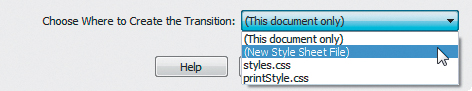
Choose whether you want the transition to be saved in an existing style sheet or a new one.
10. Switch into Live view or load the page in your browser , and view the resulting beauty of the gentle members of the camelid family .
When the page loads, all three images are the same size.
Hovering over one of the images applies the CSS transition, zooming the image to three times its original size.
Tip
If you’re not sure about which Timing Function setting to use, play around with them! The best way to decide is to just try different values and see which one works best for you.
Tip
If you want a rule that applies to a particular ID or class and you’re having trouble remembering the name, click the Target Rule pop-up, and you’ll get a list of every CSS property currently in use.
Tip
The end values of properties aren’t always sizes. Because of the varying nature of properties that support transitions, you can have anything from color pickers on up. The choices for text-shadow, for instance, are fairly complex .
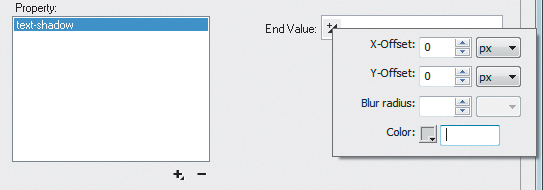
Depending on the property, there will be a variety of possible settings. For example, the text-shadow property allows you to set horizontal and vertical offsets and the amount of blur for the text shadow, and it includes a color picker so you can set the shadow’s color.