
Hour 13. Bootstrap Utilities
What You’ll Learn in This Hour:
 How to change foreground and background colors
How to align content on the page
How to show and hide content in several ways
How to embed media responsively
Techniques for making your pages more accessible
Bootstrap offers a lot of utility classes to help you manage your pages and content more effectively. Some of the classes mentioned here have been covered in other areas of the book, but because they apply to more than just specific components, you will learn about them in more detail in this hour.
This hour will cover:
How to change the foreground and background colors of elements on your pages
How to float elements right and left as well as center them on the page
How to display and hide content based on the device size or whether it’s a printout, but also for design reasons
You also will learn how to embed media so that it flexes with the size of the device but stays in the correct aspect ratio. Plus, you’ll learn some techniques for making your pages more accessible to people using assistive technology such as screen readers.
Helper Classes
Helper classes in Bootstrap extend the existing components, but more importantly, they give you additional functionality for standard HTML. In other words, you will be able to add colors, floats, and icons and show and hide content in a standard <p> tag—and not just in a Jumbotron (refer to Hour 6, “Labels, Badges, Panels, Wells, and the Jumbotron”) or navbar (refer to Hour 12, “Creating Navigation Systems with Bootstrap”).
Changing Colors
Several helper classes exist that you can use to change both the foreground (text) color and background color. These are called contextual classes because they can provide additional contextual clues about the content. In previous hours, you learned about contextual classes that are used with specific elements and components. These classes can be used with any text blocks to change the colors.
The text color classes change the foreground or text color and are as follows:
.text-muted
.text-primary
.text-success
.text-info
.text-warning
.text-danger
These classes can be applied directly to the container element holding the text you want to have that context. Or you can surround the text with a <span> tag to change the color of specific words. Listing 13.1 shows seven lines of text with the different classes and no class applied. Figure 13.1 shows how Listing 13.1 looks.
LISTING 13.1 Text Color Contextual Classes
<p>This paragraph is plain text, with no contextual class.</p>
<p class="text-muted">This paragraph is muted, class:
<code>text-muted</code>.</p>
<p class="text-primary">This paragraph is primary, class:
<code>text-primary</code>.</p>
<p class="text-success">This paragraph is success, class:
<code>text-success</code>.</p>
<p class="text-info">This paragraph is information, class:
<code>text-info</code>.</p>
<p class="text-warning">This paragraph is warning, class:
<code>text-warning</code>.</p>
<p class="text-danger">This paragraph is danger, class:
<code>text-danger</code>.</p>

You can also use the text classes to style links. When customers hover over the link, the text darkens with the contextual color, just like non-styled links.
You also can style the background color on text with contextual classes. The background color classes are
.bg-primary
.bg-success
.bg-info
.bg-warning
.bg-danger
Figure 13.2 shows what these classes look like.

As with all other contextual classes, you need to remember that screen readers do not render visual elements. So, if the color of the text or background provides some additional meaning that is critical to the page, you should include it in some other way. The most effective way is to include a text block that is hidden from non-screen readers with the .sr-only class. Listing 13.2 gives a sample of how you can do it.
LISTING 13.2 Making Contextual Classes Accessible
<p class="bg-danger">
<span class="sr-only">Danger!</span> Tigers will eat people if
you annoy them.
</p>
Caution: CSS Specificity Can Get in the Way
Sometimes contextual classes can be overridden by other CSS classes that are more specific. The best solution is to surround the text with <span> tags holding the text-* classes and surround the text with <div> tags holding the bg-* classes.
Icons
Other than Glyphicons (refer to Hour 10, “Images, Media Objects, and Glyphicons”), there are a couple classes you can use to add other icons to the text.
The .caret class displays a caret that indicates dropdown functionality. It also reverses automatically when you use a dropup menu (refer to Hour 12).
Add this class by placing it on an empty <span> tag, as in Listing 13.3.
LISTING 13.3 Using the .caret Class
<span class="caret"></span>
The .close class is added to buttons to create a close button for modal dialog boxes and alerts. It adds a small gray x to the right side of the container. The x darkens when you mouse over it. Listing 13.4 shows how to add a .close icon button.
LISTING 13.4 Using the .close Class
<button type="button" class="close" aria-label="Close">
<span aria-hidden="true">×</span>
</button>
Figure 13.3 shows the .caret and .close classes in action.

Layout Classes
There are lots of ways you can adjust the layout of web pages with Bootstrap. These utility classes help you float your content on the page and center certain elements or even the entire page.
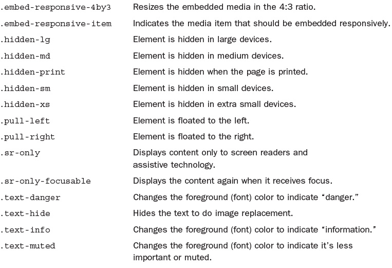
You can position content on the left and right with the .pull-left and .pull-right classes. You should not use these classes in navbars. Use .navbar-left and .navbar-right for those elements. Remember that if an element does not have some sort of width on it (either an explicit within CSS or a column width from the Bootstrap grid), floating it will do nothing because it already takes up the full width of the container.
Try it Yourself: Create a Pull Quote from a Paragraph
1. Open the page where you want the quotation in a web page editor.
2. Add a container <div>:
<div class="container">
</div>
3. Add one to three paragraphs of text inside the container.
4. Include the quotation as one paragraph. Place that quotation where you want it to be positioned on the page.
5. Add the class .col-sm-3 to the paragraph with the quote. This will resize it to be three columns wide.
6. Add the class .pull-right to that paragraph as well.
7. Create styles that make the quote larger; then add background and foreground colors and other styles to decorate the quote.
LISTING 13.5 Create a Pull Quote from a Paragraph
<!DOCTYPE html>
<html lang="en">
<head>
<meta charset="utf-8">
<meta http-equiv="X-UA-Compatible" content="IE=edge">
<meta name="viewport"
content="width=device-width, initial-scale=1">
<title>Pull Quote Paragraph</title>
<!-- Bootstrap -->
<link href="css/bootstrap.min.css" rel="stylesheet">
<!-- HTML5 shim and Respond.js for IE8 support of HTML5
elements and media queries -->
<!-- WARNING: Respond.js doesn't work if you view the page
via file:// -->
<!--[if lt IE 9]>
<script
src="https://oss.maxcdn.com/html5shiv/3.7.2/html5shiv.min.js">
</script>
<script
src="https://oss.maxcdn.com/respond/1.4.2/respond.min.js"></script>
<![endif]-->
<style>
p.pull-right {
border: solid green 3px;
color: #F0E433;
background-color: #025301;
padding: 1em;
margin-left: 1em;
font-size: 1.5em;
}
</style>
</head>
<body>
<p> </p>
<div class="container">
<p class="col-sm-3 pull-right">“If dandelions were hard
to grow, they would be most welcome on any lawn.”<br>
<span class="small">~Andrew V. Mason</span></p>
<p>Taraxacum /t 'ræksk
 m/ is a large genus of flowering
plants in the family Asteraceae. They are native to Eurasia
and North and South America, and two species, T. officinale
and T. erythrospermum, are found as weeds worldwide. Both
species are edible in their entirety. The common name
dandelion (/'dænd la
la .n/ dan-di-ly-n, from French
dent-de-lion, meaning "lion's tooth") is given to members of
the genus and, like other members of the Asteraceae family,
they have very small flowers collected together into a
composite flower head. Each single flower in a head is called
a floret. Many Taraxacum species produce seeds asexually by
apomixis, where the seeds are produced without pollination,
resulting in offspring that are genetically identical to the
parent plant.</p>
<p>Text courtesy
<a href="http://en.wikipedia.org/wiki/Taraxacum">
Wikipedia</a>.
</p>
</div>
</body>
</html>

When you float elements, you need to be able to clear them so that content stops floating. Bootstrap provides the .clearfix class for that purpose. You apply the .clearfix class when you want the float to be cleared after that element. Be aware that this is slightly different from other clear fix styles you might find on the Web.
Bootstrap includes a class .center-block that centers any element as a block. It converts the element to display as a block-level element and then centers it with automatic margins on the left and the right.
Caution: Centered Blocks Must Have a Width
For blocks centered with the .center-block class to actually be centered, they need to have an explicit width. This means you need to include a style on the element that sets the width. You cannot use Bootstrap grid classes to set the width and center the element.
Listing 13.6 shows how you might center a paragraph with the .center-block class.
LISTING 13.6 Center a Paragraph
<p class="center-block" style="width:300px;">
“If dandelions were hard to grow, they would be most
welcome on any lawn.”<br>
<span class="small">~Andrew V. Mason</span>
</p>
Notice that I set the width of the paragraph with a style attribute. I did this to make it easy to see, but it is a better practice to set the style as a class in your personal style sheet.
Displaying and Hiding Content
Several helper classes are available that you can use to display and hide content in different situations. Two that help accessibility are the .sr-only and .sr-only-focusable classes. The .sr-only class I’ve mentioned previously as a class to show the enclosed content only to screen readers. This hides it from standard browsers, but screen readers will still read it. Add the .sr-only-focusable to the element if you need it to show the element again when it’s focused on. This is particularly useful for keyboard-only users.
Listing 13.7 shows how you might write a skip link for screen readers to skip navigation lists and go directly to the content that wouldn’t be shown to a standard browser user.
LISTING 13.7 HTML for a Skip Link
<a class="sr-only sr-only-focusable" href="#content">Skip to main
content</a>
<!-- ... navigation to be skipped ... -->
<a name="content"></a>
You can use the .text-hide class to do image replacements. This creates accessible HTML content that is readable by screen readers but uses a graphic that is attractive to visual browsers. This is covered in more detail in Hour 7, “Bootstrap Typography.”
A few classes allow you to show and hide block-level content directly on your page:
.show—The content will be visible on the page to all devices, including screen readers.
.hidden—The content will be removed from the page and not seen by any devices, including screen readers.
.invisible—The content will be invisible on the page but still take up space in the flow of content.
Note that the .hide class has been deprecated as of Bootstrap 3.0.1, and you should not use it. Use .hidden, .invisible, or .sr-only instead.
Responsive Utilities
Bootstrap offers a number of utility classes you can use to show and hide content from specific devices, based on media queries.
As with the Bootstrap layout grids, you can target four standard sizes: extra-small (xs), small (sm), medium (md), and large (lg). You can define three types of element: block, inline, and inline-block. You can either hide the content (hidden) or show it (visible). These are combined to create the responsive classes.
The classes to hide elements are
.hidden-xs—Hides the content from extra-small devices
.hidden-sm—Hides the content from small devices
.hidden-md—Hides the content from medium-sized devices
.hidden-lg—Hides the content from large devices
The classes to show elements include how to display the content:
.visible-xs-block—Display to extra-small devices as a block-level element
.visible-xs-inline—Display to extra-small devices as an inline element
.visible-xs-inline-block—Display to extra-small devices as an inline-block element
.visible-sm-block—Display to small devices as a block-level element
.visible-sm-inline—Display to small devices as an inline element
.visible-sm-inline-block—Display to small devices as an inline-block element
.visible-md-block—Display to medium-sized devices as a block-level element
.visible-md-inline—Display to medium-sized devices as an inline element
.visible-md-inline-block—Display to medium-sized devices as an inline-block element
.visible-lg-block—Display to large devices as a block-level element
.visible-lg-inline—Display to large devices as an inline element
.visible-lg-inline-block—Display to large devices as an inline-block element
To use these classes, you can add them to the elements you want to show or hide. Or you can add a container around the content you want to modify the display.
Caution: Your Pages Should Use Progressive Enhancement
It can be tempting to create web pages that look completely different with different content for different devices. But this is not progressive enhancement. Progressive enhancement is when you create a site that is mobile first and then enhanced for the larger devices. This means that all the important content is displayed to everyone, and then features that improve the site are added to devices that can handle them. So you should be cautious about using the responsive classes unless you absolutely need them because they can make your site less progressively enhanced.
The classes .visible-xs, .visible-sm, .visible-md, and .visible-lg also exist, but they have been deprecated as of Bootstrap 3.2.0. Use the .visible-*-block classes instead. Table 13.1 shows how these classes display across different device sizes.

Print Classes
Bootstrap also provides a few utility classes to help you show and hide content when your web pages are printed. This is useful for when you don’t want to create a full print style sheet or you just need to show or hide a few things from printouts.
The print classes are
.hidden-print—Hides the content from print view
.visible-print-block—Displays the content as a block-level element on print views
.visible-print-inline—Displays the content as an inline element on print views
.visible-print-inline-block—Displays the content as an inline-block element on print views
To use these classes, simply add them to the elements you want to show or hide.
Here are a few things you should consider when deciding what to print:
Images take up a lot of toner or ink, so you should hide images that aren’t critical to the content, such as icons and navigation images.
Links are not clickable on printouts, but you can add the URLs as .visible-print-inline elements as footnotes or even right next to the links.
Navigation elements are not useful on printed web pages, so you should hide them.
Advertising is also not useful on printouts.
Including your site name, a small logo, and the page URL because a header and footer on printouts make the printouts more useful and act as an advertisement for your website.
It can be tempting to use the print classes to hide elements you don’t want printed, like copyrighted images, from the printer. But remember that this is not foolproof. If you absolutely must not allow your content to be printed, you should consider not posting it to the Web.
Responsive Embed
Bootstrap has classes that help you embed videos and slideshows with dimensions based on the width of the container element. Add the .embed-responsive class to a container element around the media element (<iframe>, <embed>, <video>, or <object>). Then add the .embed-responsive-item class to the media element itself. Finally, define the video size with the .embed-responsive-16by9 or .embed-responsive-4by3 class on the container element. Listing 13.8 shows how this would look for a 16×9 video.
LISTING 13.8 A 16×9 Video in Bootstrap
<div class="embed-responsive embed-responsive-16by9">
<video class="embed-responsive-item">
<source src="...">
</video>
</div>
Accessibility in Bootstrap
Bootstrap, as you have learned already, has a number of classes set up to help people using assistive technology such as screen readers. The following are a few things that Bootstrap recommends you include on all your pages to make them more accessible:
Skip links—These are links placed at the very top of the web page that enable people using screen readers to skip to the main content. The Bootstrap classes .sr-only and .sr-only-focusable hide these links from standard browsers so they don’t affect the design. To be accessible, your pages should include a skip link at the top of every page.
Contrasting colors—Some of the default color combinations in Bootstrap do not contrast as well as they could. To be more accessible, you should adjust the colors to have higher contrast.
Nested headlines—Although you can use any headlines (<h1> through <h6>) that you want, it’s most accessible to use them like an outline. Use the <h1> tag for the primary headline for the document. Then use the subsequent tags in logical order.
There are a few other simple things you can do to keep your website accessible. The most important is providing alternatives to any technology or feature that might be difficult to use. Because Bootstrap is mobile first, a lot of this is taken care of for you. But you need to remember to provide alternative text for images, use multiple source files for videos, and give fallback options for any scripts on the site.
Summary
This hour covers a lot of diverse classes that provide extra functionality for Bootstrap. There are helper classes, responsive utility classes, classes for print, and classes for embedding videos responsively.
The helper classes are the most diverse. There are classes for changing the foreground and background colors of the page and classes to add simple icons to buttons and dropdown menus. There are also several classes for positioning your content on the page, as well as for displaying and hiding it.
The responsive utilities let you show and hide content based on device size. Print classes let you show and hide content when your web pages are printed, and responsive embed classes let you resize your videos keeping the correct aspect ratio.
This hour also explains how to keep your Bootstrap pages accessible. Table 13.2 lists the CSS classes explained in this hour.


Workshop
The workshop contains quiz questions to help you process what you’ve learned in this hour. Try to answer all the questions before you read the answers.
Q&A
Q. It seems like you say we shouldn’t use the responsive utility classes, like .hidden-sm or .visible-lg-block. But why would Bootstrap have them if they are not a good idea to use?
A. Bootstrap strives to meet the needs of the majority of web designers. Although best practices indicate that pages should be designed mobile first, with progressive enhancement, and provide the same content to all visitors, not all designers want or need to do all those things.
My recommendation is to use them sparingly. But if you need to use them, don’t feel like you can’t. They are there to be used—just think about your customers before you make a website that is completely different for mobile users than for desktop users.
Q. Why are there so many different contextual classes for the different elements, such as .btn-warning, .has-success, and .text-info?
A. It seems like it should be possible to just have one contextual class that affects all the elements and components. But Bootstrap developers recognized that different elements have different style issues, so they developed specific contextual classes to meet those needs. When using contextual classes, it’s best to use the class specific for the element or component you’re using, and only use the general ones listed in this hour if there are no specific ones.
Q. The accessibility guidelines you bring up seem like a big hassle for a small number of people. Are they really that important?
A. Accessibility is going to be more important for some sites than others. Many governments have accessibility laws that websites must conform to, and if you’re designing for a public sector site, you will need to follow accessibility guidelines. Of course, sites that cater to people with different capabilities are going to need to be accessible as well. But it’s a good idea to make even mainstream, non-government websites accessible because you never know who’s going to visit your site. There are only a few things you need to do to create a more accessible site, like skip links, alternate text for images, and using good contrasting colors for text. These make your site better for everyone who uses it—and that benefits everyone.
Quiz
1. A helper class that changes the text color is called what?
a. A color class
b. A context class
c. A contextual class
d. A help class
2. What happens when you use a class from question 1 to change the color of a link?
a. The link changes color only on hover.
b. The link changes color and gets a darker color on hover.
c. The link changes color when it’s active.
d. Nothing; the link stays the same color as usual.
3. True or False: You do not need to do anything to make an element accessible, beyond adding the class, when a helper class adds critical information to the element.
a. True. The class provides the information to all customers automatically.
b. True. The class makes the element accessible.
c. False. You need to add another class to the element to make it accessible.
d. False. You need to add more information for assistive technology to make it accessible.
4. Which of the following is the correct way to add a close icon?
a. <button type="button" class="close btn">
b. <button type="close button" class="btn">
c. <span class="close"></span>
d. <div class="close"></div>
5. How do you float navigation bar elements to the right?
a. .nav-right
b. .navbar-right
c. .pull-right
d. .right
6. What does <p class="pull-right"> do?
a. Creates a right aligned paragraph, with text inside left aligned.
b. Creates a right aligned paragraph, with text inside right aligned.
c. Creates a left aligned paragraph, with text inside left aligned.
d. Creates a left aligned paragraph, with text inside right aligned.
e. Nothing. The paragraph will act like every other paragraph around it.
7. Which of the following is a valid way to remove content from the flow with Bootstrap?
a. .hide
b. .hidden
c. .invisible
d. All of the above
8. How could you hide an element from only very small mobile devices?
a. .hidden
b. .hidden-xs
c. .hidden-sm
d. .hide-xs
9. Why would you hide content from a printout?
a. To reduce the amount of ink or toner used
b. To remove elements that don’t work in print
c. To remove advertising or other elements that aren’t needed on a printout
e. All of the above
10. Which of the following is not an accessibility issue?
a. Blurry images that are hard to understand.
b. Low contrast colors.
c. Headlines are not in outline order.
d. Video that does not have alternative text.
Quiz Answers
1. c. A contextual class because it provides contextual information.
2. b. The link changes color and gets a darker color on hover.
3. d. False. You need to add more information for assistive technology to make it accessible.
4. a. <button type="button" class="close btn">
5. b. .navbar-right
6. e. Nothing. Because the paragraph has no width set, it will take up the full width of the container, and so act like every other paragraph around it.
7. b. .hidden removes the content by setting the display to none. .hide has been deprecated. .invisible only sets the visibility to hidden.
8. b. .hidden-xs
9. e. All of the above.
10. a. Blurry images are bad on a web page, but they don’t make the page any more or less accessible simply because they are blurry.
Exercises
1. Add the print classes to a web page to make your page more print-friendly.
2. Check your website with an accessibility checker, such as one found on the W3C: http://www.w3.org/WAI/ER/tools/. Look at some of the suggestions and see whether you can implement as many as possible to make your pages more accessible.