
Hour 15. Modal Windows
What You’ll Learn in This Hour:
 How to build a modal window in Bootstrap
Two ways to trigger a modal window
How to adjust the size and layout of a modal
Ways to use modals with dynamic content
In this hour you learn how to add modal windows to your Bootstrap pages. You also learn how to adjust the size and animation of modal windows and change the content in the modal windows and get some ideas for how you might use modals in your web designs.
What Is a Modal Window?
Modal windows force interactions by the user with the program at specific times. In most cases, they open and block access to the main window until the modal is taken care of. Whenever a program pops up a window that asks “Are you sure you want to delete that?” that window is a modal window. The user is expected to indicate whether or not the file should be deleted and cannot move on until he does so.
Modal windows on web pages might not be able to completely block interaction with the main web page, but otherwise they can act just like software program modals. They pop up a smaller window and allow the user to make changes without loading an entire new page.
You are not limited to asking questions in modals. You can use modal windows for lots of different things, including
A lightbox for videos and images or a slideshow
Contact and login forms
Alerts and informative messages
Embedded media like PDFs or other documents
Help windows
Bootstrap lets you easily create simple and complex modals on your web pages. Bootstrap modal windows are created as small windows with rounded corners that are displayed in a lightbox effect over the top of the regular content. The regular content is then faintly grayed out to give the modal more emphasis. You can see an example of a Bootstrap modal window in Figure 15.1.

How to Build a Modal Window
You need two things to add a modal window to your Bootstrap pages: the HTML for the window and the HTML or JavaScript for the trigger to open the modal window. Most people find it easiest to build the trigger first, so that when they build the window, they can turn it on and see it.
But before you do either, you should make sure that you have jQuery and the Bootstrap JavaScript file loaded at the bottom of your web document. You can use either bootstrap.js (or the minified version) or modal.js if you plan to use only that one plugin.
Triggering a Modal
As you learned in Hour 14, “Using Bootstrap JavaScript Plugins,” you can trigger the modal plugin in two ways: with JavaScript or with a data attribute.
Listing 15.1 shows how to trigger a modal with JavaScript.
LISTING 15.1 JavaScript to Trigger a Modal
$('#myModal').modal(options);
This opens a modal with the ID myModal with the options in the options array.
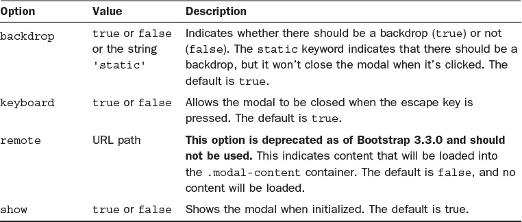
The three options you can set on your modals are
backdrop—This tells the browser whether there should be a backdrop (graying out the original page content). The default is true. Setting it to false removes the backdrop completely and forces the user to click a close button on the modal. Additionally, a value of static leaves the backdrop but removes the ability to close the modal except with the close buttons on the modal.
keyboard—If this option is true, the modal can be closed with the escape key. If it’s false, the escape key won’t close the window.
show—If this option is true, the modal will be shown when it is initialized. If it is false, the modal will be initialized but not displayed.
You might see a deprecated option, remote, on older versions of Bootstrap. This was used to load a modal from a separate HTML document on your server. It will be removed in Bootstrap 4, so you should not use it. Instead, you should use client-side templating or a data binding framework, or call jQuery load() yourself.
The other way to trigger a modal is with data attributes. You can trigger a modal by including the attribute data-toggle="modal". You need to include a reference to the modal being displayed with either data-target="#myModal" on <button> tags or href="#myModal" on <a> tags. Listing 15.2 shows a button that triggers a modal when it’s clicked.
LISTING 15.2 A Button to Trigger a Modal
<button type="button" class="btn btn-warning btn-lg"
data-toggle="modal" data-target="#myModal">
Click to Open a Modal
</button>
Listing 15.3 shows that same modal being triggered by a link.
LISTING 15.3 A Link to Trigger a Modal
<a class="bg-warning" data-toggle="modal" href="#myModal">
Click to Open a Modal
</a>
Note: Bootstrap Adds Classes When Modals Are Triggered
After a modal is triggered, Bootstrap adds the .modal-open class to the <body> tag. It also adds an empty <div> with the class .modal-backdrop to the page. These are required to create the modal and the backdrop, if there is one. However, you can use them in your style sheet as well.
The JavaScript for modals includes several methods you can use in your scripts:
toggle—This manually toggles the modal on and off. It returns to the handler before the modal is actually shown or hidden.
show—This manually opens the modal. It returns to the caller before the modal is shown.
hide—This manually closes the modal. It returns to the caller before the modal is hidden.
handleUpdate—This readjusts the modal’s positioning to counter a scrollbar should one appear. Without this method, if a scrollbar appears, the modal jumps to the left. It is needed only if the modal height changes while it’s open.
In addition, several events are available that you can use to hook into the functionality in your scripts:
show.bs.modal—This fires as the show method is called. If this is caused by a click, the clicked element is available as the relatedTarget property of the event.
shown.bs.modal—This event fires when the modal has been made visible to the user (after any CSS transitions). If this is caused by a click, the clicked element is available as the relatedTarget property of the event.
hide.bs.modal—This event fires immediately when the hide method is called.
hidden.bs.modal—This event fires when the modal has been made completely hidden from the user (including any CSS transitions).
loaded.bs.modal—This event fires when the modal has loaded content using the remote option. This has been deprecated in Bootstrap 3.3.0.
Coding a Modal
After you have a trigger, you need to create the modal window itself. This is just a block of HTML that is given modal classes. First, you need a container element with the modal class and the ID you referenced in the trigger. This contains the entire modal window:
<div class="modal" id="myModal">
If you place your modal content in this container, your modal will not have a white background color and will be the full width of the screen. You need two more containers to get your modal window to look correct:
.modal-dialog—This sets the width of the modal window.
.modal-content—This defines the content area and sets the background color for the modal window.
Listing 15.4 shows the minimum HTML you need for a reasonable looking modal window.
LISTING 15.4 The Minimum HTML for a Modal
<div class="modal" id="myModal">
<div class="modal-dialog">
<div class="modal-content">
<p>My modal content</p>
</div>
</div>
</div>
Inside the .modal-content container you can have several additional classes to define various parts of the modal:
.modal-header—This defines the header or top of the modal. In the header you should include a close element so that your modal can be closed. You also can include a title.
.modal-title—This is the title of the modal.
.modal-body—The main content of the modal.
.modal-footer—This is the footer or bottom part of the modal window. Most modals include submit and cancel buttons in this area.
Inside your modal you always should include a close button; many include two—one at the top and one at the bottom. For the top close button, you can create a small x using the .close class you learned about in Hour 13, “Bootstrap Utilities.” You also should include the data attribute data-dismiss with the value modal. This tells Bootstrap that when the close button is clicked, the modal should be dismissed:
<button type="button" class="close" data-dismiss="modal"
aria-label="Close">
<span aria-hidden="true">×</span>
</button>
If you want your close button to look like a standard button, you don’t need the .close class; you do still need the data-dismiss attribute, though:
<button type="button" class="btn btn-default" data-dismiss="modal">
Close
</button>
Listing 15.5 shows the HTML for a fancy modal window including both types of close button.
LISTING 15.5 A Fancy Modal Window
<div class="modal" id="myModal">
<div class="modal-dialog">
<div class="modal-content">
<div class="modal-header">
<button type="button" class="close" data-dismiss="modal"
aria-label="Close">
<span aria-hidden="true">×</span>
</button>
<h4 class="modal-title">Do You Love Dandylions?</h4>
</div>
<div class="modal-body">
<img src="images/seeded.jpg" alt=""
class="col-sm-3 img-circle pull-left"/>
<p>So do I!</p>
</div>
<div class="modal-footer">
<button type="button" class="btn btn-default"
data-dismiss="modal">Close</button>
</div>
</div>
</div>
</div>
Try it Yourself: Trigger a Modal When the Page Loads
1. Open the page where you want the modal to load in an HTML editor.
2. Confirm that you have jQuery and the Bootstrap JavaScript loaded at the bottom of the page:
<script src="http://code.jquery.com/jquery-latest.js"></script>
<script src="js/bootstrap.min.js"></script>
3. Add the HTML for your modal window to the HTML. Give it an ID of #myModal:
<div class="modal fade" id="myModal">
...
</div>
4. Below the Bootstrap JavaScript and jQuery, add a <script> element:
<script>
</script>
5. Inside the <script> tags, include a document ready function:
$(document).ready(function(){
});
6. Inside the document ready function, show your modal window on the #myModal element:
$('#myModal').modal('show');

LISTING 15.6 Trigger a Modal to Load Two Seconds After the Page Loads
<div class="modal fade" id="myModal">
<div class="modal-dialog">
<div class="modal-content">
<div class="modal-header">
<button type="button" class="close" data-dismiss="modal"
aria-label="Close">
<span aria-hidden="true">×</span>
</button>
<h4 class="modal-title">Do You Love Dandylions?</h4>
</div>
<div class="modal-body">
<img src="images/seeded.jpg" alt=""
class="col-sm-3 img-circle pull-left"/>
<p>So do I!</p>
</div>
<div class="modal-footer">
<button type="button" class="btn btn-default"
data-dismiss="modal">Close</button>
</div>
</div>
</div>
</div>
<script src="http://code.jquery.com/jquery-latest.js"></script>
<script src="js/bootstrap.min.js"></script>
<script>
$(document).ready(function(){
function show_modal() {
$('#myModal').modal('show');
}
window.setTimeout(show_modal, 2000);
});
</script>
Modifying Modals
A few things you can do with Bootstrap to modify how your modals look and act on the page include changing how they open on the page, the size, the layout inside them, and even the content based on how the user triggered the modal.
Changing How a Modal Opens
The default way for a modal to open is just to blink onto the screen. There is no transition—just click and it’s there. But this can be jarring, so most modals include the class .fade so that they fade in more gracefully:
<div class="modal fade" id="myModal">
Changing the Size of Modals
There are three sizes for modals: small, medium, and large. The default is medium. The classes .modal-lg and .modal-sm are placed on the .modal-dialog container and change the size to large and small, respectively. Figure 15.3 shows the three sizes of modals, and Listing 15.7 shows the HTML for a large modal.

Changing the Layout
You can use the Bootstrap grid system within the modal windows to adjust the layout inside the window. All you need to do is add a .container-fluid inside the .modal-body and then add grid elements, just like you learned in Hour 5, “Grids and How to Use Them.”
Changing Modal Content Dynamically
You can create a dynamic page that displays different content inside a modal depending on which trigger is selected. This uses the event.relatedTarget and data-* attributes to change the contents of the modal when different triggers are clicked. Listing 15.9 shows HTML and JavaScript that create a photo gallery that opens large size images when the thumbnails are clicked.
LISTING 15.9 A Modal Photo Gallery
<a href="#" data-toggle="modal" data-target="#myModal"
data-imagetitle="Shasta and McKinley"
data-imagesource="images/pic1.png">
<img src="images/thumb1.png" alt="shasta and mckinley"
class="img-thumbnail">
</a>
<a href="#" data-toggle="modal" data-target="#myModal"
data-imagetitle="Shasta" data-imagesource="images/pic2.png">
<img src="images/thumb2.png" alt="shasta" class="img-thumbnail">
</a>
<div class="modal fade" id="myModal" tabindex="-1" role="dialog"
aria-labelledby="myModalLabel" aria-hidden="true">
<div class="modal-dialog">
<div class="modal-content">
<div class="modal-header">
<button type="button" class="close" data-dismiss="modal"
aria-label="Close">
<span aria-hidden="true">×</span>
</button>
<h4 class="modal-title" id="myModalLabel">Image</h4>
</div>
<div class="modal-body">
</div>
</div>
</div>
</div>
...
<script>
$('#myModal').on('show.bs.modal', function (event) {
var button = $(event.relatedTarget);
var recipient = button.data('imagetitle');
var source = button.data('imagesource');
var modal = $(this);
modal.find('.modal-title').text(recipient);
modal.find('.modal-body').html('<img src="' + source + '" alt="'
+ recipient + '" class="center-block">');
})
</script>
Summary
This hour covered the Bootstrap plugin modal.js. You learned how to create and use modal windows to provide more information to customers in windows that open above the existing content. You also learned several ways you can use modal windows, how to trigger them, and how to style them.
There are a lot of options, methods, events, and CSS classes you can use to work with modals. Tables 15.1–15.4 detail the options, methods, events, and classes covered in this hour.


Workshop
The workshop contains quiz questions to help you process what you’ve learned in this hour. Try to answer all the questions before you read the answers.
Q&A
Q. Isn’t a modal just a lightbox?
A. Not exactly. A lightbox is a type of modal that has been optimized to display images and other media, but modal windows can do more than just display images.
Q. What are the other attributes you list in the modals, such as role="dialog", aria-labelledby="myModalLabel", and aria-hidden="true"?
A. These attributes are used to make the modal more accessible. The role attribute indicates that the modal is a dialog box, and the two aria- attributes indicate the label and if it should be hidden. These and other accessibility features are covered in more detail in Hour 21, “Customizing Bootstrap and Your Bootstrap Website.”
Q. I really want to use the remote option to load an external web page. How do I use it?
A. You can set it on your trigger button with the data-remote attribute. Set this to the URL you want to load. If your trigger is a link, you can use the href attribute to define the page to load—for example, <a data-toggle="modal" href="remote.html" data-target="#modal">Click me</a>. However, this doesn’t work in all web browsers.
Quiz
1. Which of the following can be created with a Bootstrap modal?
a. A login box
b. A photo lightbox
c. An alert
d. B and C
e. All of the above
2. Will this trigger a modal?
$('#myModal').modal({
"backdrop" : "static"
});
a. Yes, with a static backdrop
b. Yes, with a standard backdrop
c. No, because the backdrop static value is incorrect
d. No, because you cannot include options that way
3. Will this trigger a modal?
<a class="bg-warning" data-toggle="modal">
Click to Open a Modal
</a>
a. Yes, a standard modal
b. Yes, a modal with a warning background
c. No, because there is no target
d. No, because there is no URL
4. Which classes are required to create a modal window?
a. .modal.
b. .modal and .modal-dialog.
c. .modal, .modal-dialog, and .modal-content.
d. There are no required classes for modals.
5. Which of the following defines the title of a modal?
a. <div class="title">Modal Title</div>
b. <h2 class="modal-title">Modal Title</h2>
c. <h1>Modal Title</h1>
d. Modal Title
6. Why should you avoid using the remote option?
a. Because it’s not a valid option.
b. Because it doesn’t work on all browsers.
c. Because it’s deprecated.
d. You don’t need to avoid using it.
7. How do you animate the loading of a modal?
a. Use the animate class.
b. Use the fade class.
c. You don’t do anything because they are animated by default.
d. You can’t animate the loading of a modal.
8. Where do you put the .modal-sm class to create a small modal?
a. On the .modal element
b. On the .modal-dialog element
c. On the .modal-content element
d. On a new container element around the whole modal
9. True or False: You cannot use column grid classes inside modals.
10. Where do you put the .modal-open class?
a. You place it on the <body> element to indicate that the page has a modal.
b. You place it on the .container element to indicate there is a modal in the container.
c. You don’t put it anywhere. Bootstrap adds it automatically to the .modal element when the modal is opened.
d. You don’t put it anywhere. Bootstrap adds it automatically when the modal is opened.
Quiz Answers
1. e. All of the above.
2. a. Yes, with a static backdrop.
3. c. No, because there is no target.
4. c. .modal, .modal-dialog, and .modal-content are required to build correct-looking Bootstrap modals.
5. b. <h2 class="modal-title">Modal Title</h2>
6. c. Because it’s deprecated.
7. b. Use the fade class.
8. b. On the .modal-dialog element.
9. False. You can use column grid classes inside modals.
10. d. You don’t put it anywhere. Bootstrap adds it automatically when the modal is opened.
Exercise
Add a modal to one of your web pages. Trigger it with a link or a button.