
Chapter 4. Animal, Vegetable, or Mineral?
WHY USERS LIKE MINDLESS CHOICES
It doesn’t matter how many times I have to click, as long as each click is a mindless, unambiguous choice.
—KRUG’S SECOND LAW OF USABILITY
Web designers and usability professionals have spent a lot of time over the years debating how many times you can expect users to click (or tap) to get what they want without getting too frustrated. Some sites even have design rules stating that it should never take more than a specified number of clicks (usually three, four, or five) to get to any page in the site.
On the face of it, “number of clicks to get anywhere” seems like a useful metric. But over time I’ve come to think that what really counts is not the number of clicks it takes me to get to what I want (although there are limits), but rather how hard each click is—the amount of thought required and the amount of uncertainty about whether I’m making the right choice.
In general, I think it’s safe to say that users don’t mind a lot of clicks as long as each click is painless and they have continued confidence that they’re on the right track—following what’s often called the “scent of information.”1 Links that clearly and unambiguously identify their target give off a strong scent that assures users that clicking them will bring them nearer to their “prey.” Ambiguous or poorly worded links do not.
1 This term comes from Peter Pirolli and Stuart Card’s “information foraging” research at Xerox PARC in which they drew parallels between people seeking information (“informavores”) and animals following the scent of their prey.
I think the rule of thumb might be something like “three mindless, unambiguous clicks equal one click that requires thought.”2
2 Of course, there are exceptions. For instance, if I’m going to have to drill down through the same path in a site repeatedly, or if the pages are going to take a long time to load, then the value of fewer clicks increases.
The classic first question in the word game Twenty Questions—“Animal, vegetable, or mineral?”—is a wonderful example of a mindless choice. As long as you accept the premise that anything that’s not a plant or an animal—including things as diverse as pianos, limericks, and cheesecake, for instance—falls under “mineral,” it requires almost no thought to answer the question correctly.3
3 In case you’ve forgotten the game, there’s an excellent version that you can play against at www.20q.net. Created by Robin Burgener, it uses a neural net algorithm and plays a mean game.
Unfortunately, many choices on the Web aren’t as clear.
For example, as recently as a few years ago when I was trying to buy a product or service to use in my home office (like a printer, for instance), most of the manufacturers’ sites asked me to make a top-level choice like this:

Which one was me? I had to think about it, and even when I made my choice I wasn’t very confident it was the right one. In fact, what I had to look forward to when the target page finally loaded was even more thinking to figure out whether I was in the right place.
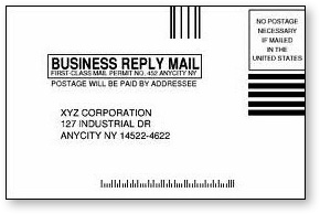
It was the feeling I get when I’m standing in front of two mailboxes labeled Stamped Mail and Metered Mail with a business reply card in my hand. What do they think it is—stamped or metered? And what happens if I drop it in the wrong box?
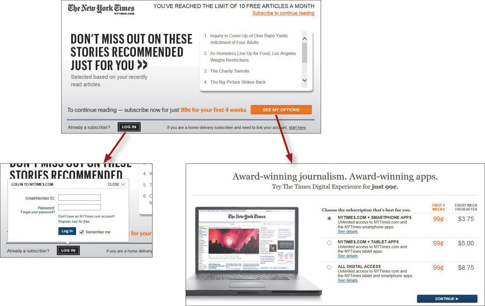
I’m trying to read an article online. The page I arrive at gives me all these options:

Now I’ve got to scan all this text and work out whether I’m a subscriber but not a member, or a member, or neither one. And then I’ll have to dig up the account number or the password that I used or decide whether it’s worth joining.
At this point, the question I’m asking myself is probably changing from “How do I answer this question?” to “Just how interested am I in this article?”
The New York Times makes the same kind of choice seem much easier by not confronting you with all the details at once. Making an initial selection (to log in or to see your options for subscribing) takes you to another screen where you see only the relevant questions or information for that selection.
This problem of giving the user difficult choices and questions that are hard to answer happens all the time in forms. Caroline Jarrett has an entire chapter about it (“Making Questions Easy to Answer”) in her book Forms that Work: Designing Web Forms for Usability.
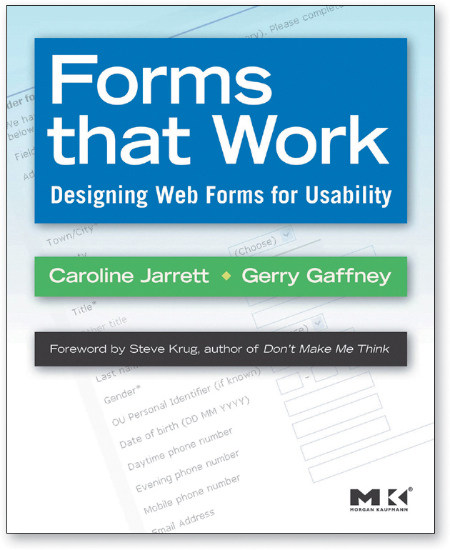
As with Ginny Redish’s book about writing for the Web, anyone who works on forms should have a well-worn copy sitting on their desk.
When you can’t avoid giving me a difficult choice, you need to go out of your way to give me as much guidance as I need—but no more.
This guidance works best when it’s
![]() Brief: The smallest amount of information that will help me
Brief: The smallest amount of information that will help me
![]() Timely: Placed so I encounter it exactly when I need it
Timely: Placed so I encounter it exactly when I need it
![]() Unavoidable: Formatted in a way that ensures that I’ll notice it
Unavoidable: Formatted in a way that ensures that I’ll notice it
Examples are tips adjacent to form fields, “What’s this?” links, and even tool tips.
My favorite example of this kind of just-in-time guidance is found on street corners throughout London.
It’s brief (“LOOK RIGHT” and an arrow pointing right), timely (you see it at the instant you need to be reminded), and unavoidable (you almost always glance down when you’re stepping off a curb).
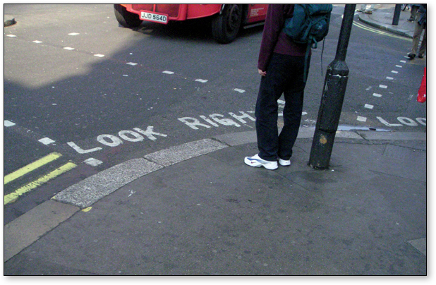
I have to think it’s saved the lives of a lot of tourists who expect traffic to be coming from the other direction. (I know it saved mine once.)
Whether you need to offer some help or not, the point is that we face choices all the time on the Web and making those choices mindless is one of the most important things you can do to make a site easy to use.