
Chapter 8. “The Farmer and the Cowman Should Be Friends”
WHY MOST ARGUMENTS ABOUT USABILITY ARE A WASTE OF TIME, AND HOW TO AVOID THEM
One man likes to push a plough The other likes to chase a cow But that’s no reason why they can’t be friends!
—OKLAHOMA!, OSCAR HAMMERSTEIN II
Left to their own devices, Web teams aren’t notoriously successful at making decisions about usability questions. Most teams end up spending a lot of precious time rehashing the same issues over and over.
Consider this scene:
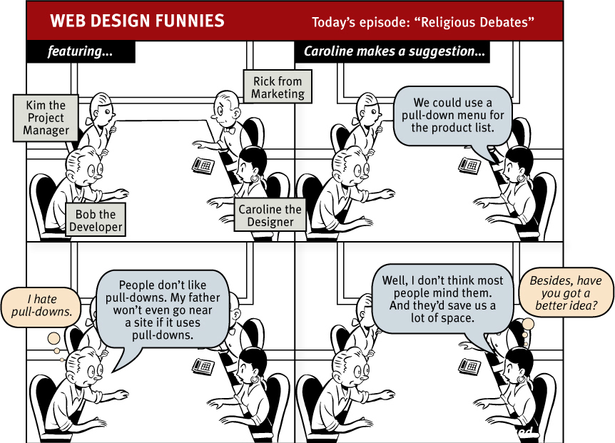

I usually call these endless discussions “religious debates,” because they have a lot in common with most discussions of religion and politics: They consist largely of people expressing strongly held personal beliefs about things that can’t be proven—supposedly in the interest of agreeing on the best way to do something important (whether it’s attaining eternal peace, governing effectively, or just designing Web pages). And, like most religious debates, they rarely result in anyone involved changing his or her point of view.
Besides wasting time, these arguments create tension and erode respect among team members and can often prevent the team from making critical decisions.
Unfortunately, there are several forces at work in most Web teams that make these debates almost inevitable. In this chapter, I’ll describe these forces and explain what I think is the best antidote.
“Everybody likes ________.”
All of us who work on Web sites have one thing in common—we’re also Web users. And like all Web users, we tend to have strong feelings about what we like and don’t like about Web sites.
As individuals, we love pages with main menus across the top and submenus down the left side because they’re familiar and easy to use, or we hate them because they’re so boring. We love pages with large evocative images because they’re engaging, or we hate them because we just want to get to the content. We really enjoy using sites with ______, or we find ______ to be a royal pain.
And when we’re working on a Web team, it turns out to be very hard to check those feelings at the door.
The result is usually a room full of individuals with strong personal convictions about what makes for a good Web site.
And given the strength of these convictions—and human nature—there’s a natural tendency to project these likes and dislikes onto users in general: to think that most users like the same things we like. We tend to think that most users are like us.

It’s not that we think that everyone is like us. We know there are some people out there who hate the things we love—after all, there are even some of them on our own Web team. But not sensible people. And there aren’t many of them.
Farmers vs. cowmen
On top of this layer of personal passion, there’s another layer: professional passion. Like the farmers and the cowmen in Oklahoma!, the players on a Web team have very different perspectives on what constitutes good Web design based on what they do for a living.1
1 In the play, the thrifty, God-fearing, family-oriented farmers are always at odds with the freewheeling, loose-living cowmen. Farmers love fences, cowmen love the open range.
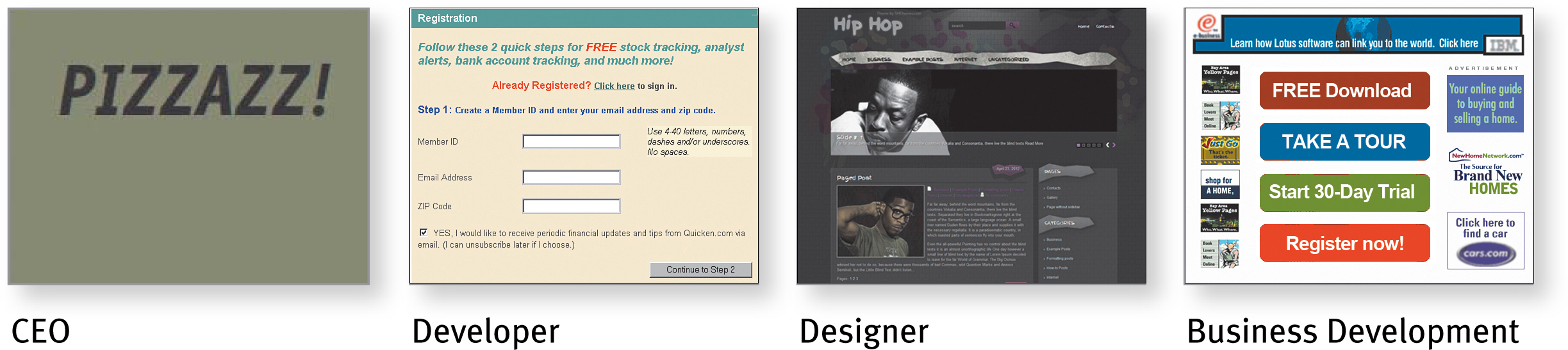
The ideal Web page as seen by someone whose job is...
It’s always seemed to me that these people probably have the jobs they do because of who they are. Designers, for instance, probably became designers because they enjoy pleasant visual experiences. They get visceral pleasure from looking at pages full of elegant type and subtle visual cues. There are endorphins involved.
And developers tend to like complexity. They enjoy figuring out how things work, reverse engineering them in their head, and looking for ideas they can use. Again, there are endorphins at work.
And because these reactions are happening at a brain-chemical level, it’s very difficult for them to imagine that everybody doesn’t feel exactly the same way.
The result is that designers want to build sites that look great, and developers want to build sites with interesting, original, ingenious features. I’m not sure who’s the farmer and who’s the cowman in this picture, but I do know that their differences in perspective often lead to conflict—and hard feelings—when it comes time to establish design priorities.
At the same time, designers and developers often find themselves siding together in another, larger clash between what Art Kleiner describes as the cultures of hype and craft.2
2 See “Corporate Culture in Internet Time” in strategy+business magazine at strategy-business.com/press/article/10374.
While the hype culture (upper management, marketing, and business development) is focused on making whatever promises are necessary to attract venture capital, revenue-generating deals, and users to the site, the burden of delivering on those promises lands on the shoulders of the craft culture artisans like the designers and developers.
This modern high-tech version of the perennial struggle between art and commerce (or perhaps farmers and cowmen vs. the railroad barons) adds another level of complexity to any discussions of usability issues—often in the form of apparently arbitrary edicts handed down from the hype side of the fence.3
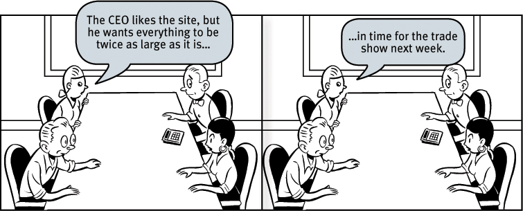
3 I once saw a particularly puzzling feature on the Home page of a prominent—and otherwise sensibly designed—site. When I asked about it, I was told, “Oh, that. It came to our CEO in a dream, so we had to add it.” True story.
The myth of the Average User
The belief that most Web users are like us is enough to produce gridlock in the average Web design meeting. But behind that belief lies another one, even more insidious: the belief that most Web users are like anything.
As soon as the clash of personal and professional opinions results in a stalemate, the conversation usually turns to finding some way (whether it’s the opinion of an outside expert, published research, a survey, or focus groups) to determine what most users like or don’t like—to figure out what the Average Web User is really like. The only problem is, there is no Average User.
In fact, all of the time I’ve spent watching people use the Web has led me to the opposite conclusion:
ALL WEB USERS ARE UNIQUE AND ALL WEB USE IS BASICALLY IDIOSYNCRATIC
The more you watch users carefully and listen to them articulate their intentions, motivations, and thought processes, the more you realize that their individual reactions to Web pages are based on so many variables that attempts to describe users in terms of one-dimensional likes and dislikes are futile—and counter-productive.
And the worst thing about the myth of the Average User is that it reinforces the idea that good Web design is largely a matter of figuring out what people like. It’s an attractive notion: Either pull-downs are good (because most people like them), or they’re bad (because most people don’t). Stories should be on a single long page or they should be broken up into many shorter pages. Home page carousels, mega menus, rollovers, etc. are either good or bad, black or white.
The problem is there are no simple “right” answers for most Web design questions (at least not for the important ones). What works is good, integrated design that fills a need—carefully thought out, well executed, and tested.
That’s not to say that there aren’t some things you should never do, and some things you should rarely do. There are some ways to design Web pages that are clearly wrong. It’s just that they aren’t the things that Web teams usually argue about.
The antidote for religious debates
The point is, it’s not productive to ask questions like “Do most people like pull-down menus?” The right kind of question to ask is “Does this pull-down, with these items and this wording in this context on this page create a good experience for most people who are likely to use this site?”
And there’s really only one way to answer that kind of question: testing. You have to use the collective skill, experience, creativity, and common sense of the team to build some version of the thing (even a crude version), then watch some people carefully as they try to figure out what it is and how to use it.
There’s no substitute for it.
Where debates about what people like waste time and drain the team’s energy, usability testing tends to defuse most arguments and break impasses by moving the discussion away from the realm of what’s right or wrong and what people like or dislike and into the realm of what works or doesn’t work. And by opening our eyes to just how varied users’ motivations, perceptions, and responses are, testing makes it hard to keep thinking that all users are like us.
Can you tell that I think usability testing is a good thing?
The next chapter explains how to test your own site.