
Introduction: Read me first
THROAT CLEARING AND DISCLAIMERS
I can’t tell you anything you don’t already know. But I’d like to clarify a few things.
—JOE FERRARA, A HIGH SCHOOL FRIEND OF MINE
I have a great job. I’m a usability consultant. Here’s what I do:
![]() People (“clients”) send me something they’re working on.
People (“clients”) send me something they’re working on.
It could be designs for a new Web site they’re building, or the URL of a site that they’re redesigning, or a prototype of an app.

Web site design by Interval (ThinkInterval.com)
![]() I try using what they send me, doing the things that their users would need or want to do with it. I note the places where people are likely to get stuck and the things that I think will confuse them (an “expert usability review”).
I try using what they send me, doing the things that their users would need or want to do with it. I note the places where people are likely to get stuck and the things that I think will confuse them (an “expert usability review”).
Sometimes I get other people to try using it while I watch to see where they get stuck and confused (“usability testing”).

![]() I have a meeting with the client’s team to describe the problems I found that are likely to cause users grief (“usability issues”) and help them decide which ones are most important to fix and how best to fix them.
I have a meeting with the client’s team to describe the problems I found that are likely to cause users grief (“usability issues”) and help them decide which ones are most important to fix and how best to fix them.
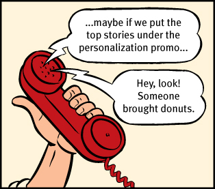
Sometimes we work by the phone...
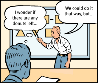
...and sometimes in person
I used to write what I called the “big honking report” detailing my findings, but I finally realized that it wasn’t worth the time and effort. A live presentation allows people to ask me questions and voice their concerns—something a written report doesn’t do. And for teams doing Agile or Lean development, there’s no time for written reports anyway.
![]() They pay me.
They pay me.
Being a consultant, I get to work on interesting projects with a lot of nice, smart people. I get to work at home most of the time and I don’t have to sit in mind-numbing meetings every day or deal with office politics. I get to say what I think, and people usually appreciate it. And I get paid well.
On top of all that, I get a lot of job satisfaction, because when we’re finished, the things they’re building are almost always much better than when we started.1
1 Almost always. Even when people know about usability problems, they can’t always fix them completely, as I’ll explain in Chapter 9.
The bad news: You probably don’t have a usability professional
Almost every development team could use somebody like me to help them build usability into their products. Unfortunately, the vast majority of them can’t afford to hire a usability professional.
And even if they could, there aren’t enough to go around. At last count there were umpteen billion Web sites (and umpteen billion apps for the iPhone alone2) and only about 10,000 usability consultants worldwide. You do the math.
2 I’m not quite sure why Apple brags about this. Having thousands of good apps for a platform is a really good thing. Having millions of mediocre apps just means it’s really hard to find the good ones.
And even if you do have a professional on your team, that person can’t possibly look at everything the team produces.
In the last few years, making things more usable has become almost everybody’s responsibility. Visual designers and developers now often find themselves doing things like interaction design (deciding what happens next when the user clicks, taps, or swipes) and information architecture (figuring out how everything should be organized).
I wrote this book mainly for people who can’t afford to hire (or rent) someone like me.
Knowing some usability principles will help you see the problems yourself—and help keep you from creating them in the first place.
No question: If you can afford to, hire someone like me. But if you can’t, I hope this book will enable you to do it yourself (in your copious spare time).
The good news: It’s not rocket surgery™
Fortunately, much of what I do is just common sense, and anyone with some interest can learn to do it.
Like a lot of common sense, though, it’s not necessarily obvious until after someone’s pointed it out to you.3
3 ...which is one reason why my consulting business is called Advanced Common Sense. “It’s not rocket surgery” is my corporate motto.
I spend a lot of my time telling people things they already know, so don’t be surprised if you find yourself thinking “I knew that” a lot in the pages ahead.
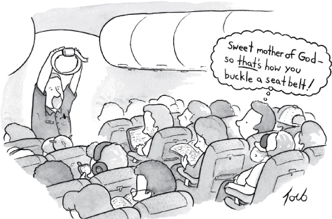
© 2013. The New Yorker Collection from cartoonbank.com All Rights Reserved.
It’s a thin book
More good news: I’ve worked hard to keep this book short—hopefully short enough so you can read it on a long plane ride. I did this for two reasons:
![]() If it’s short, it’s more likely to actually be used.4 I’m writing for the people who are in the trenches—the designers, the developers, the site producers, the project managers, the marketing people, and the people who sign the checks—and for the one-man-bands who are doing it all themselves.
If it’s short, it’s more likely to actually be used.4 I’m writing for the people who are in the trenches—the designers, the developers, the site producers, the project managers, the marketing people, and the people who sign the checks—and for the one-man-bands who are doing it all themselves.
4 There’s a good usability principle right there: If something requires a large investment of time—or looks like it will—it’s less likely to be used.
Usability isn’t your life’s work, and you don’t have time for a long book.
![]() You don’t need to know everything. As with any field, there’s a lot you could learn about usability. But unless you’re a usability professional, there’s a limit to how much is useful for you to learn.5
You don’t need to know everything. As with any field, there’s a lot you could learn about usability. But unless you’re a usability professional, there’s a limit to how much is useful for you to learn.5
5 I’ve always liked the passage in A Study in Scarlet where Dr. Watson is shocked to learn that Sherlock Holmes doesn’t know that the earth travels around the sun. Given the finite capacity of the human brain, Holmes explains, he can’t afford to have useless facts elbowing out the useful ones:
“What the deuce is it to me? You say that we go round the sun. If we went round the moon it would not make a pennyworth of difference to me or to my work.”
I find that the most valuable contributions I make to each project always come from keeping just a few key usability principles in mind. I think there’s a lot more leverage for most people in understanding these principles than in another laundry list of specific do’s and don’ts. I’ve tried to boil down the few things I think everybody involved in design should know about usability.
Not present at time of photo
Just so you don’t waste your time looking for them, here are a few things you won’t find in this book:
![]() Hard and fast usability rules. I’ve been at this for a long time, long enough to know that there is no one “right” answer to most usability questions. Design is a complicated process and the real answer to most of the questions people ask me is “It depends.” But I do think that there are a few useful guiding principles it always helps to have in mind, and those are what I’m trying to convey.
Hard and fast usability rules. I’ve been at this for a long time, long enough to know that there is no one “right” answer to most usability questions. Design is a complicated process and the real answer to most of the questions people ask me is “It depends.” But I do think that there are a few useful guiding principles it always helps to have in mind, and those are what I’m trying to convey.
![]() Predictions about the future of technology and the Web. Honestly, your guess is as good as mine. The only thing I’m sure of is that (a) most of the predictions I hear are almost certainly wrong, and (b) the things that will turn out to be important will come as a surprise, even though in hindsight they’ll seem perfectly obvious.
Predictions about the future of technology and the Web. Honestly, your guess is as good as mine. The only thing I’m sure of is that (a) most of the predictions I hear are almost certainly wrong, and (b) the things that will turn out to be important will come as a surprise, even though in hindsight they’ll seem perfectly obvious.
![]() Bad-mouthing of poorly designed sites and apps. If you enjoy people poking fun at things with obvious flaws, you’re reading the wrong book. Designing, building, and maintaining a great Web site or app isn’t easy. It’s like golf: a handful of ways to get the ball in the hole, a million ways not to. Anyone who gets it even half right has my admiration.
Bad-mouthing of poorly designed sites and apps. If you enjoy people poking fun at things with obvious flaws, you’re reading the wrong book. Designing, building, and maintaining a great Web site or app isn’t easy. It’s like golf: a handful of ways to get the ball in the hole, a million ways not to. Anyone who gets it even half right has my admiration.
As a result, you’ll find that the examples I use tend to be from excellent products with minor flaws. I think you can learn more from looking at good designs than bad ones.
Now with Mobile!
One of the dilemmas I faced when updating this book was that it’s always been a book about designing usable Web sites. Even though the principles apply to the design of anything people have to interact with (including things like election ballots and voting booths, and even PowerPoint presentations), its focus was clearly on Web design, and all the examples were from Web sites. Until recently, that’s what most people were working on.
But now there are a lot of people designing mobile apps, and even the people working on Web sites have to create versions of them that work well on mobile devices. I know they’re very interested in how all of this applies to them.
So I did three things:
![]() Included mobile examples wherever it made sense
Included mobile examples wherever it made sense
![]() Added a new chapter about some mobile-specific usability issues
Added a new chapter about some mobile-specific usability issues
![]() And the most important one: Added “and Mobile” to the subtitle on the cover
And the most important one: Added “and Mobile” to the subtitle on the cover
And as you’ll see, in some places where it made things clearer, instead of “Web site” I’ve written “Web site or mobile app.” In most cases, though, I used the Web-centric wording to keep things from getting cumbersome and distracting.
You’ll find a lot of different definitions of usability, often breaking it down into attributes like
![]() Useful: Does it do something people need done?
Useful: Does it do something people need done?
![]() Learnable: Can people figure out how to use it?
Learnable: Can people figure out how to use it?
![]() Memorable: Do they have to relearn it each time they use it?
Memorable: Do they have to relearn it each time they use it?
![]() Effective: Does it get the job done?
Effective: Does it get the job done?
![]() Efficient: Does it do it with a reasonable amount of time and effort?
Efficient: Does it do it with a reasonable amount of time and effort?
![]() Desirable: Do people want it?
Desirable: Do people want it?
and recently even
![]() Delightful: Is using it enjoyable, or even fun?
Delightful: Is using it enjoyable, or even fun?
I’ll talk about these later. But to me, the important part of the definition is pretty simple. If something is usable—whether it’s a Web site, a remote control, or a revolving door—it means that
A person of average (or even below average) ability and experience can figure out how to use the thing to accomplish something without it being more trouble than it’s worth.
Take my word for it: It’s really that simple.
I hope this book will help you build better products and—if it lets you skip a few of the endless arguments about design—maybe even get home in time for dinner once in a while.