
Chapter 9. The Essentials of Typography
There are some essential typographic rules you must know to prevent your work from appearing amateurish. Many of these guidelines are standard techniques that professional typesetters have used for centuries, but we on our computers are not taught professional typographic techniques—we are simply taught keyboarding skills. Many of us were either taught to type on a typewriter, were taught by those who learned on typewriters, or have just inherited the non-professional techniques that are based on the typewriter. Well, you have surely noticed we don’t use typewriters anymore. In fact, entire generations have never seen one in person.
A typewriter uses monospaced lettering in which each character takes up the same amount of space—a period takes as much space as a capital M (as shown on the following page). It cannot type italic; it uses a single ’ for an apostrophe or a double " mark for both opening and closing quotation marks; it cannot type dashes or copyright symbols or other special characters. It has no bold characters so the only option to emphasize text is by using all caps or an underline. All of these limitations have had an impact on our keyboarding habits today.

This is the typewriter from the 1930s that belonged to my Quaker grandmother, Pauline Williams, who lived to the age of 102. It has the fancy new “Floating Shift” key.
One space after punctuation
Yes, you might have the old-fashioned habit of typing two spaces after punctuation, but it is long past time to let that go. It doesn’t matter today where the practice originated or for how long typesetters used larger spaces between sentences. Today the standard is one space. Take a look at any book or magazine on your shelf. You will never find two spaces between sentences—unless you are reading a self-published piece from an amateur.
This isn’t worth arguing about. There is no moral superiority in belonging to the class of typists who still use two spaces after periods. Sorry!
The first example below uses proportional type, where the characters are in proportion to each other. The second example uses monospaced type.
You can draw vertical lines between the monospaced characters to create equal columns of type because every character takes up the same amount of space. The standard was to type two spaces after punctuation.
It was once upon a time. Exactly what time, no one knew. No one cared.
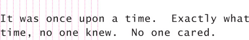
Squint your eyes at the paragraphs below and you will clearly see which one has two spaces after periods. Those big gaps interrupt the communication and make your work look old-fashioned and clumsy.
It was once upon a time. Exactly what time, no one knew. No one cared. All they could remember is that it was once. And never again. It was so long ago, in that once moment, that stories erupted. Stories exploded. Stories screamed.
It was once upon a time. Exactly what time, no one knew. No one cared. All they could remember is that it was once. And never again. It was so long ago, in that once moment, that stories erupted. Stories exploded. Stories screamed.
Quotation marks
Another glaring mistake of amateur designers is the use of typewriter quotation marks instead of typographer quote marks. Your software application will usually insert the correct marks for you, but sometimes it doesn’t and you end up with what appear to be inch and foot marks instead of quotation marks. You need to be aware and leap into action if you see the wrong marks on your page.
Opening quotation marks are shaped like sixes and closing marks like nines: “opening and closing” “66 and 99” sixes and nines
If you have never noticed quotation marks before, you might think no one else notices them. But that’s the funny thing—as soon as you become aware of the difference, you cannot stop noticing them. With just a quick glance at the two sentences below, do you have an immediate sense of which one is amateur?
"Alas," she cried, "my enigma has lost its balance!"
“Hold on,” he bellowed, “I’ll send in the clowns!”
To type the quotation marks, see the charts on pages 158 and 159.
In the United States, commas and periods are always inside the quotation marks. Always. Really. (In the U.K., they can go in or out.)
Colons and semicolons go outside the quotation marks.
A question mark or exclamation point goes inside the quotation marks if it belongs to the quotation: She hollered, “Get out of my reality!”
The question mark or exclamation point goes outside the quotation marks if it does not belong to the quoted phrase: Can you believe he replied, “I won’t do it”?
If more than one paragraph is quoted, the double quotation mark is set at the beginning of each paragraph, but only at the end of the final one.
Apostrophes
An apostrophe is actually a single closing quotation mark as mentioned on the previous page (shaped like a 9), but it is so important that it also has its own segment here. Most software applications automatically supply a true apostrophe instead of what looks like a foot mark, but there are many times when you will have to correct it.
Whenever I see a typewriter apostrophe in a million-dollar ad (and it happens too often), I wonder who hired that person? Who proofed that ad? Didn’t anybody throughout the entire creation process notice that glaring symbol of inexperience and embarrassment?
The first line, below, uses typewriter quotation marks and apostrophes, and the second line has the appropriate six and nine shapes of true quotation marks.
Circle the apostrophes below, noting which are fake and which are true.
"Save yourself," she snarled, "It’s Millie’s turn to hold the horse’s tail."
“I don’t care,” he pleaded, “I’m the one who’s shifting the paradigm.”
Notice that sans serif quotation marks and apostrophes are not as beautifully shaped, but they will have slight six and nine forms (“ ” ‘’). Circle the apostrophes below, noting which are fake and which are true.
"It’s a lost cause," she whined, "The goat’s fallen off Sam’s wagon."
“Darn,” he sighed, “Now I’ll have to find Martha’s future by myself.”
The most common mistakes with apostrophes are 1) using a typewriter mark and 2) putting the apostrophe in the wrong place. Since you are now setting your own type, you need to know where the apostrophe belongs.
Except for possessive words (such as Mary’s poem or the dog’s bone), an apostrophe means a letter is missing (isn’t or don’t or you’re).
Thus in the phrase Rock ’n’ Roll, there should be an apostrophe where the a is missing and also where the d is missing. It should NOT look like this: ‘n’ Wrong!!!! Apostrophes are shaped like 9s.
Little Quiz #4: Apostrophes
I include this quiz because it is so important to know these little things to prevent your work from looking silly. (Answers on page 224.)
Its or it’s: It’s with an apostrophe always means it is. Always. One hundred percent of the time. Below, enter the correct form: it’s or its.
1. ____ my birthday!
2. The mob lost ____ momentum.
3. Plutarch asks, “If a ship is restored over time by replacing every one of ____ wooden parts, is it still the same ship?”
4. Finding himself impaled upon the horns of a dilemma, the yellow-bellied marmot hoisted ____ flag and left.
5. Dearie, ____ too late for that.
6. “Look out! ____ headed this way!”
Draw the apostrophes in the correct shapes and in the correct places (hint: there is only one way to draw an apostrophe). Better yet, type these on your computer and make sure you use apostrophes (the keyboard shortcut for typing an apostrophe is on pages 158–159):
7. They opened the Mom _n_ Pop Shop on River Street.
8. She went fishin_ again last night.
9. We all wore bellbottoms in the _60s.
10. He loves cookies _n_ cream milkshakes.
Dashes
You know what a hyphen is, that tiny little dash that belongs in some words such as daughter-in-law or in phone numbers. It is also used to break a word at the end of a line, of course.
You might be in the habit of using a double hyphen to indicate a dash, like so: -- . This is an old-fashioned convention from the days of typewriters, since they did not have dashes built in. But now you can and should use real dashes.
Hyphen -
A hyphen is for hyphenating words or line breaks. If you are confused about when to use a hyphen, check your favorite style manual or dictionary. The character, as you probably know, is found on the upper-right of the keyboard, just to the right of the zero.
odd-looking critters
Merriam-Webster Dictionary
En dash (short dash) –
The en dash is approximately the width of a capital letter N in the font and size you are typing, thus it is longer than the hyphen. Use it between words that indicate a duration, such as hourly time or months or years. Use it where you would otherwise use the word “to.” Notice in the examples below that these are not hyphenated words, and a plain hyphen is not the logical character to use. The en dash does not need a space on either side.
October–December
7–12 years of age
7:30–9:30 P.M.
Notice when you read these examples, you automatically “read” the en dash as “to.”
Also use the en dash when you have a compound adjective and one of the elements is made of two words or a hyphenated word:
San Francisco–Chicago flight
pre–Vietnam war period
high-stress–high-energy lifestyle
Em dash (long dash) —
The em dash is twice as long as the en dash, approximately the width of a capital letter M. This dash is often used to indicate an abrupt change of thought or in a sentence where a period is too strong and a comma too weak. Check your punctuation style manual for the exact use of the em dash.
The em dash does not have a space on either side. If your software can kern or create thin spaces, you might want to add just enough space to either side of the em dash to ensure it doesn’t bump into the other letters, depending on the font you use. But don’t type a whole space.
Beware—the enigma is gaining on the paradigm.
The goat fell off the wagon—again.
To type the dashes, see the charts on the following pages.
Special characters
Your computer provides not only the alphabet and numbers to type with, but a large collection of special characters such as ©,™, ¢, º, and many others. In fact, the OpenType font format can hold about 16,000 characters, enough for one font to contain the glyphs for just about all written languages. If you use InDesign, open the Glyphs panel to access all characters in any font. Otherwise use the codes below for the most popular characters.
Special characters on the PC
To create these characters in Windows, you can almost always use the ANSI codes. Turn on Num Lock, and use the numeric keypad on the right side of your keyboard. Hold down Alt while you type the numeric code.
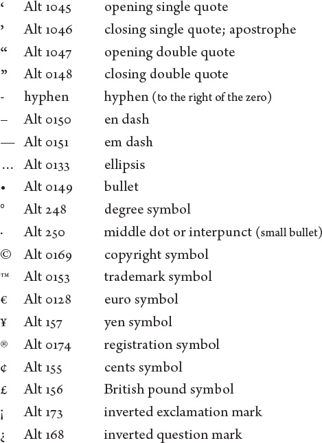
Also become familiar with the Character Map, which displays the available characters for your chosen font. Copy and paste the ones you need.
Special characters on the Mac
To create these characters, hold down the Shift and/or Option key while you tap the letter for that character. See the following page for accent marks.
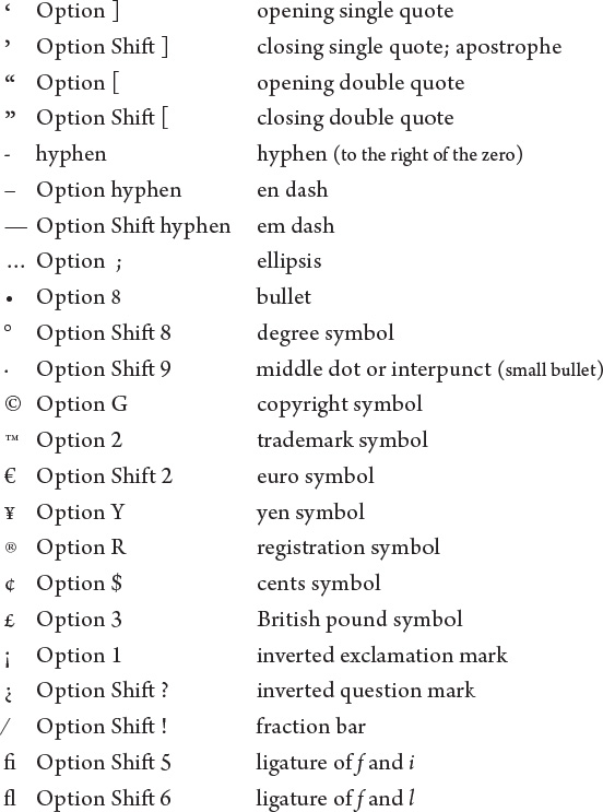
Also check the very bottom of the Edit menu in your application and see if you have the option for “Special Characters....” If so, this opens the Characters panel. Spend some time to familiarize yourself with all the options. Find a character you like, double-click it, and it appears in your document at the point where the insertion point was flashing.
Accent marks
The accent marks are a little sneakier to access. You may have tried to type piñata and ended up with pin~ata.
On a Mac, the accent marks are hidden in the Option keyboard; on a PC, use the ANSI codes.
Accent marks in Windows:
In Windows, there is a different ANSI code for every letter with an accent. For instance, é is Alt 130, but ó is Alt 162. Check the manual for your favorite software program, which might have its own shortcuts.
Accent marks on the Mac:
Find the accent mark you need in the chart below. Hold down the Option key and tap the letter key, even if that’s not the letter you want to put the accent above. Nothing will happen, or you might see a highlighted space. That’s good. Let go of the Option key and type the letter you want. They will appear together.
´ Option e
` Option tilde (upper-left)
¨ Option u
~ Option n
^ Option i
Try this, to type résumé:
1. Type r.
2. Now hold down the Option key and tap the letter e; you might see a highlighted space with the accent mark or you might see nothing.
3. Let go of the Option key and tap the letter e. It turns into é.
4. Type the rest of the word, then repeat steps 2 and 3 for the final e.
Capitals
Setting words in ALL CAPS to call attention to them is not always the best solution because all caps are actually more difficult to read than lowercase. We recognize words not only by their individual letters and groups of letters, but also by their shapes, particularly the shape of the top half of a word, sometimes called the “coastline,” as shown below.
When a block of text is in all caps, we have to read it letter by letter rather than by the shapes of groups of letters. Read the block of text below and notice how much slower than usual you read it and how tiring it can become.
Notice the shapes of these words:
When the same words are in all caps, can you distinguish their shapes?
When text is in all caps, we have to read it letter by letter, rather than by groups of letters. Read the block of text below; be conscious of how much slower than usual you read it.
Obviously, we can read all caps, and sometimes all caps is the perfect design decision. Just make sure you have a reason for using them, a reason you can put into words, such as, “I really want the text for my logo set as one rectangular piece.” If you find yourself setting all caps on the mistaken notion they are bigger and thus easier to read, try another solution.
Ever.
When was the last time you saw a word underlined in a book or magazine? Probably never. That’s because the underline was originally a visual clue on a typewriter to tell the typesetter who was creating the project that the underlined word was to be turned into italic for print. But now you are the typesetter yourself, so you do not need that visual clue—you will just use italic. Protocol is that book titles, journals, magazines, operas, etc. are set in italic.
You might also be in the habit of underlining words that you want to emphasize. However, you have several other options for emphasis that are more professional: try bold type, larger type, a different font, color, or a combination.
Simply setting text apart from the rest of the copy
can call extra attention to it.
This doesn’t mean you should never have any sort of line under the text—just don’t settle for the default underline style that you get by clicking the button or using the keyboard shortcut. Typographers have always used rules, or lines, to enhance text. Most applications, even Microsoft Word, allow you to adjust the rule: You can customize its thickness, length, and how far away it is from the baseline of the text. Check your software manual or help file.

Kerning
Kerning is the process of removing tiny units of space between characters to create visually consistent letterspacing.* Word processors have limited or no controls for this, which is one reason why a person with a trained eye can immediately tell the difference between text created in a word processor as opposed to a page layout application.
* There is a difference between kerning, tracking, and letterspacing, but that is beyond the scope of this introduction to the essentials (see The Non-Designer’s InDesign Book for those details or check your page layout application help files).
The larger the text, the more critical it is to adjust the spacing. Awkward letterspacing not only creates a naive and unprofessional presentation, it can disrupt the communication of the words.
Kerning is totally dependent on your eye; the computer cannot do it for you. In the example below you can see extra space between certain letter combinations (WA, LO) because of their shapes (angled, rounded, vertical). Depending on your application, it might attempt to adjust the spacing for you, but if you are aspiring to a professional level, you need to learn to manually adjust the spacing. Check your help files for the specific methods to kern or letterspace in your application.
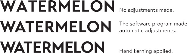
Kerning is not about making the letters fit together tightly—it is about making the space between the letters appear to be visually consistent.

Which appears larger, the square or circle? The circle appears to be smaller because of all the white space surrounding it, but both shapes are exactly the same size from edge to edge. It is this visual trick of the eye that creates the need to letterspace or kern type—each character presents a different visual impression on the page. The more white space between a letter combination, the more kerning it will need. Notice the varying spaces between these combinations:
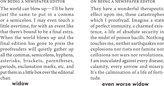
Widows and orphans
Obviously we’re not talking about bereaved widows and orphans such as some of us are ourselves. No, these are traditional typographic terms.
When the last line of a paragraph has fewer than seven (more or less, depending on the length of the line) characters, that last line is a widow. Worse than leaving one word as the last line is leaving part of a word, the other part being hyphenated on the line above. Don’t ever do that!
typeface
text
When the last line of a paragraph, be it ever so long, ends at the top of the next column or page all by itself, abandoned by the rest of its text, that is an orphan. Some people call a widow an orphan and vice versa, and that’s fine. It doesn’t matter what you call it—don’t do it.
To avoid widows and orphans, you might need to rewrite copy (if you have that power), or at least add or delete a word or two. Sometimes you can add or delete spacing between the letters, words, or lines, depending on the application you’re working in. Sometimes you can widen or narrow a margin just a hair to fix it. Do what you need to do because it must be done.
Miscellaneous
This is a short list of professional typographic niceties which, if you follow, will prevent your work from looking amateurish. There is, of course, nothing wrong with being an amateur, but the presentation of your work does have an instant impact on its readers. Why not take a tiny extra step to ensure a favorable impact?
![]() Punctuation following styled text: If you have a word styled in bold or italic or a different font, the punctuation immediately following the last character should be in the same style. As shown in the first sentence of this paragraph, the colon following the bold sans serif is also in bold sans serif. Notice the period in the previous sentence is the same format as the text it follows.
Punctuation following styled text: If you have a word styled in bold or italic or a different font, the punctuation immediately following the last character should be in the same style. As shown in the first sentence of this paragraph, the colon following the bold sans serif is also in bold sans serif. Notice the period in the previous sentence is the same format as the text it follows.
![]() Punctuation in parentheses: Just in case you are not clear on whether punctuation goes inside or outside parentheses, here is the grammatical rule.
Punctuation in parentheses: Just in case you are not clear on whether punctuation goes inside or outside parentheses, here is the grammatical rule.
If the text inside the parentheses is part of the entire sentence, then the punctuation goes outside the closing parenthesis (as in this example right here).
If the text inside the parentheses is a complete and separate sentence on its own, its punctuation goes inside. (This is an example of a sentence with its punctuation inside.)
![]() Paragraph indents: You may have been taught that a paragraph indent is five spaces, or perhaps you automatically hit the Tab key and accept whatever the default tab space is (usually half an inch). This is a holdover from the ancient days of the typewriter. The appropriate spacing for professional-level typography is not half an inch or five spaces, but one em space, and an em space is equal to the point size of the type you are using. Thus if you are using 12-point type, the paragraph indent is 12 points, or about two Spacebar spaces. You don’t have to get out a measuring device, but approximate about two spaces on your tabs ruler rather than five. Once you become accustomed to this, those half-inch indents will look really obnoxious.
Paragraph indents: You may have been taught that a paragraph indent is five spaces, or perhaps you automatically hit the Tab key and accept whatever the default tab space is (usually half an inch). This is a holdover from the ancient days of the typewriter. The appropriate spacing for professional-level typography is not half an inch or five spaces, but one em space, and an em space is equal to the point size of the type you are using. Thus if you are using 12-point type, the paragraph indent is 12 points, or about two Spacebar spaces. You don’t have to get out a measuring device, but approximate about two spaces on your tabs ruler rather than five. Once you become accustomed to this, those half-inch indents will look really obnoxious.
![]() Paragraph indent or extra space between paragraphs: An indent means, “This is a new paragraph.” Extra space between paragraphs also means, “This is a new paragraph.” Thus you need to pick one: Either indent new paragraphs or use extra space between paragraphs, not both.
Paragraph indent or extra space between paragraphs: An indent means, “This is a new paragraph.” Extra space between paragraphs also means, “This is a new paragraph.” Thus you need to pick one: Either indent new paragraphs or use extra space between paragraphs, not both.
![]() First paragraphs: Following the logic of the above principle, you can understand why the first paragraph following a heading or subhead does not need an indent. Ever.
First paragraphs: Following the logic of the above principle, you can understand why the first paragraph following a heading or subhead does not need an indent. Ever.
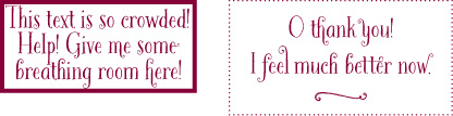
![]() Setting text in a frame or box: If you do set text inside a box, leave plenty of room on all sides. Even if you create the box in a word processor, you can find the settings that open up the space. Generally, create the visual impression that there is the same amount of space on all sides. Listen to your eyes.
Setting text in a frame or box: If you do set text inside a box, leave plenty of room on all sides. Even if you create the box in a word processor, you can find the settings that open up the space. Generally, create the visual impression that there is the same amount of space on all sides. Listen to your eyes.
![]() Use bullets or ornaments in a list, not hyphens: When listing items, please don’t use hyphens. It looks so sad. The standard bullet (• Option 8 on a Mac or Alt 0149 in Windows) is just as easy to type as a hyphen. Or use a character from a dingbat or ornament font, as you can see in this bulleted list you are reading right now (you might need to make the ornament larger or smaller than the text, depending on the dingbat you choose).
Use bullets or ornaments in a list, not hyphens: When listing items, please don’t use hyphens. It looks so sad. The standard bullet (• Option 8 on a Mac or Alt 0149 in Windows) is just as easy to type as a hyphen. Or use a character from a dingbat or ornament font, as you can see in this bulleted list you are reading right now (you might need to make the ornament larger or smaller than the text, depending on the dingbat you choose).
![]() And yet more: The things you’ve learned in this book will take you a long way. Yet there are so many details involved in creating professional-level typography, too many for this book. The Non-Designer’s Type Book is now rolled into the “Deluxe Edition” of a combination of that book and this one in your hands, called The Non-Designer’s Design & Type Books and has lots more typographic information and techniques. If you are an InDesign user, The Non-Designer’s InDesign Book will teach you how to use that application to create great typography.
And yet more: The things you’ve learned in this book will take you a long way. Yet there are so many details involved in creating professional-level typography, too many for this book. The Non-Designer’s Type Book is now rolled into the “Deluxe Edition” of a combination of that book and this one in your hands, called The Non-Designer’s Design & Type Books and has lots more typographic information and techniques. If you are an InDesign user, The Non-Designer’s InDesign Book will teach you how to use that application to create great typography.