
Chapter 5. Designing Your App’s User Interface
Every platform has its own idioms, the ways of presenting content and performing actions that users of that platform come to expect over time. Some of these conventions may be set by the platform’s vendor (for example, the use of tab bar controllers and navigation controllers in iOS, as demonstrated by Apple right from the launch of iPhone), while others come from third-party developers and designers, gain traction, and become popular across the platform (the pull-to-refresh interaction on iOS, for example, was first implemented and used by a third-party developer).
The conventions of a platform change and develop over time. Some elements endure, whereas others turn out to be gimmicks that hinder rather than help. Sometimes the platform’s owner decides it’s time for a change (what did you think the first time you saw the look and feel of iOS 7?). Sometimes the community insists.
Apple Watch is a very young platform, and few conventions have been established or user expectations set. It’s an exciting time when the world is your digital rotary input mechanism.
You’re not all on your own, though. The best place to start when deciding how to take advantage of the platform is, of course, the Apple Watch “Human Interface Guidelines” (HIG), published by Apple at http://bit.ly/bwa-hig. Every developer working in watchOS should get to know those guidelines very well. In this chapter, we’re not going to repeat what’s in the HIG, but we will highlight some of the developing best practices on the platform.
Thinking About Design
In comparison with the rest of the Apple ecosystem, Apple Watch provides a drastically different way for users to interact with your software. The watch is, of course, closest in philosophy and in size to iPhone, but it still requires a change in thinking and approach as you design your apps. Every aspect of an app’s design, be it visual layout, interaction design, information architecture, even use of color, is very different in this little window on your wrist.
Consider:
 Apple Watch is smaller than iPhone. Much smaller. (Well, obviously. You’re glad you bought this book, aren’t you, for insights like that one?) In terms of how much and what can be onscreen at a given time, and of the size of your tapping digit against the screen, there’s just less of it.
iPhones have bigger screens than the Apple Watch. The iPhone’s screen is great for long periods watching out for fave notifications from Twitter or browsing your library of cat-fail GIFs, but Apple Watch excels at the short, sharp, focused interaction. Don’t expect to be too comfortable reading through your ebook library on your wrist.
Being small, but being a class of device that you expect to always be there and always be ready when you need it, the watch is very frugal with its resources—which all, eventually, comes down to power. Talking to the network costs power, having the screen lit up costs power, performing any computation costs power, so the less time spent doing any of these things, the better.
Apple Watch introduces physical, tactile ways to connect with the user that are new to the Apple ecosystem: the Taptic engine (discussed in Chapter 14), force touch, and the digital crown.
Many of us might have our phones with us pretty much all the time, but your watch is right there strapped to your wrist. There’s no need to fish around in your pocket or purse. Just lift your arm a little and look down. The watch brings—and expects—a whole new immediacy to the use of software.
This all provides us with an interesting set of challenges: how to focus on the quick, simple interaction while still providing a beautiful and graceful experience? How to be immediate and responsive to the user, minimizing lag, while being careful and economical with system resources? How to show off as a developer without the opportunity to create awesome new custom controls? Maybe we can help with that.
Meeting the Challenge
Some pieces of information, developing best practices, techniques, and tips can help you provide the best experience possible for the user. These are based on the foundation provided by the HIG and will be useful as you work and flourish within the constraints of the platform.
“Phenomenal Cosmic Power, Itty-Bitty Living Space”
Apple Watch comes in two sizes: 42mm and 38mm (or, as we like to call them, Small and Smaller). Those numbers, which may seem arbitrary, are conventional sizes to watch makers, and refer to the height of the watch. The display on the 42mm watch is 312 pixels wide by 390 pixels tall, while that of the 38mm watch is 272 pixels wide by 340 pixels tall.
That’s not a lot of room, even on the larger watch. A number of techniques and principles will help you make the most of the space available.
Wall-to-Wall User Interface
If you look at an Apple Watch while its display is off, you might notice that it’s quite difficult to tell where the screen itself ends and the black bezel of the device begins. This is a great advantage when laying out your user interface. Figure 5.1 is a screenshot taken from the Music app running on a 42mm Apple Watch. Notice how much of the width of the screen is filled by the table rows.
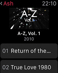
This layout looks tight in the screenshot. If you’re anything like us, then your hands are probably itching to add some margin around the edges. But when run on the device, this UI looks completely natural. The black of the watch face around the screen provides the needed margin, leaving the full size of the screen itself available to UI elements.
Of course, to take advantage of this bonus visual space, your app will need to keep to the watchOS standard of a black background. That said, with current hardware and software, you’d need to have a very good reason not to: It would take significant effort to provide a colored background for your app’s display. Doing so would be a major break from the current design language of watchOS, and on an OLED (organic LED) display such as that of the Apple Watch, black pixels consume no power, leading to longer battery life for the user.
Content Before Chrome
If you’ve been developing software for Apple platforms for more than a couple of years, then we’re sure you have an opinion on gradients in title bars. Or green felt. Or what about brushed metal? Pinstripes? Cheerful blue pills for buttons? We could go on. These are all examples of the evolving design language used on iOS and OS X over the years, and they all have one thing in common: They take up space on the screen. (They all have other things in common, as well, starting with where you might think each falls in the spectrum of good taste—but let’s not dwell on the past!)
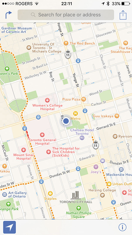
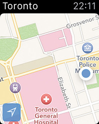
Of course, when we say “chrome” we don’t just mean the nonfunctional aspects of what’s onscreen. Compare Figure 5.2 with Figure 5.3. The first shows the Maps app running on an iPhone 6, while the second shows the Maps app on the Apple Watch. On iOS, there is plenty of screen space to expose much of the app functionality in persistent UI: search, current location, the info menu, and more. On the other hand, almost all the available screen space on the watch is given over to the map itself. Most functionality is accessed via the context menu or via Siri.
As Much As You Need—And No More
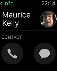
Complementary to the principle of content before chrome is that of paring content down to the absolute minimum needed for your app to perform its function for the user. Figure 5.4 shows a contact card from the watchOS Phone app. Almost none of the information available in the equivalent screen on iOS is displayed on the watch.
A key principle here is to carefully consider the use cases for your watchOS app, bearing in mind the following:
Apple Watch is not suited to lengthy perusal of huge chunks of data. In fact, its display will go to sleep after only a few seconds of inactivity, leaving the wearer with very little time to contemplate the variety of options you give them. Fewer possibilities will make for a more effective interaction.
Some of the most essential features of smartphones (especially iPhone) are their immediacy and convenience when compared with more traditional computing devices, and Apple Watch emphasizes these even more. In order to play to these strengths, you will need to identify the key information to present to your user, and the key actions they might then take with your app. Look again at Figure 5.4. The contact’s name and image (if one is set) are the key pieces of information for quick identification, and two big buttons enable the most common actions: make a call or send a message.
Of course, some apps require a fuller navigational structure to provide all the value they can for the user (see Chapter 3 for the options). In these cases, you will need to decide which approach or approaches are most appropriate. Does paging between controllers make sense, to divide up chunks of functionality? Or are you presenting structured data that would be best handled in a drill-down hierarchy? Would the scrolling provided via the digital crown help the user as they try to get into your app, find what they need, and get out again?
Getting data to the watch is costly. It is time consuming, via the Bluetooth link to the host iPhone. Using those radios to send and receive drinks up available power, as does the computational work of processing input and output. Users don’t enjoy discovering that their hot new app is also the reason they need to charge their device by lunchtime.
We’re not saying that your app shouldn’t do anything—if we were, we could all just go home now. All the potential that Apple Watch presents for wonder, delight, and utility would be wasted if we were afraid to make our apps do anything because of something we read in a book. However, designing great software is every bit as much about deciding what to leave out as it is about deciding what to put in.
Tap Targets, Fat Fingers, and Small Screens
Back in the mists of time, at the Dawn of the iPhone SDK, Apple recommended that all tap targets in an iPhone app be at least 44pt square—the size they had identified as the minimum that could be tapped accurately with a fingertip. With the release of Apple Watch, the screens we’re tapping may be smaller, but our tapping digits are as big and inaccurate as ever. You might even find that trying to tap at a little screen on your wrist makes for even less coordination and accuracy, so it’s useful to think about what controls the user will absolutely need in your app, and whether it is more useful to make them bigger targets than it is to have them all onscreen at the same time.
Figure 5.5 shows the watchOS screen displayed when an alarm is going off. Consider the circumstances in which users encounter this interface: An alarm is going off, and they need to silence it quickly and easily. Nice big buttons make this as simple as possible, which is a definite plus if your alarm has just gone off during an orchestral performance.
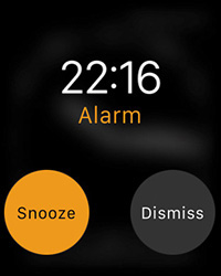
In the excitement of developing your watch app, make sure to test it on a physical device on your wrist—and to do so in the kind of situations where you imagine it might be used, be that when you’re walking down the street or when you’re lounging on your couch.
Bringing a Little Color
With the standard black background and the limited scope for visual flourish, the use of color is a key way to establish the character and identity of your app.
Each app can specify a global tint color, which is used by the OS to set, for example, the color of the text in the Watch’s status bar while your app is running (Figure 5.6) or the color of the app name text in a short-look notification.
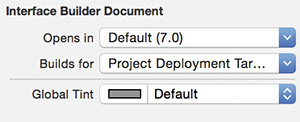
To set the global tint color for your app in Xcode:
1. Select the app’s Interface.storyboard.
2. Open the File inspector.
3. Set the global tint color using the color selector (Figure 5.7).
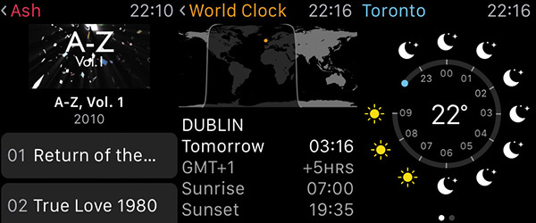
Rather than take up valuable screen space with your logo or other branding, Apple recommends using the global tint color of your app to reflect the product’s identity. This is good advice—it’s a simple, effective approach. Consider also the other places where the color could be introduced: button text or backgrounds, table row backgrounds, or other small interface elements. Look, for example, at the city location markers in the World Clock app in Figure 5.6. The app’s identifying color is used in such a small visual element, yet it is prominent enough that it strengthens the identity of the app as a whole.
Be Prepared
Waiting can be a frustrating experience. Waiting on a device that was meant to provide instant and immediate convenience is an even more frustrating experience. A poorly placed “Please Wait...” or an activity spinner blocking the UI can be enough to turn a user right off your app and send them to the delete button. Yet sometimes, especially when accessing remote resources, a wait is inevitable. So what is a developer to do?
Readiness
Do what you can to make sure your app has the data it needs in advance of when the user expects it. You might find limitations to your ability to predict the future, but sensible background loading and caching of data can greatly reduce the wait time when the user launches your app. See Chapter 10 for how to load data from the network and transfer it between the watch and its host iPhone.
The Impression of Readiness
Perhaps your app is such that it’s not practical or possible to have everything preloaded and ready for users whenever they come along. In that case, all is still not lost. If data is your thing, is there a minimal, or approximate, data set that you can use, and then refine once the app is active? Alternatively, is there an idle state that the user interface can display while being fully set up?
Our eyes and our minds are very willing to receive suggestion and to be lulled into satisfaction. A spinner might appear only for a second or two before being replaced with a fully active and interactive UI, but those seconds will seem much shorter to the user if they are spent looking at a nearly ready UI that then becomes ready.
Gesture and Touch
The range of available gestures is one of the defining characteristics of a touch-based interface. If you’ve spent much time as a user of iOS devices, you’ll have encountered a tremendous range of gestures—some more useful and usable than others: taps with varying numbers of digits, double taps, triple taps, pinches, swipes, long presses, rotations... they’ve all been put to myriad uses.
The watchOS, as you probably expect by now, has fewer options available: taps to trigger actions on controls (for example, the tap of a button), swipes for exploring content and for triggering navigation, and the force touch to trigger a WKInterfaceController’s context menu. Add in the occasional use of the digital crown to control zoom level (as in the Maps app, for example), and those are the possibilities.
From the developer’s point of view, the gestures themselves are understood and received only via watchOS controls and interface controllers, with the recognition and response to the gestures themselves being the business of the operating system. Unfortunately, there is no equivalent of the various UIGestureRecognizer subclasses available on iOS. The smaller screen sizes of Apple Watch do not leave enough room (literally) for the variety and experimentation that has been seen on the larger devices, enforcing a standard approach to touch and gesture.
Wrapping Up
Several points in this chapter have made reference to the differences between watchOS and iOS—and, in particular, to the more restrictive environment offered by the watch. We encourage you to view these differences positively and to approach the constraints creatively. Apple Watch is a new platform in the Apple ecosystem, and this is the first time many of us have developed software for the new category of “wearable” devices. These are still the early days of learning and internalizing the patterns and conventions of the platform, and users’ understanding and expectations will only develop and become more flexible over time.
We have been quite opinionated in this chapter and have sought to present current understanding of best practice in designing for watchOS. Remember, though, that the magic exists not only in knowing when to follow the rules, but also in knowing when to break them. So experiment, play, and see where your taps and swipes can take you!