
One of the duties of front-end developers is to provide the best experience to users regardless of what device or browser they are using.
This was not always the prevailing attitude, and the companies that made browsers were partly to blame. In the early days of the web, browser makers were fighting a war. Each would invent new nonstandard features in an attempt to out-do the others. In response, web developers came up with schemes for detecting which browser was requesting a document and what screen size was being used. Based on this information, a different version of the document was served out.
Sadly, this meant that front-end development became weighed down with creating multiple copies of every page on a site, each copy built with the markup and styles that would work for a specific version of a browser running at a particular screen size. Maintaining all of these copies was both time consuming and frustrating.
Thankfully, the Browser Wars are over, and browser makers now strive to conform to the same set of standard features – and modern front-end developers are free to focus on a single codebase for a website. Gone are the days of needing to create browser-specific versions of a page. But that does not mean that developers can no longer provide tailored pages based on different screen sizes or orientations. New technologies – like flexbox, which you will learn about in this chapter – allow layouts to adjust to the user’s screen size without requiring duplicate documents.
In this chapter, you are going to expand Ottergram from a simple list of images to a proper user interface ready for interactive content. Using flexbox and CSS positioning, you will build a set of interface components that adjust as needed to variations in the size of the browser window while maintaining the overall layout. At the end of the chapter, Ottergram will feature a scrolling list of thumbnail images and an area that displays a large, detailed version of a single image (Figure 4.1).

You will do this in two parts. First, you will add the minimal markup and styles necessary to show the large image on the page and to make the thumbnails smaller and scrollable. Then, you will add styles that let parts of the page stretch and shrink as the window changes size or to accommodate screens of different sizes.
Since the introduction of the iPhone, the trend toward accessing the internet via a smartphone, rather than a desktop or laptop, has grown steadily.
For front-end developers, this trend has meant that mobile-first development has proven to be the best design approach: designing for small screens first, then building on that design for tablet-size screens, and finally building up to a desktop-sized design.
Ottergram’s simple layout is already mobile-friendly. It displays the text and images at a scale that is appropriate for smaller screen sizes. Because of this, you can move right into adding the next level of complexity to your layout.
A vertically scrolling list of otters is fine, but it would be even better if the user could also see a larger version of the images. The plan for Ottergram is to make the thumbnail list scroll horizontally while a larger detail image is featured. For now, the detail image will be below the list. This plan is diagrammed in Figure 4.2.

You will begin by adding the detail image.
For now, your detail image will be fixed to a single image. In Chapter 6 you will add functionality so that the user can click on a thumbnail to make any image the detail image.
Add a new section of code to create the detail image in index.html:
...
      <li class="thumbnail-item">
        <a href="#">
          <img class="thumbnail-image" src="img/otter5.jpg" alt="Barbara the Otter">
          <span class="thumbnail-title">Barbara</span>
        </a>
      </li>
    </ul>

    <div class="detail-image-container">
      <img class="detail-image" src="img/otter1.jpg" alt="">
      <span class="detail-image-title">Stayin' Alive</span>
    </div>

  </body>
</html>
You added a <div> with a detail-image-container class.
A <div> is a generic container for content – usually for the purpose of
applying styling to the enclosed content, which
is exactly how you will use it.
Inside the <div> you added an <img> tag to display
the large version of the otter image. You also added
a <span>, which wraps around the title text for the detail image.
You gave the <img> and <span> tags the class names
detail-image and detail-image-title, respectively.
Save index.html, switch to styles.css, and, at the end, constrain
the width of your new .detail-image class.
...
.thumbnail-title {
  ...
}

.detail-image {
  width: 90%;
}
Save styles.css and start browser-sync to open your project in Chrome (Figure 4.3).
(The command is
browser-sync start --server --browser "Google Chrome" --files "stylesheets/*.css, *.html".)
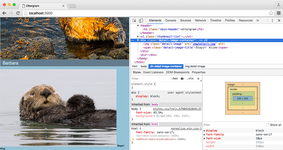
Your .detail-image will appear at the bottom of the page, a bit narrower
than your thumbnails.
By making the detail image 90% of its container’s width, you have left a little space next to it.
The browser puts the text of the .detail-image-title
in that space.
(You will style that text later in this chapter.)
If you resize the page, you will discover a bug: The detail image may be pushed out of view by the thumbnails as they adjust to the new width. You will address this problem later in this chapter.
Next, you will update the .thumbnail-list and
.thumbnail-item classes so that the images scroll horizontally.
To help you test your scrolling,
duplicate all five <li> elements in index.html. This will give you lots of content to scroll through. To do this,
simply select all of the lines between <ul class="thumbnail-list">
and </ul>, copy them, and paste the result just above the </ul>.
You should end up with 10 list items, containing images otter1.jpg through otter5.jpg twice.
Be sure to save index.html when you are done. Duplicating content while you are developing is a good technique for simulating a more robust project. It allows you to see how your code handles real-world situations.
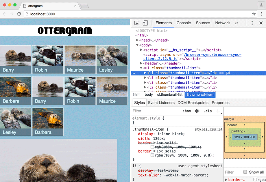
For a horizontally scrolling list of thumbnails, each thumbnail must be constrained to a specific width and the thumbnails should be laid out horizontally on a single line.
The display: block property, which you have used several times, will not create the desired effect.
It causes
the browser to render a line break before and after the element.
However, a related style, display: inline-block, is perfect for this
situation.
With inline-block, the element’s box is drawn as if you declared display: block,
but without the line breaks – allowing your thumbnails to stay lined up in a row.
Add a width declaration and change the display declaration for the .thumbnail-item class in styles.css.
...
.thumbnail-item {
  display: block;
  display: inline-block;
  width: 120px;
  border: 1px solid rgb(100%, 100%, 100%, 0.8);
  border: 1px solid rgba(100%, 100%, 100%, 0.8);
}
...
(Note that Atom’s linter may warn you that “Using width with border can sometimes make elements larger than you expect.” This is because the width property
only applies to the content portion – not the padding or border – of the element’s box.
You do not need to do anything about this warning.)
With the .thumbnail-item element’s width set to an absolute value
of 120px, the .thumbnail-image is effectively fixed as well,
since the .thumbnail-image adjusts to its container’s width.
Why not just set the .thumbnail-image to width: 120px?
You want the .thumbnail-image and the .thumbnail-title
to be the same width. Instead of setting the width property for each of these,
you set it on their common parent element. That way, if you need to change the width,
you only need to change it in one place.
Generally, it is a good practice to have inner elements adapt to their containers.
Save styles.css and check your page in Chrome.
You can see that the
.thumbnail-item elements line up side by
side – but when they fill the width of their container, they wrap
around (Figure 4.4).
To get the scrolling behavior you want, set
.thumbnail-list to prevent
wrapping and allow scrolling in styles.css.
...
.thumbnail-list {
  list-style: none;
  padding: 0;

  white-space: nowrap;
  overflow-x: auto;
}
...
The white-space: nowrap declaration prevents
the .thumbnail-item elements from wrapping.
The overflow-x: auto tells the browser that
it should add a scrollbar along the horizontal space (the x axis) of the .thumbnail-list
element to accommodate content that overflows – i.e., does not fit within the .thumbnail-list.
Without this declaration, you would have to scroll the entire web page to see the additional thumbnails.
Save your file again and take a look at the results in your browser. The thumbnails are now in a single row, and you should be able to scroll through them horizontally (Figure 4.5).

This is a good start to the enhanced Ottergram interface. It works just fine for some screen sizes. However, it is not perfect, because it does not adapt well to a wide range of sizes – especially those that are much larger or smaller than the computer you are currently using.
In the next two sections, you will add code that gives Ottergram a more fluid layout and allows its UI - its user interface - to shift between different layouts to adapt to ranges of screen sizes.