
Media queries let you group CSS declaration blocks and specify the conditions under which they should be applied. Those conditions may be something like “if the screen is at least 640 pixels wide” or “if the screen is wider than it is tall and has a high pixel density.”
The syntax begins with @media, followed by the conditions to be matched. Next is a set of curly braces that wraps around entire
declaration blocks. Let’s see what this looks like.
Begin your first media query at the end of styles.css. You will create a media query that will activate styles when being viewed on any kind of device when the viewport is at least 768 pixels wide, which is a common device width for tablets.
...
.detail-image-title {
  ...
}

@media all and (min-width: 768px) {
  /* Styles will go here */
}
@media is followed by the media type all.
Media types were originally intended to differentiate between devices, such as smart televisions
and handheld devices. Unfortunately, browsers do not implement this accurately,
so you should always specify all. The only time you might not
use all is when you want to specify styles for printing, when you can safely use the
media type print.
After the media type, you write the conditions for applying the styles.
Here, you are using the useful condition min-width. You can see that
conditions look similar to style declarations.
To achieve the effect shown in Figure 5.1,
you will need to change the flex-direction of the .main-content
element. This will let the thumbnails and the detail image sit next to one another.
You do not want the thumbnails to cause the browser to scroll. Instead, they
should continue to scroll independently of the browser window. For that, you
will add overflow: hidden.
Add those styles to your media query at the end of styles.css.
...
@media all and (min-width: 768px) {
  /* Styles will go here */
  .main-content {
    flex-direction: row;
    overflow: hidden;
  }
}
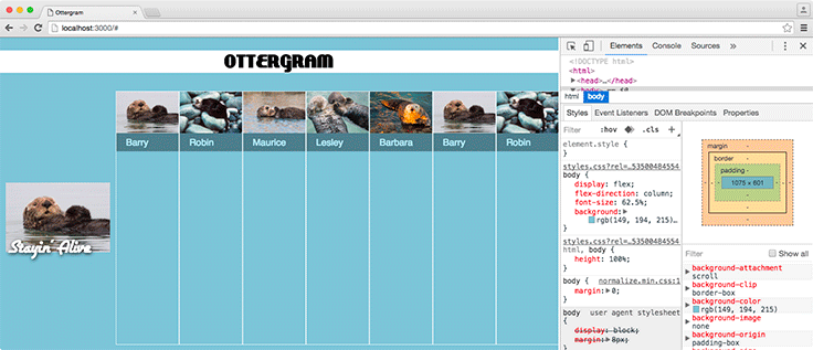
You would be in for a shock if you saved and then stretched your browser wide enough to trigger your media query. At the moment, your page looks like Figure 5.5. Not to worry. You will fix this with only a few more lines of code.
The thumbnails need to be displayed in a column instead of a row.
This is easy to do, because you used flexbox for laying them out.
Add a declaration block inside the body of the media query in styles.css
setting .thumbnail-list’s flex-direction
to column.
...
@media all and (min-width: 768px) {
  .main-content {
    flex-direction: row;
    overflow: hidden;
  }

  .thumbnail-list {
    flex-direction: column;
  }
}
Save styles.css. That has improved things significantly (Figure 5.6)!

According to your design, the thumbnails should go on the left.
You can solve this by changing .thumbnail-list’s order.
Earlier, you set it to 2 so that it would be drawn
after the .detail-image-container. Now, set it to 0
within the media query in styles.css so that it follows the source order and is drawn before the
.detail-image-container.
...
@media all and (min-width: 768px) {
  .main-content {
    flex-direction: row;
    overflow: hidden;
  }

  .thumbnail-list {
    flex-direction: column;
    order: 0;
  }
}
Save your changes and confirm that the thumbnails are drawn on the left side of the page.
You are almost there!
Add a few more styles in styles.css for the
.thumbnail-list and .thumbnail-items
to make the sizing and spacing a little nicer.
...
@media all and (min-width: 768px) {
  .main-content {
    flex-direction: row;
    overflow: hidden;
  }

  .thumbnail-list {
    flex-direction: column;
    order: 0;
    margin-left: 20px;
  }

  .thumbnail-item {
    max-width: 260px;
  }

  .thumbnail-item + .thumbnail-item {
    margin-top: 20px;
  }
}
Once again, save styles.css and switch to your browser. Your layout now looks sharp whether the viewport is narrower or wider (Figure 5.7).

Ottergram is making steady progress! You have created a good-looking website with a layout that can adapt to many screen sizes. In the next chapter, you will begin using JavaScript to add a layer of interactivity to Ottergram.