
4
Styling in React
For generations, mankind (and probably really smart dolphins) has styled HTML content using CSS. Things were good. CSS had good separation between content and presentation. The selector syntax offered a lot of flexibility in choosing which elements to style and which ones to skip. We couldn’t even find many reasons to hate the whole cascading thing CSS is all about.
Well, don’t tell React that. React doesn’t actively hate CSS, but it has a different view when it comes to styling content. As you’ve seen, one of React’s core ideas is to make an app’s visual pieces self-contained and reusable. That’s why the HTML elements and the JavaScript that impacts them are in the same bucket, called a component. You got a taste of that in the previous chapter.
What about how the HTML elements look (a.k.a. their styling)? Where should they go? You can probably guess where we’re going with this. You can’t have a self-contained piece of UI when the styling for it is defined somewhere else. That’s why React encourages you to specify how your elements look right alongside the HTML and the JavaScript. In this tutorial, you’ll learn all about this mysterious (and possibly scandalous) approach for styling your content. Of course, we also look at how to use CSS. There’s room for both approaches, even if React might sort of, kind of not think so.
Displaying Some Vowels
To learn how to style React content, let’s work together on a (totally sweet and exciting) example that simply displays vowels on a page. First, you’ll need a blank HTML page that will host your React content. Create a new HTML document and add the following content into it:
<html>
<head>
<meta charset="utf-8">
<title>Styling in React</title>
<script src="https://unpkg.com/react@16/umd/react.development.js"></script>
<script src="https://unpkg.com/react-dom@16/umd/react-dom.development.js"></script>
<script src="https://unpkg.com/[email protected]/babel.min.js"></script>
<style>
#container {
padding: 50px;
background-color: #FFF;
}
</style>
</head>
<body>
<div id="container"></div>
</body>
</html>
To display the vowels, you need to add some React-specific code. Just below the container div element, add the following:
var destination = document.querySelector("#container");
class Letter extends React.Component {
render() {
return(
<div>
{this.props.children}
</div>
);
}
}
ReactDOM.render(
<div>
<Letter>A</Letter>
<Letter>E</Letter>
<Letter>I</Letter>
<Letter>O</Letter>
<Letter>U</Letter>
</div>,
destination
);
</script>
From what you learned about components earlier, nothing here should be a mystery. You’re creating a component called Letter that is responsible for wrapping your vowels inside a div element.
If you preview your page, you’ll see something boring that looks like Figure 4.1.
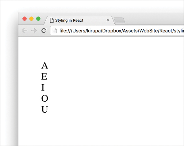
Figure 4.1 A boring output of what you see.
Don’t worry, you’ll make it look a little less boring in a few moments. After you’ve had a run at these letters, you’ll see something that looks more like Figure 4.2.

Figure 4.2 What our result looks like with some styling applied!
The vowels will be wrapped in a yellow background, aligned horizontally, with a fancy monospace font. Let’s look at how to do all of this both in CSS and using React’s newfangled approach.
Styling React Content Using CSS
Using CSS to style React content is actually as straightforward as you can imagine it to be. Because React ends up spitting out regular HTML tags, all of the various CSS tricks you’ve learned over the years for styling HTML still apply. You just need to keep a few minor points in mind.
Understand the Generated HTML
Before you can use CSS, you need to get a feel for how the HTML that React spits out is going to look. You can easily figure that out by looking at the JSX defined inside the render methods. The parent render method is our ReactDOM-based one, and it looks as follows:
<Letter>A</Letter>
<Letter>E</Letter>
<Letter>I</Letter>
<Letter>O</Letter>
<Letter>U</Letter>
</div>
We have our various Letter components wrapped inside a div. Nothing too exciting here. The render method inside our Letter component isn’t that much different, either:
{this.props.children}
</div>
As you can see, each individual vowel is wrapped inside its own set of div tags. If you play this all out (such as previewing our example in a browser), the final DOM structure for our vowels would look like Figure 4.3.
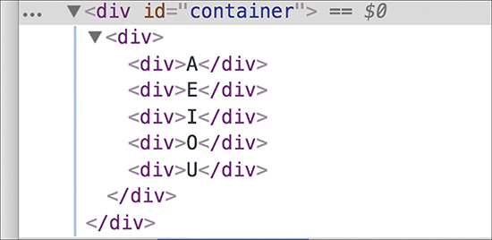
Figure 4.3 The preview from inside the browser.
We have simply an HTML-ized expansion of the various JSX fragments you saw in the render method a few moments ago, with our vowels nested inside a bunch of div elements.
Just Style It Already!
When you understand the HTML arrangement of the things you want to style, the hard part is done. Now comes the fun and familiar part of defining style selectors and specifying the properties you want to set. To affect the inner div elements, add the following inside the style tag:
padding: 10px;
margin: 10px;
background-color: #FFDE00;
color: #333;
display: inline-block;
font-family: monospace;
font-size: 32px;
text-align: center;
}
The div div div selector ensures that we style the right things. The end result will be our vowels styled to look exactly like we set out to. With that said, a style selector of div div div looks a bit odd, doesn’t it? It’s too generic. In apps with more than three div elements (which is common), you can end up styling the wrong things. At times like these, you will want to change the HTML that React generates to make the content more easily styleable.
We address this by giving our inner div elements a class value of letter. Here is where JSX differs from HTML. Make the following highlighted change:
render() {
return (
</div>
);
}
}
Notice that we designate the class value by using the className attribute instead of the class attribute. This is because the word class is a special keyword in JavaScript. If that doesn’t make any sense, don’t worry about it for now; we’ll cover it later.
After you’ve given your div a className attribute value of letter, there’s just one more thing to do. Modify the CSS selector to target the div elements more cleanly:
margin: 10px;
background-color: #FFDE00;
color: #333;
display: inline-block;
font-family: monospace;
font-size: 32px;
text-align: center;
}
As you can see, using CSS is a perfectly viable way to style the content in your React-based apps. In the next section, we look at how to style content using the approach React prefers.
Styling Content the React Way
React favors an inline approach for styling content that doesn’t use CSS. That might seem a bit strange at first, but it’s designed to make your visuals more reusable. The goal is to make your components little black boxes where everything related to how your UI looks and works is stashed. Let’s see this in action.
Continuing our example from earlier, remove the .letter style rule. Your vowels will return to their unstyled state when you preview your app in the browser. For completeness, you should also remove the className declaration from the Letter component’s render function. There’s no point having your markup contain pieces you won’t be using.
Now let’s revert the Letter component to its original state:
render() {
return (
</div>
);
}
}
You specify styles inside your component by defining an object whose content is the CSS properties and their values. When you have that object, you assign that object to the JSX elements you want to style by using the style attribute. This will make more sense when you perform these two steps yourself, so let’s apply all of this to style the output of the Letter component.
Creating a Style Object
Let’s get right to it by defining our object that contains the styles we want to apply:
render() {
padding: 10,
margin: 10,
backgroundColor: "#FFDE00",
color: "#333",
display: "inline-block",
fontFamily: "monospace",
fontSize: 32,
textAlign: "center"
};
return (
<div>
{this.props.children}
</div>
);
}
}
We have an object called letterStyle, and the properties inside it are just CSS property names and their value. If you’ve never defined CSS properties in JavaScript (by setting object.style), the formula for converting them into something JavaScript-friendly is pretty simple:
1. Single-word CSS properties (such as padding, margin, and color) remain unchanged.
2. Multiword CSS properties with a dash in them (such as background-color, font-family, and border-radius) are turned into one camel-case word, with the dash removed and the first letter of the second word capitalized. For example, using our example properties, background-color becomes backgroundColor, font-family becomes fontFamily, and border-radius becomes borderRadius.
Our letterStyle object and its properties are pretty much a direct JavaScript translation of the .letter style rule we looked at a few moments ago. All that remains now is to assign this object to the element we want to style.
Actually Styling Our Content
Now that we have our object containing the styles we want to apply, the rest is easy. Find the element you want to apply the style on and set the style attribute to refer to that object. In our case, that is the div element returned by our Letter component’s render function.
Take a look at the highlighted line to see how this is done for our example:
render() {
var letterStyle = {
padding: 10,
margin: 10,
backgroundColor: "#FFDE00",
color: "#333",
display: "inline-block",
fontFamily: "monospace",
fontSize: 32,
textAlign: "center"
};
return (
</div>
);
}
}
Our object is called letterStyle, so that’s what we specify inside the curly brackets to let React know to evaluate the expression. That’s all there is to it. Go ahead and run the example in the browser to ensure that everything works properly and that all the vowels are properly styled.
For extra validation, if you inspect the styling applied to one of the vowels using your browser developer tool of choice, you’ll see that the styles are, in fact, applied inline (see Figure 4.4).
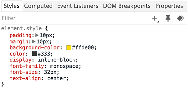
Figure 4.4 The styles are applied inline.
While this is no surprise, it might be difficult to adjust to if you’re used to styles being inside style rules. As they say, the times are a-changin’.
Making the Background Color Customizable
The last thing to do before we wrap up is take advantage of how React works with styles. By having our styles defined in the same vicinity as the JSX, we can make the various style values easily customizable by the parent (a.k.a. the consumer of the component). Let’s see this in action.
Right now, all of our vowels have a yellow background. Wouldn’t it be cool if we could specify the background color as part of each Letter declaration? To do this in our ReactDOM.render method, first add a bgcolor attribute and specify some colors, as shown in the following highlighted lines:
<div>
<Letter bgcolor="#FF605F">E</Letter>
<Letter bgcolor="#FFD52E">I</Letter>
<Letter bgcolor="#49DD8E">O</Letter>
<Letter bgcolor="#AE99FF">U</Letter>
destination
);
Next, we need to use this property. In the letterStyle object, set the value of backgroundColor to this.props.bgColor:
padding: 10,
margin: 10,
display: "inline-block",
fontFamily: "monospace",
fontSize: 32,
textAlign: "center"
};
This ensures that the backgroundColor value is inferred from what you set via the bgColor attribute as part of the Letter declaration. If you preview this in your browser, you will now see the same vowels sporting some totally sweet background colors (see Figure 4.5).
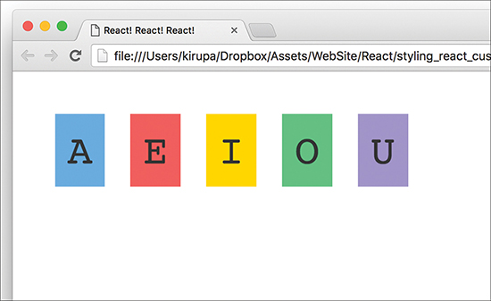
Figure 4.5 Our vowels with background colors!
What we’ve just done will be very hard to replicate using plain CSS. As we start to look at components whose contents change based on state or user interaction, you’ll see more such examples in which the React way of styling things has a lot of merit.
Conclusion
As you dive in deeper and learn more about React, you’ll see several more cases in which React does things quite differently than what you’ve been told is correct on the web. In this tutorial, you saw React promoting inline styles in JavaScript as a way to style content instead of using CSS style rules. Earlier, we looked at JSX and showed how to declare the entirety of your UI in JavaScript using an XML-like syntax that sort of, kind of looks like HTML.
In all of these cases, if you look deeper beneath the surface, the reasons React diverges from conventional wisdom make a lot of sense. Building apps with their very complex UI requirements necessitate a new way of solving the challenges. HTML, CSS, and JavaScript techniques that probably made a lot of sense when dealing with web pages and documents might not be applicable in a web-app world where components are reused inside other components.
With that said, you need to pick and choose the techniques that make the most sense for your situation. I’m biased toward React’s way of solving UI development problems, but I do my best to highlight alternate or conventional methods as well. Tying that back to what you saw here, using CSS style rules with your React content is totally okay, as long as you make the decision knowing both what you gain and what you lose.
Note: If you run into any issues, ask!
If you have any questions or your code isn’t running like you expect, don’t hesitate to ask! Post on the forums at https://forum.kirupa.com and get help from some of the friendliest and most knowledgeable people the Internet has ever brought together!