
4. Predicting Numerical Values: Getting Started with Regression
In [1]:
# setup
from mlwpy import*
%matplotlib inline
4.1 A Simple Regression Dataset
Regression is the process of predicting a finely graded numerical value from inputs. To illustrate, we need a simple dataset that has numerical results. sklearn comes with the diabetes dataset that will serve us nicely. The dataset consists of several biometric and demographic measurements. The version included with sklearn has been modified from raw numerical features by subtracting the mean and dividing by the standard deviation of each column. That process is called standardizing or z-scoring the features. We’ll return to the standard deviation later; briefly, it is a measure of how spread out a set of values are.
The net result of standardizing the columns is that each column has a mean of 0 and a standard deviation of 1. We standardize, or otherwise rescale, the data so that differences in feature ranges—heights within 50–100 inches or incomes from $20,000 to $200,000—don’t incur undo weight penalties or benefits just from their scale. We’ll discuss standardization and scaling more in Section 10.3. The categorical values in diabetes were recorded numerically as {0, 1} and then standardized. I mention it to explain why there are negative ages (the mean age is zero after standardizing) and why the sexes are coded, or recorded, as {0.0507, –0.0446} instead of {M, F}.
In [2]:
diabetes = datasets.load_diabetes()

tts = skms.train_test_split(diabetes.data,
                            diabetes.target,
                            test_size=.25)

(diabetes_train_ftrs, diabetes_test_ftrs,
 diabetes_train_tgt,  diabetes_test_tgt) = tts
We can dress the dataset up with a DataFrame and look at the first few rows:
In [3]:
diabetes_df = pd.DataFrame(diabetes.data,
                           columns=diabetes.feature_names)
diabetes_df['target'] = diabetes.target
diabetes_df.head()
Out[3]:
|
age |
sex |
bmi |
bp |
s1 |
s2 |
s3 |
s4 |
s5 |
s6 |
target |
|---|---|---|---|---|---|---|---|---|---|---|---|
0 |
0.04 |
0.05 |
0.06 |
0.02 |
-0.04 |
-0.03 |
-0.04 |
0.00 |
0.02 |
-0.02 |
151.00 |
1 |
0.00 |
-0.04 |
-0.05 |
-0.03 |
-0.01 |
-0.02 |
0.07 |
-0.04 |
-0.07 |
-0.10 |
75.00 |
2 |
0.09 |
0.05 |
0.04 |
-0.01 |
-0.05 |
-0.03 |
-0.03 |
0.00 |
0.00 |
-0.03 |
141.00 |
3 |
-0.09 |
-0.04 |
-0.01 |
-0.04 |
0.01 |
0.02 |
-0.04 |
0.03 |
0.02 |
-0.01 |
206.00 |
4 |
0.01 |
-0.04 |
-0.04 |
0.02 |
0.00 |
0.02 |
0.01 |
0.00 |
-0.03 |
-0.05 |
135.00 |
Aside from the odd values for seemingly categorical measures like age and sex, two of the other columns are quickly explainable; the rest are more specialized and somewhat underspecified:
bmi is the body mass index, computed from height and weight, which is an approximation of body-fat percentage,
bp is the blood pressure,
s1–s6 are six blood serum measurements, and
target is a numerical score measuring the progression of a patient’s illness.
As we did with the iris data, we can investigate the bivariate relationships with Seaborn’s pairplot. We’ll keep just a subset of the measurements for this graphic. The resulting mini-plots are still fairly small, but we can still glance through them and look for overall patterns. We can always redo the pairplot with all the features if we want to zoom out for a more global view.
In [4]:
sns.pairplot(diabetes_df[['age', 'sex', 'bmi', 'bp', 's1']],
             size=1.5, hue='sex', plot_kws={'alpha':.2});

4.2 Nearest-Neighbors Regression and Summary Statistics
We discussed nearest-neighbor classification in the previous chapter and we came up with the following sequence of steps:
Describe similarity between pairs of examples.
Pick several of the most-similar examples.
Combine the picked examples into a single answer.
As we shift our focus from predicting a class or category to predicting a numerical value, steps 1 and 2 can stay the same. Everything that we said about them still applies. However, when we get to step 3, we have to make adjustments. Instead of simply voting for candidate answers, we now need to take into account the quantities represented by the outputs. To do this, we need to combine the numerical values into a single, representative answer. Fortunately, there are several handy techniques for calculating a single summary value from a set of values. Values computed from a set of data are called statistics. If we are trying to represent—to summarize, if you will—the overall dataset with one of these, we call it a summary statistic. Let’s turn our attention to two of these: the median and the mean.
4.2.1 Measures of Center: Median and Mean
You may be familiar with the average, also called the arithmetic mean. But I’m going start with a—seemingly!—less math-heavy alternative: the median. The median of a group of numbers is the middle number when that group is written in order. For example, if I have three numbers, listed in order as [1, 8, 10], then 8 is the middle value: there is one number above it and one below. Within a group of numbers, the median has the same count of values below it and above it. To put it another way, if all the numbers have equal weight, regardless of their numerical value, then a scale placed at the median would be balanced (Figure 4.1). Regardless of the biggest value on the right—be it 15 or 40—the median stays the same.

Figure 4.1 Comparing mean and median with balances.
You might be wondering what to do when we have an even number of values, say [1, 2, 3, 4]. The usual way to construct the median is to take the middle two values—the 2 and 3—and take their average, which gives us 2.5. Note that there are still the same number of values, two, above and below this median.
Using the median as a summary statistic has one wonderful property. If I fiddle with the values of the numbers at the start or end of the sorted data, the median stays the same. For example, if my data recorder is fuzzy towards the tails—i.e., values far from the median—and instead of [1, 8, 10], I record [2, 8, 11], my median is the same! This resilience in the face of differing measured values is called robustness. The median is a robust measure of center.
Now, there are scenarios where we care about the actual numbers, not just their in-order positions. The other familiar way of estimating the center is the mean. Whereas the median balances the count of values to the left and right, the mean balances the total distances to the left and right. So, the mean is the value for which sum(distance(s,mean) for s in smaller) is equal to sum(distance(b,mean) for b in bigger). The only value that meets this constraint is mean=sum(d)/len(d) or, as the mathematicians say, . Referring back to Figure 4.1, if we trade the 15 for a 40, we get a different balance point: the mean has increased because the sum of the values has increased.
The benefit of the mean is that it accounts for the specific numeric values of the numbers: the value 3 is five units below the mean of 8. Compare to the median which abstracts distance away in favor of ordering: the value 3 is less than the median 8. The problem with the mean is that if we get an outlier—a rare event near the tails of our data—it can badly skew our computation precisely because the specific value matters.
As an example, here’s what happens if we shift one value by “a lot” and recompute the mean and median:
In [5]:
values = np.array([1, 3, 5, 8, 11, 13, 15])
print("no outlier")
print(np.mean(values),
      np.median(values))

values_with_outlier = np.array([1, 3, 5, 8, 11, 13, 40])
print("with outlier")
print("%5.2f" % np.mean(values_with_outlier),
      np.median(values_with_outlier))
no outlier
8.0 8.0
with outlier
11.57 8.0
Beyond the mean and median, there are many possible ways to combine the nearest-neighbor answers into an answer for a test example. One combiner that builds on the idea of the mean is a weighted mean which we discussed in Section 2.5.1. In the nearest-neighbor context, we have a perfect candidate to serve as the weighting factor: the distance from our new example to the neighbor. So, instead of neighbors contributing just their values [4.0, 6.0, 8.0], we can also incorporate the distance from each neighbor to our example. Let’s say those distances are [2.0, 4.0, 4.0], i.e. the second and third training examples are twice as far from our test example as the first one. A simple way to incorporate the distance is to compute a weighted average using
In [6]:
distances = np.array([2.0, 4.0, 4.0])
closeness = 1.0 / distances             # element-by-element division
weights = closeness / np.sum(closeness) # normalize sum to one
weights
Out[6]:
array([0.4, 0.2, 0.2])
Or, in mathese:
as the weights. We use since if you are closer, we want a higher weight; if you are further, but still a nearest neighbor, we want a lower weight. We put the entire sum into the numerator to normalize the values so they sum to one. Compare the mean with the weighted mean for these values:
In [7]:
values = np.array([4, 6, 8])

mean = np.mean(values)
wgt_mean = np.dot(values, weights)

print("Mean:", mean)
print("Weighted Mean:", wgt_mean)
Mean: 6.0
Weighted Mean: 6.4
Graphically—see Figure 4.2—our balance diagram now looks a bit different. The examples that are downweighted (contribute less than their fair share) move closer to the pivot because they have less mechanical leverage. Overweighted examples move away from the pivot and gain more influence.

Figure 4.2 The effects of weighting on a mean.
4.2.2 Building a k-NN Regression Model
Now that we have some mental concepts to back up our understanding of k-NN regression, we can return to our basic sklearn workflow: build, fit, predict, evaluate.
In [8]:
knn   = neighbors.KNeighborsRegressor(n_neighbors=3)
fit   = knn.fit(diabetes_train_ftrs, diabetes_train_tgt)
preds = fit.predict(diabetes_test_ftrs)

# evaluate our predictions against the held-back testing targets
metrics.mean_squared_error(diabetes_test_tgt, preds)
Out[8]:
3471.41941941942
If you flip back to the previous chapter and our k-NN classifier, you’ll notice only two differences.
We built a different model: this time we used
KNeighborsRegressorinstead ofKNeighborsClassifier.We used a different evaluation metric: this time we used
mean_squared_errorinstead ofaccuracy_score.
Both of these reflect the difference in the targets we are trying to predict—numerical values, not Boolean categories. I haven’t explained mean_squared_error (MSE) yet; it’s because it is deeply tied to our next learning method, linear regression, and once we understand linear regression, we’ll basically understand MSE for free. So, just press pause on evaluating regressors with MSE for a few minutes. Still, if you need something to make you feel comfortable, take a quick look at Section 4.5.1.
To put the numerical value for MSE into context, let’s look at two things. First, the MSE is approximately 3500. Let’s take its square root—since we’re adding up squares, we need to scale back to nonsquares:
In [9]:
np.sqrt(3500)
Out[9]:
59.16079783099616
Now, let’s look at the range of values that the target can take:
In [10]:
diabetes_df['target'].max() - diabetes_df['target'].min()
Out[10]:
321.0
So, the target values span about 300 units and our predictions are off—in some average sense—by 60 units. That’s around 20%. Whether or not that is “good enough” depends on many other factors which we’ll see in Chapter 7.
4.3 Linear Regression and Errors
We’re going to dive into linear regression (LR)—which is just a fancy name for drawing a straight line through a set of data points. I’m really sorry to bring up LR, particularly if you are one of those folks out there who had a bad experience studying LR previously. LR has a long history throughout math and science. You may have been exposed to it before. You may have seen LR in an algebra or statistics class. Here’s a very different presentation.
4.3.1 No Flat Earth: Why We Need Slope
Do you like to draw? (If not, please just play along.) Take a pen and draw a bunch of dots on a piece of paper. Now, draw a single straight line through the dots. You might have encountered a problem already. If there were more than two dots, there are many, many different lines you could potentially draw. The idea of drawing a line through the dots gets a general idea across, but it doesn’t give us a reproducible way of specifying or completing the task.
One way of picking a specific line through the dots is to say we want a best line—problem solved. We’re done. Let’s go for five o’clock happy hour. Oh, wait, I have to define what best means. Rats! Alright, let’s try this. I want the line that stays closest to the dots based on the vertical distance from the dots to the line. Now we’re getting somewhere. We have something we can calculate to compare different alternatives.
Which line is best under that criteria? Let me start by simplifying a little bit. Imagine we can only draw lines that are parallel to the bottom of the piece of paper. You can think about moving the line like raising or lowering an Olympic high-jump bar: it stays parallel to the ground. If I start sliding the line up and down, I’m going to start far away from all the points, move close to some points, slide onwards to a great, just-right middle ground, move close to other points, and finally end up far away from everything. Yes, the idea of a happy medium—too hot, too cold, and just right—applies here. We’ll see this example in code and graphics in just a moment. At the risk of becoming too abstract too quickly, we are limited to drawing lines like y = c. In English, that means the height of our bar is always equal to some constant, fixed value.
Let’s draw a few of these high-jump bars and see what happens.
In [11]:
def axis_helper(ax, lims):
    'clean up axes'
    ax.set_xlim(lims); ax.set_xticks([])
    ax.set_ylim(lims); ax.set_yticks([])
    ax.set_aspect('equal')
We’re going to use some trivial data to show what’s happening.
In [12]:
# our data is very simple: two (x, y) points
D = np.array([[3, 5],
              [4, 2]])

# we'll take x as our "input" and y as our "output"
x, y = D[:, 0], D[:, 1]
Now, let’s graph what happens as we move a horizontal line up through different possible values. We’ll call these values our predicted values. You can imagine each raised bar as being a possible set of predictions for our example data points. Along the way, we’ll also keep track of what our error values are. The errors are the differences between the horizontal line and the data points. We’ll also calculate a few values from the errors: the sum of errors, the sum of squares of the errors (abbreviated SSE), and the square root of the sum of squared errors. You might want to look at the output first, before trying to understand the code.
In [13]:
horizontal_lines = np.array([1, 2, 3, 3.5, 4, 5])

results = []
fig, axes = plt.subplots(1, 6, figsize=(10, 5))
for h_line, ax in zip(horizontal_lines, axes.flat):
    # styling
    axis_helper(ax, (0, 6))
    ax.set_title(str(h_line))

    # plot the data
    ax.plot(x, y, 'ro')

    # plot the prediction line
    ax.axhline(h_line, color='y') # ax coords; defaults to 100%

    # plot the errors
    # the horizontal line *is* our prediction; renaming for clarity
    predictions = h_line
    ax.vlines(x, predictions, y)

    # calculate the error amounts and their sum of squares
    errors = y - predictions
    sse = np.dot(errors, errors)

    # put together some results in a tuple
    results.append((predictions,
                    errors, errors.sum(),
                    sse, np.sqrt(sse)))
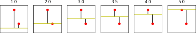
We start very far away from one point and not too far from another. As we slide the bar up, we hit a nice middle ground between the points. Yet we keep sliding the bar; we end up on the top point, fairly far away from the bottom point. Perhaps the ideal tradeoff is somewhere in the middle. Let’s look at some numbers.
In [14]:
col_labels = "Prediction", "Errors", "Sum", "SSE", "Distance"
display(pd.DataFrame.from_records(results,
                                  columns=col_labels,
                                  index="Prediction"))
|
Errors |
Sum |
SSE |
Distance |
|---|---|---|---|---|
Prediction |
|
|
|
|
1.0000 |
[4.0, 1.0] |
5.0000 |
17.0000 |
4.1231 |
2.0000 |
[3.0, 0.0] |
3.0000 |
9.0000 |
3.0000 |
3.0000 |
[2.0, -1.0] |
1.0000 |
5.0000 |
2.2361 |
3.5000 |
[1.5, -1.5] |
0.0000 |
4.5000 |
2.1213 |
4.0000 |
[1.0, -2.0] |
-1.0000 |
5.0000 |
2.2361 |
5.0000 |
[0.0, -3.0] |
-3.0000 |
9.0000 |
3.0000 |
Our table includes the raw errors that can be positive or negative—we might over- or underestimate. The sums of those raw errors don’t do a great job evaluating the lines. Errors in the opposite directions, such as [2, –1], give us a total of 1. In terms of our overall prediction ability, we don’t want these errors to cancel out. One of the best ways to address that is to use a total distance, just like we used distances in the nearest-neighbors method above. That means we want something like . The SSE column is the sum of squared errors which gets us most of the way towards calculating distances. All that’s left is to take a square root. The line that is best, under the rules so far, is the horizontal line at the mean of the points based on their vertical component: . The mean is the best answer here for the same reason it is the pivot on the balance beams we showed earlier: it perfectly balances off the errors on either side.
4.3.2 Tilting the Field
What happens if we keep the restriction of drawing straight lines but remove the restriction of making them horizontal? My apologies for stating the possibly obvious, but now we can draw lines that aren’t flat. We can draw lines that are pointed up or down, as needed. So, if the cluster of dots that you drew had an overall growth or descent, like a plane taking off or landing, a sloped line can do better than a flat, horizontal runway. The form of these sloped lines is a classic equation from algebra: y = mx + b. We get to adjust m and b so that when we know a point’s left-rightedness—the x value—we can get as close as possible on its up-downness y.
How do we define close? The same way we did above—with distance. Here, however, we have a more interesting line with a slope. What does the distance from a point to our line look like? It’s just distance(prediction, y) = distance(m*x + b,y). And what’s our total distance? Just add those up for all of our data: sum(distance(mx + b, y) for x, y in D). In mathese, that looks like
I promise code and graphics are on the way! A side note: it’s possible that for a set of dots, the best line is flat. That would mean we want an answer that is a simple, horizontal line—just what we discussed in the previous section. When that happens, we just set m to zero and head on our merry way. Nothing to see here, folks. Move along.
Now, let’s repeat the horizontal experiment with a few, select tilted lines. To break things up a bit, I’ve factored out the code that draws the graphs and calculates the table entries into a function called process. I’ll admit process is a horrible name for a function. It’s up there with stuff and things. Here, though, consider it the processing we do with our small dataset and a simple line.
In [15]:
def process(D, model, ax):
    # make some useful abbreviations/names
    # y is our "actual"
    x, y = D[:, 0], D[:, 1]
    m, b = model

    # styling
    axis_helper(ax, (0, 8))

    # plot the data
    ax.plot(x, y, 'ro')

    # plot the prediction line
    helper_xs = np.array([0, 8])
    helper_line = m * helper_xs + b
    ax.plot(helper_xs, helper_line, color='y')

    # plot the errors
    predictions = m * x + b
    ax.vlines(x, predictions, y)

    # calculate error amounts
    errors = y - predictions

    # tuple up the results
    sse = np.dot(errors, errors)
    return (errors, errors.sum(), sse, np.sqrt(sse))
Now we’ll make use of process with several different prediction lines:
In [16]:
# our data is very simple: two (x, y) points
D = np.array([[3, 5],
              [4, 2]])

#                      m   b --> predictions = mx + b
lines_mb = np.array([[ 1,  0],
                     [ 1,  1],
                     [ 1,  2],
                     [-1,  8],
                     [-3, 14]])

col_labels = ("Raw Errors", "Sum", "SSE", "TotDist")
results = []

# note: plotting occurs in process()
fig, axes = plt.subplots(1, 5, figsize=(12, 6))
records = [process(D, mod, ax) for mod,ax in zip(lines_mb, axes.flat)]
df = pd.DataFrame.from_records(records, columns=col_labels)
display(df)
|
Raw Errors |
Sum |
SSE |
TotDist |
|---|---|---|---|---|
0 |
[2, -2] |
0 |
8 |
2.8284 |
1 |
[1, -3] |
-2 |
10 |
3.1623 |
2 |
[0, -4] |
-4 |
16 |
4.0000 |
3 |
[0, -2] |
-2 |
4 |
2.0000 |
4 |
[0, 0] |
0 |
0 |
0.0000 |

So, we have a progression in calculating our measure of success:
predicted = m*x + berror = (m*x + b) - actual = predicted - actualSSE = sum(errors**2) = sum(((m*x+b) - actual)**2 for x,actual in data)total_distance = sqrt(SSE)
The last line precisely intersects with both data points. Its predictions are 100% correct; the vertical distances are zero.
4.3.3 Performing Linear Regression
So far, we’ve only considered what happens with a single predictive feature x. What happens when we add more features—more columns and dimensions—into our model? Instead of a single slope m, we now have to deal with a slope for each of our features. We have some contribution to the outcome from each of the input features. Just as we learned how our output changes with one feature, we now have to account for different relative contributions from different features.
Since we have to track many different slopes—one for each feature—we’re going to shift away from using m and use the term weights to describe the contribution of each feature. Now, we can create a linear combination—as we did in Section 2.5—of the weights and the features to get the prediction for an example. The punchline is that our prediction is rdot(weights_wo, features) + wgt_b if weights_wo is without the b part included. If we use the plus-one trick, it is rdot(weights, features_p1) where weights includes a b (as weights[0]) and features_p1 includes a column of ones. Our error still looks like distance(prediction, actual) with prediction=rdot(weights, features_p1). The mathese form of a prediction (with a prominent dot product) looks like:
In [17]:
lr    = linear_model.LinearRegression()
fit   = lr.fit(diabetes_train_ftrs, diabetes_train_tgt)
preds = fit.predict(diabetes_test_ftrs)

# evaluate our predictions against the unseen testing targets
metrics.mean_squared_error(diabetes_test_tgt, preds)
Out[17]:
2848.2953079329427
We’ll come back to mean_squared_error in just a minute, but you are already equipped to understand it. It is the average distance of the errors in our prediction.
4.4 Optimization: Picking the Best Answer
Picking the best line means picking the best values for m and b or for the weights. In turn, that means setting factory knobs to their best values. How can we choose these bests in a well-defined way?
Here are four strategies we can adopt:
Random guess: Try lots of possibilities at random, take the best one.
Random step: Try one line—pick an m and a b—at random, make several random adjustments, pick the adjustment that helps the most. Repeat.
Smart step: Try one line at random, see how it does, adjust it in some smart way. Repeat.
Calculated shortcut: Use fancy mathematics to prove that if Fact A, Fact B, and Fact C are all true, then the One Line To Rule Them All must be the best. Plug in some numbers and use The One Line To Rule Them All.
Let’s run through these using a really, really simple constant-only model. Why a constant, you might ask. Two reasons. First, it is a simple horizontal line. After we calculate its value, it is the same everywhere. Second, it is a simple baseline for comparison. If we do well with a simple constant predictor, we can just call it a day and go home. On the other hand, if a more complicated model does as well as a simple constant, we might question the value of the more complicated model. As Yoda might say, “A simple model, never underestimate.”
4.4.1 Random Guess
Let’s make some simple data to predict.
In [18]:
tgt = np.array([3, 5, 8, 10, 12, 15])
Let’s turn Method 1—random guessing—into some code.
In [19]:
# random guesses with some constraints
num_guesses = 10
results = []

for g in range(num_guesses):
    guess = np.random.uniform(low=tgt.min(), high=tgt.max())
    total_dist = np.sum((tgt - guess)**2)
    results.append((total_dist, guess))
best_guess = sorted(results)[0][1]
best_guess
Out[19]:
8.228074784134693
Don’t read too much into this specific answer. Just keep in mind that, since we have a simple value to estimate, we only need to take a few shots to get a good answer.
4.4.2 Random Step
Method 2 starts with a single random guess, but then takes a random step up or down. If that step is an improvement, we keep it. Otherwise, we go back to where we were.
In [20]:
# use a random choice to take a hypothetical
# step up or down: follow it, if it is an improvement
num_steps = 100
step_size = .05

best_guess = np.random.uniform(low=tgt.min(), high=tgt.max())
best_dist  = np.sum((tgt - best_guess)**2)

for s in range(num_steps):
    new_guess = best_guess + (np.random.choice([+1, -1]) * step_size)
    new_dist = np.sum((tgt - new_guess)**2)
    if new_dist < best_dist:
        best_guess, best_dist = new_guess, new_dist
print(best_guess)
8.836959712695537
We start with a single guess and then try to improve it by random stepping. If we take enough steps and those steps are individually small enough, we should be able to find our way to a solid answer.
4.4.3 Smart Step
Imagine walking, blindfolded, through a rock-strewn field or a child’s room. You might take tentative, test steps as you try to move around. After a step, you use your foot to probe the area around you for a clear spot. When you find a clear spot, you take that step.
In [21]:
# hypothetically take both steps (up and down)
# choose the better of the two
# if it is an improvement, follow that step
num_steps = 1000
step_size = .02

best_guess = np.random.uniform(low=tgt.min(), high=tgt.max())
best_dist = np.sum((tgt - best_guess)**2)
print("start:", best_guess)
for s in range(num_steps):
    # np.newaxis is needed to align the minus
    guesses = best_guess + (np.array([-1, 1]) * step_size)
    dists   = np.sum((tgt[:,np.newaxis] - guesses)**2, axis=0)

     better_idx = np.argmin(dists)

    if dists[better_idx] > best_dist:
        break

    best_guess = guesses[better_idx]
    best_dist  = dists[better_idx]
print(" end:", best_guess)
start: 9.575662598977047
  end: 8.835662598977063
Now, unless we get stuck in a bad spot, we should have a better shot at success than random stepping: at any given point we check out the legal alternatives and take the best of them. By effectively cutting out the random steps that don’t help, we should make progress towards a good answer.
4.4.4 Calculated Shortcuts
If you go to a statistics textbook, you’ll discover that for our SSE evaluation criteria, there is a formula for the answer. To get the smallest sum of squared errors, what we need is precisely the mean. When we said earlier that the mean balanced the distances to the values, we were merely saying the same thing in a different way. So, we don’t actually have to search to find our best value. The fancy footwork is in the mathematics that demonstrates that the mean is the right answer to this question.
In [22]:
print("mean:", np.mean(tgt))
mean: 8.833333333333334
4.4.5 Application to Linear Regression
We can apply these same ideas to fitting a sloped line, or finding many weights (one per feature), to our data points. The model becomes a bit more complicated—we have to twiddle more values, either simultaneously or in sequence. Still, it turns out that an equivalent to our Method 4, Calculated Shortcut, is the standard, classical way to find the best line. When we fit a line, the process is called least-squares fitting and it is solved by the normal equations—you don’t have to remember that—instead of just the mean. Our Method 3, Smart Step, using some mathematics to limit the direction of our steps, is common when dealing with very big data where we can’t run all the calculations needed for the standard method. That method is called gradient descent. Gradient descent (GD) uses some smart calculations—instead of probing steps—to determine directions of improvement.
The other two methods are not generally used to find a best line for linear regression. However, with some additional details, Method 2, Random Step, is close to the techniques of genetic algorithms. What about Method 1, Random Guessing? Well, it isn’t very useful by itself. But the idea of random starting points is useful when combined with other methods. This discussion is just a quick introduction to these ideas. We’ll mention them throughout the book and play with them in Chapter 15.
4.5 Simple Evaluation and Comparison of Regressors
Earlier, I promised we’d come back to the idea of mean squared error (MSE). Now that we’ve discussed sum of squared errors and total distances from a regression line, we can tie these ideas together nicely.
4.5.1 Root Mean Squared Error
How can we quantify the performance of regression predictions? We’re going to use some mathematics that are almost identical to our criteria for finding good lines. Basically, we’ll take the average of the squared errors. Remember, we can’t just add up the errors themselves because then a +3 and a–3 would cancel each other out and we’d consider those predictions perfect when we’re really off by a total of 6. Squaring and adding those two values gives us a total error of 18. Averaging gives us a mean squared error of 9. We’ll take one other step and take the square root of this value to get us back to the same scale as the errors themselves. This gives us the root mean squared error, often abbreviated RMSE. Notice that in this example, our RMSE is 3: precisely the amount of the error(s) in our individual predictions.
That reminds me of an old joke for which I can’t find specific attribution:
Two statisticians are out hunting when one of them sees a duck. The first takes aim and shoots, but the bullet goes sailing past six inches too high. The second statistician also takes aim and shoots, but this time the bullet goes sailing past six inches too low. The two statisticians then give one another high fives and exclaim, “Got him!”
Groan all you want, but that is the fundamental tradeoff we make when we deal with averages. Please note, no ducks were harmed in the making of this book.
4.5.2 Learning Performance
With data, methods, and an evaluation metric in hand, we can do a small comparison between k-NN-R and LR.
In [23]:
# stand-alone code
from sklearn import (datasets, neighbors,
                     model_selection as skms,
                     linear_model, metrics)

diabetes = datasets.load_diabetes()
tts =  skms.train_test_split(diabetes.data,
                             diabetes.target,
                             test_size=.25)
(diabetes_train, diabetes_test,
 diabetes_train_tgt, diabetes_test_tgt) = tts

models = {'kNN': neighbors.KNeighborsRegressor(n_neighbors=3),
          'linreg' : linear_model.LinearRegression()}

for name, model in models.items():
      fit = model.fit(diabetes_train, diabetes_train_tgt)
    preds = fit.predict(diabetes_test)

    score = np.sqrt(metrics.mean_squared_error(diabetes_test_tgt, preds))
    print("{:>6s} : {:0.2f}".format(name,score))
   kNN : 54.85
linreg : 46.95
4.5.3 Resource Utilization in Regression
Following Section 3.7.3, I wrote some stand-alone test scripts to get an insight into the resource utilization of these regression methods. If you compare the code here with the earlier code, you’ll find only two differences: (1) different learning methods and (2) a different learning performance metric. Here is that script adapted for k-NN-R and LR:
In [24]:
!cat scripts/perf_02.py
import timeit, sys
import functools as ft
import memory_profiler
from mlwpy import *

def knn_go(train_ftrs, test_ftrs, train_tgt):
    knn = neighbors.KNeighborsRegressor(n_neighbors=3)
    fit   = knn.fit(train_ftrs, train_tgt)
    preds = fit.predict(test_ftrs)

def lr_go(train_ftrs, test_ftrs, train_tgt):
    linreg = linear_model.LinearRegression()
    fit   = linreg.fit(train_ftrs, train_tgt)
    preds = fit.predict(test_ftrs)

def split_data(dataset):
    split = skms.train_test_split(dataset.data,
                                  dataset.target,
                                  test_size=.25)
    return split[:-1] # don't need test tgt

def msr_time(go, args):
    call = ft.partial(go, *args)
    tu = min(timeit.Timer(call).repeat(repeat=3, number=100))
    print("{:<6}: ~{:.4f} sec".format(go.__name__, tu))

def msr_mem(go, args):
    base = memory_profiler.memory_usage()[0]
    mu = memory_profiler.memory_usage((go, args),
                                       max_usage=True)[0]
    print("{:<3}: ~{:.4f} MiB".format(go.__name__, mu-base))

if __name__ == "__main__":
    which_msr = sys.argv[1]
    which_go = sys.argv[2]

    msr = {'time': msr_time, 'mem':msr_mem}[which_msr]
    go = {'lr' : lr_go, 'knn': knn_go}[which_go]

    sd = split_data(datasets.load_iris())
    msr(go, sd)
When we execute it, we see
In [25]:
!python scripts/perf_02.py mem lr
!python scripts/perf_02.py time lr
lr_go: ~1.5586 MiB
lr_go : ~0.0546 sec
In [26]:
!python scripts/perf_02.py mem knn
!python scripts/perf_02.py time knn
knn_go: ~0.3242 MiB
knn_go: ~0.0824 sec
Here’s a brief table of our results that might vary a bit over different runs:
Method |
RMSE |
Time (s) |
Memory (MiB) |
|---|---|---|---|
k-NN-R |
55 |
0.08 |
0.32 |
LR |
45 |
0.05 |
1.55 |
It may be surprising that linear regression takes up so much memory, especially considering that k-NN-R requires keeping all the data around. This surprise highlights an issue with the way we are measuring memory: (1) we are measuring the entire fit-and-predict process as one unified task and (2) we are measuring the peak usage of that unified task. Even if linear regression has one brief moment of high usage, that’s what we are going to see. Under the hood, this form of linear regression—which optimizes by Method 4, Calculated Shortcut—isn’t super clever about how it does its calculations. There’s a critical part of its operation—solving those normal equations I mentioned above—that is very memory hungry.
4.6 EOC
4.6.1 Limitations and Open Issues
There are several caveats to what we’ve done in this chapter—and many of them are the same as the previous chapter:
We compared these learners on a single dataset.
We used a very simple dataset.
We did no preprocessing on the dataset.
We used a single train-test split.
We used accuracy to evaluate the performance.
We didn’t try different numbers of neighbors.
We only compared two simple models.
Additionally, linear regression is quite sensitive to using standardized data. While diabetes came to us prestandardized, we need to keep in mind that we might be responsible for that step in other learning problems. Another issue is that we can often benefit from restricting the weights—the {m, b} or w—that a linear regression model can use. We’ll talk about why that is the case and how we can do it with sklearn in Section 9.1.
4.6.2 Summary
Wrapping up our discussion, we’ve seen several things in this chapter:
diabetes: a simple real-world dataset
Linear regression and an adaptation of nearest-neighbors for regression
Different measures of center—the mean and median
Measuring learning performance with root mean squared error (RMSE)
4.6.3 Notes
The diabetes data is from a paper by several prominent statisticians which you can read here: http://statweb.stanford.edu/~tibs/ftp/lars.pdf.
4.6.4 Exercises
You might be interested in trying some classification problems on your own. You can follow the model of the sample code in this chapter with another regression dataset from sklearn: datasets.load_boston will get you started!