
7. Evaluating Regressors
In [1]:
# Setup
from mlwpy import *
%matplotlib inline

diabetes = datasets.load_diabetes()

tts = skms.train_test_split(diabetes.data,
                            diabetes.target,
                            test_size=.25,
                            random_state=42)

(diabetes_train_ftrs, diabetes_test_ftrs,
 diabetes_train_tgt,  diabetes_test_tgt) = tts
We’ve discussed evaluation of learning systems and evaluation techniques specific to classifiers. Now, it is time to turn our focus to evaluating regressors. There are fewer ad-hoc techniques in evaluating regressors than in classifiers. For example, we don’t have confusion matrices and ROC curves, but we’ll see an interesting alternative in residual plots. Since we have some extra mental and physical space, we’ll spend a bit of our time in this chapter on some auxiliary evaluation topics: we’ll create our own sklearn-pluggable evaluation metric and take a first look at processing pipelines. Pipelines are used when learning systems require multiple steps. We’ll use a pipeline to standardize some data before we attempt to learn from it.
7.1 Baseline Regressors
As with classifiers, regressors need simple baseline strategies to compete against. We’ve already been exposed to predicting the middle value, for various definitions of middle. In sklearn’s bag of tricks, we can easily create baseline models that predict the mean and the median. These are fixed values for a given training dataset; once we train on the dataset, we get a single value which serves as our prediction for all examples. We can also pick arbitrary constants out of a hat. We might have background or domain knowledge that gives us a reason to think some value—a minimum, maximum, or maybe 0.0—is a reasonable baseline. For example, if a rare disease causes fever and most people are healthy, a temperature near 98.6 degrees Fahrenheit could be a good baseline temperature prediction.
A last option, quantile, generalizes the idea of the median. When math folks say generalize, they mean that a specific thing can be phrased within a more general template. In Section 4.2.1, we saw that the median is the sorted data’s middle value. It had an interesting property: half the values are less than it and half the values are greater than it. In more general terms, the median is one specific percentile—it is called the 50th percentile. We can take the idea of a median from a halfway point to an arbitrary midway point. For example, the 75th percentile has 75% of the data less than it and 25% of the data greater.
Using the quantile strategy, we can pick an arbitrary percent as our break point. Why’s it called quantile and not percentile? It’s because quantile refers to any set of evenly spaced break points from 0 to 100. For example, quartiles—phonetically similar to quarters—are the values 25%, 50%, 75%, and 100%. Percentiles are specifically the 100 values from 1% to 100%. Quantiles can be more finely grained than single-percent steps—for example, the 1000 values 0.1%, 0.2%, . . ., 1.0%, . . ., 99.8%, 99.9%, 100.0%.
In [2]:
baseline = dummy.DummyRegressor(strategy='median')
In [3]:
strategies = ['constant', 'quantile', 'mean', 'median', ]
baseline_args = [{"strategy":s} for s in strategies]

# additional args for constant and quantile
baseline_args[0]['constant'] = 50.0
baseline_args[1]['quantile'] =  0.75

# similar to ch 5, but using a list comprehension
# process a single argument package (a dict)
def do_one(**args):
    baseline = dummy.DummyRegressor(**args)
    baseline.fit(diabetes_train_ftrs, diabetes_train_tgt)
    base_preds = baseline.predict(diabetes_test_ftrs)
    return metrics.mean_squared_error(base_preds, diabetes_test_tgt)

# gather all results via a list comprehension
mses = [do_one(**bla) for bla in baseline_args]

display(pd.DataFrame({'mse':mses}, index=strategies))
|
mse |
|---|---|
constant |
14,657.6847 |
quantile |
10,216.3874 |
mean |
5,607.1979 |
median |
5,542.2252 |
7.2 Additional Measures for Regression
So far, we’ve used mean squared error as our measure of success—or perhaps more accurately, a measure of failure—in regression problems. We also modified MSE to the root mean squared error (RMSE) because the scale of MSE is a bit off compared to our predictions. MSE is on the same scale as the squares of the errors; RMSE moves us back to the scale of the errors. We’ve done this conversion in an ad-hoc manner by applying square roots here and there. However, RMSE is quite commonly used. So, instead of hand-spinning it—manually writing code—all the time, let’s integrate RMSE more deeply into our sklearn-fu.
7.2.1 Creating Our Own Evaluation Metric
Generally, sklearn wants to work with scores, where bigger is better. So we’ll develop our new regression evaluation metric in three steps. We’ll define an error measure, use the error to define a score, and use the score to create a scorer. Once we’ve defined the scorer function, we can simply pass the scorer with a scoring parameter to cross_val_score. Remember: (1) for errors and loss functions, lower values are better and (2) for scores, higher values are better. So, we need some sort of inverse relationship between our error measure and our score. One of the easiest ways to do that is to negate the error. There is a mental price to be paid. For RMSE, all our scores based on it will be negative, and being better means being closer to zero while still negative. That can make you turn your head sideways, the first time you think about it. Just remember, it’s like losing less money than you would have otherwise. If we must lose some money, our ideal is to lose zero.
Let’s move on to implementation details. The error and scoring functions have to receive three arguments: a fit model, predictors, and a target. Yes, the names below are a bit odd; sklearn has a naming convention that “smaller is better” ends with _error or _loss and “bigger is better” ends with _score. The *_scorer form is responsible for applying a model on features to make predictions and compare them with the actual known values. It quantifies the success using an error or score function. It is not necessary to define all three of these pieces. We could pick and choose which RMS components we implement. However, writing code for all three demonstrates how they are related.
In [4]:
def rms_error(actual, predicted):
    ' root-mean-squared-error function '
    # lesser values are better (a < b means a is better)
    mse = metrics.mean_squared_error(actual, predicted)
    return np.sqrt(mse)

def neg_rmse_score(actual, predicted):
    ' rmse based score function '
    # greater values are better (a < b means b better)
    return -rms_error(actual, predicted)

def neg_rmse_scorer(mod, ftrs, tgt_actual):
    ' rmse scorer suitable for scoring arg '
    tgt_pred = mod.predict(ftrs)
    return neg_rmse_score(tgt_actual, tgt_pred)

knn = neighbors.KNeighborsRegressor(n_neighbors=3)
skms.cross_val_score(knn,
                     diabetes.data, diabetes.target,
                     cv=skms.KFold(5, shuffle=True),
                     scoring=neg_rmse_scorer)
Out[4]:
array([-58.0034, -64.9886, -63.1431, -61.8124, -57.6243])
Our hand_and_till_M_statistic from Section 6.4.1 acted like a score and we turned it into a scorer with make_scorer. Here, we’ve laid out all the sklearn subcomponents for RMSE: an error measure, a score, and a scorer. make_scorer can be told to treat larger values as the better result with the greater_is_better argument.
7.2.2 Other Built-in Regression Metrics
We saw the laundry list of metrics in the last chapter. As a reminder, they were available through metrics.SCORERS.keys(). We can check out the default metric for linear regression by looking at help(lr.score).
In [5]:
lr = linear_model.LinearRegression()

# help(lr.score) # for full output
print(lr.score.__doc__.splitlines()[0])

Returns the coefficient of determination R^2 of the prediction.
The default metric for linear regression is R2. In fact, R2 is the default metric for all regressors. We’ll have more to say about R2 in a few minutes. The other major built-in performance evaluation metrics for regressors are mean absolute error, mean squared error (which we’ve been using), and median absolute error.
We can compare mean absolute error (MAE) and mean squared error (MSE) from a practical standpoint. We’ll ignore the M (mean) part for the moment, since in both cases it simply means—ha!—dividing by the number of examples. MAE penalizes large and small differences from actual by the same amount as the size of the error. Being off by 10 gets you a penalty of 10. However, MSE penalizes bigger errors more: being off by 10 gets a penalty of 100. Going from an error of 2 to 4 in MAE goes from a penalty of 2 to a penalty of 4; in MSE, we go from a penalty of 4 to penalty of 16. The net effect is that larger errors become really large penalties. One last take: if two predictions are off by 5—their errors are 5 each—the contributions to MAE are 5 + 5 = 10. With MSE, the contributions from two errors of 5 are 52 + 52 = 25 + 25 = 50. With MAE, we could have 10 data points off by 5 (since 5 * 10 = 50), two points off by 25 each, or one point off by 50. For MSE, we could only have one point off by about 7 since 72 = 49. Even worse, for MSE a single data point with an error of 50 will cost us 502 = 2500 squared error points. I think we’re broke.
Median absolute error enters in a slightly different way. Recall our discussion of mean and median with balances in Section 4.2.1. The reason to use median is to protect us from single large errors overwhelming other well-behaved errors. If we’re OK with a few real whammies of wrongness—as long as the rest of the predictions are on track—MAE may be a good fit.
7.2.3 R2
R2 is an inherently statistical concept. It comes with a large amount of statistical baggage—but this is not a book on statistics per se. R2 is also conceptually tied to linear regression—and this is not a book on linear regression per se. While these topics are certainly within the scope of a book on machine learning, I want to stay focused on the big-picture issues and not get held up on mathematical details—especially when there are books, classes, departments, and disciplines that deal with it. So, I’m only going to offer a few words on R2. Why even bother? Because R2 is the default regression metric in sklearn.
What is R2? I’ll define it in the manner that sklearn computes it. To get to that, let me first draw out two quantities. Note, this is not the exact phrasing you’ll see in a statistics textbook, but I’m going to describe R2 in terms of two models. Model 1 is our model of interest. From it, we can calculate how well we do with our model using the sum of squared errors which we saw back in Section 2.5.3.
Our second model is a simple baseline model that always predicts the mean of the target. The sum of squared errors for the mean model is:
Sorry to drop all of those Σ’s on you. Here’s the code view:
In [6]:
our_preds  = np.array([1, 2, 3])
mean_preds = np.array([2, 2, 2])
actual     = np.array([2, 3, 4])

sse_ours = np.sum(( our_preds - actual)**2)
sse_mean = np.sum((mean_preds - actual)**2)
With these two components, we can compute R2 just like sklearn describes in its documentation. Strictly speaking, we’re doing here something slightly different which we’ll get to in just a moment.
In [7]:
r_2 = 1 - (sse_ours / sse_mean)
print("manual r2:{:5.2f}".format(r_2))
manual r2: 0.40
The formula referenced by the sklearn docs is:
What is the second term there? is the ratio between how well we do versus how well a simple model does, when both models are measured in terms of sum of squared errors. In fact, the specific baseline model is the dummy.DummyRegressor(strategy='mean') that we saw at the start of the chapter. For example, if the errors of our fancy predictor were 2500 and the errors of simply predicting the mean were 10000, the ratio between the two would be and we would have. We are normalizing, or rescaling, our model’s performance to a model that always predicts the mean target value. Fair enough. But, what is one minus that ratio?
7.2.3.1 An Interpretation of R2 for the Machine Learning World
In the linear regression case, that second term will be between zero and one. At the high end, if the linear regression uses only a constant term, it will be identical to the mean and the value will be 1. At the low end, if the linear regression makes no errors on the data, it will be zero. A linear regression model, when fit to the training data and evaluated on the training data, can’t do worse than the mean model.
However, that limitation is not necessarily the case for us because we are not necessarily using a linear model. The easiest way to see this is to realize that our “fancy” model could be worse than the mean. While it is hard to imagine failing that badly on the training data, it starts to seem plausible on test data. If we have a worse-than-mean model and we use sklearn’s formula for R2, all of a sudden we have a negative value. For a value labeled R2, this is really confusing. Squared numbers are usually positive, right?
So, we had a formula of 1–something and it looked like we could read it as “100% minus something”—which would give us the leftovers. We can’t do that because our something might be positive or negative and we don’t know what to call a value above a true maximum of 100% that accounts for all possibilities.
Given what we’re left with, how can we think about sklearn’s R2 in a reasonable way? The ratio between the SSEs gives us a normalized performance versus a standard, baseline model. Under the hood, the SSE is really the same as our mean squared error but without the mean. Interestingly, we can put to work some of the algebra you never thought you’d need. If we divide both SSEs in the ratio by n, we get
We see that we’ve really been working with ratios of MSEs in disguise. Let’s get rid of the 1– to ease our interpretation of the right-hand side:
The upshot is that we can view 1 − R2 (for arbitrary machine learning models) as a MSE that is normalized by the MSE we get from a simple, baseline model that predicts the mean. If we have two models of interest and if we compare (divide) the 1 − R2 of our model 1 and the 1 − R2 of our model 2, we get:
which is just the ratios of MSEs—or SSEs—between the two models.
7.2.3.2 A Cold Dose of Reality: sklearn’s R2
Let’s compute a few simple R2 values manually and with sklearn. We compute r2_score from actuals and test set predictions from a simple predict-the-mean model:
In [8]:
baseline = dummy.DummyRegressor(strategy='mean')

baseline.fit(diabetes_train_ftrs, diabetes_train_tgt)
base_preds = baseline.predict(diabetes_test_ftrs)

# r2 is not symmetric because true values have priority
# and are used to compute target mean
base_r2_sklearn = metrics.r2_score(diabetes_test_tgt, base_preds)
print(base_r2_sklearn)
-0.014016723490579253
Now, let’s look at those values with some manual computations:
In [9]:
# sklearn-train-mean to predict test tgts
base_errors    = base_preds - diabetes_test_tgt
sse_base_preds = np.dot(base_errors, base_errors)

# train-mean to predict test targets
train_mean_errors = np.mean(diabetes_train_tgt) - diabetes_test_tgt
sse_mean_train    = np.dot(train_mean_errors, train_mean_errors)

# test-mean to predict test targets (Danger Will Robinson!)
test_mean_errors = np.mean(diabetes_test_tgt) - diabetes_test_tgt
sse_mean_test    = np.dot(test_mean_errors, test_mean_errors)

print("sklearn train-mean model SSE(on test):", sse_base_preds)
print(" manual train-mean model SSE(on test):", sse_mean_train)
print(" manual test-mean  model SSE(on test):", sse_mean_test)
sklearn train-mean model SSE(on test): 622398.9703179051
 manual train-mean model SSE(on test): 622398.9703179051
 manual test-mean  model SSE(on test): 613795.5675675676
Why on Earth did I do the third alternative? I calculated the mean of the test set and looked at my error against the test targets. Not surprisingly, since we are teaching to the test, we do a bit better than the other cases. Let’s see what happens if we use those taught-to-the-test values as our baseline for computing r2:
In [10]:
1 - (sse_base_preds / sse_mean_test)
Out[10]:
-0.014016723490578809
Shazam. Did you miss it? I’ll do it one more time.
In [11]:
print(base_r2_sklearn)
print(1 - (sse_base_preds / sse_mean_test))
-0.014016723490579253
-0.014016723490578809
sklearn’s R2 is specifically calculating its base model—the mean model—from the true values we are testing against. We are not comparing the performance of my_model.fit(train) and mean_model.fit(train). With sklearn’s R2, we are comparing my_model.fit(train) with mean_model.fit(test) and evaluating them against test. Since that’s counterintuitive, let’s draw it out the long way:
In [12]:
#
# WARNING!  Don't try this at home, boys and girls!
# We are fitting on the *test* set... to mimic the behavior
# of sklearn R^2.
#
testbase = dummy.DummyRegressor(strategy='mean')
testbase.fit(diabetes_test_ftrs, diabetes_test_tgt)
testbase_preds = testbase.predict(diabetes_test_ftrs)
testbase_mse = metrics.mean_squared_error(testbase_preds,
                                          diabetes_test_tgt)

models = [neighbors.KNeighborsRegressor(n_neighbors=3),
          linear_model.LinearRegression()]
results = co.defaultdict(dict)
for m in models:
    preds = (m.fit(diabetes_train_ftrs, diabetes_train_tgt)
              .predict(diabetes_test_ftrs))

  mse = metrics.mean_squared_error(preds, diabetes_test_tgt)
  r2  = metrics.r2_score(diabetes_test_tgt, preds)
  results[get_model_name(m)]['R^2'] = r2
  results[get_model_name(m)]['MSE'] = mse

print(testbase_mse)

df = pd.DataFrame(results).T
df['Norm_MSE'] = df['MSE'] / testbase_mse
df['1-R^2'] = 1-df['R^2']
display(df)
5529.689797906013
|
MSE |
R^2 |
Norm_MSE |
1-R^2 |
|---|---|---|---|---|
KNeighborsRegressor |
3,471.4194 |
0.3722 |
0.6278 |
0.6278 |
LinearRegression |
2,848.2953 |
0.4849 |
0.5151 |
0.5151 |
So, 1 − R2 computed by sklearn is equivalent to the MSE of our model normalized by the fit-to-the-test-sample mean model. If we knew the mean of our test targets, the value tells us how well we would do in comparison to predicting that known mean.
7.2.3.3 Recommendations on R2
With all that said, I’m going to recommend against using R2 unless you are an advanced user and you believe you know what you are doing. Here are my reasons:
R2 has a lot of scientific and statistical baggage. When you say R2, people may think you mean more than the calculations given here. If you google R2 by its statistical name, the coefficient of determination, you will find thousands of statements that don’t apply to our discussion here. Any statements that include “percent” or “linear” or “explained” should be viewed with extreme skepticism when applied to
sklearn’s R2. Some of the statements are true, under certain circumstances. But not always.There are a number of formulas for R2—
sklearnuses one of them. The multiple formulas for R2 are equivalent when using a linear model with an intercept, but there are other scenarios where they are not equivalent. This Babel of formulas drives the confusion with the previous point. We have a calculation for R2 that, under certain circumstances, means things beyond what we use it for withsklearn. We don’t care about those additional things right now.R2 has a simple relationship to a very weird thing: a normalized MSE computed on a test-sample-trained mean model. We can avoid the baggage by going straight to the alternative.
Instead of R2, we will simply use MSE or RMSE. If we really want to normalize these scores, we can compare our regression model with a training-set-trained mean model.
7.3 Residual Plots
We took a deep dive into some mathematical weeds. Let’s step back and look at some graphical techniques for evaluating regressors. We’re going to develop a regression analog of confusion matrices.
7.3.1 Error Plots
To get started, let’s graph an actual, true target value against a predicted value. The graphical distance between the two represents our error. So, if a particular example was really 27.5 and we predicted 31.5, we’d need to plot the point (x = 27.5, y = 31.5) on axes labeled (Reality, Predicted). One quick note: perfect predictions would be points along the line y = x because for each output, we’d be predicting exactly that value. Since we’re usually not perfect, we can calculate the error between what we predicted and the actual value. Often, we throw out the signs of our errors by squaring or taking absolute value. Here, we’ll keep the directions of our errors for now. If we predict too high, the error will be positive; if we predict too low, the error will be negative. Our second graph will simply swap the predicted-actual axes so our point above will become (x = 31.5, y = 27.5): (Predicted, Reality). It may all sound too easy—stay tuned.
In [13]:
ape_df = pd.DataFrame({'predicted' : [4, 2, 9],
                       'actual'    : [3, 5, 7]})

ape_df['error'] = ape_df['predicted'] - ape_df['actual']

ape_df.index.name = 'example'
display(ape_df)
|
predicted |
actual |
error |
|---|---|---|---|
example |
|
|
|
0 |
4 |
3 |
1 |
1 |
2 |
5 |
-3 |
2 |
9 |
7 |
2 |
In [14]:
def regression_errors(figsize, predicted, actual, errors='all'):
    ''' figsize -> subplots;
        predicted/actual data -> columns in a DataFrame
        errors -> "all" or sequence of indices '''
    fig, axes = plt.subplots(1, 2, figsize=figsize,
                             sharex=True, sharey=True)
    df = pd.DataFrame({'actual':actual,
                       'predicted':predicted})

    for ax, (x,y) in zip(axes, it.permutations(['actual',
                                                'predicted'])):
        # plot the data as '.'; perfect as y=x line
        ax.plot(df[x], df[y], '.', label='data')
        ax.plot(df['actual'], df['actual'], '-',
                label='perfection')
        ax.legend()

        ax.set_xlabel('{} Value'.format(x.capitalize()))
        ax.set_ylabel('{} Value'.format(y.capitalize()))
        ax.set_aspect('equal')

    axes[1].yaxis.tick_right()
    axes[1].yaxis.set_label_position("right")

    # show connecting bars from data to perfect
    # for all or only those specified?
    if errors == 'all':
        errors = range(len(df))
    if errors:
        acts  = df.actual.iloc[errors]
        preds = df.predicted.iloc[errors]
        axes[0].vlines(acts, preds, acts, 'r')
        axes[1].hlines(acts, preds, acts, 'r')

regression_errors((6, 3), ape_df.predicted, ape_df.actual)

In both cases, the orange line (y = x which in this case is predicted = actual) is conceptually an omniscient model where the predicted value is the true actual value. The error on that line is zero. On the left graph, the difference between prediction and reality is vertical. On the right graph, the difference between prediction and reality is horizontal. Flipping the axes results in flipping the datapoints over the line y = x. By the wonderful virtue of reuse, we can apply that to our diabetes dataset.
In [15]:
lr  = linear_model.LinearRegression()
preds = (lr.fit(diabetes_train_ftrs, diabetes_train_tgt)
           .predict(diabetes_test_ftrs))

regression_errors((8, 4), preds, diabetes_test_tgt, errors=[-20])

The difference between these graphs is that the left-hand graph is an answer to the question “Compared to reality (Actual Value), how did we do?” The right-hand graph is an answer to “For a given prediction (Predicted Value), how do we do?” This difference is similar to that between sensitivity (and specificity) being calculated with respect to the reality of sick, while precision is calculated with respect to a prediction of sick. As an example, when the actual value ranges from 200 to 250, we seem to consistently predict low. When the predicted value is near 200, we have real values ranging from 50 to 300.
7.3.2 Residual Plots
Now, we are ready to introduce residual plots. Unfortunately, we’re about to run smack into a wall of terminological problems. We talked about the error of our predictions: error = predicted – actual. But for residual plots, we need the mirror image of these: residuals = actual – predicted. Let’s make this concrete:
In [16]:
ape_df = pd.DataFrame({'predicted' : [4, 2, 9],
                       'actual'    : [3, 5, 7]})

ape_df['error'] = ape_df['predicted'] - ape_df['actual']
ape_df['resid'] = ape_df['actual'] - ape_df['predicted']
ape_df.index.name = 'example'
display(ape_df)
|
predicted |
actual |
error |
resid |
|---|---|---|---|---|
example |
|
|
|
|
0 |
4 |
3 |
1 |
-1 |
1 |
2 |
5 |
-3 |
3 |
2 |
9 |
7 |
2 |
-2 |
When talking about errors, we can interpret the value as how much we over- or undershot by. An error of 2 means our prediction was over by 2. We can think about it as what happened. With residuals, we are thinking about what adjustment we need to do to fix up our prediction. A residual of -2 means that we need to subtract 2 to get to the right answer.
Residual plots are made by graphing the predicted value against the residual for that prediction. So, we need a slight variation of the right graph above (predicted versus actual) but written in terms of residuals, not errors. We’re going to take the residual values–the signed distance from predicted back to actual–and graph them against their predicted value.
For example, we predict 31.5 for an example that is actually 27.5. The residual is -4.0. So, we’ll have a point at (x = predicted = 31.5, y = residual = -4.0). Incidentally, these can be thought of as what’s left over after we make a prediction. What’s left over is sometimes called a residue — think the green slime in Ghostbusters.
Alright, two graphs are coming your way: (1) actual against predicted and (2) predicted against residual.
In [17]:
def regression_residuals(ax, predicted, actual,
                         show_errors=None, right=False):
    ''' figsize -> subplots;
        predicted/actual data -> columns of a DataFrame
        errors -> "all" or sequence of indices '''
    df = pd.DataFrame({'actual':actual,
                       'predicted':predicted})
    df['error'] = df.actual - df.predicted
    ax.plot(df.predicted, df.error, '.')
    ax.plot(df.predicted, np.zeros_like(predicted), '-')

    if right:
        ax.yaxis.tick_right()
        ax.yaxis.set_label_position("right")
        ax.set_xlabel('Predicted Value')
        ax.set_ylabel('Residual')

     if show_errors == 'all':
         show_errors = range(len(df))
     if show_errors:
        preds = df.predicted.iloc[show_errors]
        errors = df.error.iloc[show_errors]
        ax.vlines(preds, 0, errors, 'r')

fig, (ax1, ax2) = plt.subplots(1, 2, figsize=(8, 4))

ax1.plot(ape_df.predicted, ape_df.actual, 'r.', # pred vs actual
         [0, 10], [0, 10], 'b-')                # perfect line
ax1.set_xlabel('Predicted')
ax1.set_ylabel('Actual')
regression_residuals(ax2, ape_df.predicted, ape_df.actual,
                     'all', right=True)

Now, we can compare two different learners based on their residual plots. I’m going to shift to using a proper train-test split, so these residuals are called predictive residuals. In a traditional stats class, the plain vanilla residuals are computed from the training set (sometimes called in sample). That’s not our normal method for evaluation: we prefer to evaluate against a test set.
In [18]:
lr  = linear_model.LinearRegression()
knn = neighbors.KNeighborsRegressor()

models = [lr, knn]

fig, axes = plt.subplots(1, 2, figsize=(10, 5),
                         sharex=True, sharey=True)
fig.tight_layout()

for model, ax, on_right in zip(models, axes, [False, True]):
    preds = (model.fit(diabetes_train_ftrs, diabetes_train_tgt)
                  .predict(diabetes_test_ftrs))

    regression_residuals(ax, preds, diabetes_test_tgt, [-20], on_right)

axes[0].set_title('Linear Regression Residuals')
axes[1].set_title('k-NN-Regressor Residuals');
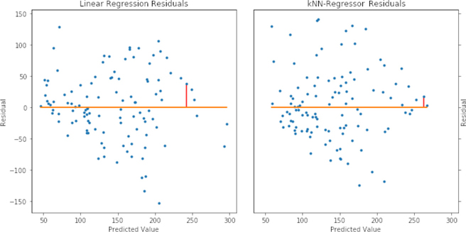
A few comments are in order. Since the two models predict different values for our point of interest, it shows up at different spots on the horizontal x axis. With the linear regression model, the value is predicted a hint under 250. With the k-NN-R model, the value is predicted to be a bit above 250. In both cases, it is underpredicted (remember, residuals tell us how to fix up the prediction: we need to add a bit to these predictions). The actual value is:
In [19]:
print(diabetes_test_tgt[-20])
280.0
If either of our models predicted 280, the residual would be zero.
In a classical stats class, when you look at residual plots, you are trying to diagnose if the assumptions of linear regression are violated. Since we’re using linear regression as a black box prediction method, we’re less concerned about meeting assumptions. However, we can be very concerned about trends among the residuals with respect to the predicted values. Potential trends are exactly what these graphs give us a chance to evaluate. At the very low end of the predicted values for the linear regression model, we have pretty consistent negative error (positive residual). That means when we predict a small value, we are probably undershooting. We also see undershooting in the predicted values around 200 to 250. For k-NN-R, we see a wider spread among the negative errors while the positive errors are a bit more clumped around the zero error line. We’ll discuss some methods of improving model predictions by diagnosing their residuals in Chapter 10.
7.4 A First Look at Standardization
I’d like to analyze a different regression dataset. To do that, I need to introduce the concept of normalization. Broadly, normalization is the process of taking different measurements and putting them on a directly comparable footing. Often, this involves two steps: (1) adjusting the center of the data and (2) adjusting the scale of the data. Here’s a quick warning that you may be getting used to: some people use normalization in this general sense, while others use this term in a more specific sense–and still others even do both.
I’m going to hold off on a more general discussion of normalization and standardization until Section 10.3. You’ll need to wait a bit–or flip ahead–if you want a more thorough discussion. For now, two things are important. First, some learning methods require normalization before we can reasonably press “Go!” Second, we’re going to use one common form of normalization called standardization. When we standardize our data, we do two things: (1) we center the data around zero and (2) we scale the data so it has a standard deviation of 1. Those two steps happen by (1) subtracting the mean and then (2) dividing by the standard deviation. Standard deviation is a close friend of variance from Section 5.6.1: we get standard deviation by taking the square root of variance. Before we get into the calculations, I want to show you what this looks like graphically.
In [20]:
# 1D standardization
# place evenly spaced values in a dataframe
xs = np.linspace(-5, 10, 20)
df = pd.DataFrame(xs, columns=['x'])

# center ( - mean) and scale (/ std)
df['std-ized'] = (df.x - df.x.mean()) / df.x.std()

# show original and new data; compute statistics
fig, ax = plt.subplots(1, 1, figsize=(3, 3))
sns.stripplot(data=df)
display(df.describe().loc[['mean', 'std']])
|
x |
std-ized |
|---|---|---|
mean |
2.5000 |
0.0000 |
std |
4.6706 |
1.0000 |

That’s all well and good, but things get far more interesting in two dimensions:
In [21]:
# 2 1D standardizations
xs = np.linspace(-5, 10, 20)
ys = 3*xs + 2 + np.random.uniform(20, 40, 20)

df = pd.DataFrame({'x':xs, 'y':ys})
df_std_ized = (df - df.mean()) / df.std()

display(df_std_ized.describe().loc[['mean', 'std']])
|
x |
y |
|---|---|---|
mean |
0.0000 |
-0.0000 |
std |
1.0000 |
1.0000 |
We can look at the original data and the standardized data on two different scales: the natural scale that matplotlib wants to use for the data and a simple, fixed, zoomed-out scale:
In [22]:
fig, ax = plt.subplots(2, 2, figsize=(5, 5))

ax[0,0].plot(df.x, df.y, '.')
ax[0,1].plot(df_std_ized.x, df_std_ized.y, '.')
ax[0,0].set_ylabel('"Natural" Scale')

ax[1,0].plot(df.x, df.y, '.')
ax[1,1].plot(df_std_ized.x, df_std_ized.y, '.')

ax[1,0].axis([-10, 50, -10, 50])
ax[1,1].axis([-10, 50, -10, 50])

ax[1,0].set_ylabel('Fixed/Shared Scale')
ax[1,0].set_xlabel('Original Data')
ax[1,1].set_xlabel('Standardized Data');

From our grid-o-graphs, we can see a few things. After standardizing, the shape of the data stays the same. You can see this clearly in the top row–where the data are on different scales and in different locations. In the top row, we let matplotlib use different scales to emphasize that the shape of the data is the same. In the bottom row, we use a fixed common scale to emphasize that the location and the spread of the data are different. Standardizing shifts the data to be centered at zero and scales the data so that the resulting values have a standard deviation and variance of 1.0.
We can perform standardization in sklearn using a special “learner” named StandardScaler. Learning has a special meaning in this case: the learner figures out the mean and standard deviation from the training data and applies these values to transform the training or test data. The name for these critters in sklearn is a Transformer. fit works the same way as it does for the learners we’ve seen so far. However, instead of predict, we use transform.
In [23]:
train_xs, test_xs = skms.train_test_split(xs.reshape(-1, 1), test_size=.5)

scaler = skpre.StandardScaler()
scaler.fit(train_xs).transform(test_xs)
Out[23]:
array([[ 0.5726],
       [ 0.9197],
       [ 1.9608],
       [ 0.7462],
       [ 1.7873],
       [-0.295 ],
       [ 1.6138],
       [ 1.4403],
       [-0.1215],
       [ 1.0932]])
Now, managing the train-test splitting and multiple steps of fitting and then multiple steps of predicting by hand would be quite painful. Extending that to cross-validation would be an exercise in frustration. Fortunately, sklearn has support for building a sequence of training and testing steps. These sequences are called pipelines. Here’s how we can standardize and then fit a model using a pipeline:
In [24]:
(train_xs, test_xs,
 train_ys, test_ys)= skms.train_test_split(xs.reshape(-1, 1),
                                           ys.reshape(-1, 1),
                                           test_size=.5)

scaler = skpre.StandardScaler()
lr  = linear_model.LinearRegression()

std_lr_pipe = pipeline.make_pipeline(scaler, lr)

std_lr_pipe.fit(train_xs, train_ys).predict(test_xs)
Out[24]:
array([[17.0989],
       [29.4954],
       [41.8919],
       [36.9333],
       [61.7263],
       [24.5368],
       [31.9747],
       [49.3298],
       [51.8091],
       [59.247 ]])
The pipeline itself acts just like any other learner we’ve seen: it has fit and predict methods. We can use a pipeline as a plug-in substitute for any other learning method. The consistent interface for learners is probably the single biggest win of sklearn. We use the same interface whether the learners are stand-alone components or built up from primitive components. This consistency is the reason we should all buy the sklearn developers celebratory rounds at conferences.
A detail on pipelines: even though the StandardScaler uses transform when it is applied stand-alone, the overall pipeline uses predict to apply the transformation. That is, calling my_pipe.predict() will do the transformations necessary to get to the final predict step.
Finally, I’ll leave you with one last warning. You may have noticed that we are learning the parameters we use to standardize (our training mean and standard deviation). We do that from the training set. Just like we don’t want to peek with a full-blown learner, we don’t want to peek with our preprocessing. There may be some wiggle room around what exactly constitutes peeking. Still, for safety’s sake, I encourage you never to peek–in any way, shape, or form–unless there is (1) a formal proof that peeking won’t bias or invalidate your results and (2) you understand the limits of the formal proof and when it may not apply–so that, again, you’re back in a scenario where you shouldn’t peek. Be cool, be safe, don’t peek.
7.5 Evaluating Regressors in a More Sophisticated Way: Take Two
We’re going to turn back to the Portuguese student data for our larger example. We have the same data we used in Chapter 6, except we’ve kept the target feature as a numerical value. So, we have just the numerical features from the original dataset and the G3 column as our target.
In [25]:
student_df = pd.read_csv('data/portugese_student_numeric.csv')
display(student_df[['absences']].describe().T)
|
count |
mean |
std |
min |
25% |
50% |
75% |
max |
|---|---|---|---|---|---|---|---|---|
absences |
395.00 |
5.71 |
8.00 |
0.00 |
0.00 |
4.00 |
8.00 |
75.00 |
In [26]:
student_ftrs = student_df[student_df.columns[:-1]]
student_tgt  = student_df['G3']
7.5.1 Cross-Validated Results on Multiple Metrics
The following code uses skms.cross_validate to score over multiple metrics. This is a very nice convenience function: it allows us to evaluate multiple metrics with one call. It also does some work to capture the amount of time spent to fit and predict with the given model. We’re going to ignore those other pieces and simply make use of the multiple metric evaluations that it returns. Like skms.cross_val_score, it requires scorers passed into the scoring argument.
In [27]:
scaler = skpre.StandardScaler()

lr     = linear_model.LinearRegression()
knn_3  = neighbors.KNeighborsRegressor(n_neighbors=3)
knn_10 = neighbors.KNeighborsRegressor(n_neighbors=10)

std_lr_pipe    = pipeline.make_pipeline(scaler, lr)
std_knn3_pipe  = pipeline.make_pipeline(scaler, knn_3)
std_knn10_pipe = pipeline.make_pipeline(scaler, knn_10)

# mean with/without Standardization should give same results
regressors = {'baseline'  : dummy.DummyRegressor(strategy='mean'),
              'std_knn3'  : std_knn3_pipe,
              'std_knn10' : std_knn10_pipe,
              'std_lr'    : std_lr_pipe}

msrs = {'MAE'  : metrics.make_scorer(metrics.mean_absolute_error),
        'RMSE' : metrics.make_scorer(rms_error)}

fig, axes = plt.subplots(2, 1, figsize=(6, 4))
fig.tight_layout()
for mod_name, model in regressors.items():
    cv_results = skms.cross_validate(model,
                                     student_ftrs, student_tgt,
                                     scoring = msrs, cv=10)

    for ax, msr in zip(axes, msrs):
        msr_results = cv_results["test_" + msr]

        my_lbl = "{:12s} {:.3f} {:.2f}".format(mod_name,
                                               msr_results.mean(),
                                               msr_results.std())
        ax.plot(msr_results, 'o--', label=my_lbl)
        ax.set_title(msr)
        # ax.legend() # uncomment for summary stats

A few things stand out here. 3-NN is not serving us very well in this problem: the baseline method generally has less error than 3-NN. For several folds, 10-NN and LR perform very similarly and their overall performance is mostly on par with one another and slightly better than baseline.
We can tease out some of the close values–and get a more direct comparison with the baseline regressor–by looking at the ratio of the
In [28]:
fig,ax = plt.subplots(1, 1, figsize=(6, 3))
baseline_results = skms.cross_val_score(regressors['baseline'],
                                        student_ftrs, student_tgt,
                                        scoring = msrs['RMSE'], cv=10)

for mod_name, model in regressors.items():
    if mod_name.startswith("std_"):
        cv_results = skms.cross_val_score(model,
                                          student_ftrs, student_tgt,
                                          scoring = msrs['RMSE'], cv=10)

        my_lbl = "{:12s} {:.3f} {:.2f}".format(mod_name,
                                               cv_results.mean(),
                                               cv_results.std())

        ax.plot(cv_results / baseline_results, 'o--', label=my_lbl)
ax.set_title("RMSE(model) / RMSE(baseline)
$<1$ is better than baseline")
ax.legend();

Here, it is quite clear that 3-NN is generating substantially more error than baseline (its ratios are bigger than 1) and it is worse than the other two regressors. We also see that LR seems to be a bit of a winner on more folds, although 10-NN does eek out a few victories in folds 6–9.
Although it is easily abused (as we discussed in Section 7.2.3), let’s see the default R2 scoring for this problem:
In [29]:
fig, ax = plt.subplots(1, 1, figsize=(6, 3))
for mod_name, model in regressors.items():
        cv_results = skms.cross_val_score(model,
                                          student_ftrs, student_tgt,
                                          cv=10)
        my_lbl = "{:12s} {:.3f} {:.2f}".format(mod_name,
                                               cv_results.mean(),
                                               cv_results.std())

       ax.plot(cv_results, 'o--', label=my_lbl)
ax.set_title("$R^2$");
# ax.legend(); # uncomment for summary stats

There are two interesting patterns here. The first is that our linear regression seems to be consistently better than k-NN-R. Secondly, the pattern between our two metrics appears pretty consistent. Certainly the order of the winners on each fold–remember that R2 approaching 1 is a better value–seems to be the same. Given the relationships between R2 and MSE we saw above, we probably aren’t too surprised by that.
Second, if you’ve been paying close attention, you might wonder why the baseline model–which was a mean predictor model–doesn’t have an R2 of zero. By the way, you get a gold star for noticing. Can you figure out why? As we discussed, there’s going to be different values for the means of training and testing sets. Since we’re doing train-test splitting wrapped up in cross-validation, our training and testing means are going to be a bit off from each other, but not too much. You’ll notice that most of the R2 values for the mean model are in the vicinity of zero. That’s the price we pay for randomness and using R2.
7.5.2 Summarizing Cross-Validated Results
Another approach to cross-validated predictions is to view the entire cross-validation process as a single learner. If you dig through your notes, you might find that when we do cross-validation, each example is in one and only one testing scenario. As a result, we can simply gather up all the predictions–made by a basket of learners training on different partitions of the data–and compare them with our known targets. Applying an evaluation metric to these predictions and targets gives us a net result of a single value for each model and metric. We access these predictions with cross_val_predict.
In [30]:
 msrs = {'MAD'  : metrics.mean_absolute_error,
         'RMSE' : rms_error} # not scorer, no model

results = {}
for mod_name, model in regressors.items():
    cv_preds = skms.cross_val_predict(model,
                                      student_ftrs, student_tgt,
                                      cv=10)
    for ax, msr in zip(axes, msrs):
        msr_results = msrs[msr](student_tgt, cv_preds)
        results.setdefault(msr, []).append(msr_results)
df = pd.DataFrame(results, index=regressors.keys())
df
Out[30]:
|
MAD |
RMSE |
|---|---|---|
baseline |
3.4470 |
4.6116 |
std_knn3 |
3.7797 |
4.8915 |
std_knn10 |
3.3666 |
4.4873 |
std_lr |
3.3883 |
4.3653 |
7.5.3 Residuals
Since we did some basic residual plots earlier, let’s make this interesting by (1) looking at the residuals of our baseline model and (2) using the standardized, preprocessed data.
In [31]:
fig, axes = plt.subplots(1, 4, figsize=(10, 5),
                         sharex=True, sharey=True)
fig.tight_layout()
for model_name, ax in zip(regressors, axes):
    model = regressors[model_name]
    preds = skms.cross_val_predict(model,
                                   student_ftrs, student_tgt,
                                   cv=10)

    regression_residuals(ax, preds, student_tgt)
    ax.set_title(model_name + " residuals")
pd.DataFrame(student_tgt).describe().T
Out[31]:
|
count |
mean |
std |
min |
25% |
50% |
75% |
max |
|---|---|---|---|---|---|---|---|---|
G3 |
395.00 |
10.42 |
4.58 |
0.00 |
8.00 |
11.00 |
14.00 |
20.00 |

A few interesting points:
Even though we are using the mean model as our baseline model, we have multiple means–there’s one for each training-split. But take heart, our predicted values only have a slight variation for the mean-only model(s).
The residuals for our standardize-then-fit models have some striking patterns.
They all show banding. The banding is due to the integer values of the target: there are target values of 17 and 18, but not 17.5. So, we have distinct gaps.
The overall patterns seem quite similar for each of the nonbaseline models.
There’s a whole band of “error outliers” where all of the residuals are negative and keep decreasing with the amount of the prediction. Negative residuals are positive errors. They indicate we are overpredicting. On the right, we predict 15 and we’re over by about 15, as the actual is near zero. On the left, we predict near 5 and we’re over by about 5; the actual is, again, near zero. So, the reason we see that band is that it shows us our maximum error (minimum residual) at each possible predicted value. If we predict x and the actual value is zero, our error is x (residual of -x).
7.6 EOC
7.6.1 Summary
We’ve added a few tools to our toolkit for assessing regression methods: (1) baseline regression models, (2) residual plots, and (3) some appropriate metrics. We’ve also explained some of the difficulties in using these metrics. We took a first look at pipelines and standardization, which we’ll come back to in more detail later.
7.6.2 Notes
In the residual plots, you might have noticed that the (actual, predicted) points are equidistant from the y = x line in both the horizontal and vertical directions. That regularity, if unexpected, might indicate that something is wrong. However, it turns out that we should expect that regularity.
Any triangle made up of one 90-degree angle and two 45-degree angles is going to have its short sides (those are the bases, not the hypotenuse) of the same length. (Ah, what a stroll down the memory line to high school geometry.) Conceptually, this means that the distance (1) from actual to predicted is the same as the distance (2) from predicted to actual. That’s not surprising. The distance from Pittsburgh to Philadelphia is the same as the distance from Philadelphia to Pittsburgh. Nothing to see here, carry on.
When we see troublesome patterns in a residual plot, we might ask, “What do we do to fix it?” Here are some recommendations that come out of the statistical world (see, for example, Chapter 3 of Applied Linear Statistical Models by Kutner and friends)— with the caveat that these recommendations are generally made with respect to linear regression and are merely starting points. Your mileage might vary.
If the spread of the residuals is pretty even, transform the inputs (not the outputs).
If the spread of the residuals is increasing (they look like a funnel), taking the logarithm of the output can force it back to an even spread.
If there is a clear functional relationship in the residuals (for example, if we try to model a true x2 with a linear regression, our residuals would look like x2 - (mx + b), which in turn looks like a parabola), then transforming the inputs may help.
We’ll talk about performing these tasks in Chapter 10.
Statisticians—there they go again—like to work with something called Studentized residuals. Studentization depends on using a linear regression (LR) model. Since we don’t necessarily have a LR model, we can use semi-Studentized residuals simply by dividing our errors—the residuals—by the root-mean-squared error . Basically, we are normalizing their size to the average-ish error size.
If you insist on a statistical approach to comparing algorithms—that’s t-tests, comparing means, and so forth—you may want to check out:
Dietterich, Thomas G. (1998). “Approximate Statistical Tests for Comparing Supervised Classification Learning Algorithms.” Neural Computation 10 (7): 1895–1923.
We’ll make use of another idea from that paper—5 × 2 cross-validation—in Section 11.3.
In a 2010 article “What You Can and Can’t Properly Do with Regression,” Richard Berk describes three levels of application of linear regression.
The first is as a purely descriptive model. This is how we are generally using models throughout this book. We say, “We are going to get the best description of the relationship between the predictors and the target using a linear model.” We don’t make any assumptions about how the data came to be, nor do we have a preconceived idea of the relationship. We just hold up a ruler and see how well it measures what we are seeing.
Level two is statistical inference: computing confidence intervals and constructing formal tests of statistical hypotheses. To access level two, our data must be a suitable random sampling of a larger population.
Level three involves making claims about causality: the predictors cause the target. A follow-on is that if we manipulate the predictor values, we can tell you what the change in the target will be. This is a very strong statement of belief and we are not going there. If we could intervene in our variables and generate test cases to see the outcomes (also known as performing experiments), we could potentially rule out things like confounding factors and illusory correlations.
More Comments on R2 Strictly speaking, R2 is sklearn’s default metric for classes that inherit from sklearn’s parent regression class RegressorMixin. Discussing inheritance is beyond the scope of this book; the quick summary is that we can place common behavior in a parent class and access that behavior without reimplementing it in a child class. The idea is similar to how genetic traits are inherited from parent to child.
If you want to dive into some of the limitations of R2, start here:
Kvalseth, Tarald O. (1985). “Cautionary Note about R2.” The American Statistician 39 (4): 279–285.
Anscombe, F. J. (1973). “Graphs in Statistical Analysis.” American Statistician 27 (1): 17–21.
Yes, they are both statistical journals. No, I’m not sorry. The first is primarily about calculations surrounding R2 and the second is about interpreting its value. Above, I limited my critiques of R2 to its use in predictive evaluation of learning systems. But in the larger statistical context, (1) even in cases where it is completely appropriate to use R2, people often have strong misconceptions about its interpretation and (2) it is often applied inappropriately. Basically, lots of people are running around with scissors, just waiting to trip and hurt themselves. If you’d like to fortify yourself against some of the most common misuses, check out Chapter 2 of Advanced Data Analysis by Shalizi.
R2, as it is used by many scientists, means much more than the specific calculation I’ve presented here. To many folks in the wide academic world, R2 is inherently tied to our model being a linear model—that is, a linear regression. There are often additional assumptions placed on top of that. Thus, you will commonly hear phrases like “R2 is the percentage of variance explained by a linear relationship between the predictors and the target.” That statement is true, if you are using a linear model as your prediction model. We are interested in models that go beyond a typical linear regression.
Fetching the Student Data Here is the code to download and preprocess the data we used in the final example.
In [32]:
student_url = ('https://archive.ics.uci.edu/' +
               'ml/machine-learning-databases/00320/student.zip')
def grab_student_numeric():
    # download zip file and unzip
    # unzipping unknown files can be a security hazard
    import urllib.request, zipfile
    urllib.request.urlretrieve(student_url,
                               'port_student.zip')
    zipfile.ZipFile('port_student.zip').extract('student-mat.csv')

    # preprocessing
    df = pd.read_csv('student-mat.csv', sep=';')

    # g1 & g2 are highly correlated with g3;
    # dropping them makes the problem significantly harder
    # we also remove all non-numeric columns
    df = df.drop(columns=['G1', 'G2']).select_dtypes(include=['number'])

    # save as
    df.to_csv('portugese_student_numeric.csv', index=False)

# grab_student_numeric()
7.6.3 Exercises
Try applying our regression evaluation techniques against the boston dataset that you can pull in with datasets.load_boston.
Here’s a more thought-provoking question: what relationship between true and predicted values would give a linear residual plot as the result?