
13. Models That Engineer Features for Us
In [1]:
# setup
from mlwpy import *
%matplotlib inline*

kwargs = {'test_size':.25, 'random_state':42}

iris = datasets.load_iris()
tts = skms.train_test_split(iris.data, iris.target, **kwargs)
(iris_train,     iris_test,
 iris_train_tgt, iris_test_tgt) = tts

wine = datasets.load_wine()
tts = skms.train_test_split(wine.data, wine.target, **kwargs)
(wine_train,     wine_test,
 wine_train_tgt, wine_test_tgt) = tts

diabetes = datasets.load_diabetes()
tts = skms.train_test_split(diabetes.data, diabetes.target, **kwargs)
(diabetes_train_ftrs, diabetes_test_ftrs,
 diabetes_train_tgt,  diabetes_test_tgt) = tts

# these are entire datasets
iris_df = pd.DataFrame(iris.data, columns=iris.feature_names)
wine_df = pd.DataFrame(wine.data, columns=wine.feature_names)
diabetes_df = pd.DataFrame(diabetes.data, columns=diabetes.feature_names)
In Chapter 10, we performed feature engineering by hand. For example, we could manually—with our own eyes—read through a list of features and say that some more are needed. We could manually create a new feature for body mass index (BMI)—from height and weight—by running the necessary calculations. In this chapter, we will talk about automated ways of performing feature selection and construction. There are two benefits to automation: (1) we can consider many, many possible combinations of features and operations and (2) we can place these steps within cross-validation loops to prevent overfitting due to feature engineering.
So far in this book, I have preferred to start with some specifics and then talk about things more abstractly. I’m going to flip things around for a few minutes and speak abstractly and then follow up with some intuitive examples. From Chapter 2, you might remember that we can take a geometric view of our data. We act as if each of our examples is a point in some 2D, 3D, or n-D space. Things get weird in higher dimensions—but rest assured, theoretical physicists and mathematicians have us covered. If we have a simple scenario of five examples with three features each—five points in 3D space—then there are several ways we might rewrite or reexpress this data:
We might ask: if I can only keep one of the original dimensions, which one should I keep?
We can extend that: if I can keep n of the original dimensions, which should I keep?
We can reverse it: which dimensions should I get rid of?
I measured some features in ways which were convenient. Are there better ways to express those measurements?
Some measurements may overlap in their information: for example, if height and weight are highly correlated, we may not need both.
Some measurements may do better when combined: for health purposes, combining height and weight to BMI may be beneficial.
If I want to reduce the data down to a best line, which line should I use?
If I want to reduce the data down to a best plane, which plane should I use (Figure 13.1)?

Figure 13.1 Mapping points from 3D to 2D.
We can answer these questions using a variety of techniques. Here’s a quick reminder about terminology (which we discussed more thoroughly in Section 10.1). The process of selecting some features to use, and excluding others, is called feature selection. The process of reexpressing the given measurements is called feature construction. We’ll save feature extraction for the next chapter. Some learning techniques make use of feature selection and feature construction, internally, in their regular operation. We can also perform feature selection and feature construction as stand-alone preprocessing steps.
One major reason to select a subset of features is when we have a very large dataset with many measurements that could be used to train several different learning systems. For example, if we had data on housing sales, we might care about predicting values of houses, recommending houses to particular users, and verifying that mortgage lenders are complying with financial and anti-discrimination laws. Some aspects of the dataset might be useful for answering all of these questions; other features might only apply to one or two of those questions. Trimming down the unneeded features can simplify the learning task by removing irrelevant or redundant information.
One concrete example of feature construction is body mass index. It turns out that accurately measuring a person’s lean body mass—or, less enthusiastically for some, our nonlean mass—is very difficult. Even in a laboratory setting, taking accurate and repeatable measurements is difficult. On the other hand, there are many well-documented relationships between health concerns and the ratio of lean to nonlean mass. In short, it’s very useful for health care providers to have a quick assessment of that ratio.
While it has limitations, BMI is an easy-to-compute result from easy-to-measure values that has a good relationship with health outcomes. It is calculated as with weight in kilograms and height in meters. Practically speaking, at the doctor’s office, you take a quick step on a scale, they put the little stick on your head, and after two quick operations on a calculator, you have a surrogate value for the hard-to-measure concept of lean mass. We can apply similar ideas to bring hard-to-measure or loosely related concepts to the forefront in learning systems.
13.1 Feature Selection
From a high-level viewpoint, there are three ways to pick features:
Single-step filtering: evaluate each feature in isolation, then select some and discard the rest.
Select-Model-Evaluate-Repeat: select one or more features, build a model, and assess the results. Repeat after adding or removing features. Compared to single-step filtering, this technique lets us account for interactions between features and between features and a model.
Embed feature selection within model building: as part of the model building process, we can select or ignore different features.
We’ll talk about the first two in more detail in a moment. For the third, feature selection is naturally embedded in several learning techniques. For example:
Lasso regression from Section 9.1, and L1 regularization generally, leads to zeros for regression coefficients which is equivalent to ignoring those features.
Decision trees, as commonly implemented, select a single feature at each tree node. Limiting the depth of a tree limits the total number of features that the tree can consider.
13.1.1 Single-Step Filtering with Metric-Based Feature Selection
The simplest method of selecting features is to numerically score the features and then take the top results. We can use a number of statistical or information-based measures to do the scoring. We will look at variance, covariance, and information gain.
13.1.1.1 Variance
The simplest way to choose features to use in a model is to give them scores. We can score features in pure isolation or in relationship to the target. The simplest scoring ignores even the target and simply asks something about a feature in isolation. What characteristics of a feature could be useful for learning but don’t draw on the relationship we want to learn? Suppose a feature has the same value for every example—an entire column with the value Red. That column, literally, has no information to provide. It also happens to have zero variance. Less extremely, the lower variance a feature has, the less likely it is to be useful to distinguish a target value. Low-variance features, as a general rule, are not going to be good for prediction. So, this argument says we can get rid of features with very low variance.
The features from the wine dataset have the following variances:
In [2]:
print(wine_df.var())
alcohol                                                   0.6591
malic_acid                                                1.2480
ash                                                       0.0753
alcalinity_of_ash                                        11.1527
magnesium                                               203.9893
total_phenols                                             0.3917
flavanoids                                                0.9977
nonflavanoid_phenols                                      0.0155
proanthocyanins                                           0.3276
color_intensity                                           5.3744
hue                                                       0.0522
od280/od315_of_diluted_wines                              0.5041
proline                                              99,166.7174
dtype: float64
You may notice a problem: the scales of the measurements may differ so much that their average squared distance from the mean—that’s the variance, by the way—is small compared to the raw measurements on other scales. Here’s an example in the wine data:
In [3]:
print(wine_df['hue'].max() - wine_df['hue'].min())
1.23
The biggest possible difference in hue is 1.23; its variance was about 0.05. Meanwhile:
In [4]:
print(wine_df['proline'].max() - wine_df['proline'].min())
1402.0
The range of proline is just over 1400 and the average squared difference from the average proline value is almost 10,000. The two features are simply speaking different languages—or, one is whispering and one is shouting. So, while the argument for selecting based on variance has merits, selecting features in this exact manner is not recommended. Still, we’ll march ahead to get a feel for how it works before we add complications.
Here, we’ll pick out those features that have a variance greater than one.
In [5]:
# variance-selection example without scaling
varsel = ftr_sel.VarianceThreshold(threshold=1.0)
varsel.fit_transform(wine_train)

print("first example")
print(varsel.fit_transform(wine_train)[0],
      wine_train[0, wine_train.var(axis=0) > 1.0], sep='
')
first example
[   2.36   18.6   101.     3.24   5.68 1185.  ]
[   2.36   18.6   101.     3.24   5.68 1185.  ]
So, running the VarianceThreshold.fit_transform is effectively the same as picking the columns with variance greater than one. Good enough. get_support gives us a set of Boolean values to select columns.
In [6]:
print(varsel.get_support())
[False  True False  True  True False  True False False  True False False
  True]
If we want to know the names of the features we kept, we have go back to the dataset’s feature_names:
In [7]:
keepers_idx = varsel.get_support()
keepers = np.array(wine.feature_names)[keepers_idx]
print(keepers)
['malic_acid' 'alcalinity_of_ash' 'magnesium' 'flavanoids'
 'color_intensity' 'proline']
Here’s one other conceptual example. Imagine I measured human heights in centimeters versus meters. The differences from the mean, when measured in meters, are going to be relatively small; in centimeters, they are going to be larger. When we square those differences—remember, the formula for variance includes an —they are magnified even more. So, we need the units of the measurements to be comparable. We don’t want to normalize these measurements by dividing by the standard deviation—if we do that, all the variances will go to 1. Instead, we can rescale them to [0, 1] or [–1, 1].
In [8]:
minmax = skpre.MinMaxScaler().fit_transform(wine_train)
print(np.sort(minmax.var(axis=0)))
[0.0223 0.0264 0.0317 0.0331 0.0361 0.0447 0.0473 0.0492 0.0497 0.0569
 0.058  0.0587 0.071 ]
Now, we can assess the variance of those rescaled values. It’s not super principled, but we’ll apply a threshold of 0.05. Alternatively, you could decide you want to keep some number or percentage of the best features and work backwards from that to an appropriate threshold.
In [9]:
# scaled-variance selection example
pipe = pipeline.make_pipeline(skpre.MinMaxScaler(),
                              ftr_sel.VarianceThreshold(threshold=0.05))
pipe.fit_transform(wine_train).shape

# pipe.steps is list of (name, step_object)
keepers_idx = pipe.steps[1][1].get_support()
print(np.array(wine.feature_names)[keepers_idx])
['nonflavanoid_phenols' 'color_intensity' 'od280/od315_of_diluted_wines'
 'proline']
Unfortunately, using variance is troublesome for two reasons. First, we don’t have any absolute scale on which to pick a threshold for a good variance. Sure, if the variance is zero, we can probably ditch the feature—but on the other extreme, a feature with unique values for every example is also a problem. In Section 8.2 we saw that we can make a perfect decision tree for training from such a feature, but it has no generalization utility. Second, the value we choose is very much a relative decision based on the features we have in the dataset. If we want to be more objective, we could use a pipeline and grid-search mechanisms to choose a good variance threshold based on the data. Still, if a learning problem has too many features (hundreds or thousands), applying a variance threshold to reduce the features quickly without investing a lot of computational effort may be useful.
13.1.1.2 Correlation
There is a more serious issue with using variance. Considering the variance of an isolated feature ignores any information about the target. Ideally, we’d like to incorporate information about how a feature varies together with the target. Aha! That sounds a lot like covariance. True, but there are some differences. Covariance has some subtle and weird behavior which makes it slightly difficult to interpret. Covariance becomes easier to understand when we normalize it by the variance of its parts. Essentially, for two features, we ask (1) how the two vary together compared to, (2) how the two vary individually. A deep result in mathematics says that the first (varying together) is always less than or equal to the second (varying individually). We can put these ideas together to get the correlation between two things—in this case, a feature and a target. Mathematically, . With a feature and a target, we substitute ftr → x and tgt → y and get r = cor(ftr, tgt).
Correlation has many interpretations; of interest to us here is interpreting it as an answer to: if we ignore the signs, how close is the covariance to its maximum possible value? Note that both covariance and correlation can be positive or negative. I’ll let one other point slip: when the correlation is 1—and when the covariance is at its maximum—there is a perfect linear relationship between the two inputs. However, while the correlation is all about this linear relationship, the covariance itself cares about more than just linearity. If we rewrite covariance as a multiplication of correlation and covariances —and squint a bit, we see that (1) spreading out x or y (increasing their variance), (2) increasing the line-likeness (increasing cor(x, y)), and, less obviously, (3) equally distributing a given total variance between x and y will all increase the covariance. While that got a bit abstract, it answers the question of why people often prefer correlation to covariance: correlation is simply about lines.
Since correlation can be positive or negative—it’s basically whether the line points up or down—comparing raw correlations can cause a slight problem. A line isn’t bad just because it points down instead of up. We’ll adopt one of our classic solutions to plus-minus issues and square the correlation value. So, instead of working with r, we’ll work with r2. And now, at long last, we’ve completed a circle back to topics we first discussed in Section 7.2.3. Our approach earlier was quite different, even though the underlying mathematics of the two are the same. The difference is in the use and interpretation of the results.
One other confusing side note. We are using the correlation as a univariate feature selection method because we are picking a single feature with the method. However, the longer name for the correlation value we are computing is the bivariate correlation between a predictive feature and the target output. Sorry for the confusion here, but I didn’t make up the names. sklearn lets us use the correlation between feature and target in a sneaky way: they wrap it up inside of their f_regression univariate selection method. I won’t go into the mathematical details here (see the End-of-Chapter Notes), but the ordering of features under f_regression will be the same if we rank-order the features by their squared correlations.
We’ll show that these are equivalent and, while we’re at it, we’ll also show off computing correlations by hand. First, let’s compute the covariances between each feature and the target for the diabetes dataset. For this problem, the covariance for one feature will look like The code looks pretty similar—we just have to deal with a few numpy axis issues.
In [10]:
# cov(X,Y) = np.dot(X-E(X), Y-E(Y)) / n
n = len(diabetes_train_ftrs)

# abbreviate names
x = diabetes_train_tgt[np.newaxis,:]
y = diabetes_train_ftrs
cov_via_dot = np.dot(x-x.mean(), y-y.mean()) / n

# compute all covariances, extract the ones between ftr and target
# bias=True to divide by n instead of n-1; np.cov defaults to bias=False
cov_via_np  = np.cov(diabetes_train_ftrs, diabetes_train_tgt,
                     rowvar=False, bias=True)[-1, :-1]
print(np.allclose(cov_via_dot, cov_via_np))
True
Now, we can calculate the correlations in two ways: (1) from the covariances we just calculated or (2) from numpy’s np.corrcoef directly.
In [11]:
# np.var default ddof=0 equates to bias=True
# np.corrcoef is a bit of a hot mess to extract values from

# cov()/sqrt(var() var())
cor_via_cov = cov_via_np / np.sqrt(np.var(diabetes_train_tgt) *
                                   np.var(diabetes_train_ftrs, axis=0))
cor_via_np = np.corrcoef(diabetes_train_ftrs, diabetes_train_tgt,
                         rowvar=False)[-1, :-1]
print(np.allclose(cor_via_cov, cor_via_np))
True
Lastly, we can confirm that the order of the variables when we calculate the correlations and the order when we use sklearn’s f_regression is the same.
In [12]:
# note: we use the squares of the correlations, r^2
corrs = np.corrcoef(diabetes_train_ftrs,
                    diabetes_train_tgt, rowvar=False)[-1, :-1]
cor_order = np.argsort(corrs**2) # r^2 (!)
cor_names = np.array(diabetes.feature_names)[cor_order[::-1]]

# and sklearn's f_regression calculation
f_scores = ftr_sel.f_regression(diabetes_train_ftrs,
                                diabetes_train_tgt)[0]
freg_order = np.argsort(f_scores)
freg_names = np.array(diabetes.feature_names)[freg_order[::-1]]

# numpy arrays don't like comparing strings
print(tuple(cor_names) == tuple(freg_names))
True
If you lost the big picture, here’s a recap:
Variance was OK-ish, but covariance is a big improvement.
Covariance has some rough edges; correlation r is nice; squared-correlation r2 is nicer.
sklearn’sf_regressionorders by r2 for us.
We can order by r2 using f_regression.
13.1.1.3 Information Measures
Correlation can only directly measure linear relationships between its inputs. There are many—even infinitely many—other relationships we might care about. So, there are other useful statistics between columns that we might calculate. A very general way to look at the relationships between features and a target comes from the field of coding and information theory. We won’t go into details, but let me give you a quick story.
Like many young children, I loved flashlights. It didn’t take long for me to find out that Morse code allows people to transmit information with blinking flashlights. However, the young me viewed memorizing Morse code as an insurmountable task. Instead, my friends and I made up our own codes for very specific scenarios. For example, when playing capture-the-flag, we wanted to know if it was safe to cross a field. If there were only two answers, yes and no, then two simple blinking patterns would suffice: one blink for no and two blinks for yes. Imagine that most of the time the field is safe to cross. Then, most of the time, we’d want to send a yes message. But then, we’re actually being a bit wasteful by using two blinks for yes. If we swap the meaning of our blinks—making it one for yes and two for no—we’ll save some work. In a nutshell, these are the ideas that coding and information theory consider: how do we communicate or transmit information efficiently, considering that some of the messages we want to transmit are more likely than others.
Now, if you didn’t nod off, you are probably wondering what this has to do with relating features and targets. Imagine that the feature value is a message that gets sent to the learner (Figure 13.2). The learner needs to decode that message and turn it into a result—our target of interest. Information-theoretic measures take the view of translating a feature to a message which gets decoded and leads to a final target. Then, they quantify how well different features get their message across. One concrete measure from information theory is called mutual information and it captures, in a generic sense, how much knowing a value of one outcome tells us about the value of another.

Figure 13.2 Sending messages from features to target via flashlight.
One Useful and One Random Variable We’ll start with a problem that is simple to express but results in a nonlinear classification problem.
In [13]:
xs = np.linspace(-10,10,1000).reshape(-1,1)
data = np.c_[xs, np.random.uniform(-10,10,xs.shape)]
tgt = (np.cos(xs) > 0).flatten()
Since that is a pretty unintuitive formula, let’s look at it graphically:
In [14]:
plt.figure(figsize=(4,3))
plt.scatter(data[:,0], tgt);
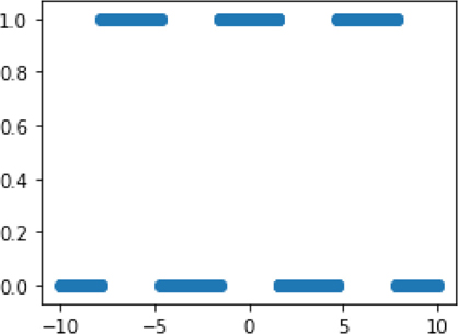
Basically, we have a pattern that turns off and on (0 and 1) at regular intervals. The graph is not that complicated, but it is decidedly nonlinear. In data, our first column is evenly spaced values; our second column is random values. We can look at the mutual information for each column against our nonlinear target:
In [15]:
mi = ftr_sel.mutual_info_classif(data, tgt,
                                 discrete_features=False)
print(mi)
[0.6815 0.0029]
That’s a pretty good sign: we have a small, almost zero, value for the random column and larger value for the informative column. We can use similar measures for regression problems.
In [16]:
xs = np.linspace(-10,10,1000).reshape(-1,1)
data = np.c_[xs, np.random.uniform(-10,10,xs.shape)]
tgt = np.cos(xs).flatten()
Here’s a graph of column one versus our target:
In [17]:
plt.figure(figsize=(4,3))
plt.plot(data[:,0], tgt);

And now we can compare the r2-like and mutual information techniques:
In [18]:
print(ftr_sel.f_regression(data, tgt)[0],
      ftr_sel.mutual_info_regression(data, tgt),
      sep='
')
[0. 0.]
[1.9356 0.    ]
In this example, both the uninformative, random column and the informative column have a zero linear relationship with the target. However, looking at the mutual_info_regression, we see a reasonable set of values: the random column gives zero and the informative column gives a positive number.
Two Predictive Variables Now, what happens when we have more than one informative variable? Here’s some data:
In [19]:
xs, ys = np.mgrid[-2:2:.2, -2:2:.2]
c_tgt = (ys > xs**2).flatten()

# basically, turn r_tgt off if y<x**2
r_tgt = ((xs**2 + ys**2)*(ys>xs**2))

data = np.c_[xs.flat, ys.flat]

# print out a few examples
print(np.c_[data, c_tgt, r_tgt.flat][[np.arange(0,401,66)]])
[[-2.  -2.   0.  0. ]
 [-1.4 -0.8  0.  0. ]
 [-0.8  0.4  0.  0. ]
 [-0.2  1.6  1.  2.6]
 [ 0.6 -1.2  0.  0. ]
 [ 1.2  0.   0.  0. ]
 [ 1.8  1.2  0.  0. ]]
And that leads to two different problems, one classification and one regression.
In [20]:
fig,axes = plt.subplots(1,2, figsize=(6,3), sharey=True)
axes[0].scatter(xs, ys, c=np.where(c_tgt, 'r', 'b'), marker='.')
axes[0].set_aspect('equal');

bound_xs = np.linspace(-np.sqrt(2), np.sqrt(2), 100)
bound_ys = bound_xs**2

axes[0].plot(bound_xs, bound_ys, 'k')
axes[0].set_title('Classification')

axes[1].pcolormesh(xs, ys, r_tgt,cmap='binary')
axes[1].set_aspect('equal')
axes[1].set_title('Regression');

Before we compute any statistics here, let’s think about this scenario for a minute. If you tell me the value of y and it is less than zero, I know an awful lot about the result: it’s always blue (for classification) or white (for regression). If y is bigger than zero, we don’t get as much of a win, but as y keeps increasing, we get a higher likelihood of red (in the left figure) or black (in the right figure). For x, a value greater or less than zero doesn’t really mean much: things are perfectly balanced about the x-axis.
That said, we can look at the information-based metric for c_tgt which is calculated using mutual_info_classif:
In [21]:
print(ftr_sel.mutual_info_classif(data, c_tgt,
                                  discrete_features=False, random_state=42))
[0.0947 0.1976]
The relative values for the r_tgt regression problem are broadly similar to those for mutual_info_regression:
In [22]:
print(ftr_sel.mutual_info_regression(data, r_tgt.flat,
                                     discrete_features=False))
[0.0512 0.4861]
These values line up well with our intuitive discussion.
13.1.1.4 Selecting the Top Features
Practically speaking, when we want to apply a selection metric, we want to rank and then pick features. If we want some fixed number of features, SelectKBest lets us do that easily. We can take the top five with the following code:
In [23]:
ftrsel = ftr_sel.SelectKBest(ftr_sel.mutual_info_classif, k=5)
ftrsel.fit_transform(wine_train, wine_train_tgt)

# extract names
keepers_idx = ftrsel.get_support()
print(np.array(wine.feature_names)[keepers_idx])
['flavanoids' 'color_intensity' 'hue' 'od280/od315_of_diluted_wines'
 'proline']
That makes it relatively easy to compare two different feature selection methods. We see that most of the top five selected features are the same under f_classif and mutual_info_classif.
In [24]:
ftrsel = ftr_sel.SelectKBest(ftr_sel.f_classif, k=5)
ftrsel.fit_transform(wine_train, wine_train_tgt)

keepers_idx = ftrsel.get_support()
print(np.array(wine.feature_names)[keepers_idx])
['alcohol' 'flavanoids' 'color_intensity' 'od280/od315_of_diluted_wines'
 'proline']
If we’d prefer to grab some percentage of the features, we can use SelectPercentile. Combining it with r2 gives us:
In [25]:
ftrsel = ftr_sel.SelectPercentile(ftr_sel.f_regression,
                                  percentile=25)
ftrsel.fit_transform(diabetes_train_ftrs,
                     diabetes_train_tgt)

print(np.array(diabetes.feature_names)[ftrsel.get_support()])
['bmi' 'bp' 's5']
And to use mutual information, we can do this:
In [26]:
ftrsel = ftr_sel.SelectPercentile(ftr_sel.mutual_info_regression,
                                  percentile=25)
ftrsel.fit_transform(diabetes_train_ftrs,
                     diabetes_train_tgt)

print(np.array(diabetes.feature_names)[ftrsel.get_support()])
['bmi' 's4' 's5']
Very generally speaking, different feature selection metrics often give similar rankings.
13.1.2 Model-Based Feature Selection
So far, we’ve been selecting features based either on their stand-alone characteristics (using variance) or on their relationship with the target (using correlation or information). Correlation is nice because it tracks a linear relationship with the target. Information is nicer because it tracks any—for some definition of “any”—relationship. Still, in reality, when we select features, we are going to use them with a model. It would be nice if the features we used were tailored to that model. Not all models are lines or otherwise linear. The existence of a relationship between a feature and a target does not mean that a particular model can find or make use of it. So, we can naturally ask if there are any feature selection methods that can work with models to select features that work well in that model. The answer is yes.
A second issue, up to this point, is that we’ve only evaluated single features, not sets of features. Models work with whole sets of features in one go. For example, linear regressions have coefficients on each feature, and decision trees compare values of some features after considering all features. Since models work with multiple features, we can use the performance of models on different baskets of features to assess the value of those features to the models.
Combinatorics—the sheer number of ways of picking a subset of features from a bigger set—is what usually prevents us from testing each and every possible subset of features. There are simply too many subsets to evaluate. There are two major ways of addressing this limitation: randomness and greediness. It sounds like we are taking yet another trip to a casino.
Randomness is fairly straightforward: we take subsets of the features at random and evaluate them. Greediness involves starting from some initial set of features and adding or removing features from that starting point. Here, greed refers to the fact that we may take steps that individually look good, but we may end up in a less-than-best final spot. Think of it this way. If you are wandering around a big city without a map, looking for the zoo, you might proceed by walking to a corner and asking, “Which way to the zoo?” You get an answer and follow the directions to a next corner. If people are honest—we can hope—you might end up at the zoo after quite a long walk. Unfortunately, different people might have different ideas about how to take you to the zoo, so you might end up backtracking or going around in circles for a bit. If you had a map, however, you could take yourself there directly via a shortest path. When we have a limited view of the total problem—whether standing on a street corner or only considering some features to add or delete—we may not reach an optimal solution.
In practice, greedy feature selection gives us an overall process that looks like this:
Select some initial set of features.
Build a model with the current features.
Evaluate the importance of the features to the model.
Keep the best features or drop the worst features from the current set. Systematically or randomly add or remove features, if desired.
Repeat from step 2, if desired.
Very often, the starting point is either (1) a single feature, with us working forward by adding features, or (2) all the features, with us working backward by removing features.
13.1.2.1 Good for Model, Good for Prediction
Without the repetition step (step 5), we only have a single model-building step. Many models give their input features an importance score or a coefficient. SelectFromModel uses these to rank and select features. For several models, the default is to keep the features with the score above the mean or average.
In [27]:
ftrsel = ftr_sel.SelectFromModel(ensemble.RandomForestClassifier(),
                                 threshold='mean') # default
ftrsel.fit_transform(wine_train, wine_train_tgt)
print(np.array(wine.feature_names)[ftrsel.get_support()])
['alcohol' 'flavanoids' 'color_intensity' 'hue'
 'od280/od315_of_diluted_wines' 'proline']
For models with L1 regularization—that’s what we called the lasso in Section 9.1—the default threshold is to throw out small coefficients.
In [28]:
lmlr = linear_model.LogisticRegression
ftrsel = ftr_sel.SelectFromModel(lmlr(penalty='l1'))
    # thesh is "small" coeffs
ftrsel.fit_transform(wine_train, wine_train_tgt)

print(np.array(wine.feature_names)[ftrsel.get_support()])
['alcohol' 'malic_acid' 'ash' 'alcalinity_of_ash' 'magnesium' 'flavanoids'
 'proanthocyanins' 'color_intensity' 'od280/od315_of_diluted_wines'
 'proline']
Note that we don’t have any easy way to order the selected features unless we go back to the coefficients or importances from the underlying model. SelectFromModel gives us a binary—yes or no—look at whether to keep features or not.
13.1.2.2 Let a Model Guide Decision
Going beyond a one-step process, we can let the basket of features grow or shrink based on repeated model-building steps. Here, the repetition of step 5 (from two sections back) is desired. Imagine we build a model, evaluate the features, and then drop the worst feature. Now, we repeat the process. Since features can interact with each other, the entire ordering of the features may now be different. We drop the worst feature under the new ordering. We continue on until we’ve dropped as many features as we want to drop. This method is called recursive feature elimination and is available in sklearn through RFE.
Here we will use a RandomForestClassifier as the underlying model. As we saw in Section 12.3, random forests (RFs) operate by repeatedly working with random selections of the features. If a feature shows up in many of the component trees, we can use that as an indicator that a more frequently used feature has more importance than a less frequently used feature. This idea is formalized as the feature importance.
In [29]:
ftrsel = ftr_sel.RFE(ensemble.RandomForestClassifier(),
                     n_features_to_select=5)

res = ftrsel.fit_transform(wine_train, wine_train_tgt)
print(np.array(wine.feature_names)[ftrsel.get_support()])
['alcohol' 'flavanoids' 'color_intensity' 'od280/od315_of_diluted_wines'
 'proline']
We can also select features using a linear regression model. In the sklearn implementation, features are dropped based on the size of their regression coefficients. Statisticians should now read a warning in the End-of-Chapter Notes.
In [30]:
# statisticians be warned (see end-of-chapter notes)
# this picks based on feature weights (coefficients)
# not on significance of coeffs nor on r^2/anova/F of (whole) model
ftrsel = ftr_sel.RFE(linear_model.LinearRegression(),
                     n_features_to_select=5)
ftrsel.fit_transform(wine_train, wine_train_tgt)
print(np.array(wine.feature_names)[ftrsel.get_support()])
['alcohol' 'total_phenols' 'flavanoids' 'hue'
 'od280/od315_of_diluted_wines']
We can use .ranking_ to order the dropped features—that is, where in the rounds of evaluation they were kept or dropped—without going back to the coefficients or importances of the models that were used along the way. If we want to order the remaining features—the keepers—we have to do some extra . work:
In [31]:
# all the 1s are selected; non-1s indicate when they were dropped
# go to the estimator and ask its coefficients
print(ftrsel.ranking_,
      ftrsel.estimator_.coef_, sep='
')
1 5 2 4 9 1 1 3 7 6 1 1 8]
[-0.2164 0.1281 -0.3936 -0.6394 -0.3572]
Here, the 1s in the ranking are selected: they are our keepers. The non-1s indicate when that feature was dropped. The five 1s can be ordered based on the the absolute value of the five estimator coefficients.
In [32]:
# the order for the five 1s
keepers_idx = np.argsort(np.abs(ftrsel.estimator_.coef_))
# find the indexes of the 1s and get their ordering
keepers_order_idx = np.where(ftrsel.ranking_ == 1)[0][keepers_idx]
print(np.array(wine.feature_names)[keepers_order_idx])
['total_phenols' 'alcohol' 'od280/od315_of_diluted_wines' 'flavanoids'
 'hue']
13.1.3 Integrating Feature Selection with a Learning Pipeline
Now that we have some feature selection tools to play with, we can put together feature selection and model building in a pipeline and see how various combinations do. Here’s a quick baseline of regularized logistic regression on the wine data:
In [33]:
skms.cross_val_score(linear_model.LogisticRegression(),
                     wine.data, wine.target)
Out[33]:
array([0.8667, 0.95 , 1. ])
You might wonder if selecting features based on that same classifier helps matters:
In [34]:
# do it
# theshold is "small" coeffs
lmlr = linear_model.LogisticRegression
ftrsel = ftr_sel.SelectFromModel(lmlr(penalty='l1'))

pipe = pipeline.make_pipeline(ftrsel, linear_model.LogisticRegression())
skms.cross_val_score(pipe, wine.data, wine.target)
Out[34]:
array([0.8667, 0.95 , 1. ])
That’s a definitive no. We’d have to dive into more details to see if keeping different numbers of features helped or not. We’ll come back to that in a second. For now, we’ll check if using a different learning model to pick features helps:
In [35]:
ftrsel = ftr_sel.RFE(ensemble.RandomForestClassifier(),
                     n_features_to_select=5)
pipe = pipeline.make_pipeline(ftrsel, linear_model.LogisticRegression())
skms.cross_val_score(pipe, wine.data, wine.target)
Out[35]:
array([0.8667, 0.9167, 0.9655])
Again, the answer is no. But it wasn’t hard to do—and it could potentially help in other problems! Remember, it’s easy to experiment with different learning pipelines. Let’s switch to using an information-based feature evaluator:
In [36]:
ftrsel = ftr_sel.SelectPercentile(ftr_sel.mutual_info_classif,
                                  percentile=25)
pipe = pipeline.make_pipeline(ftrsel, linear_model.LogisticRegression())
skms.cross_val_score(pipe, wine.data, wine.target)
Out[36]:
array([0.9167, 0.9167, 1. ])
It seems to help a bit, but I wouldn’t read too much into it here. We’d need to do a bit more experimentation to be sold on making it part of our pipeline. Let’s turn to fine-tuning the number of features we keep. We can do that with a GridSearch on the Pipeline.
In [37]:
ftrsel = ftr_sel.SelectPercentile(ftr_sel.mutual_info_classif, percentile=25)
pipe = pipeline.make_pipeline(ftrsel, linear_model.LogisticRegression())

param_grid = {'selectpercentile__percentile':[5,10,15,20,25]}
grid = skms.GridSearchCV(pipe, param_grid=param_grid, cv=3, iid=False)
grid.fit(wine.data, wine.target)

print(grid.best_params_)
print(grid.best_score_)
{'selectpercentile__percentile': 20}
0.9444444444444443
13.2 Feature Construction with Kernels
Now, we’re going to look at some automatic methods for feature construction in the form of kernels. Kernels are a fairly abstract mathematical concept, so I’ll take a few pages to describe the problem they solve and how they operate. We’ll actually do a fair bit of motivation and background discussion before we get to see exactly what kernels are.
13.2.1 A Kernel Motivator
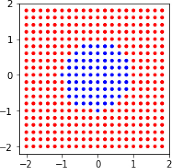
Let’s start with a nonlinear problem that will give linear methods a headache. It’s sort of like a Zen kōan. We’ll make a simple classification problem that determines whether or not a point is inside or outside of a circle.
In [38]:
xs, ys = np.mgrid[-2:2:.2, -2:2:.2]
tgt = (xs**2 + ys**2 > 1).flatten()
data = np.c_[xs.flat, ys.flat]

fig, ax = plt.subplots(figsize=(4,3))

# draw the points
ax.scatter(xs, ys, c=np.where(tgt, 'r', 'b'), marker='.')
ax.set_aspect('equal');

# draw the circle boundary
circ = plt.Circle((0,0), 1, color='k', fill=False)
ax.add_patch(circ);

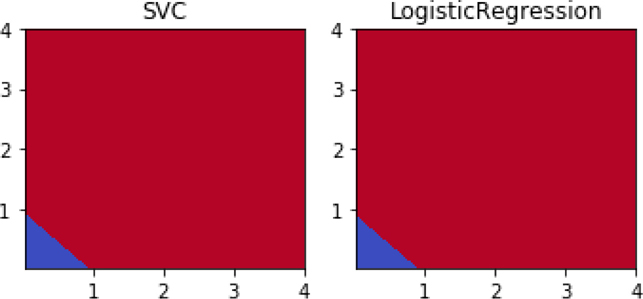
If we look at the performance of two linear methods, Support Vector Classifier (SVC) and logistic regression (LogReg), we’ll see that they leave something to be desired.
In [39]:
shootout_linear = [svm.SVC(kernel='linear'),
                   linear_model.LogisticRegression()]

fig, axes = plt.subplots(1,2,figsize=(4,2), sharey=True)
for mod, ax in zip(shootout_linear, axes):
    plot_boundary(ax, data, tgt, mod, [0,1])
    ax.set_title(get_model_name(mod))
plt.tight_layout()

Both of them always predict blue—everything is labeled as being in the circle. Oops. Can we do better if we switch to nonlinear learning methods? Yes. We’ll take a look at k-NN and decision trees.
In [40]:
# create some nonlinear learning models
knc_p, dtc_p = [1,20], [1,3,5,10]
KNC = neighbors.KNeighborsClassifier
DTC = tree.DecisionTreeClassifier
shootout_nonlin = ([(KNC(n_neighbors=p), p) for p in knc_p] +
                   [(DTC(max_depth=p), p)   for p in dtc_p ])

# plot 'em
fig, axes = plt.subplots(2,3,figsize=(9, 6),
                         sharex=True, sharey=True)
for (mod, param), ax in zip(shootout_nonlin, axes.flat):
    plot_boundary(ax, data, tgt, mod, [0,1])
    ax.set_title(get_model_name(mod) + "({})".format(param))
plt.tight_layout()

Our nonlinear classifiers do much better. When we give them some reasonable learning capacity, they form a reasonable approximation of the boundary between red (the outer area, except in the top-right figure) and blue (the inner area and all of the top-right figure). A DTC with one split—the top-right graphic—is really making a single-feature test like x > .5. That test represents a single line formed from a single node tree which is really just a linear classifier. We don’t see it visually in this case, because under the hood the split point is actually x < –1 where everything is the same color (it’s all blue here because of a default color choice). But, as we add depth to the tree, we segment off other parts of the data and work towards a more circular boundary. k-NN works quite well with either many (20) or few (1) neighbors. You might find the similarities between the classification boundaries KNC(n_neigh=1) and DTC(max_depth=10) interesting. I’ll leave it to you to think about why they are so similar.
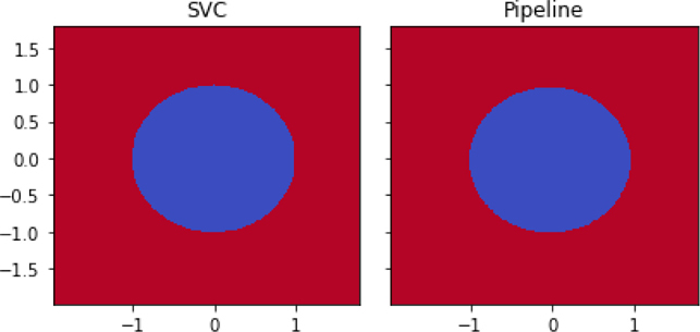
We could simply throw our linear methods under the bus and use nonlinear methods when the linear methods fail. However, we’re good friends with linear methods and we wouldn’t do that to a good friend. Instead, we’ll figure out how to help our linear methods. One thing we can do is take some hints from Section 10.6.1 and manually add some features that might support a linear boundary. We’ll simply add squares—x2 and y2—into the hopper and see how far we can get.
In [41]:
new_data = np.concatenate([data, data**2], axis=1)
print("augmented data shape:", new_data.shape)
print("first row:", new_data[0])

fig, axes = plt.subplots(1,2,figsize=(5,2.5))
for mod, ax in zip(shootout_linear, axes):
    # using the squares for prediction and graphing
    plot_boundary(ax, new_data, tgt, mod, [2,3])
    ax.set_title(get_model_name(mod))
plt.tight_layout()
augmented data shape: (400, 4)
first row: [-2. -2.  4.  4.]
What just happened? We have reds and blues—that’s a good thing. The blues are in the lower-left corner. But, where did the circle go? If you look very closely, you might also wonder: where did the negative values go? The answer is in the features we constructed. When we square values, negatives become positive—literally and figuratively. We’ve rewritten our problem from one of asking if to asking if xnew + ynew < 1. That second question is a linear question. Let’s investigate in more detail.
We’re going to focus on two test points: one that starts inside the circle and one that starts outside the circle. Then, we’ll see where they end up when we construct new features out of them.
In [42]:
# pick a few points to show off the before/after differences
test_points = np.array([[.5,.5],
                       [-1, -1.25]])

# wonderful trick from trig class:
# if we walk around circle (fractions of pi),
# sin/cos give x and y value from pi
circle_pts = np.linspace(0,2*np.pi,100)
circle_xs, circle_ys = np.sin(circle_pts), np.cos(circle_pts)
Basically, let’s look at our data before and after squaring. We’ll look at the overall space—all pairs—of x, y values and we’ll look at a few specific points.
In [43]:
fig, axes = plt.subplots(1,2, figsize=(6,3))

labels = [('x',     'y',     'Original Space'),
          ('$x^2$', '$y^2$', 'Squares Space')]

funcs = [lambda x:x,    # for original ftrs
         lambda x:x**2] # for squared ftrs

for ax, func, lbls in zip(axes, funcs, labels):
    ax.plot(func(circle_xs), func(circle_ys), 'k')
    ax.scatter(*func(data.T), c=np.where(tgt, 'r', 'b'), marker='.')
    ax.scatter(*func(test_points.T), c=['k', 'y'], s=100, marker='^')

    ax.axis('equal')
    ax.set_xlabel(lbls[0])
    ax.set_ylabel(lbls[1])
    ax.set_title(lbls[2])

axes[1].yaxis.tick_right()
axes[1].yaxis.set_label_position("right");

As we reframe the problem—using the same trick we pulled in Section 10.6.1 when we attacked the xor problem—we make it solvable by linear methods. Win. The dark triangle in the cirlce ends up inside the triangle at the lower-left corner of the SquaresSpace figure. Now, there are a few issues. What we did required manual intervention, and it was only easy because we knew that squaring was the right way to go. If you look at the original target tgt = (xs**2 + ys**2 > 1).flatten(), you’ll see that squares figured prominently in it. If we had needed to divide—take a ratio—of features instead, squaring the values wouldn’t have helped!
So, we want an automated way to approach these problems and we also want the automated method to try the constructed features for us. One of the most clever and versatile ways to automate the process is with kernel methods. Kernel methods can’t do everything we could possibly do by hand, but they are more than sufficient in many scenarios. For our next step, we will use kernels in a somewhat clunky, manual fashion. But kernels can be used in much more powerful ways that don’t require manual intervention. We are—slowly, or perhaps carefully—building our way up to an automated system for trying many possible constructed features and using the best ones.
13.2.2 Manual Kernel Methods
I haven’t defined a kernel. I could, but it wouldn’t mean anything to you—yet. Instead, I’m going to start by demonstrating what a kernel does and how it is related to our problem of constructing good features. We’ll start by manually applying a kernel. (Warning! Normally we won’t do this. I’m just giving you an idea of what is under the hood of kernel methods.) Instead of performing manual mathematics (x2, y2), we are going to go from our original data to a kernel of the data. In this case, it is a very specific kernel that captures the same idea of squaring the input features, which we just did by hand.
In [44]:
k_data = metrics.pairwise.polynomial_kernel(data, data,
                                            degree=2) # squares
print('first example: ', data[0])

print('# features in original form:', data[0].shape)
print('# features with kernel form:', k_data[0].shape)

print('# examples in both:', len(data), len(k_data))
first example:  [-2. -2.]
# features in original form: (2,)
# features with kernel form: (400,)
# examples in both: 400 400
That may have been slightly underwhelming and probably a bit confusing. When we applied the kernel to our 400 examples, we went from having 2 features to having 400 features. Why? Because kernels redescribe the data in terms of the relationship between an example and every other example. The 400 features for the first example are describing how the first example relates to every other example. That makes it a bit difficult to see what is going on. However, we can force the kernel features to talk. We’ll do it by feeding the kernelized data to a prediction model and then graphing those predictions back over the original data. Basically, we are looking up information about someone by their formal name—Mark Fenner lives in Pennsylvania—and then associating the result with their nickname—Marco lives in Pennsylvania.
One other quick point: if you are reminded of covariances between pairs of features, you aren’t too far off. However, kernels are about relationships between examples. Covariances are about relationships between features. One is between columns; the other is between rows.
In [45]:
fig, ax = plt.subplots(figsize=(4,3))

# learn from k_data instead of original data
preds = (linear_model.LogisticRegression()
                     .fit(k_data, tgt)
                     .predict(k_data))

ax.scatter(xs, ys, c=np.where(preds, 'r', 'b'), marker='.')
ax.set_aspect('equal')
Something certainly happened here. Before, we couldn’t successfully apply the LogReg model to the circle data: it resulted in flat blue predictions everywhere. Now, we seem to be getting perfect prediction. We’ll take a closer look at how this happened in just a moment. But for now, let’s deal with applying manual kernels a little more cleanly. Manually applying kernels is a bit clunky. We can make a sklearn Transformer—see Section 10.6.3 for our first look at them—to let us hook up manual kernels in a learning pipeline:
In [46]:
from sklearn.base import TransformerMixin

class PolyKernel(TransformerMixin):
    def __init__(self, degree):
        self.degree = degree

    def transform(self, ftrs):
        pk = metrics.pairwise.pairwise_kernels
        return pk(ftrs, self.ftrs, metric='poly', degree=self.degree)

    def fit(self, ftrs, tgt=None):
        self.ftrs = ftrs
        return self
Basically, we have a pipeline step that passes data through a kernel before sending it on to the next step. We can compare our manual degree-2 polynomial with a fancier cousin from the big city. I won’t go into the details of the Nystroem kernel but I want you to know it’s there for two reasons:
The Nystroem kernel—as implemented in
sklearn—plays nicely with pipelines. We don’t have to wrap it up in aTransformerourselves. Basically, we can use it for programming convenience.In reality, Nystroem kernels have a deeply important role beyond making our programming a bit easier. If we have a bigger problem with many examples, then constructing a full kernel comparing each example against each other may cause problems because of a very large memory footprint. Nystroem constructs an approximate kernel by reducing the number of examples it considers. Effectively, it only keeps the most important comparative examples.
In [47]:
from sklearn import kernel_approximation

kn = kernel_approximation.Nystroem(kernel='polynomial',
                                   degree=2, n_components=6)
LMLR = linear_model.LogisticRegression()
k_logreg1 = pipeline.make_pipeline(kn, LMLR)
k_logreg2 = pipeline.make_pipeline(PolyKernel(2), LMLR)

shootout_fancy = [(k_logreg1, 'Nystroem'),
                  (k_logreg2, 'PolyKernel')]

fig, axes = plt.subplots(1,2,figsize=(6,3), sharey=True)
for (mod, kernel_name), ax in zip(shootout_fancy, axes):
    plot_boundary(ax, data, tgt, mod, [0,1])
    ax.set_title(get_model_name(mod)+"({})".format(kernel_name))
    ax.set_aspect('equal')
plt.tight_layout()

Here, we have performed a mock up of kernelized logistic regression. We’ve hacked together a kernel-method form of logistic regression. I apologize for relying on such rickety code for kernelized logistic regression, but I did it for two reasons. First, sklearn doesn’t have a full kernelized logistic regression in its toolbox. Second, it gave me an opportunity to show how we can write PlainVanillaLearningMethod(Data) as PlainVanillaLearner(KernelOf(Data)) and achieve something like a kernel method. In reality, we should be careful of calling such a mock-up a kernel method. It has several limitations that don’t affect full kernel methods. We’ll come back to those in a minute.
We’ve made some substantial progress over our original, all-blue logistic regression model. But we’re are still doing a lot by hand. Let’s take off the training wheels and fully automate the process.
13.2.2.1 From Manual to Automated Kernel Methods
Our first foray into a fully automated kernel method will be with a kernelized support vector classifier which is known as a support vector machine (SVM). We’ll compare the SVM with the polynomial kernel we built by hand.
In [48]:
k_logreg = pipeline.make_pipeline(PolyKernel(2),
                                  linear_model.LogisticRegression())

shootout_fancy = [svm.SVC(kernel='poly', degree=2),
                  k_logreg]

fig, axes = plt.subplots(1,2,figsize=(6,3), sharey=True)
for mod, ax in zip(shootout_fancy, axes):
    plot_boundary(ax, data, tgt, mod, [0,1])
    ax.set_title(get_model_name(mod))
plt.tight_layout()
We’ve now performed a real-deal—no mock-up—kernel method. We computed a SVM with SVC(kernel='poly'). It has something pretty amazing going on under the hood. Somehow, we can tell SVC to use a kernel internally and then it takes the raw data and operates as if we are doing manual feature construction. Things get even better. We don’t have to explicitly construct all the features. More specifically, we don’t have to build the full set of all the features that a kernel implies building. We don’t do it and SVC doesn’t do it either. Through the kernel trick, we can replace (1) explicitly constructing features and comparing examples in the bigger feature space with (2) simply computing distances between objects using the kernel.
13.2.3 Kernel Methods and Kernel Options
Now, let’s talk a bit about what kernels are and how they operate.
13.2.3.1 Overview of Kernels
Kernels may seem like a magic trick that can solve very serious problems. While they aren’t really magic, they are really useful. Fundamentally, kernel methods involve two plug-and-play components: a kernel and a learning method. The kernel shows up in two forms: a kernel function and a kernel matrix. The function form may be a bit abstract, but a kernel matrix is simply a table of example similarities. If you give me two examples, I tell you how similar they are by looking up a value in the table. The learners used with kernel methods are often linear methods, but a notable exception is nearest neighbors. Whatever method is used, the learner is often described and implemented in a way that emphasizes relationships between examples instead of relationships between features. As we said before, covariance-based methods are all about feature-to-feature interactions. Kernel methods and the kernel matrices are about example-to-example interaction.
Up to now, we’ve been representing examples by a set of features—remember the ruler dude from Chapter 1?—and then compared examples based on the similarity or distance between those feature values. Kernels take a different view: they compare examples by directly measuring similarity between pairs of examples. The kernel view is more general: anything our traditional representation can do, kernels can do also. If we simply treat the examples as points in space and calculate the dot product between the examples—presto!—we have a simple kernel. In fact, this is what a linear kernel does. In the same way that all-Nearest Neighbors—that is, a nearest neighbors method which includes information from everyone—relies on the information from every example, kernel methods also rely on these pairwise connections. I’ll make one last point to minimize confusion. Kernels measure similarity which increases as examples become more alike; distance measures distance-apart-ness which decreases as examples become more alike.
There’s one last major win of the kernel approach. Since kernels rely on pairwise relationships between examples, we don’t have to have our initial data in a table of rows and columns to use a kernel. All we need are two individuals that we can identify and look up in the kernel table. Imagine that we are comparing two strings—“the cat in the hat” and “the cow jumped over the moon”. Our traditional learning setup would be to measure many features of those strings (the number of as, the number of occurrences of the word cow, etc.), put those features in a data table, and then try to learn. With kernel methods, we can directly compute the similarity relationship between the strings and work with those similarity values. It may be significantly easier to define relationships—similarities—between examples than to turn examples into sets of features. In the case of text strings, the concept of edit distance fits the bill very nicely. In the case of biological strings—DNA letters like AGCCAT—there are distances that account for biological factoids like mutation rates.
Here’s a quick example. I don’t know how to graph words in space. It just doesn’t make sense to me. But, if I have some words, I can give you an idea of how similar they are. If I start at 1.0 which means “completely the same” and work down towards zero, I might create the following table for word similarity:
|
cat |
hat |
bar |
|---|---|---|---|
cat |
1 |
.5 |
.3 |
hat |
.5 |
1 |
.3 |
bar |
.3 |
.3 |
1 |
Now, I can say how similar I think any pair of example words are: cat versus hat gives .5 similarity.
What’s the point? Essentially, we can directly apply preexisting background knowledge—also known as assumptions—about the similarities between the data examples. There may be several steps to get from simple statements about the real world to the numbers that show up in the kernel, but it can be done. Kernels can apply this knowledge to arbitrary objects—strings, trees, sets—not just examples in a table. Kernels can be applied to many learning methods: various forms of regression, nearest-neighbors, and principal components analysis (PCA). We haven’t discussed PCA yet, but we will see it soon.
13.2.3.2 How Kernels Operate
With some general ideas about kernels, we can start looking at their mathematics a bit more closely. As with most mathematical topics in this book, all we need is the idea of dot product. Many learning algorithms can be kernelized. What do we mean by this? Consider a learning algorithm L. Now, reexpress that algorithm in a different form: Ldot, where the algorithm has the same input-output behavior—it computes the same predictions from a given training set—but it is written in terms of dot products between the examples: dot(E, F). If we can do that, then we can take a second step and replace all occurrences of the dot(E, F) with our kernel values between the examples K(E, F). Presto—we have a kernelized version Lk of L. We go from L to Ldot to Lk.
When we use K instead of dot, we are mapping the Es into a different, usually higher-dimensional, space and asking about their similarity there. That mapping essentially adds more columns in our table or axes in our graph. We can use these to describe our data. We’ll call the mapping from here to there a warp function—cue Piccard, “make it so”—φ(E). φ is a Greek “phi”, pronounced like “fi” in a giant’s fee-fi-fo-fum. φ takes an example and moves it to a spot in a different space. This translation is precisely what we did by hand when we converted our circle problem into a line problem in Section 13.2.2.
In the circle-to-line scenario, our degree-2 polynomial kernel K2 took two examples E and F and performed some mathematics on them: K2(E, F) = (dot(E, F))2. In Python, we’d write that as np.dot(E,F)**2 or similar. I’m going to make a bold claim: there is a φ—a warp function—that makes the following equation work:
That is, we could either (1) compute the kernel function K2 between the two examples or (2) map both examples into a different space with φ2 and then take a standard dot product. We haven’t specified φ2, though. I’ll tell you what it is and then show that the two methods work out equivalently. With two features (e1, e2) for E, φ2 looks like
Now, we need to show that we can expand—write out in a longer form—the left-hand side K2(E, F) and the right-hand side dot(φ2(E), φ2(F)) and get the same results. If so, we’ve shown the two things are equal.
Expanding K2 means we want to expand (dot(E, F))2. Here goes. With E = (e1, e2) and F = (f1, f2), we have dot(E, F) = e1f1 + e2f2. Squaring it isn’t fun, but it is possible using the classic (a + b)2 = a2 + 2ab + b2 formula:
Turning to the RHS, we need to expand dot(φ2(E), φ2(F)). We need the φ2 pieces which we get by expanding out a bunch of interactions:
With those in place, we have
We can simply read off that ✶ and ✶✶ are the same thing. Thankfully, both expansions work out to the same answer. Following the second path required a bit more work because we had to explicitly expand the axes before going back and doing the dot product. Also, the dot product in the second path had more terms to deal with—four versus two. Keep that difference in mind.
13.2.3.3 Common Kernel Examples
Through a powerful mathematical theorem—Mercer’s theorem, if you must have a name—we know that whenever we apply a valid kernel, there is an equivalent dot product being calculated in a different, probably more complicated, space of constructed features. That theorem was the basis of my bold claim above. As long as we can write a learning algorithm in terms of dot products between examples, we can replace those dot products with kernels, press go, and effectively perform learning in complicated spaces for relatively little computational cost. What kernels K are legal? Those that have a valid underlying φ. That doesn’t really help though, does it? There is a mathematical condition that lets us specify the legal K. If K is positive semi-definite (PSD), then it is a legal kernel. Again, that doesn’t seem too helpful. What the heck does it mean to be PSD? Well, formally, it means that for any z, zT K z ≥ 0. We seem to be going from bad to worse. It’s almost enough to put your face in your hands.
Let’s switch to building some intuition. PSD matrices rotate vectors—arrows drawn in our data space—making them point in a different direction. You might have rotated an arrow when you spun a spinner playing a game like Twister. Or, you might have seen an analog clock hand sweep from one direction to another. With PSD rotators, the important thing is that the overall direction is still mostly similar. PSD matrices only change the direction by at most 90 degrees. They never make a vector point closer to the direction opposite to the direction it started out. Here’s one other way to think about it. That weird form, zT K z, is really just a more general way of writing kz2. If k is positive, that whole thing has to be positive since z2 > 0. So, this whole idea of PSD is really a matrix equivalent of a positive number. Multiplying by a positive number doesn’t change the sign—the direction—of another number.
There are many examples of kernels but we’ll focus on two that work well for the data we’ve seen in this book: examples described by columns of features. We’ve already played around with degree-2 polynomial kernels in code and mathematics. There is a whole family of polynomial kernels K(E, F) = (dot(E, F))p or K(E, F) = (dot(E, F) + 1)p. We won’t stress much about the differences between those two variations. In the later case, the axes in the high-dimensional space are the terms from the p-th degree polynomial in the features with various factors on the terms. So, the axes look like etc. You might recall these as the interaction terms between features from Section 10.6.2.
A kernel that goes beyond the techniques we’ve used is the Gaussian or Radial Basis Function (RBF) kernel: . Some more involved mathematics—Taylor expansion is the technique—shows that this is equivalent to projecting our examples into an infinite-dimensional space. That means there aren’t simply 2, 3, 5, or 10 axes. For as many new columns as we could add to our data table, there’s still more to be added. That’s far out, man. The practical side of that mind-bender is that example similarity drops off very quickly as examples move away from each other. This behavior is equivalent to the way the normal distribution has relatively short tails—most of its mass is concentrated around its center. In fact, the mathematical form of the normal (Gaussian) distribution and the RBF (Gaussian) kernel is the same.
13.2.4 Kernelized SVCs: SVMs
In Section 8.3, we looked at examples of Support Vector Classifiers that were linear: they did not make use of a fancy kernel. Now that we know a bit about kernels, we can look at the nonlinear extensions (shiny upgrade time!) of SVCs to Support Vector Machines, or SVMs. Here are the calls to create SVMs for the kernels we just discussed:
2nd degree polynomial:
svm.SVC(kernel='poly', degree=2)3rd degree polynomial:
svm.SVC(kernel='poly', degree=3)Gaussian (or RBF):
svm.SVC(kernel='rbf', gamma = value)
The gamma parameter—in math, written as γ—controls how far the influence of examples travels. It is related to the inverse of the standard deviation (σ) and variance (σ2): . A small γ means there’s a big variance; in turn, a big variance means that things that are far apart can still be strongly related. So, a small gamma means that the influence of examples travels a long way to other examples. The default is gamma=1/len(data). That means that with more examples, the default gamma goes down and influence travels further.
Once we’ve discussed kernels and we know how to implement various SVM options, let’s look at how different kernels affect the classification boundary of the iris problem.
13.2.4.1 Visualizing SVM Kernel Differences
In [49]:
# first three are linear (but different)
sv_classifiers = {"LinearSVC"   : svm.LinearSVC(),
                  "SVC(linear)" : svm.SVC(kernel='linear'),

                  "SVC(poly=1)" : svm.SVC(kernel='poly', degree=1),
                  "SVC(poly=2)" : svm.SVC(kernel='poly', degree=2),
                  "SVC(poly=3)" : svm.SVC(kernel='poly', degree=3),

                  "SVC(rbf,.5)" : svm.SVC(kernel='rbf', gamma=0.5),
                  "SVC(rbf,1.0)": svm.SVC(kernel='rbf', gamma=1.0),
                  "SVC(rbf,2.0)": svm.SVC(kernel='rbf', gamma=2.0)}

fig, axes = plt.subplots(4,2,figsize=(8,8),sharex=True, sharey=True)
for ax, (name, mod) in zip(axes.flat, sv_classifiers.items()):
    plot_boundary(ax, iris.data, iris.target, mod, [0,1])
    ax.set_title(name)
plt.tight_layout()

Conceptually, LinearSVC, SVC(linear), and SVC(poly=1) should all be the same; practically there are some mathematical and implementation differences between the three. LinearSVC uses a slightly different loss function and it treats its constant term—the plus-one trick—differently than SVC. Regardless, each of the linear options has boundaries defined by lines. There’s no curve or bend to the borders. Notice that the SVC(poly=3) example has some deep curvature to its boundaries. The rbf examples have increasingly deep curves and a bit of waviness to their boundaries.
13.2.5 Take-Home Notes on SVM and an Example
Although this book is largely about explaining concepts, not giving recipes, people often need specific advice. SVMs have lots of options. What are you supposed to do when you want to use them? Fortunately, the authors of the most popular SVM implementation, libsvm (used under the hood by sklearn), have some simple advice:
Scale the data.
Use an
rbfkernel.Pick kernel parameters using cross-validation.
For rbf, we need to select gamma and C. That will get you started. However, there are a few more issues. Again, a giant of the machine learning community, Andrew Ng, has some advice:
Use a linear kernel when the number of features is larger than number of observations.
Use an RBF kernel when number of observations is larger than number of features.
If there are many observations, say more than 50k, consider using a linear kernel for speed.
Let’s apply our newfound skills to the digits dataset. We’ll take the advice and use an RBF kernel along with cross-validation to select a good gamma.
In [50]:
digits = datasets.load_digits()

param_grid = {"gamma" : np.logspace(-10, 1, 11, base=2),
              "C"     : [0.5, 1.0, 2.0]}

svc = svm.SVC(kernel='rbf')

grid_model = skms.GridSearchCV(svc, param_grid = param_grid,
                               cv=10, iid=False)
grid_model.fit(digits.data, digits.target);
We can extract out the best parameter set:
In [51]:
grid_model.best_params_
Out[51]:
{'C': 2.0, 'gamma': 0.0009765625}
We can see how those parameters translate into 10-fold CV performance:
In [52]:
my_gamma = grid_model.best_params_['gamma']
my_svc = svm.SVC(kernel='rbf', **grid_model.best_params_)
scores = skms.cross_val_score(my_svc,
                              digits.data, digits.target,
                              cv=10,
                              scoring='f1_macro')
print(scores)
print("{:5.3f}".format(scores.mean()))
[0.9672 1.    0.9493 0.9944 0.9829 0.9887 0.9944 0.9944 0.9766 0.9658]
0.981
Easy enough. These results compare favorably with the better methods from the Chapter 8 showdown on digits in Section 8.7. Note that there are several methods that achieve a high-90s f1_macro score. Choosing to use a kernel for its learning performance gains comes with resource demands. Balancing the two requires understanding the costs of mistakes and the available computing hardware.
13.3 Principal Components Analysis: An Unsupervised Technique
Unsupervised techniques find relationships and patterns in a dataset without appealing to a target feature. Instead, they apply some fixed standard and let the data express itself through that fixed lens. Examples of real-world unsupervised activities include sorting a list of names, dividing students by skill level for a ski lesson, and dividing a stack of dollar bills fairly. We relate components of the group to each other, apply some fixed rules, and press go. Even simple calculated statistics, such as the mean and variance, are unsupervised: they are calculated from the data with respect to a predefined standard that isn’t related to an explicit target.
Here’s an example that connects to our idea of learning examples as points in space. Imagine we have a scatter plot of points drawn on transparent paper. If we place the transparency on a table, we can turn it clockwise and counterclockwise. If we had a set of xy axes drawn underneath it on the table, we could align the data points with the axes in any way we desired. One way that might make sense is to align the horizontal axis with the biggest spread in the data. By doing that, we’ve let the data determine the direction of the axes. Picking one gets us the other one for free, since the axes are at right angles.
While we’re at it, a second visual piece that often shows up on axes is tick marks. Tick marks tell us about the scale of the data and the graph. We could probably come up with several ways of determining scale, but one that we’ve already seen is the variance of the data in that direction. If we put ticks at one, two, and three standard deviations—that’s the square root of the variance—in the directions of the axes, all of a sudden, we have axes, with tick marks, that were completely developed based on the data without appealing to any target feature. More specifically, the axes and ticks are based on the covariance and the variance of data. We’ll see how in a few minutes. Principal components analysis gives us a principled way to determine these data-driven axes.
13.3.1 A Warm Up: Centering
PCA is a very powerful technique. Before we consider it, let’s return to centering data which mirrors the process we’ll use with PCA. Centering a dataset has two steps: calculate the mean of the data and then subtract that mean from each data point. In code, it looks like this:
In [53]:
data = np.array([[1, 2, 4, 5],
                 [2.5,.75,5.25,3.5]]).T
mean = data.mean(axis=0)
centered_data = data - mean
The reason we call this centering is because our points are now dispersed directly around the origin (0, 0) and the origin is the center of the geometric world. We’ve moved from an arbitrary location to the center of the world. Visually, we have:
In [54]:
fig, ax = plt.subplots(figsize=(3,3))

# original data in red;
# mean is larger dot at (3,3)
ax.plot(*data.T, 'r.')
ax.plot(*mean, 'ro')

# centered data in blue, mean at (0,0)
ax.plot(*centered_data.T, 'b.')
ax.plot(*centered_data.mean(axis=0), 'bo')

#ax.set_aspect('equal');
high_school_style(ax)

In Section 4.2.1, we discussed that the mean is our best guess if we want to minimize the distance from a point to each other value. It might not be the most likely point (that’s actually called the mode) and it might not be the middle-most point (that’s the median), but it is the closest point, on average, to all the other points. We’ll talk about this concept more in relation to PCA in a moment. When we center data, we lose a bit of information. Unless we write down the value of the mean that we subtracted, we no longer know the actual center of the data. We still know how spread out the data is since shifting left or right, up or down does not change the variance of the data. The distances between any two points are the same before and after centering. But we no longer know whether the average length of our zucchini is six or eight inches. However, if we write down the mean, we can easily undo the centering and place the data points back in their original location.
In [55]:
# we can reproduce the original data
fig,ax = plt.subplots(figsize=(3,3))
orig_data = centered_data + mean
plt.plot(*orig_data.T, 'r.')
plt.plot(*orig_data.mean(axis=0), 'ro')

ax.set_xlim((0,6))
ax.set_ylim((0,6))
high_school_style(ax)

If we write this symbolically, we get something like: . We move from the original data D to the centered data CD by subtracting the mean µ from the original. We move from the centered data back to the original data by adding the mean to the centered data. Centering deals with shifting the data left-right and up-down. When we standardized data in Section 7.4, we both centered and scaled the data. When we perform principal components analysis, we are going to rotate, or spin, the data.
13.3.2 Finding a Different Best Line
It might seem obvious (or not!) but when we performed linear regression in Section 4.3, we dealt with differences between our line and the data in one direction: vertical. We assumed that all of the error was in our prediction of the target value. But what if there is error or randomness in the inputs? That means, instead of calculating our error up and down, we would need to account for both a vertical and a horizontal component in our distance from the best-fitting line. Let’s take a look at some pictures.
In [56]:
fig, axes = plt.subplots(1,3,figsize=(9,3), sharex=True,sharey=True)
xs = np.linspace(0,6,30)
lines = [(1,0), (0,3), (-1,6)]
data = np.array([[1, 2, 4, 5],
                 [2.5,.75,5.25,3.5]]).T
plot_lines_and_projections(axes, lines, data, xs)

I’ve drawn three yellow lines (from left to right sloping up, horizontal, and down) and connected our small red data points to the yellow line. They connect with the yellow line at their respective blue dots. More technically, we say that we project the red dots to the blue dots. The solid blue lines represent the distances from a red dot to a blue dot. The dashed blue lines represent the distances from a red point to the mean, which is the larger black dot. The distance between a blue dot and the mean is a portion of the yellow line. Unless a red dot happens to fall directly on the yellow line, it will be closer to the mean when we project it onto its blue companion. Don’t believe me? Look at it as a right triangle (using Y for yellow and B for blue): . The yellow piece has to be smaller—unless red happens to be on the yellow line.
There are lots of yellow lines I could have drawn. To cut down on the possibilities, I drew them all through the mean. The yellow lines I’ve drawn show off a fundamental tradeoff of any yellow line we could draw. Consider two aspects of these graphs: (1) how spread-out are the blue dots on the yellow line and (2) what is the total distance of the red points from the yellow line. We won’t prove it—we could, if we wanted—but the yellow line that has the most spread-out blue dots is also the one that has the shortest total distance from the red points. In more technical terms, we might say that the line that leads to the maximum variance in the blue points is also the line with the lowest error from the red points.
When we perform PCA, our first step is asking for this best line: which line has the lowest error and the maximum variance? We can continue the process and ask for the next best line that is perpendicular—at a right angle—to the first line. Putting these two lines together gives us a plane. We can keep going. We can add another direction for each feature we had in the original dataset. The wine dataset has 13 training features, so we could have as many as 13 directions. As it turns out, one use of PCA is to stop the process early so that we’ve (1) found some good directions and (2) reduced the total amount of information we keep around.
13.3.3 A First PCA
Having done all that work by hand—the details were hidden in plot_lines_and_ projections which isn’t too long but does rely on some linear algebra—I’ll pull my normal trick and tell you that we don’t have to do that by hand. There’s an automated alternative in sklearn. Above, we tried several possible lines and saw that some were better than others. It would be ideal if there were some underlying mathematics that would tell us the best answer without trying different outcomes. It turns out there is just such a process. Principal components analysis (PCA) finds the best line under the minimum error and maximum variance constraints.
Imagine that we found a best line—the best single direction—for a multifeatured dataset. Now, we may want to find the second-best direction—a second direction with the most spread and the least error—with a slight constraint. We want this second direction to be perpendicular to the first direction. Since we’re thinking about more than two features, there is more than one perpendicular possibility. Two directions pick out a plane. PCA selects directions that maximize variance, minimize error, and are perpendicular to the already selected directions. PCA can do this for all of the directions at once. Under ideal circumstances, we can find one new direction for each feature in the dataset, although we usually stop early because we use PCA to reduce our dataset by reducing the total number of features we send into a learning algorithm.
Let’s create some data, use sklearn’s PCA transformer on the data, and extract some useful pieces from the result. I’ve translated two of the result components into things we want to draw: the principal directions of the data and the amount of variability in that direction. The directions tell us where the data-driven axes point. We’ll see where the lengths of the arrows come from momentarily.
In [57]:
# draw data
ax = plt.gca()
ax.scatter(data[:,0], data[:,1], c='b', marker='.')

# draw mean
mean = np.mean(data, axis=0, keepdims=True)
centered_data = data - mean
ax.scatter(*mean.T, c='k')
# compute PCA
pca = decomposition.PCA()
P = pca.fit_transform(centered_data)

# extract useful bits for drawing
directions = pca.components_
lengths = pca.explained_variance_
print("Lengths:", lengths)
var_wgt_prindirs = -np.diag(lengths).dot(directions)
    # negate to point up/right

# draw principal axes
sane_quiver(var_wgt_prindirs, ax, origin=np.mean(data,axis=0), colors='r')
ax.set_xlim(0,10)
ax.set_ylim(0,10)
ax.set_aspect('equal')
Lengths: [5.6067 1.2683]

That wasn’t too bad. If we tilt our heads—or our pages or screens—so that the axes are pointing left-right and up-down, all of a sudden, we’ve translated our data from an arbitrary orientation to a standard grid relative to the red arrows. We’ll get to performing that last step—without tilting our heads—shortly. I’d like to take a moment and talk about the covariance of the results. In the process, I’ll explain why I choose to draw the data axes with the lengths of explained_variance. As a warm-up, remember that the variance—and the covariance—is unaffected by shifting the data. Specifically, it isn’t affected by centering the data.
In [58]:
print(np.allclose(np.cov(data, rowvar=False),
                  np.cov(centered_data, rowvar=False)))
True
Now, statisticians sometimes care about the total amount of variation in the data. It comes from the diagonal entries of the covariance matrix (see Section 8.5.1). Since data and centered_data have the same covariance, we can use either of them to calculate the covariance. Here’s the covariance matrix and the sum of the diagonal from top-left to bottom-right:
In [59]:
orig_cov = np.cov(centered_data, rowvar=False)
print(orig_cov)
print(np.diag(orig_cov).sum())
[[3.3333 2.1667]
 [2.1667 3.5417]]
6.875
When we perform PCA, we get a new set of directions with the same total amount of variance. However, our directions will distribute the variance in different ways. In fact, we’ll pile as much of the total variance onto the first direction as possible. That variance is completely related to the maximum variance/minimum error criteria we discussed earlier. In the next direction, we get as much of the left-over variation as possible, and so forth. If we add up all the variances of the new directions, we’ll see that we get the same total.
In [60]:
EPS = 2.2e-16 # EPS (epsilon) is computer-sciency for "really small"
p_cov = np.cov(P, rowvar=False)
p_cov[p_cov<EPS] = 0.0  # throw out "really small" values
print(p_cov)
print(p_cov.sum())
[[5.6067 0.    ]
 [0.     1.2683]]
6.875000000000002
The diagonal values are the lengths that we used to draw the data axes. We also see that cov(P) has all zero entries off of the diagonal. We’ve eliminated the covariance between features. It is precisely because we chose directions via PCA that are not linearly related (they are at right angles) to each other. We’ve taken the liberty of replacing any suitably small values (less than EPS) with an exact 0.0, primarily to deal with floating-point issues.
13.3.4 Under the Hood of PCA
We can take a quick look at what happens when sklearn calculates the PCA of a dataset. The standard way to perform PCA relies on the singular value decomposition (SVD) of matrices. I want to show off this process for three reasons: (1) the overall strategy and algorithm is pretty straightforward, but it can be confusing to read about, (2) treating tabular data as a matrix opens up a large window of opportunity to understand other techniques, and (3) it is a great introduction to why you might ever want to study linear algebra, even if what you really care about is machine learning and data analysis.
One of the major tools of linear algebra is matrix decompositions or matrix factorizations—those are two names for the same sort of thing. When we decompose something, we break it down into its component parts. When we factor an integer—a whole number—we break it down into its component factors. 64 = 8 · 8 or 24 = 12 · 2 = 3 · 2 · 2 · 2 = 3 · 23. There are lots of ways to factor integers. We can seek pieces that can’t be broken down further: this is called a prime factorization. Or, we could simply ask for any pair of two factors. Or, we could ask if the number can be factored into values that are the same—is it a square, cube, etc.
Matrix decomposition or factorization is an equivalent process for matrices. We take a known matrix and ask how we can break it down into more primitive, smaller, component parts. What’s interesting is that we can often talk about these parts in terms of how they affect a scatter plot of a data matrix. For example, the SVD of a matrix essentially says that any data matrix can be factored—broken down or separated—into three components: a rotation or spinning, a stretching, and another rotation. Working backwards, if we start with the most vanilla data we can imagine, and we rotate, stretch, and rotate again, we can get any data matrix as a result. Another decomposition, the eigendecomposition, decomposes a matrix into a rotation, a stretch, and then an undo of the first rotation. Let’s examine that here.
We’ll need a quick helper that can rotate data points around the origin (0, 0) by a given angle:
In [61]:
def make_rotation(theta):
    ''' ccw rotation of theta when it post-multiplies
        a row vector (an example) '''
    return np.array([[np.cos(theta), -np.sin(theta)],
                     [np.sin(theta),  np.cos(theta)]]).T
With that, we can create some points that are equally spaced around a circle and set an amount of rotation and scaling we want to perform:
In [62]:
spacing = np.linspace(0,2*np.pi,17)
points  = np.c_[np.sin(spacing), np.cos(spacing)]
    # sin/cos walk around circle

two_points = points[[0,3]]

rot = make_rotation(np.pi/8) # 1/16th turn degrees ccw
scale = np.diag([2,.5])
Then, we can put it all together to move from a vanilla circle to an interesting ellipse. Graphically, here’s what it looks like:
In [63]:
fig, axes = plt.subplots(1,4,figsize=(8,2), sharey=True)

# original vanilla circle
axes[0].plot(*two_points.T, 'k^')
axes[0].plot(*points.T, 'b.')

# make a rotation
axes[1].plot(*np.dot(two_points, rot).T, 'k^')
axes[1].plot(*np.dot(points, rot).T, 'r.')

# stretch along x and y axes
axes[2].plot(*two_points.dot(rot).dot(scale).T, 'k^')
axes[2].plot(*points.dot(rot).dot(scale).T, 'r.')

# undo initial rotation
axes[3].plot(*two_points.dot(rot).dot(scale).dot(rot.T).T, 'k^')
axes[3].plot(*points.dot(rot).dot(scale).dot(rot.T).T, 'b.')

names = ['circle', 'rotate', 'scale', 'unrotate']
for ax,name in zip(axes,names):
    ax.set_aspect('equal')
    ax.set_title(name)
    ax.set_xlim(-2,2)
    ax.set_ylim(-2,2)

Now, what we did here is sort of the opposite of factoring a number: we multiplied things together, like going from 3 and 5 to 3 × 5 = 15. Normally, we’re given interesting data that we can describe with the rightmost ellipse, and we want to work backwards to the uninteresting leftmost circle. If you wonder why we would go from something interesting to something uninteresting, it’s because the things we learn along the way are the pieces that allow us to do the conversions from one graph to the next. These actions on the scatterplots are the really interesting bits. In fact, they are the bits we can use to compute a PCA.
To do that, I want to show that a few things are the same. However, when we talk about similarity, there are always constraints. When people say that I’m like my brother, they are typically talking about some specific characteristic like our humor or mannerisms. We actually look a bit different. So, really, when we say the same, we don’t always mean exactly the same. Sometimes we mean same up to some point or degree.
Here’s a mathematical example. Say you are 10 feet away from me. On a line, you could be in front of me, at me +10, or behind me, at me –10. So, you could be in two different spots, but it is correct to say that either is 10 feet away from me. Ten feet away determines where you are up to a plus or minus sign. If, instead, we were on a soccer field, you could be anywhere on a 10-foot circle around me. In that case, where you are is determined up to your angle-like position on a sundial or an analog clock face. Back to signs: you might remember that when you factored numbers in grade school, you did it with positive numbers: 15 = 5 × 3. In reality, you could also factor 15 as –5 × –3. Keeping the numbers positive meant you could give fewer, simpler answers because the legal space of answers was reduced.
Now, imagine we wanted to factor –15. We no longer have the luxury of staying positive. Our factoring has to include a negative value somewhere. As such, we could equally well use –5 × 3 or –3 × 5. We don’t know where the –1 belongs. We face a similar issue when we compute the SVD. There are several places where signs can be flipped, and we get the same answer when we multiply things out, so either way is equally valid. The only problem is when two different methods try to do the SVD and pick different signs for the components. This difference means that when we say they give the same answer, we really mean that the answers are the same up to some plus or minus signs. To make up for that, we have the following helper routine that massages two different matrices into similar signs. It has a test on it that makes sure the matrices are numerically similar—have the same absolute values—before applying the sign fix.
In [64]:
def signs_like(A, B):
    ' produce new A,B with signs of A '
    assert np.allclose(np.abs(A), np.abs(B))
    signs = np.sign(A) * np.sign(B)
    return A, B * signs
signs_like([1,-1], [1,1])
Out[64]:
([1, -1], array([ 1, -1]))
So, let’s compute the SVD of our centered data. Basically, instead of factoring a number 15 = 5 × 3 we are going to factor a matrix of our centered data: DC = USVT. We will compute the SVD and then show that we haven’t lost anything. We can multiply together the components of the SVD—U, S, VT—and we get back our centered data.
We do a few things in the code to simplify our lives. full_matrices = False and S=np.diag(s) makes the multiplication to reconstruct centered_data easier. We use signs_like to deal with the sign issue we discussed above. Lastly and confusingly, np.linalg.svd returns a flipped—actually transposed, with rows turned into columns and columns into rows—version of V. We indicate this by assigning that part to Vt, the t standing for transposed. To get V itself, we unflip it with .T by taking Vt.T. Flipping twice gets us back to the original. Sometimes double negatives are a good thing.
In [65]:
N = len(centered_data)

U, s, Vt = np.linalg.svd(centered_data, full_matrices=False)
S = np.diag(s)
print(np.allclose(centered_data, U.dot(S).dot(Vt)))
True
svd plus a bit of work gave us U, S, and V. These components can be almost directly compared with the results from PCA. Here we check the directions, the variances, and the adjusted data:
In [66]:
# align signs
# note: U.S.Vt won't give centered now because
# U, Vt work together and we monkeyed with Vt
_, Vt = signs_like(pca.components_, Vt)
V = Vt.T

# directions come from Vt; amounts come from S
# divide by n-1 to get unbiased... see EOC
print(all((np.allclose(pca.components_,         Vt),
           np.allclose(pca.explained_variance_, s**2/(N-1)),
           np.allclose(P,                       centered_data.dot(V)))))
True
Now, recall that we can compute the covariance matrix from our centered data with a quick dot.
In [67]:
print('original covariance:
', orig_cov)
print('centered covariance:
',
      centered_data.T.dot(centered_data) / (N-1))
original covariance:
 [[3.3333 2.1667]
 [2.1667 3.5417]]
centered covariance:
 [[3.3333 2.1667]
 [2.1667 3.5417]]
So, we just computed the PCA of our data by computing the SVD of our data.
One other way to compute the PCA of our data is by computing the eigendecomposition (EIGD) of the covariance matrix of our data. There is a deep mathematical relationship and equivalence between SVD(data) and EIGD(cov(data)).
In [68]:
eigval, eigvec = np.linalg.eig(orig_cov)

# two differences:
# 1.  eigenvalues aren't ordered high to low (S from svd is ordered)
# 2.  final signs with SVD go through V *and* U, eigenvector is a bit
#     different
order = np.argsort(eigval)[::-1]
print(np.allclose(eigval[order], s**2/(N-1)))

_,ev = signs_like(Vt,eigvec[:,order])
print(np.allclose(ev, Vt))
True
True
When mathematicians talk about eigenvalues and eigenvectors, they immediately throw up the following equation: Aυ = λυ where υ and λ are respectively the eigenvectors and eigenvalues of A. Unfortuantely, they don’t often talk about what it means. Here’s a quick take:
Representing our data as a matrix organizes the data as a table and naturally places each example as a point in space.
The covariance matrix of our data tells us how we map—via multiplication—a set of plain vanilla points into the actual data we see. These plain vanilla points simply have a value of 1 for a single feature and zero elsewhere. As a matrix, it is called the identity matrix.
The eigenvalues and eigenvectors of the covariance matrix tell us what directions point the same way and how long they are, after being mapped by the covariance matrix. We can read Cv = λv as saying that multiplying by C is the same as multiplying by single value λ. This means that C stretches v the same as a simple number λ and doesn’t point it in a different direction. Note, this only works for some v, not every possible v.
For our problem of finding the principal components—or the primary directions, if you will—we need exactly the directions that are not changed when mapped by the covariance matrix.
If this look at the mechanics of PCA has left your head spinning with singular eigens and vectored components and principal decompositions (none of which exist), keep these three things in mind.
Through linear algebra, we can talk about tables of data—matrices—the same way we talked about single numeric values in grade school.
Matrices can describe points in space and ways to manipulate those points.
We can break down complicated matrices into simpler matrices.
The simpler matrices are often related to problems we’d like to solve, such as finding best lines and directions.
These are the four reasons why you might want to dig into linear algebra at some point in your machine learning and data analysis studies.
13.3.5 A Finale: Comments on General PCA
We can now actually talk about what PCA does. Above, we talked about how centering and uncentering data can shift back and forth between data centered at 0 and data centered at its empirical—actually measured—mean. Then we dove into mapping data points to a line that minimizes the distances between the points and that line. That line is different from linear regression because linear regression minimizes the vertical distances between the points and the line, not the shortest-path distances to the line.
Now, what does PCA do? When we apply PCA to n features, and we take the first k principal components, we are generating a best—closest—k-dimensional object to the points that live in n-dimensional space. You might like to look at Figure 13.3 to reduce your confusion. Suppose we have 10 features and k = 2. Two dimensions give a plane, so when we perform PCA(k=2), we are finding the best plane (as in Figure 13.1) to represent the data that originally exists in 10 dimensions. If we take PCA(k=3), we are finding the best infinite solid (just like lines go on forever, imagine a 3D set of axes extending out forever) to map our points to. The concepts get pretty weird, but the take-home is that we reduce our data from 10-D to k-D and we try to keep as much information—specifically, as much of the total variance—in the data as possible. In the process, we keep our projected points as close to the originals as possible by minimizing the error (distance) between the originals and the projections.

Figure 13.3 PCA reduces the dimensionality of our data, effectively reducing the number of conceptual columns describing each example.
One other way to view the PCA process is to consider it as one half of a cyclic process that takes us from (1) random white noise with no information in it to (2) interesting empirical or generated data and (3) back to the white noise. EIGD and SVD recover the stretching and rotating from that process.
13.3.6 Kernel PCA and Manifold Methods
Above, we discussed kernel methods and we said somewhat abstractly that as long as we can express a learning method as dot products between examples—not dot products between features, which is almost a covariance matrix—we can turn a vanilla method into a kernel method. It turns out that PCA is well poised to do that. Why?
Remember that taking the SVD(X) was like taking the EIGD(XT X). Well, there’s another relationship hidden in there. The calculations under the hood for SVD(X) (remember, we had a U and a V running around) also gives us EIGD(XXT) which precisely describes a PCA version that operates between examples instead of between features. This same-but-different way of solving a problem—in some cases with more or less difference—is called solving a dual problem or simply solving the dual of an original problem. In mathematics, the term dual refers to an alternative but equivalent way of representing or solving a problem.
Standard principal components analysis finds good directions—data-defined axes—for the data by breaking down the covariance matrix. However, it does this by implicitly using the SVD of the data. We could consider that to be an unnecessary detail, but the covariance matrix is merely one way to capture the similarities in our data in a feature-centric fashion. As we discussed in Section 13.2.3.2, dot products and kernels give us another way to capture similarities—now in an example-centric fashion. The net result is that we can plug kernels instead of covariances into PCA and get out more exotic creatures that have an equally exotic name: manifold methods.
13.3.6.1 Manifolds
Don’t be scared by the name manifolds: it is simply a fancy term for things that can clearly be related to points, lines, and planes but aren’t exactly these things. For example (Figure 13.4), if I draw a circle and label it like a watch dial—I, II, III, etc.—and I am willing to break the circle at XII (noon), I can very easily connect spots on the circle to spots on a line. The circle and the line share certain characteristics. Namely, take the times near 3 o’clock. It’s neighbors are at 2:59 and 3:01 (sorry, I can’t write minutes as Roman numerals). Those neighbors are the same whether we draw the times as a circular watch-face or flatten them out as a timeline.

Figure 13.4 Viewing geometric objects as manifolds emphasizes the abstract similarity between different forms based on local neighbors. These neighbors remain unchanged by bending and looping.
Yes, you have a point: if we cut the watch face at the top, XII loses one side of its neighbors. Sacrifices must be made. As another example, if I unroll a lidless and bottomless aluminum can, I would have something looking like an aluminum cookie sheet—and again, away from the boundary where I cut the can, the local neighborhoods before and after the cut look very similar. In both cases, if I’m trying to deal with the mathematics that describe these things, I’ve reduced the complexity I have to deal with. I’m moving from curvy things to linear things. I’m afraid that I’m simplifying this pretty drastically—you can see the End-of-Chapter Notes for a technical caveat, if you care.
Here’s a more complicated graphical example. sklearn can make a wonderfully complicated 3D dataset in the shape of an S that extends depthwise into a piece of paper it is written on. Here’s what it looks like:
In [69]:
from mpl_toolkits.mplot3d import Axes3D
import sklearn.manifold as manifold
data_3d, color = datasets.samples_generator.make_s_curve(n_samples=750,
                                                         random_state=42)

cmap = plt.cm.Spectral
fig = plt.figure(figsize=(4,4))
ax = plt.gca(projection='3d')
ax.scatter(*data_3d.T, c=color, cmap=cmap)
ax.view_init(20, -50)

If it’s a little hard to see, imagine someone took an S and smeared it depthwise from left to right. Now, take a moment and think about what that would look like if you flattened it out—perhaps by pulling at its ending edges like a string. Ideas? If you’re stumped, we can let the computer do it for us.
In [70]:
fig, axes = plt.subplots(1,2,figsize=(8,4))
n_components = 2

# method 1:  map to 2D using isomap
isomap = manifold.Isomap(n_neighbors=10, n_components=n_components)
data_2d = isomap.fit_transform(data_3d)
axes[0].scatter(*data_2d.T, c=color, cmap=cmap)

# method 2:  map to 2D using TSNE
tsne = manifold.TSNE(n_components=n_components,
                     init='pca',
                     random_state=42)
data_2d = tsne.fit_transform(data_3d)
axes[1].scatter(*data_2d.T, c=color, cmap=cmap);
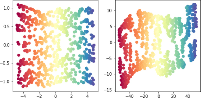
Surprisingly or not, we end up with a pair of sort of cookie sheets. It doesn’t work out perfectly, but the algorithm is trying to reconstruct that flat cookie sheet from the complex bendy S in space. So, now, we have a very cool tool.
PCA wants to find a best flat space—a line, plane, solid, etc.
We can rewrite PCA to use dot products.
We can replace dot products with kernels.
Using kernels instead of dot products lets us effectively, and efficiently, work with nonlinear—curvy—objects.
If we use the data-reducing capabilities of PCA with kernels, we can reduce our data from curvy manifolds to flat spaces.
There are several different manifold methods that aim at reducing arbitrary data down to some less complex space. Our example here used TSNE and IsoMap. Due to some clever mathematics, these methods can generally be described as PCA plus a kernel. That is, if we pick the right kernel and feed it to PCA, we get out the kernel method. Now, don’t be misled. It may well be the case that it is preferable to use some custom code to implement a method. But it is equally important that to understand what these methods are doing and to compare them to similar techniques, we can show off the similarities by writing them all as variations on a theme—in this case, PCA plus different kernels. I won’t go into the details of the kernels underneath these methods, but if you are curious, you can find the references in the End-of-Chapter Notes.
13.4 EOC
13.4.1 Summary
In this chapter, we’ve added some powerful—and in some cases, almost hypermodern—techniques to our toolbox. We have some ways of quantifying the contributions of features which we can use to select subsets of features that we hope are interesting and useful for learning. We can replace some of our manual feature construction steps with automatically applied kernel methods—whether the kernels are used with support vectors, principal components, or other learning models. We can also use SVMs and PCA as stand-alone tools to, respectively, classify examples and to redescribe our data explicitly for other processing steps.
13.4.2 Notes
Feature Evaluation Metrics There are many feature evaluation metrics, but they are largely built from the same underlying toolbox of mathematical tools. If we expand out some of the components, we can start to see the mathematical similarities among these metrics. The dot product is a fundamental component: dot(x, y) = ∑xiyi, where x, y are features (columns).
We didn’t discuss the cosine similarity, but we’ll see it in the next chapter. I’ll start with it as a building block. Verbally, we can call the cosine-similarity a (length-)normalized dot product.
We’ve seen the covariance before, but here’s the formula in these terms. We’ll use to represent the mean of x. Verbally, we can call the covariance an (average) centered dot product. The average comes in when we divide by n.
The correlation combines these two ideas of centering and normalizing. Verbally, we can call the correlation a centered cosine similarity, a (length-)normalized covariance, or a centered, (length-)normalized dot product.
One last related measure is the linear regression coefficient we would get if we used x to predict y without an intercept (lrcwo):
When we have our usual linear regression coefficient estimated with an intercept term (lrcw), we get several interesting relationships. I’ll highlight two here: one that includes the correlation and one that shows this coefficient’s relationship to a covariance that is normalized by the spread in x:
A wonderful, deep result in mathematics called the Cauchy-Schwart inequality tells us that <= var(x)var(y).
In this book, I’ve completely avoided the issue of biased and unbiased estimates of standard deviation and variance. Basically, we have always divided by n in our variance calculations. For some purposes, we’d prefer to divide by n – 1 or even by other values. Dividing by n – 1 is called Bessel’s correction. I’ll leave it to you to find out more via Google or a statistically minded friend. However, I’ll warn you that the calculation routines in numpy and friends can be inconsistent in their use of n versus n – 1. Read the documentation and default parameters very closely.
Formal Statistics for Feature Selection Here are a few technical details about ordering features by r2 for my statistical readers. The rank ordering of univariate F-statistics is the same as the rank ordering of correlations . The algebra to show this is not hard. There are many relationships between formal statistical tests that can be made to determine the worth of features. The main tests are the t-test and ANOVAs. Some of the theory gets pretty deep, but you can get a quick overview by looking at Leemis and McQuestion’s paper “Univariate Distributions Relationships” which has a wonderful graphic that is also available around the Web.
Our statistician friends should also be aware that in the statistical world an F-statistic is used in feature selection through a technique called forward stepwise selection. Forward stepwise selection is a sequential process which involves picking an initial feature f1 and then combining with f1 the feature which does best in combination with f1 for learning. This is not what sklearn does. sklearn evaluates each feature individually, in isolation from all other features.
Metric Selection and Relationship to Tree-Splitting Criteria One important special case of feature selection occurs when we select the features to divide our data in a decision tree. We tap-danced around this topic in Section 8.2. We can select features in several different ways. The major ones are the Gini and entropy measures based on the distributions of the target values. Briefly, for the probability of a class pi, these look like Gini = 1 – ∑ pi and entropy = – ∑ pi log(pi). The entropy is used by comparing the entropy before the split with the weighted entropies after the split in a measure called the information gain.
Metric Selection Note: On Metrics and Models While we separated our discussion of feature selection methods into those that used a model and those that didn’t, the “modelless” methods are really using some model as their underlying intellectual foundation. For example, correlation is measuring how well a single-feature linear regression would do. Variance is measuring how well a single value—a mean—would do as a predictor. Mutual information measures are tied to the error rate of something called a Bayes optimal classifier; these are theoretical unicorns that are generally only constructable for toy problems—but they give us a formal notion of a “best” classifier. If you are a more advanced reader, you can find more details in a (heavy academic) paper “Feature Extraction by Non-Parametric Mutual Information Maximization” by Torkkola.
Kernel Notes Why are 1-NN and a deep, high max_depth tree so similar for the circle problem? Both segment out many, many regions of space until there’s only a small region to make a prediction for. 1-NN does this by asking for only a single close neighbor. The tree, ten nodes deep, does it by repeatedly cutting away more regions of space.
To give you an idea of what a kernel would look like on data that doesn’t come prepackaged in a table, let’s look at the edit distance, also called the Levenshtein distance. The edit distance between two strings is the number of insertions, deletions, and character substitutions needed to go from one string to another. For example, cat → hat requries one character substitution. at → hat requires one insertion of an h at the start. You can imagine that our phones’ autocorrect feature is using something similar to fix our typos. This notion of distance can also be translated into a notion of similarity and used to define a kernel function between any two strings. Poof! We no longer need to explicitly turn the strings of text into features in a table.
Depending on your mathematical background, when you start seeing covariance matrices and kernels, you might start thinking about Gram matrices. And that can get really confusing because most writers define Gram matrices in terms of column vectors while we use rows as our examples. So, for our purposes, the usual Gram matrix can be used directly for kernels. However, if we want to talk about covariances, we have to take a transpose somewhere. With that in mind, Mercer’s condition about the legality of kernels says: the example-pairwise Gram matrix K must be symmetric positive-definite. A feature-pairwise Gram matrix would be the covariance matrix.
SVM Notes If you’re going to use SVMs in general and libsvm in particular (even via sklearn), I’d recommend you read the libsvm user guide. It’s not long. Here’s the address: https://www.csie.ntu.edu.tw/~cjlin/papers/guide/guide.pdf.
In sklearn, LinearSVC uses squared hinge loss instead of the simple hinge. The change in loss, coupled with LinearSVC’s different treatment of the intercept term, really upsets some folks who are sticklers for the definition of what makes a support vector machine. I wouldn’t stress about that, though those two facts will account for slight to significant differences between LinearSVC and SVC(linear)/SVC(poly=1).
Technical Notes on PCA, SVD, and EIG PCA on a dataset of n features can recover up to n directions. We’ll get n directions if none of the input features are linear combinations of others.
The best line graphic was inspired by a great animation by user amoeba from a StackExchange discussion: https://stats.stackexchange.com/a/140579/1704.
Without getting into a whole lesson on linear algebra, we can give a quick overview of the mathematics that connect PCA, SVD, and EIGD. Again, this sort of answers the question, “Why would I ever want to study linear algebra?” Here goes.
We’ll start with three quick facts:
Some matrices are called orthogonal (yes, in the same sense of 90-degree angles). This means that their transpose acts like a numerical reciprocal . For an orthogonal matrix Mo, we have = I. I is the identity matrix. It is the matrix equivalent of the number one. Multiplying by I leaves the overall value unchanged.
For all matrices, the transpose MT trades rows for columns and columns for rows. With we have .
When we take the transpose of multiplied matrices—multiplication first, transpose second—we must swap the order of the inner matrices if we do the transpose first: .
That order-swapping shows up in several mathematical and computer-science operations. Here’s a simple example with sorted lists and reversal. What happens if we reverse two sublists of an ordered list? Imagine we have l1 + l2 = L and all three are in order (here, + mean concatenation). If I reverse l1 and l2 separately and join them, rev(l1) + rev(l2), I don’t have a correctly reversed L. That is, rev(l1) + rev(l2) ≠ rev(L). Reversing is OK enough for l1 and l2 separately, but it falls apart when they are combined. To fix things up, I have to join together the reversed lists in swapped order: rev(l2) + rev(l1) = rev(L). If you want to make that idea concrete, create two lists of names (Mike, Adam, Zoe; Bill, Paul, Kate) and go through the process yourself.
With those rules in mind:
If we start with patternless data, W, our covariance matrix is ΣW = WTW = I.
If we then stretch out the data with S, we get SW with covariance matrix ΣSW = (SW)TSW = WTSTSW.
Then we can rotate it with an orthogonal R, giving RSW. Since R is orthogonal, RTR = I. Its covariance matrix is ΣRSW = (RSW)TRSW = WTSTRTRSW = WTS2W.
Squaring a matrix is a bit complicated, but it turns out the S only has entries on its diagonal and squaring it means we just square the values on the diagonal. Crisis averted.
If we now work backwards, from the end data RSW and the end covariance matrix ΣRSW, we have
From EIGD on the covariance matrix: eig(ΣRSW) gives ΣRSWV = V L or ΣRSW = V LVT.
From SVD on the data matrix: svd(RSW) = (UDVT)TUDVT = V DUTU DVT = V D2VT.
Subject to a few caveats, we can identify RS—our stretching and rotating—with V L and V D2. In the real world, we start with interesting data that comes to us in the form of RSW. We don’t see the component pieces. Then we use SVD or EIG to figure out the RS that could conceptually get us from white-noise data to the data we observed.
PCA’s Crew: PPCA, FA, and ICA PCA can be related to several other techniques: probabilistic PCA (PPCA), factor analysis (FA), and independent component analysis (ICA). All of these techniques can be used in a fashion similar to PCA: create newly derived features and keep fewer of them than what we started with.
PCA is closely related to PPCA and FA. All of these techniques care about accounting for the variance in the data but they make different modeling assumptions about the nature of the covariance of the data being analyzed. PCA takes the covariance matrix as is. PPCA adds a shared random amount of variance to each feature. FA adds varying random amounts of variance to each feature.
ICA swaps out maximizing variance for maximizing kurtosis. There are other ways of describing and understanding ICA as well; ICA has an interpretation as minimizing mutual information. Kurtosis is a charteristic of distributions similar to the mean and variance. The mean is the center of the data and the variance is the spread of the data; kurtosis—loosely (there are several quibbles with most verbal descriptions)—describes how heavy the tails of the data are or how quickly the probability curve drops off to zero. Practically speaking, while PCA wants to find directions that account for variance and are orthogonal (uncorrelated) from one another, ICA wants to find directions that are maximally statistically independent from one another.
Manifolds My discussion of manifolds blended the general idea of manifolds with the more specific idea of differentiable manifolds. Now you know why I didn’t mention it in the main text. But the details are that manifolds have some nice equivalence with Euclidean space—our normal playground for graphing datasets and functions. Differentiable manifolds are a bit more strict: they have an equivalence with linear subsets of Euclidean space. If you recall your calculus, you took derivatives by approximating—with a line—the slope at very, very small intervals of a function. Differentiable manifolds extend that idea so we can perform calculus on weird mathematical objects—like models of black holes.
13.4.3 Exercises
We can use
GridSearchto help us find good parameters for feature selection. Try using a grid search to find a good threshold forVarianceThreshold. Compare the result of learning with and without the removed features.Look up the Anscombe datasets. Compare the variance, covariance, and correlation of the datasets. Consider yourself enlightened.
Take a second look at the two-feature mutual information example. What is the
mutual_info_classifondata**2—that is, on the squares of the feature values? Why might we expect the information to be higher there? You might try on the regression problem also.Constructing models to select features seems like a fairly heavyweight process. How do the execution times of some of the model-based feature selection techniques like
SelectFromModelorRFEcompare to simply running those models and calling it a day? Try learning on all of the features and compare it to a round of feature selection and then learning on just the selected features.In the circle classification problem, the
depth=10decision tree was not terribly circle-like. Does adding more data lead to a more circle-like boundary?I claimed that the Nystroem kernel was useful to save resources. Demonstrate it. Compare the resource usage of full kernel and a Nystroem approximation.
Take some data—say a dozen rows from the iris dataset. Now, do a few things to it. Standarize the data and compute the covariance matrix of it; now compare with the correlation of the original. Compute the PCA on the standarized data and the PCA of the correlation matrix of the original.
rbfkernels are very powerful. Their main parameter isgamma. Evaluate the effect of changinggammaby looking at a complexity curve over differentgammavalues. Are bigger values ofgammamore or less biased?