
16
Creating Visualizations with ggplot2
The ability to create visualizations (graphical representations) of data is a key step in being able to communicate information and findings to others. In this chapter, you will learn to use the ggplot21 package to declaratively make beautiful visual representations of your data.
1ggplot2: http://ggplot2.tidyverse.org
Although R does provide built-in plotting functions, the ggplot2 package is built on the premise of the Grammar of Graphics (similar to how dplyr implements a Grammar of Data Manipulation; indeed, both packages were originally developed by the same person). This makes the package particularly effective for describing how visualizations should represent data, and has turned it into the preeminent plotting package in R. Learning to use this package will allow you to make nearly any kind of (static) data visualization, customized to your exact specifications.
16.1 A Grammar of Graphics
Just as the grammar of language helps you construct meaningful sentences out of words, the Grammar of Graphics helps you construct graphical figures out of different visual elements. This grammar provides a way to talk about parts of a visual plot: all the circles, lines, arrows, and text that are combined into a diagram for visualizing data. Originally developed by Leland Wilkinson, the Grammar of Graphics was adapted by Hadley Wickham2 to describe the components of a plot:
2Wickham, H. (2010). A layered grammar of graphics. Journal of Computational and Graphical Statistics, 19(1), 3–28. https://doi.org/10.1198/jcgs.2009.07098. Also at http://vita.had.co.nz/papers/layered-grammar.pdf
The data being plotted
The geometric objects (e.g., circles, lines) that appear on the plot
The aesthetics (appearance) of the geometric objects, and the mappings from variables in the data to those aesthetics
A position adjustment for placing elements on the plot so they don’t overlap
A scale (e.g., a range of values) for each aesthetic mapping used
A coordinate system used to organize the geometric objects
The facets or groups of data shown in different plots
ggplot2 further organizes these components into layers, where each layer displays a single type of (highly configurable) geometric object. Following this grammar, you can think of each plot as a set of layers of images, where each image’s appearance is based on some aspect of the data set.
Collectively, this grammar enables you to discuss what plots look like using a standard set of vocabulary. And like with dplyr and the Grammar of Data Manipulation, ggplot2 uses this grammar directly to declare plots, allowing you to more easily create specific visual images and tell stories3 about your data.
3Sander, L. (2016). Telling stories with data using the grammar of graphics. Code Words, 6. https://codewords.recurse.com/issues/six/telling-stories-with-data-using-the-grammar-of-graphics
16.2 Basic Plotting with ggplot2
The ggplot2 package provides a set of functions that mirror the Grammar of Graphics, enabling you to efficaciously specify what you want a plot to look like (e.g., what data, geometric objects, aesthetics, scales, and so on you want it to have).
ggplot2 is yet another external package (like dplyr, httr, etc.), so you will need to install and load the package to use it:
install.packages("ggplot2") # once per machine
library("ggplot2")          # in each relevant script
This will make all of the plotting functions you will need available. As a reminder, plots will be rendered in the lower-right quadrant of RStudio, as shown in Figure 16.1.
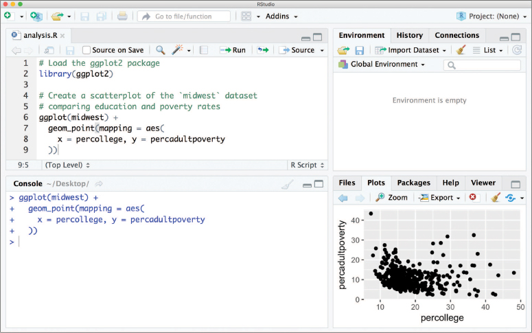
ggplot2 graphics will render in the lower-right quadrant of the RStudio window.
Fun Fact
Similar to dplyr, the ggplot2 package also comes with a number of built-in data sets. This chapter will use the provided midwest data set as an example, described below.
This section uses the midwest data set that is included as part of the ggplot2 package—a subset of the data is shown in Figure 16.2. The data set contains information on each of 437 counties in 5 states in the midwestern United States (specifically, Illinois, Indiana, Michigan, Ohio, and Wisconsin). For each county, there are 28 features that describe the demographics of the county, including racial composition, poverty levels, and education rates. To learn more about the data, you can consult the documentation (?midwest).
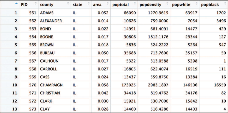
midwest data set, which captures demographic information on 5 midwestern states. The data set is included as part of the ggplot2 package and used throughout this chapter.
To create a plot using the ggplot2 package, you call the ggplot() function, specifying as an argument the data that you wish to plot (i.e., ggplot(data = SOME_DATA_FRAME)). This will create a blank canvas upon which you can layer different visual markers. Each layer contains a specific geometry—think points, lines, and so on—that will be drawn on the canvas. For example, in Figure 16.3 (created using the following code), you can add a layer of points to assess the association between the percentage of people with a college education and the percentage of adults living in poverty in counties in the Midwest.
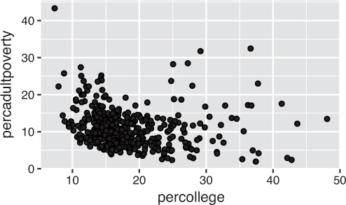
ggplot: comparing the college education rates to adult poverty rates in Midwestern counties by adding a layer of points (thereby creating a scatterplot).# Plot the `midwest` data set, with college education rate on the x-axis and # percentage of adult poverty on the y-axis ggplot(data = midwest) + geom_point(mapping = aes(x = percollege, y = percadultpoverty))
The code for creating a ggplot2 plot involves a few steps:
The
ggplot()function is passed the data frame to plot as the nameddataargument (it can also be passed as the first positional argument). Calling this function creates the blank canvas on which the visualization will be created.You specify the type of geometric object (sometimes referred to as a “geom”) to draw by calling one of the many
geom_functions4—in this case,geom_point(). Functions to render a layer of geometric objects all share a common prefix (geom_), followed by the name of the kind of geometry you wish to create. For example,geom_point()will create a layer with “point” (dot) elements as the geometry. There are a large number of these functions; more details are provided in Section 16.2.1.4Layer: geoms function reference: http://ggplot2.tidyverse.org/reference/index.html#section-layer-geoms
In each
geom_function, you must specify the aesthetic mappings, which specify how data from the data frame will be mapped to the visual aspects of the geometry. These mappings are defined using theaes()(aesthetic) function. Theaes()function takes a set of named arguments (like a list), where the argument name is the visual property to map to, and the argument value is the data feature (i.e., the column in the data frame) to map from. The value returned by theaes()function is passed to the namedmappingargument (or passed as the first positional argument).Caution
The
aes()function uses non-standard evaluation similar todplyr, so you don’t need to put the data frame column names in quotes. This can cause issues if the name of the column you wish to plot is stored as a string in a variable (e.g.,plot_var <- "COLUMN_NAME"). To handle this situation, you can use the aes_string() function instead and specify the column names as string values or variables.You add layers of geometric objects to the plot by using the addition (
+) operator.
Thus, you can create a basic plot by specifying a data set, an appropriate geometry, and a set of aesthetic mappings.
Tip
The ggplot2 package includes a qplot() functiona for creating “quick plots.” This function is a convenient shortcut for making simple, “default”-like plots. While this is a nice starting point, the strength of ggplot2 lies in its customizability, so read on!
16.2.1 Specifying Geometries
The most obvious distinction between plots is the geometric objects that they include. ggplot2 supports the rendering of a variety of geometries, each created using the appropriate geom_ function. These functions include, but are not limited to, the following:
geom_point()for drawing individual points (e.g., for a scatterplot)geom_line()for drawing lines (e.g., for a line chart)geom_smooth()for drawing smoothed lines (e.g., for simple trends or approximations)geom_col()for drawing columns (e.g., for a bar chart)geom_polygon()for drawing arbitrary shapes (e.g., for drawing an area in a coordinate plane)
Each of these geom_ functions requires as an argument a set of aesthetic mappings (defined using the aes() function, described in Section 16.2.2), though the specific visual properties that the data will map to will vary. For example, you can map a data feature to the shape of a geom_point() (e.g., if the points should be circles or squares), or you can map a feature to the linetype of a geom_line() (e.g., if it is solid or dotted), but not vice versa.
Since graphics are two-dimensional representations of data, almost all geom_ functions require an x and y mapping. For example, in Figure 16.4, the bar chart of the number of counties per state (left) is built using the geom_col() geometry, while the hexagonal aggregation of the scatterplot from Figure 16.3 (right) is built using the geom_hex() function.
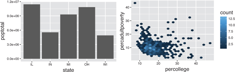
# A bar chart of the total population of each state
# The `state` is mapped to the x-axis, and the `poptotal` is mapped
# to the y-axis
ggplot(data = midwest) +
  geom_col(mapping = aes(x = state, y = poptotal))

# A hexagonal aggregation that counts the co-occurrence of college
# education rate and percentage of adult poverty
ggplot(data = midwest) +
  geom_hex(mapping = aes(x = percollege, y = percadultpoverty))
What makes this really powerful is that you can add multiple geometries to a plot. This allows you to create complex graphics showing multiple aspects of your data, as in Figure 16.5.
# A plot with both points and a smoothed line
ggplot(data = midwest) +
  geom_point(mapping = aes(x = percollege, y = percadultpoverty)) +
  geom_smooth(mapping = aes(x = percollege, y = percadultpoverty))
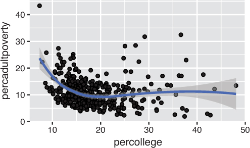
ggplot2 function: geom_point() for points, and geom_smooth() for the smoothed line.While the geom_point() and geom_smooth() layers in this code both use the same aesthetic mappings, there’s no reason you couldn’t assign different aesthetic mappings to each geometry. Note that if the layers do share some aesthetic mappings, you can specify those as an argument to the ggplot() function as follows:
# A plot with both points and a smoothed line, sharing aesthetic mappings
ggplot(data = midwest, mapping = aes(x = percollege, y = percadultpoverty)) +
  geom_point() + # uses the default x and y mappings
  geom_smooth() + # uses the default x and y mappings
  geom_point(mapping = aes(y = percchildbelowpovert)) # uses own y mapping
Each geometry will use the data and individual aesthetics specified in the ggplot() function unless they are overridden by individual specifications.
16.2.2 Aesthetic Mappings
The aesthetic mappings take properties of the data and use them to influence visual channels (graphical encodings), such as position, color, size, or shape. Each visual channel therefore encodes a feature of the data and can be used to express that data. Aesthetic mappings are used for visual features that should be driven by data values, rather than set for all geometric elements. For example, if you want to use a color encoding to express the values in a column, you would use an aesthetic mapping. In contrast, if you want the color of all points to be the same (e.g., blue), you would not use an aesthetic mapping (because the color has nothing to do with your data).
The data-driven aesthetics for a plot are specified using the aes() function and passed into a particular geom_ function layer. For example, if you want to know which state each county is in, you can add a mapping from the state feature of each row to the color channel. ggplot2 will even create a legend for you automatically (as in Figure 16.6)! Note that using the aes() function will cause the visual channel to be based on the data specified in the argument.
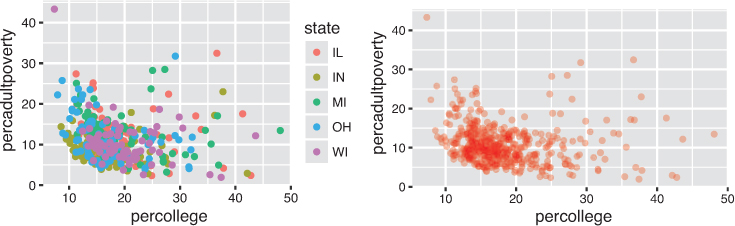
state column is used to set the color (an aesthetic mapping), while the right sets a constant color for all observations. Code is below.
Conversely, if you wish to apply a visual property to an entire geometry, you can set that property on the geometry by passing it as an argument to the geom_ function, outside of the aes() call, as shown in the following code. Figure 16.6 shows both approaches: driving color with the aesthetic (left) and choosing constant styles for each point (right).
# Change the color of each point based on the state it is in
ggplot(data = midwest) +
  geom_point(
    mapping = aes(x = percollege, y = percadultpoverty, color = state)
  )

# Set a consistent color ("red") for all points -- not driven by data
ggplot(data = midwest) +
  geom_point(
    mapping = aes(x = percollege, y = percadultpoverty),
    color = "red",
    alpha = .3
  )
16.3 Complex Layouts and Customization
Building on these basics, you can use ggplot2 to create almost any kind of plot you may want. In addition to specifying the geometry and aesthetics, you can further customize plots by using functions that follow from the Grammar of Graphics.
16.3.1 Position Adjustments
The plot using geom_col() in Figure 16.4 stacked all of the observations (rows) per state into a single column. This stacking is the default position adjustment for the geometry, which specifies a “rule” as to how different components should be positioned relative to each other to make sure they don’t overlap. This positional adjustment can be made more apparent if you map a different variable to the color encoding (using the fill aesthetic). In Figure 16.7 you can see the racial breakdown for the population in each state by adding a fill to the column geometry:
# Load the `dplyr` and `tidyr` libraries for data manipulation
library("dplyr")
library("tidyr")

# Wrangle the data using `tidyr` and `dplyr` -- a common step!
# Select the columns for racial population totals, then
# `gather()` those column values into `race` and `population` columns
state_race_long <- midwest %>%
  select(state, popwhite, popblack, popamerindian, popasian, popother) %>%
  gather(key = race, value = population, -state) # all columns except `state`

# Create a stacked bar chart of the number of people in each state
# Fill the bars using different colors to show racial composition
ggplot(state_race_long) +
  geom_col(mapping = aes(x = state, y = population, fill = race))

fill aesthetic based on the race column.
Remember
You will need to use your dplyr and tidyr skills to wrangle your data frames into the proper orientation for plotting. Being confident in those skills will make using the ggplot2 library a relatively straightforward process; the hard part is getting your data in the desired shape.
Tip
Use the fill aesthetic when coloring in bars or other area shapes (that is, specifying what color to “fill” the area). The color aesthetic is instead used for the outline (stroke) of the shapes.
By default, ggplot will adjust the position of each rectangle by stacking the “columns” for each county. The plot thus shows all of the elements instead of causing them to overlap. However, if you wish to specify a different position adjustment, you can use the position argument. For example, to see the relative composition (e.g., percentage) of people by race in each state, you can use a "fill" position (to fill each bar to 100%). To see the relative measures within each state side by side, you can use a "dodge" position. To explicitly achieve the default behavior, you can use the "identity" position. The first two options are shown in Figure 16.8.
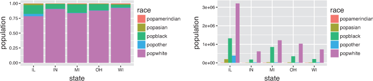
# Create a percentage (filled) column of the population (by race) in each state
ggplot(state_race_long) +
  geom_col(
    mapping = aes(x = state, y = population, fill = race), position = "fill"
  )

# Create a grouped (dodged) column of the number of people (by race) in each state
ggplot(state_race_long) +
  geom_col(
    mapping = aes(x = state, y = population, fill = race), position = "dodge"
  )
16.3.2 Styling with Scales
Whenever you specify an aesthetic mapping, ggplot2 uses a particular scale to determine the range of values that the data encoding should be mapped to. Thus, when you specify a plot such as:
# Plot the `midwest` data set, with college education rate on the x-axis and
# percentage of adult poverty on the y-axis. Color by state.
ggplot(data = midwest) +
  geom_point(mapping = aes(x = percollege, y = percadultpoverty, color = state))
ggplot2 automatically adds a scale for each mapping to the plot:
# Plot the `midwest` data set, with college education rate and
# percentage of adult poverty. Explicitly set the scales.
ggplot(data = midwest) +
  geom_point(mapping = aes(x = percollege, y = percadultpoverty, color = state)) +
  scale_x_continuous() + # explicitly set a continuous scale for the x-axis
  scale_y_continuous() + # explicitly set a continuous scale for the y-axis
  scale_color_discrete() # explicitly set a discrete scale for the color aesthetic
Each scale can be represented by a function named in the following format: scale_, followed by the name of the aesthetic property (e.g., x or color), followed by an _ and the type of the scale (e.g., continuous or discrete). A continuous scale will handle values such as numeric data (where there is a continuous set of numbers), whereas a discrete scale will handle values such as colors (since there is a small discrete list of distinct colors). Notice also that scales are added to a plot using the + operator, similar to a geom layer.
While the default scales will often suffice for your plots, it is possible to explicitly add different scales to replace the defaults. For example, you can use a scale to change the direction of an axis (scale_x_reverse()), or plot the data on a logarithmic scale (scale_x_log10()). You can also use scales to specify the range of values on an axis by passing in a limits argument. Explicit limits are useful for making sure that multiple graphs share scales or formats, as well as for customizing the appearance of your visualizations. For example, the following code imposes the same scale across two plots, as shown in Figure 16.9:
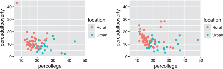
# Create a better label for the `inmetro` column
labeled <- midwest %>%
  mutate(location = if_else(inmetro == 0, "Rural", "Urban"))

# Subset data by state
wisconsin_data <- labeled %>% filter(state == "WI")
michigan_data <- labeled %>% filter(state == "MI")

# Define continuous scales based on the entire data set:
# range() produces a (min, max) vector to use as the limits
x_scale <- scale_x_continuous(limits = range(labeled$percollege))
y_scale <- scale_y_continuous(limits = range(labeled$percadultpoverty))

# Define a discrete color scale using the unique set of locations (urban/rural)
color_scale <- scale_color_discrete(limits = unique(labeled$location))

# Plot the Wisconsin data, explicitly setting the scales
ggplot(data = wisconsin_data) +
  geom_point(
    mapping = aes(x = percollege, y = percadultpoverty, color = location)
  ) +
  x_scale +
  y_scale +
  color_scale

# Plot the Michigan data using the same scales
ggplot(data = michigan_data) +
  geom_point(
    mapping = aes(x = percollege, y = percadultpoverty, color = location)
  ) +
  x_scale +
  y_scale +
  color_scale
These scales can also be used to specify the “tick” marks and labels; see the ggplot2 documentation for details. For further ways of specifying where the data appears on the graph, see Section 16.3.3.
16.3.2.1 Color Scales
One of the most common scales to change is the color scale (i.e., the set of colors used in a plot). While you can use scale functions such as scale_color_manual() to specify a specific set of colors for your plot, a more common option is to use one of the predefined ColorBewer5 palettes (described in Chapter 15, Figure 15.19). These palettes can be specified as a color scale with the scale_color_brewer() function, passing the palette as a named argument (see the rendered plot in Figure 16.10).
5ColorBrewer: http://colorbrewer2.org

Set3 palette.
# Change the color of each point based on the state it is in
ggplot(data = midwest) +
  geom_point(
    mapping = aes(x = percollege, y = percadultpoverty, color = state)
  ) +
  scale_color_brewer(palette = "Set3") # use the "Set3" color palette
If you instead want to define your own color scheme, you can make use of a variety of ggplot2 functions. For discrete color scales6, you can specify a distinct set of colors to map to using a function such as scale_color_manual(). For continuous color scales7, you can specify a range of colors to display using a function such as scale_color_gradient().
6Gradient color scales function reference: http://ggplot2.tidyverse.org/reference/scale_gradient.html
7Create your own discrete scale function reference:http://ggplot2.tidyverse.org/reference/scale_manual.html
16.3.3 Coordinate Systems
It is also possible to specify a plot’s coordinate system, which is used to organize the geometric objects. As with scales, coordinate systems are specified with functions (whose names all start with coord_) and are added to a ggplot. You can use several different coordinate systems,8 including but not limited to the following:
8Coordinate systems function reference: http://ggplot2.tidyverse.org/reference/index.html#section-coordinate-systems
coord_cartesian(): The default Cartesian coordinate system, where you specifyxandyvalues—xvalues increase from left to right, andyvalues increase from bottom to topcoord_flip(): A Cartesian system with thexandyflippedcoord_fixed(): A Cartesian system with a “fixed” aspect ratio (e.g., 1.78 for “widescreen”)coord_polar(): A plot using polar coordinates (i.e., a pie chart)coord_quickmap(): A coordinate system that approximates a good aspect ratio for maps. See the documentation for more details
The example in Figure 16.11 uses coord_flip() to create a horizontal bar chart (a useful layout for making labels more legible). In the geom_col() function’s aesthetic mapping, you do not change what you assign to the x and y variables to make the bars horizontal; instead, you call the coord_flip() function to switch the orientation of the graph. The following code (which generates Figure 16.11) also creates a factor variable to sort the bars using the variable of interest:
# Create a horizontal bar chart of the most populous counties
# Thoughtful use of `tidyr` and `dplyr` is required for wrangling

# Filter down to top 10 most populous counties
top_10 <- midwest %>%
  top_n(10, wt = poptotal) %>%
  unite(county_state, county, state, sep = ", ") %>% # combine state + county
  arrange(poptotal) %>% # sort the data by population
  mutate(location = factor(county_state, county_state)) # set the row order

# Render a horizontal bar chart of population
ggplot(top_10) +
  geom_col(mapping = aes(x = location, y = poptotal)) +
  coord_flip() # switch the orientation of the x- and y-axes
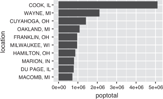
coord_flip() function.
In general, the coordinate system is used to specify where in the plot the x and y axes are placed, while scales are used to determine which values are shown on those axes.
16.3.4 Facets
Facets are ways of grouping a visualization into multiple different pieces (subplots). This allows you to view a separate plot for each unique value in a categorical variable. Conceptually, breaking a plot up into facets is similar to using the group_by() verb in dplyr: it creates the same visualization for each group separately (just as summarize() performs the same analysis for each group).
You can construct a plot with multiple facets by using a facet_ function such as facet_wrap(). This function will produce a “row” of subplots, one for each categorical variable (the number of rows can be specified with an additional argument); subplots will “wrap” to the next line if there is not enough space to show them all in a single row. Figure 16.12 demonstrates faceting; as you can see in this plot, using facets is basically an “automatic” way of doing the same kind of grouping performed in Figure 16.9, which shows separate graphs for Wisconsin and Michigan.
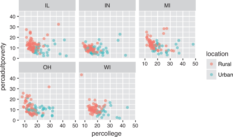
facet_wrap() function.
# Create a better label for the `inmetro` column
labeled <- midwest %>%
  mutate(location = if_else(inmetro == 0, "Rural", "Urban"))

# Create the same chart as Figure 16.9, faceted by state
ggplot(data = labeled) +
  geom_point(
    mapping = aes(x = percollege, y = percadultpoverty, color = location),
    alpha = .6
  ) +
 facet_wrap(~state) # pass the `state` column as a *fomula* to `facet_wrap()`
Note that the argument to the facet_wrap() function is the column to facet by, with the column name written with a tilde (~) in front of it, turning it into a formula.9 A formula is a bit like an equation in mathematics; that is, it represents a set of operations to perform. The tilde can be read “as a function of.” The facet_ functions take formulas as arguments in order to determine how they should group and divide the subplots. In short, with facet_wrap() you need to put a ~ in front of the feature name you want to “group” by. See the official ggplot2 documentation10 for facet_ functions for more details and examples.
9Formula documentation: https://www.rdocumentation.org/packages/stats/versions/3.4.3/topics/formula. See the Details in particular.
10ggplot2 facetting: https://ggplot2.tidyverse.org/reference/#section-facetting
16.3.5 Labels and Annotations
Textual labels and annotations that more clearly express the meaning of axes, legends, and markers are an important part of making a plot understandable and communicating information. Although not an explicit part of the Grammar of Graphics (they would be considered a form of geometry), ggplot2 provides functions for adding such annotations.
You can add titles and axis labels to a chart using the labs() function (not labels(), which is a different R function!), as in Figure 16.13. This function takes named arguments for each aspect to label—either title (or subtitle or caption), or the name of the aesthetic (e.g., x, y, color). Axis aesthetics such as x and y will have their label shown on the axis, while other aesthetics will use the provided label for the legend.
labs() function is used to add a title and labels for each aesthetic mapping.
# Adding better labels to the plot in Figure 16.10
ggplot(data = labeled) +
  geom_point(
    mapping = aes(x = percollege, y = percadultpoverty, color = location),
    alpha = .6
  ) +

  # Add title and axis labels
  labs(
    title = "Percent College Educated versus Poverty Rates", # plot title
    x = "Percentage of College Educated Adults", # x-axis label
    y = "Percentage of Adults Living in Poverty", # y-axis label
    color = "Urbanity" # legend label for the "color" property
  )
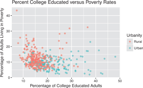
You can also add labels into the plot itself (e.g., to label each point or line) by adding a new geom_text() (for plain text) or geom_label() (for boxed text). In effect, you’re plotting an extra set of data values that happen to be the value names. For example, in Figure 16.14, labels are used to identify the county with the highest level of poverty in each state. The background and border for each piece of text is created by using the geom_label_repel() function, which provides labels that don’t overlap.

ggrepel package is used to prevent labels from overlapping.
# Load the `ggrepel` package: functions that prevent labels from overlapping
library(ggrepel)

# Find the highest level of poverty in each state
most_poverty <- midwest %>%
  group_by(state) %>% # group by state
  top_n(1, wt = percadultpoverty) %>% # select the highest poverty county
  unite(county_state, county, state, sep = ", ") # for clear labeling

# Store the subtitle in a variable for cleaner graphing code
subtitle <- "(the county with the highest level of poverty
  in each state is labeled)"

# Plot the data with labels
ggplot(data = labeled, mapping = aes(x = percollege, y = percadultpoverty)) +

  # add the point geometry
  geom_point(mapping = aes(color = location), alpha = .6) +
  # add the label geometry
  geom_label_repel(
    data = most_poverty, # uses its own specified data set
    mapping = aes(label = county_state),
    alpha = 0.8
  ) +

  # set the scale for the axis
  scale_x_continuous(limits = c(0, 55)) +

  # add title and axis labels
  labs(
    title = "Percent College Educated versus Poverty Rates", # plot title
    subtitle = subtitle, # subtitle
    x = "Percentage of College Educated Adults", # x-axis label
    y = "Percentage of Adults Living in Poverty", # y-axis label
    color = "Urbanity" # legend label for the "color" property
  )
16.4 Building Maps
In addition to building charts using ggplot2, you can use the package to draw geographic maps. Because two-dimensional maps already depend on a coordinate system (latitude and longitude), you can exploit the ggplot2 Cartesian layout to create geographic visualizations. Generally speaking, there are two types of maps you will want to create:
Choropleth maps: Maps in which different geographic areas are shaded based on data about each region (as in Figure 16.16). These maps can be used to visualize data that is aggregated to specified geographic areas. For example, you could show the eviction rate in each state using a choropleth map. Choropleth maps are also called heatmaps.
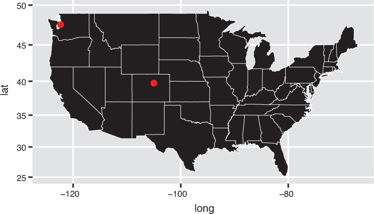
Dot distribution maps: Maps in which markers are placed at specific coordinates, as in Figure 16.19. These plots can be used to visualize observations that occur at discrete (latitude/longitude) points. For example, you could show the specific address of each eviction notice filed in a given city.
This section details how to build such maps using ggplot2 and complementary packages.
16.4.1 Choropleth Maps
To draw a choropleth map, you need to first draw the outline of each geographic unit (e.g., state, country). Because each geography will be an irregular closed shape, ggplot2 can use the geom_polygon() function to draw the outlines. To do this, you will need to load a data file that describes the geometries (outlines) of your areas, appropriately called a shapefile. Many shapefiles such as those made available by the U.S. Census Bureau11 and OpenStreetMap12 can be freely downloaded and used in R.
11U.S. Census: Cartographic Boundary Shapefiles: https://www.census.gov/geo/maps-data/data/tiger-cart-boundary.html
12OpenStreetMap: Shapefiles: https://wiki.openstreetmap.org/wiki/Shapefiles
To help you get started with mapping, ggplot2 includes a handful of shapefiles (meaning you don’t need to download one). You can load a given shapefile by providing the name of the shapefile you wish to load (e.g., "usa", "state", "world") to the map_data() function. Once you have the desired shapefile in a usable format, you can render a map using the geom_polygon() function. This function plots a shape by drawing lines between each individual pair of x- and y- coordinates (in order), similar to a “connect-the-dots” puzzle. To maintain an appropriate aspect ratio for your map, use the coord_map() coordinate system. The map created by the following code is shown in Figure 16.15.
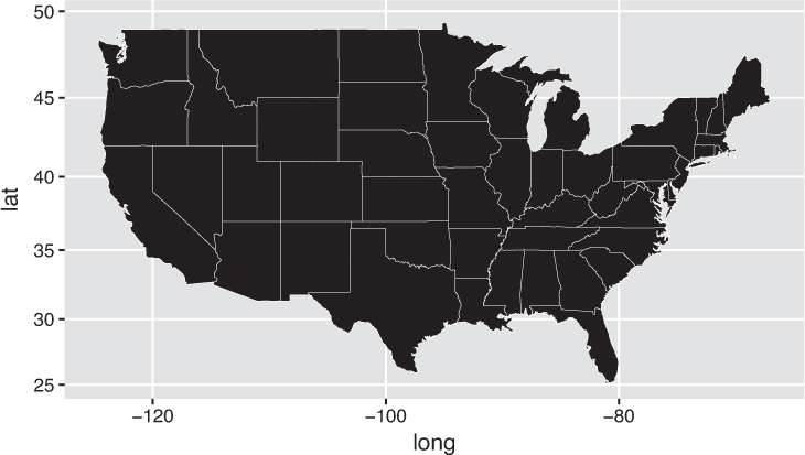
ggplot2.# Load a shapefile of U.S. states using ggplot's `map_data()` function state_shape <- map_data("state") # Create a blank map of U.S. states ggplot(state_shape) + geom_polygon( mapping = aes(x = long, y = lat, group = group), color = "white", # show state outlines size = .1 # thinly stroked ) + coord_map() # use a map-based coordinate system
The data in the state_shape variable is just a data frame of longitude/latitude points that describe how to draw the outline of each state—the group variable indicates which state each point belongs to. If you want each geographic area (in this case, each U.S. state) to express different data through a visual channel such as color, you need to load the data, join it to the shapefile, and map the fill of each polygon. As is often the case, the biggest challenge is getting the data in the proper format for visualizing it (not using the visualization package). The map in Figure 16.16, which is built using the following code, shows the eviction rate in each U.S. state in 2016. The data was downloaded from the Eviction Lab at Princeton University.13
13Eviction Lab: https://evictionlab.org. The Eviction Lab at Princeton University is a project directed by Matthew Desmond and designed by Ashley Gromis, Lavar Edmonds, James Hendrickson, Katie Krywokulski, Lillian Leung, and Adam Porton. The Eviction Lab is funded by the JPB, Gates, and Ford Foundations, as well as the Chan Zuckerberg Initiative.
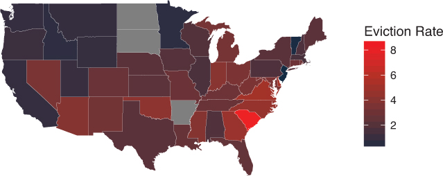
ggplot2.# Load evictions data evictions <- read.csv("data/states.csv", stringsAsFactors = FALSE) %>% filter(year == 2016) %>% # keep only 2016 data mutate(state = tolower(state)) # replace with lowercase for joining # Join eviction data to the U.S. shapefile state_shape <- map_data("state") %>% # load state shapefile rename(state = region) %>% # rename for joining left_join(evictions, by="state") # join eviction data # Draw the map setting the `fill` of each state using its eviction rate ggplot(state_shape) + geom_polygon( mapping = aes(x = long, y = lat, group = group, fill = eviction.rate), color = "white", # show state outlines size = .1 # thinly stroked ) + coord_map() + # use a map-based coordinate system scale_fill_continuous(low = "#132B43", high = "Red") + labs(fill = "Eviction Rate") + blank_theme # variable containing map styles (defined in next code snippet)
The beauty and challenge of working with ggplot2 are that nearly every visual feature is configurable. These features can be adjusted using the theme() function for any plot (including maps!). Nearly every granular detail—minor grid lines, axis tick color, and more—is available for your manipulation. See the documentation14 for details. The following is an example set of styles targeted to remove default visual features from maps:
14ggplot2 themes reference: http://ggplot2.tidyverse.org/reference/index.html#section-themes
# Define a minimalist theme for maps
blank_theme <- theme_bw() +
  theme(
    axis.line = element_blank(),        # remove axis lines
    axis.text = element_blank(),        # remove axis labels
    axis.ticks = element_blank(),       # remove axis ticks
    axis.title = element_blank(),       # remove axis titles
    plot.background = element_blank(),  # remove gray background
    panel.grid.major = element_blank(), # remove major grid lines
    panel.grid.minor = element_blank(), # remove minor grid lines
    panel.border = element_blank()      # remove border around plot
  )
16.4.2 Dot Distribution Maps
ggplot also allows you to plot data at discrete locations on a map. Because you are already using a geographic coordinate system, it is somewhat trivial to add discrete points to a map. The following code generates Figure 16.17:
# Create a data frame of city coordinates to display
cities <- data.frame(
  city = c("Seattle", "Denver"),
  lat = c(47.6062, 39.7392),
  long = c(-122.3321, -104.9903)
)

# Draw the state outlines, then plot the city points on the map
ggplot(state_shape) +
  geom_polygon(mapping = aes(x = long, y = lat, group = group)) +
  geom_point(
    data = cities, # plots own data set
    mapping = aes(x = long, y = lat), # points are drawn at given coordinates
    color = "red"
  ) +
  coord_map() # use a map-based coordinate system
As you seek to increase the granularity of your map visualizations, it may be infeasible to describe every feature with a set of coordinates. This is why many visualizations use images (rather than polygons) to show geographic information such as streets, topography, buildings, and other geographic features. These images are called map tiles—they are pictures that can be stitched together to represent a geographic area. Map tiles are usually downloaded from a remote server, and then combined to display the complete map. The ggmap15 package provides a nice extension to ggplot2 for both downloading map tiles and rendering them in R. Map tiles are also used with the Leaflet package, described in Chapter 17.
15ggmap repository on GitHub: https://github.com/dkahle/ggmap
16.5 ggplot2 in Action: Mapping Evictions in San Francisco
To demonstrate the power of ggplot2 as a visualization tool for understanding pertinent social issues, this section visualizes eviction notices filed in San Francisco in 2017.16 The complete code for this analysis is also available online in the book code repository.17
16data.gov: Eviction Notices: https://catalog.data.gov/dataset/eviction-notices
17ggplot2 in Action: https://github.com/programming-for-data-science/in-action/tree/master/ggplot2
Before mapping this data, a minor amount of formatting needs to be done on the raw data set (shown in Figure 16.18):
# Load and format eviction notices data
# Data downloaded from https://catalog.data.gov/dataset/eviction-notices

# Load packages for data wrangling and visualization
library("dplyr")
library("tidyr")

# Load .csv file of notices
notices <- read.csv("data/Eviction_Notices.csv", stringsAsFactors = F)

# Data wrangling: format dates, filter to 2017 notices, extract lat/long data
notices <- notices %>%
  mutate(date = as.Date(File.Date, format="%m/%d/%y")) %>%
  filter(format(date, "%Y") == "2017") %>%
  separate(Location, c("lat", "long"), ", ") %>% # split column at the comma
  mutate(
    lat = as.numeric(gsub("\(", "", lat)), # remove starting parentheses
    long = as.numeric(gsub("\)", "", long)) # remove closing parentheses
  )

To create a background map of San Francisco, you can use the qmplot() function from the development version of ggmap package (see below). Because the ggmap package is built to work with ggplot2, you can then display points on top of the map as you normally would (using geom_point()). Figure 16.19 shows the location of each eviction notice filed in 2017, created using the following code:

ggplot2 package.Tip
Installing the development version of a package using devtools::install_github ("PACKAGE_NAME") provides you access to the most recent version of a package, including bug fixes and new—though not always fully tested—features.
# Create a map of San Francisco, with a point at each eviction notice address
# Use `install_github()` to install the newer version of `ggmap` on GitHub
# devtools::install_github("dkhale/ggmap") # once per machine
library("ggmap")
library("ggplot2")

# Create the background of map tiles
base_plot <- qmplot(
    data = notices,               # name of the data frame
    x = long,                     # data feature for longitude
    y = lat,                      # data feature for latitude
    geom = "blank",               # don't display data points (yet)
    maptype = "toner-background", # map tiles to query
    darken = .7,                  # darken the map tiles
    legend = "topleft"            # location of legend on page
)

# Add the locations of evictions to the map
base_plot +
  geom_point(mapping = aes(x = long, y = lat), color = "red", alpha = .3) +
  labs(title = "Evictions in San Francisco, 2017") +
  theme(plot.margin = margin(.3, 0, 0, 0, "cm")) # adjust spacing around the map
Tip
You can store a plot returned by the ggplot() function in a variable (as in the preceding code)! This allows you to add different layers on top of a base plot, or to render the plot at chosen locations throughout a report (see Chapter 18).
While Figure 16.19 captures the gravity of the issue of evictions in the city, the overlapping nature of the points prevents ready identification of any patterns in the data. Using the geom_polygon() function, you can compute point density across two dimensions and display the computed values in contours, as shown in Figure 16.20.
# Draw a heatmap of eviction rates, computing the contours
base_plot +
  geom_polygon(
    stat = "density2d", # calculate two-dimensional density of points (contours)
    mapping = aes(fill = stat(level)), # use the computed density to set the fill
    alpha = .3 # Set the alpha (transparency)
  ) +
  scale_fill_gradient2(
    "# of Evictions",
    low = "white",
    mid = "yellow",
    high = "red"
  ) +
  labs(title="Number of Evictions in San Francisco, 2017") +
  theme(plot.margin = margin(.3, 0, 0, 0, "cm"))

ggplot2’s statistical transformations.This example of the geom_polygon() function uses the stat argument to automatically perform a statistical transformation (aggregation)—similar to what you could do using the dplyr functions group_by() and summarize()—that calculates the shape and color of each contour based on point density (a "density2d" aggregation). ggplot2 stores the result of this aggregation in an internal data frame in a column labeled level, which can be accessed using the stat() helper function to set the fill (that is, mapping = aes(fill = stat(level))).
Tip
For more examples of producing maps with ggplot2, see this tutorial.a
ahttp://eriqande.github.io/rep-res-web/lectures/making-maps-with-R.html
This chapter introduced the ggplot2 package for constructing precise data visualizations. While the intricacies of this package can be difficult to master, the investment is well worth the effort, as it enables you to control the granular details of your visualizations.
Tip
Similar to dplyr and many other packages, ggplot2 has a large number of functions. A cheatsheet for the package is available through the RStudio menu: Help > Cheatsheets. In addition, this phenomenal cheatsheeta describes how to control the granular details of your ggplot2 visualizations.
ahttp://zevross.com/blog/2014/08/04/beautiful-plotting-in-r-a-ggplot2-cheatsheet-3/
For practice creating configurable visualizations with ggplot2, see the set of accompanying book exercises.18
18ggplot2 exercises: https://github.com/programming-for-data-science/chapter-16-exercises