
Lesson 12
Creating Layouts Using Modern CSS Techniques
What You’ll Learn in This Lesson:
How fixed layouts work
How liquid layouts work
How to create a fixed/liquid hybrid layout
How to create CSS flexible box layouts
How to use CSS grid layouts
So far, you’ve learned a lot about styling web content, from font sizes and colors to images, block elements, lists, and more. But what we haven’t yet discussed is a high-level overview of page layout. Page layout is how a whole web page looks to the viewer. Most beginning web designers think of this as a static feature and have a goal of creating web pages that look identical in every web browser and device that views it. But that’s only one way to design web pages, and it’s not a very good way.
There are two basic types of layouts: fixed and liquid. But it’s also possible to use a combination of the two, with some elements fixed and others liquid. In this lesson, you’ll first learn about the characteristics of these two types of layouts and see a few examples of websites that use them. You’ll then see a basic template that combines elements of both types of layouts, using an older style of web design.
Modern CSS gives you more tools for building web page layouts, and in this lesson you will learn how to design pages using the CSS Flexible Box Layout module and the CSS Grid Layout module.
Ultimately, the type of layout you choose is up to you; it’s hard to go wrong as long as your sites follow HTML and CSS standards.
Getting Ready to Do Page Layout
In the previous lessons, you have learned how to build HTML and CSS web pages, but in order to create effective layouts, you need to be very clear about the following things:
 CSS box model—If you don’t feel completely comfortable with margins, padding, borders, and content boxes, you should take another look at Lesson 9, “Working with Margins, Padding, Alignment, and Floating” and Lesson 10, “Understanding the CSS Box Model and Positioning.” These two lessons are the basis of most page layout techniques and are particularly important for building the fixed and liquid layouts in the first few sections of this lesson.
- Progressive enhancement—Progressive enhancement is the idea that you should start by creating web pages with the minimum required to work, and then you can enhance them with design and interactivity elements. To do this, you need to focus your attention on exactly what each page on your site needs to do. That one thing is what needs to be visible, functional, and accessible—no matter what. Once you have that element, you can add CSS styles to make it look good and JavaScript scripts to make it interactive, but these steps should never get in the way of the primary purpose of that page.
- Separation of structure from design and interactivity—Your goal should be to create web pages where the HTML holds only the structure and content, the CSS holds only the design, and the JavaScript holds only the interactivity.
The Importance of Putting Mobile Devices First
One aspect of web page layout that many designers forget is that most people are not viewing their web pages the way the designers are viewing them. Most designers use large computer monitors (sometimes multiple monitors) with web browsers that, if not maximized, are at least filling up a lot of space. For example, my default browser is currently open to around 1500px by 900px, and I’m using it on a 5120 × 2880 display, so I could make it much larger.
However, according to StatCounter, as of this writing, the most popular resolution worldwide is 360 × 640, with 23% share. And even in the United States, while the most popular resolution is 1920 × 1080, it accounts for only 10.4% of users, and smaller resolutions like 360 × 640 and 375 × 667 are right behind, at 10.2% and 9.8% of users, respectively. Using mobile devices is becoming a more and more popular way to consume web content, and your pages should reflect that.
In the previous section, you learned about progressive enhancement, and it is critical that your page layouts use this technique with regard to mobile devices. You should design your pages for the smallest devices first and then add enhancements for larger and larger screens.
Caution
It may be easy to ignore this advice, as designing for small screens can be tedious, and your pages may seem ugly. But if you rely on search engines for any of your traffic, you will need to keep this in mind. Google and other search engines are starting to give sites that function well on mobile devices priority over sites that do not.
In this lesson, you’ll learn about specific layout techniques that may not be mobile friendly or that may not put mobile design first. But you need to know how to do them so that you can implement mobile first techniques. You will learn more about how to make your designs more mobile friendly in Part IV, “Responsive Web Design.”
Understanding Fixed Layouts
A fixed layout, or fixed-width layout, is just what it sounds like: a layout in which the body of the page is set to a specific width. That width is typically controlled by a master “wrapper” element that contains all the content. The width property of a wrapper element, such as a <div>, is set in the style sheet entry if the <div> was given an ID value such as main or wrapper (although the name is up to you).
Note
If you have been paying attention, you may realize that the minute you give an HTML element an ID such as wrapper, you are moving the design of the page into the HTML instead of keeping it in the CSS. One way to evaluate this is to ask yourself the question “Does the meaning or function of this element’s ID change if the layout changes?” If the answer is yes, then you’ve given it an ID that is more design than structure. It’s better to use a more semantic ID, such as main, which tells the browser that the contained content is the main part of the page. Then, if the layout changes, that content will still be the main part of the page, although it might be in a different location in the layout.
When creating a fixed-width layout, the most important decision is determining the minimum screen resolution to accommodate. The best way to decide how to set a fixed-width layout is to look at the stats for the visitors to your website. If the majority of your viewers use a small screen such as 800 × 600, then your layout should reflect that. But if you don’t have stats from your site because it is new or for some other reason, you can use a service like StatCounter (http://gs.statcounter.com/screen-resolution-stats/) to get a more generic view.
For many years, 800 × 600 was the “lowest common denominator” for web designers, resulting in a typical fixed width of approximately 760 pixels. However, the percentage of people using 800 × 600 screen resolution for nonmobile browsers is now less than 1%. Many web designers now consider 1280 × 800 the minimum screen resolution, so if they create fixed-width layouts, the fixed width typically is somewhere between 1100 and 1200 pixels.
Caution
Remember that the web browser window contains non-viewable areas, including the scrollbar. So, if you are targeting a 1280-pixel-wide screen resolution, you really can’t use all 1280 of those pixels.
A main reason for creating a fixed-width layout is so that you can have precise control over the appearance of the content area. However, if users visit your fixed-width site with smaller or much larger screen resolutions than the resolution you had in mind while you designed it, they will encounter scrollbars (if their resolution is smaller) or a large amount of empty space (if their resolution is greater). Finding fixed-width layouts is difficult among the most popular websites these days because site designers know they need to cater to the largest possible audience (and therefore make no assumptions about browser size). However, fixed-width layouts still have wide adoption, especially by site administrators using content management systems with strict templates.
The following figures show one such site, for San Jose State University. University websites commonly use a strict template and content management system, so this was an easy example to find. It has a wrapper element fixed at 960 pixels wide. In Figure 12.1, the browser window is a shade under 900 pixels wide. On the right side of the image, important content is cut off (and at the bottom of the figure, a horizontal scrollbar displays in the browser).
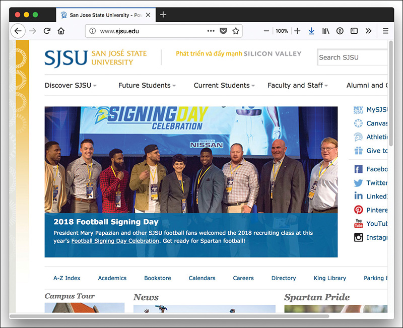
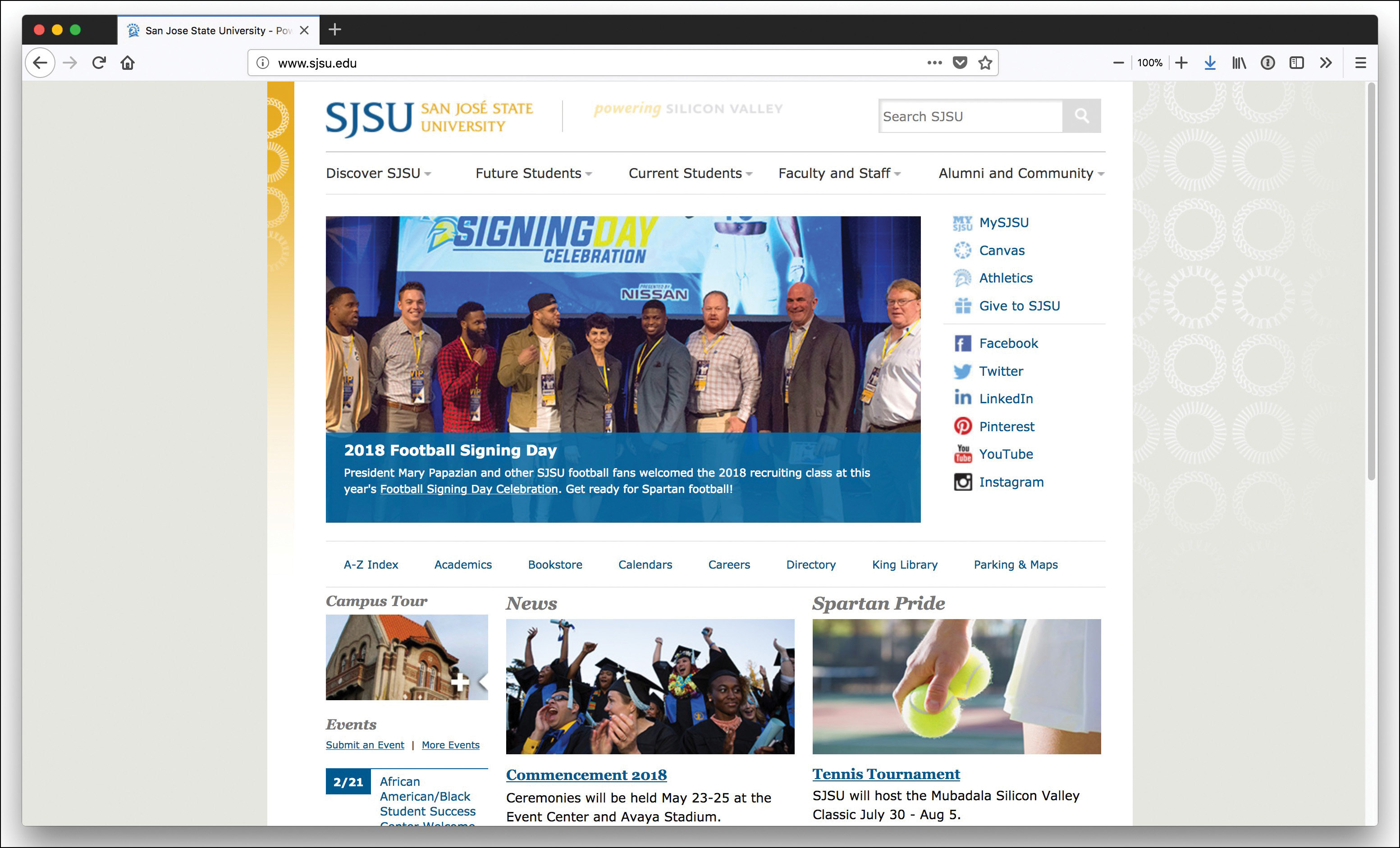
Figure 12.2 shows how this site looks when the browser window is more than 1500 pixels wide: You see a lot of empty space (or “real estate”) on both sides of the main body content, which some consider aesthetically displeasing.
In addition to deciding whether to create a fixed-width layout in the first place, you need to determine whether to place the fixed-width content flush left or centered. Placing the content flush left produces extra space on the right side only; centering the content area creates extra space on both sides. However, centering at least provides balance, whereas a flush-left design could end up looking like a small rectangle shoved in the corner of the browser, depending on the size and resolution of a user’s monitor.
Understanding Liquid Layouts
A liquid layout—also called a fluid layout—is a layout in which the body of the page does not use a specified width in pixels, although it might be enclosed in a master wrapper element that uses a percentage width. The idea behind a liquid layout is that it can be perfectly usable and still retain the overall design aesthetic, even if the user has a very small or very wide screen.
Figures 12.3, 12.4, and 12.5 show three examples of a liquid layout in action.
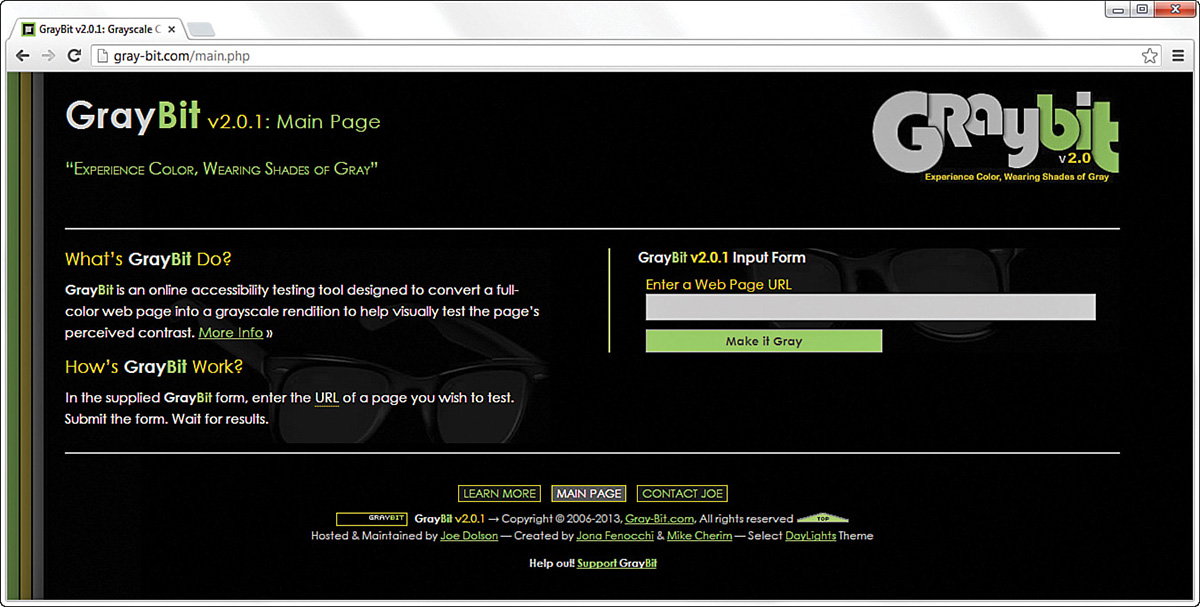
In Figure 12.3, the browser window is approximately 770 pixels wide. This example shows a reasonable minimum screen width before a horizontal scrollbar appears. In fact, the scrollbar does not appear until the browser is 735 pixels wide. On the other hand, Figure 12.4 shows a very small browser window (less than 600 pixels wide).
In Figure 12.4, you can see a horizontal scrollbar; in the header area of the page content, the logo graphic is beginning to take over the text and appear on top of it. But the bulk of the page is still quite usable. The informational content on the left side of the page is still legible and is sharing the available space with the input form on the right side.
Figure 12.5 shows how this same page looks in a very wide screen. In Figure 12.5, the browser window is approximately 1330 pixels wide. There is plenty of room for all the content on the page to spread out. This liquid layout is achieved because all the design elements have a percentage width specified instead of a fixed width. This way, the layout makes use of all the available browser real estate.
The liquid layout approach might seem like the best approach at first glance; after all, who wouldn’t want to take advantage of all the screen real estate available? But there’s a fine line between taking advantage of space and not allowing the content to breathe. Too much content is overwhelming; not enough content in an open space is underwhelming. Plus, if the screen gets too wide, the text will be much harder to read.
A purely liquid layout can be quite impressive, but it requires a significant amount of testing to ensure that it is usable in a wide range of browsers at varying screen resolutions. You might not have the time and effort available to produce such a design; in that case, a reasonable compromise is a fixed/liquid hybrid layout, or a fully responsive design, as we’ll discuss later on.
Creating a Fixed/Liquid Hybrid Layout
A fixed/liquid hybrid layout contains elements of both types of layouts. For example, you could have a fluid layout that includes fixed-width content areas either within the body area or as anchor elements (such as a left-side column or as a top navigation strip). You can even create a fixed content area that acts like a frame, in which a content area remains fixed even as users scroll through the content.
Starting with a Basic Layout Structure
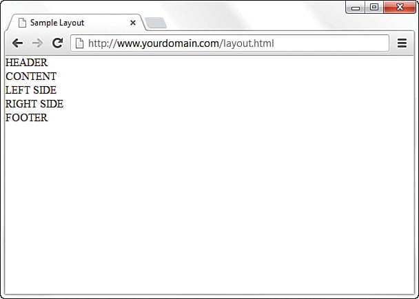
In this example, you’ll learn to create a template that is liquid but with two fixed-width columns, one on each side of the main body area (which is a third column, if you think about it, only much wider than the others). The template also has a delineated header and footer area. Listing 12.1 shows the basic HTML structure for this layout.
Listing 12.1 Basic Fixed/Liquid Hybrid Layout Structure
<!doctype html>
<html lang="en">
<head>
<meta charset="utf-8">
<title>Sample Layout</title>
<link href="layout.css" rel="stylesheet">
</head>
<body>
<header>HEADER</header>
<section id="main">
<article id="main_content">CONTENT</article>
<aside id="secondary_content">LEFT SIDE</aside>
<aside id="tertiary_content">RIGHT SIDE</aside>
</section>
<footer>FOOTER</footer>
</body>
</html>
First, note that the style sheet for this layout is linked to with the <link> tag instead of included in the template. A template is used for more than one page, and you want to be able to control the display elements of the template in the most organized way possible. This means you need to change the definitions of those elements in only one place—the style sheet.
Next, notice that the basic HTML is just that: extremely basic. Truth be told, this basic HTML structure can be used for a fixed layout, a liquid layout, or the fixed/liquid hybrid in this example because all the actual styling that makes a layout fixed, liquid, or hybrid happens in the style sheet.
Even the IDs on the elements say nothing about where the content should live in the layout; they just provide semantic information about the content itself. Right now the secondary_content <aside> element is being displayed on the left side (according to the content itself), but there is no reason you couldn’t move it to the right side or below the footer or anywhere else on the page you wanted to put it.
With the HTML structure in Listing 12.1, you actually have an identification of the content areas you want to include in your site. This planning is crucial to any development; you have to know what you want to include before you can think about the type of layout you are going to use, let alone the specific styles that will be applied to that layout.
At this stage, the layout.css file includes only this entry:
body {
margin:0;
padding:0;
}
If you look at the HTML in Listing 12.1 and say to yourself, “But those elements will just stack on top of each other without any styles,” you are correct. As shown in Figure 12.6, there is no layout to speak of.
Defining Two Columns in a Fixed/Liquid Hybrid Layout
Because this layout is supposed to be liquid, we know that whatever we put in the header and footer areas will extend the width of the browser window, regardless of how narrow or wide the window might be.
Adding the following code to the style sheet gives the header and footer area each a width of 100% as well as the same background color and text color:
header, footer {
float: left;
width: 100%;
background-color: #7152f4;
color: #ffffff;
}
Now things get a little trickier. We have to define the two fixed columns on either side of the page, plus the column in the middle. In the HTML we’re using here, note that a <section> element, called main, surrounds all the columns. This element is defined in the style sheet as follows:
#main {
float: left;
padding-left: 200px;
padding-right: 125px;
}
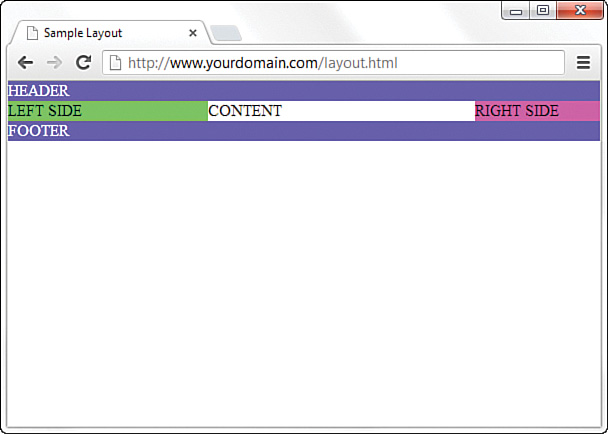
The two padding definitions essentially reserve space for the two fixed-width columns on the left and right of the page. The column on the left will be 200 pixels wide, the column on the right will be 125 pixels wide, and each will have a different background color. But we also have to position the items relative to where they would be placed if the HTML remained unstyled (refer to Figure 12.6). This means adding position: relative; to the style sheet entries for each of these columns.
But in the case of the secondary_content <aside>, we also indicate that we want the rightmost margin edge to be 200 pixels in from the edge. (This is in addition to the column being defined as 200 pixels wide.) We also want the margin on the left side to be a full negative margin; this will pull it into place (as you will soon see). The tertiary_content <aside> does not include a value for right, but it does include a negative margin on the right side:
#secondary_content {
position: relative;
float: left;
width: 200px;
background-color: #52f471;
right: 200px;
margin-left: -100%;
}
#tertiary_content {
position: relative;
float: left;
width: 125px;
background-color: #f452d5;
margin-right: -125px;
}
At this point, let’s also define the content area so that it has a white background, takes up 100% of the available area, and floats to the left relative to its position:
#main_content {
position: relative;
float: left;
background-color: #ffffff;
width: 100%;
}
At this point, the basic layout should look something like Figure 12.7, with the areas clearly delineated.
However, there’s a problem with this template if the window is resized below a certain width. Because the left column is 200 pixels wide and the right column is 125 pixels wide, and you want at least some text in the content area, you can imagine that this page will break if the window is only 350 to 400 pixels wide. There is also an issue if the browser is too wide. We address these issues in the next section.
Setting the Minimum and Maximum Width of a Layout
Although users won’t likely visit your site with a desktop browser that displays less than 400 pixels wide, many people might view it on a small mobile phone that size. You can extrapolate and apply this information broadly: Even in fixed/liquid hybrid sites, at some point, your layout will break down unless you do something to prevent that outcome.
One of those “somethings” is to use the min-width CSS property. The min-width property sets the minimum width of an element, not including padding, borders, or margins. Figure 12.8 shows what happens when min-width is applied to the <body> element.
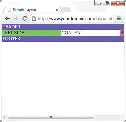
Figure 12.8 shows a small portion of the right column after the screen has been scrolled to the right, but the point is that the layout does not break apart when resized below a minimum width. In this case, the minimum width is 525 pixels:
body {
margin: 0;
padding: 0;
min-width: 525px;
}
The horizontal scrollbar appears in this example because the browser window itself is less than 500 pixels wide. The scrollbar disappears when the window is slightly larger than 525 pixels wide.
You can use the max-width CSS property in the same way to ensure that elements of the page with percentage widths don’t get too wide. This property lets the element expand up to a point and then stop.
Handling Column Height in a Fixed/Liquid Hybrid Layout
This example is all well and good except for one problem: It has no content. When content is added to the various elements, more problems arise. As Figure 12.9 shows, the columns become as tall as necessary for the content they contain.
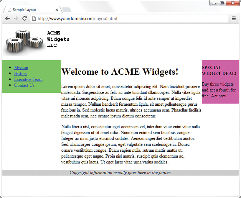
Note
In Figure 12.9, we have moved beyond the basic layout example. So, we also took the liberty of removing the background and text color properties for the header and footer, which is why the example no longer shows white text on a very dark background. In addition, we’ve centered the text in the <footer> element, which now has a light gray background.
Because you cannot count on a user’s browser being a specific height or the content always being the same length, you might think this poses a problem with the fixed/liquid hybrid layout. Not so. If you think a little outside the box, you can apply a few more styles to bring all the pieces together.
First, add the following declarations in the style sheet entries for the secondary_content, tertiary_content, and main_content IDs:
margin-bottom: -2000px;
padding-bottom: 2000px;
These declarations add a ridiculous amount of padding and assign a too-large margin to the bottom of all three elements. You must also add position:relative; to the footer element definitions in the style sheet so that the footer is visible despite this padding.
At this point, the page looks as shown in Figure 12.10, which is still not what we want but is closer.
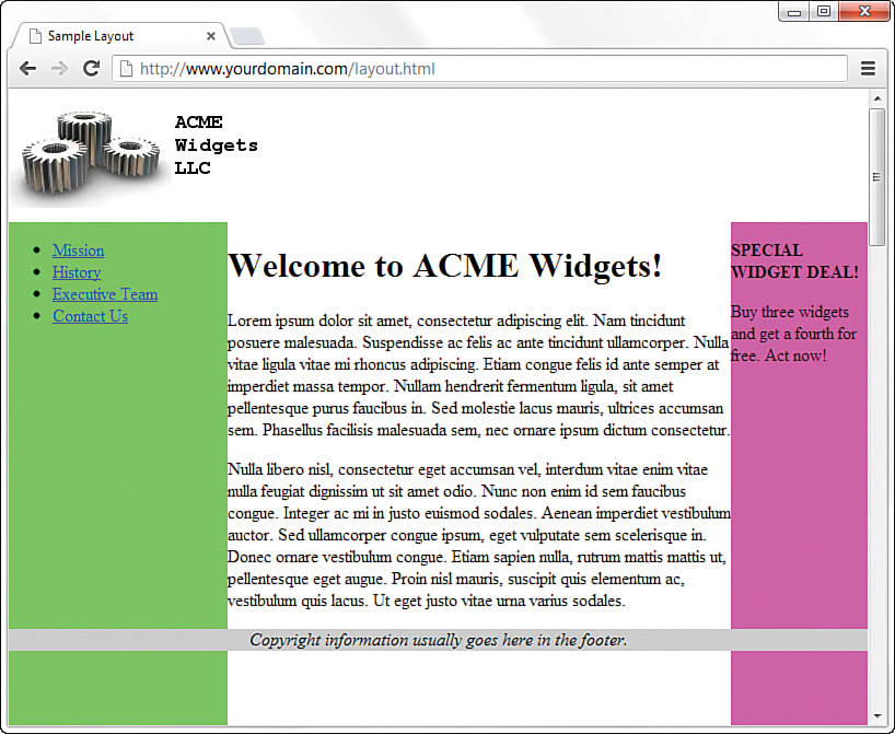
To clip off the bottom of the columns, add the following to the style sheet for the main ID:
overflow: hidden;
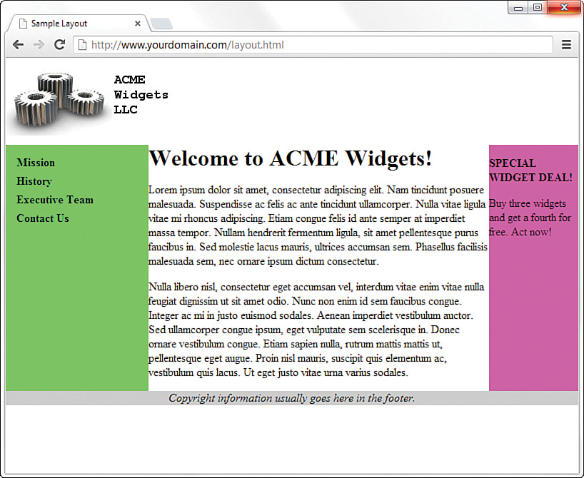
Figure 12.11 shows the final result: a fixed-width/liquid hybrid layout with the necessary column spacing. Here we took the liberty of styling the navigational links and adjusting the margin around the welcome message. You can see the complete style sheet in Listing 12.3.
The full HTML code appears in Listing 12.2, and Listing 12.3 shows the final style sheet.
Listing 12.2 Basic Fixed/Liquid Hybrid Layout Structure (with Content)
<!doctype html>
<html lang="en">
<head>
<meta charset="utf-8">
<title>Sample Layout</title>
<link href="layout.css" rel="stylesheet">
</head>
<body>
<header>
<img src="acmewidgets.jpg" alt="ACME Widgets LLC">
</header>
<section id="main">
<article id="main_content">
<h1>Welcome to ACME Widgets!</h1>
<p>Lorem ipsum dolor sit amet, consectetur adipiscing elit.
Nam tincidunt posuere malesuada. Suspendisse ac felis ac ante
tincidunt ullamcorper. Nulla vitae ligula vitae mi rhoncus
adipiscing. Etiam congue felis id ante semper at imperdiet
massa tempor. Nullam hendrerit fermentum ligula, sit amet
pellentesque purus faucibus in. Sed molestie lacus mauris,
ultrices accumsan sem. Phasellus facilisis malesuada sem, nec
ornare ipsum dictum consectetur.</p>
<p>Nulla libero nisl, consectetur eget accumsan vel, interdum
vitae enim vitae nulla feugiat dignissim ut sit amet odio.
Nunc non enim id sem faucibus congue. Integer ac mi in justo
euismod sodales. Aenean imperdiet vestibulum auctor. Sed
ullamcorper congue ipsum, eget vulputate sem scelerisque in.
Donec ornare vestibulum congue. Etiam sapien nulla, rutrum
mattis ut, pellentesque eget augue. Proin nisl mauris,
suscipit quis elementum ac, vestibulum quis lacus. Ut eget
justo vitae urna varius sodales. </p>
</article>
<aside id="secondary_content">
<ul>
<li><a href="#">Mission</a></li>
<li><a href="#">History</a></li>
<li><a href="#">Executive Team</a></li>
<li><a href="#">Contact Us</a></li>
</ul>
</aside>
<aside id="tertiary_content">
<p><strong>SPECIAL WIDGET DEAL!</strong></p>
<p>Buy three widgets and get a fourth for free. Act now!</p>
</aside>
</section>
<footer>Copyright information usually goes here in the
footer.</footer>
</body>
</html>
Listing 12.3 Full Style Sheet for the Fixed/Liquid Hybrid Layout
body {
margin:0;
padding:0;
min-width: 525px;
}
header {
float: left;
width: 100%;
}
footer {
position:relative;
float: left;
width: 100%;
background-color: #cccccc;
text-align:center;
font-style: italic;
}
#main {
float: left;
padding-left: 200px;
padding-right: 125px;
overflow: hidden;
}
#secondary_content {
position: relative;
float: left;
width: 200px;
background-color: #52f471;
right: 200px;
margin-left: -100%;
margin-bottom: -2000px;
padding-bottom: 2000px;
}
#tertiary_content {
position: relative;
float: left;
width: 125px;
background-color: #f452d5;
margin-right: -125px;
margin-bottom: -2000px;
padding-bottom: 2000px;
}
#main_content {
position: relative;
float: left;
background-color: #ffffff;
width: 100%;
margin-bottom: -2000px;
padding-bottom: 2000px;
}
h1 {
margin: 0;
}
#secondary_content ul {
list-style: none;
margin: 12px 0px 0px 12px;
padding: 0px;
}
#secondary_content li a:link, #secondary_content li a:visited {
font-size: 12pt;
font-weight: bold;
padding: 3px 0px 3px 3px;
color: #000000;
text-decoration: none;
display: block;
}
#secondary_content li a:hover, #secondary_content li a:active {
font-size: 12pt;
font-weight: bold;
padding: 3px 0px 3px 3px;
color: #ffffff;
text-decoration: none;
display: block;
}
Using Modern CSS Layout Techniques
In the previous sections, you learned how web designers used to build web page layouts—methods that many designers still use. But CSS3 offers several new ways to handle web page layout, and most modern browsers support them without much trouble. These are the three that are most commonly used:
- CSS table—CSS properties that change the display of page elements to tables, table rows, and table columns.
- CSS flexible box layout—CSS properties that make it easier to lay out, align, and distribute space among elements in a container.
- CSS grid layout—A grid-based layout system with rows and columns.
These CSS layout systems all start with the display property. Before CSS3, the display property took the values inline, block, and none. This meant you could change how elements were displayed in the normal flow or hide them completely. CSS3 added a number of new values, including list-item, to indicate that the element was a list item, and inline-block, to indicate that the element was like an <img> element with characteristics of inline and block elements. In the next few sections, you will learn about more values of the display property that help with layout.
How to Use CSS display: table;
Unlike HTML tables, the CSS display: table; property is not a structural table in HTML. This means you can convert any element into a table and use it to build your layout.
There are several table options on the display property:
- table—Behaves like a
<table>element - inline-table—Behaves like a
<table>element that is rendered inline - table-row—Behaves like a table row (
<tr>) element - table-cell—Behaves like a table cell (
<td>) element - table-column—Behaves like a
<col>element - table-caption—Behaves like a
<caption>element - table-row-group—Behaves like a
<tbody>element - table-header-group—Behaves like a
<thead>element - table-footer-group—Behaves like a
<tfoot>element - table-column-group—Behaves like a
<colgroup>element
Note
Some people are concerned about using CSS table styles for layout because they learned that you should never use tables for layout. However, despite the name, CSS table properties are not HTML table tags. The issues with accessibility are mitigated when you use CSS table styles because the HTML can be structured in a way that is accessible, regardless of the layout.
By using CSS tables, you can create layouts similar to how web designers might have created them using actual tables back in the “bad old days.” For example, you can take the HTML you used in Listing 12.2 and change the CSS to create a similar three-column layout.
First, define the main <section> as a table and give it 100% width:
#main {
width: 100%;
display: table;
}
This tells the browsers that this element contains table content and should display like a table.
Then define the three content areas as table cells:
#main_content, #secondary_content, #tertiary_content {
display: table-cell;
}
If you set the background colors and other styles so that you end up with the CSS in Listing 12.4, the page will look as shown in Figure 12.12.
Listing 12.4 Three-Column Layout with display: table;
#main {
width: 100%;
display: table;
}
#main_content, #secondary_content, #tertiary_content {
display: table-cell;
}
footer {
width: 100%;
background-color: #cccccc;
text-align:center;
font-style: italic;
}
#secondary_content { width: 200px; background-color: #52f471; }
#tertiary_content { width: 125px; background-color: #f452d5; }
#secondary_content ul {
list-style: none;
margin: 12px 0px 0px 12px;
padding: 0px;
}
#secondary_content li a:link, #secondary_content li a:visited {
font-size: 12pt;
font-weight: bold;
padding: 3px 0px 3px 3px;
color: #000000;
text-decoration: none;
display: block;
}
#secondary_content li a:hover, #secondary_content li a:active {
font-size: 12pt;
font-weight: bold;
padding: 3px 0px 3px 3px;
color: #ffffff;
text-decoration: none;
display: block;
}
One thing you will notice is that the secondary_content column is now in the middle of the three columns. This is because that is where it is located in the HTML source. One of the drawbacks to this layout method is that to change the positions of different elements, you need to change the actual HTML. But as you will see in the next sections, CSS3 has answers for this, too.
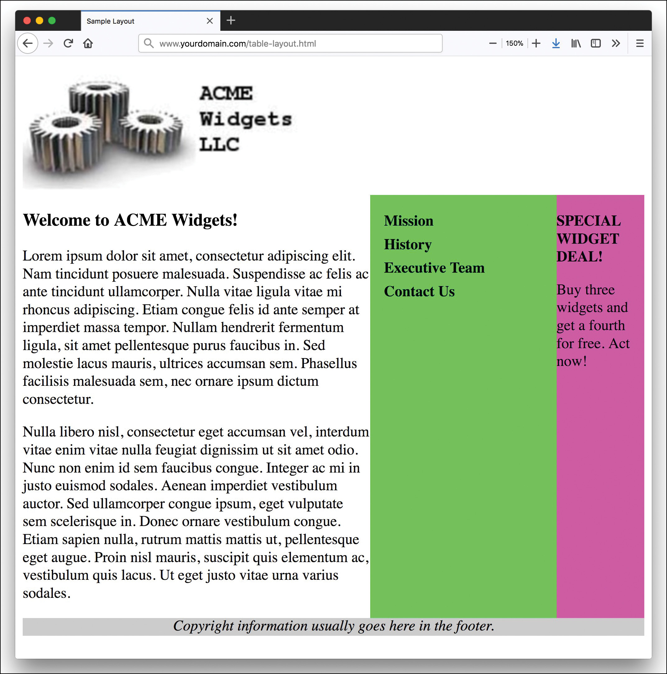
display: table;. (Credit: Kjpargeter/Shutterstock)
Understanding the CSS Flexible Box Layout Module
The CSS Flexible Box module gives you a way to position elements that display on a line in a container. The container can alter the dimensions of the elements inside it to best fit the available free space. A flexible box container, or flex container, will expand items to fill available free space or shrink them to prevent overflow in smaller spaces.
Note
While you can use the flexible box layout for any web page, this model is best suited for application components and small-scale layouts. If you are designing a full website or other larger-scale project, you should use the grid layout model, described later in this lesson.
Normal layout in web pages is based on block and inline elements interacting with one another in the normal flow. Normal flow in web page designs travels from left to right (or right to left on pages with RTL formatting), filling the width of the available space and then moving down the document until all the content is available on the page. With flexible box layout, items in the layout can be placed on the page in a more flexible fashion. If the designer wants the items to stack vertically from top to bottom, the box can accommodate that. This layout is, as its name promises, flexible.
Building a Flexible Box Container
The first thing you need when creating a flexible layout is a container element. This is the element that holds all the items that will be laid out on the page. You define a flex container with the display property:
.container {
display: flex;
}
This enables a flex context for all of the direct children of the container.
Once you have defined the container, you need to determine in what direction the elements in the container are going to flow. For this you use the flex-direction property with one of these values:
- row—The flex items flow left to right in
ltrlayouts and right to left inrtllayouts. This is the default. - row-reverse—The items flow right to left in
ltrlayouts and left to right inrtllayouts. This is the opposite ofrow. - column—Items flow from top to bottom in a column.
- column-reverse—Items flow from bottom to top in a column. This is the opposite of
column.
Once you have the flow direction, you need to consider how the items will wrap when they come to a boundary. By default, flex items try to fit onto one line. But you can change this with the flex-wrap property and these values:
- nowrap—All flex items are on one line (horizontal or vertical). This is the default.
- wrap—Flex items wrap to multiple lines from top to bottom.
- wrap-reverse—Flex items wrap to multiple lines from bottom to top. This is the opposite of
wrap.
You can define both the flex direction and wrap with the flex-flow shorthand property:
flex-flow: flex-direction || flex-wrap;
The last three properties you need to know for your flex containers are justify-content, align-items, and align-content. These properties control how the items will be displayed within the container.
The justify-content property defines how the items will be spaced if there is more room in the container than the items take up. You can distribute the extra free space so that it is between or around the items. These are the possible values:
- flex-start—The items are placed at the start of the container, and any extra space is placed after all the items. This is the default.
- flex-end—This is the same as
flex-start, only instead of placing the extra space at the end, you place it at the beginning and push all the items to the end. - center—The items are placed in the center of the container, and extra free space is placed evenly at the start and end.
- space-between—The items are evenly distributed in the line, with the first item right at the start and the last placed right at the end. Extra space is distributed evenly between all the items.
- space-around—The items are placed evenly on the line, with equal space all around them. This spacing does not appear equal, however, as inner items will have twice as much space between them as the first and last items will have on the outer edges.
Figure 12.13 shows how the different justify-content values look.

justify-content property.
The justify-content property defines how items will be laid out along the main line of the container (either horizontally or vertically). But you can also define how the items will be positioned along the perpendicular line of the container. In other words, if you have a horizontal flexbox, the align-items will define how the items are positioned on the vertical axis. If you have a vertical flexbox, the align-items property will define how they are positioned on the horizontal axis. This property has the following possible values:
- stretch—The items should stretch to fill the whole container while respecting
min-widthandmax-widthrules. This is the default. - center—Items are centered along the cross axis.
- baseline—Items are aligned so that their baselines align.
- flex-start—The items are positioned at the start of the element (the top for horizontal and the left for vertical
ltrlayouts). - flex-end—The items are positioned at the end of the element (the bottom for horizontal and the right for vertical ltr layouts).
If there are multiple lines in your container, you need to use the align-content property to determine how any extra space between lines will be distributed. This property can have the following values:
- stretch—Lines stretch to take up the remaining space. This is the default.
- center—Lines are packed in the center of the container, with extra space placed evenly before and after.
- space-between—The first line is placed at the start of the container, and the last line is at the end, and remaining lines are evenly distributed between them.
- space-around—The lines are evenly distributed, with extra space placed before and after each line.
- flex-start—Lines are pushed to the start of the container, with extra space placed after.
- flex-end—Lines are pushed to the end of the container, with extra space placed first.
Modifying Flex Items
Once you have a container, any element placed inside if is a flexbox item. But there are several things you can do to control how they are displayed in the container.
Normally, flexbox items appear on the page in the same order in which they appear in the HTML, but with the order property, you can change that. This property takes an integer. The lower the number (including negative numbers) the closer to the start the item will appear. If items have the same order value, they will be ordered the way they appear in the HTML source. (This helps solve the problem shown in Figure 12.12.) Starting with the CSS from Listing 12.4, change the #main element to display: flex; and remove the display: table-cell; from the content blocks. This gives you a layout just like the layout shown in Figure 12.12, but now you can reorder the columns. Change the order of the columns with the CSS like so:
#secondary_content {
order: -1;
}
This simple CSS places the #secondary_content lowest in the list order, so it comes first. The other two columns display in the order in which they are listed in the HTML because we did not specify an order for them. Listing 12.5 shows the CSS we used to get the layout in Figure 12.14. We used exactly the same HTML as in Listing 12.2.
Listing 12.5 Changing the Order of the Layout Columns with a Flexible Box Layout
#main {
width: 100%;
display: flex;
}
#secondary_content {
order: -1;
}
footer {
width: 100%;
background-color: #cccccc;
text-align:center;
font-style: italic;
}
#secondary_content { width: 200px; background-color: #52f471; }
#tertiary_content { width: 125px; background-color: #f452d5; }
#secondary_content ul {
list-style: none;
margin: 12px 0px 0px 12px;
padding: 0px;
}
#secondary_content li a:link, #secondary_content li a:visited {
font-size: 12pt;
font-weight: bold;
padding: 3px 0px 3px 3px;
color: #000000;
text-decoration: none;
display: block;
}
#secondary_content li a:hover, #secondary_content li a:active {
font-size: 12pt;
font-weight: bold;
padding: 3px 0px 3px 3px;
color: #ffffff;
text-decoration: none;
display: block;
}
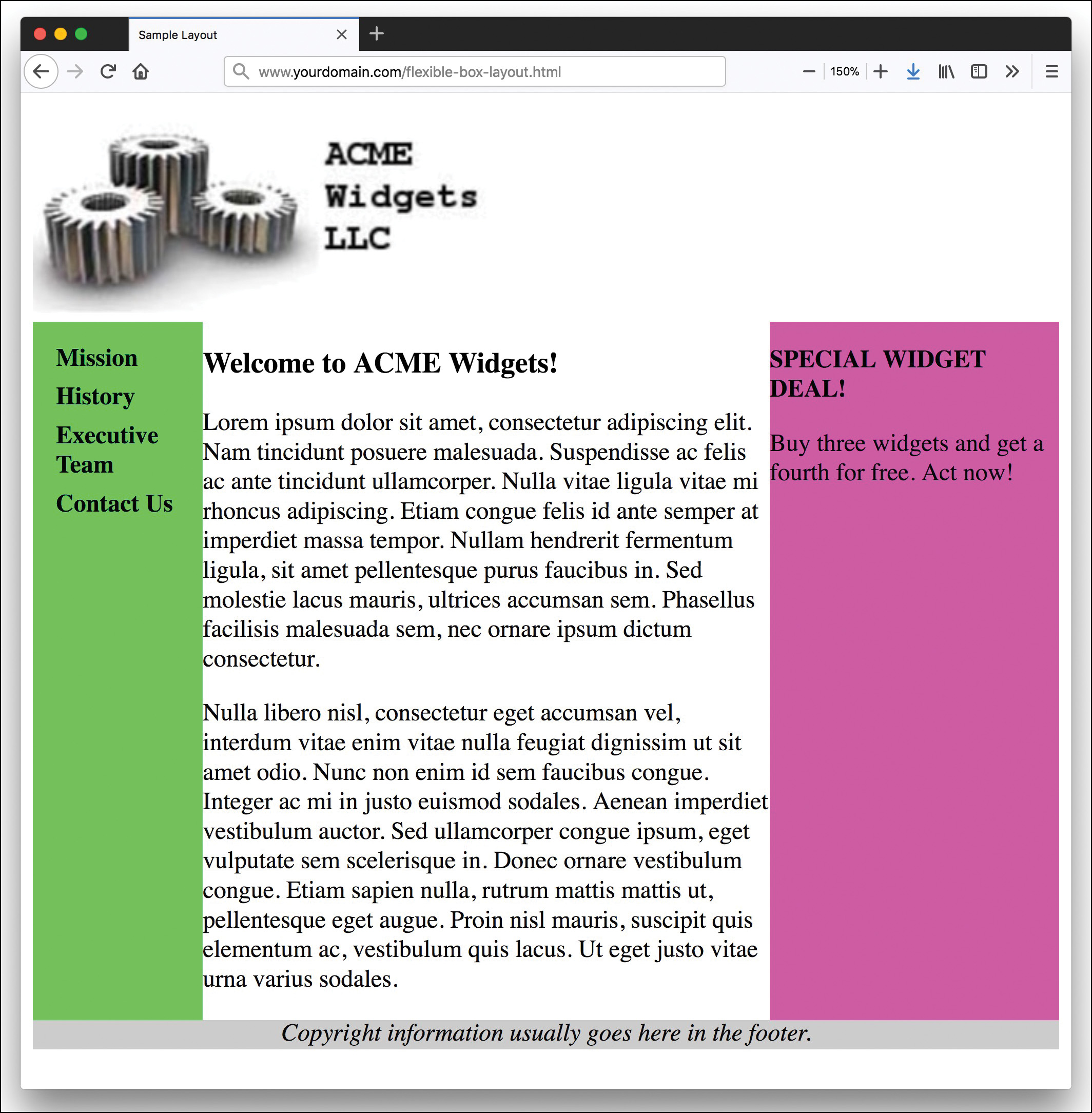
Note
If the order feature of flexible box layouts does not excite you, I don’t know what will. Because of the order property, you can create designs for all sorts of layouts that rely on databased entries of content. Normally, you would have to program the order of display into the database functionality itself, but now you can control it with CSS. Now, if you are selling shoes and want to highlight a certain style by displaying it first, you can just change the order in the CSS—no database programming or server-side scripting required.
The Flexible Box Layout module is very complicated and hard to use, and there are a lot more features to it, but it can be very useful in certain situations. There are lots of places you can learn more about CSS flexible boxes, but one fun online game is Flexbox Zombies (https://flexboxzombies.com). It’s long but worth it.
Understanding CSS Grid Layout Module
You may not be familiar with the CSS Grid Layout module, but chances are if you’ve done any web design, you have used grids. Most web pages are built using some form of invisible grid. If you use tables for layout, you are using a grid. And the three-column layout used in the previous sections is also laid out on a grid.
With the CSS3 Grid Layout module, you can define any container element as a grid with specific row and column sizes and then place your child elements into the grid. Just as with flexible box layouts, the order of items in the HTML doesn’t matter. Once they are in the grid, you can place them wherever you want. Just as with flexible boxes, the grid layout system has full support in modern browsers. Only Internet Explorer 11 requires a prefix (-ms), for example display: -ms-grid;.
To use the CSS Grid Layout system, you define a container element as display: grid; and then define your columns and rows with the grid-template-columns and grid-template-rows properties. Once you have defined the grid, you place the child elements into the grid with grid-template-areas and the grid-area property.
Working with the Grid Container
The first thing you do when creating a grid layout is to define the container element as a grid. You do this in the same way as with flex boxes, with the display property. There are three possible values for grids:
- grid—Generates a block-level grid
- inline-grid—Generates an inline grid
- subgrid—With nested grids, indicates that the nested grid should take the sizes of its rows and columns from the parent grid rather than requiring the designer to specify new ones.
Then you define the grid columns and rows with the grid-template-columns and grid-template-rows properties, both of which use space-separated lists of values.
The best way to think about grids created in the CSS Grid Layout module is to imagine that you’re creating your grid in text form right in the CSS. The values of the grid-template-columns/rows properties represent the track size, and the space between them represents the grid line. One way to build it is to write your CSS so it represents the grid, like so:
/* column1 column 2 column 3 column 4 */
grid-template-columns: 100px auto 100px 200px;
grid-template-rows:
/* row 1 */ 100px
/* row 2 */ 300px
/* row 3 */ 100px;
The browser will ignore the whitespace, but you can immediately see that this grid will be 4 × 3 (that is, four columns by three rows).
Note
One useful feature of the CSS grid system is that it adds a new unit of measure—fr. This refers to the free space inside the container. The browser first removes any space taken by non-flexible items and then divides up the remaining space among the elements with fr units. For example, you might have a three-column layout with a 15% left column and the remaining columns taking up three-quarters and one-quarter of the remaining available space. This is written like so:
grid-template-columns: 15% 3fr 1fr;
While you can define your columns and rows with spacing and comments as described previously, an easier way is to use the grid-template-areas property. To use this property, you need to name the different items with the grid-area property. For example, you might name your layout elements like this:
header { grid-area: header; }
footer { grid-area: footer; }
section { grid-area: main; }
aside { grid-area: sidebar; }
nav { grid-area: navigation; }
Then you define your layout grid with the grid-template-areas property. You reference the names of a grid area in the cell in which you want them to display. If you repeat it, the content will span those columns or rows. And a period is an empty cell in the layout.
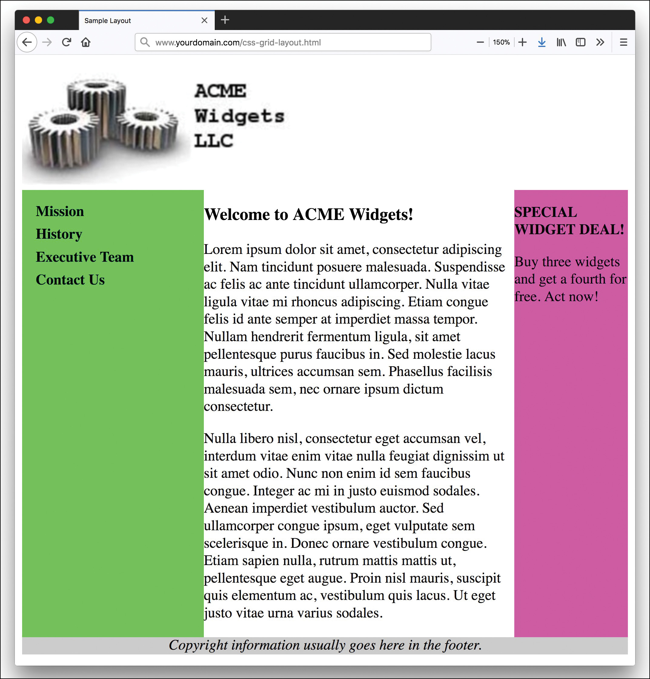
To replicate the three-column layout from the beginning of this lesson, first we apply the style sheet to the HTML from Listing 12.2. In it, we define the #main section as the grid container:
#main {
display: grid;
}
Then we name the grid elements with the grid-area property:
#main_content {
grid-area: main_content;
}
#secondary_content {
grid-area: secondary_content;
background-color: #52f471;
}
#tertiary_content {
grid-area: tertiary_content;
background-color: #f452d5;
}
Here we removed all the width styles as those will be defined in the grid itself. Next, we add the columns and rows to the #main element:
grid-template-columns: 200px auto 125px;
grid-template-rows: auto;
And then we lay out the design with grid-template-areas. Remember that the names of the areas should be in quotation marks:
grid-template-areas:
"secondary_content main_content tertiary_content";
Listing 12.6 shows the full CSS for this example, and Figure 12.15 shows the result.
Listing 12.6 Using the CSS Grid Module to Lay Out a Web Page
#main {
display: grid;
grid-template-columns: 200px auto 125px;
grid-template-rows: auto;
grid-template-areas:
"secondary_content main_content tertiary_content";
}
#main_content {
grid-area: main_content;
}
footer {
background-color: #cccccc;
text-align:center;
font-style: italic;
}
#secondary_content {
grid-area: secondary_content;
background-color: #52f471;
}
#tertiary_content {
grid-area: tertiary_content;
background-color: #f452d5;
}
#secondary_content ul {
list-style: none;
margin: 12px 0px 0px 12px;
padding: 0px;
}
#secondary_content li a:link, #secondary_content li a:visited {
font-size: 12pt;
font-weight: bold;
padding: 3px 0px 3px 3px;
color: #000000;
text-decoration: none;
display: block;
}
#secondary_content li a:hover, #secondary_content li a:active {
font-size: 12pt;
font-weight: bold;
padding: 3px 0px 3px 3px;
color: #ffffff;
text-decoration: none;
display: block;
}
Caution
When you turn a container element into a grid container, the grid elements are only the immediate children of that container. In the examples in this lesson, the container is the main <section> element. If you turned the <body> element in these examples into the container, then the grid items would be the <header>, <section>, and <footer> elements because these are the first children of the <body> element.
Like the Flexible Boxes module, the CSS Grid module has a lot more to it than this lesson could cover. You can do things like name grid lines, control how “extra” items fit in the layout, span rows and columns, and more. One site we find useful for understanding how CSS Grid works is Grid by Example (https://gridbyexample.com/examples/), but there are many other excellent tutorials as well—just search for CSS Grid Layout.
Summary
In this lesson, you learned about the three main types of layouts: fixed, liquid, and a fixed/liquid hybrid. In the middle of the lesson, an extended example walked you through the process of creating a fixed/liquid hybrid layout in which the HTML and CSS all validate properly. Then you saw how to create a similar layout by using modern CSS layout, with flexible boxes and grids. In this lesson, you learned that the most important part of creating a layout is figuring out the sections of content you think you might need to account for in the design.
Q&A
Q. Why would I want to use CSS flexible boxes or a CSS grid instead of the more “tried and true” methods of layout?
A. As with many other areas of web design, what you choose to do is completely up to you, but the new CSS flexible box and grid methods give you a lot more flexibility to change the layout right within the CSS, without changing the HTML at all. This means that you can work on the design of a page and even create multiple iterations without affecting the underlying structure. If the first layout you try doesn’t work, simply swap out the CSS to something else.
Q. I read that flexible boxes are often called a one-dimensional layout system. What does that mean?
A. At its core, the flexible box layout system is meant to allow you to control the layout of items in a single direction—either horizontally or vertically. While flex box items can flow to a second line or column, the primary intention was for the singular dimension. In comparison, the CSS grid layout defines both rows and columns and allows you to place items anywhere within the predefined grid.
Q. I’ve heard about something called an elastic layout. How does that differ from the liquid layout?
A. An elastic layout is a layout whose content areas resize when the user resizes the text. Elastic layouts use ems, which are inherently proportional to text and font size. An em is a typographical unit of measurement equal to the point size of the current font. When ems are used in an elastic layout, if a user forces the text size to increase or decrease in size by using Ctrl and the mouse scroll wheel, the areas containing the text increase or decrease proportionally. Elastic layouts are often quite difficult to achieve.
Q. Is there one type of layout system that is better than the others?
A. Better is a subjective term; the goal of these lessons is to help you create standards-compliant code. Most designers will tell you that liquid layouts take longer to create (and perfect), but the usability enhancements are worth it, especially when the process leads to a responsive design. Grid and flexible box layouts give you more options in terms of controlling the content display, but because they are so new, many designers are not yet comfortable using them. In general, most designers avoid fixed layout designs because they are not responsive and can be difficult for mobile users to navigate. You’ll learn more about how to build responsive websites in Part IV.
Workshop
The Workshop contains quiz questions and activities to help you solidify your understanding of the material covered.
Quiz
1. Which is the best layout to use, in general: fixed, liquid, or hybrid?
2. Can you position a fixed layout anywhere on the page?
3. What does min-width do?
4. Which would be better to use to display a group of products for sale: a CSS grid or flexible boxes layout?
5. Why is it important to consider mobile devices when creating your design?
6. Which is a better ID on an element: container or primary?
7. If you are targeting an audience with a standard browser size of 800 × 600 pixels, what should be the maximum fixed width in pixels, and why?
8. How do you define a container as a table?
9. Name three modern CSS layout techniques.
10. What does display: inline-grid; do?
Note
Just a reminder for those of you reading these words in the print or e-book edition of this book: If you go to www.informit.com/register and register this book (using ISBN 9780672338083), you can receive free access to an online Web Edition that not only contains the complete text of this book but also features an interactive version of this quiz.
Answers
1. This is a trick question; there is no “best” layout. What is best depends on the content and the needs of the audience. Note that we ultimately lean toward responsive grid layouts as the “best” and recommend against using fixed layouts except in very limited situations.
2. Sure. Although most fixed layouts are flush left or centered, you can assign a fixed position on an x,y axis and could place a <div> that contains all the other layout <div> elements.
3. The min-width property sets the minimum width of an element, not including padding, borders, or margins.
4. Flexible boxes were designed specifically for this type of layout, where there is a series of objects (the products for sale) that need to be displayed neatly within a container.
5. More and more people are accessing web pages primarily on their mobile devices, and if your layout is hard to read on such a device, they won’t stick around.
6. The ID primary is better because it doesn’t define a part of the layout but rather defines that the included content is primary.
7. It should be no more than 780 pixels or so, to account for the non-viewable areas of the browser.
8. Use the display: table; property.
9. The three modern layout techniques discussed in this lesson are CSS tables, flexible boxes, and grid layouts.
10. It indicates that the container is a grid that should be displayed inline with the surrounding content.
Exercises
 Figure 12.15 shows the finished CSS grid layout, but a few areas could stand to be improved. For example, there isn’t any space around the text in the right-side column, there aren’t any margins between the body text and either column, the footer strip is a little sparse, and so on. Take some time to fix these design elements.
- Figure 12.14 shows the finished flexible boxes layout, but there are problems with it as well. In addition to the issues mentioned above, the columns aren’t necessarily the right size, and the colors are hard on the eyes. Use what you learned in this lesson to modify this layout to better reflect your design skills. Don’t edit the HTML; do this just with CSS.